Year: 2021

  • Create Beautiful User Crud Template in React js Application

    Create Beautiful User Crud Template in React js Application

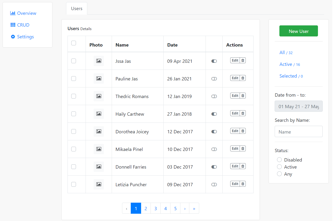
    Hello friends, welcome back to my blog. Today in this blog post, I am going to show you, Create Beautiful User Crud Template in React js Application.

    Guys in this post we will cover below things:

    1. Create Responsive Template in React Js.
    2. React js Responsive Modal Popup Form.

    Guys please watch below video to check react crud template working and responsiveness:

    React Crud Template

    Create Beautiful User Crud Template in React js Application
    Create Beautiful User Crud Template in React js Application
    Reactjs User Crud Template Add User Popup
    Reactjs User Crud Template Add User Popup

    For reactjs new comers, please check the below link:

    Reactjs Basic Tutorials


    Friends now I proceed onwards and here is the working code snippet and please use this carefully to avoid the mistakes:

    1. Firstly, we need fresh reactjs setup and for that, we need to run below commands into out terminal and also we should have latest node version installed on our system:

    npx create-react-app reactcrudtemplate
    
    cd reactcrudtemplate

    2. Now we need to run below commands into our project terminal to get bootstrap and related modules into our reactjs application:

    Guys I use jquery just because of bootstrap so please don’t mind or you can avoid it:

    npm install bootstrap --save
    
    npm install jquery --save //for bootstrap modal popup
    
    npm start //For start project again

    3. Finally for the main output, we need to add below code into our reactcrudtemplate/src/App.js file or if you have fresh setup then you can replace reactcrudtemplate/src/App.js file code with below code:

    import React from "react";
    
    import './App.css'
    //for bootstrap styles and scripts
    import 'bootstrap/dist/css/bootstrap.min.css';
    import 'bootstrap/dist/js/bootstrap.min.js';
    
    
    class App extends React.Component {
      render() {
        return (
          <div className="main_container">
              <div class="container">
            <div class="row flex-lg-nowrap">
            <div class="col-12 col-lg-auto mb-3" style={{width: "200px"}}>
                <div class="card p-3">
                <div class="e-navlist e-navlist--active-bg">
                    <ul class="nav">
                    <li class="nav-item"><a class="nav-link px-2 active" href="#"><i class="fa fa-fw fa-bar-chart mr-1"></i><span>Overview</span></a></li>
                    <li class="nav-item"><a class="nav-link px-2" href="#"><i class="fa fa-fw fa-th mr-1"></i><span>CRUD</span></a></li>
                    <li class="nav-item"><a class="nav-link px-2" href="#"><i class="fa fa-fw fa-cog mr-1"></i><span>Settings</span></a></li>
                    </ul>
                </div>
                </div>
            </div>
    
            <div class="col">
                <div class="e-tabs mb-3 px-3">
                <ul class="nav nav-tabs">
                    <li class="nav-item"><a class="nav-link active" href="#">Users</a></li>
                </ul>
                </div>
    
                <div class="row flex-lg-nowrap">
                <div class="col mb-3">
                    <div class="e-panel card">
                    <div class="card-body">
                        <div class="card-title">
                        <h6 class="mr-2"><span>Users</span><small class="px-1">Details</small></h6>
                        </div>
                        <div class="e-table">
                        <div class="table-responsive table-lg mt-3">
                            <table class="table table-bordered">
                            <thead>
                                <tr>
                                <th class="align-top">
                                    <div class="custom-control custom-control-inline custom-checkbox custom-control-nameless m-0">
                                    <input type="checkbox" class="custom-control-input" id="all-items" />
                                    <label class="custom-control-label" for="all-items"></label>
                                    </div>
                                </th>
                                <th>Photo</th>
                                <th class="max-width">Name</th>
                                <th class="sortable">Date</th>
                                <th> </th>
                                <th>Actions</th>
                                </tr>
                            </thead>
                            <tbody>
                                <tr>
                                <td class="align-middle">
                                    <div class="custom-control custom-control-inline custom-checkbox custom-control-nameless m-0 align-top">
                                    <input type="checkbox" class="custom-control-input" id="item-1" />
                                    <label class="custom-control-label" for="item-1"></label>
                                    </div>
                                </td>
                                <td class="align-middle text-center">
                                    <div class="bg-light d-inline-flex justify-content-center align-items-center align-top itemdiv" ><i class="fa fa-fw fa-photo" ></i></div>
                                </td>
                                <td class="text-nowrap align-middle">Jssa Jas</td>
                                <td class="text-nowrap align-middle"><span>09 Apr 2021</span></td>
                                <td class="text-center align-middle"><i class="fa fa-fw text-secondary cursor-pointer fa-toggle-on"></i></td>
                                <td class="text-center align-middle">
                                    <div class="btn-group align-top">
                                        <button class="btn btn-sm btn-outline-secondary badge" type="button" data-toggle="modal" data-target="#user-form-modal">Edit</button>
                                        <button class="btn btn-sm btn-outline-secondary badge" type="button"><i class="fa fa-trash"></i></button>
                                    </div>
                                </td>
                                </tr>
                                <tr>
                                <td class="align-middle">
                                    <div class="custom-control custom-control-inline custom-checkbox custom-control-nameless m-0 align-top">
                                    <input type="checkbox" class="custom-control-input" id="item-2" />
                                    <label class="custom-control-label" for="item-2"></label>
                                    </div>
                                </td>
                                <td class="align-middle text-center">
                                    <div class="bg-light d-inline-flex justify-content-center align-items-center align-top itemdiv" ><i class="fa fa-fw fa-photo" ></i></div>
                                </td>
                                <td class="text-nowrap align-middle">Pauline Jas</td>
                                <td class="text-nowrap align-middle"><span>26 Jan 2021</span></td>
                                <td class="text-center align-middle"><i class="fa fa-fw text-secondary cursor-pointer fa-toggle-off"></i></td>
                                <td class="text-center align-middle">
                                    <div class="btn-group align-top">
                                        <button class="btn btn-sm btn-outline-secondary badge" type="button" data-toggle="modal" data-target="#user-form-modal">Edit</button>
                                        <button class="btn btn-sm btn-outline-secondary badge" type="button"><i class="fa fa-trash"></i></button>
                                    </div>
                                </td>
                                </tr>
                                <tr>
                                <td class="align-middle">
                                    <div class="custom-control custom-control-inline custom-checkbox custom-control-nameless m-0 align-top">
                                    <input type="checkbox" class="custom-control-input" id="item-3" />
                                    <label class="custom-control-label" for="item-3"></label>
                                    </div>
                                </td>
                                <td class="align-middle text-center">
                                    <div class="bg-light d-inline-flex justify-content-center align-items-center align-top itemdiv" ><i class="fa fa-fw fa-photo" ></i></div>
                                </td>
                                <td class="text-nowrap align-middle">Sherilyn Metzel</td>
                                <td class="text-nowrap align-middle"><span>27 Jan 2021</span></td>
                                <td class="text-center align-middle"><i class="fa fa-fw text-secondary cursor-pointer fa-toggle-on"></i></td>
                                <td class="text-center align-middle">
                                    <div class="btn-group align-top">
                                        <button class="btn btn-sm btn-outline-secondary badge" type="button" data-toggle="modal" data-target="#user-form-modal">Edit</button>
                                        <button class="btn btn-sm btn-outline-secondary badge" type="button"><i class="fa fa-trash"></i></button>
                                    </div>
                                </td>
                                </tr>
                                <tr>
                                <td class="align-middle">
                                    <div class="custom-control custom-control-inline custom-checkbox custom-control-nameless m-0 align-top">
                                    <input type="checkbox" class="custom-control-input" id="item-4" />
                                    <label class="custom-control-label" for="item-4"></label>
                                    </div>
                                </td>
                                <td class="align-middle text-center">
                                    <div class="bg-light d-inline-flex justify-content-center align-items-center align-top itemdiv" ><i class="fa fa-fw fa-photo" ></i></div>
                                </td>
                                <td class="text-nowrap align-middle">Terrie Boaler</td>
                                <td class="text-nowrap align-middle"><span>20 Jan 2021</span></td>
                                <td class="text-center align-middle"><i class="fa fa-fw text-secondary cursor-pointer fa-toggle-on"></i></td>
                                <td class="text-center align-middle">
                                    <div class="btn-group align-top">
                                        <button class="btn btn-sm btn-outline-secondary badge" type="button" data-toggle="modal" data-target="#user-form-modal">Edit</button>
                                        <button class="btn btn-sm btn-outline-secondary badge" type="button"><i class="fa fa-trash"></i></button>
                                    </div>
                                </td>
                                </tr>
                                <tr>
                                <td class="align-middle">
                                    <div class="custom-control custom-control-inline custom-checkbox custom-control-nameless m-0 align-top">
                                    <input type="checkbox" class="custom-control-input" id="item-5" />
                                    <label class="custom-control-label" for="item-5"></label>
                                    </div>
                                </td>
                                <td class="align-middle text-center">
                                    <div class="bg-light d-inline-flex justify-content-center align-items-center align-top itemdiv" ><i class="fa fa-fw fa-photo" ></i></div>
                                </td>
                                <td class="text-nowrap align-middle">Rutter Pude</td>
                                <td class="text-nowrap align-middle"><span>13 Jan 2021</span></td>
                                <td class="text-center align-middle"><i class="fa fa-fw text-secondary cursor-pointer fa-toggle-off"></i></td>
                                <td class="text-center align-middle">
                                    <div class="btn-group align-top">
                                        <button class="btn btn-sm btn-outline-secondary badge" type="button" data-toggle="modal" data-target="#user-form-modal">Edit</button>
                                        <button class="btn btn-sm btn-outline-secondary badge" type="button"><i class="fa fa-trash"></i></button>
                                    </div>
                                </td>
                                </tr>
                                <tr>
                                <td class="align-middle">
                                    <div class="custom-control custom-control-inline custom-checkbox custom-control-nameless m-0 align-top">
                                    <input type="checkbox" class="custom-control-input" id="item-6" />
                                    <label class="custom-control-label" for="item-6"></label>
                                    </div>
                                </td>
                                <td class="align-middle text-center">
                                    <div class="bg-light d-inline-flex justify-content-center align-items-center align-top itemdiv" ><i class="fa fa-fw fa-photo" ></i></div>
                                </td>
                                <td class="text-nowrap align-middle">Clifford Benjamin</td>
                                <td class="text-nowrap align-middle"><span>25 Jan 2020</span></td>
                                <td class="text-center align-middle"><i class="fa fa-fw text-secondary cursor-pointer fa-toggle-on"></i></td>
                                <td class="text-center align-middle">
                                    <div class="btn-group align-top">
                                        <button class="btn btn-sm btn-outline-secondary badge" type="button" data-toggle="modal" data-target="#user-form-modal">Edit</button>
                                        <button class="btn btn-sm btn-outline-secondary badge" type="button"><i class="fa fa-trash"></i></button>
                                    </div>
                                </td>
                                </tr>
                                <tr>
                                <td class="align-middle">
                                    <div class="custom-control custom-control-inline custom-checkbox custom-control-nameless m-0 align-top">
                                    <input type="checkbox" class="custom-control-input" id="item-7" />
                                    <label class="custom-control-label" for="item-7"></label>
                                    </div>
                                </td>
                                <td class="align-middle text-center">
                                    <div class="bg-light d-inline-flex justify-content-center align-items-center align-top itemdiv" ><i class="fa fa-fw fa-photo" ></i></div>
                                </td>
                                <td class="text-nowrap align-middle">Thedric Romans</td>
                                <td class="text-nowrap align-middle"><span>12 Jan 2019</span></td>
                                <td class="text-center align-middle"><i class="fa fa-fw text-secondary cursor-pointer fa-toggle-off"></i></td>
                                <td class="text-center align-middle">
                                    <div class="btn-group align-top">
                                        <button class="btn btn-sm btn-outline-secondary badge" type="button" data-toggle="modal" data-target="#user-form-modal">Edit</button>
                                        <button class="btn btn-sm btn-outline-secondary badge" type="button"><i class="fa fa-trash"></i></button>
                                    </div>
                                </td>
                                </tr>
                                <tr>
                                <td class="align-middle">
                                    <div class="custom-control custom-control-inline custom-checkbox custom-control-nameless m-0 align-top">
                                    <input type="checkbox" class="custom-control-input" id="item-8" />
                                    <label class="custom-control-label" for="item-8"></label>
                                    </div>
                                </td>
                                <td class="align-middle text-center">
                                    <div class="bg-light d-inline-flex justify-content-center align-items-center align-top itemdiv" ><i class="fa fa-fw fa-photo" ></i></div>
                                </td>
                                <td class="text-nowrap align-middle">Haily Carthew</td>
                                <td class="text-nowrap align-middle"><span>27 Jan 2018</span></td>
                                <td class="text-center align-middle"><i class="fa fa-fw text-secondary cursor-pointer fa-toggle-on"></i></td>
                                <td class="text-center align-middle">
                                    <div class="btn-group align-top">
                                        <button class="btn btn-sm btn-outline-secondary badge" type="button" data-toggle="modal" data-target="#user-form-modal">Edit</button>
                                        <button class="btn btn-sm btn-outline-secondary badge" type="button"><i class="fa fa-trash"></i></button>
                                    </div>
                                </td>
                                </tr>
                                <tr>
                                <td class="align-middle">
                                    <div class="custom-control custom-control-inline custom-checkbox custom-control-nameless m-0 align-top">
                                    <input type="checkbox" class="custom-control-input" id="item-9" />
                                    <label class="custom-control-label" for="item-9"></label>
                                    </div>
                                </td>
                                <td class="align-middle text-center">
                                    <div class="bg-light d-inline-flex justify-content-center align-items-center align-top itemdiv" ><i class="fa fa-fw fa-photo" ></i></div>
                                </td>
                                <td class="text-nowrap align-middle">Dorothea Joicey</td>
                                <td class="text-nowrap align-middle"><span>12 Dec 2017</span></td>
                                <td class="text-center align-middle"><i class="fa fa-fw text-secondary cursor-pointer fa-toggle-on"></i></td>
                                <td class="text-center align-middle">
                                    <div class="btn-group align-top">
                                        <button class="btn btn-sm btn-outline-secondary badge" type="button" data-toggle="modal" data-target="#user-form-modal">Edit</button>
                                        <button class="btn btn-sm btn-outline-secondary badge" type="button"><i class="fa fa-trash"></i></button>
                                    </div>
                                </td>
                                </tr>
                                <tr>
                                <td class="align-middle">
                                    <div class="custom-control custom-control-inline custom-checkbox custom-control-nameless m-0 align-top">
                                    <input type="checkbox" class="custom-control-input" id="item-10" />
                                    <label class="custom-control-label" for="item-10"></label>
                                    </div>
                                </td>
                                <td class="align-middle text-center">
                                    <div class="bg-light d-inline-flex justify-content-center align-items-center align-top itemdiv" ><i class="fa fa-fw fa-photo" ></i></div>
                                </td>
                                <td class="text-nowrap align-middle">Mikaela Pinel</td>
                                <td class="text-nowrap align-middle"><span>10 Dec 2017</span></td>
                                <td class="text-center align-middle"><i class="fa fa-fw text-secondary cursor-pointer fa-toggle-off"></i></td>
                                <td class="text-center align-middle">
                                    <div class="btn-group align-top">
                                        <button class="btn btn-sm btn-outline-secondary badge" type="button" data-toggle="modal" data-target="#user-form-modal">Edit</button>
                                        <button class="btn btn-sm btn-outline-secondary badge" type="button"><i class="fa fa-trash"></i></button>
                                    </div>
                                </td>
                                </tr>
                                <tr>
                                <td class="align-middle">
                                    <div class="custom-control custom-control-inline custom-checkbox custom-control-nameless m-0 align-top">
                                    <input type="checkbox" class="custom-control-input" id="item-11" />
                                    <label class="custom-control-label" for="item-11"></label>
                                    </div>
                                </td>
                                <td class="align-middle text-center">
                                    <div class="bg-light d-inline-flex justify-content-center align-items-center align-top itemdiv" ><i class="fa fa-fw fa-photo" ></i></div>
                                </td>
                                <td class="text-nowrap align-middle">Donnell Farries</td>
                                <td class="text-nowrap align-middle"><span>03 Dec 2017</span></td>
                                <td class="text-center align-middle"><i class="fa fa-fw text-secondary cursor-pointer fa-toggle-on"></i></td>
                                <td class="text-center align-middle">
                                    <div class="btn-group align-top">
                                        <button class="btn btn-sm btn-outline-secondary badge" type="button" data-toggle="modal" data-target="#user-form-modal">Edit</button>
                                        <button class="btn btn-sm btn-outline-secondary badge" type="button"><i class="fa fa-trash"></i></button>
                                    </div>
                                </td>
                                </tr>
                                <tr>
                                <td class="align-middle">
                                    <div class="custom-control custom-control-inline custom-checkbox custom-control-nameless m-0 align-top">
                                    <input type="checkbox" class="custom-control-input" id="item-12" />
                                    <label class="custom-control-label" for="item-12"></label>
                                    </div>
                                </td>
                                <td class="align-middle text-center">
                                    <div class="bg-light d-inline-flex justify-content-center align-items-center align-top itemdiv" ><i class="fa fa-fw fa-photo" ></i></div>
                                </td>
                                <td class="text-nowrap align-middle">Letizia Puncher</td>
                                <td class="text-nowrap align-middle"><span>09 Dec 2017</span></td>
                                <td class="text-center align-middle"><i class="fa fa-fw text-secondary cursor-pointer fa-toggle-off"></i></td>
                                <td class="text-center align-middle">
                                    <div class="btn-group align-top">
                                        <button class="btn btn-sm btn-outline-secondary badge" type="button" data-toggle="modal" data-target="#user-form-modal">Edit</button>
                                        <button class="btn btn-sm btn-outline-secondary badge" type="button"><i class="fa fa-trash"></i></button>
                                    </div>
                                </td>
                                </tr>
                            </tbody>
                            </table>
                        </div>
                        <div class="d-flex justify-content-center">
                            <ul class="pagination mt-3 mb-0">
                            <li class="disabled page-item"><a href="#" class="page-link">‹</a></li>
                            <li class="active page-item"><a href="#" class="page-link">1</a></li>
                            <li class="page-item"><a href="#" class="page-link">2</a></li>
                            <li class="page-item"><a href="#" class="page-link">3</a></li>
                            <li class="page-item"><a href="#" class="page-link">4</a></li>
                            <li class="page-item"><a href="#" class="page-link">5</a></li>
                            <li class="page-item"><a href="#" class="page-link">›</a></li>
                            <li class="page-item"><a href="#" class="page-link">»</a></li>
                            </ul>
                        </div>
                        </div>
                    </div>
                    </div>
                </div>
                <div class="col-12 col-lg-3 mb-3">
                    <div class="card">
                    <div class="card-body">
                        <div class="text-center px-xl-3">
                        <button class="btn btn-success btn-block" type="button" data-toggle="modal" data-target="#user-form-modal">New User</button>
                        </div>
                        <hr class="my-3" />
                        <div class="e-navlist e-navlist--active-bold">
                        <ul class="nav">
                            <li class="nav-item active"><a href="" class="nav-link"><span>All</span>&nbsp;<small>/&nbsp;32</small></a></li>
                            <li class="nav-item"><a href="" class="nav-link"><span>Active</span>&nbsp;<small>/&nbsp;16</small></a></li>
                            <li class="nav-item"><a href="" class="nav-link"><span>Selected</span>&nbsp;<small>/&nbsp;0</small></a></li>
                        </ul>
                        </div>
                        <hr class="my-3"/>
                        <div>
                        <div class="form-group">
                            <label>Date from - to:</label>
                            <div>
                            <input id="dates-range" class="form-control flatpickr-input" placeholder="01 May 21 - 27 May 21" type="text" readonly="readonly" />
                            </div>
                        </div>
                        <div class="form-group">
                            <label>Search by Name:</label>
                            <div><input class="form-control w-100" type="text" placeholder="Name" value="" /></div>
                        </div>
                        </div>
                        <hr class="my-3" />
                        <div class="">
                        <label>Status:</label>
                        <div class="px-2">
                            <div class="custom-control custom-radio">
                            <input type="radio" class="custom-control-input" name="user-status" id="users-status-disabled" />
                            <label class="custom-control-label" for="users-status-disabled">Disabled</label>
                            </div>
                        </div>
                        <div class="px-2">
                            <div class="custom-control custom-radio">
                            <input type="radio" class="custom-control-input" name="user-status" id="users-status-active" />
                            <label class="custom-control-label" for="users-status-active">Active</label>
                            </div>
                        </div>
                        <div class="px-2">
                            <div class="custom-control custom-radio">
                            <input type="radio" class="custom-control-input" name="user-status" id="users-status-any" checked="" />
                            <label class="custom-control-label" for="users-status-any">Any</label>
                            </div>
                        </div>
                        </div>
                    </div>
                    </div>
                </div>
                </div>
     
                {/* Moda */}          
                <div class="modal fade" role="dialog" tabindex="-1" id="user-form-modal">
                <div class="modal-dialog modal-lg" role="document">
                    <div class="modal-content">
                    <div class="modal-header">
                        <h5 class="modal-title">Create User</h5>
                        <button type="button" class="close" data-dismiss="modal">
                        <span aria-hidden="true">×</span>
                        </button>
                    </div>
                    <div class="modal-body">
                        <div class="py-1">
                        <form class="form" novalidate="">
                            <div class="row">
                            <div class="col">
                                <div class="row">
                                <div class="col">
                                    <div class="form-group">
                                    <label>Full Name</label>
                                    <input class="form-control" type="text" name="name" placeholder="John Smith" value="John Smith" />
                                    </div>
                                </div>
                                <div class="col">
                                    <div class="form-group">
                                    <label>Username</label>
                                    <input class="form-control" type="text" name="username" placeholder="johnny.s" value="johnny.s" />
                                    </div>
                                </div>
                                </div>
                                <div class="row">
                                <div class="col">
                                    <div class="form-group">
                                    <label>Email</label>
                                    <input class="form-control" type="text" placeholder="user@example.com" />
                                    </div>
                                </div>
                                </div>
                                <div class="row">
                                <div class="col mb-3">
                                    <div class="form-group">
                                    <label>About</label>
                                    <textarea class="form-control" rows="5" placeholder="My Bio"></textarea>
                                    </div>
                                </div>
                                </div>
                            </div>
                            </div>
                            <div class="row">
                            <div class="col-12 col-sm-6 mb-3">
                                <div class="mb-2"><b>Change Password</b></div>
                                <div class="row">
                                <div class="col">
                                    <div class="form-group">
                                    <label>Current Password</label>
                                    <input class="form-control" type="password" placeholder="••••••" />
                                    </div>
                                </div>
                                </div>
                                <div class="row">
                                <div class="col">
                                    <div class="form-group">
                                    <label>New Password</label>
                                    <input class="form-control" type="password" placeholder="••••••" />
                                    </div>
                                </div>
                                <div class="col">
                                    <div class="form-group">
                                    <label>Confirm <span class="d-none d-xl-inline">Password</span></label>
                                    <input class="form-control" type="password" placeholder="••••••" /></div>
                                </div>
                                </div>
                            </div>
                            <div class="col-12 col-sm-5 offset-sm-1 mb-3">
                                <div class="mb-2"><b>Keeping in Touch</b></div>
                                <div class="row">
                                <div class="col">
                                    <label>Email Notifications</label>
                                    <div class="custom-controls-stacked px-2">
                                    <div class="custom-control custom-checkbox">
                                        <input type="checkbox" class="custom-control-input" id="notifications-blog" checked="" />
                                        <label class="custom-control-label" for="notifications-blog">Blog posts</label>
                                    </div>
                                    <div class="custom-control custom-checkbox">
                                        <input type="checkbox" class="custom-control-input" id="notifications-news" checked="" />
                                        <label class="custom-control-label" for="notifications-news">Newsletter</label>
                                    </div>
                                    <div class="custom-control custom-checkbox">
                                        <input type="checkbox" class="custom-control-input" id="notifications-offers" checked="" />
                                        <label class="custom-control-label" for="notifications-offers">Personal Offers</label>
                                    </div>
                                    </div>
                                </div>
                                </div>
                            </div>
                            </div>
                            <div class="row">
                            <div class="col d-flex justify-content-end">
                                <button class="btn btn-primary" type="submit">Save Changes</button>
                            </div>
                            </div>
                        </form>
    
                        </div>
                    </div>
                    </div>
                </div>
                </div>
            </div>
            </div>
            </div>
          </div>
        );
      }
    }
    export default App;

    4. Now friends, we need to add below code into our reactcrudtemplate/src/App.css file for some custom styling:

    @import url("https://maxcdn.bootstrapcdn.com/font-awesome/4.3.0/css/font-awesome.min.css");
    body{
        margin-top:20px!important;
        background:#f8f8f8!important;
    }
    .fa-photo
    {
        opacity: 0.8;
    }
    .itemdiv
    {
        width: 35px; height: 35px; border-radius: 3px;
    }

    Now we are done with html friends and in future I will come with full functional as well with MySQL backend. If you have any kind of query or suggestion or any requirement then feel free to comment below.

    Note: Friends, I just tell the basic setup and things, you can change the code according to your requirements.

    I will appreciate that if you will tell your views for this post. Nothing matters if your views will be good or bad.

    Jassa

    Thanks

  • Angular 11 – Angular Material Carousel Slider

    Angular 11 – Angular Material Carousel Slider

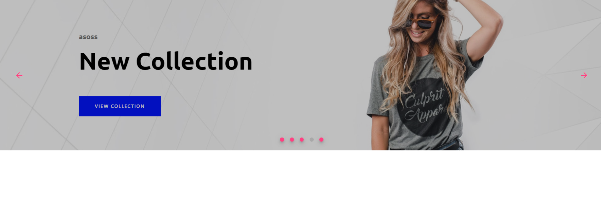
    Hello friends, welcome back to my blog. Today in this blog post, I am going to tell you, Angular 11 – Angular Material Carousel Slider.

    Material Angular

    Angular 11 - Angular Material Carousel Slider
    Angular 11 – Angular Material Carousel Slider

    Angular 11 came and very soon Angular 12 will come and if you are new then you must check below two links:

    1. Angular11 Basic Tutorials

    Friends now I proceed onwards and here is the working code snippet and please use carefully this to avoid the mistakes:

    1. Firstly friends we need fresh angular 11 setup and for this we need to run below commands but if you already have angular 11 setup then you can avoid below commands. Secondly we should also have latest node version installed on our system:

    npm install -g @angular/cli 
    
    ng new angularmaterial //Create new Angular Project
    
    cd angularmaterial // Go inside the Angular Project Folder
    
    ng serve --open // Run and Open the Angular Project
    
    http://localhost:4200/ // Working Angular Project Url

    2. Now friends, here we need to run below commands into our project terminal to install angular material modules into our angular application:

    ng add @angular/material
    
    npm i @ngmodule/material-carousel

    3. Now friends we just need to add below code into src/app/app.component.html file to get final out on the web browser:

    <mat-carousel
    timings="250ms ease-in"
    [autoplay]="true"
    interval="5000"
    color="accent"
    maxWidth="auto"
    proportion="25"
    slides="5"
    [loop]="true"
    [hideArrows]="false"
    [hideIndicators]="false"
    [useKeyboard]="true"
    [useMouseWheel]="false"
    orientation="ltr"
    >
    <mat-carousel-slide
      #matCarouselSlide
      *ngFor="let slide of slides; let i = index"
      [image]="slide.image"
      overlayColor="#00000040"
      [hideOverlay]="false"
    ></mat-carousel-slide>
    </mat-carousel>

    4. Now friends we just need to add below code into src/app/app.module.ts file:

    ...
    import { BrowserAnimationsModule } from '@angular/platform-browser/animations';
    import { MatCarouselModule } from '@ngmodule/material-carousel';
    
    @NgModule({
     ...
      imports: [
        ...
        BrowserAnimationsModule,
        MatCarouselModule.forRoot()
       
      ]...
    

    5. Now friends we just need to add below code into src/app/app.component.ts file:

    ...
    import { MatCarousel, MatCarouselComponent } from '@ngmodule/material-carousel';
    
    export class AppComponent {
       ...
       // Slider Images
       slides = [{'image': 'https://therichpost.com/wp-content/uploads/2021/02/Vuejs-Fashion-Ecommerce-Template-Free.png'}, {'image': 'https://therichpost.com/wp-content/uploads/2021/02/angular-11-bootstrap-4.5-Ecommerce-Template-Free.png'},{'image': 'https://therichpost.com/wp-content/uploads/2020/10/Angular-10-Learning-Education-Center-Free-Template-1.png'}, {'image': 'https://therichpost.com/wp-content/uploads/2020/11/Reactjs-Easy-Shop-Free-Template-with-Source-Code.png'}, {'image': 'https://therichpost.com/wp-content/uploads/2021/02/angular-11-bootstrap-4.5-Ecommerce-Template-Free.png'}];
    
      
    }
    

    Friends in the end must run ng serve command into your terminal to run the angular 11 project.

    Now we are done friends. If you have any kind of query, suggestion and new requirement then feel free to comment below.

    Note: Friends, In this post, I just tell the basic setup and things, you can change the code according to your requirements.

    I will appreciate that if you will tell your views for this post. Nothing matters if your views will be good or bad because with your views, I will make my next posts more good and helpful.

    Jassa

    Thanks

  • Build Professional Website in Laravel 8.16 Bootstrap 4.6

    Build Professional Website in Laravel 8.16 Bootstrap 4.6

    Hello friends, welcome back to my blog. Today in this blog post, I am going to show you, Build Professional Website in Laravel 8.16 Bootstrap 4.6.

    Laravel 8 Website

    Build Professional Website in Laravel 8.16 Bootstrap 4.6
    Build Professional Website in Laravel 8.16 Bootstrap 4.6

    Guys please check below link for more laravel 8 posts:


    Friends now I proceed onwards and here is the working code snippet and please use this carefully to avoid the mistakes:

    1. Now friends, here is the complete working code snippet

    and I have added inside my laravel 8: projectname/resources/views/ welcome.blade.php file for showing you working example but you can add according to your requirement:

    I have added bootstrap live cdn’s for template working

    <!DOCTYPE html>
    <html lang="{{ str_replace('_', '-', app()->getLocale()) }}">
    <head>
    <meta charset="utf-8">
    <meta name="viewport" content="width=device-width, initial-scale=1">
    <title>Laravel</title>
    <link rel="stylesheet" href="https://maxcdn.bootstrapcdn.com/bootstrap/4.5.2/css/bootstrap.min.css">
    
    <!-- Custom Styles -->
    <style>
      @import url("https://use.fontawesome.com/releases/v5.0.8/css/all.css");
      @import url("https://cdnjs.cloudflare.com/ajax/libs/simple-line-icons/2.5.5/css/simple-line-icons.min.css");
      @import url("https://fonts.googleapis.com/css?family=Lato:300,400,700,300italic,400italic,700italic");
      body {
          font-family: Lato,'Helvetica Neue',Helvetica,Arial,sans-serif!important;
      }
      .features-icons {
          padding-top: 7rem;
          padding-bottom: 7rem;
        }
        .features-icons .features-icons-item {
          max-width: 20rem;
        }
        .features-icons .features-icons-item .features-icons-icon {
          height: 7rem;
        }
        .features-icons .features-icons-item .features-icons-icon i {
          font-size: 4.5rem;
        }
        .features-icons .features-icons-item:hover .features-icons-icon i {
          font-size: 5rem;
        }
        
        header.masthead {
          position: relative;
          background-color: #343a40;
          background: url("../assets/img/bg-masthead.jpg") no-repeat center center;
          background-size: cover;
          padding-top: 8rem;
          padding-bottom: 8rem;
        }
        header.masthead .overlay {
          position: absolute;
          background-color: #212529;
          height: 100%;
          width: 100%;
          top: 0;
          left: 0;
          opacity: 0.3;
        }
        header.masthead h1 {
          font-size: 2rem;
        }
        @media (min-width: 768px) {
          header.masthead {
            padding-top: 12rem;
            padding-bottom: 12rem;
          }
          header.masthead h1 {
            font-size: 3rem;
          }
        }
        
        .showcase .showcase-text {
          padding: 3rem;
        }
        .showcase .showcase-img {
          min-height: 30rem;
          background-size: cover;
        }
        @media (min-width: 768px) {
          .showcase .showcase-text {
            padding: 7rem;
          }
        }
        
        .testimonials {
          padding-top: 7rem;
          padding-bottom: 7rem;
        }
        .testimonials .testimonial-item {
          max-width: 18rem;
        }
        .testimonials .testimonial-item img {
          max-width: 12rem;
          box-shadow: 0px 5px 5px 0px #adb5bd;
        }
        
        .call-to-action {
          position: relative;
          background-color: #343a40;
          background: url("../assets/img/bg-masthead.jpg") no-repeat center center;
          background-size: cover;
          padding-top: 7rem;
          padding-bottom: 7rem;
        }
        .call-to-action .overlay {
          position: absolute;
          background-color: #212529;
          height: 100%;
          width: 100%;
          top: 0;
          left: 0;
          opacity: 0.3;
        }
        
        footer.footer {
          padding-top: 4rem;
          padding-bottom: 4rem;
        }
        h1, h2, h3, h4, h5, h6 {
          font-family: Lato,'Helvetica Neue',Helvetica,Arial,sans-serif;
          font-weight: 700;
      }
    </style>    
    </head>
    <body>
      <!-- Navigation-->
      <nav class="navbar navbar-light bg-light static-top">
          <div class="container">
              <a class="navbar-brand" href="#!">Therichpost</a>
              <a class="btn btn-primary" href="#!">Sign In</a>
          </div>
      </nav>
      <!-- Masthead-->
      <header class="masthead text-white text-center">
          <div class="overlay"></div>
          <div class="container">
              <div class="row">
                  <div class="col-xl-9 mx-auto"><h1 class="mb-5">Build a landing page for your business or project and generate more leads!</h1></div>
                  <div class="col-md-10 col-lg-8 col-xl-7 mx-auto">
                      <form>
                          <div class="form-row">
                              <div class="col-12 col-md-9 mb-2 mb-md-0"><input class="form-control form-control-lg" type="email" placeholder="Enter your email..." /></div>
                              <div class="col-12 col-md-3"><button class="btn btn-block btn-lg btn-primary" type="submit">Sign up!</button></div>
                          </div>
                      </form>
                  </div>
              </div>
          </div>
      </header>
      <!-- Icons Grid-->
      <section class="features-icons bg-light text-center">
          <div class="container">
              <div class="row">
                  <div class="col-lg-4">
                      <div class="features-icons-item mx-auto mb-5 mb-lg-0 mb-lg-3">
                          <div class="features-icons-icon d-flex"><i class="icon-screen-desktop m-auto text-primary"></i></div>
                          <h3>Laravel 8+ Responsive</h3>
                          <p class="lead mb-0">This theme will look great on any device, no matter the size!</p>
                      </div>
                  </div>
                  <div class="col-lg-4">
                      <div class="features-icons-item mx-auto mb-5 mb-lg-0 mb-lg-3">
                          <div class="features-icons-icon d-flex"><i class="icon-layers m-auto text-primary"></i></div>
                          <h3>Bootstrap 4.6 Ready</h3>
                          <p class="lead mb-0">Featuring the latest build of the new Bootstrap 4 framework!</p>
                      </div>
                  </div>
                  <div class="col-lg-4">
                      <div class="features-icons-item mx-auto mb-0 mb-lg-3">
                          <div class="features-icons-icon d-flex"><i class="icon-check m-auto text-primary"></i></div>
                          <h3>Easy to Use</h3>
                          <p class="lead mb-0">Ready to use with your own content, or customize the source files!</p>
                      </div>
                  </div>
              </div>
          </div>
      </section>
      <!-- Image Showcases-->
      <section class="showcase">
          <div class="container-fluid p-0">
              <div class="row no-gutters">
                  <div class="col-lg-6 order-lg-2 text-white showcase-img" style="background-image: url('assets/img/bg-showcase-1.jpg')"></div>
                  <div class="col-lg-6 order-lg-1 my-auto showcase-text">
                      <h2>Fully Responsive Design</h2>
                      <p class="lead mb-0">Lorem Ipsum is simply dummy text of the printing and typesetting industry. Lorem Ipsum is simply dummy text of the printing and typesetting industry.</p>
                  </div>
              </div>
              <div class="row no-gutters">
                  <div class="col-lg-6 text-white showcase-img" style="background-image: url('assets/img/bg-showcase-2.jpg')"></div>
                  <div class="col-lg-6 my-auto showcase-text">
                      <h2>Updated For Bootstrap 4.6</h2>
                      <p class="lead mb-0">Lorem Ipsum is simply dummy text of the printing and typesetting industry. Lorem Ipsum is simply dummy text of the printing and typesetting industry.</p>
                  </div>
              </div>
              <div class="row no-gutters">
                  <div class="col-lg-6 order-lg-2 text-white showcase-img" style="background-image: url('assets/img/bg-showcase-3.jpg')"></div>
                  <div class="col-lg-6 order-lg-1 my-auto showcase-text">
                      <h2>Easy to Use & Customize</h2>
                      <p class="lead mb-0">Lorem Ipsum is simply dummy text of the printing and typesetting industry. Lorem Ipsum is simply dummy text of the printing and typesetting industry.</p>
                  </div>
              </div>
          </div>
      </section>
      <!-- Testimonials-->
      <section class="testimonials text-center bg-light">
          <div class="container">
              <h2 class="mb-5">What people are saying...</h2>
              <div class="row">
                  <div class="col-lg-4">
                      <div class="testimonial-item mx-auto mb-5 mb-lg-0">
                          <img class="img-fluid rounded-circle mb-3" src="assets/img/testimonials-1.jpg" alt="..." />
                          <h5>Jassa E.</h5>
                          <p class="font-weight-light mb-0">"This is fantastic! Thanks so much guys!"</p>
                      </div>
                  </div>
                  <div class="col-lg-4">
                      <div class="testimonial-item mx-auto mb-5 mb-lg-0">
                          <img class="img-fluid rounded-circle mb-3" src="assets/img/testimonials-2.jpg" alt="..." />
                          <h5>Jassa S.</h5>
                          <p class="font-weight-light mb-0">"Laravel Bootstrap combination is amazing. I've been using it to create lots of super nice landing pages."</p>
                      </div>
                  </div>
                  <div class="col-lg-4">
                      <div class="testimonial-item mx-auto mb-5 mb-lg-0">
                          <img class="img-fluid rounded-circle mb-3" src="assets/img/testimonials-3.jpg" alt="..." />
                          <h5>Jassa W.</h5>
                          <p class="font-weight-light mb-0">"Thanks so much for making these free resources available to us!"</p>
                      </div>
                  </div>
              </div>
          </div>
      </section>
      <!-- Call to Action-->
      <section class="call-to-action text-white text-center">
          <div class="overlay"></div>
          <div class="container">
              <div class="row">
                  <div class="col-xl-9 mx-auto"><h2 class="mb-4">Ready to get started? Sign up now!</h2></div>
                  <div class="col-md-10 col-lg-8 col-xl-7 mx-auto">
                      <form>
                          <div class="form-row">
                              <div class="col-12 col-md-9 mb-2 mb-md-0"><input class="form-control form-control-lg" type="email" placeholder="Enter your email..." /></div>
                              <div class="col-12 col-md-3"><button class="btn btn-block btn-lg btn-primary" type="submit">Sign up!</button></div>
                          </div>
                      </form>
                  </div>
              </div>
          </div>
      </section>
      <!-- Footer-->
      <footer class="footer bg-light">
          <div class="container">
              <div class="row">
                  <div class="col-lg-6 h-100 text-center text-lg-left my-auto">
                      <ul class="list-inline mb-2">
                          <li class="list-inline-item"><a href="#!">About</a></li>
                          <li class="list-inline-item">⋅</li>
                          <li class="list-inline-item"><a href="#!">Contact</a></li>
                          <li class="list-inline-item">⋅</li>
                          <li class="list-inline-item"><a href="#!">Terms of Use</a></li>
                          <li class="list-inline-item">⋅</li>
                          <li class="list-inline-item"><a href="#!">Privacy Policy</a></li>
                      </ul>
                      <p class="text-muted small mb-4 mb-lg-0">© Your Website 2021. All Rights Reserved.</p>
                  </div>
                  <div class="col-lg-6 h-100 text-center text-lg-right my-auto">
                      <ul class="list-inline mb-0">
                          <li class="list-inline-item mr-3">
                              <a href="#!"><i class="fab fa-facebook fa-2x fa-fw"></i></a>
                          </li>
                          <li class="list-inline-item mr-3">
                              <a href="#!"><i class="fab fa-twitter-square fa-2x fa-fw"></i></a>
                          </li>
                          <li class="list-inline-item">
                              <a href="#!"><i class="fab fa-instagram fa-2x fa-fw"></i></a>
                          </li>
                      </ul>
                  </div>
              </div>
          </div>
      </footer>
    </body>
    </html>

    2. Guys please create `img` folder inside laraveproject/public/assets folder.

    Download and paste below images inside laraveproject/public/assets/img folder:

    bg-showcase-3

    testimonials-1

    testimonials-2

    testimonials-3

    bg-masthead

    bg-showcase-1

    bg-showcase-2


    Now we are done friends. If you have any kind of query, suggestion and new requirement then feel free to comment below.

    Note: Friends, In this post, I just tell the basic setup and things, you can change the code according to your requirements.

    I will appreciate that if you will tell your views for this post. Nothing matters if your views will be good or bad because with your views, I will make my next posts more good and helpful.

    Jassa

    Thanks

  • Build Professional Website in Angular 11.2 Bootstrap 4.6

    Build Professional Website in Angular 11.2 Bootstrap 4.6

    Hello friends, welcome back to my blog. Today in this blog post, I am going to tell you, Build Professional Website in Angular 11.2 Bootstrap 4.6.

    Guys in this post we will cover below things:

    1. Create website in Angular 11.2 and in future this will be useful for Angular 12 as well.
    2. Responsive website in Angular 11.
    3. Create website in angular 11.2 with very few steps.

    Create Website in Angular 11+

    Build Professional Website in Angular 11.2 Bootstrap 4.6
    Build Professional Website in Angular 11.2 Bootstrap 4.6

    Angular 11 came and very soon Angular 12 will come and if you are new then you must check below two links and also please contact me for live angular training:

    1. Angular11 Basic Tutorials
    2. Angular 11 Free Templates

    Friends now I proceed onwards and here is the working code snippet and please use carefully this to avoid the mistakes:

    1. Firstly friends we need fresh angular 11 setup and for this we need to run below commands but if you already have angular 11 setup then you can avoid below commands.

    Secondly we should also have latest node version installed on our system:

    npm install -g @angular/cli 
    
    ng new angularsite //Create new Angular Project
    
    cd angularsite // Go inside the Angular Project Folder
    
    ng serve --open // Run and Open the Angular Project
    
    http://localhost:4200/ // Working Angular Project Url

    2. Now friends, here we need to run below commands into our project terminal to install bootstrap and jquery modules into our angular application:

    npm i bootstrap

    3. Now friends, here we need to add below  into our angularsite/angular.json file:

    "styles": [
                ...
                "node_modules/bootstrap/dist/css/bootstrap.min.css"
              ],
             

    4. Now friends we just need to add below code into angularsite/src/app/app.component.html file to get final out on the web browser:

       <!-- Navigation-->
       <nav class="navbar navbar-light bg-light static-top">
        <div class="container">
            <a class="navbar-brand" href="#!">Therichpost</a>
            <a class="btn btn-primary" href="#!">Sign In</a>
        </div>
    </nav>
    <!-- Masthead-->
    <header class="masthead text-white text-center">
        <div class="overlay"></div>
        <div class="container">
            <div class="row">
                <div class="col-xl-9 mx-auto"><h1 class="mb-5">Build a landing page for your business or project and generate more leads!</h1></div>
                <div class="col-md-10 col-lg-8 col-xl-7 mx-auto">
                    <form>
                        <div class="form-row">
                            <div class="col-12 col-md-9 mb-2 mb-md-0"><input class="form-control form-control-lg" type="email" placeholder="Enter your email..." /></div>
                            <div class="col-12 col-md-3"><button class="btn btn-block btn-lg btn-primary" type="submit">Sign up!</button></div>
                        </div>
                    </form>
                </div>
            </div>
        </div>
    </header>
    <!-- Icons Grid-->
    <section class="features-icons bg-light text-center">
        <div class="container">
            <div class="row">
                <div class="col-lg-4">
                    <div class="features-icons-item mx-auto mb-5 mb-lg-0 mb-lg-3">
                        <div class="features-icons-icon d-flex"><i class="icon-screen-desktop m-auto text-primary"></i></div>
                        <h3>Angular 11+ Responsive</h3>
                        <p class="lead mb-0">This theme will look great on any device, no matter the size!</p>
                    </div>
                </div>
                <div class="col-lg-4">
                    <div class="features-icons-item mx-auto mb-5 mb-lg-0 mb-lg-3">
                        <div class="features-icons-icon d-flex"><i class="icon-layers m-auto text-primary"></i></div>
                        <h3>Bootstrap 4.6 Ready</h3>
                        <p class="lead mb-0">Featuring the latest build of the new Bootstrap 4 framework!</p>
                    </div>
                </div>
                <div class="col-lg-4">
                    <div class="features-icons-item mx-auto mb-0 mb-lg-3">
                        <div class="features-icons-icon d-flex"><i class="icon-check m-auto text-primary"></i></div>
                        <h3>Easy to Use</h3>
                        <p class="lead mb-0">Ready to use with your own content, or customize the source files!</p>
                    </div>
                </div>
            </div>
        </div>
    </section>
    <!-- Image Showcases-->
    <section class="showcase">
        <div class="container-fluid p-0">
            <div class="row no-gutters">
                <div class="col-lg-6 order-lg-2 text-white showcase-img" style="background-image: url('assets/img/bg-showcase-1.jpg')"></div>
                <div class="col-lg-6 order-lg-1 my-auto showcase-text">
                    <h2>Fully Responsive Design</h2>
                    <p class="lead mb-0">Lorem Ipsum is simply dummy text of the printing and typesetting industry. Lorem Ipsum is simply dummy text of the printing and typesetting industry.</p>
                </div>
            </div>
            <div class="row no-gutters">
                <div class="col-lg-6 text-white showcase-img" style="background-image: url('assets/img/bg-showcase-2.jpg')"></div>
                <div class="col-lg-6 my-auto showcase-text">
                    <h2>Updated For Bootstrap 4.6</h2>
                    <p class="lead mb-0">Lorem Ipsum is simply dummy text of the printing and typesetting industry. Lorem Ipsum is simply dummy text of the printing and typesetting industry.</p>
                </div>
            </div>
            <div class="row no-gutters">
                <div class="col-lg-6 order-lg-2 text-white showcase-img" style="background-image: url('assets/img/bg-showcase-3.jpg')"></div>
                <div class="col-lg-6 order-lg-1 my-auto showcase-text">
                    <h2>Easy to Use & Customize</h2>
                    <p class="lead mb-0">Lorem Ipsum is simply dummy text of the printing and typesetting industry. Lorem Ipsum is simply dummy text of the printing and typesetting industry.</p>
                </div>
            </div>
        </div>
    </section>
    <!-- Testimonials-->
    <section class="testimonials text-center bg-light">
        <div class="container">
            <h2 class="mb-5">What people are saying...</h2>
            <div class="row">
                <div class="col-lg-4">
                    <div class="testimonial-item mx-auto mb-5 mb-lg-0">
                        <img class="img-fluid rounded-circle mb-3" src="assets/img/testimonials-1.jpg" alt="..." />
                        <h5>Jassa E.</h5>
                        <p class="font-weight-light mb-0">"This is fantastic! Thanks so much guys!"</p>
                    </div>
                </div>
                <div class="col-lg-4">
                    <div class="testimonial-item mx-auto mb-5 mb-lg-0">
                        <img class="img-fluid rounded-circle mb-3" src="assets/img/testimonials-2.jpg" alt="..." />
                        <h5>Jassa S.</h5>
                        <p class="font-weight-light mb-0">"Angular Bootstrap combination is amazing. I've been using it to create lots of super nice landing pages."</p>
                    </div>
                </div>
                <div class="col-lg-4">
                    <div class="testimonial-item mx-auto mb-5 mb-lg-0">
                        <img class="img-fluid rounded-circle mb-3" src="assets/img/testimonials-3.jpg" alt="..." />
                        <h5>Jassa W.</h5>
                        <p class="font-weight-light mb-0">"Thanks so much for making these free resources available to us!"</p>
                    </div>
                </div>
            </div>
        </div>
    </section>
    <!-- Call to Action-->
    <section class="call-to-action text-white text-center">
        <div class="overlay"></div>
        <div class="container">
            <div class="row">
                <div class="col-xl-9 mx-auto"><h2 class="mb-4">Ready to get started? Sign up now!</h2></div>
                <div class="col-md-10 col-lg-8 col-xl-7 mx-auto">
                    <form>
                        <div class="form-row">
                            <div class="col-12 col-md-9 mb-2 mb-md-0"><input class="form-control form-control-lg" type="email" placeholder="Enter your email..." /></div>
                            <div class="col-12 col-md-3"><button class="btn btn-block btn-lg btn-primary" type="submit">Sign up!</button></div>
                        </div>
                    </form>
                </div>
            </div>
        </div>
    </section>
    <!-- Footer-->
    <footer class="footer bg-light">
        <div class="container">
            <div class="row">
                <div class="col-lg-6 h-100 text-center text-lg-left my-auto">
                    <ul class="list-inline mb-2">
                        <li class="list-inline-item"><a href="#!">About</a></li>
                        <li class="list-inline-item">⋅</li>
                        <li class="list-inline-item"><a href="#!">Contact</a></li>
                        <li class="list-inline-item">⋅</li>
                        <li class="list-inline-item"><a href="#!">Terms of Use</a></li>
                        <li class="list-inline-item">⋅</li>
                        <li class="list-inline-item"><a href="#!">Privacy Policy</a></li>
                    </ul>
                    <p class="text-muted small mb-4 mb-lg-0">© Your Website 2021. All Rights Reserved.</p>
                </div>
                <div class="col-lg-6 h-100 text-center text-lg-right my-auto">
                    <ul class="list-inline mb-0">
                        <li class="list-inline-item mr-3">
                            <a href="#!"><i class="fab fa-facebook fa-2x fa-fw"></i></a>
                        </li>
                        <li class="list-inline-item mr-3">
                            <a href="#!"><i class="fab fa-twitter-square fa-2x fa-fw"></i></a>
                        </li>
                        <li class="list-inline-item">
                            <a href="#!"><i class="fab fa-instagram fa-2x fa-fw"></i></a>
                        </li>
                    </ul>
                </div>
            </div>
        </div>
    </footer>

    5. Now friends we just need to add css code into angularsite/src/index.html file:

    ...
    <head>
    ...
    <style>
    body {
        font-family: Lato,'Helvetica Neue',Helvetica,Arial,sans-serif!important;
    }
      </style>
    </head>

    6. Now friends we just need to add below code into angularsite/src/app/app.component..css file:

    @import url("https://use.fontawesome.com/releases/v5.0.8/css/all.css");
    @import url("https://cdnjs.cloudflare.com/ajax/libs/simple-line-icons/2.5.5/css/simple-line-icons.min.css");
    @import url("https://fonts.googleapis.com/css?family=Lato:300,400,700,300italic,400italic,700italic");
    .features-icons {
        padding-top: 7rem;
        padding-bottom: 7rem;
      }
      .features-icons .features-icons-item {
        max-width: 20rem;
      }
      .features-icons .features-icons-item .features-icons-icon {
        height: 7rem;
      }
      .features-icons .features-icons-item .features-icons-icon i {
        font-size: 4.5rem;
      }
      .features-icons .features-icons-item:hover .features-icons-icon i {
        font-size: 5rem;
      }
      
      header.masthead {
        position: relative;
        background-color: #343a40;
        background: url("../assets/img/bg-masthead.jpg") no-repeat center center;
        background-size: cover;
        padding-top: 8rem;
        padding-bottom: 8rem;
      }
      header.masthead .overlay {
        position: absolute;
        background-color: #212529;
        height: 100%;
        width: 100%;
        top: 0;
        left: 0;
        opacity: 0.3;
      }
      header.masthead h1 {
        font-size: 2rem;
      }
      @media (min-width: 768px) {
        header.masthead {
          padding-top: 12rem;
          padding-bottom: 12rem;
        }
        header.masthead h1 {
          font-size: 3rem;
        }
      }
      
      .showcase .showcase-text {
        padding: 3rem;
      }
      .showcase .showcase-img {
        min-height: 30rem;
        background-size: cover;
      }
      @media (min-width: 768px) {
        .showcase .showcase-text {
          padding: 7rem;
        }
      }
      
      .testimonials {
        padding-top: 7rem;
        padding-bottom: 7rem;
      }
      .testimonials .testimonial-item {
        max-width: 18rem;
      }
      .testimonials .testimonial-item img {
        max-width: 12rem;
        box-shadow: 0px 5px 5px 0px #adb5bd;
      }
      
      .call-to-action {
        position: relative;
        background-color: #343a40;
        background: url("../assets/img/bg-masthead.jpg") no-repeat center center;
        background-size: cover;
        padding-top: 7rem;
        padding-bottom: 7rem;
      }
      .call-to-action .overlay {
        position: absolute;
        background-color: #212529;
        height: 100%;
        width: 100%;
        top: 0;
        left: 0;
        opacity: 0.3;
      }
      
      footer.footer {
        padding-top: 4rem;
        padding-bottom: 4rem;
      }
      h1, h2, h3, h4, h5, h6 {
        font-family: Lato,'Helvetica Neue',Helvetica,Arial,sans-serif;
        font-weight: 700;
    }
    

    7. Guys please create `img` folder inside angularsite/src/assets folder.

    Download and paste below images inside angularsite/src/assets/img folder:

    bg-showcase-3

    testimonials-1

    testimonials-2

    testimonials-3

    bg-masthead

    bg-showcase-1

    bg-showcase-2


    Friends in the end must run ng serve command into your terminal to run the angular 11 project.

    Now we are done friends. If you have any kind of query, suggestion and new requirement then feel free to comment below.

    Note: Friends, In this post, I just tell the basic setup and things, you can change the code according to your requirements.

    I will appreciate that if you will tell your views for this post. Nothing matters if your views will be good or bad because with your views, I will make my next posts more good and helpful.

    Jassa

    Thanks

  • Build Professional Website in Vue 3 Bootstrap 4.6

    Build Professional Website in Vue 3 Bootstrap 4.6

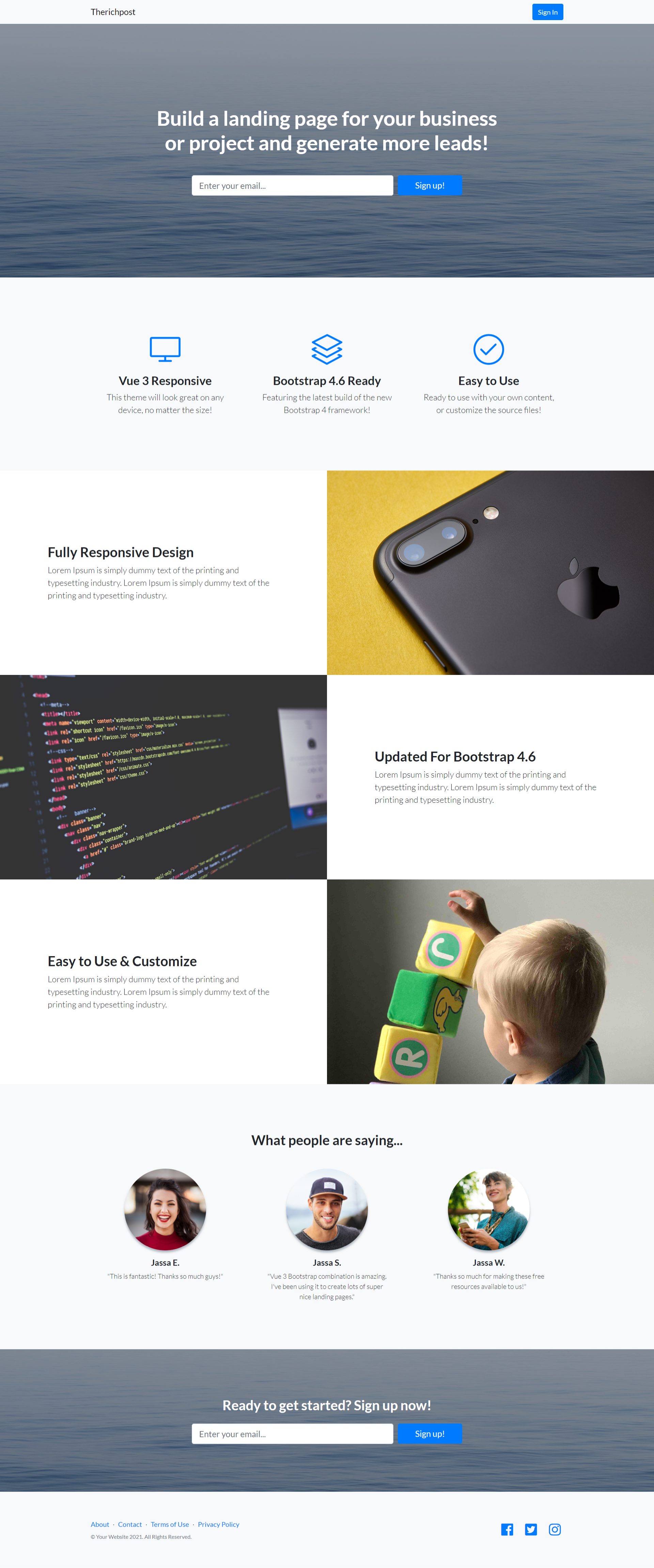
    Hello my friends, welcome back to my blog. Today in this blog post, I am going to show you, Build Professional Website in Vue 3 Bootstrap 4.6.

    Vue js Create Website

    Build Professional Website in Vue 3 Bootstrap 4.6
    Build Professional Website in Vue 3 Bootstrap 4.6

    Vue 3 came and if you are new then you must check below link:
    Vue 3 Tutorials


    Friends now I proceed onwards and here is the working code snippet and please use this carefully to avoid the mistakes:

    1. Firstly friends we need fresh vuejs(Vue 3) setup and for that we need to run below commands into our terminal

    and also we should have latest node version installed on our system:

    npm install -g @vue/cli
    
    vue create vuesite
    
    cd vuesite
    
    npm install bootstrap --save
    
    npm run serve //http://localhost:8080/

    2. Now friends please create new file “App.css” inside vuesite/src folder and add below code inside it:

    @import url("https://use.fontawesome.com/releases/v5.0.8/css/all.css");
    @import url("https://cdnjs.cloudflare.com/ajax/libs/simple-line-icons/2.5.5/css/simple-line-icons.min.css");
    @import url("https://fonts.googleapis.com/css?family=Lato:300,400,700,300italic,400italic,700italic");
    body {
        font-family: Lato,'Helvetica Neue',Helvetica,Arial,sans-serif!important;
    }
    .features-icons {
        padding-top: 7rem;
        padding-bottom: 7rem;
      }
      .features-icons .features-icons-item {
        max-width: 20rem;
      }
      .features-icons .features-icons-item .features-icons-icon {
        height: 7rem;
      }
      .features-icons .features-icons-item .features-icons-icon i {
        font-size: 4.5rem;
      }
      .features-icons .features-icons-item:hover .features-icons-icon i {
        font-size: 5rem;
      }
      
      header.masthead {
        position: relative;
        background-color: #343a40;
        background: url("/assets/img/bg-masthead.jpg") no-repeat center center;
        background-size: cover;
        padding-top: 8rem;
        padding-bottom: 8rem;
      }
      header.masthead .overlay {
        position: absolute;
        background-color: #212529;
        height: 100%;
        width: 100%;
        top: 0;
        left: 0;
        opacity: 0.3;
      }
      header.masthead h1 {
        font-size: 2rem;
      }
      @media (min-width: 768px) {
        header.masthead {
          padding-top: 12rem;
          padding-bottom: 12rem;
        }
        header.masthead h1 {
          font-size: 3rem;
        }
      }
      
      .showcase .showcase-text {
        padding: 3rem;
      }
      .showcase .showcase-img {
        min-height: 30rem;
        background-size: cover;
      }
      @media (min-width: 768px) {
        .showcase .showcase-text {
          padding: 7rem;
        }
      }
      
      .testimonials {
        padding-top: 7rem;
        padding-bottom: 7rem;
      }
      .testimonials .testimonial-item {
        max-width: 18rem;
      }
      .testimonials .testimonial-item img {
        max-width: 12rem;
        box-shadow: 0px 5px 5px 0px #adb5bd;
      }
      
      .call-to-action {
        position: relative;
        background-color: #343a40;
        background: url("/assets/img/bg-masthead.jpg") no-repeat center center;
        background-size: cover;
        padding-top: 7rem;
        padding-bottom: 7rem;
      }
      .call-to-action .overlay {
        position: absolute;
        background-color: #212529;
        height: 100%;
        width: 100%;
        top: 0;
        left: 0;
        opacity: 0.3;
      }
      
      footer.footer {
        padding-top: 4rem;
        padding-bottom: 4rem;
      }
      h1, h2, h3, h4, h5, h6 {
        font-family: Lato,'Helvetica Neue',Helvetica,Arial,sans-serif;
        font-weight: 700;
    }

    3. Finally friends we need to add below code into our vuesite/src/App.vue file to get final output on web browser:

    <template>
        <!-- Navigation-->
       <nav class="navbar navbar-light bg-light static-top">
        <div class="container">
            <a class="navbar-brand" href="#!">Therichpost</a>
            <a class="btn btn-primary" href="#!">Sign In</a>
        </div>
    </nav>
    <!-- Masthead-->
    <header class="masthead text-white text-center">
        <div class="overlay"></div>
        <div class="container">
            <div class="row">
                <div class="col-xl-9 mx-auto"><h1 class="mb-5">Build a landing page for your business or project and generate more leads!</h1></div>
                <div class="col-md-10 col-lg-8 col-xl-7 mx-auto">
                    <form>
                        <div class="form-row">
                            <div class="col-12 col-md-9 mb-2 mb-md-0"><input class="form-control form-control-lg" type="email" placeholder="Enter your email..." /></div>
                            <div class="col-12 col-md-3"><button class="btn btn-block btn-lg btn-primary" type="submit">Sign up!</button></div>
                        </div>
                    </form>
                </div>
            </div>
        </div>
    </header>
    <!-- Icons Grid-->
    <section class="features-icons bg-light text-center">
        <div class="container">
            <div class="row">
                <div class="col-lg-4">
                    <div class="features-icons-item mx-auto mb-5 mb-lg-0 mb-lg-3">
                        <div class="features-icons-icon d-flex"><i class="icon-screen-desktop m-auto text-primary"></i></div>
                        <h3>Vue 3 Responsive</h3>
                        <p class="lead mb-0">This theme will look great on any device, no matter the size!</p>
                    </div>
                </div>
                <div class="col-lg-4">
                    <div class="features-icons-item mx-auto mb-5 mb-lg-0 mb-lg-3">
                        <div class="features-icons-icon d-flex"><i class="icon-layers m-auto text-primary"></i></div>
                        <h3>Bootstrap 4.6 Ready</h3>
                        <p class="lead mb-0">Featuring the latest build of the new Bootstrap 4 framework!</p>
                    </div>
                </div>
                <div class="col-lg-4">
                    <div class="features-icons-item mx-auto mb-0 mb-lg-3">
                        <div class="features-icons-icon d-flex"><i class="icon-check m-auto text-primary"></i></div>
                        <h3>Easy to Use</h3>
                        <p class="lead mb-0">Ready to use with your own content, or customize the source files!</p>
                    </div>
                </div>
            </div>
        </div>
    </section>
    <!-- Image Showcases-->
    <section class="showcase">
        <div class="container-fluid p-0">
            <div class="row no-gutters">
                <div class="col-lg-6 order-lg-2 text-white showcase-img" style="background-image: url('/assets/img/bg-showcase-1.jpg')"></div>
                <div class="col-lg-6 order-lg-1 my-auto showcase-text">
                    <h2>Fully Responsive Design</h2>
                    <p class="lead mb-0">Lorem Ipsum is simply dummy text of the printing and typesetting industry. Lorem Ipsum is simply dummy text of the printing and typesetting industry.</p>
                </div>
            </div>
            <div class="row no-gutters">
                <div class="col-lg-6 text-white showcase-img" style="background-image: url('/assets/img/bg-showcase-2.jpg')"></div>
                <div class="col-lg-6 my-auto showcase-text">
                    <h2>Updated For Bootstrap 4.6</h2>
                    <p class="lead mb-0">Lorem Ipsum is simply dummy text of the printing and typesetting industry. Lorem Ipsum is simply dummy text of the printing and typesetting industry.</p>
                </div>
            </div>
            <div class="row no-gutters">
                <div class="col-lg-6 order-lg-2 text-white showcase-img" style="background-image: url('/assets/img/bg-showcase-3.jpg')"></div>
                <div class="col-lg-6 order-lg-1 my-auto showcase-text">
                    <h2>Easy to Use & Customize</h2>
                    <p class="lead mb-0">Lorem Ipsum is simply dummy text of the printing and typesetting industry. Lorem Ipsum is simply dummy text of the printing and typesetting industry.</p>
                </div>
            </div>
        </div>
    </section>
    <!-- Testimonials-->
    <section class="testimonials text-center bg-light">
        <div class="container">
            <h2 class="mb-5">What people are saying...</h2>
            <div class="row">
                <div class="col-lg-4">
                    <div class="testimonial-item mx-auto mb-5 mb-lg-0">
                        <img class="img-fluid rounded-circle mb-3" src="/assets/img/testimonials-1.jpg" alt="..." />
                        <h5>Jassa E.</h5>
                        <p class="font-weight-light mb-0">"This is fantastic! Thanks so much guys!"</p>
                    </div>
                </div>
                <div class="col-lg-4">
                    <div class="testimonial-item mx-auto mb-5 mb-lg-0">
                        <img class="img-fluid rounded-circle mb-3" src="/assets/img/testimonials-2.jpg" alt="..." />
                        <h5>Jassa S.</h5>
                        <p class="font-weight-light mb-0">"Vue 3 Bootstrap combination is amazing. I've been using it to create lots of super nice landing pages."</p>
                    </div>
                </div>
                <div class="col-lg-4">
                    <div class="testimonial-item mx-auto mb-5 mb-lg-0">
                        <img class="img-fluid rounded-circle mb-3" src="/assets/img/testimonials-3.jpg" alt="..." />
                        <h5>Jassa W.</h5>
                        <p class="font-weight-light mb-0">"Thanks so much for making these free resources available to us!"</p>
                    </div>
                </div>
            </div>
        </div>
    </section>
    <!-- Call to Action-->
    <section class="call-to-action text-white text-center">
        <div class="overlay"></div>
        <div class="container">
            <div class="row">
                <div class="col-xl-9 mx-auto"><h2 class="mb-4">Ready to get started? Sign up now!</h2></div>
                <div class="col-md-10 col-lg-8 col-xl-7 mx-auto">
                    <form>
                        <div class="form-row">
                            <div class="col-12 col-md-9 mb-2 mb-md-0"><input class="form-control form-control-lg" type="email" placeholder="Enter your email..." /></div>
                            <div class="col-12 col-md-3"><button class="btn btn-block btn-lg btn-primary" type="submit">Sign up!</button></div>
                        </div>
                    </form>
                </div>
            </div>
        </div>
    </section>
    <!-- Footer-->
    <footer class="footer bg-light">
        <div class="container">
            <div class="row">
                <div class="col-lg-6 h-100 text-center text-lg-left my-auto">
                    <ul class="list-inline mb-2">
                        <li class="list-inline-item"><a href="#!">About</a></li>
                        <li class="list-inline-item">⋅</li>
                        <li class="list-inline-item"><a href="#!">Contact</a></li>
                        <li class="list-inline-item">⋅</li>
                        <li class="list-inline-item"><a href="#!">Terms of Use</a></li>
                        <li class="list-inline-item">⋅</li>
                        <li class="list-inline-item"><a href="#!">Privacy Policy</a></li>
                    </ul>
                    <p class="text-muted small mb-4 mb-lg-0">© Your Website 2021. All Rights Reserved.</p>
                </div>
                <div class="col-lg-6 h-100 text-center text-lg-right my-auto">
                    <ul class="list-inline mb-0">
                        <li class="list-inline-item mr-3">
                            <a href="#!"><i class="fab fa-facebook fa-2x fa-fw"></i></a>
                        </li>
                        <li class="list-inline-item mr-3">
                            <a href="#!"><i class="fab fa-twitter-square fa-2x fa-fw"></i></a>
                        </li>
                        <li class="list-inline-item">
                            <a href="#!"><i class="fab fa-instagram fa-2x fa-fw"></i></a>
                        </li>
                    </ul>
                </div>
            </div>
        </div>
    </footer>
    </template>
    <script>
    //Bootstrap
    import 'bootstrap/dist/css/bootstrap.min.css';
    import './App.css'; 
     
    export default {
    }
    </script>

    4. Guys please create `img` folder inside vuesite/public/assets folder.

    Download and paste below images inside vuesite/public/assets/img folder:

    bg-showcase-3

    testimonials-1

    testimonials-2

    testimonials-3

    bg-masthead

    bg-showcase-1

    bg-showcase-2

    Now we are done friends also and If you have any kind of query or suggestion or any requirement then feel free to comment below.

    Note: Friends, I just tell the basic setup and things, you can change the code according to your requirements. For better understanding must watch video above.

    I will appreciate that if you will tell your views for this post. Nothing matters if your views will be good or bad.

    Jassa

    Thanks

  • Create shop order tracking page in Reactjs Application

    Create shop order tracking page in Reactjs Application

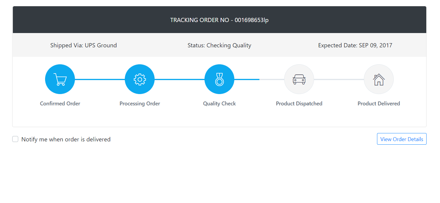
    Hello friends, welcome back to my blog. Today in this blog post, I am going to show you, Create shop order tracking page in Reactjs Application.


    How to create shop order tracking page in Reactjs Application?
    Create shop order tracking page in Reactjs Application

    For reactjs new comers, please check the below link:

    Reactjs Basic Tutorials


    Friends now I proceed onwards and here is the working code snippet and please use this carefully to avoid the mistakes:

    1. Firstly, we need fresh reactjs setup and for that, we need to run below commands into out terminal and also we should have latest node version installed on our system:

    npx create-react-app reacttemplate
    
    cd reacttemplate
    
    npm start

    2. Now we need to run below commands into our project terminal to get bootstrap and related modules into our reactjs application:

    npm install bootstrap --save
    
    npm start //For start project again

    3. Finally for the main output, we need to add below code into our reacttemplate/src/App.js file or if you have fresh setup then you can replace reacttemplate/src/App.js file code with below code:

    import React from "react";
    
    import './App.css'
    
    //Bootstrap for responsiveness
    import 'bootstrap/dist/css/bootstrap.min.css';
    
    class App extends React.Component {


      render() {
        return (
          <div className="main_container">
         
                <h1>Therichpost.com</h1>


            <div class="container padding-bottom-3x mb-1">
            <div class="card mb-3">
              <div class="p-4 text-center text-white text-lg bg-dark rounded-top"><span class="text-uppercase">Tracking Order No - </span><span class="text-medium">001698653lp</span></div>
              <div class="d-flex flex-wrap flex-sm-nowrap justify-content-between py-3 px-2 bg-secondary">
                <div class="w-100 text-center py-1 px-2"><span class="text-medium">Shipped Via:</span> UPS Ground</div>
                <div class="w-100 text-center py-1 px-2"><span class="text-medium">Status:</span> Checking Quality</div>
                <div class="w-100 text-center py-1 px-2"><span class="text-medium">Expected Date:</span> APR 27, 2021</div>
              </div>
              <div class="card-body">
                <div class="steps d-flex flex-wrap flex-sm-nowrap justify-content-between padding-top-2x padding-bottom-1x">
                  <div class="step completed">
                    <div class="step-icon-wrap">
                      <div class="step-icon"><i class="pe-7s-cart"></i></div>
                    </div>
                    <h4 class="step-title">Confirmed Order</h4>
                  </div>
                  <div class="step completed">
                    <div class="step-icon-wrap">
                      <div class="step-icon"><i class="pe-7s-config"></i></div>
                    </div>
                    <h4 class="step-title">Processing Order</h4>
                  </div>
                  <div class="step completed">
                    <div class="step-icon-wrap">
                      <div class="step-icon"><i class="pe-7s-medal"></i></div>
                    </div>
                    <h4 class="step-title">Quality Check</h4>
                  </div>
                  <div class="step">
                    <div class="step-icon-wrap">
                      <div class="step-icon"><i class="pe-7s-car"></i></div>
                    </div>
                    <h4 class="step-title">Product Dispatched</h4>
                  </div>
                  <div class="step">
                    <div class="step-icon-wrap">
                      <div class="step-icon"><i class="pe-7s-home"></i></div>
                    </div>
                    <h4 class="step-title">Product Delivered</h4>
                  </div>
                </div>
              </div>
            </div>
            <div class="d-flex flex-wrap flex-md-nowrap justify-content-center justify-content-sm-between align-items-center">
              <div class="custom-control custom-checkbox mr-3">
                <input class="custom-control-input" type="checkbox" id="notify_me" checked="" />
                <label class="custom-control-label" for="notify_me">Notify me when order is delivered</label>
              </div>
              <div class="text-left text-sm-right"><a class="btn btn-outline-primary btn-rounded btn-sm" href="#">View Order Details</a></div>
            </div>
          </div>
    
          </div>
        );
      }
    }
    export default App;

    4. Now friends, we need to below code into our reacttemplate/src/App.css file for some custom styling:

    @import url("https://cdn.jsdelivr.net/npm/pixeden-stroke-7-icon@1.2.3/pe-icon-7-stroke/dist/pe-icon-7-stroke.min.css");
    body{margin-top:20px;}
    
    .steps .step {
        display: block;
        width: 100%;
        margin-bottom: 35px;
        text-align: center
    }
    
    .steps .step .step-icon-wrap {
        display: block;
        position: relative;
        width: 100%;
        height: 80px;
        text-align: center
    }
    
    .steps .step .step-icon-wrap::before,
    .steps .step .step-icon-wrap::after {
        display: block;
        position: absolute;
        top: 50%;
        width: 50%;
        height: 3px;
        margin-top: -1px;
        background-color: #e1e7ec;
        content: '';
        z-index: 1
    }
    
    .steps .step .step-icon-wrap::before {
        left: 0
    }
    
    .steps .step .step-icon-wrap::after {
        right: 0
    }
    
    .steps .step .step-icon {
        display: inline-block;
        position: relative;
        width: 80px;
        height: 80px;
        border: 1px solid #e1e7ec;
        border-radius: 50%;
        background-color: #f5f5f5;
        color: #374250;
        font-size: 38px;
        line-height: 81px;
        z-index: 5
    }
    
    .steps .step .step-title {
        margin-top: 16px;
        margin-bottom: 0;
        color: #606975;
        font-size: 14px;
        font-weight: 500
    }
    
    .steps .step:first-child .step-icon-wrap::before {
        display: none
    }
    
    .steps .step:last-child .step-icon-wrap::after {
        display: none
    }
    
    .steps .step.completed .step-icon-wrap::before,
    .steps .step.completed .step-icon-wrap::after {
        background-color: #0da9ef
    }
    
    .steps .step.completed .step-icon {
        border-color: #0da9ef;
        background-color: #0da9ef;
        color: #fff
    }
    
    @media (max-width: 576px) {
        .flex-sm-nowrap .step .step-icon-wrap::before,
        .flex-sm-nowrap .step .step-icon-wrap::after {
            display: none
        }
    }
    
    @media (max-width: 768px) {
        .flex-md-nowrap .step .step-icon-wrap::before,
        .flex-md-nowrap .step .step-icon-wrap::after {
            display: none
        }
    }
    
    @media (max-width: 991px) {
        .flex-lg-nowrap .step .step-icon-wrap::before,
        .flex-lg-nowrap .step .step-icon-wrap::after {
            display: none
        }
    }
    
    @media (max-width: 1200px) {
        .flex-xl-nowrap .step .step-icon-wrap::before,
        .flex-xl-nowrap .step .step-icon-wrap::after {
            display: none
        }
    }
    
    .bg-faded, .bg-secondary {
        background-color: #f5f5f5 !important;
    }

    Now we are done friends. If you have any kind of query or suggestion or any requirement then feel free to comment below.

    Note: Friends, I just tell the basic setup and things, you can change the code according to your requirements.

    I will appreciate that if you will tell your views for this post. Nothing matters if your views will be good or bad.

    Jassa

    Thanks

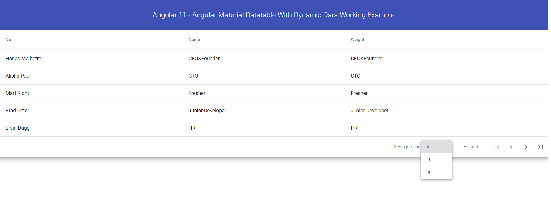
  • Angular 11 – Angular Material Data table with Dynamic Data

    Angular 11 – Angular Material Data table with Dynamic Data

    Hello friends, welcome back to my blog. Today in this blog post, I am going to tell you, Angular 11 – Angular Material Data table with Dynamic Data.

    Material Angular Data Table

    Angular 11 came and very soon Angular 12 will come and if you are new then you must check below two links:

    1. Angular11 Basic Tutorials
    Angular 11 - Angular Material Data table with Dynamic Data
    Angular 11 – Angular Material Data table with Dynamic Data

    Friends now I proceed onwards and here is the working code snippet and please use carefully this to avoid the mistakes:

    1. Firstly friends we need fresh angular 11 setup and for this we need to run below commands but if you already have angular 11 setup then you can avoid below commands. Secondly we should also have latest node version installed on our system:

    npm install -g @angular/cli 
    
    ng new angularmaterial //Create new Angular Project
    
    cd angularmaterial // Go inside the Angular Project Folder
    
    ng serve --open // Run and Open the Angular Project
    
    http://localhost:4200/ // Working Angular Project Url

    2. Now friends, here we need to run below commands into our project terminal to install angular material modules into our angular application:

    ng add @angular/material

    3. Now friends we just need to add below code into src/app/app.component.html file to get final out on the web browser:

    <div class="mat-elevation-z8">
      <table mat-table [dataSource]="dataSource">
    
        <!-- Position Column -->
        <ng-container matColumnDef="name">
          <th mat-header-cell *matHeaderCellDef> No. </th>
          <td mat-cell *matCellDef="let element"> {{element.name}} </td>
        </ng-container>
    
        <!-- Name Column -->
        <ng-container matColumnDef="email">
          <th mat-header-cell *matHeaderCellDef> Name </th>
          <td mat-cell *matCellDef="let element"> {{element.job_title}} </td>
        </ng-container>
    
        <!-- Weight Column -->
        <ng-container matColumnDef="job_title">
          <th mat-header-cell *matHeaderCellDef> Weight </th>
          <td mat-cell *matCellDef="let element"> {{element.job_title}} </td>
        </ng-container>


        <tr mat-header-row *matHeaderRowDef="displayedColumns"></tr>
        <tr mat-row *matRowDef="let row; columns: displayedColumns;"></tr>
      </table>
    
      <mat-paginator [pageSizeOptions]="[5, 10, 20]" showFirstLastButtons></mat-paginator>
    </div>

    4. Now friends we just need to add below code into src/app/app.module.ts file:

    ...
    import {  MatTableModule } from '@angular/material/table';
    import {  MatPaginatorModule } from '@angular/material/paginator';
    import { HttpClientModule } from '@angular/common/http';
    
    @NgModule({
     ...
      imports: [
       ...
        MatPaginatorModule,
        MatTableModule,
        HttpClientModule
      ],
      ...

    5. Now friends we just need to add below code into src/app/app.component.ts file:

    ...
    import {MatPaginator} from '@angular/material/paginator';
    import {MatTableDataSource} from '@angular/material/table';
    import { HttpClient } from '@angular/common/http';
    export class AppComponent {
      ...
    
      //Material table columns
      displayedColumns: string[] = ['name', 'email', 'job_title'];
    
      //Table Data Source
      dataSource: MatTableDataSource<any>;
    
      //Dynamic Data Variable
      data:any;
      constructor(private http: HttpClient){}
    
      @ViewChild(MatPaginator, {static: true}) paginator: MatPaginator;
    
      ngOnInit() {
           //get request from web api and this web api is totaly free to use
           this.http.get('https://www.testjsonapi.com/users/').subscribe(data => {
           this.data = data;
         
            //Data Table Data Source and pagination with dynamic data
            this.dataSource = new MatTableDataSource(this.data);
            this.dataSource.paginator = this.paginator
            
         
              }, error => console.error(error));
       
      
      }
    }
    export interface PeriodicElement {
      name: string;
      email: string;
      job_title: string;
     
    }
    

    Friends in the end must run ng serve command into your terminal to run the angular 11 project.

    Here is the free WEB API JSON data:

    https://www.testjsonapi.com/fake-data-rest-apis/

    Now we are done friends. If you have any kind of query, suggestion and new requirement then feel free to comment below.

    Note: Friends, In this post, I just tell the basic setup and things, you can change the code according to your requirements.

    I will appreciate that if you will tell your views for this post. Nothing matters if your views will be good or bad because with your views, I will make my next posts more good and helpful.

    Jassa

    Thanks

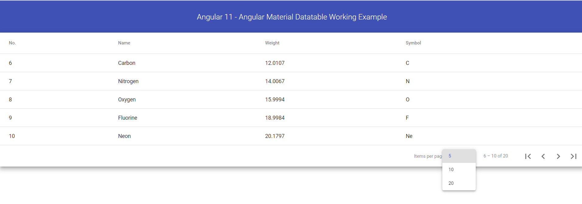
  • Angular 11 – Angular Material Datatable Working Example

    Angular 11 – Angular Material Datatable Working Example

    Hello friends, welcome back to my blog. Today in this blog post, I am going to tell you, Angular 11 – Angular Material Datatable Working Example.

    Material Angular Data Table

    Angular 11 - Angular Material Datatable Working Example
    Angular 11 – Angular Material Datatable Working Example

    Angular 11 came and very soon Angular 12 will come and if you are new then you must check below two links:

    1. Angular11 Basic Tutorials

    Friends now I proceed onwards and here is the working code snippet and please use carefully this to avoid the mistakes:

    1. Firstly friends we need fresh angular 11 setup and for this we need to run below commands but if you already have angular 11 setup then you can avoid below commands. Secondly we should also have latest node version installed on our system:

    npm install -g @angular/cli 
    
    ng new angularmaterial //Create new Angular Project
    
    cd angularmaterial // Go inside the Angular Project Folder
    
    ng serve --open // Run and Open the Angular Project
    
    http://localhost:4200/ // Working Angular Project Url

    2. Now friends, here we need to run below commands into our project terminal to install angular material modules into our angular application:

    ng add @angular/material

    3. Now friends we just need to add below code into src/app/app.component.html file to get final out on the web browser:

    <div class="mat-elevation-z8">
      <table mat-table [dataSource]="dataSource">
    
        <!-- Position Column -->
        <ng-container matColumnDef="position">
          <th mat-header-cell *matHeaderCellDef> No. </th>
          <td mat-cell *matCellDef="let element"> {{element.position}} </td>
        </ng-container>
    
        <!-- Name Column -->
        <ng-container matColumnDef="name">
          <th mat-header-cell *matHeaderCellDef> Name </th>
          <td mat-cell *matCellDef="let element"> {{element.name}} </td>
        </ng-container>
    
        <!-- Weight Column -->
        <ng-container matColumnDef="weight">
          <th mat-header-cell *matHeaderCellDef> Weight </th>
          <td mat-cell *matCellDef="let element"> {{element.weight}} </td>
        </ng-container>
    
        <!-- Symbol Column -->
        <ng-container matColumnDef="symbol">
          <th mat-header-cell *matHeaderCellDef> Symbol </th>
          <td mat-cell *matCellDef="let element"> {{element.symbol}} </td>
        </ng-container>
    
        <tr mat-header-row *matHeaderRowDef="displayedColumns"></tr>
        <tr mat-row *matRowDef="let row; columns: displayedColumns;"></tr>
      </table>
    
      <mat-paginator [pageSizeOptions]="[5, 10, 20]" showFirstLastButtons></mat-paginator>
    </div>

    4. Now friends we just need to add below code into src/app/app.module.ts file:

    ...
    import {  MatTableModule } from '@angular/material/table';
    import {  MatPaginatorModule } from '@angular/material/paginator';
    
    
    @NgModule({
      ...
      imports: [
        ...
        MatPaginatorModule,
        MatTableModule
      ]...
    

    5. Now friends we just need to add below code into src/app/app.component.ts file:

    ...
    import {MatPaginator} from '@angular/material/paginator';
    import {MatTableDataSource} from '@angular/material/table';
    
    export class AppComponent {
    ...
      displayedColumns: string[] = ['position', 'name', 'weight', 'symbol'];
      dataSource = new MatTableDataSource<PeriodicElement>(ELEMENT_DATA);
    
      @ViewChild(MatPaginator, {static: true}) paginator: MatPaginator;
    
      ngOnInit() {
        this.dataSource.paginator = this.paginator;
      }
      title = 'paginator';
    }
    export interface PeriodicElement {
      name: string;
      position: number;
      weight: number;
      symbol: string;
    }
    const ELEMENT_DATA: PeriodicElement[] = [
      {position: 1, name: 'Hydrogen', weight: 1.0079, symbol: 'H'},
      {position: 2, name: 'Helium', weight: 4.0026, symbol: 'He'},
      {position: 3, name: 'Lithium', weight: 6.941, symbol: 'Li'},
      {position: 4, name: 'Beryllium', weight: 9.0122, symbol: 'Be'},
      {position: 5, name: 'Boron', weight: 10.811, symbol: 'B'},
      {position: 6, name: 'Carbon', weight: 12.0107, symbol: 'C'},
      {position: 7, name: 'Nitrogen', weight: 14.0067, symbol: 'N'},
      {position: 8, name: 'Oxygen', weight: 15.9994, symbol: 'O'},
      {position: 9, name: 'Fluorine', weight: 18.9984, symbol: 'F'},
      {position: 10, name: 'Neon', weight: 20.1797, symbol: 'Ne'},
      {position: 11, name: 'Sodium', weight: 22.9897, symbol: 'Na'},
      {position: 12, name: 'Magnesium', weight: 24.305, symbol: 'Mg'},
      {position: 13, name: 'Aluminum', weight: 26.9815, symbol: 'Al'},
      {position: 14, name: 'Silicon', weight: 28.0855, symbol: 'Si'},
      {position: 15, name: 'Phosphorus', weight: 30.9738, symbol: 'P'},
      {position: 16, name: 'Sulfur', weight: 32.065, symbol: 'S'},
      {position: 17, name: 'Chlorine', weight: 35.453, symbol: 'Cl'},
      {position: 18, name: 'Argon', weight: 39.948, symbol: 'Ar'},
      {position: 19, name: 'Potassium', weight: 39.0983, symbol: 'K'},
      {position: 20, name: 'Calcium', weight: 40.078, symbol: 'Ca'},
    ];

    Friends in the end must run ng serve command into your terminal to run the angular 11 project.

    Now we are done friends. If you have any kind of query, suggestion and new requirement then feel free to comment below.

    Note: Friends, In this post, I just tell the basic setup and things, you can change the code according to your requirements.

    I will appreciate that if you will tell your views for this post. Nothing matters if your views will be good or bad because with your views, I will make my next posts more good and helpful.

    Jassa

    Thanks

  • Vuejs International Telephone Input – Vue 3

    Vuejs International Telephone Input – Vue 3

    Hello friends, welcome back to my blog. Today in this blog post, I am going to show you, Vuejs International Telephone Input – Vue 3.

    Here is working live example:

    Vue Input Tel

    Reason behind this post:

    I was working on my local project and I had requirement for Vue js International telephone input and for that, I searched a lot on web but did not get better result so I made my own code and post it to help others.
    Vuejs International Telephone Input - Vue 3
    Vuejs International Telephone Input – Vue 3

    Vue 3 came and if you are new then you must check below two link:

    1. Vuejs

    Friends now I proceed onwards and here is the working code snippet and use this carefully to avoid the mistakes:

    1. Firstly friends we need fresh vue 3 setup and for this we need to run below commands . Secondly we should also have latest node version installed on our system. With below we will have bootstrap and input tel modules in our Vue 3 application:

    npm install -g @vue/cli
    
    vue create vueproject
    
    cd vueproject
    
    npm i bootstrap
    npm install intl-tel-input --save
    npm run serve //http://localhost:8080/


    2. Now friends we need to add below code into src/App.vue file to check the final output on browser:

    <template>
     
         <h3>Therichpost.com</h3>
         <div class="form-group">
            <label> All Countries</label> <br>
            <input type="tel" class="form-control" id="telephone">
        </div>
    
    </template>
    <script>
    
    import './App.css'; 
    //Bootstrap
    import 'bootstrap/dist/css/bootstrap.min.css';
    
    //intlTelInput
    import 'intl-tel-input/build/css/intlTelInput.css';
    import 'intl-tel-input/build/js/intlTelInput.js';
    import intlTelInput from 'intl-tel-input';
     
    export default {
      mounted(){
        const input = document.querySelector("#telephone");
        intlTelInput(input, {
          // any initialisation options go here
              preferredCountries: ["in", "us", "ca"],
          
            
        });
        
      }
      
    }
    </script>

    Now we are done friends  also and If you have any kind of query or suggestion or any requirement then feel free to comment below.

    Note: Friends, I just tell the basic setup and things, you can change the code according to your requirements.

    I will appreciate that if you will tell your views for this post. Nothing matters if your views will be good or bad.

    Jassa

    Thanks

  • Reactjs International Telephone Input

    Reactjs International Telephone Input

    Hello friends, welcome back to my blog. Today in this blog post, I am going to show you, Reactjs International Telephone Input.

    In this post, we will do below steps:

    1. Add country code and courting flag to telephone input in react js.
    2. Set and get the telephone input.
    3. Countries Check.

    Reactjs International Telephone Input
    Reactjs International Telephone Input
    Reactjs International Telephone Input with few countries
    Reactjs International Telephone Input with few countries

    For reactjs new comers, please check the below link:

    Reactjs Basic Tutorials


    Friends now I proceed onwards and here is the working code snippet and please use this carefully to avoid the mistakes:

    1. Firstly, we need fresh reactjs setup and for that, we need to run below commands into out terminal and also we should have latest node version installed on our system:

    npx create-react-app reacttemplate
    
    cd reacttemplate
    
    npm start

    2. Now we need to run below commands into our project terminal to get bootstrap and related modules into our reactjs application:

    npm install bootstrap --save
    
    npm install react-phone-input-2 --save
    
    npm start //For start project again

    3. Finally for the main output, we need to add below code into our reacttemplate/src/App.js file or if you have fresh setup then you can replace reacttemplate/src/App.js file code with below code:

    import React from "react";
    
    import './App.css'
    import 'bootstrap/dist/css/bootstrap.min.css';
    
    //Importing input tepp modules
    import PhoneInput from 'react-phone-input-2'
    import 'react-phone-input-2/lib/style.css'
    
    
    class App extends React.Component {
     //setting default phone number
     constructor(props) {
      super(props);
      this.state = {phone: "13338965474"};
    }
    
     
      render() {
        return (
          <div className="main_container">
         
            <div class="container">
            
              <p>Current Phone Number is : {this.state.phone}</p>
              <br></br>
            <form>
            <div class="form-group">
            <PhoneInput
              country={'us'}
              value={this.state.phone}
              onChange={phone => this.setState({ phone })}
            />
                    </div>
                   
    
                   <div className="form-group">
                     <label>Only Few Countries Available</label>
                   <PhoneInput
                   country={'gr'}
                    onlyCountries={['gr', 'fr', 'us']}
                    />
                   </div>
                    
            </form>
            </div>


          </div>
        );
      }
    }
    export default App;

    Now we are done friends. If you have any kind of query or suggestion or any requirement then feel free to comment below.

    Note: Friends, I just tell the basic setup and things, you can change the code according to your requirements.

    I will appreciate that if you will tell your views for this post. Nothing matters if your views will be good or bad.

    Jassa

    Thanks