
Hello friends, welcome back to my blog. Today in this blog post, I am going to tell you, Build Professional Website in Angular 11.2 Bootstrap 4.6.
Guys in this post we will cover below things:
- Create website in Angular 11.2 and in future this will be useful for Angular 12 as well.
- Responsive website in Angular 11.
- Create website in angular 11.2 with very few steps.
Angular 11 came and very soon Angular 12 will come and if you are new then you must check below two links and also please contact me for live angular training:
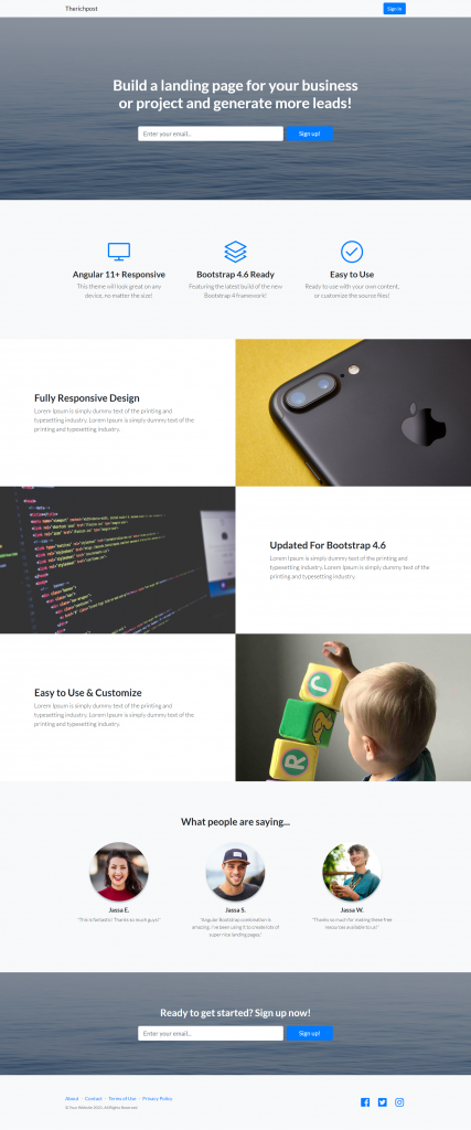
Friends now I proceed onwards and here is the working code snippet and please use carefully this to avoid the mistakes:
1. Firstly friends we need fresh angular 11 setup and for this we need to run below commands but if you already have angular 11 setup then you can avoid below commands.
Secondly we should also have latest node version installed on our system:
npm install -g @angular/cli

ng new angularsite //Create new Angular Project

cd angularsite // Go inside the Angular Project Folder

ng serve --open // Run and Open the Angular Project

http://localhost:4200/ // Working Angular Project Url
2. Now friends, here we need to run below commands into our project terminal to install bootstrap and jquery modules into our angular application:
npm i bootstrap
3. Now friends, here we need to add below into our angularsite/angular.json file:
"styles": [
            ...
            "node_modules/bootstrap/dist/css/bootstrap.min.css"
          ],
4. Now friends we just need to add below code into angularsite/src/app/app.component.html file to get final out on the web browser:
   <!-- Navigation-->
   <nav class="navbar navbar-light bg-light static-top">
    <div class="container">
        <a class="navbar-brand" href="#!">Therichpost</a>
        <a class="btn btn-primary" href="#!">Sign In</a>
    </div>
</nav>
<!-- Masthead-->
<header class="masthead text-white text-center">
    <div class="overlay"></div>
    <div class="container">
        <div class="row">
            <div class="col-xl-9 mx-auto"><h1 class="mb-5">Build a landing page for your business or project and generate more leads!</h1></div>
            <div class="col-md-10 col-lg-8 col-xl-7 mx-auto">
                <form>
                    <div class="form-row">
                        <div class="col-12 col-md-9 mb-2 mb-md-0"><input class="form-control form-control-lg" type="email" placeholder="Enter your email..." /></div>
                        <div class="col-12 col-md-3"><button class="btn btn-block btn-lg btn-primary" type="submit">Sign up!</button></div>
                    </div>
                </form>
            </div>
        </div>
    </div>
</header>
<!-- Icons Grid-->
<section class="features-icons bg-light text-center">
    <div class="container">
        <div class="row">
            <div class="col-lg-4">
                <div class="features-icons-item mx-auto mb-5 mb-lg-0 mb-lg-3">
                    <div class="features-icons-icon d-flex"><i class="icon-screen-desktop m-auto text-primary"></i></div>
                    <h3>Angular 11+ Responsive</h3>
                    <p class="lead mb-0">This theme will look great on any device, no matter the size!</p>
                </div>
            </div>
            <div class="col-lg-4">
                <div class="features-icons-item mx-auto mb-5 mb-lg-0 mb-lg-3">
                    <div class="features-icons-icon d-flex"><i class="icon-layers m-auto text-primary"></i></div>
                    <h3>Bootstrap 4.6 Ready</h3>
                    <p class="lead mb-0">Featuring the latest build of the new Bootstrap 4 framework!</p>
                </div>
            </div>
            <div class="col-lg-4">
                <div class="features-icons-item mx-auto mb-0 mb-lg-3">
                    <div class="features-icons-icon d-flex"><i class="icon-check m-auto text-primary"></i></div>
                    <h3>Easy to Use</h3>
                    <p class="lead mb-0">Ready to use with your own content, or customize the source files!</p>
                </div>
            </div>
        </div>
    </div>
</section>
<!-- Image Showcases-->
<section class="showcase">
    <div class="container-fluid p-0">
        <div class="row no-gutters">
            <div class="col-lg-6 order-lg-2 text-white showcase-img" style="background-image: url('assets/img/bg-showcase-1.jpg')"></div>
            <div class="col-lg-6 order-lg-1 my-auto showcase-text">
                <h2>Fully Responsive Design</h2>
                <p class="lead mb-0">Lorem Ipsum is simply dummy text of the printing and typesetting industry. Lorem Ipsum is simply dummy text of the printing and typesetting industry.</p>
            </div>
        </div>
        <div class="row no-gutters">
            <div class="col-lg-6 text-white showcase-img" style="background-image: url('assets/img/bg-showcase-2.jpg')"></div>
            <div class="col-lg-6 my-auto showcase-text">
                <h2>Updated For Bootstrap 4.6</h2>
                <p class="lead mb-0">Lorem Ipsum is simply dummy text of the printing and typesetting industry. Lorem Ipsum is simply dummy text of the printing and typesetting industry.</p>
            </div>
        </div>
        <div class="row no-gutters">
            <div class="col-lg-6 order-lg-2 text-white showcase-img" style="background-image: url('assets/img/bg-showcase-3.jpg')"></div>
            <div class="col-lg-6 order-lg-1 my-auto showcase-text">
                <h2>Easy to Use & Customize</h2>
                <p class="lead mb-0">Lorem Ipsum is simply dummy text of the printing and typesetting industry. Lorem Ipsum is simply dummy text of the printing and typesetting industry.</p>
            </div>
        </div>
    </div>
</section>
<!-- Testimonials-->
<section class="testimonials text-center bg-light">
    <div class="container">
        <h2 class="mb-5">What people are saying...</h2>
        <div class="row">
            <div class="col-lg-4">
                <div class="testimonial-item mx-auto mb-5 mb-lg-0">
                    <img class="img-fluid rounded-circle mb-3" src="assets/img/testimonials-1.jpg" alt="..." />
                    <h5>Jassa E.</h5>
                    <p class="font-weight-light mb-0">"This is fantastic! Thanks so much guys!"</p>
                </div>
            </div>
            <div class="col-lg-4">
                <div class="testimonial-item mx-auto mb-5 mb-lg-0">
                    <img class="img-fluid rounded-circle mb-3" src="assets/img/testimonials-2.jpg" alt="..." />
                    <h5>Jassa S.</h5>
                    <p class="font-weight-light mb-0">"Angular Bootstrap combination is amazing. I've been using it to create lots of super nice landing pages."</p>
                </div>
            </div>
            <div class="col-lg-4">
                <div class="testimonial-item mx-auto mb-5 mb-lg-0">
                    <img class="img-fluid rounded-circle mb-3" src="assets/img/testimonials-3.jpg" alt="..." />
                    <h5>Jassa W.</h5>
                    <p class="font-weight-light mb-0">"Thanks so much for making these free resources available to us!"</p>
                </div>
            </div>
        </div>
    </div>
</section>
<!-- Call to Action-->
<section class="call-to-action text-white text-center">
    <div class="overlay"></div>
    <div class="container">
        <div class="row">
            <div class="col-xl-9 mx-auto"><h2 class="mb-4">Ready to get started? Sign up now!</h2></div>
            <div class="col-md-10 col-lg-8 col-xl-7 mx-auto">
                <form>
                    <div class="form-row">
                        <div class="col-12 col-md-9 mb-2 mb-md-0"><input class="form-control form-control-lg" type="email" placeholder="Enter your email..." /></div>
                        <div class="col-12 col-md-3"><button class="btn btn-block btn-lg btn-primary" type="submit">Sign up!</button></div>
                    </div>
                </form>
            </div>
        </div>
    </div>
</section>
<!-- Footer-->
<footer class="footer bg-light">
    <div class="container">
        <div class="row">
            <div class="col-lg-6 h-100 text-center text-lg-left my-auto">
                <ul class="list-inline mb-2">
                    <li class="list-inline-item"><a href="#!">About</a></li>
                    <li class="list-inline-item">⋅</li>
                    <li class="list-inline-item"><a href="#!">Contact</a></li>
                    <li class="list-inline-item">⋅</li>
                    <li class="list-inline-item"><a href="#!">Terms of Use</a></li>
                    <li class="list-inline-item">⋅</li>
                    <li class="list-inline-item"><a href="#!">Privacy Policy</a></li>
                </ul>
                <p class="text-muted small mb-4 mb-lg-0">© Your Website 2021. All Rights Reserved.</p>
            </div>
            <div class="col-lg-6 h-100 text-center text-lg-right my-auto">
                <ul class="list-inline mb-0">
                    <li class="list-inline-item mr-3">
                        <a href="#!"><i class="fab fa-facebook fa-2x fa-fw"></i></a>
                    </li>
                    <li class="list-inline-item mr-3">
                        <a href="#!"><i class="fab fa-twitter-square fa-2x fa-fw"></i></a>
                    </li>
                    <li class="list-inline-item">
                        <a href="#!"><i class="fab fa-instagram fa-2x fa-fw"></i></a>
                    </li>
                </ul>
            </div>
        </div>
    </div>
</footer>
5. Now friends we just need to add css code into angularsite/src/index.html file:
...
<head>
...
<style>
body {
    font-family: Lato,'Helvetica Neue',Helvetica,Arial,sans-serif!important;
}
  </style>
</head>
6. Now friends we just need to add below code into angularsite/src/app/app.component..css file:
@import url("https://use.fontawesome.com/releases/v5.0.8/css/all.css");
@import url("https://cdnjs.cloudflare.com/ajax/libs/simple-line-icons/2.5.5/css/simple-line-icons.min.css");
@import url("https://fonts.googleapis.com/css?family=Lato:300,400,700,300italic,400italic,700italic");
.features-icons {
    padding-top: 7rem;
    padding-bottom: 7rem;
  }
  .features-icons .features-icons-item {
    max-width: 20rem;
  }
  .features-icons .features-icons-item .features-icons-icon {
    height: 7rem;
  }
  .features-icons .features-icons-item .features-icons-icon i {
    font-size: 4.5rem;
  }
  .features-icons .features-icons-item:hover .features-icons-icon i {
    font-size: 5rem;
  }

  header.masthead {
    position: relative;
    background-color: #343a40;
    background: url("../assets/img/bg-masthead.jpg") no-repeat center center;
    background-size: cover;
    padding-top: 8rem;
    padding-bottom: 8rem;
  }
  header.masthead .overlay {
    position: absolute;
    background-color: #212529;
    height: 100%;
    width: 100%;
    top: 0;
    left: 0;
    opacity: 0.3;
  }
  header.masthead h1 {
    font-size: 2rem;
  }
  @media (min-width: 768px) {
    header.masthead {
      padding-top: 12rem;
      padding-bottom: 12rem;
    }
    header.masthead h1 {
      font-size: 3rem;
    }
  }

  .showcase .showcase-text {
    padding: 3rem;
  }
  .showcase .showcase-img {
    min-height: 30rem;
    background-size: cover;
  }
  @media (min-width: 768px) {
    .showcase .showcase-text {
      padding: 7rem;
    }
  }

  .testimonials {
    padding-top: 7rem;
    padding-bottom: 7rem;
  }
  .testimonials .testimonial-item {
    max-width: 18rem;
  }
  .testimonials .testimonial-item img {
    max-width: 12rem;
    box-shadow: 0px 5px 5px 0px #adb5bd;
  }

  .call-to-action {
    position: relative;
    background-color: #343a40;
    background: url("../assets/img/bg-masthead.jpg") no-repeat center center;
    background-size: cover;
    padding-top: 7rem;
    padding-bottom: 7rem;
  }
  .call-to-action .overlay {
    position: absolute;
    background-color: #212529;
    height: 100%;
    width: 100%;
    top: 0;
    left: 0;
    opacity: 0.3;
  }

  footer.footer {
    padding-top: 4rem;
    padding-bottom: 4rem;
  }
  h1, h2, h3, h4, h5, h6 {
    font-family: Lato,'Helvetica Neue',Helvetica,Arial,sans-serif;
    font-weight: 700;
}
7. Guys please create `img` folder inside angularsite/src/assets folder.
Download and paste below images inside angularsite/src/assets/img folder:
Friends in the end must run ng serve command into your terminal to run the angular 11 project.
Now we are done friends. If you have any kind of query, suggestion and new requirement then feel free to comment below.
Note: Friends, In this post, I just tell the basic setup and things, you can change the code according to your requirements.
I will appreciate that if you will tell your views for this post. Nothing matters if your views will be good or bad because with your views, I will make my next posts more good and helpful.
Jassa
Thanks
Leave a Reply