
Hello guys how are you? Welcome back to my blog. Today in this blog post we will create Creating a Beautiful Admin Dashboard in ReactJS using Material-UI.
Key Features:
- Reactjs
- Material Ui
- Login page with auth Token functionality
- Admin Dashboard Page
- Settings page with beautiful form layout
- Profile page with beautiful page and form
- Burger Menu
- Developer-friendly Codebase
- Cross-browser Compatible
- 100% Responsive
For react js new comers, please check the below links:
Guys here is the complete code snippet and please do carefully to avoid the mistakes:
1. Set Up Your Project:
First, set up your React project using create-react-app if you haven’t already.
npx create-react-app admin-dashboard
cd admin-dashboard
npm install @mui/material @emotion/react @emotion/styled @mui/icons-material react-router-dom
2. Create the Login Page:
Create a simple login page component using Material-UI.
// src/LoginPage.js
import React, { useState } from 'react';
import { useNavigate } from 'react-router-dom';
import { Container, TextField, Button, Typography, Box, Alert } from '@mui/material';

const LoginPage = () => {
  const navigate = useNavigate();
  const [email, setEmail] = useState('');
  const [password, setPassword] = useState('');
  const [error, setError] = useState('');

  const handleSubmit = async (event) => {
    event.preventDefault();
    setError('');

    // Dummy authentication logic for demonstration purposes
    if (email === 'admin@example.com' && password === 'password') {
      // Simulate token creation
      const authToken = '12345';
      localStorage.setItem('authToken', authToken);
      navigate('/dashboard');
    } else {
      setError('Invalid email or password');
    }
  };

  return (
    <Container component="main" maxWidth="xs">
      <Box
        sx={{
          marginTop: 8,
          display: 'flex',
          flexDirection: 'column',
          alignItems: 'center',
        }}
      >
        <Typography component="h1" variant="h5">
          Admin Login
        </Typography>
        {error && <Alert severity="error">{error}</Alert>}
        <Box component="form" onSubmit={handleSubmit} sx={{ mt: 1 }}>
          <TextField
            margin="normal"
            required
            fullWidth
            id="email"
            label="Email Address"
            name="email"
            autoComplete="email"
            autoFocus
            value={email}
            onChange={(e) => setEmail(e.target.value)}
          />
          <TextField
            margin="normal"
            required
            fullWidth
            name="password"
            label="Password"
            type="password"
            id="password"
            autoComplete="current-password"
            value={password}
            onChange={(e) => setPassword(e.target.value)}
          />
          <Button
            type="submit"
            fullWidth
            variant="contained"
            sx={{ mt: 3, mb: 2 }}
          >
            Login
          </Button>
        </Box>
      </Box>
    </Container>
  );
};

export default LoginPage;
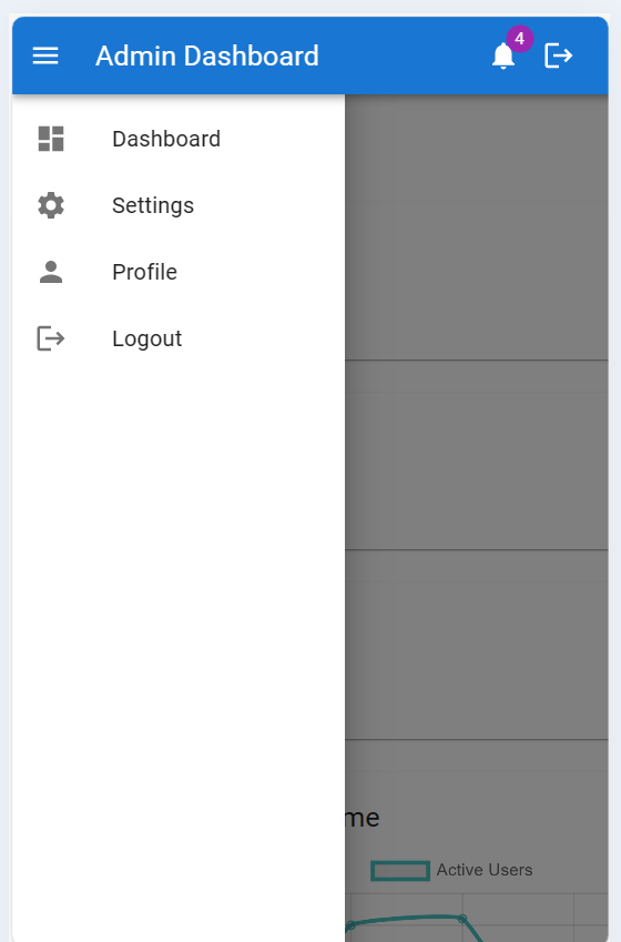
3. Guys now create Layout as global component which will include all the others components:
// src/Layout.js
import React, { useState } from 'react';
import { AppBar, Toolbar, Typography, Box, Drawer, List, ListItem, ListItemIcon, ListItemText, IconButton, CssBaseline, Badge } from '@mui/material';
import MenuIcon from '@mui/icons-material/Menu';
import DashboardIcon from '@mui/icons-material/Dashboard';
import SettingsIcon from '@mui/icons-material/Settings';
import PersonIcon from '@mui/icons-material/Person';
import LogoutIcon from '@mui/icons-material/Logout';
import NotificationsIcon from '@mui/icons-material/Notifications';
import { useNavigate } from 'react-router-dom';

const drawerWidth = 240;

const Layout = ({ children }) => {
  const [isOpen, setIsOpen] = useState(false);
  const navigate = useNavigate();

  const handleDrawerToggle = () => {
    setIsOpen(!isOpen);
  };

  const handleLogout = () => {
    localStorage.removeItem('authToken'); // Clear token from local storage
    navigate('/login');
  };

  return (
    <Box sx={{ display: 'flex' }}>
      <CssBaseline />
      <AppBar position="fixed" sx={{ zIndex: (theme) => theme.zIndex.drawer + 1 }}>
        <Toolbar>
          <IconButton
            color="inherit"
            aria-label="open drawer"
            edge="start"
            onClick={handleDrawerToggle}
            sx={{ mr: 2, display: { md: 'none' } }}
          >
            <MenuIcon />
          </IconButton>
          <Typography variant="h6" noWrap component="div" sx={{ flexGrow: 1 }}>
            Admin Dashboard
          </Typography>
          <IconButton color="inherit">
            <Badge badgeContent={4} color="secondary">
              <NotificationsIcon />
            </Badge>
          </IconButton>
          <IconButton color="inherit" onClick={handleLogout}>
            <LogoutIcon />
          </IconButton>
        </Toolbar>
      </AppBar>
      <Drawer
        variant="permanent"
        sx={{
          width: drawerWidth,
          flexShrink: 0,
          [`& .MuiDrawer-paper`]: { width: drawerWidth, boxSizing: 'border-box' },
          display: { xs: 'none', md: 'block' },
        }}
        open
      >
        <Toolbar />
        <Box sx={{ overflow: 'auto' }}>
          <List>
            <ListItem button onClick={() => navigate('/dashboard')}>
              <ListItemIcon>
                <DashboardIcon />
              </ListItemIcon>
              <ListItemText primary="Dashboard" />
            </ListItem>
            <ListItem button onClick={() => navigate('/settings')}>
              <ListItemIcon>
                <SettingsIcon />
              </ListItemIcon>
              <ListItemText primary="Settings" />
            </ListItem>
            <ListItem button onClick={() => navigate('/profile')}>
              <ListItemIcon>
                <PersonIcon />
              </ListItemIcon>
              <ListItemText primary="Profile" />
            </ListItem>
            <ListItem button onClick={handleLogout}>
              <ListItemIcon>
                <LogoutIcon />
              </ListItemIcon>
              <ListItemText primary="Logout" />
            </ListItem>
          </List>
        </Box>
      </Drawer>
      <Drawer
        variant="temporary"
        open={isOpen}
        onClose={handleDrawerToggle}
        ModalProps={{
          keepMounted: true, // Better open performance on mobile.
        }}
        sx={{
          display: { xs: 'block', md: 'none' },
          [`& .MuiDrawer-paper`]: { boxSizing: 'border-box', width: drawerWidth },
        }}
      >
        <Toolbar />
        <Box sx={{ overflow: 'auto' }}>
          <List>
            <ListItem button onClick={() => navigate('/dashboard')}>
              <ListItemIcon>
                <DashboardIcon />
              </ListItemIcon>
              <ListItemText primary="Dashboard" />
            </ListItem>
            <ListItem button onClick={() => navigate('/settings')}>
              <ListItemIcon>
                <SettingsIcon />
              </ListItemIcon>
              <ListItemText primary="Settings" />
            </ListItem>
            <ListItem button onClick={() => navigate('/profile')}>
              <ListItemIcon>
                <PersonIcon />
              </ListItemIcon>
              <ListItemText primary="Profile" />
            </ListItem>
            <ListItem button onClick={handleLogout}>
              <ListItemIcon>
                <LogoutIcon />
              </ListItemIcon>
              <ListItemText primary="Logout" />
            </ListItem>
          </List>
        </Box>
      </Drawer>
      <Box
        component="main"
        sx={{ flexGrow: 1, bgcolor: 'background.default', p: 3 }}
      >
        <Toolbar />
        {children}
      </Box>
    </Box>
  );
};

export default Layout;
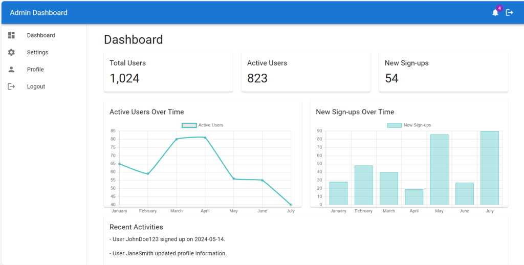
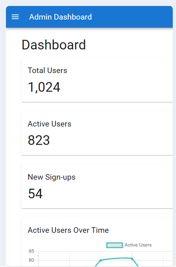
4. Create the Admin Dashboard:
Create a basic admin dashboard component with a navigation bar and some sample content using Material-UI.
// src/AdminDashboard.js
import React from 'react';
import { Container, Paper, Typography, Grid, Box } from '@mui/material';
import Layout from './Layout';
import UserChart from './components/UserChart';
import SignupChart from './components/SignupChart';

const AdminDashboard = () => {
  return (
    <Layout>
      <Container maxWidth="lg">
        <Typography variant="h4" gutterBottom>
          Dashboard
        </Typography>

        {/* Section 1: Summary Cards */}
        <Grid container spacing={3} mb={3}>
          <Grid item xs={12} md={4}>
            <Paper sx={{ p: 2 }}>
              <Typography variant="h6" gutterBottom>
                Total Users
              </Typography>
              <Typography variant="h4">1,024</Typography>
            </Paper>
          </Grid>
          <Grid item xs={12} md={4}>
            <Paper sx={{ p: 2 }}>
              <Typography variant="h6" gutterBottom>
                Active Users
              </Typography>
              <Typography variant="h4">823</Typography>
            </Paper>
          </Grid>
          <Grid item xs={12} md={4}>
            <Paper sx={{ p: 2 }}>
              <Typography variant="h6" gutterBottom>
                New Sign-ups
              </Typography>
              <Typography variant="h4">54</Typography>
            </Paper>
          </Grid>
        </Grid>

        {/* Section 2: Charts */}
        <Grid container spacing={3} mb={3}>
          <Grid item xs={12} md={6}>
            <Paper sx={{ p: 2, height: 300 }}>
              <Typography variant="h6" gutterBottom>
                Active Users Over Time
              </Typography>
              <UserChart />
            </Paper>
          </Grid>
          <Grid item xs={12} md={6}>
            <Paper sx={{ p: 2, height: 300 }}>
              <Typography variant="h6" gutterBottom>
                New Sign-ups Over Time
              </Typography>
              <SignupChart />
            </Paper>
          </Grid>
        </Grid>

        {/* Section 3: Recent Activities */}
        <Paper sx={{ p: 2, mb: 3 }}>
          <Typography variant="h6" gutterBottom>
            Recent Activities
          </Typography>
          <Box sx={{ maxHeight: 300, overflow: 'auto' }}>
            <Typography variant="body1" paragraph>
              - User JohnDoe123 signed up on 2024-05-14.
            </Typography>
            <Typography variant="body1" paragraph>
              - User JaneSmith updated profile information.
            </Typography>
            <Typography variant="body1" paragraph>
              - Admin performed system maintenance.
            </Typography>
            {/* Add more activities as needed */}
          </Box>
        </Paper>

        {/* Section 4: User Statistics */}
        <Paper sx={{ p: 2, mb: 3 }}>
          <Typography variant="h6" gutterBottom>
            User Statistics
          </Typography>
          <Box>
            <Typography variant="body1" paragraph>
              - Total Users: 1,024
            </Typography>
            <Typography variant="body1" paragraph>
              - Active Users: 823
            </Typography>
            <Typography variant="body1" paragraph>
              - Inactive Users: 201
            </Typography>
            <Typography variant="body1" paragraph>
              - New Sign-ups this month: 128
            </Typography>
          </Box>
        </Paper>

        {/* Section 5: System Health */}
        <Paper sx={{ p: 2 }}>
          <Typography variant="h6" gutterBottom>
            System Health
          </Typography>
          <Box>
            <Typography variant="body1" paragraph>
              - Server Status: Online
            </Typography>
            <Typography variant="body1" paragraph>
              - Database Status: Healthy
            </Typography>
            <Typography variant="body1" paragraph>
              - API Response Time: 123ms
            </Typography>
            <Typography variant="body1" paragraph>
              - Error Rate: 0.02%
            </Typography>
          </Box>
        </Paper>
      </Container>
    </Layout>
  );
};

export default AdminDashboard;
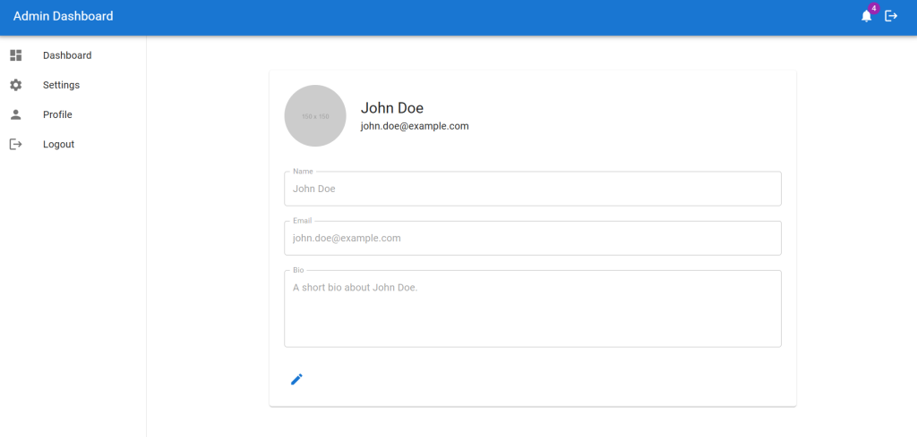
5. Create the ProfilePage Component:
// src/ProfilePage.js
import React, { useState } from 'react';
import { Container, Box, Typography, TextField, Button, Avatar, IconButton, Paper } from '@mui/material';
import EditIcon from '@mui/icons-material/Edit';
import SaveIcon from '@mui/icons-material/Save';
import Layout from './Layout';

const ProfilePage = () => {
  const [isEditing, setIsEditing] = useState(false);
  const [profile, setProfile] = useState({
    name: 'John Doe',
    email: 'john.doe@example.com',
    bio: 'A short bio about John Doe.',
  });

  const handleEditClick = () => {
    setIsEditing(true);
  };

  const handleSaveClick = () => {
    setIsEditing(false);
    // Save the updated profile information
  };

  const handleChange = (e) => {
    const { name, value } = e.target;
    setProfile((prevProfile) => ({
      ...prevProfile,
      [name]: value,
    }));
  };

  return (
    <Layout>
      <Container component="main" maxWidth="md">
        <Paper sx={{ p: 3, mt: 4 }}>
          <Box display="flex" alignItems="center" mb={3}>
            <Avatar
              alt="Profile Picture"
              src="https://via.placeholder.com/150"
              sx={{ width: 100, height: 100, mr: 3 }}
            />
            <Box>
              <Typography variant="h5">{profile.name}</Typography>
              <Typography variant="body1">{profile.email}</Typography>
            </Box>
          </Box>

          <Box component="form" noValidate autoComplete="off">
            <TextField
              variant="outlined"
              margin="normal"
              fullWidth
              id="name"
              label="Name"
              name="name"
              value={profile.name}
              onChange={handleChange}
              disabled={!isEditing}
            />
            <TextField
              variant="outlined"
              margin="normal"
              fullWidth
              id="email"
              label="Email"
              name="email"
              value={profile.email}
              onChange={handleChange}
              disabled={!isEditing}
            />
            <TextField
              variant="outlined"
              margin="normal"
              fullWidth
              id="bio"
              label="Bio"
              name="bio"
              value={profile.bio}
              onChange={handleChange}
              disabled={!isEditing}
              multiline
              rows={4}
            />

            {isEditing ? (
              <Button
                variant="contained"
                color="primary"
                startIcon={<SaveIcon />}
                onClick={handleSaveClick}
                sx={{ mt: 3 }}
              >
                Save
              </Button>
            ) : (
              <IconButton
                color="primary"
                onClick={handleEditClick}
                sx={{ mt: 3 }}
              >
                <EditIcon />
              </IconButton>
            )}
          </Box>
        </Paper>
      </Container>
    </Layout>
  );
};

export default ProfilePage;
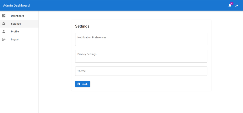
6. Create the SettingsPage Component:
// src/SettingsPage.js
import React, { useState } from 'react';
import { Container, Box, Typography, TextField, Button, Paper } from '@mui/material';
import SaveIcon from '@mui/icons-material/Save';
import Layout from './Layout';

const SettingsPage = () => {
  const [settings, setSettings] = useState({
    notification: '',
    privacy: '',
    theme: '',
  });

  const handleChange = (e) => {
    const { name, value } = e.target;
    setSettings((prevSettings) => ({
      ...prevSettings,
      [name]: value,
    }));
  };

  const handleSaveClick = () => {
    // Save the updated settings information
    console.log('Settings saved:', settings);
  };

  return (
    <Layout>
      <Container component="main" maxWidth="md">
        <Paper sx={{ p: 3, mt: 4 }}>
          <Typography variant="h5" gutterBottom>
            Settings
          </Typography>
          <Box component="form" noValidate autoComplete="off">
            <TextField
              variant="outlined"
              margin="normal"
              fullWidth
              id="notification"
              label="Notification Preferences"
              name="notification"
              value={settings.notification}
              onChange={handleChange}
              multiline
              rows={2}
            />
            <TextField
              variant="outlined"
              margin="normal"
              fullWidth
              id="privacy"
              label="Privacy Settings"
              name="privacy"
              value={settings.privacy}
              onChange={handleChange}
              multiline
              rows={2}
            />
            <TextField
              variant="outlined"
              margin="normal"
              fullWidth
              id="theme"
              label="Theme"
              name="theme"
              value={settings.theme}
              onChange={handleChange}
            />
            <Button
              variant="contained"
              color="primary"
              startIcon={<SaveIcon />}
              onClick={handleSaveClick}
              sx={{ mt: 3 }}
            >
              Save
            </Button>
          </Box>
        </Paper>
      </Container>
    </Layout>
  );
};

export default SettingsPage;
7. Update App.js Component:
Set up the main App component to handle routing between the login page, setting page, profile page and the dashboard.
Also guys if you have any kind of project or any freelancer work then feel free to contact me:
// src/App.js
import React from 'react';
import { BrowserRouter as Router, Route, Routes, Navigate } from 'react-router-dom';
import LoginPage from './LoginPage';
import AdminDashboard from './AdminDashboard';
import ProfilePage from './ProfilePage';
import SettingsPage from './SettingsPage';

function App() {
  const isAuthenticated = !!localStorage.getItem('authToken'); // Check for token in local storage

  return (
    <Router>
      <Routes>
        <Route path="/login" element={<LoginPage />} />
        {isAuthenticated ? (
          <>
            <Route path="/dashboard" element={<AdminDashboard />} />
            <Route path="/profile" element={<ProfilePage />} />
            <Route path="/settings" element={<SettingsPage />} />
            <Route path="/" element={<Navigate to="/dashboard" />} />
          </>
        ) : (
          <Route path="/" element={<Navigate to="/login" />} />
        )}
      </Routes>
    </Router>
  );
}

export default App;
8. Guys now for dashboard page charts we will create very first components folder inside the src folder and create SignupChart.js file and add below code inside it:
// src/components/SignupChart.js
import React from 'react';
import { Bar } from 'react-chartjs-2';
import { Chart, BarElement, CategoryScale, LinearScale, Tooltip, Legend } from 'chart.js';

Chart.register(BarElement, CategoryScale, LinearScale, Tooltip, Legend);

const SignupChart = () => {
  const data = {
    labels: ['January', 'February', 'March', 'April', 'May', 'June', 'July'],
    datasets: [
      {
        label: 'New Sign-ups',
        data: [28, 48, 40, 19, 86, 27, 90],
        backgroundColor: 'rgba(75,192,192,0.4)',
        borderColor: 'rgba(75,192,192,1)',
        borderWidth: 1,
      },
    ],
  };

  const options = {
    responsive: true,
    maintainAspectRatio: false,
    scales: {
      x: {
        display: true,
      },
      y: {
        display: true,
      },
    },
  };

  return <Bar data={data} options={options} />;
};

export default SignupChart;
9. Guys now create UserChart.js file inside components folder and add below code inside it:
// src/components/UserChart.js
import React from 'react';
import { Line } from 'react-chartjs-2';
import { Chart, LineElement, PointElement, LinearScale, Title, CategoryScale, Tooltip, Legend } from 'chart.js';

Chart.register(LineElement, PointElement, LinearScale, Title, CategoryScale, Tooltip, Legend);

const UserChart = () => {
  const data = {
    labels: ['January', 'February', 'March', 'April', 'May', 'June', 'July'],
    datasets: [
      {
        label: 'Active Users',
        data: [65, 59, 80, 81, 56, 55, 40],
        fill: false,
        borderColor: 'rgba(75,192,192,1)',
        tension: 0.1,
      },
    ],
  };

  const options = {
    responsive: true,
    maintainAspectRatio: false,
    scales: {
      x: {
        display: true,
      },
      y: {
        display: true,
      },
    },
  };

  return <Line data={data} options={options} />;
};

export default UserChart;
10. Run Your Application:
Start your development server to see your login page and dashboard.
npm start
Guys this basic setup gives you a login page, profile page, settings and an admin dashboard using React and Material-UI. You can further customize the styles and add more functionality as needed.
This setup gives you a basic structure for your admin dashboard using React and Material UI. You can extend this by adding state management with Redux, connecting to a backend server, and integrating payment gateways to create a full-fledged Admin platform.
This is it guys and if you will have any kind of query, suggestion or requirement then feel free to comment below.
Thanks
Ajay
Leave a Reply