
Hello friends, welcome back to my blog. Today in this blog post, I am going to show you, Build Professional Website in Laravel 8.16 Bootstrap 4.6.
Guys please check below link for more laravel 8 posts:
Friends now I proceed onwards and here is the working code snippet and please use this carefully to avoid the mistakes:
1. Now friends, here is the complete working code snippet
and I have added inside my laravel 8: projectname/resources/views/ welcome.blade.php file for showing you working example but you can add according to your requirement:
I have added bootstrap live cdn’s for template working
<!DOCTYPE html>
<html lang="{{ str_replace('_', '-', app()->getLocale()) }}">
<head>
<meta charset="utf-8">
<meta name="viewport" content="width=device-width, initial-scale=1">
<title>Laravel</title>
<link rel="stylesheet" href="https://maxcdn.bootstrapcdn.com/bootstrap/4.5.2/css/bootstrap.min.css">
<!-- Custom Styles -->
<style>
@import url("https://use.fontawesome.com/releases/v5.0.8/css/all.css");
@import url("https://cdnjs.cloudflare.com/ajax/libs/simple-line-icons/2.5.5/css/simple-line-icons.min.css");
@import url("https://fonts.googleapis.com/css?family=Lato:300,400,700,300italic,400italic,700italic");
body {
font-family: Lato,'Helvetica Neue',Helvetica,Arial,sans-serif!important;
}
.features-icons {
padding-top: 7rem;
padding-bottom: 7rem;
}
.features-icons .features-icons-item {
max-width: 20rem;
}
.features-icons .features-icons-item .features-icons-icon {
height: 7rem;
}
.features-icons .features-icons-item .features-icons-icon i {
font-size: 4.5rem;
}
.features-icons .features-icons-item:hover .features-icons-icon i {
font-size: 5rem;
}
header.masthead {
position: relative;
background-color: #343a40;
background: url("../assets/img/bg-masthead.jpg") no-repeat center center;
background-size: cover;
padding-top: 8rem;
padding-bottom: 8rem;
}
header.masthead .overlay {
position: absolute;
background-color: #212529;
height: 100%;
width: 100%;
top: 0;
left: 0;
opacity: 0.3;
}
header.masthead h1 {
font-size: 2rem;
}
@media (min-width: 768px) {
header.masthead {
padding-top: 12rem;
padding-bottom: 12rem;
}
header.masthead h1 {
font-size: 3rem;
}
}
.showcase .showcase-text {
padding: 3rem;
}
.showcase .showcase-img {
min-height: 30rem;
background-size: cover;
}
@media (min-width: 768px) {
.showcase .showcase-text {
padding: 7rem;
}
}
.testimonials {
padding-top: 7rem;
padding-bottom: 7rem;
}
.testimonials .testimonial-item {
max-width: 18rem;
}
.testimonials .testimonial-item img {
max-width: 12rem;
box-shadow: 0px 5px 5px 0px #adb5bd;
}
.call-to-action {
position: relative;
background-color: #343a40;
background: url("../assets/img/bg-masthead.jpg") no-repeat center center;
background-size: cover;
padding-top: 7rem;
padding-bottom: 7rem;
}
.call-to-action .overlay {
position: absolute;
background-color: #212529;
height: 100%;
width: 100%;
top: 0;
left: 0;
opacity: 0.3;
}
footer.footer {
padding-top: 4rem;
padding-bottom: 4rem;
}
h1, h2, h3, h4, h5, h6 {
font-family: Lato,'Helvetica Neue',Helvetica,Arial,sans-serif;
font-weight: 700;
}
</style>
</head>
<body>
<!-- Navigation-->
<nav class="navbar navbar-light bg-light static-top">
<div class="container">
<a class="navbar-brand" href="#!">Therichpost</a>
<a class="btn btn-primary" href="#!">Sign In</a>
</div>
</nav>
<!-- Masthead-->
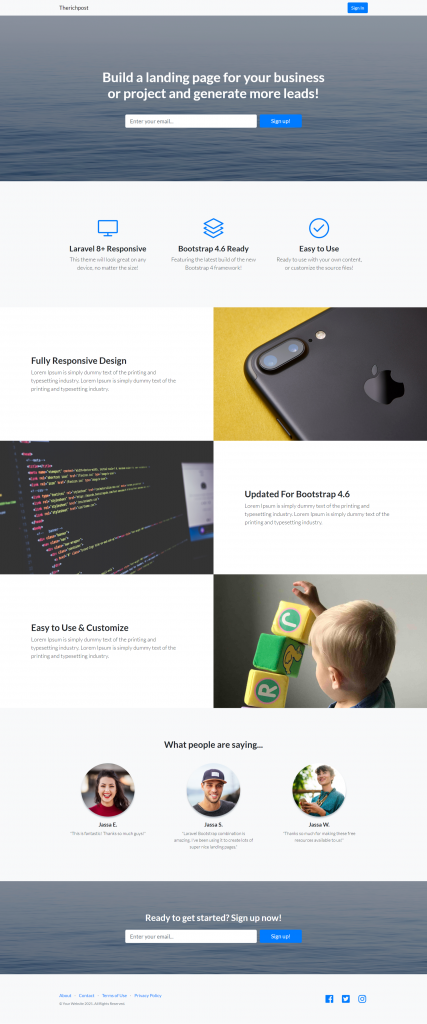
<header class="masthead text-white text-center">
<div class="overlay"></div>
<div class="container">
<div class="row">
<div class="col-xl-9 mx-auto"><h1 class="mb-5">Build a landing page for your business or project and generate more leads!</h1></div>
<div class="col-md-10 col-lg-8 col-xl-7 mx-auto">
<form>
<div class="form-row">
<div class="col-12 col-md-9 mb-2 mb-md-0"><input class="form-control form-control-lg" type="email" placeholder="Enter your email..." /></div>
<div class="col-12 col-md-3"><button class="btn btn-block btn-lg btn-primary" type="submit">Sign up!</button></div>
</div>
</form>
</div>
</div>
</div>
</header>
<!-- Icons Grid-->
<section class="features-icons bg-light text-center">
<div class="container">
<div class="row">
<div class="col-lg-4">
<div class="features-icons-item mx-auto mb-5 mb-lg-0 mb-lg-3">
<div class="features-icons-icon d-flex"><i class="icon-screen-desktop m-auto text-primary"></i></div>
<h3>Laravel 8+ Responsive</h3>
<p class="lead mb-0">This theme will look great on any device, no matter the size!</p>
</div>
</div>
<div class="col-lg-4">
<div class="features-icons-item mx-auto mb-5 mb-lg-0 mb-lg-3">
<div class="features-icons-icon d-flex"><i class="icon-layers m-auto text-primary"></i></div>
<h3>Bootstrap 4.6 Ready</h3>
<p class="lead mb-0">Featuring the latest build of the new Bootstrap 4 framework!</p>
</div>
</div>
<div class="col-lg-4">
<div class="features-icons-item mx-auto mb-0 mb-lg-3">
<div class="features-icons-icon d-flex"><i class="icon-check m-auto text-primary"></i></div>
<h3>Easy to Use</h3>
<p class="lead mb-0">Ready to use with your own content, or customize the source files!</p>
</div>
</div>
</div>
</div>
</section>
<!-- Image Showcases-->
<section class="showcase">
<div class="container-fluid p-0">
<div class="row no-gutters">
<div class="col-lg-6 order-lg-2 text-white showcase-img" style="background-image: url('assets/img/bg-showcase-1.jpg')"></div>
<div class="col-lg-6 order-lg-1 my-auto showcase-text">
<h2>Fully Responsive Design</h2>
<p class="lead mb-0">Lorem Ipsum is simply dummy text of the printing and typesetting industry. Lorem Ipsum is simply dummy text of the printing and typesetting industry.</p>
</div>
</div>
<div class="row no-gutters">
<div class="col-lg-6 text-white showcase-img" style="background-image: url('assets/img/bg-showcase-2.jpg')"></div>
<div class="col-lg-6 my-auto showcase-text">
<h2>Updated For Bootstrap 4.6</h2>
<p class="lead mb-0">Lorem Ipsum is simply dummy text of the printing and typesetting industry. Lorem Ipsum is simply dummy text of the printing and typesetting industry.</p>
</div>
</div>
<div class="row no-gutters">
<div class="col-lg-6 order-lg-2 text-white showcase-img" style="background-image: url('assets/img/bg-showcase-3.jpg')"></div>
<div class="col-lg-6 order-lg-1 my-auto showcase-text">
<h2>Easy to Use & Customize</h2>
<p class="lead mb-0">Lorem Ipsum is simply dummy text of the printing and typesetting industry. Lorem Ipsum is simply dummy text of the printing and typesetting industry.</p>
</div>
</div>
</div>
</section>
<!-- Testimonials-->
<section class="testimonials text-center bg-light">
<div class="container">
<h2 class="mb-5">What people are saying...</h2>
<div class="row">
<div class="col-lg-4">
<div class="testimonial-item mx-auto mb-5 mb-lg-0">
<img class="img-fluid rounded-circle mb-3" src="assets/img/testimonials-1.jpg" alt="..." />
<h5>Jassa E.</h5>
<p class="font-weight-light mb-0">"This is fantastic! Thanks so much guys!"</p>
</div>
</div>
<div class="col-lg-4">
<div class="testimonial-item mx-auto mb-5 mb-lg-0">
<img class="img-fluid rounded-circle mb-3" src="assets/img/testimonials-2.jpg" alt="..." />
<h5>Jassa S.</h5>
<p class="font-weight-light mb-0">"Laravel Bootstrap combination is amazing. I've been using it to create lots of super nice landing pages."</p>
</div>
</div>
<div class="col-lg-4">
<div class="testimonial-item mx-auto mb-5 mb-lg-0">
<img class="img-fluid rounded-circle mb-3" src="assets/img/testimonials-3.jpg" alt="..." />
<h5>Jassa W.</h5>
<p class="font-weight-light mb-0">"Thanks so much for making these free resources available to us!"</p>
</div>
</div>
</div>
</div>
</section>
<!-- Call to Action-->
<section class="call-to-action text-white text-center">
<div class="overlay"></div>
<div class="container">
<div class="row">
<div class="col-xl-9 mx-auto"><h2 class="mb-4">Ready to get started? Sign up now!</h2></div>
<div class="col-md-10 col-lg-8 col-xl-7 mx-auto">
<form>
<div class="form-row">
<div class="col-12 col-md-9 mb-2 mb-md-0"><input class="form-control form-control-lg" type="email" placeholder="Enter your email..." /></div>
<div class="col-12 col-md-3"><button class="btn btn-block btn-lg btn-primary" type="submit">Sign up!</button></div>
</div>
</form>
</div>
</div>
</div>
</section>
<!-- Footer-->
<footer class="footer bg-light">
<div class="container">
<div class="row">
<div class="col-lg-6 h-100 text-center text-lg-left my-auto">
<ul class="list-inline mb-2">
<li class="list-inline-item"><a href="#!">About</a></li>
<li class="list-inline-item">⋅</li>
<li class="list-inline-item"><a href="#!">Contact</a></li>
<li class="list-inline-item">⋅</li>
<li class="list-inline-item"><a href="#!">Terms of Use</a></li>
<li class="list-inline-item">⋅</li>
<li class="list-inline-item"><a href="#!">Privacy Policy</a></li>
</ul>
<p class="text-muted small mb-4 mb-lg-0">© Your Website 2021. All Rights Reserved.</p>
</div>
<div class="col-lg-6 h-100 text-center text-lg-right my-auto">
<ul class="list-inline mb-0">
<li class="list-inline-item mr-3">
<a href="#!"><i class="fab fa-facebook fa-2x fa-fw"></i></a>
</li>
<li class="list-inline-item mr-3">
<a href="#!"><i class="fab fa-twitter-square fa-2x fa-fw"></i></a>
</li>
<li class="list-inline-item">
<a href="#!"><i class="fab fa-instagram fa-2x fa-fw"></i></a>
</li>
</ul>
</div>
</div>
</div>
</footer>
</body>
</html>
2. Guys please create `img` folder inside laraveproject/public/assets folder.
Download and paste below images inside laraveproject/public/assets/img folder:
Now we are done friends. If you have any kind of query, suggestion and new requirement then feel free to comment below.
Note: Friends, In this post, I just tell the basic setup and things, you can change the code according to your requirements.
I will appreciate that if you will tell your views for this post. Nothing matters if your views will be good or bad because with your views, I will make my next posts more good and helpful.
Jassa
Thanks
Leave a Reply
You must be logged in to post a comment.