Year: 2021

  • Laravel 8 Admin Dashboard Template Simple and free

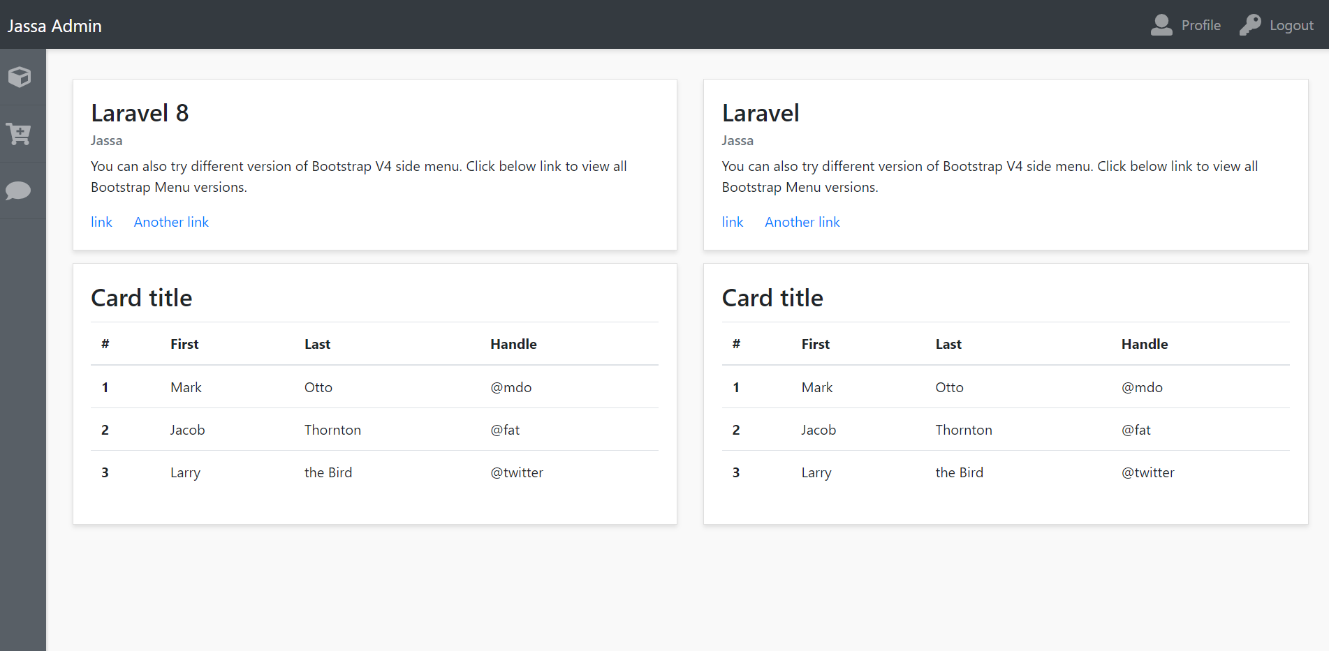
    Laravel 8 Admin Dashboard Template Simple and free

    Hello friends, welcome back to my blog. Today in this blog post, I am going to show you, Laravel 8 Admin Dashboard Template Simple and free.

    Laravel 8 Admin Dashboard Template Simple and free
    Laravel Admin Dashboard
    Laravel Dashboard Sidebar Open

    Guys please check below link for more laravel 8 posts:


    Friends now I proceed onwards and here is the working code snippet for Laravel 8 Admin Dashboard Template Simple and free and please use this carefully to avoid the mistakes:

    1. Now friends, here is the complete working code snippet and I have added inside my laravel 8 projectname/resources/views/ welcome.blade.php file for showing you working example but you can add according to your requirement:

    I have added bootstrap and jquery cdn’s for template working

    <!DOCTYPE html>
    <html lang="{{ str_replace('_', '-', app()->getLocale()) }}">
        <head>
            <meta charset="utf-8">
            <meta name="viewport" content="width=device-width, initial-scale=1">
    
            <title>Laravel</title>
    
            <!-- Fonts -->
            <link href="https://fonts.googleapis.com/css?family=Nunito:200,600" rel="stylesheet">
    
            <link rel="stylesheet" href="https://maxcdn.bootstrapcdn.com/bootstrap/4.5.2/css/bootstrap.min.css">
            <script src="https://ajax.googleapis.com/ajax/libs/jquery/3.5.1/jquery.min.js"></script>
            <script src="https://maxcdn.bootstrapcdn.com/bootstrap/4.5.2/js/bootstrap.min.js"></script>
            <script defer src="https://use.fontawesome.com/releases/v5.0.6/js/all.js"></script>
            
            <style>
              body{background:#f9f9f9;}
    #wrapper{padding:90px 15px;}
    .navbar-expand-lg .navbar-nav.side-nav{flex-direction: column;}
    .card{margin-bottom: 15px; border-radius:0; box-shadow: 0 3px 5px rgba(0,0,0,.1); }
    .header-top{box-shadow: 0 3px 5px rgba(0,0,0,.1)}
    .leftmenutrigger, .navbar-nav li a .shortmenu{display: none}
    .card-title{ font-size: 28px}
    @media(min-width:992px) {
    #wrapper{padding: 90px 15px 15px 75px; }
    .navbar-nav.side-nav:hover {left:0;}
    .side-nav li a {padding: 20px}
    .navbar-nav li a .shortmenu {float: right;display: block;opacity: 1}
    .navbar-nav.side-nav:hover li a .shortmenu{opacity: 0}
    .navbar-nav.side-nav{background: #585f66;box-shadow: 2px 1px 2px rgba(0,0,0,.1);position:fixed;top:56px;flex-direction: column!important;left:-140px;width:200px;overflow-y:auto;bottom:0;overflow-x:hidden;padding-bottom:40px}
    }
    .animate{-webkit-transition:all .2s ease-in-out;-moz-transition:all .2s ease-in-out;-o-transition:all .2s ease-in-out;-ms-transition:all .2s ease-in-out;transition:all .2s ease-in-out}
    .navbar-nav li a svg{font-size: 25px;float: left;margin: 0 10px 0 5px;}
    .side-nav li { border-bottom: 1px solid #50575d;}
            </style>    
        </head>
        <body>
        <div id="wrapper" class="animate">
        <nav class="navbar header-top fixed-top navbar-expand-lg navbar-dark bg-dark">
          <a class="navbar-brand" href="#">Jassa Admin</a>
          <button class="navbar-toggler" type="button" data-toggle="collapse" data-target="#navbarText" aria-controls="navbarText"
            aria-expanded="false" aria-label="Toggle navigation">
            <span class="navbar-toggler-icon"></span>
          </button>
          <div class="collapse navbar-collapse" id="navbarText">
            <ul class="navbar-nav animate side-nav">
              <li class="nav-item">
                <a class="nav-link" href="#" title="Dashboard"><i class="fas fa-cube"></i> Dashboard <i class="fas fa-cube shortmenu animate"></i></a>
              </li>
              <li class="nav-item">
                <a class="nav-link" href="#" title="Cart"><i class="fas fa-cart-plus"></i> Cart <i class="fas fa-cart-plus shortmenu animate"></i></a>
              </li>
              <li class="nav-item">
                <a class="nav-link" href="#" title="Comment"><i class="fas fa-comment"></i> Comment <i class="fas fa-comment shortmenu animate"></i></a>
              </li>
            </ul>
            <ul class="navbar-nav ml-md-auto d-md-flex">
              <li class="nav-item">
                <a class="nav-link" href="#"><i class="fas fa-user"></i> Profile</a>
              </li>
              <li class="nav-item">
                <a class="nav-link" href="#"><i class="fas fa-key"></i> Logout</a>
              </li>
            </ul>
          </div>
        </nav>
        <div class="container-fluid">
          <div class="row">
            <div class="col">
              <div class="card">
                <div class="card-body">
                  <h5 class="card-title">Laravel 8</h5>
                  <h6 class="card-subtitle mb-2 text-muted">Jassa</h6>
                  <p class="card-text">You can also try different version of Bootstrap V4 side menu. Click below link to view all Bootstrap Menu versions.</p>
                  <a href="#" class="card-link">link</a>
                  <a href="#" class="card-link">Another link</a>
                </div>
              </div>
            </div>
            <div class="col">
              <div class="card">
                <div class="card-body">
                  <h5 class="card-title">Laravel</h5>
                  <h6 class="card-subtitle mb-2 text-muted">Jassa</h6>
                  <p class="card-text">You can also try different version of Bootstrap V4 side menu. Click below link to view all Bootstrap Menu versions.</p>
                  <a href="#" class="card-link">link</a>
                  <a href="#" class="card-link">Another link</a>
                </div>
              </div>
            </div>
          </div>
          <div class="row">
            <div class="col">
              <div class="card">
                <div class="card-body">
                  <h5 class="card-title">Card title</h5>
                  <table class="table">
                    <thead>
                      <tr>
                        <th scope="col">#</th>
                        <th scope="col">First</th>
                        <th scope="col">Last</th>
                        <th scope="col">Handle</th>
                      </tr>
                    </thead>
                    <tbody>
                      <tr>
                        <th scope="row">1</th>
                        <td>Mark</td>
                        <td>Otto</td>
                        <td>@mdo</td>
                      </tr>
                      <tr>
                        <th scope="row">2</th>
                        <td>Jacob</td>
                        <td>Thornton</td>
                        <td>@fat</td>
                      </tr>
                      <tr>
                        <th scope="row">3</th>
                        <td>Larry</td>
                        <td>the Bird</td>
                        <td>@twitter</td>
                      </tr>
                    </tbody>
                  </table>
                </div>
              </div>
            </div>
          </div>
        </div>
      </div>
        </body>
    </html>

    Now we are done friends. If you have any kind of query, suggestion and new requirement then feel free to comment below.

    Note: Friends, In this post, I just tell the basic setup and things, you can change the code according to your requirements.

    I will appreciate that if you will tell your views for this post. Nothing matters if your views will be good or bad because with your views, I will make my next posts more good and helpful.

    Jassa

    Thanks

  • Vue 3 Admin Dashboard Template Simple and free

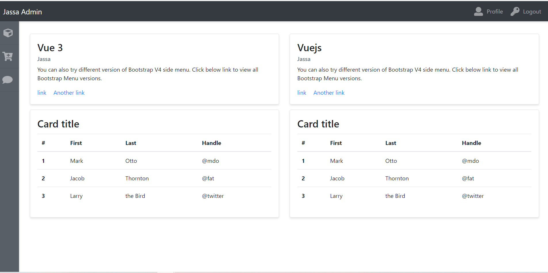
    Vue 3 Admin Dashboard Template Simple and free

    Hello my friends, welcome back to my blog. Today in this blog post, I am going to show you, Vue 3 Admin Dashboard Template Simple and free.

    Vuejs Admin Dashboard

    Vue 3 Admin Dashboard Template Simple and free
    Vue Admin Dashboard

    Vue 3 came and if you are new then you must check below link::
    Vuejs


    Friends now I proceed onwards and here is the working code snippet for Vue 3 Admin Dashboard Template Simple and free and please use this carefully to avoid the mistakes:

    1. Firstly friends we need fresh vuejs(Vue 3) setup and for that we need to run below commands into our terminal and also w should have latest node version installed on our system:

    npm install -g @vue/cli
    
    vue create vuepage
    
    cd vuepage
    
    npm install bootstrap --save
    
    npm install popper.js --save
    
    npm i jquery --save
    
    npm run serve //http://localhost:8080/

    2. Now friends please create new file “App.css” inside src folder and add below code inside it:

    body{background:#f9f9f9;}
    #wrapper{padding:90px 15px;}
    .navbar-expand-lg .navbar-nav.side-nav{flex-direction: column;}
    .card{margin-bottom: 15px; border-radius:0; box-shadow: 0 3px 5px rgba(0,0,0,.1); }
    .header-top{box-shadow: 0 3px 5px rgba(0,0,0,.1)}
    .leftmenutrigger, .navbar-nav li a .shortmenu{display: none}
    .card-title{ font-size: 28px}
    @media(min-width:992px) {
    #wrapper{padding: 90px 15px 15px 75px; }
    .navbar-nav.side-nav:hover {left:0;}
    .side-nav li a {padding: 20px}
    .navbar-nav li a .shortmenu {float: right;display: block;opacity: 1}
    .navbar-nav.side-nav:hover li a .shortmenu{opacity: 0}
    .navbar-nav.side-nav{background: #585f66;box-shadow: 2px 1px 2px rgba(0,0,0,.1);position:fixed;top:56px;flex-direction: column!important;left:-140px;width:200px;overflow-y:auto;bottom:0;overflow-x:hidden;padding-bottom:40px}
    }
    .animate{-webkit-transition:all .2s ease-in-out;-moz-transition:all .2s ease-in-out;-o-transition:all .2s ease-in-out;-ms-transition:all .2s ease-in-out;transition:all .2s ease-in-out}
    .navbar-nav li a svg{font-size: 25px;float: left;margin: 0 10px 0 5px;}
    .side-nav li { border-bottom: 1px solid #50575d;}

    3. Finally friends we need to add below code into our src/App.vue file to get final output on web browser:

    <template>
     <div id="wrapper" class="animate">
        <nav class="navbar header-top fixed-top navbar-expand-lg navbar-dark bg-dark">
          <a class="navbar-brand" href="#">Jassa Admin</a>
          <button class="navbar-toggler" type="button" data-toggle="collapse" data-target="#navbarText" aria-controls="navbarText"
            aria-expanded="false" aria-label="Toggle navigation">
            <span class="navbar-toggler-icon"></span>
          </button>
          <div class="collapse navbar-collapse" id="navbarText">
            <ul class="navbar-nav animate side-nav">
              <li class="nav-item">
                <a class="nav-link" href="#" title="Dashboard"><i class="fas fa-cube"></i> Dashboard <i class="fas fa-cube shortmenu animate"></i></a>
              </li>
              <li class="nav-item">
                <a class="nav-link" href="#" title="Cart"><i class="fas fa-cart-plus"></i> Cart <i class="fas fa-cart-plus shortmenu animate"></i></a>
              </li>
              <li class="nav-item">
                <a class="nav-link" href="#" title="Comment"><i class="fas fa-comment"></i> Comment <i class="fas fa-comment shortmenu animate"></i></a>
              </li>
            </ul>
            <ul class="navbar-nav ml-md-auto d-md-flex">
              <li class="nav-item">
                <a class="nav-link" href="#"><i class="fas fa-user"></i> Profile</a>
              </li>
              <li class="nav-item">
                <a class="nav-link" href="#"><i class="fas fa-key"></i> Logout</a>
              </li>
            </ul>
          </div>
        </nav>
        <div class="container-fluid">
          <div class="row">
            <div class="col">
              <div class="card">
                <div class="card-body">
                  <h5 class="card-title">Vue 3</h5>
                  <h6 class="card-subtitle mb-2 text-muted">Jassa</h6>
                  <p class="card-text">You can also try different version of Bootstrap V4 side menu. Click below link to view all Bootstrap Menu versions.</p>
                  <a href="#" class="card-link">link</a>
                  <a href="#" class="card-link">Another link</a>
                </div>
              </div>
            </div>
            <div class="col">
              <div class="card">
                <div class="card-body">
                  <h5 class="card-title">Vuejs</h5>
                  <h6 class="card-subtitle mb-2 text-muted">Jassa</h6>
                  <p class="card-text">You can also try different version of Bootstrap V4 side menu. Click below link to view all Bootstrap Menu versions.</p>
                  <a href="#" class="card-link">link</a>
                  <a href="#" class="card-link">Another link</a>
                </div>
              </div>
            </div>
          </div>
          <div class="row">
            <div class="col">
              <div class="card">
                <div class="card-body">
                  <h5 class="card-title">Card title</h5>
                  <table class="table">
                    <thead>
                      <tr>
                        <th scope="col">#</th>
                        <th scope="col">First</th>
                        <th scope="col">Last</th>
                        <th scope="col">Handle</th>
                      </tr>
                    </thead>
                    <tbody>
                      <tr>
                        <th scope="row">1</th>
                        <td>Mark</td>
                        <td>Otto</td>
                        <td>@mdo</td>
                      </tr>
                      <tr>
                        <th scope="row">2</th>
                        <td>Jacob</td>
                        <td>Thornton</td>
                        <td>@fat</td>
                      </tr>
                      <tr>
                        <th scope="row">3</th>
                        <td>Larry</td>
                        <td>the Bird</td>
                        <td>@twitter</td>
                      </tr>
                    </tbody>
                  </table>
                </div>
              </div>
            </div>
          </div>
        </div>
      </div>
    </template>
    <script>
    //Bootstrap
    import './App.css'; 
    import 'bootstrap/dist/css/bootstrap.min.css';
    import 'bootstrap/dist/js/bootstrap.min.js';
    export default {
     //
    
      
    }
    </script>

    4. In the end friends we need to add below code into our public/index.html file:

    <!DOCTYPE html>
    <html lang="">
      <head>
       ...
       
        <script defer src="https://use.fontawesome.com/releases/v5.0.6/js/all.js"></script>
      </head>
       
        
    </head>
     ...


    Now we are done friends also and If you have any kind of query or suggestion or any requirement then feel free to comment below.

    Note: Friends, I just tell the basic setup and things, you can change the code according to your requirements. For better understanding must watch video above.

    I will appreciate that if you will tell your views for this post. Nothing matters if your views will be good or bad.

    Jassa

    Thanks

  • Reactjs Animated Ecommerce Shop Page with Dynamic Products

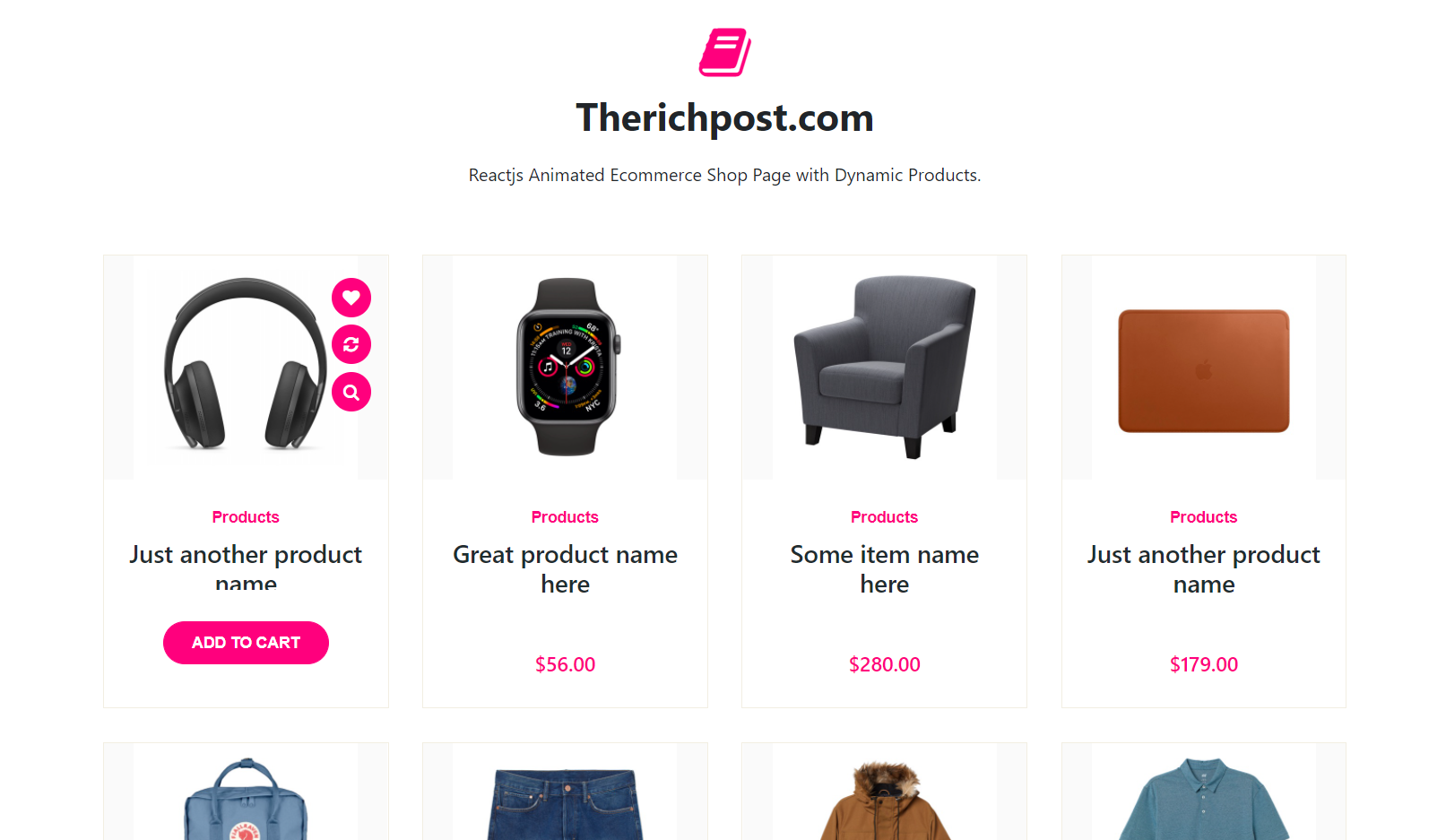
    Reactjs Animated Ecommerce Shop Page with Dynamic Products

    Hello friends, welcome back to my blog. Today in this blog post, I am going to show you, Reactjs Animated Ecommerce Shop Page with Dynamic Products.

    Reactjs Animated Ecommerce Shop Page with Dynamic Products
    Reactjs Web API DATA

    For reactjs new comers, please check the below link:

    Reactjs Basic Tutorials


    Friends now I proceed onwards and here is the working code snippet for Reactjs Animated Ecommerce Shop Page with Dynamic Products and please use this carefully to avoid the mistakes:

    1. Firstly, we need fresh reactjs setup and for that, we need to run below commands into out terminal and also we should have latest node version installed on our system:

    npx create-react-app reacttemplate
    
    cd reacttemplate
    
    npm start


    2. Now we need to run below commands into our project terminal to get bootstrap and related modules into our reactjs application:

    npm install bootstrap --save
    npm install axios
    npm start //For start project again

    3. Finally for the main output, we need to add below code into our reacttemplate/src/App.js file or if you have fresh setup then you can replace reacttemplate/src/App.js file code with below code:

    import React from "react";
    
    import './App.css'
    import 'bootstrap/dist/css/bootstrap.min.css';
    import axios from 'axios';
    
    class App extends React.Component {
      state={
        products:[]
      }
      componentDidMount(){
        //calling rest api for products data
        axios.get('https://www.testjsonapi.com/products/')
        .then(res =>{
          const products = res.data;
          this.setState({products});
        })
      }
     
      render() {
        return (
          <div className="main_container">
           
           
           <section class="our-publication pt-100 pb-70">
                <div class="container">
                    <div class="section-header">
                        <i class="fa fa-book"></i>
                        <h2>Therichpost.com</h2>
                        <p>Reactjs Animated Ecommerce Shop Page with Dynamic Products.</p>
                    </div>
                    
                    <div class="row">
                    {this.state.products.map((result) => {
                       return (
                        <div class="col-sm-6 col-lg-3"> 
                            <div class="single-publication">
                                <figure>
                                    <a href="#">
                                        <img src={result.product_image} alt="Publication Image" />
                                    </a>
                                    <ul>
                                        <li><a href="#" title="Add to Favorite"><i class="fa fa-heart"></i></a></li>
                                        <li><a href="#" title="Add to Compare"><i class="fa fa-refresh"></i></a></li>
                                        <li><a href="#" title="Quick View"><i class="fa fa-search"></i></a></li>
                                    </ul>
                                </figure>
                                <div class="publication-content">
                                    <span class="category">Products</span>
                                    <h3><a href="#">{result.product_title}</a></h3>
                                    <ul>
                                        <li><i class="icofont-star"></i></li>
                                        <li><i class="icofont-star"></i></li>
                                        <li><i class="icofont-star"></i></li>
                                        <li><i class="icofont-star"></i></li>
                                        <li><i class="icofont-star"></i></li>
                                    </ul>
                                    <h4 class="price">{result.product_price}</h4>
                                </div>
                                <div class="add-to-cart">
                                    <a href="#" class="default-btn">Add to Cart</a>
                                </div>
                            </div>
                        </div>
                        
                        )
                     })}
                    </div>
                </div>
            </section>
    
          </div>
        );
      }
    }
    export default App;


    4. Now friends, we need to below code into our reacttemplate/src/App.css file for some custom styling:

    @import url('https://cdnjs.cloudflare.com/ajax/libs/font-awesome/4.7.0/css/font-awesome.min.css');
    .pt-100 {
      padding-top: 100px;
    }
    .pb-70 {
      padding-bottom: 70px;
    }
    .section-header {
      margin-bottom: 60px;
      text-align: center;
    }
    .section-header i {
      color: #ff007d;
      font-size: 50px;
      display: inline-block;
      margin-bottom: 10px;
    }
    .section-header h2 {
      font-weight: bold;
      font-size: 34px;
      margin: 0;
    }
    .section-header p {
      max-width: 500px;
      margin: 20px auto 0;
    }
    .single-publication {
      border: 1px solid #f2eee2;
      margin-bottom: 30px;
      position: relative;
      overflow: hidden;
    }
    .single-publication figure {
      position: relative;
      margin: 0;
      text-align: center;
    }
    .single-publication figure > a {
      background-color: #fafafa;
      display: block;
    }
    .single-publication figure ul {
      list-style-type: none;
      padding: 0;
      margin: 0;
      position: absolute;
      right: -50px;
      top: 20px;
      transition: .6s;
      -webkit-transition: .6s;
    }
    .single-publication:hover figure ul {
      right: 15px;
    }
    .single-publication figure ul li a {
      display: inline-block;
      width: 35px;
      height: 35px;
      text-align: center;
      font-size: 15px;
      background: #ff007d;
      margin-bottom: 7px;
      border-radius: 50%;
      line-height: 35px;
      color: #fff;
    }
    .single-publication figure ul li a:hover {
      color: #fff;
      background: #e50663;
    }
    .single-publication .publication-content {
      text-align: center;
      padding: 20px;
    }
    .single-publication .publication-content .category {
      display: inline-block;
      font-family: 'Open Sans', sans-serif;
      font-size: 14px;
      color: #ff007d;
      font-weight: 600;
    }
    .single-publication .publication-content h3 {
      font-weight: 600;
      margin: 8px 0 10px;
      font-size: 20px;
    }
    .single-publication .publication-content h3 a {
      color: #1f2d30;
      font-size: 22px;
    }
    .single-publication .publication-content h3 a:hover {
      color: #ff007d;
    }
    .single-publication .publication-content ul {
      list-style-type: none;
      padding: 0;
      margin: 0;
      margin-bottom: 15px;
    }
    .single-publication .publication-content ul li {
      display: inline-block;
      font-size: 18px;
      color: #fec42d;
    }
    .single-publication .publication-content .price {
      font-size: 18px;
      color: #ff007d;
    }
    .single-publication .publication-content .price span {
      color: #6f6f6f;
      text-decoration: line-through;
      padding-left: 5px;
      font-weight: 300;
    }
    .single-publication .add-to-cart {
      position: absolute;
      right: 0;
      bottom: 0;
      left: 0;
      background: #fff;
      opacity: 0;
      visibility: hidden;
      text-align: center;
      -webkit-transform: scale(.7);
      transform: scale(.7);
      height: 105px;
      -moz-transition: .4s;
      -webkit-transition: .4s;
      transition: .4s;
    }
    .single-publication:hover .add-to-cart {
      visibility: visible;
      transform: scale(1);
      -webkit-transform: scale(1);
      opacity: 1;
    }
    .single-publication .add-to-cart .default-btn {
      margin-top: 28px;
      padding: 8px 25px;
      font-size: 14px;
    }
    .single-publication .category {
      margin: 0;
    }
    .single-publication .add-to-cart .default-btn {
      margin-top: 28px;
      padding: 8px 25px;
      font-size: 14px;
    }
    .default-btn {
      background-color: #ff007d;
      color: #fff;
      border: 1px solid #ff007d;
      display: inline-block;
      padding: 10px 30px;
      border-radius: 30px;
      text-transform: uppercase;
      font-weight: 600;
      font-family: 'Open Sans', sans-serif;
    }
    a:hover {
      color: #fff;
      text-decoration: none;
    }
    figure img{width: 200px;}

    Now we are done friends. If you have any kind of query or suggestion or any requirement then feel free to comment below.

    Here is the site from where I use json fake data to show into my applications:

    https://www.testjsonapi.com/fake-data-rest-apis/
    https://www.testjsonapi.com/fake-data-rest-apis/

    Note: Friends, I just tell the basic setup and things, you can change the code according to your requirements.

    I will appreciate that if you will tell your views for this post. Nothing matters if your views will be good or bad.

    Jassa

    Thanks

  • Vuejs – Vue 3 Animated Ecommerce Shop Page with Dynamic Products

    Vuejs – Vue 3 Animated Ecommerce Shop Page with Dynamic Products

    Hello friends, welcome back to my blog. Today in this blog post, I am going to show you, Vuejs – Vue 3 Animated Ecommerce Shop Page with Dynamic Products.

    Friends with this post, we will cover with below functionalities:

    1. How to fetch and show api json data in vuejs application?
    2. Veujs show page with dynamic data.

    Here is the API link from where I am getting demo products json data:

    https://www.testjsonapi.com/products/


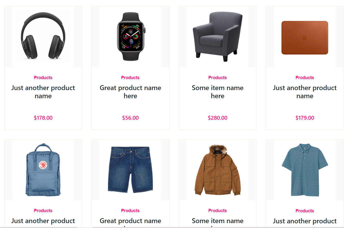
    Vuejs - Vue 3 Animated Ecommerce Shop Page with Dynamic Products
    Vue js Dynamic Products
    Hover Effect

    Vue 3 came and if you are new then you must check below two link:

    1. Vuejs

    Friends now I proceed onwards and here is the working code snippet for Vuejs – Vue 3 Animated Ecommerce Shop Page with Dynamic Products and use this carefully to avoid the mistakes:

    1. Firstly friends we need fresh vue 3 setup and for this we need to run below commands . Secondly we should also have latest node version installed on our system. With below we will have datatable, jquery, bootstrap and axios modules in our Vue 3 application:

    npm install -g @vue/cli
    
    vue create vueshoppage
    
    cd vueshoppage
    
    npm i axios
    
    npm i bootstrap
    
    npm run serve //http://localhost:8080/


    2. Now friends we need to add below code into src/App.vue file to check the final output on browser:

    <template>
    <section class="our-publication pt-100 pb-70">
                <div class="container">
                    <div class="section-header">
                        <i class="fa fa-book"></i>
                        <h2>Therichpost.com</h2>
                        <p>Vuejs - Vue 3 Animated Ecommerce Shop Page with Dynamic Products.</p>
                    </div>
                    
                    <div class="row">
                        <div class="col-sm-6 col-lg-3" v-for="product in products" :key="product.id"> 
                            <div class="single-publication">
                                <figure>
                                    <a href="#">
                                        <img :src="product.product_image" alt="Publication Image">
                                    </a>
    
                                    <ul>
                                        <li><a href="#" title="Add to Favorite"><i class="fa fa-heart"></i></a></li>
                                        <li><a href="#" title="Add to Compare"><i class="fa fa-refresh"></i></a></li>
                                        <li><a href="#" title="Quick View"><i class="fa fa-search"></i></a></li>
                                    </ul>
                                </figure>
    
                                <div class="publication-content">
                                    <span class="category">Products</span>
                                    <h3><a href="#">{{product.product_title}}</a></h3>
                                    <ul>
                                        <li><i class="icofont-star"></i></li>
                                        <li><i class="icofont-star"></i></li>
                                        <li><i class="icofont-star"></i></li>
                                        <li><i class="icofont-star"></i></li>
                                        <li><i class="icofont-star"></i></li>
                                    </ul>
                                    <h4 class="price">{{product.product_price}}</h4>
                                </div>
    
                                <div class="add-to-cart">
                                    <a href="#" class="default-btn">Add to Cart</a>
                                </div>
                            </div>
                        </div>
                        
                        
                    </div>
                </div>
            </section>
    </template>
    <script>
    //Bootstrap
    import './App.css'; 
    import 'bootstrap/dist/css/bootstrap.min.css';
    import axios from 'axios'
    export default {
     //
      mounted(){
        //API Call
        axios
        .get("https://www.testjsonapi.com/products/")
        .then((res)=>
        {
          this.products = res.data;
         
        })
      },
      data: function() {
            return {
                products:[]
            }
        },
      
    }
    </script>

    3. Now guys we need to add below code into src/app.css file to styling products and give hover effect:

    @import url('https://cdnjs.cloudflare.com/ajax/libs/font-awesome/4.7.0/css/font-awesome.min.css');
    .pt-100 {
      padding-top: 100px;
    }
    .pb-70 {
      padding-bottom: 70px;
    }
    .section-header {
      margin-bottom: 60px;
      text-align: center;
    }
    .section-header i {
      color: #ff007d;
      font-size: 50px;
      display: inline-block;
      margin-bottom: 10px;
    }
    .section-header h2 {
      font-weight: bold;
      font-size: 34px;
      margin: 0;
    }
    .section-header p {
      max-width: 500px;
      margin: 20px auto 0;
    }
    .single-publication {
      border: 1px solid #f2eee2;
      margin-bottom: 30px;
      position: relative;
      overflow: hidden;
    }
    .single-publication figure {
      position: relative;
      margin: 0;
      text-align: center;
    }
    .single-publication figure > a {
      background-color: #fafafa;
      display: block;
    }
    .single-publication figure ul {
      list-style-type: none;
      padding: 0;
      margin: 0;
      position: absolute;
      right: -50px;
      top: 20px;
      transition: .6s;
      -webkit-transition: .6s;
    }
    .single-publication:hover figure ul {
      right: 15px;
    }
    .single-publication figure ul li a {
      display: inline-block;
      width: 35px;
      height: 35px;
      text-align: center;
      font-size: 15px;
      background: #ff007d;
      margin-bottom: 7px;
      border-radius: 50%;
      line-height: 35px;
      color: #fff;
    }
    .single-publication figure ul li a:hover {
      color: #fff;
      background: #e50663;
    }
    .single-publication .publication-content {
      text-align: center;
      padding: 20px;
    }
    .single-publication .publication-content .category {
      display: inline-block;
      font-family: 'Open Sans', sans-serif;
      font-size: 14px;
      color: #ff007d;
      font-weight: 600;
    }
    .single-publication .publication-content h3 {
      font-weight: 600;
      margin: 8px 0 10px;
      font-size: 20px;
    }
    .single-publication .publication-content h3 a {
      color: #1f2d30;
      font-size: 22px;
    }
    .single-publication .publication-content h3 a:hover {
      color: #ff007d;
    }
    .single-publication .publication-content ul {
      list-style-type: none;
      padding: 0;
      margin: 0;
      margin-bottom: 15px;
    }
    .single-publication .publication-content ul li {
      display: inline-block;
      font-size: 18px;
      color: #fec42d;
    }
    .single-publication .publication-content .price {
      font-size: 18px;
      color: #ff007d;
    }
    .single-publication .publication-content .price span {
      color: #6f6f6f;
      text-decoration: line-through;
      padding-left: 5px;
      font-weight: 300;
    }
    .single-publication .add-to-cart {
      position: absolute;
      right: 0;
      bottom: 0;
      left: 0;
      background: #fff;
      opacity: 0;
      visibility: hidden;
      text-align: center;
      -webkit-transform: scale(.7);
      transform: scale(.7);
      height: 105px;
      -moz-transition: .4s;
      -webkit-transition: .4s;
      transition: .4s;
    }
    .single-publication:hover .add-to-cart {
      visibility: visible;
      transform: scale(1);
      -webkit-transform: scale(1);
      opacity: 1;
    }
    .single-publication .add-to-cart .default-btn {
      margin-top: 28px;
      padding: 8px 25px;
      font-size: 14px;
    }
    .single-publication .category {
      margin: 0;
    }
    .single-publication .add-to-cart .default-btn {
      margin-top: 28px;
      padding: 8px 25px;
      font-size: 14px;
    }
    .default-btn {
      background-color: #ff007d;
      color: #fff;
      border: 1px solid #ff007d;
      display: inline-block;
      padding: 10px 30px;
      border-radius: 30px;
      text-transform: uppercase;
      font-weight: 600;
      font-family: 'Open Sans', sans-serif;
    }
    a:hover {
      color: #fff;
      text-decoration: none;
    }
    figure img{width: 200px;}


    Now we are done friends  also and If you have any kind of query or suggestion or any requirement then feel free to comment below.

    Note: Friends, I just tell the basic setup and things, you can change the code according to your requirements. For better understanding must watch video above.

    I will appreciate that if you will tell your views for this post. Nothing matters if your views will be good or bad.

    Jassa

    Thanks

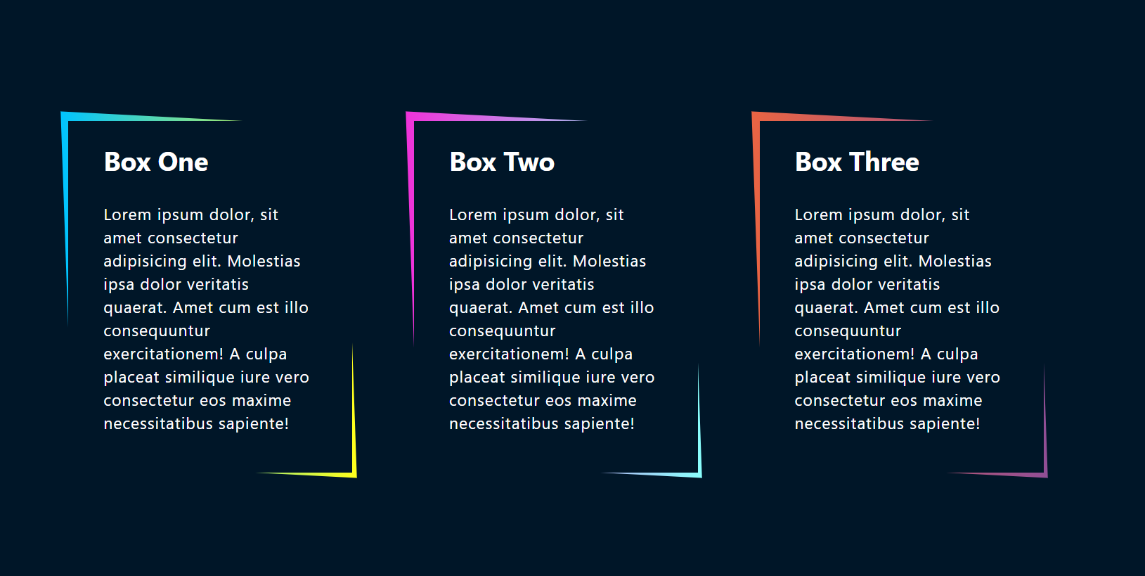
  • Vuejs Box Skew Hover Effect Working Demo Code

    Vuejs Box Skew Hover Effect Working Demo Code

    Hello my friends, welcome back to my blog. Today in this blog post, I am going to show you, Vuejs Box Skew Hover Effect Working Demo Code.

    Vuejs Box Skew Hover Effect Working Demo Code
    Vuejs Skew Hover Effect
    Vue 3 Tutorials

    Vue 3 came and if you are new then you must check below link::
    Vuejs


    Friends now I proceed onwards and here is the working code snippet for Vuejs Box Skew Hover Effect Working Demo Code and please use this carefully to avoid the mistakes:

    1. Firstly friends we need fresh vuejs(Vue 3) setup and for that we need to run below commands into our terminal and also w should have latest node version installed on our system:

    npm install -g @vue/cli
    
    vue create vuepage
    
    cd vuepage
    
    npm install bootstrap --save
    
    npm run serve //http://localhost:8080/


    2. Now friends please create new file “App.css” inside src folder and add below code inside it:

    @import url('https://fonts.googleapis.com/css?family=Lato:300,400,700');
    * {
      margin: 0;
      padding: 0;
    }
    body {
      font-family: "Lato", sans-serif;
      display: flex;
      justify-content: center;
      align-items: center;
      min-height: 100vh;
      background-color: #001628!important;
    }
    .container {
      position: relative;
      width: 90%;
      display: grid;
      grid-template-columns: repeat(auto-fit, minmax(250px, 1fr));
      grid-gap: 70px;
    }
    .container .box::before {
      content: '';
      position: absolute;
      height: 100%;
      width: 100%;
      background: #fff;
      z-index: -1;
      top: -2px;
      left: -2px;
      right: -2px;
      bottom: -2px;
      transform: skew(2deg, 3deg);
      transition: .5s;
    }
    .container .box:hover:before {
      transform: skew(-2deg, -3deg);
    }
    .container .box {
      position: relative;
      color: #fff;
      height: 400px;
    /*   border: 1px solid #fff; */
      display: flex;
      align-content: center;
      align-items: center;
      background-color: #001628;
    }
    .container .box:nth-child(1):before {
      background: linear-gradient(to right, #00c3ff, #ffff1c);
    }
    .container .box:nth-child(2):before {
      background: linear-gradient(to right, #ef32d9, #89fffd);
    }
    .container .box:nth-child(3):before {
      background: linear-gradient(to right, #e96443, #904e95);
    }
    .content {
      padding: 0 40px;
      position: relative;
    }
    .content h2 {
      font-weight: 700;
      font-size: 30px;
      margin-bottom: 30px;
    }
    .content p {
      letter-spacing: 1px;
      font-size: 18px;
    }


    3. Finally friends we need to add below code into our src/App.vue file to get final output on web browser:

    <template>
    <div class="container">
      
      <div class="box">
        <div class="content">
        <h2>Box One</h2>
        <p>Lorem ipsum dolor, sit amet consectetur adipisicing elit. Molestias ipsa dolor veritatis quaerat. Amet cum est illo consequuntur exercitationem! A culpa placeat similique iure vero consectetur eos maxime necessitatibus sapiente!</p>
          </div>
      </div>
      
        <div class="box">
          <div class="content">
        <h2>Box Two</h2>
        <p>Lorem ipsum dolor, sit amet consectetur adipisicing elit. Molestias ipsa dolor veritatis quaerat. Amet cum est illo consequuntur exercitationem! A culpa placeat similique iure vero consectetur eos maxime necessitatibus sapiente!</p>
            </div>
      </div>
      
        <div class="box">
          <div class="content">
            <h2>Box Three</h2>
            <p>Lorem ipsum dolor, sit amet consectetur adipisicing elit. Molestias ipsa dolor veritatis quaerat. Amet cum est illo consequuntur exercitationem! A culpa placeat similique iure vero consectetur eos maxime necessitatibus sapiente!</p>
          </div>
      </div>
      
    </div>
    </template>
    <script>
    //Bootstrap
    import './App.css'; 
    import 'bootstrap/dist/css/bootstrap.min.css';
    export default {
     //
      
    }
    </script>


    Now we are done friends also and If you have any kind of query or suggestion or any requirement then feel free to comment below.

    Note: Friends, I just tell the basic setup and things, you can change the code according to your requirements. For better understanding must watch video above.

    I will appreciate that if you will tell your views for this post. Nothing matters if your views will be good or bad.

    Jassa

    Thanks

  • Reactjs Box Skew Hover Effect Working Demo Code

    Reactjs Box Skew Hover Effect Working Demo Code

    Hello friends, welcome back to my blog. Today in this blog post, I am going to show you, Reactjs Box Skew Hover Effect Working Demo Code.


    Reactjs Box Skew Hover Effect Working Demo Code
    Reactjs Skew Functionality

    For reactjs new comers, please check the below link:

    Reactjs Basic Tutorials


    Friends now I proceed onwards and here is the working code snippet for Reactjs Box Skew Hover Effect Working Demo Code and please use this carefully to avoid the mistakes:

    1. Firstly, we need fresh reactjs setup and for that, we need to run below commands into out terminal and also we should have latest node version installed on our system:

    npx create-react-app reacttemplate
    
    cd reacttemplate
    
    npm start


    2. Now we need to run below commands into our project terminal to get bootstrap and related modules into our reactjs application:

    npm install bootstrap --save
    
    npm start //For start project again


    3. Finally for the main output, we need to add below code into our reacttemplate/src/App.js file or if you have fresh setup then you can replace reacttemplate/src/App.js file code with below code:

    import React from "react";
    
    import './App.css'
    import 'bootstrap/dist/css/bootstrap.min.css';
    
    class App extends React.Component {
     
      render() {
        return (
          <div className="main_container">
           
           
           <div class="container">
      
      <div class="box">
        <div class="content">
        <h2>Box One</h2>
        <p>Lorem ipsum dolor, sit amet consectetur adipisicing elit. Molestias ipsa dolor veritatis quaerat. Amet cum est illo consequuntur exercitationem! A culpa placeat similique iure vero consectetur eos maxime necessitatibus sapiente!</p>
          </div>
      </div>
      
        <div class="box">
          <div class="content">
        <h2>Box Two</h2>
        <p>Lorem ipsum dolor, sit amet consectetur adipisicing elit. Molestias ipsa dolor veritatis quaerat. Amet cum est illo consequuntur exercitationem! A culpa placeat similique iure vero consectetur eos maxime necessitatibus sapiente!</p>
            </div>
      </div>
      
        <div class="box">
          <div class="content">
            <h2>Box Three</h2>
            <p>Lorem ipsum dolor, sit amet consectetur adipisicing elit. Molestias ipsa dolor veritatis quaerat. Amet cum est illo consequuntur exercitationem! A culpa placeat similique iure vero consectetur eos maxime necessitatibus sapiente!</p>
          </div>
      </div>
      
    </div>
    
          </div>
        );
      }
    }
    export default App;


    4. Now friends, we need to below code into our reacttemplate/src/App.css file for some custom styling:

    @import url('https://fonts.googleapis.com/css?family=Lato:300,400,700');
    
    * {
      margin: 0;
      padding: 0;
    }
    
    body {
      font-family: "Lato", sans-serif;
      display: flex;
      justify-content: center;
      align-items: center;
      min-height: 100vh;
      background-color: #001628!important;
    }
    
    .container {
      position: relative;
      width: 90%;
      display: grid;
      grid-template-columns: repeat(auto-fit, minmax(250px, 1fr));
      grid-gap: 70px;
    }
    
    .container .box::before {
      content: '';
      position: absolute;
      height: 100%;
      width: 100%;
      background: #fff;
      z-index: -1;
      top: -2px;
      left: -2px;
      right: -2px;
      bottom: -2px;
      transform: skew(2deg, 3deg);
      transition: .5s;
    }
    
    .container .box:hover:before {
      transform: skew(-2deg, -3deg);
    }
    
    .container .box {
      position: relative;
      color: #fff;
      height: 400px;
    /*   border: 1px solid #fff; */
      display: flex;
      align-content: center;
      align-items: center;
      background-color: #001628;
    }
    
    .container .box:nth-child(1):before {
      background: linear-gradient(to right, #00c3ff, #ffff1c);
    }
    
    .container .box:nth-child(2):before {
      background: linear-gradient(to right, #ef32d9, #89fffd);
    }
    
    .container .box:nth-child(3):before {
      background: linear-gradient(to right, #e96443, #904e95);
    }
    
    
    .content {
      padding: 0 40px;
      position: relative;
    }
    
    
    .content h2 {
      font-weight: 700;
      font-size: 30px;
      margin-bottom: 30px;
    }
    
    .content p {
      letter-spacing: 1px;
      font-size: 18px;
    }


    Now we are done friends. If you have any kind of query or suggestion or any requirement then feel free to comment below.

    Note: Friends, I just tell the basic setup and things, you can change the code according to your requirements.

    I will appreciate that if you will tell your views for this post. Nothing matters if your views will be good or bad.

    Jassa

    Thanks

  • Angular 11 Box Skew Hover Effect Working Demo Code

    Angular 11 Box Skew Hover Effect Working Demo Code

    Hello friends, welcome back to my blog. Today in this blog post, I am going to tell you, Angular 11 Box Skew Hover Effect Working Demo Code.


    Angular 11 Box Skew Hover Effect Working Demo Code
    Angular Skew Effect

    Angular 11 came and if you are new then you must check below two links:

    1. Angular11 Basic Tutorials

    Friends now I proceed onwards and here is the working code snippet for Angular 11 Box Skew Hover Effect Working Demo Code and please use carefully this to avoid the mistakes:

    1. Firstly friends we need fresh angular 11 setup and for this we need to run below commands but if you already have angular 11 setup then you can avoid below commands. Secondly we should also have latest node version installed on our system:

    npm install -g @angular/cli 
    
    ng new angularbootstrap //Create new Angular Project
    
    cd angularbootstrap // Go inside the Angular Project Folder
    
    ng serve --open // Run and Open the Angular Project
    
    http://localhost:4200/ // Working Angular Project Url


    2. Now friends, here we need to run below commands into our project terminal to install bootstrap and jquery modules into our angular application:

    npm install --save bootstrap
    
    npm i jquery --save


    3. Now friends, here we need to add below  into our angular.json file:

    ...
     "styles": [
                  ...
                  "node_modules/bootstrap/dist/css/bootstrap.min.css"
                 
                  
                ],
                "scripts": [
                  "node_modules/jquery/dist/jquery.min.js",
                  "node_modules/bootstrap/dist/js/bootstrap.min.js"
                ]
    ...


    4. Now friends we just need to add below code into src/app/app.component.html file to get final out on the web browser:

    <div class="container">
      
      <div class="box">
        <div class="content">
        <h2>Box One</h2>
        <p>Lorem ipsum dolor, sit amet consectetur adipisicing elit. Molestias ipsa dolor veritatis quaerat. Amet cum est illo consequuntur exercitationem! A culpa placeat similique iure vero consectetur eos maxime necessitatibus sapiente!</p>
          </div>
      </div>
      
        <div class="box">
          <div class="content">
        <h2>Box Two</h2>
        <p>Lorem ipsum dolor, sit amet consectetur adipisicing elit. Molestias ipsa dolor veritatis quaerat. Amet cum est illo consequuntur exercitationem! A culpa placeat similique iure vero consectetur eos maxime necessitatibus sapiente!</p>
            </div>
      </div>
      
        <div class="box">
          <div class="content">
            <h2>Box Three</h2>
            <p>Lorem ipsum dolor, sit amet consectetur adipisicing elit. Molestias ipsa dolor veritatis quaerat. Amet cum est illo consequuntur exercitationem! A culpa placeat similique iure vero consectetur eos maxime necessitatibus sapiente!</p>
          </div>
      </div>
      
    </div>

    5. Now friends we just need to css code code into src/index.html file:

    ...
    <head>
      ...
    
      <style>
       @import url('https://fonts.googleapis.com/css?family=Lato:300,400,700');
    
    * {
      margin: 0;
      padding: 0;
    }
    
    body {
      font-family: "Lato", sans-serif;
      display: flex;
      justify-content: center;
      align-items: center;
      min-height: 100vh;
      background-color: #001628!important;
    }
    
    .container {
      position: relative;
      width: 90%;
      display: grid;
      grid-template-columns: repeat(auto-fit, minmax(250px, 1fr));
      grid-gap: 70px;
    }
    
    .container .box::before {
      content: '';
      position: absolute;
      height: 100%;
      width: 100%;
      background: #fff;
      z-index: -1;
      top: -2px;
      left: -2px;
      right: -2px;
      bottom: -2px;
      transform: skew(2deg, 3deg);
      transition: .5s;
    }
    
    .container .box:hover:before {
      transform: skew(-2deg, -3deg);
    }
    
    .container .box {
      position: relative;
      color: #fff;
      height: 400px;
    /*   border: 1px solid #fff; */
      display: flex;
      align-content: center;
      align-items: center;
      background-color: #001628;
    }
    
    .container .box:nth-child(1):before {
      background: linear-gradient(to right, #00c3ff, #ffff1c);
    }
    
    .container .box:nth-child(2):before {
      background: linear-gradient(to right, #ef32d9, #89fffd);
    }
    
    .container .box:nth-child(3):before {
      background: linear-gradient(to right, #e96443, #904e95);
    }
    
    
    .content {
      padding: 0 40px;
      position: relative;
    }
    
    
    .content h2 {
      font-weight: 700;
      font-size: 30px;
      margin-bottom: 30px;
    }
    
    .content p {
      letter-spacing: 1px;
      font-size: 18px;
    }
      </style>
    </head>
    ...


    Friends in the end must run ng serve command into your terminal to run the angular 11 project.

    Now we are done friends. If you have any kind of query, suggestion and new requirement then feel free to comment below.

    Note: Friends, In this post, I just tell the basic setup and things, you can change the code according to your requirements.

    I will appreciate that if you will tell your views for this post. Nothing matters if your views will be good or bad because with your views, I will make my next posts more good and helpful.

    Jassa

    Thanks

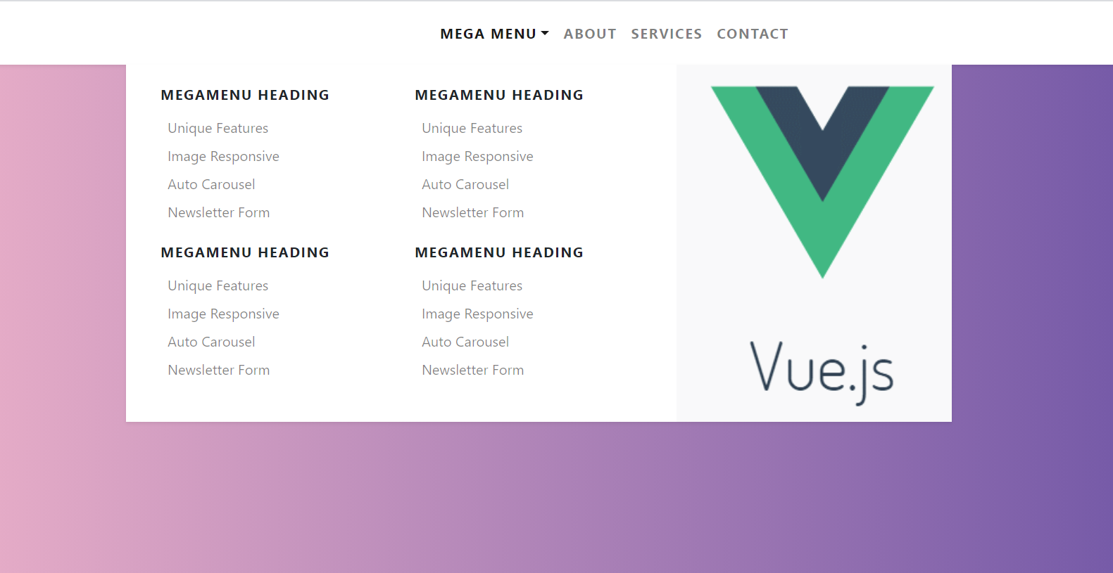
  • Vue 3 Bootstrap 4 Mega Menus Working Demo

    Vue 3 Bootstrap 4 Mega Menus Working Demo

    Hello my friends, welcome back to my blog. Today in this blog post, I am going to show you, Vue 3 Bootstrap 4 Mega Menus Working Demo.

    Vue Mega Menu
    Vue Mega Menu
    Vue 3 Bootstrap 4 Mega Menus Working Demo
    Vue Bootstrap 4 Mega Menus Working Demo
    Vue 3 Tutorials

    Vue 3 came and if you are new then you must check below link::
    Vuejs


    Friends now I proceed onwards and here is the working code snippet for Vue 3 Bootstrap 4 Mega Menus Working Demo and please use this carefully to avoid the mistakes:

    1. Firstly friends we need fresh vuejs(Vue 3) setup and for that we need to run below commands into our terminal and also w should have latest node version installed on our system:

    npm install -g @vue/cli
    
    vue create vuepage
    
    cd vuepage
    
    npm install bootstrap --save
    
    npm install popper.js --save
    
    npm i jquery --save
    
    npm run serve //http://localhost:8080/


    2. Now friends please create new file “App.css” inside src folder and add below code inside it:

    /*
    *
    * ==========================================
    * CUSTOM UTIL CLASSES
    * ==========================================
    *
    */
    
    .megamenu {
      position: static!important;
    }
    
    .megamenu .dropdown-menu {
      background: none;
      border: none;
      width: 100%;
    }
    
    /*
    *
    * ==========================================
    * FOR DEMO PURPOSES
    * ==========================================
    *
    */


    code {
      color: #745eb1;
      background: #fff;
      padding: 0.1rem 0.2rem;
      border-radius: 0.2rem;
    }
    
    .text-uppercase {
      letter-spacing: 0.08em;
    }
    body {
      background: #eaafc8!important;
      background: -webkit-linear-gradient(to right, #eaafc8, #654ea3)!important;
      background: linear-gradient(to right, #eaafc8, #654ea3)!important;
      min-height: 100vh;
    }


    3. Finally friends we need to add below code into our src/App.vue file to get final output on web browser:

    <template>
    <nav class="navbar navbar-expand-lg navbar-light bg-white py-3 shadow-sm">
      <a href="#" class="navbar-brand font-weight-bold d-block d-lg-none">MegaMenu</a>
      <button type="button" data-toggle="collapse" data-target="#navbarContent" aria-controls="navbars" aria-expanded="false" aria-label="Toggle navigation" class="navbar-toggler">
              <span class="navbar-toggler-icon"></span>
          </button>
      <div id="navbarContent" class="collapse navbar-collapse">
        <ul class="navbar-nav mx-auto">
          <!-- Megamenu-->
          <li class="nav-item dropdown megamenu"><a id="megamneu" href="" data-toggle="dropdown" aria-haspopup="true" aria-expanded="false" class="nav-link dropdown-toggle font-weight-bold text-uppercase">Mega Menu</a>
            <div aria-labelledby="megamneu" class="dropdown-menu border-0 p-0 m-0">
              <div class="container">
                <div class="row bg-white rounded-0 m-0 shadow-sm">
                  <div class="col-lg-7 col-xl-8">
                    <div class="p-4">
                      <div class="row">
                        <div class="col-lg-6 mb-4">
                          <h6 class="font-weight-bold text-uppercase">MegaMenu heading</h6>
                          <ul class="list-unstyled">
                            <li class="nav-item"><a href="" class="nav-link text-small pb-0">Unique Features</a></li>
                            <li class="nav-item"><a href="" class="nav-link text-small pb-0 ">Image Responsive</a></li>
                            <li class="nav-item"><a href="" class="nav-link text-small pb-0 ">Auto Carousel</a></li>
                            <li class="nav-item"><a href="" class="nav-link text-small pb-0 ">Newsletter Form</a></li>
                          </ul>
                        </div>
                        <div class="col-lg-6 mb-4">
                          <h6 class="font-weight-bold text-uppercase">MegaMenu heading</h6>
                          <ul class="list-unstyled">
                            <li class="nav-item"><a href="" class="nav-link text-small pb-0 ">Unique Features</a></li>
                            <li class="nav-item"><a href="" class="nav-link text-small pb-0 ">Image Responsive</a></li>
                            <li class="nav-item"><a href="" class="nav-link text-small pb-0 ">Auto Carousel</a></li>
                            <li class="nav-item"><a href="" class="nav-link text-small pb-0 ">Newsletter Form</a></li>
                          </ul>
                        </div>
                      </div>
                    </div>
                  </div>
                  <div class="col-lg-5 col-xl-4 px-0 d-none d-lg-block" style="background: center center url(https://therichpost.com/wp-content/uploads/2018/01/vuejs.png)no-repeat; background-size: cover;"></div>
                </div>
              </div>
            </div>
          </li>
          <li class="nav-item"><a href="" class="nav-link font-weight-bold text-uppercase">About</a></li>
          <li class="nav-item"><a href="" class="nav-link font-weight-bold text-uppercase">Services</a></li>
          <li class="nav-item"><a href="" class="nav-link font-weight-bold text-uppercase">Contact</a></li>
        </ul>
      </div>
    </nav>
    
    
    <!-- For demo purpose -->
    <section class="py-5 text-white">
      <div class="container py-4">
        <div class="row">
          <div class="col-lg-8 mx-auto text-center">
            <h1 class="display-4">Vue 3 Bootstrap 4 Mega menu</h1>
            <p class="lead mb-0">A very simple way to create Vue 3 Bootstrap 4 mega mneu. </p>
            <p class="lead">Snippet by <a href="https://therichpost.com/" class='text-white'><u>Jasss</u></a>. </p>
          </div>
        </div>
        
      </div>
    </section>
    <!-- End -->
    </template>
    <script>
    //Bootstrap
    import './App.css'; 
    import 'bootstrap/dist/css/bootstrap.min.css';
    import 'bootstrap/dist/js/bootstrap.min.js';
    export default {
     //
      
    }
    </script>


    Now we are done friends also and If you have any kind of query or suggestion or any requirement then feel free to comment below.

    Note: Friends, I just tell the basic setup and things, you can change the code according to your requirements. For better understanding must watch video above.

    I will appreciate that if you will tell your views for this post. Nothing matters if your views will be good or bad.

    Jassa

    Thanks

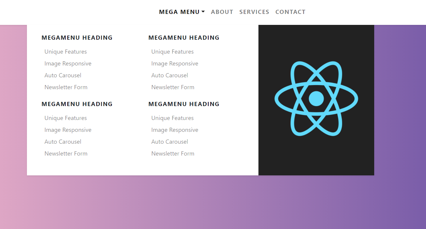
  • Reactjs Bootstrap 4 Mega Menus Working Demo

    Reactjs Bootstrap 4 Mega Menus Working Demo

    Hello friends, welcome back to my blog. Today in this blog post, I am going to show you, Reactjs Bootstrap 4 Mega Menus Working Demo.


    React js Mega Menu
    Reactjs Bootstrap 4 Mega Menus Working Demo
    Reactjs Bootstrap Mega Menus

    For reactjs new comers, please check the below link:

    Reactjs Basic Tutorials


    Friends now I proceed onwards and here is the working code snippet for Reactjs Bootstrap 4 Mega Menus Working Demo and please use this carefully to avoid the mistakes:

    1. Firstly, we need fresh reactjs setup and for that, we need to run below commands into out terminal and also we should have latest node version installed on our system:

    npx create-react-app reacttemplate
    
    cd reacttemplate
    
    npm start


    2. Now we need to run below commands into our project terminal to get bootstrap and related modules into our reactjs application:

    npm install bootstrap --save
    
    npm install jquery --save
    
    npm install popper.js
    
    npm start //For start project again


    3. Finally for the main output, we need to add below code into our reacttemplate/src/App.js file or if you have fresh setup then you can replace reacttemplate/src/App.js file code with below code:

    import React from "react";
    
    import './App.css'
    import 'bootstrap/dist/css/bootstrap.min.css';
    import 'bootstrap/dist/js/bootstrap.min.js';
    
    class App extends React.Component {
     
      render() {
        return (
          <div className="main_container">
           
           
           <nav class="navbar navbar-expand-lg navbar-light bg-white py-3 shadow-sm">
          <a href="#" class="navbar-brand font-weight-bold d-block d-lg-none">MegaMenu</a>
          <button type="button" data-toggle="collapse" data-target="#navbarContent" aria-controls="navbars" aria-expanded="false" aria-label="Toggle navigation" class="navbar-toggler">
                  <span class="navbar-toggler-icon"></span>
              </button>
          <div id="navbarContent" class="collapse navbar-collapse">
            <ul class="navbar-nav mx-auto">
            
              <li class="nav-item dropdown megamenu"><a id="megamneu" href="" data-toggle="dropdown" aria-haspopup="true" aria-expanded="false" class="nav-link dropdown-toggle font-weight-bold text-uppercase">Mega Menu</a>
                <div aria-labelledby="megamneu" class="dropdown-menu border-0 p-0 m-0">
                  <div class="container">
                    <div class="row bg-white rounded-0 m-0 shadow-sm">
                      <div class="col-lg-7 col-xl-8">
                        <div class="p-4">
                          <div class="row">
                            <div class="col-lg-6 mb-4">
                              <h6 class="font-weight-bold text-uppercase">MegaMenu heading</h6>
                              <ul class="list-unstyled">
                                <li class="nav-item"><a href="" class="nav-link text-small pb-0">Unique Features</a></li>
                                <li class="nav-item"><a href="" class="nav-link text-small pb-0 ">Image Responsive</a></li>
                                <li class="nav-item"><a href="" class="nav-link text-small pb-0 ">Auto Carousel</a></li>
                                <li class="nav-item"><a href="" class="nav-link text-small pb-0 ">Newsletter Form</a></li>
                              </ul>
                            </div>
                            <div class="col-lg-6 mb-4">
                              <h6 class="font-weight-bold text-uppercase">MegaMenu heading</h6>
                              <ul class="list-unstyled">
                                <li class="nav-item"><a href="" class="nav-link text-small pb-0 ">Unique Features</a></li>
                                <li class="nav-item"><a href="" class="nav-link text-small pb-0 ">Image Responsive</a></li>
                                <li class="nav-item"><a href="" class="nav-link text-small pb-0 ">Auto Carousel</a></li>
                                <li class="nav-item"><a href="" class="nav-link text-small pb-0 ">Newsletter Form</a></li>
                              </ul>
                            </div>
                          </div>
                        </div>
                      </div>
                      <div class="col-lg-5 col-xl-4 px-0 d-none d-lg-block MegaMenuDiv"></div>
                    </div>
                  </div>
                </div>
              </li>
              <li class="nav-item"><a href="" class="nav-link font-weight-bold text-uppercase">About</a></li>
              <li class="nav-item"><a href="" class="nav-link font-weight-bold text-uppercase">Services</a></li>
              <li class="nav-item"><a href="" class="nav-link font-weight-bold text-uppercase">Contact</a></li>
            </ul>
          </div>
        </nav>


    <section class="py-5 text-white">
      <div class="container py-4">
        <div class="row">
          <div class="col-lg-8 mx-auto text-center">
            <h1 class="display-4">Reactjs Bootstrap 4 Megamenu</h1>
            <p class="lead mb-0">A very simple way to create Reactjs Bootstrap 4 megamneu. </p>
            <p class="lead">Snippet by <a href="https://therichpost.com/" class='text-white'><u>Jasss</u></a>. </p>
          </div>
        </div>
        
      </div>
    </section>
    
          </div>
        );
      }
    }
    export default App;


    4. Now friends, we need to below code into our reacttemplate/src/App.css file for some custom styling:

    /*
    *
    * ==========================================
    * CUSTOM UTIL CLASSES
    * ==========================================
    *
    */
    
    .megamenu {
      position: static!important;
    }
    
    .megamenu .dropdown-menu {
      background: none;
      border: none;
      width: 100%;
    }
    
    /*
    *
    * ==========================================
    * FOR DEMO PURPOSES
    * ==========================================
    *
    */
    
    body {
      background: #eaafc8!important;
      background: -webkit-linear-gradient(to right, #eaafc8, #654ea3)!important;
      background: linear-gradient(to right, #eaafc8, #654ea3)!important;
      min-height: 100vh;
    }
    
    code {
      color: #745eb1;
      background: #fff;
      padding: 0.1rem 0.2rem;
      border-radius: 0.2rem;
    }
    
    .text-uppercase {
      letter-spacing: 0.08em;
    }
    .MegaMenuDiv{
      background: center center 
      url(https://therichpost.com/wp-content/uploads/2020/07/Create-your-first-page-in-reactjs-with-bootstrap.png)no-repeat; 
      background-size: cover;
    }


    Now we are done friends. If you have any kind of query or suggestion or any requirement then feel free to comment below.

    Note: Friends, I just tell the basic setup and things, you can change the code according to your requirements.

    I will appreciate that if you will tell your views for this post. Nothing matters if your views will be good or bad.

    Jassa

    Thanks

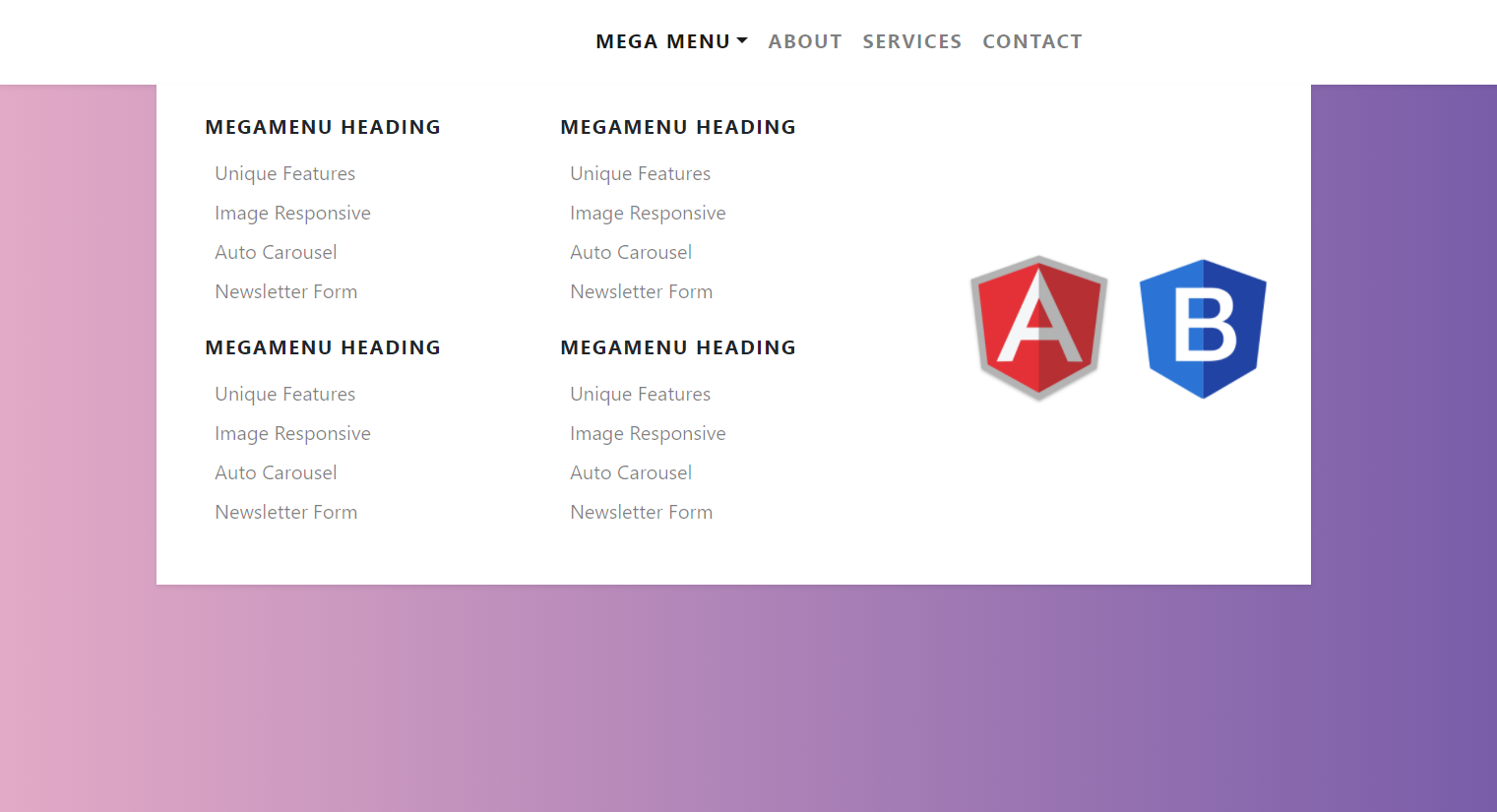
  • Angular 11 Bootstrap 4 Mega Menus Working Demo

    Angular 11 Bootstrap 4 Mega Menus Working Demo

    Hello friends, welcome back to my blog. Today in this blog post, I am going to tell you, Angular 11 Bootstrap 4 Mega Menus Working Demo.


    Angular Bootstrap Mega Menu
    Angular+Bootstrap Mega Menu
    Angular 11 Bootstrap 4 Mega Menus Working Demo
    Angular Bootstrap Mega Menu

    Angular 11 came and if you are new then you must check below two links:

    1. Angular11 Basic Tutorials

    Friends now I proceed onwards and here is the working code snippet for Angular 11 Bootstrap 4 Mega Menus Working Demo and please use carefully this to avoid the mistakes:

    1. Firstly friends we need fresh angular 11 setup and for this we need to run below commands but if you already have angular 11 setup then you can avoid below commands. Secondly we should also have latest node version installed on our system:

    npm install -g @angular/cli 
    
    ng new angularbootstrap //Create new Angular Project
    
    cd angularbootstrap // Go inside the Angular Project Folder
    
    ng serve --open // Run and Open the Angular Project
    
    http://localhost:4200/ // Working Angular Project Url


    2. Now friends, here we need to run below commands into our project terminal to install bootstrap and jquery modules into our angular application:

    npm install --save bootstrap
    
    npm i jquery --save


    3. Now friends, here we need to add below  into our angular.json file:

    ...
     "styles": [
                  ...
                  "node_modules/bootstrap/dist/css/bootstrap.min.css"
                 
                  
                ],
                "scripts": [
                  "node_modules/jquery/dist/jquery.min.js",
                  "node_modules/bootstrap/dist/js/bootstrap.min.js"
                ]
    ...


    4. Now friends we just need to add below code into src/app/app.component.html file to get final out on the web browser:

    <nav class="navbar navbar-expand-lg navbar-light bg-white py-3 shadow-sm">
      <a href="#" class="navbar-brand font-weight-bold d-block d-lg-none">MegaMenu</a>
      <button type="button" data-toggle="collapse" data-target="#navbarContent" aria-controls="navbars" aria-expanded="false" aria-label="Toggle navigation" class="navbar-toggler">
              <span class="navbar-toggler-icon"></span>
          </button>
      <div id="navbarContent" class="collapse navbar-collapse">
        <ul class="navbar-nav mx-auto">
          <!-- Megamenu-->
          <li class="nav-item dropdown megamenu"><a id="megamneu" href="" data-toggle="dropdown" aria-haspopup="true" aria-expanded="false" class="nav-link dropdown-toggle font-weight-bold text-uppercase">Mega Menu</a>
            <div aria-labelledby="megamneu" class="dropdown-menu border-0 p-0 m-0">
              <div class="container">
                <div class="row bg-white rounded-0 m-0 shadow-sm">
                  <div class="col-lg-7 col-xl-8">
                    <div class="p-4">
                      <div class="row">
                        <div class="col-lg-6 mb-4">
                          <h6 class="font-weight-bold text-uppercase">MegaMenu heading</h6>
                          <ul class="list-unstyled">
                            <li class="nav-item"><a href="" class="nav-link text-small pb-0">Unique Features</a></li>
                            <li class="nav-item"><a href="" class="nav-link text-small pb-0 ">Image Responsive</a></li>
                            <li class="nav-item"><a href="" class="nav-link text-small pb-0 ">Auto Carousel</a></li>
                            <li class="nav-item"><a href="" class="nav-link text-small pb-0 ">Newsletter Form</a></li>
                          </ul>
                        </div>
                        <div class="col-lg-6 mb-4">
                          <h6 class="font-weight-bold text-uppercase">MegaMenu heading</h6>
                          <ul class="list-unstyled">
                            <li class="nav-item"><a href="" class="nav-link text-small pb-0 ">Unique Features</a></li>
                            <li class="nav-item"><a href="" class="nav-link text-small pb-0 ">Image Responsive</a></li>
                            <li class="nav-item"><a href="" class="nav-link text-small pb-0 ">Auto Carousel</a></li>
                            <li class="nav-item"><a href="" class="nav-link text-small pb-0 ">Newsletter Form</a></li>
                          </ul>
                        </div>
                        <div class="col-lg-6 mb-4">
                          <h6 class="font-weight-bold text-uppercase">MegaMenu heading</h6>
                          <ul class="list-unstyled">
                            <li class="nav-item"><a href="" class="nav-link text-small pb-0 ">Unique Features</a></li>
                            <li class="nav-item"><a href="" class="nav-link text-small pb-0 ">Image Responsive</a></li>
                            <li class="nav-item"><a href="" class="nav-link text-small pb-0 ">Auto Carousel</a></li>
                            <li class="nav-item"><a href="" class="nav-link text-small pb-0 ">Newsletter Form</a></li>
                          </ul>
                        </div>
                        <div class="col-lg-6 mb-4">
                          <h6 class="font-weight-bold text-uppercase">MegaMenu heading</h6>
                          <ul class="list-unstyled">
                            <li class="nav-item"><a href="" class="nav-link text-small pb-0 ">Unique Features</a></li>
                            <li class="nav-item"><a href="" class="nav-link text-small pb-0 ">Image Responsive</a></li>
                            <li class="nav-item"><a href="" class="nav-link text-small pb-0 ">Auto Carousel</a></li>
                            <li class="nav-item"><a href="" class="nav-link text-small pb-0 ">Newsletter Form</a></li>
                          </ul>
                        </div>
                      </div>
                    </div>
                  </div>
                  <div class="col-lg-5 col-xl-4 px-0 d-none d-lg-block" style="background: center center url(https://therichpost.com/wp-content/uploads/2020/07/angular-bootstrap.jpg)no-repeat; background-size: contain;"></div>
                </div>
              </div>
            </div>
          </li>
          <li class="nav-item"><a href="" class="nav-link font-weight-bold text-uppercase">About</a></li>
          <li class="nav-item"><a href="" class="nav-link font-weight-bold text-uppercase">Services</a></li>
          <li class="nav-item"><a href="" class="nav-link font-weight-bold text-uppercase">Contact</a></li>
        </ul>
      </div>
    </nav>
    
    
    <!-- For demo purpose -->
    <section class="py-5 text-white">
      <div class="container py-4">
        <div class="row">
          <div class="col-lg-8 mx-auto text-center">
            <h1 class="display-4">Angular 11 Bootstrap 4 Megamenu</h1>
            <p class="lead mb-0">A very simple way to create Angular 11 Bootstrap 4 megamneu. </p>
            <p class="lead">Snippet by <a href="https://therichpost.com/" class='text-white'><u>Jasss</u></a>. </p>
          </div>
        </div>
        
      </div>
    </section>
    <!-- End -->


    5. Now friends we just need to css code code into src/app/app.component.css file:

    /*
    *
    * ==========================================
    * CUSTOM UTIL CLASSES
    * ==========================================
    *
    */
    
    .megamenu {
        position: static;
      }
      
      .megamenu .dropdown-menu {
        background: none;
        border: none;
        width: 100%;
      }
      
      /*
      *
      * ==========================================
      * FOR DEMO PURPOSES
      * ==========================================
      *
      */


      code {
        color: #745eb1;
        background: #fff;
        padding: 0.1rem 0.2rem;
        border-radius: 0.2rem;
      }
      
      .text-uppercase {
        letter-spacing: 0.08em;
      }


    6. Now friends we just need to css code code into src/index.html file:

    ...
    <head>
     ...
      <style>
        body {
        background: #eaafc8!important;
        background: -webkit-linear-gradient(to right, #eaafc8, #654ea3)!important;
        background: linear-gradient(to right, #eaafc8, #654ea3)!important;
        min-height: 100vh;
      }
      </style>
    </head>
    ...


    Friends in the end must run ng serve command into your terminal to run the angular 11 project.

    Now we are done friends. If you have any kind of query, suggestion and new requirement then feel free to comment below.

    Note: Friends, In this post, I just tell the basic setup and things, you can change the code according to your requirements.

    I will appreciate that if you will tell your views for this post. Nothing matters if your views will be good or bad because with your views, I will make my next posts more good and helpful.

    Jassa

    Thanks