Year: 2021

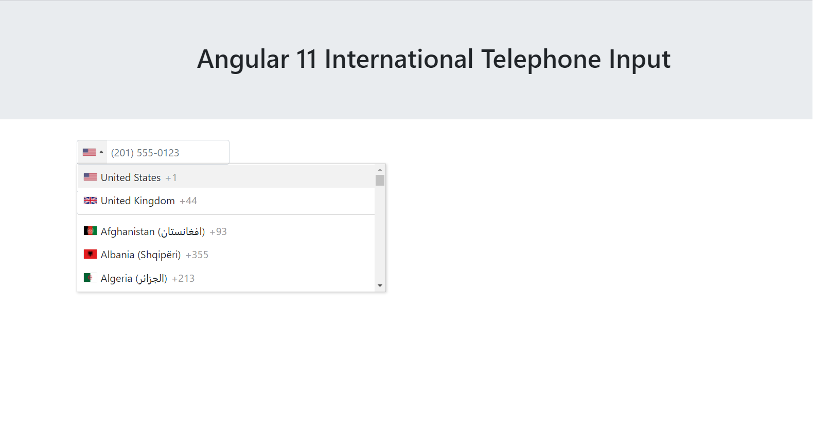
  • Angular 11 International Telephone Input

    Angular 11 International Telephone Input

    Hello friends, welcome back to my blog. Today in this blog post, I am going to tell you, Angular 11 International Telephone Input


    Angular 11 International Telephone Input
    Angular 11 International Telephone Input

    Angular 11 came and very soon Angular 12 will come and if you are new then you must check below two links:

    1. Angular11 Basic Tutorials

    Friends now I proceed onwards and here is the working code snippet and please use carefully this to avoid the mistakes:

    1. Firstly friends we need fresh angular 11 setup and for this we need to run below commands but if you already have angular 11 setup then you can avoid below commands. Secondly we should also have latest node version installed on our system:

    npm install -g @angular/cli 
    
    ng new angularsite //Create new Angular Project
    
    cd angularsite // Go inside the Angular Project Folder
    
    ng serve --open // Run and Open the Angular Project
    
    http://localhost:4200/ // Working Angular Project Url

    2. Now friends, here we need to run below commands into our project terminal to install bootstrap and input tel modules into our angular application:

    npm i bootstrap
    
    npm install ng2-tel-input intl-tel-input --save

    3. Now friends, here we need to add below  into our angular.json file:

    "styles": [
                  ...
                  "node_modules/bootstrap/dist/css/bootstrap.min.css",
                 
                  "node_modules/intl-tel-input/build/css/intlTelInput.css"
                ],
                "scripts": [
                 ...
                  "node_modules/intl-tel-input/build/js/intlTelInput.min.js"
                ]

    4. Now friends we just need to add below code into src/app/app.component.html file to get final out on the web browser:

    <h1>Therichpost.com</h1>
      
    <form>
      <div class="form-group">
        <input type="tel" class="form-control" ng2TelInput>
      </div>
      <br>
      <div class="form-group">
        <input type="tel" class="form-control" ng2TelInput>
      </div>
    </form>
    

    5. Now friends we just need to add below code into src/app/app.module.ts file:

    ...
    import {Ng2TelInputModule} from 'ng2-tel-input';
    
    @NgModule({
    ...
      imports: [
       ...
        Ng2TelInputModule
      ],
      ...
    })
    

    Friends in the end must run ng serve command into your terminal to run the angular 11 project.

    If you want to get country details and other stuff then please follow below post as well:

    Now we are done friends. If you have any kind of query, suggestion and new requirement then feel free to comment below.

    Note: Friends, In this post, I just tell the basic setup and things, you can change the code according to your requirements.

    I will appreciate that if you will tell your views for this post. Nothing matters if your views will be good or bad because with your views, I will make my next posts more good and helpful.

    Jassa

    Thanks

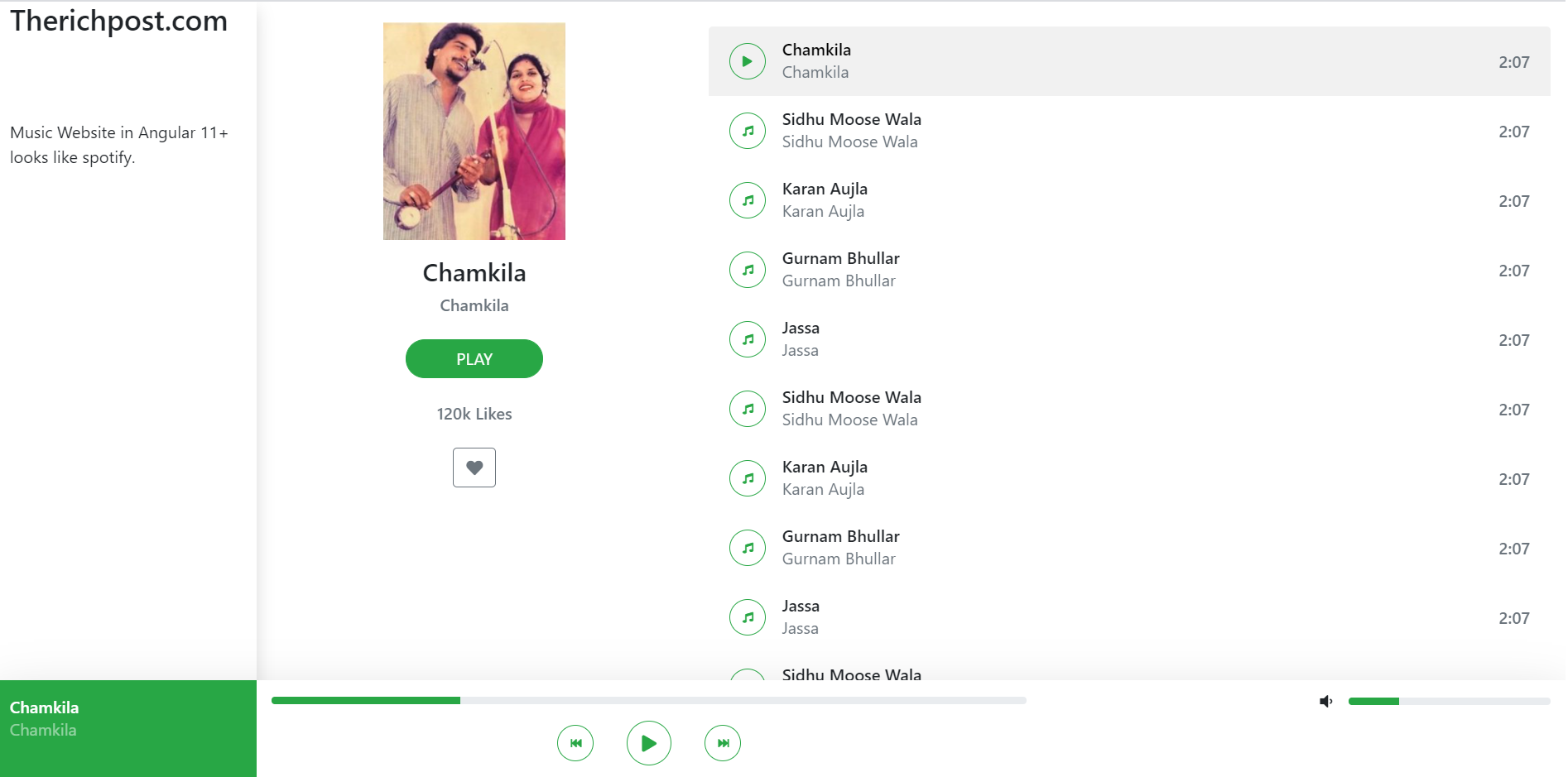
  • How to make music website in angular 11?

    How to make music website in angular 11?

    Hello friends, welcome back to my blog. Today in this blog post, I am going to tell you, How to make music website in angular 11?

    Website building in Angular 11 is very easy. We just need to follow small steps and we are done. No need to follow paid tutorials or paid courses. I have share many posts regarding website building angular.

    How to make music website in angular 11?
    Music website in Angular 11

    Angular 11 came and very soon Angular 12 will come and if you are new then you must check below two links:

    1. Angular11 Basic Tutorials

    Friends now I proceed onwards and here is the working code snippet and please use carefully this to avoid the mistakes:

    1. Firstly friends we need fresh angular 11 setup and for this we need to run below commands but if you already have angular 11 setup then you can avoid below commands. Secondly we should also have latest node version installed on our system:

    npm install -g @angular/cli 
    
    ng new angularsite //Create new Angular Project
    
    cd angularsite // Go inside the Angular Project Folder
    
    ng serve --open // Run and Open the Angular Project
    
    http://localhost:4200/ // Working Angular Project Url

    2. Now friends, here we need to run below commands into our project terminal to install bootstrap and jquery modules into our angular application:

    npm i bootstrap

    3. Now friends, here we need to add below  into our angular.json file:

    "styles": [
                ...
                "node_modules/bootstrap/dist/css/bootstrap.min.css",
                
              ]
           

    4. Now friends we just need to add below code into src/app/app.component.html file to get final out on the web browser:

    <div class="container-fluid">
        <div class="row">
            <div class="col-lg-2 offset-fixed shadow">
                <h3>Therichpost.com</h3><br><br><br>
               <p>Music Website in Angular 11+ looks like spotify.</p>
                
            </div>
            <div class="col-lg-10 offset-lg-2">
                <div class="row">
                    <div class="col-lg-4 offset-left">
                        <div class="card bg-transparent border-0 offset-left">
                            <div class="card-body text-center">
                                <img src="https://therichpost.com/wp-content/uploads/2021/04/Amar-Singh-Chamkila-and-Amarjot-on-mike.jpg" class="w-50" alt="">
                                <div>
                                    <div class="mb-4 mt-3">
                                        <div class="h4">Chamkila</div>
                                        <div class="h6 text-muted"> Chamkila</div>
                                    </div>
                                    <button type="button"
                                        class="btn btn-success rounded-pill px-5 text-uppercase">Play</button>
                                    <div class="h6 text-muted my-4">
                                        120k Likes
                                    </div>
                                    <button type="button" class="btn btn-outline-secondary">
                                        <i class="fas fa-heart    "></i>
                                    </button>
                                </div>
                            </div>
                        </div>
                    </div>
                    <div class="col-lg-8">
                        <ul class="list-group mt-4 mb-8">
                            <li class="list-group-item d-flex justify-content-between align-items-center active">
                                <div class="d-flex align-items-center">
                                    <button type="button" class="btn btn-outline-success rounded-circle btn-circle-sm">
                                        <i class="fas fa-play"></i>
                                    </button>
                                    <div class="ml-3">
                                        <div class="h6 m-0">Chamkila</div>
                                        <div class="h7 text-muted"> Chamkila</div>
                                    </div>
                                </div>
                                <div class="h6 m-0 text-muted">2:07</div>
                            </li>
                            <li class="list-group-item d-flex justify-content-between align-items-center">
                                <div class="d-flex align-items-center">
                                    <button type="button" class="btn btn-outline-success rounded-circle btn-circle-sm">
                                        <i class="fas fa-music"></i>
                                    </button>
                                    <div class="ml-3">
                                        <div class="h6 m-0">Sidhu Moose Wala</div>
                                        <div class="h7 text-muted"> Sidhu Moose Wala</div>
                                    </div>
                                </div>
                                <div class="h6 m-0 text-muted">2:07</div>
                            </li>
                            <li class="list-group-item d-flex justify-content-between align-items-center">
                                <div class="d-flex align-items-center">
                                    <button type="button" class="btn btn-outline-success rounded-circle btn-circle-sm">
                                        <i class="fas fa-music"></i>
                                    </button>
                                    <div class="ml-3">
                                        <div class="h6 m-0">Karan Aujla</div>
                                        <div class="h7 text-muted"> Karan Aujla</div>
                                    </div>
                                </div>
                                <div class="h6 m-0 text-muted">2:07</div>
                            </li>
                            <li class="list-group-item d-flex justify-content-between align-items-center">
                                <div class="d-flex align-items-center">
                                    <button type="button" class="btn btn-outline-success rounded-circle btn-circle-sm">
                                        <i class="fas fa-music"></i>
                                    </button>
                                    <div class="ml-3">
                                        <div class="h6 m-0">Gurnam Bhullar</div>
                                        <div class="h7 text-muted"> Gurnam Bhullar</div>
                                    </div>
                                </div>
                                <div class="h6 m-0 text-muted">2:07</div>
                            </li>
                            <li class="list-group-item d-flex justify-content-between align-items-center">
                                <div class="d-flex align-items-center">
                                    <button type="button" class="btn btn-outline-success rounded-circle btn-circle-sm">
                                        <i class="fas fa-music"></i>
                                    </button>
                                    <div class="ml-3">
                                        <div class="h6 m-0">Jassa</div>
                                        <div class="h7 text-muted"> Jassa</div>
                                    </div>
                                </div>
                                <div class="h6 m-0 text-muted">2:07</div>
                            </li>
                            <li class="list-group-item d-flex justify-content-between align-items-center">
                                <div class="d-flex align-items-center">
                                    <button type="button" class="btn btn-outline-success rounded-circle btn-circle-sm">
                                        <i class="fas fa-music"></i>
                                    </button>
                                    <div class="ml-3">
                                        <div class="h6 m-0">Sidhu Moose Wala</div>
                                        <div class="h7 text-muted"> Sidhu Moose Wala</div>
                                    </div>
                                </div>
                                <div class="h6 m-0 text-muted">2:07</div>
                            </li>
                            <li class="list-group-item d-flex justify-content-between align-items-center">
                                <div class="d-flex align-items-center">
                                    <button type="button" class="btn btn-outline-success rounded-circle btn-circle-sm">
                                        <i class="fas fa-music"></i>
                                    </button>
                                    <div class="ml-3">
                                        <div class="h6 m-0">Karan Aujla</div>
                                        <div class="h7 text-muted"> Karan Aujla</div>
                                    </div>
                                </div>
                                <div class="h6 m-0 text-muted">2:07</div>
                            </li>
                            <li class="list-group-item d-flex justify-content-between align-items-center">
                                <div class="d-flex align-items-center">
                                    <button type="button" class="btn btn-outline-success rounded-circle btn-circle-sm">
                                        <i class="fas fa-music"></i>
                                    </button>
                                    <div class="ml-3">
                                        <div class="h6 m-0">Gurnam Bhullar</div>
                                        <div class="h7 text-muted"> Gurnam Bhullar</div>
                                    </div>
                                </div>
                                <div class="h6 m-0 text-muted">2:07</div>
                            </li>
                            <li class="list-group-item d-flex justify-content-between align-items-center">
                                <div class="d-flex align-items-center">
                                    <button type="button" class="btn btn-outline-success rounded-circle btn-circle-sm">
                                        <i class="fas fa-music"></i>
                                    </button>
                                    <div class="ml-3">
                                        <div class="h6 m-0">Jassa</div>
                                        <div class="h7 text-muted"> Jassa</div>
                                    </div>
                                </div>
                                <div class="h6 m-0 text-muted">2:07</div>
                            </li>
                        </ul>
                    </div>
                </div>
            </div>
        </div>
    </div>
    
    <div class="container-fluid fixed-bottom bg-white shadow-lg">
        <div class="row">
            <div class="col-lg-2 bg-success py-3">
                <div class="h6 m-0 text-white">Chamkila</div>
                <div class="h7 text-white-50"> Chamkila</div>
            </div>
            <div class="col-lg-6">
                <div class="py-3">
                    <div class="progress mb-3" style="height: 7px;">
                        <div class="progress-bar bg-success" role="progressbar" style="width: 25%;" aria-valuenow="25"
                            aria-valuemin="0" aria-valuemax="100"></div>
                    </div>
                    <div class=" d-flex align-items-center justify-content-center">
                        <button type="button" class="btn btn-outline-success rounded-circle mx-3 btn-circle-sm">
                            <i class="fas fa-fast-backward"></i>
                        </button>
                        <button type="button" class="btn btn-outline-success rounded-circle mx-3 btn-circle-md">
                            <i class="fas fa-play"></i>
                        </button>
                        <button type="button" class="btn btn-outline-success rounded-circle mx-3 btn-circle-sm">
                            <i class="fas fa-fast-forward"></i>
                        </button>
                    </div>
                </div>
            </div>
            <div class="col-lg-2 ml-auto">
                <div class="d-flex align-items-center my-2">
                    <div class="mr-3">
                        <i class="fas fa-volume-down"></i>
                    </div>
                    <div class="progress w-100" style="height: 7px;">
                        <div class="progress-bar bg-success" role="progressbar" style="width: 25%;" aria-valuenow="25"
                            aria-valuemin="0" aria-valuemax="100"></div>
                    </div>
                </div>
            </div>
        </div>
    </div>

    5. Now friends we just need to add css code into src/app/app.component.css file:

    @import url("https://cdnjs.cloudflare.com/ajax/libs/font-awesome/5.11.2/css/all.min.css");
    .offset-fixed {
        position: fixed;
        left: 0;
        top: 0;
        bottom: 0;
    }
    
    .btn-circle-md {
        height: 2.7rem;
        width: 2.7rem
    }
    
    .btn-circle-sm {
        height: 2.2rem;
        width: 2.2rem;
        font-size: 0.67rem
    }
    
    .list-group-item {
        background-color: transparent !important;
        border: none !important
    }
    
    .list-group-item.active {
        color: #000 !important;
        background-color: #f1f1f1 !important;
    }
    
    .mb-8 {
        margin-bottom: 6rem !important
    }
    
    .offset-left {
        position: sticky;
        left: 0;
        top: 0;
        bottom: 0;
    }

    Friends in the end must run ng serve command into your terminal to run the angular 11 project.

    Now we are done friends. If you have any kind of query, suggestion and new requirement then feel free to comment below.

    Note: Friends, In this post, I just tell the basic setup and things, you can change the code according to your requirements.

    I will appreciate that if you will tell your views for this post. Nothing matters if your views will be good or bad because with your views, I will make my next posts more good and helpful.

    Jassa

    Thanks

  • How to make website in reactjs?

    How to make website in reactjs?

    Hello friends, welcome back to my blog. Today in this blog post, I am going to show you, How to make website in reactjs?

    Guys in this post we will cover below things:

    1. Create website in React Js.
    2. Using Animation in React website with wow js.
    3. Responsive website in React.
    4. Create website in Reactjs with very few steps.

    To check the website working, please watch the below video that I have made for my angular 11 tutorials:


    How to make website in reactjs?
    Make website in React Js

    For reactjs new comers, please check the below link:

    Reactjs Basic Tutorials


    Friends now I proceed onwards and here is the working code snippet for How to make website in reactjs? and please use this carefully to avoid the mistakes:

    1. Firstly, we need fresh reactjs setup and for that, we need to run below commands into out terminal and also we should have latest node version installed on our system:

    npx create-react-app reacttemplate
    
    cd reacttemplate
    
    npm start

    2. Now we need to run below commands into our project terminal to get bootstrap and related modules into our reactjs application:

    npm install bootstrap --save
    
    npm install jquery --save
    
    npm install wowjs
    
    npm start //For start project again

    3. Finally for the main output, we need to add below code into our reacttemplate/src/App.js file or if you have fresh setup then you can replace reacttemplate/src/App.js file code with below code:

    import React from "react";
    
    import './App.css'
    import 'bootstrap/dist/css/bootstrap.min.css';
    import 'bootstrap/dist/js/bootstrap.min.js';
    
    //Calling WOWjs
    import WOW from "wowjs";
    
    class App extends React.Component {
        // Defining WOW 
            componentDidMount() {
               
                    const wow = new WOW.WOW({
                      live: false,
                    })
                    wow.init()
                  
            }
     
      render() {
        return (
          <div className="main_container">
          <header id="home">
            <div class="overlay"></div>
            <nav class="navbar fixed-top navbar-expand-lg navbar-dark">
                <div class="container-fluid">
                    <a class="navbar-brand" href="#">
                        <h3 class="my-heading ">Therichpost</h3>
                    </a>
                    <button class="navbar-toggler navbar-toggler-right" type="button" data-toggle="collapse" data-target="#navbarResponsive" aria-controls="navbarResponsive" aria-expanded="false" aria-label="Toggle navigation">
                        <span class="fa fa-bars mfa-white"></span>
                    </button>
                    <div class="collapse navbar-collapse" id="navbarResponsive">
                        <ul class="navbar-nav ml-auto">
                <li class="nav-item">
                                <a class="nav-link" href="#home">HOME</a>
                            </li>
                            <li class="nav-item">
                                <a class="nav-link" href="#overview">OVERVIEW</a>
                            </li>
                            <li class="nav-item">
                                <a class="nav-link" href="#team"> TEAM</a>
                            </li>
                            <li class="nav-item">
                                <a class="nav-link" href="#testimonials">TESTIMONIALS</a>
                            </li>
                            <li class="nav-item">
                                <a class="nav-link" href="#blog">BLOG</a>
                            </li>
                            <li class="nav-item">
                                <a class="nav-link" href="#contact">CONTACT</a>
                            </li>
    
                        </ul>
    
                    </div>
    
                </div>
            </nav>
    
            <div class="tophead" >
                <div class="container-fluid">
                    <div class="row">
                        <div class="col-md-7 ">
                            <h1 class="title-main wow fadeInLeft" data-wow-duration="1.5s">Therichpost CREATIVE PAGE</h1>
                            <h3 class="subtitle-main wow fadeInUp" data-wow-duration="1.1s">Lorem ipsum dolor sit amet consectetur adipiscing elit proin leo leo ornare nec vulputate tempus velit nam id purus tellus hendrerit mi dapibus.</h3>
                <div class="top-btn-block wow fadeInUp" data-wow-duration="2.5s">
                    <a href="#" class="btn-explore ">Explore</a>
                    <a href="#" class="btn-account ">Create Account</a>
                </div>
                        </div>
                    </div>
                </div>
            </div>
            <div class="sesgoabajo"></div>
            
            </header>
            <main>
            <section class="overview-wrap" id="overview">
                <div class="container">
                    <div class="contenedor">
                        <h2 class="title-overview wow fadeInUp">Overview</h2>
                            <div class="hr"></div>
                        <p class="subtitle-overview wow fadeInUp">Lorem ipsum dolor sit amet consectetur adipiscing elit proin leo leo ornare nec vulputate tempus velit nam id purus tellus hendrerit mi dapibus</p>
                        <div class="row">
                            <div class="col-md-6 col-lg-3 wow bounceInUp" data-wow-duration="1.4s">
                                <div class="overview-box mx-auto">
                                    <div class="features-icons-icon d-flex">
                                        <i class="fa fa-html5 fa-5x html5 m-auto"></i>
                                    </div>
                                    <h5>Html 5</h5>
                                    <p class=" mb-0">Lorem ipsum dolor sit amet consectetur adipiscing elit proin leo ornare!</p>
                                </div>
                            </div>
                            <div class="col-md-6 col-lg-3 wow bounceInUp" data-wow-duration="1.4s">
                                <div class="overview-box mx-auto">
                                    <div class="features-icons-icon d-flex">
                                        <i class="fa fa-css3 fa-5x css3 m-auto"></i>
                                    </div>
                                    <h5>CSS 3</h5>
                                    <p class=" mb-0">Lorem ipsum dolor sit amet consectetur adipiscing elit proin leo ornare!</p>
                                </div>
                            </div>
                            <div class="col-md-6 col-lg-3 wow bounceInUp" data-wow-duration="1.4s">
                                <div class="overview-box mx-auto">
                                    <div class="features-icons-icon d-flex">
                                        <i class="fa fa-android fa-5x android m-auto"></i>
                                    </div>
                                    <h5>Android</h5>
                                    <p class=" mb-0">Lorem ipsum dolor sit amet consectetur adipiscing elit proin leo ornare!</p>
                                </div>
                            </div>
                            <div class="col-md-6 col-lg-3 wow bounceInUp" data-wow-duration="1.4s">
                                <div class="overview-box mx-auto">
                                    <div class="features-icons-icon d-flex">
                                        <i class="fa fa-drupal fa-5x drupal m-auto"></i>
                                    </div>
                                    <h5>Drupal</h5>
                                    <p class=" mb-0">Lorem ipsum dolor sit amet consectetur adipiscing elit proin leo ornare!</p>
                                </div>
                            </div>
                        </div>
    
                        
                    </div>
                </div>
            </section>
            <section class="galeria">
                <div class="sesgoarriba"></div>
                <div class="imagenes">
                    
            <div class="enmica">
                        <h2>Therichpost</h2>
                        <div></div>
                        <h5>"Web design and web development this are the things we enjoy doing daily"</h5>  
                    </div>
                </div>
                
                <div class="sesgoabajo"></div>
            </section>
    
           
            <section class="our-team" id="team">
                <div class="container">
                    <h2 class="title-our-team wow fadeInUp">Our Team</h2>
                    <div class="hr"></div>
                    <p class="subtitle-our-team wow fadeInUp">Lorem ipsum dolor sit amet consectetur adipiscing elit proin leo leo ornare nec vulputate tempus velit nam id purus tellus hendrerit mi dapibus</p>
    
                    <ul class="row">
                        <li class="col-12 col-md-6 col-lg-3 wow fadeInLeft" data-wow-duration="1.4s">
                            <div class="mycard-block equal-hight">
                                <figure><img src="https://secure.gravatar.com/avatar/d09eaad01aea86c51b4f892b4f8abf6f?s=100&d=wavatar&r=g" class="img-fluid" alt="" /></figure>
                                <h3><a href="#">Lorem Ipsum</a></h3>
                
                                <p>Lorem ipsum dolor sit amet consectetur adipiscing elit.</p>
                                <ul class="follow-us clearfix">
                                    <li><a href="#" class="btn btn-circle my-social-btn fb"><i class="fa fa-facebook " ></i></a></li>
                                    <li><a href="#" class="btn btn-circle my-social-btn twitter"><i class="fa fa-twitter " ></i></a></li>
                                    <li><a href="#" class="btn btn-circle my-social-btn google"><i class="fa fa-linkedin " ></i></a></li>
                                </ul>
                            </div>
                        </li>
                        <li class="col-12 col-md-6 col-lg-3 wow fadeInLeft" data-wow-duration="1.4s">
                            <div class="mycard-block equal-hight">
                                <figure><img src="https://secure.gravatar.com/avatar/d09eaad01aea86c51b4f892b4f8abf6f?s=100&d=wavatar&r=g" class="img-fluid" alt="" /></figure>
                                <h3><a href="#">Lorem Ipsum</a></h3>
                                <p>Lorem ipsum dolor sit amet consectetur adipiscing elit.</p>
                                <ul class="follow-us clearfix">
                                    <li><a href="#" class="btn btn-circle my-social-btn fb"><i class="fa fa-facebook " ></i></a></li>
                                    <li><a href="#" class="btn btn-circle my-social-btn twitter"><i class="fa fa-twitter " ></i></a></li>
                                    <li><a href="#" class="btn btn-circle my-social-btn google"><i class="fa fa-linkedin " ></i></a></li>
                                </ul>
                            </div>
                        </li>
                        <li class="col-12 col-md-6 col-lg-3 wow fadeInLeft" data-wow-duration="1.4s">
                            <div class="mycard-block equal-hight" >
                                <figure><img src="https://secure.gravatar.com/avatar/d09eaad01aea86c51b4f892b4f8abf6f?s=100&d=wavatar&r=g" class="img-fluid" alt="" /></figure>
                                <h3><a href="#">Lorem Ipsum</a></h3>
                                <p>Lorem ipsum dolor sit amet consectetur adipiscing elit.</p>
                                <ul class="follow-us clearfix">
                                    <li><a href="#" class="btn btn-circle my-social-btn fb"><i class="fa fa-facebook " ></i></a></li>
                                    <li><a href="#" class="btn btn-circle my-social-btn twitter"><i class="fa fa-twitter " ></i></a></li>
                                    <li><a href="#" class="btn btn-circle my-social-btn google"><i class="fa fa-linkedin " ></i></a></li>
                                </ul>
                            </div>
                        </li>
                    </ul>
                </div>
            </section>
    
            <section class="testimonials-wrap" id="testimonials">
                <div class="sesgoarriba"></div>
                <div class="container">
                    <div class="contenedor">
                        <h2 class="title-testimonials wow fadeInUp">Happy Clients</h2>
                        <div class="hr1"></div>
                        <h3 class="subtitle-testimonials wow fadeInUp">Lorem ipsum dolor sit amet consectetur adipiscing elit proin leo leo ornare nec vulputate tempus velit nam id purus tellus hendrerit mi dapibus</h3>


                        <div class="slide-one">
                            <div id="demo" class="carousel slide" data-ride="carousel">
    
                              
                                    <ul class="carousel-indicators">
                                    <li data-target="#demo" data-slide-to="0" class="active"></li>
                                    <li data-target="#demo" data-slide-to="1"></li>
                                    <li data-target="#demo" data-slide-to="2"></li>
                                    </ul>
    
                               
                                <div class="carousel-inner">
                                    <div class="carousel-item active ">
                                        <div class="banner-slide">
                                            <img src="https://secure.gravatar.com/avatar/d09eaad01aea86c51b4f892b4f8abf6f?s=100&d=wavatar&r=g" class="img-fluid" />
                                            <h5>Lorem Ipsum -</h5>
                                            <p>Lorem ipsum dolor sit amet consectetur adipiscing elit proin leo leo ornare nec vulputate tempus velit nam id purus tellus hendrerit mi dapibus.
                                            </p>
                                        </div>
                                    </div>
                                    <div class="carousel-item ">
                                        <div class="banner-slide">
                                            <img src="https://secure.gravatar.com/avatar/d09eaad01aea86c51b4f892b4f8abf6f?s=100&d=wavatar&r=g" class="img-fluid" />
                                            <h5>Lorem Ipsum -</h5>
                                            <p>Lorem ipsum dolor sit amet consectetur adipiscing elit proin leo leo ornare nec vulputate tempus velit nam id purus tellus hendrerit mi dapibus.
                                            </p>
                                        </div>
    
                                    </div>
                                    <div class="carousel-item">
                                        <div class="banner-slide">
                                            <img src="https://secure.gravatar.com/avatar/d09eaad01aea86c51b4f892b4f8abf6f?s=100&d=wavatar&r=g" class="img-fluid" />
                                            <h5>Lorem Ipsum -</h5>
                                            <p>Lorem ipsum dolor sit amet consectetur adipiscing elit proin leo leo ornare nec vulputate tempus velit nam id purus tellus hendrerit mi dapibus.</p>
                                        </div>
    
                                    </div>
                                </div>
    
                               
                                <a class="carousel-control-prev " href="#demo" data-slide="prev">
                                    <span class="carousel-control-prev-icon"></span>
                                </a>
                                <a class="carousel-control-next" href="#demo" data-slide="next">
                                    <span class="carousel-control-next-icon"></span>
                                </a>
    
                            </div>
                        </div>
    
                    </div>
                </div>
            <div class="sesgoabajo"></div>
            </section>
    
            
            <section class="blog-wrap" id="blog">            
                <div class="container-fluid">
                    <h2 class="title-blog wow fadeInUp">Latest Posts</h2>
                        <div class="hr"></div>
                        <p class="subtitle-blog wow fadeInUp">Lorem ipsum dolor sit amet consectetur adipiscing elit proin leo leo ornare nec vulputate tempus velit nam id purus tellus hendrerit mi dapibus</p>
                    <div class="row">
                        <div class="col-md-4 wow bounceInUp" data-wow-duration="1.4s">
                            <div class="card">
                                <figure class="text-center">
                                    <img src="https://therichpost.com/wp-content/uploads/2021/04/Angular-11-Reactjs-17-Vue-3-Free-Template-Download-364x225.png" class="img-fluid" />
                                </figure>
                                <div class="card-body">
                                    <h5 class="card-title">ANGULAR 11 | REACT 17 | VUE 3 FREE TEMPLATE DOWNLOAD</h5>
                                    <p class="card-text">Lorem ipsum dolor sit amet consectetur adipiscing elit proin leo leo ornare nec vulputate tempus.</p>
                                    <a href="https://therichpost.com/angular-11-react-17-vue-3-free-template-download/" class="">Read more</a>
                                    </div>
                            </div>
                        </div>
                        <div class="col-md-4 wow bounceInUp" data-wow-duration="1.4s">
                            <div class="card">
                                <figure class="text-center">
                                    <img src="https://therichpost.com/wp-content/uploads/2021/04/Angular-11-Sign-In-Form-Designs-364x225.png" class="img-fluid" />
                                </figure>
                                <div class="card-body">
                                    <h5 class="card-title">ANGULAR 11 SIGN IN FORM DESIGNS</h5>
                                    <p class="card-text">Lorem ipsum dolor sit amet consectetur adipiscing elit proin leo leo ornare nec vulputate tempus.</p>
                                    <a href="https://therichpost.com/angular-11-sign-in-form-designs/" class="">Read more</a>
                                    </div>
                            </div>
                        </div>
                        <div class="col-md-4 wow bounceInUp" data-wow-duration="1.4s">
                            <div class="card">
                                <figure class="text-center">
                                    <img src="https://therichpost.com/wp-content/uploads/2021/04/Angular-11-Crud-with-Firebase-Database-1-364x225.png" class="img-fluid" />
                                </figure>
                                <div class="card-body">
                                    <h5 class="card-title">ANGULAR 11 CRUD WITH FIREBASE DATABASE</h5>
                                    <p class="card-text">Lorem ipsum dolor sit amet consectetur adipiscing elit proin leo leo ornare nec vulputate tempus.</p>
                                    <a href="https://therichpost.com/angular-11-crud-with-firebase-database/" class="">Read more</a>
                                    </div>
                            </div>
                        </div>
                    </div>
                </div>
            </section>
    
            <section class="cta contact-wrap" id="contact">
    
                <div class="container">
                    <div class="row">
                        <div class="col-xl-9 mx-auto  wow zoomIn" data-wow-duration="1.1s">
                            <div class="cta-inner text-center rounded">
                                <h2 class="section-heading mb-4">
                        <span class="section-heading-upper">Get in Touch With Us</span>
                                </h2>
                                <div class="contactForm">
                                    <form>
                                        <div class="form-group">
                                            <input type="text" name="name" class="form-control" placeholder="Name" required="required" />
                                        </div>
                                        <div class="form-group">
                                            <input type="email" name="email" class="form-control" placeholder="Email" required="required" />
                                        </div>
                                        <div class="form-group">
                                            <input type="text" name="mobile" class="form-control" placeholder="Mobile" required="required" />
                                        </div>
                                        <div class="form-group">
                                            <textarea class="form-control" rows="4" cols="50" placeholder="Message"></textarea>
                                        </div>
                                        <div class="form-group">
                                            <div class="col-md-12">
                                                <input type="submit" name="submit" value="Send" class="btn-login" />
                                            </div>
                                        </div>
                                    </form>
                                </div>
                            </div>
                        </div>
                    </div>
                </div>
    
            </section>
            </main>


            <footer class="footer bg-dark">
            <div class="container">
                <div class="row">               
                    <div class="col-lg-12 text-center  my-auto wow slideInLeft">                   
                        <p class="mb-4 mb-lg-0">© Jassa Therichpost.com 2021. All Rights Reserved.</p>
                    </div>                
                </div>
            </div>
            </footer>


          </div>
        );
      }
    }
    export default App;


    4. Now friends, we need to below code into our reacttemplate/src/App.css file for some custom styling:

    @import url("https://cdn.jsdelivr.net/npm/animate.css@3.5.2/animate.min.css");
    @import url("https://maxcdn.bootstrapcdn.com/font-awesome/4.7.0/css/font-awesome.min.css");
    *{
        margin: 0;
        padding: 0;
      }
      html {
      scroll-behavior: smooth;
      }
      h1,h2,h3,h4,h5,h6{margin:0;}
      body {
        font-family: 'Roboto', sans-serif !important;
        font-size: 16px;
      }
      .container-fluid {
      width: 100%;
      max-width: 1180px;
      margin: 0 auto; 
      }
      .navbar-dark .navbar-nav .nav-link {
        color: #ffffff;
      }
      .navbar-shrink{
        padding-top: 0;
        padding-bottom: 0;
      transition: all ease .5s;
      }
      .navbar{
            padding: 1.5rem 1rem;
        background-color: #343A40;
        padding: 1.5rem 1rem;
      }
      .mybg-dark {
        background: #503eff  !important;
        box-shadow: 0 1px 3px 0 rgba(0, 0, 0, 0.2);
      }
      h3.my-heading {
        font-weight: bold;
      }
      li.nav-item {
        margin: 0 20px 0 0;
      }
      header{
        width: 100%;
        height: 100vh;
        
        position: relative;
        color: #ffffff;
        overflow: hidden;
        
      }
      .overlay{position:absolute;background-color:#212529;height:100%;width:100%;top:0;left:0;opacity:.3}
      header .tophead{
        margin-top: 150px;
      }
      header .title-main{
        font-size: 65px;
        font-weight: bold;
      text-transform: uppercase;
      }
      header .subtitle-main{
        font-size: 18px;
        font-weight: 300;
        margin-bottom: 35px;
        line-height: 1.5em;
      }
      header .btn-explore{
        display: inline-block;
        padding: 8px 20px;
        /*width: 128px;*/
        font-size: 14px;
        background: #474DFB;
        border: 1px solid #474DFB;
        color: #ffffff;
        text-align: center;
        text-transform: uppercase;
        text-decoration: none;
        border-radius: 3px;
      cursor:pointer;
        box-shadow: 0px 0px 10px 0px #00000059;
      }
      header .btn-account{
        display: inline-block;
        padding: 8px 20px;
       /* width: 128px;*/
        font-size: 14px;
        background: #ffffff;
        border: 1px solid #ffffff;
        color: #4f44ff;
        text-align: center;
        text-transform: uppercase;
        text-decoration: none;
        border-radius: 3px;
      cursor:pointer;
        box-shadow: 0px 0px 10px 0px #00000059;
      }
      .top-btn-block a{
      margin: 0 7px 0 0;
      }
      /***overview***/
      .overview-wrap .title-overview{
      text-align: center;
        color: #3dce8c;
        text-transform: uppercase;
        font-weight: bold;
        font-size: 36px;
        margin-bottom: 23px;
      }
      .overview-wrap .subtitle-overview{
        font-size: 16px;
        font-weight: 300;
        line-height: 27px;
        max-width: 660px;
      margin: 19px auto 103px;
        text-align: center;
      }
      .hr {
        position: relative;
        display: block;
        top: 46%;
        width: 40px;
        height: 5px;
        background: #474DFB;
        margin: auto;
      }
      /***abedesigns***/
      .sesgoabajo{
        z-index: 10;
        position: absolute;
        left: 0;
        bottom: 0;
        border-width: 0 0 35vh 100vw;
        border-style: solid;
        border-color: transparent transparent #ffffff transparent;
      }
      .sesgoarriba{
        z-index: 10;
         position: absolute;
        left: 0;
        top: 0;
        border-width: 35vh 100vw 0 0;
        border-style: solid;
        border-color: #ffffff transparent transparent  transparent;
      }
      .contenedor{
        overflow: hidden;
        padding: 100px 5px;
      }
      /***our team***/
      .our-team{position: relative;padding: 5rem 0;}
      .title-our-team{
        text-align: center;
        color: #3dce8c;
        text-transform: uppercase;
        font-weight: bold;
        font-size: 36px;
        margin-bottom: 23px;
      }
      .subtitle-our-team{
        font-size: 16px;
        font-weight: 300;
        line-height: 27px;
        max-width: 660px;
      margin: 19px auto 103px;
        text-align: center;
      }
      /***overview***/
      .overview-box{
        height: 340px;
        width: 100%;
        text-align: center;
        padding: 35px 20px;
      }
      .overview-box:hover{box-shadow: 0px 0px 10px rgba(0,0,0,0.3);transition: all ease 1s;}
      .overview-box h5{
        font-weight: 700;
        line-height: 30px;
        font-size: 18px;
        text-transform: uppercase;
        color: #606060;
      margin-bottom:20px;
      }
      .overview-box p{font-size: 14px;color:#666666;}
      .features-icons-icon {       
        vertical-align: middle;
        margin: 20px auto;
      }
      .features-icons-icon i {color:lightgrey;}
      .overview-box:hover .features-icons-icon i.html5 {
        color: #e54d26;
      transition: all ease 1s;
      }.overview-box:hover .features-icons-icon i.css3 {
        color: #379ad5;
      transition: all ease 1s;
      }.overview-box:hover .features-icons-icon i.android {
        color: #a4c739;
      transition: all ease 1s;
      }
      .overview-box:hover .features-icons-icon i.drupal {
        color: #0c76ab;
        transition: all ease 1s;
      }
      .overview-wrap .title-overview {
        text-align: center;
        color: #474DFB;
        text-transform: uppercase;
        font-weight: bold;
        font-size: 36px;
        margin-bottom: 23px;
      }
      /***gallery***/
      .galeria{
        width: 100%;
        height: 500px;
        overflow: hidden;
        display: flex;
        position: relative;
      }
      .imagenes{
        width: 100%;
        height: 500px;
        overflow: hidden;
        position: relative;
      }
      .imagenes img{
        width: 100%;
        height: 100%;
        object-fit: cover;
      }
      .enmica{
        position: absolute;
        top: 0;
        left: 0;
        width: 100%;
        height: 100%;
        background: rgba(52, 73, 94, 0.815);
        padding-bottom: 100px;
      }
      .enmica h2{
        position: relative;
        top: 45%;
        text-align: center;
        color: #ffffff;
      }
      .enmica h5 {
        text-align: center;
        color: #ffffff;
        top: 48%;
        position: relative;
      }
      .enmica div{
        position: relative;
        display: block;
        top: 46%;
        width: 40px;
        height: 5px;
        background: #ffffff;
        margin: auto;
      }
      /***testimonial***/
      .testimonials-wrap{
         background: linear-gradient(0deg, #08d4fd 0%, #503eff 100%);
         width: 100%;
        height: 100%;
        overflow: hidden;
        display: flex;
        position: relative;
        padding: 8rem 0 12rem;
      }
      .title-testimonials{
       text-align: center;
        color: #ffffff;
        text-transform: uppercase;
        font-weight: 700;
        font-size: 36px;
        margin-bottom: 23px;
      }
      .subtitle-testimonials{
        font-size: 16px;
        font-weight: 300;
        line-height: 27px;
        color: #ffffff;
      max-width: 660px;
      margin: 19px auto 103px;
        text-align: center;
      }
      .slide-one {
        padding: 30px 70px;
        background-color: #fff;
        border-radius: 5px;
        box-shadow: 0px 0px 10px 0px #00000059;
        width: 100%;
        max-width: 950px;
        margin: 0 auto;
        text-align: center;
      }
      .banner-slide img {
        height: 120px;
        width: 120px;
        border-radius: 100%;
        overflow: hidden;
        object-fit: cover;
      }
      .banner-slide h5 {
        color: #046ab3;
        font-weight: 700;
        margin: 15px 0;
      }
      .banner-slide h6 {
        font-size: 15px;
        color: #000;
        margin-bottom: 45px;
        font-weight: 600;
      }
      .banner-slide p {
        color: #000;
        font-size: 16px;
        
      }
      .carousel-control-prev {
        left: -175px;
      }
      .carousel-control-next {
        right: -175px;
      }
      .carousel-indicators{bottom:-70px;}
      .hr1 {
        position: relative;
        display: block;
        top: 46%;
        width: 40px;
        height: 5px;
        background: #fff;
        margin: auto;
      }
      /******/
      .row.heading h2 {
        color: #fff;
        font-size: 52.52px;
        line-height: 95px;
        font-weight: 400;
        text-align: center;
        margin: 0 0 40px;
        padding-bottom: 20px;
        text-transform: uppercase;
      }
      ul{
      margin:0;
      padding:0;
      list-style:none;
      }
      .title-our-team {
        text-align: center;
        color: #474DFB;
        text-transform: uppercase;
        font-weight: bold;
        font-size: 36px;
        margin-bottom: 23px;
      }
      .our-team .mycard-block{ 
       float:left; 
       width:100%; 
       background:#fff; 
       padding:30px 20px; 
       text-align:center; 
        box-shadow: 0px 0px 10px rgba(0,0,0,0.3);
        border: 3px solid #ffffff;
        margin-bottom: 2rem;
      }
      .our-team .mycard-block:hover{
        border: 3px solid #503eff;
      }
      .our-team .mycard-block img{ 
       width:130px; 
       height:130px; 
       border-radius:100%; 
       object-fit: cover;
      }
      .our-team .mycard-block h3{ 
       color:#2a2a2a; 
       font-size:20px; 
       font-weight:500; 
       padding:6px 0;
       text-transform:uppercase;
      }
      .our-team .mycard-block h3 a{
      text-decoration:none;
        color: #606060;
        font-weight: 700;
      }
      .our-team .mycard-block h3 a:hover{
        color:#337ab7;
      }
      .our-team .mycard-block p{ 
       color:#2a2a2a; 
       font-size:13px; 
       line-height:20px; 
       font-weight:400;
      }
      .our-team .mycard-block .follow-us li{ 
        display:inline-block; 
        width:auto; 
        margin:0 5px;
      }
      .btn-circle {
        border-radius: 50%;
      }
      .my-social-btn {
        background: lightgrey;
      }
      a.btn.btn-circle.my-social-btn {
        color: #fff;
        height: 40px;
        width: 40px;
      }
      .mycard-block:hover .my-social-btn.fb {
        background: #205b9f;
      }
      .mycard-block:hover .my-social-btn.twitter {
        background: #00ace3;
      }
      .mycard-block:hover .my-social-btn.google {
        background: #ff3921;
      }
      /******blog******/
      section#blog {
        position: relative;
        padding: 7rem 0;
      }
      section#blog .card{margin-bottom: 2rem;}
      section#blog .card-text{
        font-weight: 400;
        font-size: 14px;
        color: #666666;
        padding-bottom: 20px;
      }
      section#blog  .title-blog{
        text-align: center;
        color: #474DFB;
        text-transform: uppercase;
        font-weight: bold;
        font-size: 36px;
        margin-bottom: 23px;
      }
      section#blog  .subtitle-blog{
        font-size: 16px;
        font-weight: 300;
        line-height: 27px;
        max-width: 660px;
        margin: 19px auto 103px;
        text-align: center;
      }
      .card img{
        height: 220px;
        width: 100%;
        object-fit: cover;
      }
      .card a{
        color: #503eff;
        text-transform: uppercase;
        text-decoration: none;
        font-weight: 700;
        font-size: 14px;
      }
      /******contact wrap******/
      section.contact-wrap{
        padding: 5rem 0;
        position: relative;
        
      }
      .section-heading{
        
        color:#fff;
      }
      .cta {
        padding-top: 5rem;
        padding-bottom: 5rem;
      }
      .cta .cta-inner {
        position: relative;
        background: rgba(0, 0, 0, 0.7);
        padding: 3rem;
        margin: .5rem;
        box-shadow: 0px 0px 10px 0px #00000059;
      }
      .contactForm {
        width: 100%;
        max-width: 484px;
        border-radius: 5px;
        margin: auto;
        padding: 30px 40px 20px;
        
      }
      .contactForm .form-control{
        border-radius: 0px;
        border: none;
        border-bottom: 1px solid #fff;
        background-color: transparent !important;
        color: #fff;
        margin-bottom: 2rem;
        outline:none;
      }
      .contactForm ::placeholder{color: #fff;}
      input.btn-login {
        display: block;
        margin: auto;
        text-align: center;
        background-color: #474DFB;
        border: 1px solid #474DFB;
         border-radius: 3px;
         font-size: 14px;
        color: #ffffff;
        cursor: pointer;
        text-transform: uppercase;
        padding: 10px 50px;
        outline: none;
         box-shadow: 0px 0px 10px 0px #00000059;
      }
      /* Footer */
      footer.footer{padding:4rem 0;}
      footer.footer ul li a{color: #ffffff;text-decoration: none;}
      footer.footer p{font-size: 18px;color:#dcdcdc;}
      /***responsive---/
      @media only screen and (min-width: 960px) and (max-width: 1023px) {}
      @media only screen and (min-width: 768px) and (max-width: 959px) {
      .enmica h2{font-size:15px;}
      /******/
      .testimonials{padding: 18rem 0;}
      @media only screen and (max-width:736px) and (orientation:landscape){}
      @media only screen and (max-width:667px) and (orientation:landscape){}
      @media only screen and (max-width:568px) and (orientation:landscape){}
      @media only screen and (min-width: 600px) and (max-width: 767px) {
      .enmica h2{font-size:18px;}
      }
      @media only screen and (min-width: 480px) and (max-width: 599px) {
      header .tophead {margin-top: 145px;}
      header .title-main {font-size: 28px;}
      header .subtitle-main {font-size: 13px;}
      header .btn-explore{padding: 5px 8px;font-size: 13px;}
      header .btn-account{padding: 5px 8px;font-size: 13px;}
      /******/
      .overview .title-overview{font-size: 28px;}
      .overview .subtitle-overview{font-size: 14px;}
      /******/
      .title-our-team{font-size: 28px;}
      .subtitle-our-team{font-size: 14px;}
      /******/
      .title-testimonials{font-size: 28px;}
      .subtitle-testimonials{font-size: 14px;}
      /******/
      .slide-one {padding: 30px 25px;}
      /******/
      section#blog .title-blog{font-size: 28px;}
      section#blog .subtitle-blog{font-size: 14px;}
      /******/
      .contactForm{padding: 0;}
      .contact-wrap h2{font-size: 28px;}
      }
      @media only screen and (min-width: 321px) and (max-width: 479px) {
      header .tophead {margin-top: 145px;}
      header .title-main {font-size: 25px;}
      header .subtitle-main {font-size: 13px;}
      header .btn-explore{padding: 5px 8px;font-size: 13px;}
      header .btn-account{padding: 5px 8px;font-size: 13px;}
      /******/
      .overview .title-overview{font-size: 25px;}
      .overview .subtitle-overview{font-size: 14px;}
      /******/
      .title-our-team{font-size: 25px;}
      .subtitle-our-team{font-size: 14px;}
      /******/
      .title-testimonials{font-size: 25px;}
      .subtitle-testimonials{font-size: 14px;}
      /******/
      .slide-one {padding: 30px 25px;}
      /******/
      section#blog .title-blog{font-size: 25px;}
      section#blog .subtitle-blog{font-size: 14px;}
      /******/
      .contactForm{padding: 0;}
      .contact-wrap h2{font-size: 25px;}
      }
      @media only screen and (max-width: 320px) {
      header .tophead {margin-top: 125px;}
      header .title-main {font-size: 18px;}
      header .subtitle-main {font-size: 13px;}
      header .btn-explore{padding: 5px 8px;font-size: 13px;}
      header .btn-account{padding: 5px 8px;font-size: 13px;}
      /******/
      .overview .title-overview{font-size: 25px;}
      .overview .subtitle-overview{font-size: 14px;}
      /******/
      .title-our-team{font-size: 25px;}
      .subtitle-our-team{font-size: 14px;}
      /******/
      .title-testimonials{font-size: 25px;}
      .subtitle-testimonials{font-size: 14px;}
      /******/
      .slide-one {padding: 30px 25px;}
      /******/
      section#blog .title-blog{font-size: 25px;}
      section#blog .subtitle-blog{font-size: 14px;}
      /******/
      .contactForm{padding: 0;}
      .contact-wrap h2{font-size: 25px;}
      }


    Now we are done friends. If you have any kind of query or suggestion or any requirement then feel free to comment below.

    Note: Friends, I just tell the basic setup and things, you can change the code according to your requirements.

    I will appreciate that if you will tell your views for this post. Nothing matters if your views will be good or bad.

    Jassa

    Thanks

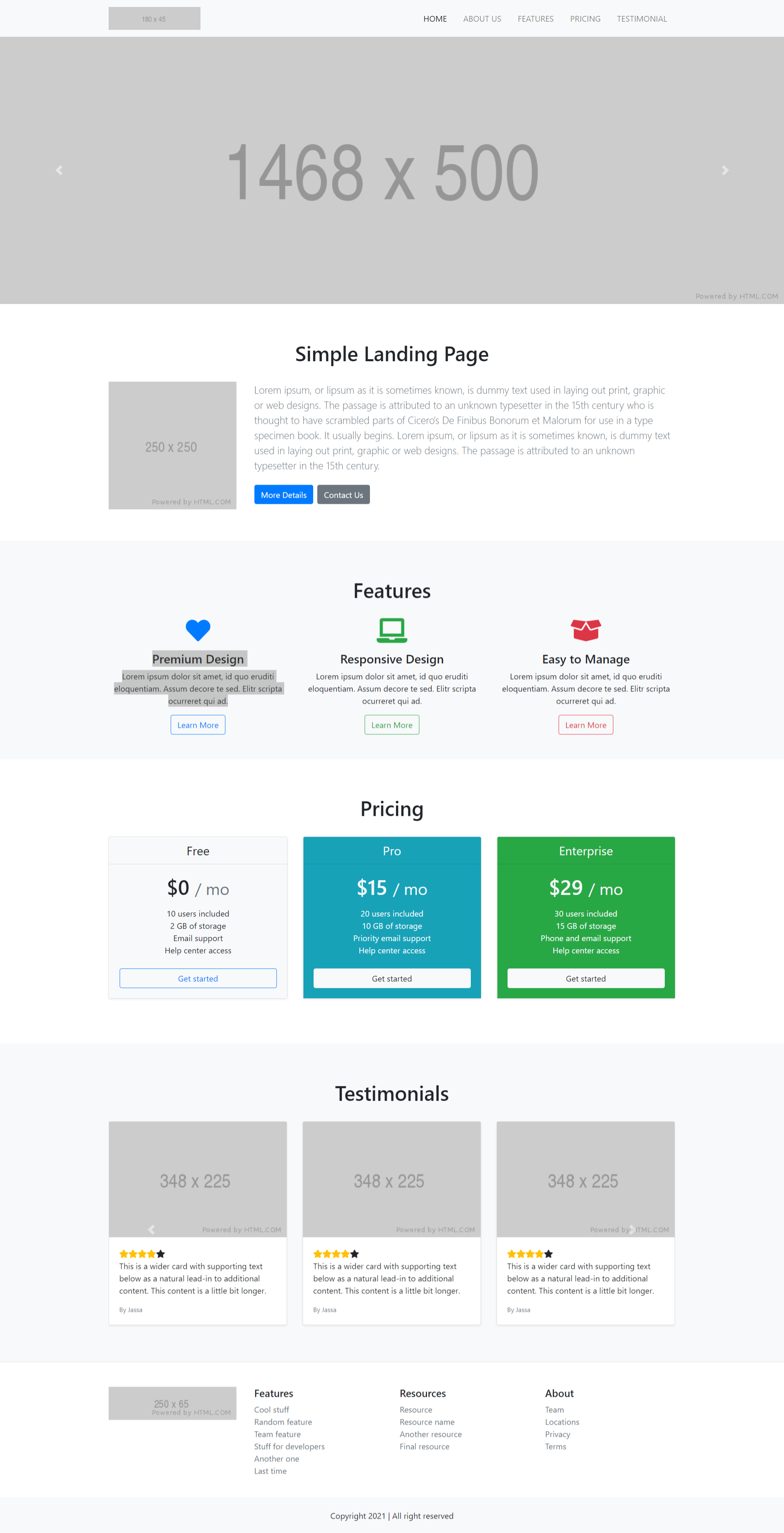
  • How to make website in angular 11?

    How to make website in angular 11?

    Hello friends, welcome back to my blog. Today in this blog post, I am going to tell you, How to make website in angular 11?

    Guys in this post we will cover below things:

    1. Create website in Angular 11 and in future this will be useful for Angular 12 as well.
    2. Using Animation in website with wow js.
    3. Responsive website in Angular 11.
    4. Create website in angular 11 with very few steps.

    Create Website in Angular 11+
    How to make website in angular 11?
    Website in angular 11

    Angular 11 came and very soon Angular 12 will come and if you are new then you must check below two links:

    1. Angular11 Basic Tutorials

    Friends now I proceed onwards and here is the working code snippet and please use carefully this to avoid the mistakes:

    1. Firstly friends we need fresh angular 11 setup and for this we need to run below commands but if you already have angular 11 setup then you can avoid below commands. Secondly we should also have latest node version installed on our system:

    npm install -g @angular/cli 
    
    ng new angularsite //Create new Angular Project
    
    cd angularsite // Go inside the Angular Project Folder
    
    ng serve --open // Run and Open the Angular Project
    
    http://localhost:4200/ // Working Angular Project Url

    2. Now friends, here we need to run below commands into our project terminal to install bootstrap and jquery modules into our angular application:

    npm i bootstrap
    
    npm i jquery
    
    npm i animate.css
    
    npm i wowjs
    
    npm i ngx-wow

    3. Now friends, here we need to add below  into our angular.json file:

    "styles": [
                ...
                "node_modules/bootstrap/dist/css/bootstrap.min.css",
                "node_modules/wowjs/css/libs/animate.css",
                "node_modules/animate.css/animate.min.css"
              ],
              "scripts": [
                ...
                "node_modules/jquery/dist/jquery.min.js",
                "node_modules/bootstrap/dist/js/bootstrap.min.js",
                "node_modules/wowjs/dist/wow.js"
              ]

    4. Now friends we just need to add below code into src/app/app.component.html file to get final out on the web browser:

    <header id="home">
      <div class="overlay"></div>
      <nav class="navbar fixed-top navbar-expand-lg navbar-dark">
          <div class="container-fluid">
              <a class="navbar-brand" href="javascript:void(0)">
                  <h3 class="my-heading ">Therichpost</h3>
              </a>
              <button class="navbar-toggler navbar-toggler-right" type="button" data-toggle="collapse" data-target="#navbarResponsive" aria-controls="navbarResponsive" aria-expanded="false" aria-label="Toggle navigation">
                  <span class="fa fa-bars mfa-white"></span>
              </button>
              <div class="collapse navbar-collapse" id="navbarResponsive">
                  <ul class="navbar-nav ml-auto">
         <li class="nav-item">
                          <a class="nav-link" href="#home">HOME</a>
                      </li>
                      <li class="nav-item">
                          <a class="nav-link" href="#overview">OVERVIEW</a>
                      </li>
                      <li class="nav-item">
                          <a class="nav-link" href="#team"> TEAM</a>
                      </li>
                      <li class="nav-item">
                          <a class="nav-link" href="#testimonials">TESTIMONIALS</a>
                      </li>
                       <li class="nav-item">
                          <a class="nav-link" href="#blog">BLOG</a>
                      </li>
                      <li class="nav-item">
                          <a class="nav-link" href="#contact">CONTACT</a>
                      </li>
    
                  </ul>
    
              </div>
    
          </div>
      </nav>
    
      <div class="tophead" >
          <div class="container-fluid">
              <div class="row">
                  <div class="col-md-7 ">
                      <h1 class="title-main wow fadeInLeft" data-wow-duration="1.5s">Therichpost CREATIVE PAGE</h1>
                      <h3 class="subtitle-main wow fadeInUp" data-wow-duration="1.1s">Lorem ipsum dolor sit amet consectetur adipiscing elit proin leo leo ornare nec vulputate tempus velit nam id purus tellus hendrerit mi dapibus.</h3>
          <div class="top-btn-block wow fadeInUp" data-wow-duration="2.5s">
            <a href="javascript:void(0)" class="btn-explore ">Explore</a>
            <a href="javascript:void(0)" class="btn-account ">Create Account</a>
          </div>
                  </div>
              </div>
          </div>
    </div>
    <div class="sesgoabajo"></div>
     
    </header>
    <main>
      <section class="overview-wrap" id="overview">
          <div class="container">
              <div class="contenedor">
                  <h2 class="title-overview wow fadeInUp">Overview</h2>
                    <div class="hr"></div>
                  <p class="subtitle-overview wow fadeInUp">Lorem ipsum dolor sit amet consectetur adipiscing elit proin leo leo ornare nec vulputate tempus velit nam id purus tellus hendrerit mi dapibus</p>
                  <div class="row">
                      <div class="col-md-6 col-lg-3 wow bounceInUp" data-wow-duration="1.4s">
                          <div class="overview-box mx-auto">
                              <div class="features-icons-icon d-flex">
                                  <i class="fa fa-html5 fa-5x html5 m-auto"></i>
                              </div>
                              <h5>Html 5</h5>
                              <p class=" mb-0">Lorem ipsum dolor sit amet consectetur adipiscing elit proin leo ornare!</p>
                          </div>
                      </div>
                      <div class="col-md-6 col-lg-3 wow bounceInUp" data-wow-duration="1.4s">
                          <div class="overview-box mx-auto">
                              <div class="features-icons-icon d-flex">
                                  <i class="fa fa-css3 fa-5x css3 m-auto"></i>
                              </div>
                              <h5>CSS 3</h5>
                              <p class=" mb-0">Lorem ipsum dolor sit amet consectetur adipiscing elit proin leo ornare!</p>
                          </div>
                      </div>
                     <div class="col-md-6 col-lg-3 wow bounceInUp" data-wow-duration="1.4s">
                          <div class="overview-box mx-auto">
                              <div class="features-icons-icon d-flex">
                                  <i class="fa fa-android fa-5x android m-auto"></i>
                              </div>
                              <h5>Android</h5>
                              <p class=" mb-0">Lorem ipsum dolor sit amet consectetur adipiscing elit proin leo ornare!</p>
                          </div>
                      </div>
                     <div class="col-md-6 col-lg-3 wow bounceInUp" data-wow-duration="1.4s">
                          <div class="overview-box mx-auto">
                              <div class="features-icons-icon d-flex">
                                  <i class="fa fa-drupal fa-5x drupal m-auto"></i>
                              </div>
                              <h5>Drupal</h5>
                              <p class=" mb-0">Lorem ipsum dolor sit amet consectetur adipiscing elit proin leo ornare!</p>
                          </div>
                      </div>
                  </div>
    
                
              </div>
          </div>
      </section>
      <section class="galeria">
          <div class="sesgoarriba"></div>
          <div class="imagenes">
             
       <div class="enmica">
                  <h2>Therichpost</h2>
                  <div></div>
                <h5>"Web design and web development this are the things we enjoy doing daily"</h5>  
              </div>
          </div>
         
          <div class="sesgoabajo"></div>
      </section>
    
    <!--Our Team-->
      <section class="our-team" id="team">
          <div class="container">
              <h2 class="title-our-team wow fadeInUp">Our Team</h2>
              <div class="hr"></div>
              <p class="subtitle-our-team wow fadeInUp">Lorem ipsum dolor sit amet consectetur adipiscing elit proin leo leo ornare nec vulputate tempus velit nam id purus tellus hendrerit mi dapibus</p>
    
              <ul class="row">
                  <li class="col-12 col-md-6 col-lg-3 wow fadeInLeft" data-wow-duration="1.4s">
                      <div class="mycard-block equal-hight">
                          <figure><img src="https://secure.gravatar.com/avatar/d09eaad01aea86c51b4f892b4f8abf6f?s=100&d=wavatar&r=g" class="img-fluid" alt=""></figure>
                          <h3><a href="javascript:void(0)">Lorem Ipsum</a></h3>
         
                          <p>Lorem ipsum dolor sit amet consectetur adipiscing elit.</p>
                          <ul class="follow-us clearfix">
                              <li><a href="#" class="btn btn-circle my-social-btn fb"><i class="fa fa-facebook " ></i></a></li>
                              <li><a href="#" class="btn btn-circle my-social-btn twitter"><i class="fa fa-twitter " ></i></a></li>
                              <li><a href="#" class="btn btn-circle my-social-btn google"><i class="fa fa-linkedin " ></i></a></li>
                          </ul>
                      </div>
                  </li>
                  <li class="col-12 col-md-6 col-lg-3 wow fadeInLeft" data-wow-duration="1.4s">
                      <div class="mycard-block equal-hight">
                          <figure><img src="https://secure.gravatar.com/avatar/d09eaad01aea86c51b4f892b4f8abf6f?s=100&d=wavatar&r=g" class="img-fluid" alt=""></figure>
                          <h3><a href="javascript:void(0)">Lorem Ipsum</a></h3>
                          <p>Lorem ipsum dolor sit amet consectetur adipiscing elit.</p>
                          <ul class="follow-us clearfix">
                              <li><a href="#" class="btn btn-circle my-social-btn fb"><i class="fa fa-facebook " ></i></a></li>
                              <li><a href="#" class="btn btn-circle my-social-btn twitter"><i class="fa fa-twitter " ></i></a></li>
                              <li><a href="#" class="btn btn-circle my-social-btn google"><i class="fa fa-linkedin " ></i></a></li>
                          </ul>
                      </div>
                  </li>
                  <li class="col-12 col-md-6 col-lg-3 wow fadeInLeft" data-wow-duration="1.4s">
                      <div class="mycard-block equal-hight" >
                          <figure><img src="https://secure.gravatar.com/avatar/d09eaad01aea86c51b4f892b4f8abf6f?s=100&d=wavatar&r=g" class="img-fluid" alt=""></figure>
                          <h3><a href="javascript:void(0)">Lorem Ipsum</a></h3>
                          <p>Lorem ipsum dolor sit amet consectetur adipiscing elit.</p>
                          <ul class="follow-us clearfix">
                              <li><a href="#" class="btn btn-circle my-social-btn fb"><i class="fa fa-facebook " ></i></a></li>
                              <li><a href="#" class="btn btn-circle my-social-btn twitter"><i class="fa fa-twitter " ></i></a></li>
                              <li><a href="#" class="btn btn-circle my-social-btn google"><i class="fa fa-linkedin " ></i></a></li>
                          </ul>
                      </div>
                  </li>
              </ul>
          </div>
      </section>
    
      <section class="testimonials-wrap" id="testimonials">
          <div class="sesgoarriba"></div>
          <div class="container">
              <div class="contenedor">
                  <h2 class="title-testimonials wow fadeInUp">Happy Clients</h2>
                  <div class="hr1"></div>
                  <h3 class="subtitle-testimonials wow fadeInUp">Lorem ipsum dolor sit amet consectetur adipiscing elit proin leo leo ornare nec vulputate tempus velit nam id purus tellus hendrerit mi dapibus</h3>
    
                  <!-- banner starts -->
    
                  <div class="slide-one">
                      <div id="demo" class="carousel slide" data-ride="carousel">
    
                          <!-- Indicators -->
                            <ul class="carousel-indicators">
                              <li data-target="#demo" data-slide-to="0" class="active"></li>
                              <li data-target="#demo" data-slide-to="1"></li>
                              <li data-target="#demo" data-slide-to="2"></li>
                            </ul>
    
                          <!-- The slideshow -->
                          <div class="carousel-inner">
                              <div class="carousel-item active ">
                                  <div class="banner-slide">
                                      <img src="https://secure.gravatar.com/avatar/d09eaad01aea86c51b4f892b4f8abf6f?s=100&d=wavatar&r=g" class="img-fluid">
                                      <h5>Lorem Ipsum -</h5>
                                      <p>Lorem ipsum dolor sit amet consectetur adipiscing elit proin leo leo ornare nec vulputate tempus velit nam id purus tellus hendrerit mi dapibus.
                                      </p>
                                  </div>
                              </div>
                              <div class="carousel-item ">
                                  <div class="banner-slide">
                                      <img src="https://secure.gravatar.com/avatar/d09eaad01aea86c51b4f892b4f8abf6f?s=100&d=wavatar&r=g" class="img-fluid">
                                      <h5>Lorem Ipsum -</h5>
                                      <p>Lorem ipsum dolor sit amet consectetur adipiscing elit proin leo leo ornare nec vulputate tempus velit nam id purus tellus hendrerit mi dapibus.
                                      </p>
                                  </div>
    
                              </div>
                              <div class="carousel-item">
                                  <div class="banner-slide">
                                      <img src="https://secure.gravatar.com/avatar/d09eaad01aea86c51b4f892b4f8abf6f?s=100&d=wavatar&r=g" class="img-fluid">
                                      <h5>Lorem Ipsum -</h5>
                                      <p>Lorem ipsum dolor sit amet consectetur adipiscing elit proin leo leo ornare nec vulputate tempus velit nam id purus tellus hendrerit mi dapibus.</p>
                                  </div>
    
                              </div>
                          </div>
    
                          <!-- Left and right controls -->
                          <a class="carousel-control-prev " href="#demo" data-slide="prev">
                              <span class="carousel-control-prev-icon"></span>
                          </a>
                          <a class="carousel-control-next" href="#demo" data-slide="next">
                              <span class="carousel-control-next-icon"></span>
                          </a>
    
                      </div>
                  </div>
    
              </div>
          </div>
      <div class="sesgoabajo"></div>
      </section>
    
      <!--latest post-->
      <section class="blog-wrap" id="blog">            
          <div class="container-fluid">
               <h2 class="title-blog wow fadeInUp">Latest Posts</h2>
                 <div class="hr"></div>
                  <p class="subtitle-blog wow fadeInUp">Lorem ipsum dolor sit amet consectetur adipiscing elit proin leo leo ornare nec vulputate tempus velit nam id purus tellus hendrerit mi dapibus</p>
              <div class="row">
                  <div class="col-md-4 wow bounceInUp" data-wow-duration="1.4s">
                      <div class="card">
                          <figure class="text-center">
                              <img src="https://therichpost.com/wp-content/uploads/2021/04/Angular-11-Reactjs-17-Vue-3-Free-Template-Download-364x225.png" class="img-fluid">
                          </figure>
                          <div class="card-body">
                              <h5 class="card-title">ANGULAR 11 | REACT 17 | VUE 3 FREE TEMPLATE DOWNLOAD</h5>
                              <p class="card-text">Lorem ipsum dolor sit amet consectetur adipiscing elit proin leo leo ornare nec vulputate tempus.</p>
                              <a href="https://therichpost.com/angular-11-react-17-vue-3-free-template-download/" class="">Read more</a>
                            </div>
                      </div>
                  </div>
                  <div class="col-md-4 wow bounceInUp" data-wow-duration="1.4s">
                      <div class="card">
                          <figure class="text-center">
                              <img src="https://therichpost.com/wp-content/uploads/2021/04/Angular-11-Sign-In-Form-Designs-364x225.png" class="img-fluid">
                          </figure>
                          <div class="card-body">
                              <h5 class="card-title">ANGULAR 11 SIGN IN FORM DESIGNS</h5>
                              <p class="card-text">Lorem ipsum dolor sit amet consectetur adipiscing elit proin leo leo ornare nec vulputate tempus.</p>
                              <a href="https://therichpost.com/angular-11-sign-in-form-designs/" class="">Read more</a>
                            </div>
                      </div>
                  </div>
                  <div class="col-md-4 wow bounceInUp" data-wow-duration="1.4s">
                      <div class="card">
                          <figure class="text-center">
                              <img src="https://therichpost.com/wp-content/uploads/2021/04/Angular-11-Crud-with-Firebase-Database-1-364x225.png" class="img-fluid">
                          </figure>
                          <div class="card-body">
                              <h5 class="card-title">ANGULAR 11 CRUD WITH FIREBASE DATABASE</h5>
                              <p class="card-text">Lorem ipsum dolor sit amet consectetur adipiscing elit proin leo leo ornare nec vulputate tempus.</p>
                              <a href="https://therichpost.com/angular-11-crud-with-firebase-database/" class="">Read more</a>
                            </div>
                      </div>
                  </div>
              </div>
          </div>
      </section>
    
      <section class="cta contact-wrap" id="contact">
    
          <div class="container">
              <div class="row">
                  <div class="col-xl-9 mx-auto  wow slideInLeft" data-wow-duration="1.1s">
                      <div class="cta-inner text-center rounded">
                          <h2 class="section-heading mb-4">
                <span class="section-heading-upper">Get in Touch With Us</span>
                           </h2>
                          <div class="contactForm">
                              <form>
                                  <div class="form-group">
                                      <input type="text" name="name" class="form-control" placeholder="Name" required="required">
                                  </div>
                                  <div class="form-group">
                                      <input type="email" name="email" class="form-control" placeholder="Email" required="required">
                                  </div>
                                  <div class="form-group">
                                      <input type="text" name="mobile" class="form-control" placeholder="Mobile" required="required">
                                  </div>
                                  <div class="form-group">
                                      <textarea class="form-control" rows="4" cols="50" placeholder="Message"></textarea>
                                  </div>
                                  <div class="form-group">
                                      <div class="col-md-12">
                                          <input type="submit" name="submit" value="Send" class="btn-login">
                                      </div>
                                  </div>
                              </form>
                          </div>
                      </div>
                  </div>
              </div>
          </div>
    
      </section>
    </main>


    <footer class="footer bg-dark">
      <div class="container">
          <div class="row">               
              <div class="col-lg-12 text-center  my-auto wow slideInLeft">                   
                  <p class="mb-4 mb-lg-0">© Jassa Therichpost.com 2021. All Rights Reserved.</p>
              </div>                
          </div>
      </div>
    </footer>

    5. Now friends we just need to add css code into src/index.html file:

    ...
    <head>
      ...
    
    
    <link rel="stylesheet" type="text/css" href="https://maxcdn.bootstrapcdn.com/font-awesome/4.7.0/css/font-awesome.min.css">
    
      <style>
    *{
      margin: 0;
      padding: 0;
    }
    html {
    scroll-behavior: smooth;
    }
    h1,h2,h3,h4,h5,h6{margin:0;}
    body {
      font-family: 'Roboto', sans-serif !important;
      font-size: 16px;
    }
    .container-fluid {
    width: 100%;
    max-width: 1180px;
    margin: 0 auto; 
    }
    
    .navbar-dark .navbar-nav .nav-link {
      color: #ffffff;
    }
    .navbar-shrink{
      padding-top: 0;
      padding-bottom: 0;
    transition: all ease .5s;
    }
    .navbar{
          padding: 1.5rem 1rem;
      background-color: #343A40;
      padding: 1.5rem 1rem;
    }
    .mybg-dark {
      background: #503eff  !important;
      box-shadow: 0 1px 3px 0 rgba(0, 0, 0, 0.2);
    }
    h3.my-heading {
      font-weight: bold;
    }
    li.nav-item {
      margin: 0 20px 0 0;
    }
    header{
      width: 100%;
      height: 100vh;
      
      position: relative;
      color: #ffffff;
      overflow: hidden;
      
    }
    .overlay{position:absolute;background-color:#212529;height:100%;width:100%;top:0;left:0;opacity:.3}
    header .tophead{
      margin-top: 150px;
    
    }
    header .title-main{
      font-size: 65px;
      font-weight: bold;
    text-transform: uppercase;
    }
    header .subtitle-main{
      font-size: 18px;
      font-weight: 300;
      margin-bottom: 35px;
      line-height: 1.5em;
    }
    
    
    header .btn-explore{
      display: inline-block;
      padding: 8px 20px;
      /*width: 128px;*/
      font-size: 14px;
      background: #474DFB;
      border: 1px solid #474DFB;
      color: #ffffff;
      text-align: center;
      text-transform: uppercase;
      text-decoration: none;
      border-radius: 3px;
    cursor:pointer;
      box-shadow: 0px 0px 10px 0px #00000059;
    }
    
    header .btn-account{
      display: inline-block;
      padding: 8px 20px;
     /* width: 128px;*/
      font-size: 14px;
      background: #ffffff;
      border: 1px solid #ffffff;
      color: #4f44ff;
      text-align: center;
      text-transform: uppercase;
      text-decoration: none;
      border-radius: 3px;
    cursor:pointer;
      box-shadow: 0px 0px 10px 0px #00000059;
    }
    
    .top-btn-block a{
    margin: 0 7px 0 0;
    }
    
    
    /***overview***/
    .overview-wrap .title-overview{
    text-align: center;
      color: #3dce8c;
      text-transform: uppercase;
      font-weight: bold;
      font-size: 36px;
      margin-bottom: 23px;
    }
    .overview-wrap .subtitle-overview{
      font-size: 16px;
      font-weight: 300;
      line-height: 27px;
      max-width: 660px;
    margin: 19px auto 103px;
      text-align: center;
    }
    
    
    .hr {
      position: relative;
      display: block;
      top: 46%;
      width: 40px;
      height: 5px;
      background: #474DFB;
      margin: auto;
    
    }
    
    
    /***abedesigns***/
    .sesgoabajo{
      z-index: 10;
      position: absolute;
      left: 0;
      bottom: 0;
      border-width: 0 0 35vh 100vw;
      border-style: solid;
      border-color: transparent transparent #ffffff transparent;
    }
    .sesgoarriba{
      z-index: 10;
       position: absolute;
      left: 0;
      top: 0;
      border-width: 35vh 100vw 0 0;
      border-style: solid;
      border-color: #ffffff transparent transparent  transparent;
    }
    .contenedor{
      overflow: hidden;
      padding: 100px 5px;
    }


    /***our team***/
    .our-team{position: relative;padding: 5rem 0;}
    .title-our-team{
      text-align: center;
      color: #3dce8c;
      text-transform: uppercase;
      font-weight: bold;
      font-size: 36px;
      margin-bottom: 23px;
    }
    .subtitle-our-team{
      font-size: 16px;
      font-weight: 300;
      line-height: 27px;
      max-width: 660px;
    margin: 19px auto 103px;
      text-align: center;
    }


    /***overview***/
    .overview-box{
      height: 340px;
      width: 100%;
      text-align: center;
      padding: 35px 20px;
    }
    .overview-box:hover{box-shadow: 0px 0px 10px rgba(0,0,0,0.3);transition: all ease 1s;}
    .overview-box h5{
      font-weight: 700;
      line-height: 30px;
      font-size: 18px;
      text-transform: uppercase;
      color: #606060;
    margin-bottom:20px;
    }
    .overview-box p{font-size: 14px;color:#666666;}
    .features-icons-icon {       
      vertical-align: middle;
      margin: 20px auto;
    }
    .features-icons-icon i {color:lightgrey;}
    .overview-box:hover .features-icons-icon i.html5 {
      color: #e54d26;
    transition: all ease 1s;
    }.overview-box:hover .features-icons-icon i.css3 {
      color: #379ad5;
    transition: all ease 1s;
    }.overview-box:hover .features-icons-icon i.android {
      color: #a4c739;
    transition: all ease 1s;
    }
    .overview-box:hover .features-icons-icon i.drupal {
      color: #0c76ab;
      transition: all ease 1s;
    }
    
    .overview-wrap .title-overview {
      text-align: center;
      color: #474DFB;
      text-transform: uppercase;
      font-weight: bold;
      font-size: 36px;
      margin-bottom: 23px;
    }
    
    
    /***gallery***/
    
    .galeria{
      width: 100%;
      height: 500px;
      overflow: hidden;
      display: flex;
      position: relative;
    }
    .imagenes{
      width: 100%;
      height: 500px;
      overflow: hidden;
      position: relative;
    }
    
    .imagenes img{
      width: 100%;
      height: 100%;
      object-fit: cover;
    }
    
    .enmica{
      position: absolute;
      top: 0;
      left: 0;
      width: 100%;
      height: 100%;
      background: rgba(52, 73, 94, 0.815);
      padding-bottom: 100px;
    }
    .enmica h2{
      position: relative;
      top: 45%;
      text-align: center;
      color: #ffffff;
    }
    
    .enmica h5 {
      text-align: center;
      color: #ffffff;
      top: 48%;
      position: relative;
    }
    .enmica div{
      position: relative;
      display: block;
      top: 46%;
      width: 40px;
      height: 5px;
      background: #ffffff;
      margin: auto;
    }


    /***testimonial***/
    .testimonials-wrap{
       background: linear-gradient(0deg, #08d4fd 0%, #503eff 100%);
       width: 100%;
      height: 100%;
      overflow: hidden;
      display: flex;
      position: relative;
      padding: 8rem 0 12rem;
    }
    .title-testimonials{
     text-align: center;
      color: #ffffff;
      text-transform: uppercase;
      font-weight: 700;
      font-size: 36px;
      margin-bottom: 23px;
    }
    .subtitle-testimonials{
      font-size: 16px;
      font-weight: 300;
      line-height: 27px;
      color: #ffffff;
    max-width: 660px;
    margin: 19px auto 103px;
      text-align: center;
    }
    .slide-one {
      padding: 30px 70px;
      background-color: #fff;
      border-radius: 5px;
      box-shadow: 0px 0px 10px 0px #00000059;
      width: 100%;
      max-width: 950px;
      margin: 0 auto;
      text-align: center;
    }
    .banner-slide img {
      height: 120px;
      width: 120px;
      border-radius: 100%;
      overflow: hidden;
      object-fit: cover;
    }
    .banner-slide h5 {
      color: #046ab3;
      font-weight: 700;
      margin: 15px 0;
    }
    .banner-slide h6 {
      font-size: 15px;
      color: #000;
      margin-bottom: 45px;
      font-weight: 600;
    }
    .banner-slide p {
      color: #000;
      font-size: 16px;
      
    }
    .carousel-control-prev {
      left: -175px;
    }
    .carousel-control-next {
      right: -175px;
    }
    
    .carousel-indicators{bottom:-70px;}
    
    
    .hr1 {
      position: relative;
      display: block;
      top: 46%;
      width: 40px;
      height: 5px;
      background: #fff;
      margin: auto;
    
    }
    
    
    /******/
    .row.heading h2 {
      color: #fff;
      font-size: 52.52px;
      line-height: 95px;
      font-weight: 400;
      text-align: center;
      margin: 0 0 40px;
      padding-bottom: 20px;
      text-transform: uppercase;
    }
    ul{
    margin:0;
    padding:0;
    list-style:none;
    }
    
    .title-our-team {
      text-align: center;
      color: #474DFB;
      text-transform: uppercase;
      font-weight: bold;
      font-size: 36px;
      margin-bottom: 23px;
    }
    
    
    .our-team .mycard-block{ 
     float:left; 
     width:100%; 
     background:#fff; 
     padding:30px 20px; 
     text-align:center; 
      box-shadow: 0px 0px 10px rgba(0,0,0,0.3);
      border: 3px solid #ffffff;
      margin-bottom: 2rem;
    }
    .our-team .mycard-block:hover{
      border: 3px solid #503eff;
    }
    
    .our-team .mycard-block img{ 
     width:130px; 
     height:130px; 
     border-radius:100%; 
     object-fit: cover;
    }
    .our-team .mycard-block h3{ 
     color:#2a2a2a; 
     font-size:20px; 
     font-weight:500; 
     padding:6px 0;
     text-transform:uppercase;
    }
    .our-team .mycard-block h3 a{
    text-decoration:none;
      color: #606060;
      font-weight: 700;
    }
    .our-team .mycard-block h3 a:hover{
      color:#337ab7;
    }
    .our-team .mycard-block p{ 
     color:#2a2a2a; 
     font-size:13px; 
     line-height:20px; 
     font-weight:400;
    }
    
    .our-team .mycard-block .follow-us li{ 
      display:inline-block; 
      width:auto; 
      margin:0 5px;
    }
    
    .btn-circle {
      border-radius: 50%;
    }
    .my-social-btn {
      background: lightgrey;
    }
    a.btn.btn-circle.my-social-btn {
      color: #fff;
      height: 40px;
      width: 40px;
    }
    .mycard-block:hover .my-social-btn.fb {
      background: #205b9f;
    }
    .mycard-block:hover .my-social-btn.twitter {
      background: #00ace3;
    }
    .mycard-block:hover .my-social-btn.google {
      background: #ff3921;
    }


    /******blog******/
    
    section#blog {
      position: relative;
      padding: 7rem 0;
    }
    section#blog .card{margin-bottom: 2rem;}
    section#blog .card-text{
      font-weight: 400;
      font-size: 14px;
      color: #666666;
      padding-bottom: 20px;
    }
    section#blog  .title-blog{
      text-align: center;
      color: #474DFB;
      text-transform: uppercase;
      font-weight: bold;
      font-size: 36px;
      margin-bottom: 23px;
    }
    section#blog  .subtitle-blog{
      font-size: 16px;
      font-weight: 300;
      line-height: 27px;
      max-width: 660px;
      margin: 19px auto 103px;
      text-align: center;
    }
    .card img{
      height: 220px;
      width: 100%;
      object-fit: cover;
    }
    .card a{
      color: #503eff;
      text-transform: uppercase;
      text-decoration: none;
      font-weight: 700;
      font-size: 14px;
    }


    /******contact wrap******/
    
    section.contact-wrap{
      padding: 5rem 0;
      position: relative;
      
    }
    
    .section-heading{
      
      color:#fff;
    }
    .cta {
      padding-top: 5rem;
      padding-bottom: 5rem;
    }
    .cta .cta-inner {
      position: relative;
      background: rgba(0, 0, 0, 0.7);
      padding: 3rem;
      margin: .5rem;
      box-shadow: 0px 0px 10px 0px #00000059;
    }
    .contactForm {
      width: 100%;
      max-width: 484px;
      border-radius: 5px;
      margin: auto;
      padding: 30px 40px 20px;
      
    }
    .contactForm .form-control{
      border-radius: 0px;
      border: none;
      border-bottom: 1px solid #fff;
      background-color: transparent !important;
      color: #fff;
      margin-bottom: 2rem;
      outline:none;
    }
    .contactForm ::placeholder{color: #fff;}
    input.btn-login {
      display: block;
      margin: auto;
      text-align: center;
      background-color: #474DFB;
      border: 1px solid #474DFB;
       border-radius: 3px;
       font-size: 14px;
      color: #ffffff;
      cursor: pointer;
      text-transform: uppercase;
      padding: 10px 50px;
      outline: none;
       box-shadow: 0px 0px 10px 0px #00000059;
    }
    
    
    /* Footer */
    footer.footer{padding:4rem 0;}
    footer.footer ul li a{color: #ffffff;text-decoration: none;}
    footer.footer p{font-size: 18px;color:#dcdcdc;}
    
    
    /***responsive---/
    
    @media only screen and (min-width: 960px) and (max-width: 1023px) {}
    
    @media only screen and (min-width: 768px) and (max-width: 959px) {
    .enmica h2{font-size:15px;}
    /******/
    .testimonials{padding: 18rem 0;}
    
    
    @media only screen and (max-width:736px) and (orientation:landscape){}
    @media only screen and (max-width:667px) and (orientation:landscape){}
    @media only screen and (max-width:568px) and (orientation:landscape){}
    @media only screen and (min-width: 600px) and (max-width: 767px) {
    .enmica h2{font-size:18px;}
    }
    @media only screen and (min-width: 480px) and (max-width: 599px) {
    header .tophead {margin-top: 145px;}
    header .title-main {font-size: 28px;}
    header .subtitle-main {font-size: 13px;}
    header .btn-explore{padding: 5px 8px;font-size: 13px;}
    header .btn-account{padding: 5px 8px;font-size: 13px;}
    /******/
    .overview .title-overview{font-size: 28px;}
    .overview .subtitle-overview{font-size: 14px;}
    /******/
    .title-our-team{font-size: 28px;}
    .subtitle-our-team{font-size: 14px;}
    /******/
    .title-testimonials{font-size: 28px;}
    .subtitle-testimonials{font-size: 14px;}
    /******/
    .slide-one {padding: 30px 25px;}
    /******/
    section#blog .title-blog{font-size: 28px;}
    section#blog .subtitle-blog{font-size: 14px;}
    /******/
    .contactForm{padding: 0;}
    .contact-wrap h2{font-size: 28px;}
    }
    
    @media only screen and (min-width: 321px) and (max-width: 479px) {
    header .tophead {margin-top: 145px;}
    header .title-main {font-size: 25px;}
    header .subtitle-main {font-size: 13px;}
    header .btn-explore{padding: 5px 8px;font-size: 13px;}
    header .btn-account{padding: 5px 8px;font-size: 13px;}
    /******/
    .overview .title-overview{font-size: 25px;}
    .overview .subtitle-overview{font-size: 14px;}
    /******/
    .title-our-team{font-size: 25px;}
    .subtitle-our-team{font-size: 14px;}
    /******/
    .title-testimonials{font-size: 25px;}
    .subtitle-testimonials{font-size: 14px;}
    /******/
    .slide-one {padding: 30px 25px;}
    /******/
    section#blog .title-blog{font-size: 25px;}
    section#blog .subtitle-blog{font-size: 14px;}
    /******/
    .contactForm{padding: 0;}
    .contact-wrap h2{font-size: 25px;}
    }
    
    
    @media only screen and (max-width: 320px) {
    header .tophead {margin-top: 125px;}
    header .title-main {font-size: 18px;}
    header .subtitle-main {font-size: 13px;}
    header .btn-explore{padding: 5px 8px;font-size: 13px;}
    header .btn-account{padding: 5px 8px;font-size: 13px;}
    /******/
    .overview .title-overview{font-size: 25px;}
    .overview .subtitle-overview{font-size: 14px;}
    /******/
    .title-our-team{font-size: 25px;}
    .subtitle-our-team{font-size: 14px;}
    /******/
    .title-testimonials{font-size: 25px;}
    .subtitle-testimonials{font-size: 14px;}
    /******/
    .slide-one {padding: 30px 25px;}
    /******/
    section#blog .title-blog{font-size: 25px;}
    section#blog .subtitle-blog{font-size: 14px;}
    /******/
    .contactForm{padding: 0;}
    .contact-wrap h2{font-size: 25px;}
    }
      </style>
      
    </head>


    6. Now friends we just need to add below code into src/app/app.module.ts file:

    ...
    import { NgwWowModule } from 'ngx-wow';
    
    @NgModule({
      ...
      imports: [
        ...
        NgwWowModule
      ],
      ...
    })
    ...


    7. Now friends we just need to add below code into src/app/app.component.ts file:

    ...
    import { NgwWowService } from 'ngx-wow';
    
    export class AppComponent {
     ...
      constructor(private wowService: NgwWowService) {
        this.wowService.init();
      }
    
     ...
    }


    Friends in the end must run ng serve command into your terminal to run the angular 11 project.

    Now we are done friends. If you have any kind of query, suggestion and new requirement then feel free to comment below.

    Note: Friends, In this post, I just tell the basic setup and things, you can change the code according to your requirements.

    I will appreciate that if you will tell your views for this post. Nothing matters if your views will be good or bad because with your views, I will make my next posts more good and helpful.

    Jassa

    Thanks

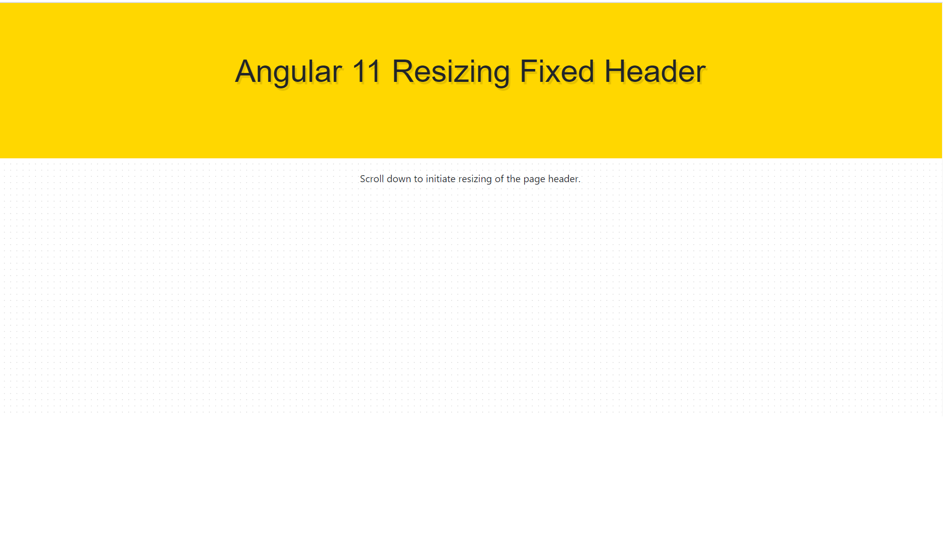
  • Angular 11 Resizing Fixed Header After Scrolling

    Angular 11 Resizing Fixed Header After Scrolling

    Hello friends, welcome back to my blog. Today in this blog post, I am going to tell you, Angular 11 Resizing Fixed Header After Scrolling.


    Angular 11 Resizing Fixed Header After Scrolling
    Fixed Header Before Scroll
    Angular Fixed Header After Scroll
    Fixed Header After Scroll

    Angular 11 came and if you are new then you must check below two links:

    1. Angular11 Basic Tutorials

    Friends now I proceed onwards and here is the working code snippet for Angular 11 Resizing Fixed Header After Scrolling and please use carefully this to avoid the mistakes:

    1. Firstly friends we need fresh angular 11 setup and for this we need to run below commands but if you already have angular 11 setup then you can avoid below commands. Secondly we should also have latest node version installed on our system:

    npm install -g @angular/cli 
    
    ng new angularfixedheader //Create new Angular Project
    
    cd angularfixedheader // Go inside the Angular Project Folder
    
    ng serve --open // Run and Open the Angular Project
    
    http://localhost:4200/ // Working Angular Project Url

    2. Now friends we just need to add below code into src/app/app.component.html file to get final out on the web browser:

    <div class="header">
        <h1 class="header_logo">Angular 11 Resizing Fixed Header</h1>
      </div>
      <div class="offset">
        <p>Scroll down to initiate resizing of the page header.</p>
      </div>

    3. Now friends we just need to css code code into app/app.component.css file:

    .offset {
      margin-top: 0;
      padding-top: 270px;
      text-align: center;
      transition: .3s;
      height: 1500px;
    }
    
    .header {
      position: fixed;
      width: 100%;
      height: 250px;
      font-weight: bold;
      text-align: center;
      background: gold;
      transition: .3s;
    }
    .header.small {
      height: 70px;
      box-shadow: 0 0 5px rgba(0, 0, 0, 0.2);
    }
    .header.small ~ .offset {
      padding-top: 140px;
    }
    .header.small .header_logo {
      padding-top: 20px;
      font-size: 20px;
      text-shadow: none;
    }
    
    .header_logo {
      font-family: 'Oswald', sans-serif;
      margin: 0;
      padding-top: 80px;
      font-size: 50px;
      text-shadow: 3px 4px rgba(0, 0, 0, 0.1);
      transition: .3s;
    }


    4. Now friends we just need to css code code into app/app.component.ts file:

    ...
    export class AppComponent {
     ...
      ngOnInit()
      {
        window.addEventListener('scroll', function() {
          navbarScroll();
         });
         function navbarScroll() {
           var y = window.scrollY;
           if (y > 10) {
             var header = document.getElementsByClassName('header')[0];
               header.classList.add('small');
         
           } else if (y < 10) {
               var header = document.getElementsByClassName('header')[0];
              header.classList.remove('small');
           }
         }
    
      }
    }


    Friends in the end must run ng serve command into your terminal to run the angular 11 project.

    Now we are done friends. If you have any kind of query, suggestion and new requirement then feel free to comment below.

    Note: Friends, In this post, I just tell the basic setup and things, you can change the code according to your requirements.

    I will appreciate that if you will tell your views for this post. Nothing matters if your views will be good or bad because with your views, I will make my next posts more good and helpful.

    Jassa

    Thanks

  • Angular 11 | React 17 | Vue 3 Free Template Download

    Angular 11 | React 17 | Vue 3 Free Template Download

    Hello friends, welcome back to my blog. Today in this blog post, I am going to tell you, Angular 11 | React 17 | Vue 3 Free Template Download.

    Guys you can find below free responsive landing page template code snippet for Angular 11, React js and Vuejs and this is very to implement because I have told all the steps very easily.


    Angular 11 | React 17 | Vue 3 Free Template Download
    Fully Responsive Landing Page

    Angular 11, React 17 and Vue 3 came and if you are new then you must check below two links:

    1. Angular11 Basic Tutorials
    2. Vue js Basic Tutorials
    3. React js Basic Tutorials

    Friends now I proceed onwards and here is the working code snippet for Angular 11 | React 17 | Vue 3 Free Template Download and please use carefully this to avoid the mistakes:

    Code Snippet For Angular 11:


    1. Firstly friends we need fresh angular 11 setup and for this we need to run below commands but if you already have angular 11 setup then you can avoid below commands. Secondly we should also have latest node version installed on our system:

    npm install -g @angular/cli 
    
    ng new angularbootstrap //Create new Angular Project
    
    cd angularbootstrap // Go inside the Angular Project Folder
    
    ng serve --open // Run and Open the Angular Project
    
    http://localhost:4200/ // Working Angular Project Url

    2. Now friends, here we need to run below commands into our project terminal to install bootstrap and jquery modules into our angular application:

    npm install --save bootstrap
    
    npm i jquery --save

    3. Now friends, here we need to add below  into our angular.json file:

    ...
     "styles": [
                  ...
                  "node_modules/bootstrap/dist/css/bootstrap.min.css"
                 
                  
                ],
                "scripts": [
                  "node_modules/jquery/dist/jquery.min.js",
                  "node_modules/bootstrap/dist/js/bootstrap.min.js"
                ]
    ...

    4. Now friends we just need to add below code into src/app/app.component.html file to get final out on the web browser:

    <header>
      <nav class="navbar navbar-expand-lg navbar-light bg-light">
          <div class="container">
              <a class="navbar-brand" target="_blank" href="#">
                  <img class="img-fluid" src="https://via.placeholder.com/180x45">
              </a>
              <button class="navbar-toggler" type="button" data-toggle="collapse" data-target="#navbarNav" aria-controls="navbarNav" aria-expanded="false" aria-label="Toggle navigation">
                  <span class="navbar-toggler-icon"></span>
              </button>
              <div class="collapse navbar-collapse" id="navbarNav">
                  <ul class="ml-auto navbar-nav text-uppercase">
                      <li class="nav-item active">
                          <a class="nav-link p-3" href="#">Home <span class="sr-only">(current)</span></a>
                      </li>
                      <li class="nav-item">
                          <a class="nav-link p-3" href="#about-us">About us</a>
                      </li>
                      <li class="nav-item">
                          <a class="nav-link p-3" href="#features">Features</a>
                      </li>
                      <li class="nav-item">
                          <a class="nav-link p-3" href="#pricing">Pricing</a>
                      </li>
                      <li class="nav-item">
                          <a class="nav-link p-3" href="#testimonial">Testimonial</a>
                      </li>
                  </ul>
              </div>
          </div>
      </nav>
    </header>
    <main>
      <section>
          <div id="carouselExampleControls" class="carousel slide" data-ride="carousel">
              <div class="carousel-inner">
                  <div class="carousel-item active">
                      <a target="_blank" href="#"><img src="https://via.placeholder.com/1468x500" class="d-block w-100" alt="..."></a>
                  </div>
                  <div class="carousel-item">
                      <a target="_blank" href="#"><img src="https://via.placeholder.com/1468x500" class="d-block w-100" alt="..."></a>
                  </div>
                  <div class="carousel-item">
                      <a target="_blank" href="#"><img src="https://via.placeholder.com/1468x500" class="d-block w-100" alt="..."></a>
                  </div>
              </div>
              <a class="carousel-control-prev" href="#carouselExampleControls" role="button" data-slide="prev">
                  <span class="carousel-control-prev-icon" aria-hidden="true"></span>
                  <span class="sr-only">Previous</span>
              </a>
              <a class="carousel-control-next" href="#carouselExampleControls" role="button" data-slide="next">
                  <span class="carousel-control-next-icon" aria-hidden="true"></span>
                  <span class="sr-only">Next</span>
              </a>
          </div>
      </section>
      <section id="about-us" class="py-5">
          <div class="container">
              <div class="text-center py-4">
                  <h1 class="jumbotron-heading">Simple Landing Page</h1>
              </div>
              <div class="row">
                  <div class="col-md-3">
                      <a target="_blank" href="#">
                          <img src="https://via.placeholder.com/250x250" class="d-block img-fluid" alt="...">
                      </a>
                  </div>
                  <div class="col-md-9">
                      <p class="lead text-muted">Lorem ipsum, or lipsum as it is sometimes known, is dummy text used in laying out print, graphic or web designs. The passage is attributed to an unknown typesetter in the 15th century who is thought to have scrambled parts of Cicero's De Finibus Bonorum et Malorum for use in a type specimen book. It usually begins. Lorem ipsum, or lipsum as it is sometimes known, is dummy text used in laying out print, graphic or web designs. The passage is attributed to an unknown typesetter in the 15th century.</p>
                      <p>
                          <a href="#" class="btn btn-primary my-2 mr-2">More Details</a>
                          <a href="#" class="btn btn-secondary my-2">Contact Us</a>
                      </p>
                  </div>
              </div>
          </div>
      </section>
    
      <section id="features" class="py-5 bg-light">
          <div class="container">
              <div class="text-center py-4">
                  <h1 class="jumbotron-heading">Features</h1>
              </div>
              <div class="row">
                  <div class="col-lg-4 col-md-4 col-sm-4 col-xs-12">
                      <div class="box-part text-center">
                          <i class="text-primary fas fa-heart fa-3x mb-3" aria-hidden="true"></i>
                          <div class="title">
                              <h4>Premium Design</h4>
                          </div>
                          <div class="text mb-3">
                              <span>Lorem ipsum dolor sit amet, id quo eruditi eloquentiam. Assum decore te sed. Elitr scripta ocurreret qui ad.</span>
                          </div>
                          <a class="btn btn-outline-primary" href="#">Learn More</a>
                      </div>
                  </div>
                  <div class="col-lg-4 col-md-4 col-sm-4 col-xs-12">
                      <div class="box-part text-center">
                          <i class="text-success fas fa-laptop fa-3x mb-3" aria-hidden="true"></i>
                          <div class="title">
                              <h4>Responsive Design</h4>
                          </div>
                          <div class="text mb-3">
                              <span>Lorem ipsum dolor sit amet, id quo eruditi eloquentiam. Assum decore te sed. Elitr scripta ocurreret qui ad.</span>
                          </div>
                          <a class="btn btn-outline-success" href="#">Learn More</a>
                      </div>
                  </div>
                  <div class="col-lg-4 col-md-4 col-sm-4 col-xs-12">
                      <div class="box-part text-center">
                          <i class="text-danger fas fa-box-open fa-3x mb-3" aria-hidden="true"></i>
                          <div class="title">
                              <h4>Easy to Manage</h4>
                          </div>
                          <div class="text mb-3">
                              <span>Lorem ipsum dolor sit amet, id quo eruditi eloquentiam. Assum decore te sed. Elitr scripta ocurreret qui ad.</span>
                          </div>
                          <a class="btn btn-outline-danger" href="#">Learn More</a>
                      </div>
                  </div>
              </div>
          </div>
      </section>
    
      <section id="pricing" class="py-5">
          <div class="container">
              <div class="text-center py-4">
                  <h1 class="jumbotron-heading">Pricing</h1>
              </div>
              <div class="card-deck mb-3 text-center">
                  <div class="card mb-4 shadow-sm">
                      <div class="card-header bg-light">
                          <h4 class="my-0 font-weight-normal">Free</h4>
                      </div>
                      <div class="card-body bg-light">
                          <h1 class="card-title pricing-card-title">$0 <small class="text-muted">/ mo</small></h1>
                          <ul class="list-unstyled mt-3 mb-4">
                              <li>10 users included</li>
                              <li>2 GB of storage</li>
                              <li>Email support</li>
                              <li>Help center access</li>
                          </ul>
                          <button type="button" class="btn btn-block btn-outline-primary">Get started</button>
                      </div>
                  </div>
                  <div class="card mb-4 shadow-sm">
                      <div class="card-header bg-info text-light">
                          <h4 class="my-0 font-weight-normal">Pro</h4>
                      </div>
                      <div class="card-body bg-info text-light">
                          <h1 class="card-title pricing-card-title">$15 <small>/ mo</small></h1>
                          <ul class="list-unstyled mt-3 mb-4">
                              <li>20 users included</li>
                              <li>10 GB of storage</li>
                              <li>Priority email support</li>
                              <li>Help center access</li>
                          </ul>
                          <button type="button" class="btn btn-block btn-light">Get started</button>
                      </div>
                  </div>
                  <div class="card mb-4 shadow-sm">
                      <div class="card-header bg-success text-light">
                          <h4 class="my-0 font-weight-normal">Enterprise</h4>
                      </div>
                      <div class="card-body bg-success text-light">
                          <h1 class="card-title pricing-card-title">$29 <small>/ mo</small></h1>
                          <ul class="list-unstyled mt-3 mb-4">
                              <li>30 users included</li>
                              <li>15 GB of storage</li>
                              <li>Phone and email support</li>
                              <li>Help center access</li>
                          </ul>
                          <button type="button" class="btn btn-block btn-light">Get started</button>
                      </div>
                  </div>
              </div>
          </div>
      </section>
    
      <section id="testimonial" class="py-5 bg-light">
          <div class="container">
              <div class="text-center py-4">
                  <h1 class="jumbotron-heading">Testimonials</h1>
              </div>
              <div id="carouselExampleInterval" class="carousel slide" data-ride="carousel">
                  <div class="carousel-inner">
                      <div class="carousel-item active" data-interval="10000">
                          <div class="row">
                              <div class="col-md-4">
                                  <div class="card mb-4 shadow-sm">
                                      <a href="#">
                                          <img class="img-fluid" src="https://via.placeholder.com/348x225" alt="">
                                      </a>
                                      <div class="card-body">
                                          <div class="stars d-inline">
                                              <span class="fas fa-star text-warning"></span>
                                              <span class="fas fa-star text-warning"></span>
                                              <span class="fas fa-star text-warning"></span>
                                              <span class="fas fa-star text-warning"></span>
                                              <span class="fas fa-star"></span>
                                          </div>
                                          <p class="card-text">This is a wider card with supporting text below as a natural lead-in to additional content. This content is a little bit longer.</p>
                                          <div class="d-flex justify-content-between align-items-center">
                                              <small class="text-muted">By Jassa</small>
                                          </div>
                                      </div>
                                  </div>
                              </div>
                          </div>
                      </div>
                      <div class="carousel-item" data-interval="2000">
                          <div class="row">
                              <div class="col-md-4">
                                  <div class="card mb-4 shadow-sm">
                                      <a href="#">
                                          <img class="img-fluid" src="https://via.placeholder.com/348x225" alt="">
                                      </a>
                                      <div class="card-body">
                                          <div class="stars d-inline">
                                              <span class="fas fa-star text-warning"></span>
                                              <span class="fas fa-star text-warning"></span>
                                              <span class="fas fa-star text-warning"></span>
                                              <span class="fas fa-star text-warning"></span>
                                              <span class="fas fa-star"></span>
                                          </div>
                                          <p class="card-text">This is a wider card with supporting text below as a natural lead-in to additional content. This content is a little bit longer.</p>
                                          <div class="d-flex justify-content-between align-items-center">
                                              <small class="text-muted">By Jassa</small>
                                          </div>
                                      </div>
                                  </div>
                              </div>
                              <div class="col-md-4">
                                  <div class="card mb-4 shadow-sm">
                                      <a href="#">
                                          <img class="img-fluid" src="https://via.placeholder.com/348x225" alt="">
                                      </a>
                                      <div class="card-body">
                                          <div class="stars d-inline">
                                              <span class="fas fa-star text-warning"></span>
                                              <span class="fas fa-star text-warning"></span>
                                              <span class="fas fa-star text-warning"></span>
                                              <span class="fas fa-star text-warning"></span>
                                              <span class="fas fa-star"></span>
                                          </div>
                                          <p class="card-text">This is a wider card with supporting text below as a natural lead-in to additional content. This content is a little bit longer.</p>
                                          <div class="d-flex justify-content-between align-items-center">
                                              <small class="text-muted">By Jassa</small>
                                          </div>
                                      </div>
                                  </div>
                              </div>
                              <div class="col-md-4">
                                  <div class="card mb-4 shadow-sm">
                                      <a href="#">
                                          <img class="img-fluid" src="https://via.placeholder.com/348x225" alt="">
                                      </a>
                                      <div class="card-body">
                                          <div class="stars d-inline">
                                              <span class="fas fa-star text-warning"></span>
                                              <span class="fas fa-star text-warning"></span>
                                              <span class="fas fa-star text-warning"></span>
                                              <span class="fas fa-star text-warning"></span>
                                              <span class="fas fa-star"></span>
                                          </div>
                                          <p class="card-text">This is a wider card with supporting text below as a natural lead-in to additional content. This content is a little bit longer.</p>
                                          <div class="d-flex justify-content-between align-items-center">
                                              <small class="text-muted">By Jassa</small>
                                          </div>
                                      </div>
                                  </div>
                              </div>
                          </div>
                      </div>
                  </div>
                  <a class="carousel-control-prev" href="#carouselExampleInterval" role="button" data-slide="prev">
                      <span class="carousel-control-prev-icon" aria-hidden="true"></span>
                      <span class="sr-only">Previous</span>
                  </a>
                  <a class="carousel-control-next" href="#carouselExampleInterval" role="button" data-slide="next">
                      <span class="carousel-control-next-icon" aria-hidden="true"></span>
                      <span class="sr-only">Next</span>
                  </a>
              </div>
          </div>
      </section>
    
    </main>
    <footer class="pt-4 pt-md-5 border-top">
      <div class="container">
          <div class="row">
              <div class="col-12 col-md">
                  <a href="#">
                      <img class="img-fluid" src="https://via.placeholder.com/250x65">
                  </a>
              </div>
              <div class="col-6 col-md">
                  <h5>Features</h5>
                  <ul class="list-unstyled text-small">
                      <li><a class="text-muted" href="#">Cool stuff</a></li>
                      <li><a class="text-muted" href="#">Random feature</a></li>
                      <li><a class="text-muted" href="#">Team feature</a></li>
                      <li><a class="text-muted" href="#">Stuff for developers</a></li>
                      <li><a class="text-muted" href="#">Another one</a></li>
                      <li><a class="text-muted" href="#">Last time</a></li>
                  </ul>
              </div>
              <div class="col-6 col-md">
                  <h5>Resources</h5>
                  <ul class="list-unstyled text-small">
                      <li><a class="text-muted" href="#">Resource</a></li>
                      <li><a class="text-muted" href="#">Resource name</a></li>
                      <li><a class="text-muted" href="#">Another resource</a></li>
                      <li><a class="text-muted" href="#">Final resource</a></li>
                  </ul>
              </div>
              <div class="col-6 col-md">
                  <h5>About</h5>
                  <ul class="list-unstyled text-small">
                      <li><a class="text-muted" href="#">Team</a></li>
                      <li><a class="text-muted" href="#">Locations</a></li>
                      <li><a class="text-muted" href="#">Privacy</a></li>
                      <li><a class="text-muted" href="#">Terms</a></li>
                  </ul>
              </div>
          </div>
      </div>
      <div class="text-center py-4 bg-light mt-4">Copyright 2021 | All right reserved</div>
    </footer>

    5. Now friends we just need to css code code into src/index.html file:

    ...
    <head>
      ...
      <link rel="stylesheet" href="https://use.fontawesome.com/releases/v5.7.0/css/all.css">
      <style>
    
      </style>
    </head>
    ...

    Friends in the end must run ng serve command into your terminal to run the angular 11 project.


    Code Snippet For React js / React 17:


    1. Firstly, we need fresh reactjs setup and for that, we need to run below commands into out terminal and also we should have latest node version installed on our system:

    npx create-react-app reacttemplate
    
    cd reacttemplate
    
    npm start

    2. Now we need to run below commands into our project terminal to get bootstrap and related modules into our reactjs application:

    npm install bootstrap --save
    
    npm install jquery --save
    
    npm install popper.js
    
    npm start //For start project again

    3. Finally for the main output, we need to add below code into our reacttemplate/src/App.js file or if you have fresh setup then you can replace reacttemplate/src/App.js file code with below code:

    import React from "react";
    
    import './App.css'
    import 'bootstrap/dist/css/bootstrap.min.css';
    import 'bootstrap/dist/js/bootstrap.min.js';
    class App extends React.Component {
     
      render() {
        return (
          <div className="main_container">
           <header>
                <nav class="navbar navbar-expand-lg navbar-light bg-light">
                    <div class="container">
                        <a class="navbar-brand" target="_blank" href="#">
                            <img class="img-fluid" src="https://via.placeholder.com/180x45" />
                        </a>
                        <button class="navbar-toggler" type="button" data-toggle="collapse" data-target="#navbarNav" aria-controls="navbarNav" aria-expanded="false" aria-label="Toggle navigation">
                            <span class="navbar-toggler-icon"></span>
                        </button>
                        <div class="collapse navbar-collapse" id="navbarNav">
                            <ul class="ml-auto navbar-nav text-uppercase">
                                <li class="nav-item active">
                                    <a class="nav-link p-3" href="#">Home <span class="sr-only">(current)</span></a>
                                </li>
                                <li class="nav-item">
                                    <a class="nav-link p-3" href="#about-us">About us</a>
                                </li>
                                <li class="nav-item">
                                    <a class="nav-link p-3" href="#features">Features</a>
                                </li>
                                <li class="nav-item">
                                    <a class="nav-link p-3" href="#pricing">Pricing</a>
                                </li>
                                <li class="nav-item">
                                    <a class="nav-link p-3" href="#testimonial">Testimonial</a>
                                </li>
                            </ul>
                        </div>
                    </div>
                </nav>
                </header>
                <main>
                <section>
                    <div id="carouselExampleControls" class="carousel slide" data-ride="carousel">
                        <div class="carousel-inner">
                            <div class="carousel-item active">
                                <a target="_blank" href="#"><img src="https://via.placeholder.com/1468x500" class="d-block w-100" alt="..." /></a>
                            </div>
                            <div class="carousel-item">
                                <a target="_blank" href="#"><img src="https://via.placeholder.com/1468x500" class="d-block w-100" alt="..." /></a>
                            </div>
                            <div class="carousel-item">
                                <a target="_blank" href="#"><img src="https://via.placeholder.com/1468x500" class="d-block w-100" alt="..." /></a>
                            </div>
                        </div>
                        <a class="carousel-control-prev" href="#carouselExampleControls" role="button" data-slide="prev">
                            <span class="carousel-control-prev-icon" aria-hidden="true"></span>
                            <span class="sr-only">Previous</span>
                        </a>
                        <a class="carousel-control-next" href="#carouselExampleControls" role="button" data-slide="next">
                            <span class="carousel-control-next-icon" aria-hidden="true"></span>
                            <span class="sr-only">Next</span>
                        </a>
                    </div>
                </section>
                <section id="about-us" class="py-5">
                    <div class="container">
                        <div class="text-center py-4">
                            <h1 class="jumbotron-heading">Simple Landing Page</h1>
                        </div>
                        <div class="row">
                            <div class="col-md-3">
                                <a target="_blank" href="#">
                                    <img src="https://via.placeholder.com/250x250" class="d-block img-fluid" alt="..." />
                                </a>
                            </div>
                            <div class="col-md-9">
                                <p class="lead text-muted">Lorem ipsum, or lipsum as it is sometimes known, is dummy text used in laying out print, graphic or web designs. The passage is attributed to an unknown typesetter in the 15th century who is thought to have scrambled parts of Cicero's De Finibus Bonorum et Malorum for use in a type specimen book. It usually begins. Lorem ipsum, or lipsum as it is sometimes known, is dummy text used in laying out print, graphic or web designs. The passage is attributed to an unknown typesetter in the 15th century.</p>
                                <p>
                                    <a href="#" class="btn btn-primary my-2 mr-2">More Details</a>
                                    <a href="#" class="btn btn-secondary my-2">Contact Us</a>
                                </p>
                            </div>
                        </div>
                    </div>
                </section>
    
                <section id="features" class="py-5 bg-light">
                    <div class="container">
                        <div class="text-center py-4">
                            <h1 class="jumbotron-heading">Features</h1>
                        </div>
                        <div class="row">
                            <div class="col-lg-4 col-md-4 col-sm-4 col-xs-12">
                                <div class="box-part text-center">
                                    <i class="text-primary fas fa-heart fa-3x mb-3" aria-hidden="true"></i>
                                    <div class="title">
                                        <h4>Premium Design</h4>
                                    </div>
                                    <div class="text mb-3">
                                        <span>Lorem ipsum dolor sit amet, id quo eruditi eloquentiam. Assum decore te sed. Elitr scripta ocurreret qui ad.</span>
                                    </div>
                                    <a class="btn btn-outline-primary" href="#">Learn More</a>
                                </div>
                            </div>
                            <div class="col-lg-4 col-md-4 col-sm-4 col-xs-12">
                                <div class="box-part text-center">
                                    <i class="text-success fas fa-laptop fa-3x mb-3" aria-hidden="true"></i>
                                    <div class="title">
                                        <h4>Responsive Design</h4>
                                    </div>
                                    <div class="text mb-3">
                                        <span>Lorem ipsum dolor sit amet, id quo eruditi eloquentiam. Assum decore te sed. Elitr scripta ocurreret qui ad.</span>
                                    </div>
                                    <a class="btn btn-outline-success" href="#">Learn More</a>
                                </div>
                            </div>
                            <div class="col-lg-4 col-md-4 col-sm-4 col-xs-12">
                                <div class="box-part text-center">
                                    <i class="text-danger fas fa-box-open fa-3x mb-3" aria-hidden="true"></i>
                                    <div class="title">
                                        <h4>Easy to Manage</h4>
                                    </div>
                                    <div class="text mb-3">
                                        <span>Lorem ipsum dolor sit amet, id quo eruditi eloquentiam. Assum decore te sed. Elitr scripta ocurreret qui ad.</span>
                                    </div>
                                    <a class="btn btn-outline-danger" href="#">Learn More</a>
                                </div>
                            </div>
                        </div>
                    </div>
                </section>
    
                <section id="pricing" class="py-5">
                    <div class="container">
                        <div class="text-center py-4">
                            <h1 class="jumbotron-heading">Pricing</h1>
                        </div>
                        <div class="card-deck mb-3 text-center">
                            <div class="card mb-4 shadow-sm">
                                <div class="card-header bg-light">
                                    <h4 class="my-0 font-weight-normal">Free</h4>
                                </div>
                                <div class="card-body bg-light">
                                    <h1 class="card-title pricing-card-title">$0 <small class="text-muted">/ mo</small></h1>
                                    <ul class="list-unstyled mt-3 mb-4">
                                        <li>10 users included</li>
                                        <li>2 GB of storage</li>
                                        <li>Email support</li>
                                        <li>Help center access</li>
                                    </ul>
                                    <button type="button" class="btn btn-block btn-outline-primary">Get started</button>
                                </div>
                            </div>
                            <div class="card mb-4 shadow-sm">
                                <div class="card-header bg-info text-light">
                                    <h4 class="my-0 font-weight-normal">Pro</h4>
                                </div>
                                <div class="card-body bg-info text-light">
                                    <h1 class="card-title pricing-card-title">$15 <small>/ mo</small></h1>
                                    <ul class="list-unstyled mt-3 mb-4">
                                        <li>20 users included</li>
                                        <li>10 GB of storage</li>
                                        <li>Priority email support</li>
                                        <li>Help center access</li>
                                    </ul>
                                    <button type="button" class="btn btn-block btn-light">Get started</button>
                                </div>
                            </div>
                            <div class="card mb-4 shadow-sm">
                                <div class="card-header bg-success text-light">
                                    <h4 class="my-0 font-weight-normal">Enterprise</h4>
                                </div>
                                <div class="card-body bg-success text-light">
                                    <h1 class="card-title pricing-card-title">$29 <small>/ mo</small></h1>
                                    <ul class="list-unstyled mt-3 mb-4">
                                        <li>30 users included</li>
                                        <li>15 GB of storage</li>
                                        <li>Phone and email support</li>
                                        <li>Help center access</li>
                                    </ul>
                                    <button type="button" class="btn btn-block btn-light">Get started</button>
                                </div>
                            </div>
                        </div>
                    </div>
                </section>
    
                <section id="testimonial" class="py-5 bg-light">
                    <div class="container">
                        <div class="text-center py-4">
                            <h1 class="jumbotron-heading">Testimonials</h1>
                        </div>
                        <div id="carouselExampleInterval" class="carousel slide" data-ride="carousel">
                            <div class="carousel-inner">
                                <div class="carousel-item active" data-interval="10000">
                                    <div class="row">
                                        <div class="col-md-4">
                                            <div class="card mb-4 shadow-sm">
                                                <a href="#">
                                                    <img class="img-fluid" src="https://via.placeholder.com/348x225" alt="" />
                                                </a>
                                                <div class="card-body">
                                                    <div class="stars d-inline">
                                                        <span class="fas fa-star text-warning"></span>
                                                        <span class="fas fa-star text-warning"></span>
                                                        <span class="fas fa-star text-warning"></span>
                                                        <span class="fas fa-star text-warning"></span>
                                                        <span class="fas fa-star"></span>
                                                    </div>
                                                    <p class="card-text">This is a wider card with supporting text below as a natural lead-in to additional content. This content is a little bit longer.</p>
                                                    <div class="d-flex justify-content-between align-items-center">
                                                        <small class="text-muted">By Jassa</small>
                                                    </div>
                                                </div>
                                            </div>
                                        </div>
                                    </div>
                                </div>
                                <div class="carousel-item" data-interval="2000">
                                    <div class="row">
                                        <div class="col-md-4">
                                            <div class="card mb-4 shadow-sm">
                                                <a href="#">
                                                    <img class="img-fluid" src="https://via.placeholder.com/348x225" alt="" />
                                                </a>
                                                <div class="card-body">
                                                    <div class="stars d-inline">
                                                        <span class="fas fa-star text-warning"></span>
                                                        <span class="fas fa-star text-warning"></span>
                                                        <span class="fas fa-star text-warning"></span>
                                                        <span class="fas fa-star text-warning"></span>
                                                        <span class="fas fa-star"></span>
                                                    </div>
                                                    <p class="card-text">This is a wider card with supporting text below as a natural lead-in to additional content. This content is a little bit longer.</p>
                                                    <div class="d-flex justify-content-between align-items-center">
                                                        <small class="text-muted">By Jassa</small>
                                                    </div>
                                                </div>
                                            </div>
                                        </div>
                                        <div class="col-md-4">
                                            <div class="card mb-4 shadow-sm">
                                                <a href="#">
                                                    <img class="img-fluid" src="https://via.placeholder.com/348x225" alt="" />
                                                </a>
                                                <div class="card-body">
                                                    <div class="stars d-inline">
                                                        <span class="fas fa-star text-warning"></span>
                                                        <span class="fas fa-star text-warning"></span>
                                                        <span class="fas fa-star text-warning"></span>
                                                        <span class="fas fa-star text-warning"></span>
                                                        <span class="fas fa-star"></span>
                                                    </div>
                                                    <p class="card-text">This is a wider card with supporting text below as a natural lead-in to additional content. This content is a little bit longer.</p>
                                                    <div class="d-flex justify-content-between align-items-center">
                                                        <small class="text-muted">By Jassa</small>
                                                    </div>
                                                </div>
                                            </div>
                                        </div>
                                        <div class="col-md-4">
                                            <div class="card mb-4 shadow-sm">
                                                <a href="#">
                                                    <img class="img-fluid" src="https://via.placeholder.com/348x225" alt="" />
                                                </a>
                                                <div class="card-body">
                                                    <div class="stars d-inline">
                                                        <span class="fas fa-star text-warning"></span>
                                                        <span class="fas fa-star text-warning"></span>
                                                        <span class="fas fa-star text-warning"></span>
                                                        <span class="fas fa-star text-warning"></span>
                                                        <span class="fas fa-star"></span>
                                                    </div>
                                                    <p class="card-text">This is a wider card with supporting text below as a natural lead-in to additional content. This content is a little bit longer.</p>
                                                    <div class="d-flex justify-content-between align-items-center">
                                                        <small class="text-muted">By Jassa</small>
                                                    </div>
                                                </div>
                                            </div>
                                        </div>
                                    </div>
                                </div>
                            </div>
                            <a class="carousel-control-prev" href="#carouselExampleInterval" role="button" data-slide="prev">
                                <span class="carousel-control-prev-icon" aria-hidden="true"></span>
                                <span class="sr-only">Previous</span>
                            </a>
                            <a class="carousel-control-next" href="#carouselExampleInterval" role="button" data-slide="next">
                                <span class="carousel-control-next-icon" aria-hidden="true"></span>
                                <span class="sr-only">Next</span>
                            </a>
                        </div>
                    </div>
                </section>
    
                </main>
                <footer class="pt-4 pt-md-5 border-top">
                <div class="container">
                    <div class="row">
                        <div class="col-12 col-md">
                            <a href="#">
                                <img class="img-fluid" src="https://via.placeholder.com/250x65" />
                            </a>
                        </div>
                        <div class="col-6 col-md">
                            <h5>Features</h5>
                            <ul class="list-unstyled text-small">
                                <li><a class="text-muted" href="#">Cool stuff</a></li>
                                <li><a class="text-muted" href="#">Random feature</a></li>
                                <li><a class="text-muted" href="#">Team feature</a></li>
                                <li><a class="text-muted" href="#">Stuff for developers</a></li>
                                <li><a class="text-muted" href="#">Another one</a></li>
                                <li><a class="text-muted" href="#">Last time</a></li>
                            </ul>
                        </div>
                        <div class="col-6 col-md">
                            <h5>Resources</h5>
                            <ul class="list-unstyled text-small">
                                <li><a class="text-muted" href="#">Resource</a></li>
                                <li><a class="text-muted" href="#">Resource name</a></li>
                                <li><a class="text-muted" href="#">Another resource</a></li>
                                <li><a class="text-muted" href="#">Final resource</a></li>
                            </ul>
                        </div>
                        <div class="col-6 col-md">
                            <h5>About</h5>
                            <ul class="list-unstyled text-small">
                                <li><a class="text-muted" href="#">Team</a></li>
                                <li><a class="text-muted" href="#">Locations</a></li>
                                <li><a class="text-muted" href="#">Privacy</a></li>
                                <li><a class="text-muted" href="#">Terms</a></li>
                            </ul>
                        </div>
                    </div>
                </div>
                <div class="text-center py-4 bg-light mt-4">Copyright 2021 | All right reserved</div>
                </footer>


          </div>
        );
      }
    }
    export default App;

    4. Now friends, we need to below code into our reacttemplate/src/App.css file for some custom styling:

    /* Add you css */

    5. Now friends, we need to below code into our reacttemplate/public/index.html file for font awesome icons:

    ...
    <head>
    ...
     <link rel="stylesheet" href="https://use.fontawesome.com/releases/v5.7.0/css/all.css">
    
    </head>

    Code Snippet For Vue js/Vue 3:


    1. Firstly friends we need fresh vuejs(Vue 3) setup and for that we need to run below commands into our terminal and also w should have latest node version installed on our system:

    npm install -g @vue/cli
    
    vue create vuepage
    
    cd vuepage
    
    npm install bootstrap --save
    
    npm install popper.js --save
    
    npm i jquery --save
    
    npm run serve //http://localhost:8080/

    2. Now friends please create new file “App.css” inside src folder and add below code inside it:

    /* Add you css */

    3. Finally friends we need to add below code into our src/App.vue file to get final output on web browser:

    <template>
     <header>
      <nav class="navbar navbar-expand-lg navbar-light bg-light">
          <div class="container">
              <a class="navbar-brand" target="_blank" href="#">
                  <img class="img-fluid" src="https://via.placeholder.com/180x45">
              </a>
              <button class="navbar-toggler" type="button" data-toggle="collapse" data-target="#navbarNav" aria-controls="navbarNav" aria-expanded="false" aria-label="Toggle navigation">
                  <span class="navbar-toggler-icon"></span>
              </button>
              <div class="collapse navbar-collapse" id="navbarNav">
                  <ul class="ml-auto navbar-nav text-uppercase">
                      <li class="nav-item active">
                          <a class="nav-link p-3" href="#">Home <span class="sr-only">(current)</span></a>
                      </li>
                      <li class="nav-item">
                          <a class="nav-link p-3" href="#about-us">About us</a>
                      </li>
                      <li class="nav-item">
                          <a class="nav-link p-3" href="#features">Features</a>
                      </li>
                      <li class="nav-item">
                          <a class="nav-link p-3" href="#pricing">Pricing</a>
                      </li>
                      <li class="nav-item">
                          <a class="nav-link p-3" href="#testimonial">Testimonial</a>
                      </li>
                  </ul>
              </div>
          </div>
      </nav>
    </header>
    <main>
      <section>
          <div id="carouselExampleControls" class="carousel slide" data-ride="carousel">
              <div class="carousel-inner">
                  <div class="carousel-item active">
                      <a target="_blank" href="#"><img src="https://via.placeholder.com/1468x500" class="d-block w-100" alt="..."></a>
                  </div>
                  <div class="carousel-item">
                      <a target="_blank" href="#"><img src="https://via.placeholder.com/1468x500" class="d-block w-100" alt="..."></a>
                  </div>
                  <div class="carousel-item">
                      <a target="_blank" href="#"><img src="https://via.placeholder.com/1468x500" class="d-block w-100" alt="..."></a>
                  </div>
              </div>
              <a class="carousel-control-prev" href="#carouselExampleControls" role="button" data-slide="prev">
                  <span class="carousel-control-prev-icon" aria-hidden="true"></span>
                  <span class="sr-only">Previous</span>
              </a>
              <a class="carousel-control-next" href="#carouselExampleControls" role="button" data-slide="next">
                  <span class="carousel-control-next-icon" aria-hidden="true"></span>
                  <span class="sr-only">Next</span>
              </a>
          </div>
      </section>
      <section id="about-us" class="py-5">
          <div class="container">
              <div class="text-center py-4">
                  <h1 class="jumbotron-heading">Simple Landing Page</h1>
              </div>
              <div class="row">
                  <div class="col-md-3">
                      <a target="_blank" href="#">
                          <img src="https://via.placeholder.com/250x250" class="d-block img-fluid" alt="...">
                      </a>
                  </div>
                  <div class="col-md-9">
                      <p class="lead text-muted">Lorem ipsum, or lipsum as it is sometimes known, is dummy text used in laying out print, graphic or web designs. The passage is attributed to an unknown typesetter in the 15th century who is thought to have scrambled parts of Cicero's De Finibus Bonorum et Malorum for use in a type specimen book. It usually begins. Lorem ipsum, or lipsum as it is sometimes known, is dummy text used in laying out print, graphic or web designs. The passage is attributed to an unknown typesetter in the 15th century.</p>
                      <p>
                          <a href="#" class="btn btn-primary my-2 mr-2">More Details</a>
                          <a href="#" class="btn btn-secondary my-2">Contact Us</a>
                      </p>
                  </div>
              </div>
          </div>
      </section>
    
      <section id="features" class="py-5 bg-light">
          <div class="container">
              <div class="text-center py-4">
                  <h1 class="jumbotron-heading">Features</h1>
              </div>
              <div class="row">
                  <div class="col-lg-4 col-md-4 col-sm-4 col-xs-12">
                      <div class="box-part text-center">
                          <i class="text-primary fas fa-heart fa-3x mb-3" aria-hidden="true"></i>
                          <div class="title">
                              <h4>Premium Design</h4>
                          </div>
                          <div class="text mb-3">
                              <span>Lorem ipsum dolor sit amet, id quo eruditi eloquentiam. Assum decore te sed. Elitr scripta ocurreret qui ad.</span>
                          </div>
                          <a class="btn btn-outline-primary" href="#">Learn More</a>
                      </div>
                  </div>
                  <div class="col-lg-4 col-md-4 col-sm-4 col-xs-12">
                      <div class="box-part text-center">
                          <i class="text-success fas fa-laptop fa-3x mb-3" aria-hidden="true"></i>
                          <div class="title">
                              <h4>Responsive Design</h4>
                          </div>
                          <div class="text mb-3">
                              <span>Lorem ipsum dolor sit amet, id quo eruditi eloquentiam. Assum decore te sed. Elitr scripta ocurreret qui ad.</span>
                          </div>
                          <a class="btn btn-outline-success" href="#">Learn More</a>
                      </div>
                  </div>
                  <div class="col-lg-4 col-md-4 col-sm-4 col-xs-12">
                      <div class="box-part text-center">
                          <i class="text-danger fas fa-box-open fa-3x mb-3" aria-hidden="true"></i>
                          <div class="title">
                              <h4>Easy to Manage</h4>
                          </div>
                          <div class="text mb-3">
                              <span>Lorem ipsum dolor sit amet, id quo eruditi eloquentiam. Assum decore te sed. Elitr scripta ocurreret qui ad.</span>
                          </div>
                          <a class="btn btn-outline-danger" href="#">Learn More</a>
                      </div>
                  </div>
              </div>
          </div>
      </section>
    
      <section id="pricing" class="py-5">
          <div class="container">
              <div class="text-center py-4">
                  <h1 class="jumbotron-heading">Pricing</h1>
              </div>
              <div class="card-deck mb-3 text-center">
                  <div class="card mb-4 shadow-sm">
                      <div class="card-header bg-light">
                          <h4 class="my-0 font-weight-normal">Free</h4>
                      </div>
                      <div class="card-body bg-light">
                          <h1 class="card-title pricing-card-title">$0 <small class="text-muted">/ mo</small></h1>
                          <ul class="list-unstyled mt-3 mb-4">
                              <li>10 users included</li>
                              <li>2 GB of storage</li>
                              <li>Email support</li>
                              <li>Help center access</li>
                          </ul>
                          <button type="button" class="btn btn-block btn-outline-primary">Get started</button>
                      </div>
                  </div>
                  <div class="card mb-4 shadow-sm">
                      <div class="card-header bg-info text-light">
                          <h4 class="my-0 font-weight-normal">Pro</h4>
                      </div>
                      <div class="card-body bg-info text-light">
                          <h1 class="card-title pricing-card-title">$15 <small>/ mo</small></h1>
                          <ul class="list-unstyled mt-3 mb-4">
                              <li>20 users included</li>
                              <li>10 GB of storage</li>
                              <li>Priority email support</li>
                              <li>Help center access</li>
                          </ul>
                          <button type="button" class="btn btn-block btn-light">Get started</button>
                      </div>
                  </div>
                  <div class="card mb-4 shadow-sm">
                      <div class="card-header bg-success text-light">
                          <h4 class="my-0 font-weight-normal">Enterprise</h4>
                      </div>
                      <div class="card-body bg-success text-light">
                          <h1 class="card-title pricing-card-title">$29 <small>/ mo</small></h1>
                          <ul class="list-unstyled mt-3 mb-4">
                              <li>30 users included</li>
                              <li>15 GB of storage</li>
                              <li>Phone and email support</li>
                              <li>Help center access</li>
                          </ul>
                          <button type="button" class="btn btn-block btn-light">Get started</button>
                      </div>
                  </div>
              </div>
          </div>
      </section>
    
      <section id="testimonial" class="py-5 bg-light">
          <div class="container">
              <div class="text-center py-4">
                  <h1 class="jumbotron-heading">Testimonials</h1>
              </div>
              <div id="carouselExampleInterval" class="carousel slide" data-ride="carousel">
                  <div class="carousel-inner">
                      <div class="carousel-item active" data-interval="10000">
                          <div class="row">
                              <div class="col-md-4">
                                  <div class="card mb-4 shadow-sm">
                                      <a href="#">
                                          <img class="img-fluid" src="https://via.placeholder.com/348x225" alt="">
                                      </a>
                                      <div class="card-body">
                                          <div class="stars d-inline">
                                              <span class="fas fa-star text-warning"></span>
                                              <span class="fas fa-star text-warning"></span>
                                              <span class="fas fa-star text-warning"></span>
                                              <span class="fas fa-star text-warning"></span>
                                              <span class="fas fa-star"></span>
                                          </div>
                                          <p class="card-text">This is a wider card with supporting text below as a natural lead-in to additional content. This content is a little bit longer.</p>
                                          <div class="d-flex justify-content-between align-items-center">
                                              <small class="text-muted">By Jassa</small>
                                          </div>
                                      </div>
                                  </div>
                              </div>
                              <div class="col-md-4">
                                  <div class="card mb-4 shadow-sm">
                                      <a href="#">
                                          <img class="img-fluid" src="https://via.placeholder.com/348x225" alt="">
                                      </a>
                                      <div class="card-body">
                                          <div class="stars d-inline">
                                              <span class="fas fa-star text-warning"></span>
                                              <span class="fas fa-star text-warning"></span>
                                              <span class="fas fa-star text-warning"></span>
                                              <span class="fas fa-star text-warning"></span>
                                              <span class="fas fa-star"></span>
                                          </div>
                                          <p class="card-text">This is a wider card with supporting text below as a natural lead-in to additional content. This content is a little bit longer.</p>
                                          <div class="d-flex justify-content-between align-items-center">
                                              <small class="text-muted">By Jassa</small>
                                          </div>
                                      </div>
                                  </div>
                              </div>
                              <div class="col-md-4">
                                  <div class="card mb-4 shadow-sm">
                                      <a href="#">
                                          <img class="img-fluid" src="https://via.placeholder.com/348x225" alt="">
                                      </a>
                                      <div class="card-body">
                                          <div class="stars d-inline">
                                              <span class="fas fa-star text-warning"></span>
                                              <span class="fas fa-star text-warning"></span>
                                              <span class="fas fa-star text-warning"></span>
                                              <span class="fas fa-star text-warning"></span>
                                              <span class="fas fa-star"></span>
                                          </div>
                                          <p class="card-text">This is a wider card with supporting text below as a natural lead-in to additional content. This content is a little bit longer.</p>
                                          <div class="d-flex justify-content-between align-items-center">
                                              <small class="text-muted">By Jassa</small>
                                          </div>
                                      </div>
                                  </div>
                              </div>
                          </div>
                      </div>
                      <div class="carousel-item" data-interval="2000">
                          <div class="row">
                              <div class="col-md-4">
                                  <div class="card mb-4 shadow-sm">
                                      <a href="#">
                                          <img class="img-fluid" src="https://via.placeholder.com/348x225" alt="">
                                      </a>
                                      <div class="card-body">
                                          <div class="stars d-inline">
                                              <span class="fas fa-star text-warning"></span>
                                              <span class="fas fa-star text-warning"></span>
                                              <span class="fas fa-star text-warning"></span>
                                              <span class="fas fa-star text-warning"></span>
                                              <span class="fas fa-star"></span>
                                          </div>
                                          <p class="card-text">This is a wider card with supporting text below as a natural lead-in to additional content. This content is a little bit longer.</p>
                                          <div class="d-flex justify-content-between align-items-center">
                                              <small class="text-muted">By Jassa</small>
                                          </div>
                                      </div>
                                  </div>
                              </div>
                              <div class="col-md-4">
                                  <div class="card mb-4 shadow-sm">
                                      <a href="#">
                                          <img class="img-fluid" src="https://via.placeholder.com/348x225" alt="">
                                      </a>
                                      <div class="card-body">
                                          <div class="stars d-inline">
                                              <span class="fas fa-star text-warning"></span>
                                              <span class="fas fa-star text-warning"></span>
                                              <span class="fas fa-star text-warning"></span>
                                              <span class="fas fa-star text-warning"></span>
                                              <span class="fas fa-star"></span>
                                          </div>
                                          <p class="card-text">This is a wider card with supporting text below as a natural lead-in to additional content. This content is a little bit longer.</p>
                                          <div class="d-flex justify-content-between align-items-center">
                                              <small class="text-muted">By Jassa</small>
                                          </div>
                                      </div>
                                  </div>
                              </div>
                              <div class="col-md-4">
                                  <div class="card mb-4 shadow-sm">
                                      <a href="#">
                                          <img class="img-fluid" src="https://via.placeholder.com/348x225" alt="">
                                      </a>
                                      <div class="card-body">
                                          <div class="stars d-inline">
                                              <span class="fas fa-star text-warning"></span>
                                              <span class="fas fa-star text-warning"></span>
                                              <span class="fas fa-star text-warning"></span>
                                              <span class="fas fa-star text-warning"></span>
                                              <span class="fas fa-star"></span>
                                          </div>
                                          <p class="card-text">This is a wider card with supporting text below as a natural lead-in to additional content. This content is a little bit longer.</p>
                                          <div class="d-flex justify-content-between align-items-center">
                                              <small class="text-muted">By Jassa</small>
                                          </div>
                                      </div>
                                  </div>
                              </div>
                          </div>
                      </div>
                  </div>
                  <a class="carousel-control-prev" href="#carouselExampleInterval" role="button" data-slide="prev">
                      <span class="carousel-control-prev-icon" aria-hidden="true"></span>
                      <span class="sr-only">Previous</span>
                  </a>
                  <a class="carousel-control-next" href="#carouselExampleInterval" role="button" data-slide="next">
                      <span class="carousel-control-next-icon" aria-hidden="true"></span>
                      <span class="sr-only">Next</span>
                  </a>
              </div>
          </div>
      </section>
    
    </main>
    <footer class="pt-4 pt-md-5 border-top">
      <div class="container">
          <div class="row">
              <div class="col-12 col-md">
                  <a href="#">
                      <img class="img-fluid" src="https://via.placeholder.com/250x65">
                  </a>
              </div>
              <div class="col-6 col-md">
                  <h5>Features</h5>
                  <ul class="list-unstyled text-small">
                      <li><a class="text-muted" href="#">Cool stuff</a></li>
                      <li><a class="text-muted" href="#">Random feature</a></li>
                      <li><a class="text-muted" href="#">Team feature</a></li>
                      <li><a class="text-muted" href="#">Stuff for developers</a></li>
                      <li><a class="text-muted" href="#">Another one</a></li>
                      <li><a class="text-muted" href="#">Last time</a></li>
                  </ul>
              </div>
              <div class="col-6 col-md">
                  <h5>Resources</h5>
                  <ul class="list-unstyled text-small">
                      <li><a class="text-muted" href="#">Resource</a></li>
                      <li><a class="text-muted" href="#">Resource name</a></li>
                      <li><a class="text-muted" href="#">Another resource</a></li>
                      <li><a class="text-muted" href="#">Final resource</a></li>
                  </ul>
              </div>
              <div class="col-6 col-md">
                  <h5>About</h5>
                  <ul class="list-unstyled text-small">
                      <li><a class="text-muted" href="#">Team</a></li>
                      <li><a class="text-muted" href="#">Locations</a></li>
                      <li><a class="text-muted" href="#">Privacy</a></li>
                      <li><a class="text-muted" href="#">Terms</a></li>
                  </ul>
              </div>
          </div>
      </div>
      <div class="text-center py-4 bg-light mt-4">Copyright 2021 | All right reserved</div>
    </footer>
    </template>
    <script>
    //Bootstrap
    import './App.css'; 
    import 'bootstrap/dist/css/bootstrap.min.css';
    import 'bootstrap/dist/js/bootstrap.min.js';
    export default {
     //
    
      
    }
    </script>

    4. In the end friends we need to add below code into our public/index.html file:

    ...
      <head>
       ...
       
        <link rel="stylesheet" href="https://use.fontawesome.com/releases/v5.7.0/css/all.css">
      
      </head>
    
    ...
    

    Now we are done friends also and If you have any kind of query or suggestion or any requirement then feel free to comment below.

    Note: Friends, I just tell the basic setup and things, you can change the code according to your requirements.

    I will appreciate that if you will tell your views for this post. Nothing matters if your views will be good or bad.

    Jassa

    Thanks

  • How to make form with floating labels in react js application?

    How to make form with floating labels in react js application?

    Hello friends, welcome back to my blog. Today in this blog post, I am going to show you, How to make form with floating labels in react js application?

    With this post, we will cover below points:

    • React beautiful form building.
    • React form with floating labels.
    • Reactjs form buttons hover animation.

    Form Float Label
    How to make form with floating labels in react js application?
    Floating labels in react js application

    For reactjs new comers, please check the below link:

    Reactjs Basic Tutorials


    Friends now I proceed onwards and here is the working code snippet for How to make form with floating labels in react js application? and Free and please use this carefully to avoid the mistakes:

    1. Firstly, we need fresh reactjs setup and for that, we need to run below commands into out terminal and also we should have latest node version installed on our system:

    npx create-react-app reacttemplate
    
    cd reacttemplate
    
    npm start

    2. Now we need to run below commands into our project terminal to get bootstrap and related modules into our reactjs application:

    npm install bootstrap --save
    
    npm start //For start project again

    3. Finally for the main output, we need to add below code into our reacttemplate/src/App.js file or if you have fresh setup then you can replace reacttemplate/src/App.js file code with below code:

    import React from "react";
    
    import './App.css'
    import 'bootstrap/dist/css/bootstrap.min.css';
    class App extends React.Component {
     
      render() {
        return (
          <div className="main_container">
            <section class="ready__started project__form">
            <div class="container">
                <h3 class="text-center">Reactjs Build Form With Floating Labels</h3>
                <p class="text-center"> How to make form with floating labels in reactjs application?</p>
                <div class="ready__started-box">
                    <form class="main__form">
                        <div class="row">
                            <div class="col-md-6">
                                <div class="form-group">
                                    <input type="text" class="form-control" id="firstName" aria-describedby="firstName" placeholder="Jassa" required />
                                    <label for="firstName">First Name*</label>
                                </div>
                            </div>
                            <div class="col-md-6">
                                <div class="form-group">
                                    <input type="text" class="form-control" id="lastName" aria-describedby="lastName" placeholder="Jas" required />
                                    <label for="lastName">Last Name*</label>
                                </div>
                            </div>
                        </div>
                        <div class="row">
                            <div class="col-md-6">
                                <div class="form-group">
                                    <input type="email" class="form-control" id="email" aria-describedby="email" placeholder="therichposts@gmail.com" required />
                                    <label for="email">Email*</label>
                                </div>
                            </div>
                            <div class="col-md-6">
                                <div class="form-group">
                                    <input type="text" class="form-control" id="contactNumber" aria-describedby="contactNumber" placeholder="xxx-xxx-xxxx" required />
                                    <label for="contactNumber">Contact Number*</label>
                                </div>
                            </div>
                        </div>
                        <div class="row">
                            <div class="col-md-6">
                                <div class="form-group">
                                    <input type="text" class="form-control" id="company" aria-describedby="company" placeholder="Company Name" required />
                                    <label for="company">Company*</label>
                                </div>
                            </div>
                            <div class="col-md-6">
                                <div class="form-group">
                                    <input type="text" class="form-control" id="webSite" aria-describedby="webSite" placeholder="https://therichpost.com" required />
                                    <label for="webSite">Website*</label>
                                </div>
                            </div>
                        </div>
                        <div class="form-group form-message">
                            <textarea class="form-control" id="message" rows="6" placeholder="Message"></textarea>
                            <label for="message">Message</label>
                        </div>
                        <div class="form-groups">
                            <label class="btn-attached" for="attached_file"><i class="fa fa-paperclip" aria-hidden="true"></i> Attach File</label>
                            <input style={{display: "none"}} type="file" class="form-control-file" id="attached_file" />
                        </div>
                        <div class="form-groups form-check">
                            <input type="checkbox" class="form-check-input" id="checkBox" />
                            <label class="form-check-label" for="checkBox">Check out our Privacy Policy.</label>
                        </div>
                        <div class="text-center">
                            <button type="submit" class=" btn btn-get"><span> Submit Now!</span></button></div>
                    </form>
                </div>
            </div>
        </section>


          </div>
        );
      }
    }
    export default App;


    4. Now friends, we need to below code into our reacttemplate/src/App.css file for some custom styling:

    html {
        font-size: 10px;
      }
      .btn-get {
        font-size: 1.8rem;
        font-family: "Quicksand", sans-serif;
        color: #fff !important;
        text-transform: capitalize;
        background-image: -webkit-gradient(linear, left top, right top, from(#b70b83), to(#33077f));
        background-image: linear-gradient(to right, #b70b83, #33077f);
        padding: 10px 20px 10px;
        position: relative;
        border: 0;
        border-radius: 5px;
        overflow: hidden;
        text-transform: capitalize !important;
      }
      
      .btn-get::before {
        position: absolute;
        content: '';
        top: 0;
        height: 100%;
        width: 0;
        left: 0;
        background-image: -webkit-gradient(linear, left top, right top, from(#33077f), to(#b70b83));
        background-image: linear-gradient(to right, #33077f, #b70b83);
        -webkit-transition: .5s ease-out;
        transition: .5s ease-out;
      }
      
      .btn-get:hover::before {
        width: 100%;
      }
      
      .btn-get span {
        position: relative;
        z-index: 2;
      }
      
      
      .main__form .form-group {
        position: relative;
        margin-bottom: 2rem;
      }
      
      .main__form .form-group label {
        font-family: "Quicksand", sans-serif;
        font-size: 1.6rem;
        color: #575757;
        padding: 0 2.5rem;
        position: absolute;
        top: 50%;
        -webkit-transform: translateY(-50%);
                transform: translateY(-50%);
        z-index: 0;
        -webkit-transition: .3s all;
        transition: .3s all;
      }
      
      .main__form .form-group input,
      .main__form .form-group textarea {
        font-size: 1.6rem;
        border-color: #f7f7f7;
        padding: 0 2.5rem;
        position: relative;
        z-index: 1;
        background: transparent;
      }
      
      .main__form .form-group input:not(:placeholder-shown) + label,
      .main__form .form-group textarea:not(:placeholder-shown) + label {
        top: 2%;
        background: #fff;
        z-index: 2;
        font-weight: 600;
      }
      
      .main__form .form-group input:focus,
      .main__form .form-group textarea:focus {
        outline: none;
        -webkit-box-shadow: none;
                box-shadow: none;
      }
      
      .main__form .form-group input:focus::-webkit-input-placeholder,
      .main__form .form-group textarea:focus::-webkit-input-placeholder {
        color: #999;
      }
      
      .main__form .form-group input:focus:-ms-input-placeholder,
      .main__form .form-group textarea:focus:-ms-input-placeholder {
        color: #999;
      }
      
      .main__form .form-group input:focus::-ms-input-placeholder,
      .main__form .form-group textarea:focus::-ms-input-placeholder {
        color: #999;
      }
      
      .main__form .form-group input:focus::placeholder,
      .main__form .form-group textarea:focus::placeholder {
        color: #999;
      }
      
      .main__form .form-group input:focus + label,
      .main__form .form-group textarea:focus + label {
        background: #fff;
        z-index: 2;
        top: 2%;
        font-weight: 600;
      }
      
      .main__form .form-group input::-webkit-input-placeholder,
      .main__form .form-group textarea::-webkit-input-placeholder {
        color: transparent;
      }
      
      .main__form .form-group input:-ms-input-placeholder,
      .main__form .form-group textarea:-ms-input-placeholder {
        color: transparent;
      }
      
      .main__form .form-group input::-ms-input-placeholder,
      .main__form .form-group textarea::-ms-input-placeholder {
        color: transparent;
      }
      
      .main__form .form-group input::placeholder,
      .main__form .form-group textarea::placeholder {
        color: transparent;
      }
      
      .main__form .form-group input {
        height: 6rem;
      }
      
      .main__form .form-group.form-message label {
       font-family: "Quicksand", sans-serif;
        font-size: 1.6rem;
        color: #575757;
        padding: 2.5rem;
        position: absolute;
        top: -5%;
        -webkit-transform: unset;
                transform: unset;
        z-index: 0;
        -webkit-transition: .3s all;
        transition: .3s all;
      }
      
      .main__form .form-group.form-message textarea {
        padding: 2.5rem;
      }
      
      .main__form .form-group.form-message textarea:not(:placeholder-shown) + label {
        top: -8% !important;
        background: #fff;
        z-index: 2;
        font-weight: 600;
        padding: 0 2.5rem !important;
      }
      
      .main__form .form-group.form-message textarea:focus {
        outline: none;
        -webkit-box-shadow: none;
                box-shadow: none;
      }
      
      .main__form .form-group.form-message textarea:focus::-webkit-input-placeholder {
        color: #999;
      }
      
      .main__form .form-group.form-message textarea:focus:-ms-input-placeholder {
        color: #999;
      }
      
      .main__form .form-group.form-message textarea:focus::-ms-input-placeholder {
        color: #999;
      }
      
      .main__form .form-group.form-message textarea:focus::placeholder {
        color: #999;
      }
      
      .main__form .form-group.form-message textarea:focus + label {
        background: #fff;
        z-index: 2;
        top: -8% !important;
        font-weight: 600;
        padding: 0 2.5rem !important;
      }
      
      .main__form label.btn-attached {
        background: #b30b83;
        padding: 11px 42px;
        border-radius: 3px;
        color: #fff;
        font-size: 1.6rem;
        -webkit-transition: .3s all;
        transition: .3s all;
      }
      
      .main__form label.btn-attached:hover {
        cursor: pointer;
        background: #33077f;
      }
      
      .main__form .form-groups.form-check {
        margin: 1.5rem 0;
      }
      
      .main__form .form-groups.form-check input {
        position: relative;
      }
      
      .main__form .form-groups.form-check label {
        font-size: 1.4rem;
        color: #718399;
      }
      
      .main__form button.btn.btn-get {
        position: relative;
        top: 0px;
        margin: 0 0 -80px;
        font-size:20px;
      }
      
      
      .project__form {
        font-size: 1.6rem;
      }
      
      .project__form h3 {
         font-family: "Quicksand", sans-serif;;
        font-size: 4.1rem;
        color: #272727;
        line-height: 8.8rem;
        color: #fff;
      }
      
      .project__form::before {
        display: none;
      }
      
      .ready__started {
        background: linear-gradient(150deg, #b70b83, #33077f);
        background-size: 200% 200%;
        -webkit-animation: AnimationGradient 5s ease infinite;
                animation: AnimationGradient 5s ease infinite;
        padding: 0rem 0 5rem;
        position: relative;
      }
      
      .ready__started::before {
       
        content: '';
        position: absolute;
        bottom: 0;
        width: 100%;
        height: 100%;
        top: 0;
      }
      
      .ready__started p {
        color: #fff;
      }
      
      .ready__started-box {
        background: #fff;
        padding: 3rem;
        border-radius: 5px;
        margin-top: 0rem;
      }
      
      .ready__started-box h3 {
        font-size: 5rem;
        font-family: "Quicksand", sans-serif;
        font-weight:900;
      }
      
      .ready__started-box p {
        color: #272727;
        font-size: 2.2rem;
        font-family: "Quicksand", sans-serif;
      }
      
      @-webkit-keyframes AnimationGradient {
        0% {
          background-position: 26% 0%;
        }
        50% {
          background-position: 75% 100%;
        }
        100% {
          background-position: 26% 0%;
        }
      }
      
      @keyframes AnimationGradient {
        0% {
          background-position: 26% 0%;
        }
        50% {
          background-position: 75% 100%;
        }
        100% {
          background-position: 26% 0%;
        }
      }
      
      section.ready__started.project__form {
        margin-bottom: 40rem;
      }
      
      section.ready__started.project__form .ready__started-box {
        position: relative;
        margin-bottom: -40rem;
        -webkit-box-shadow: 0 3px 3.2rem rgba(0, 0, 0, 0.08);
                box-shadow: 0 3px 3.2rem rgba(0, 0, 0, 0.08);
      }
      

    5. Now friends, we need to below code into our reacttemplate/public/index.html file for font family:

    ...
      <head>
        ...
          <link href="https://fonts.googleapis.com/css?family=Quicksand:300,400,500,600,700&display=swap" rel="stylesheet">
    
        
      </head>


    Now we are done friends. If you have any kind of query or suggestion or any requirement then feel free to comment below.

    Note: Friends, I just tell the basic setup and things, you can change the code according to your requirements. For better working understanding please watch the video above.

    I will appreciate that if you will tell your views for this post. Nothing matters if your views will be good or bad.

    Jassa

    Thanks

  • Angular 11 Admin Dashboard Template Simple and Free

    Angular 11 Admin Dashboard Template Simple and Free

    Hello friends, welcome back to my blog. Today in this blog post, I am going to tell you, Angular 11 Admin Dashboard Template Simple and Free.


    Angular 11 Admin Dashboard Template Simple and Free
    Angular Admin Dashboard
    Sidebar Opened
    Responsive Template

    Angular 11 came and if you are new then you must check below two links:

    1. Angular11 Basic Tutorials

    Friends now I proceed onwards and here is the working code snippet for Angular 11 Admin Dashboard Template Simple and Free and please use carefully this to avoid the mistakes:

    1. Firstly friends we need fresh angular 11 setup and for this we need to run below commands but if you already have angular 11 setup then you can avoid below commands. Secondly we should also have latest node version installed on our system:

    npm install -g @angular/cli 
    
    ng new angularbootstrap //Create new Angular Project
    
    cd angularbootstrap // Go inside the Angular Project Folder
    
    ng serve --open // Run and Open the Angular Project
    
    http://localhost:4200/ // Working Angular Project Url

    2. Now friends, here we need to run below commands into our project terminal to install bootstrap and jquery modules into our angular application:

    npm install --save bootstrap
    
    npm i jquery --save

    3. Now friends, here we need to add below  into our angular.json file:

    ...
     "styles": [
                  ...
                  "node_modules/bootstrap/dist/css/bootstrap.min.css"
                 
                  
                ],
                "scripts": [
                  "node_modules/jquery/dist/jquery.min.js",
                  "node_modules/bootstrap/dist/js/bootstrap.min.js"
                ]
    ...

    4. Now friends we just need to add below code into src/app/app.component.html file to get final out on the web browser:

    <div id="wrapper" class="animate">
      <nav class="navbar header-top fixed-top navbar-expand-lg navbar-dark bg-dark">
        <a class="navbar-brand" href="#">Jassa Admin</a>
        <button class="navbar-toggler" type="button" data-toggle="collapse" data-target="#navbarText" aria-controls="navbarText"
          aria-expanded="false" aria-label="Toggle navigation">
          <span class="navbar-toggler-icon"></span>
        </button>
        <div class="collapse navbar-collapse" id="navbarText">
          <ul class="navbar-nav animate side-nav">
            <li class="nav-item">
              <a class="nav-link" href="#" title="Dashboard"><i class="fas fa-cube"></i> Dashboard <i class="fas fa-cube shortmenu animate"></i></a>
            </li>
            <li class="nav-item">
              <a class="nav-link" href="#" title="Cart"><i class="fas fa-cart-plus"></i> Cart <i class="fas fa-cart-plus shortmenu animate"></i></a>
            </li>
            <li class="nav-item">
              <a class="nav-link" href="#" title="Comment"><i class="fas fa-comment"></i> Comment <i class="fas fa-comment shortmenu animate"></i></a>
            </li>
          </ul>
          <ul class="navbar-nav ml-md-auto d-md-flex">
            <li class="nav-item">
              <a class="nav-link" href="#"><i class="fas fa-user"></i> Profile</a>
            </li>
            <li class="nav-item">
              <a class="nav-link" href="#"><i class="fas fa-key"></i> Logout</a>
            </li>
          </ul>
        </div>
      </nav>
      <div class="container-fluid">
        <div class="row">
          <div class="col">
            <div class="card">
              <div class="card-body">
                <h5 class="card-title">Angular 11</h5>
                <h6 class="card-subtitle mb-2 text-muted">Jassa</h6>
                <p class="card-text">You can also try different version of Bootstrap V4 side menu. Click below link to view all Bootstrap Menu versions.</p>
                <a href="#" class="card-link">link</a>
                <a href="#" class="card-link">Another link</a>
              </div>
            </div>
          </div>
          <div class="col">
            <div class="card">
              <div class="card-body">
                <h5 class="card-title">Angular</h5>
                <h6 class="card-subtitle mb-2 text-muted">Jassa</h6>
                <p class="card-text">You can also try different version of Bootstrap V4 side menu. Click below link to view all Bootstrap Menu versions.</p>
                <a href="#" class="card-link">link</a>
                <a href="#" class="card-link">Another link</a>
              </div>
            </div>
          </div>
        </div>
        <div class="row">
          <div class="col">
            <div class="card">
              <div class="card-body">
                <h5 class="card-title">Card title</h5>
                <table class="table">
                  <thead>
                    <tr>
                      <th scope="col">#</th>
                      <th scope="col">First</th>
                      <th scope="col">Last</th>
                      <th scope="col">Handle</th>
                    </tr>
                  </thead>
                  <tbody>
                    <tr>
                      <th scope="row">1</th>
                      <td>Mark</td>
                      <td>Otto</td>
                      <td>@mdo</td>
                    </tr>
                    <tr>
                      <th scope="row">2</th>
                      <td>Jacob</td>
                      <td>Thornton</td>
                      <td>@fat</td>
                    </tr>
                    <tr>
                      <th scope="row">3</th>
                      <td>Larry</td>
                      <td>the Bird</td>
                      <td>@twitter</td>
                    </tr>
                  </tbody>
                </table>
              </div>
            </div>
          </div>
        </div>
      </div>
    </div>

    5. Now friends we just need to css code code into src/index.html file:

    ...
    <head>
    ...
      <script defer src="https://use.fontawesome.com/releases/v5.0.6/js/all.js"></script>
      <style>
      body{background:#f9f9f9;}
    #wrapper{padding:90px 15px;}
    .navbar-expand-lg .navbar-nav.side-nav{flex-direction: column;}
    .card{margin-bottom: 15px; border-radius:0; box-shadow: 0 3px 5px rgba(0,0,0,.1); }
    .header-top{box-shadow: 0 3px 5px rgba(0,0,0,.1)}
    .leftmenutrigger, .navbar-nav li a .shortmenu{display: none}
    .card-title{ font-size: 28px}
    @media(min-width:992px) {
    #wrapper{padding: 90px 15px 15px 75px; }
    .navbar-nav.side-nav:hover {left:0;}
    .side-nav li a {padding: 20px}
    .navbar-nav li a .shortmenu {float: right;display: block;opacity: 1}
    .navbar-nav.side-nav:hover li a .shortmenu{opacity: 0}
    .navbar-nav.side-nav{background: #585f66;box-shadow: 2px 1px 2px rgba(0,0,0,.1);position:fixed;top:56px;flex-direction: column!important;left:-140px;width:200px;overflow-y:auto;bottom:0;overflow-x:hidden;padding-bottom:40px}
    }
    .animate{-webkit-transition:all .2s ease-in-out;-moz-transition:all .2s ease-in-out;-o-transition:all .2s ease-in-out;-ms-transition:all .2s ease-in-out;transition:all .2s ease-in-out}
    .navbar-nav li a svg{font-size: 25px;float: left;margin: 0 10px 0 5px;}
    .side-nav li { border-bottom: 1px solid #50575d;}
      </style>
    </head>
    ...
    

    Friends in the end must run ng serve command into your terminal to run the angular 11 project.

    Now we are done friends. If you have any kind of query, suggestion and new requirement then feel free to comment below.

    Note: Friends, In this post, I just tell the basic setup and things, you can change the code according to your requirements.

    I will appreciate that if you will tell your views for this post. Nothing matters if your views will be good or bad because with your views, I will make my next posts more good and helpful.

    Jassa

    Thanks

  • Vuejs – Vue 3 Flip Card Working Demo

    Vuejs – Vue 3 Flip Card Working Demo

    Hello friends, welcome back to my blog. Today in this blog post, I am going to show you, Vuejs – Vue 3 Flip Card Working Demo.


    Vuejs - Vue 3 Flip Card Working Demo
    Vue 3 Card Flip
    Vue3 Flip Card
    Flip Card

    Vue 3 came and if you are new then you must check below two link:

    1. Vuejs

    Friends now I proceed onwards and here is the working code snippet for Vuejs – Vue 3 Flip Card Working Demo and use this carefully to avoid the mistakes:

    1. Firstly friends we need fresh vue 3 setup and for this we need to run below commands . Secondly we should also have latest node version installed on our system. With below we will have  bootstrap modules in our Vue 3 application:

    npm install -g @vue/cli
    
    vue create vueshoppage
    
    cd vueshoppage
    
    npm i bootstrap
    
    npm run serve //http://localhost:8080/


    2. Now friends we need to add below code into src/App.vue file to check the final output on browser:

    <template>
     <div class="container">
       <center class="mt-4 mb-4">
          <h2>Vue 3 Flip Card Working Demo</h2>
       </center>
       <section class="section-tours">
          <div class="row">
             <div class="col-lg-4 mb-4">
                <div class="my-flip-container">
                   <div class="my-flip-inner my-flip-right">
                      <div class="my-flip-inner-wrapper">
                         <div class="my-flip-side my-flip-front">
                            <div class="my-flip-image my-flip-image--1">
                               <img src="https://therichpost.com/wp-content/uploads/2021/04/flip-1.jpg">                                 
                            </div>
                            <div class="my-flip-details">
                               <h4 class="my-flip-heading">My Flip Title</h4>
                               <div class="my-flip-text">
                                  <p>Lorem ipsum dolor sit amet adipisicing elit sed do eiusmod tempor incididunt labore et dolore magna aliqua. Ut enim ad minim veniam, quis nostrud exercitation ullamco laboris nisi ut aliquip</p>
                               </div>
                            </div>
                         </div>
                         <div class="my-flip-side my-flip-back my-flip-back-1">
                            <div class="my-flip-back-inner">
                               <div class="my-flip-price">
                                  <h3>$129</h3>
                               </div>
                               <div class="my-flip-back-text">
                                  <ul>
                                     <li>All Widgets</li>
                                     <li>Unlimited Section</li>
                                     <li>300 Line Icon</li>
                                     <li>Support 24x7</li>
                                     <li>Updates for 1 year</li>
                                  </ul>
                               </div>
                               <div class="my-flip-btn-box"><a href="#0" class="my-flip-btn">Book Now</a></div>
                            </div>
                         </div>
                      </div>
                   </div>
                </div>
             </div>
             <div class="col-lg-4 mb-4">
                <div class="my-flip-container">
                   <div class="my-flip-inner my-flip-right">
                      <div class="my-flip-inner-wrapper">
                         <div class="my-flip-side my-flip-front">
                            <div class="my-flip-image my-flip-image--2">
                               <img src="https://therichpost.com/wp-content/uploads/2021/04/flip-2.jpg">                
                            </div>
                            <div class="my-flip-details">
                               <h4 class="my-flip-heading">My Flip Title</h4>
                               <div class="my-flip-text">
                                  <p>Lorem ipsum dolor sit amet adipisicing elit sed do eiusmod tempor incididunt labore et dolore magna aliqua. Ut enim ad minim veniam, quis nostrud exercitation ullamco laboris nisi ut aliquip</p>
                               </div>
                            </div>
                         </div>
                         <div class="my-flip-side my-flip-back my-flip-back-2">
                            <div class="my-flip-back-inner">
                               <div class="my-flip-price">
                                  <h3>$149</h3>
                               </div>
                               <div class="my-flip-back-text">
                                  <ul>
                                     <li>All Widgets</li>
                                     <li>Unlimited Section</li>
                                     <li>400 Line Icon</li>
                                     <li>Support 24x7</li>
                                     <li>Updates for 2 year</li>
                                  </ul>
                               </div>
                               <div class="my-flip-btn-box"><a href="#0" class="my-flip-btn">Book Now</a></div>
                            </div>
                         </div>
                      </div>
                   </div>
                </div>
             </div>
             <div class="col-lg-4 mb-4">
                <div class="my-flip-container">
                   <div class="my-flip-inner my-flip-right">
                      <div class="my-flip-inner-wrapper">
                         <div class="my-flip-side my-flip-front">
                            <div class="my-flip-image my-flip-image--3">
                               <img src="https://therichpost.com/wp-content/uploads/2021/04/flip-3.jpg">                               
                            </div>
                            <div class="my-flip-details">
                               <h4 class="my-flip-heading">My Flip Title</h4>
                               <div class="my-flip-text">
                                  <p>Lorem ipsum dolor sit amet adipisicing elit sed do eiusmod tempor incididunt labore et dolore magna aliqua. Ut enim ad minim veniam, quis nostrud exercitation ullamco laboris nisi ut aliquip</p>
                               </div>
                            </div>
                         </div>
                         <div class="my-flip-side my-flip-back my-flip-back-3">
                            <div class="my-flip-back-inner">
                               <div class="my-flip-price">
                                  <h3>$169</h3>
                               </div>
                               <div class="my-flip-back-text">
                                  <ul>
                                     <li>All Widgets</li>
                                     <li>Unlimited Section</li>
                                     <li>500+ Line Icon</li>
                                     <li>Support 24x7</li>
                                     <li>Lifetime Update</li>
                                  </ul>
                               </div>
                               <div class="my-flip-btn-box"><a href="#0" class="my-flip-btn">Book Now</a></div>
                            </div>
                         </div>
                      </div>
                   </div>
                </div>
             </div>
          </div>
       </section>
    </div>
    </template>
    <script>
    //Bootstrap
    import './App.css'; 
    import 'bootstrap/dist/css/bootstrap.min.css';
    export default {
     //
      
    }
    </script>


    3. Now guys we need to add below code into src/app.css file to styling products and give hover effect:

    a:hover{
        text-decoration: none;
     }
     
     .my-flip-inner-wrapper {
        perspective: 150rem;
        -moz-perspective: 150rem;
        position: relative;   
     }
     .my-flip-side {
         display: block;
         height: 500px;
         top: 0;
         right: 0;
         left: 0;
         box-shadow: 0 1.5rem 4rem rgba(0, 0, 0, 0.15);    
         transition: all .8s ease;    
         -webkit-backface-visibility: hidden;
         backface-visibility: hidden;   
     }
     
     .my-flip-back {
        transform: rotateY(180deg);
        color: #fff;
        position: absolute;
        z-index: -1;
        box-shadow: 0 1.5rem 4rem rgba(0, 0, 0, 0.15);
        padding: 46px;   
     }
     
     .my-flip-back-1 {
        background: linear-gradient(to right bottom, #ffb900, #ff7730);
     }
     
     .my-flip-back-2 {
        background: linear-gradient(to right bottom, #000428, #004e92);
     }
     
     .my-flip-back-3 {
        background: linear-gradient(to right bottom, #2998ff, #5643fa);
     }
     
     .my-flip-inner-wrapper:hover .my-flip-front {
        transform: rotateY(-180deg);
     }
     
     .my-flip-inner-wrapper:hover .my-flip-back {
        transform: rotateY(0);
     }
     .my-flip-image {
        height: 15rem;
        background-blend-mode: screen;
        clip-path: polygon(0 0, 100% 0, 100% 85%, 0 100%);
     }
     .my-flip-image img{
        width: 100%;
        height: 100%;
        background-blend-mode: screen;
        object-fit: cover;   
     }
     .my-flip-heading {
         margin: 0 0 15px;
     }
     .my-flip-details {
        padding: 2rem;
     }
     .my-flip-details p {
        font-size: 15px;
        margin: 0;
        line-height: 2;
        color: #848484;
     }
     .my-flip-back-inner ul {
        list-style: none;  
        margin: 0 0 1.5rem;
        padding: 0;
     }
     .my-flip-back-text  ul li {
        text-align: center;
        color:#fff;
        font-size: 1rem;
        padding: 0.8rem 0;
     }
     .my-flip-back-inner ul li:not(:last-child) {
        border-bottom: 1px solid #ffffff;
     }
     .my-flip-price {
        color: #fff;
        text-align: center;
        margin-bottom: 1rem;
     }
     .my-flip-price h3 {
         font-size: 3rem;
         font-weight: 300;
     }
     .my-flip-btn-box {
         text-align: center;
     }
     .my-flip-btn{
        text-transform: uppercase;
        padding: 1rem 1.8rem;
        font-size: 1rem;
        background-color: #fff;
        color: #000;
        border-radius: 10rem;
        display: inline-block;
        transition: all .2s;
        color: initial;
        position: relative;
     }
     .my-flip-btn:hover {
        transform: translateY(-4px);
        box-shadow: 0 1rem 2rem rgba(0, 0, 0, 0.2);
        color: #000;
     }

    Now we are done friends  also and If you have any kind of query or suggestion or any requirement then feel free to comment below.

    Note: Friends, I just tell the basic setup and things, you can change the code according to your requirements.

    I will appreciate that if you will tell your views for this post. Nothing matters if your views will be good or bad.

    Jassa

    Thanks

  • Reactjs Admin Dashboard Template Simple and Free

    Reactjs Admin Dashboard Template Simple and Free

    Hello friends, welcome back to my blog. Today in this blog post, I am going to show you, Reactjs Admin Dashboard Template Simple and Free.


    Reactjs Admin Dashboard Template Simple and Free
    Reactjs Admin Dashboard Template
    Open Sidebar on hover
    Reactjs Responsive Admin Dashboard Template

    For reactjs new comers, please check the below link:

    Reactjs Basic Tutorials


    Friends now I proceed onwards and here is the working code snippet for Reactjs Admin Dashboard Template Simple and Free and please use this carefully to avoid the mistakes:

    1. Firstly, we need fresh reactjs setup and for that, we need to run below commands into out terminal and also we should have latest node version installed on our system:

    npx create-react-app reacttemplate
    
    cd reacttemplate
    
    npm start

    2. Now we need to run below commands into our project terminal to get bootstrap and related modules into our reactjs application:

    npm install bootstrap --save
    
    npm install jquery --save
    
    npm install popper.js
    
    npm start //For start project again

    3. Finally for the main output, we need to add below code into our reacttemplate/src/App.js file or if you have fresh setup then you can replace reacttemplate/src/App.js file code with below code:

    import React from "react";
    
    import './App.css'
    import 'bootstrap/dist/css/bootstrap.min.css';
    import 'bootstrap/dist/js/bootstrap.min.js';
    class App extends React.Component {
     
      render() {
        return (
          <div className="main_container">
            <div id="wrapper" class="animate">
        <nav class="navbar header-top fixed-top navbar-expand-lg navbar-dark bg-dark">
          <a class="navbar-brand" href="#">Jassa Admin</a>
          <button class="navbar-toggler" type="button" data-toggle="collapse" data-target="#navbarText" aria-controls="navbarText"
            aria-expanded="false" aria-label="Toggle navigation">
            <span class="navbar-toggler-icon"></span>
          </button>
          <div class="collapse navbar-collapse" id="navbarText">
            <ul class="navbar-nav animate side-nav">
              <li class="nav-item">
                <a class="nav-link" href="#" title="Dashboard"><i class="fas fa-cube"></i> Dashboard <i class="fas fa-cube shortmenu animate"></i></a>
              </li>
              <li class="nav-item">
                <a class="nav-link" href="#" title="Cart"><i class="fas fa-cart-plus"></i> Cart <i class="fas fa-cart-plus shortmenu animate"></i></a>
              </li>
              <li class="nav-item">
                <a class="nav-link" href="#" title="Comment"><i class="fas fa-comment"></i> Comment <i class="fas fa-comment shortmenu animate"></i></a>
              </li>
            </ul>
            <ul class="navbar-nav ml-md-auto d-md-flex">
              <li class="nav-item">
                <a class="nav-link" href="#"><i class="fas fa-user"></i> Profile</a>
              </li>
              <li class="nav-item">
                <a class="nav-link" href="#"><i class="fas fa-key"></i> Logout</a>
              </li>
            </ul>
          </div>
        </nav>
        <div class="container-fluid">
          <div class="row">
            <div class="col">
              <div class="card">
                <div class="card-body">
                  <h5 class="card-title">Reactjs 17</h5>
                  <h6 class="card-subtitle mb-2 text-muted">Jassa</h6>
                  <p class="card-text">You can also try different version of Bootstrap V4 side menu. Click below link to view all Bootstrap Menu versions.</p>
                  <a href="#" class="card-link">link</a>
                  <a href="#" class="card-link">Another link</a>
                </div>
              </div>
            </div>
            <div class="col">
              <div class="card">
                <div class="card-body">
                  <h5 class="card-title">React</h5>
                  <h6 class="card-subtitle mb-2 text-muted">Jassa</h6>
                  <p class="card-text">You can also try different version of Bootstrap V4 side menu. Click below link to view all Bootstrap Menu versions.</p>
                  <a href="#" class="card-link">link</a>
                  <a href="#" class="card-link">Another link</a>
                </div>
              </div>
            </div>
          </div>
          <div class="row">
            <div class="col">
              <div class="card">
                <div class="card-body">
                  <h5 class="card-title">Card title</h5>
                  <table class="table">
                    <thead>
                      <tr>
                        <th scope="col">#</th>
                        <th scope="col">First</th>
                        <th scope="col">Last</th>
                        <th scope="col">Handle</th>
                      </tr>
                    </thead>
                    <tbody>
                      <tr>
                        <th scope="row">1</th>
                        <td>Mark</td>
                        <td>Otto</td>
                        <td>@mdo</td>
                      </tr>
                      <tr>
                        <th scope="row">2</th>
                        <td>Jacob</td>
                        <td>Thornton</td>
                        <td>@fat</td>
                      </tr>
                      <tr>
                        <th scope="row">3</th>
                        <td>Larry</td>
                        <td>the Bird</td>
                        <td>@twitter</td>
                      </tr>
                    </tbody>
                  </table>
                </div>
              </div>
            </div>
          </div>
        </div>
      </div>


          </div>
        );
      }
    }
    export default App;

    4. Now friends, we need to below code into our reacttemplate/src/App.css file for some custom styling:

    body{background:#f9f9f9;}
    #wrapper{padding:90px 15px;}
    .navbar-expand-lg .navbar-nav.side-nav{flex-direction: column;}
    .card{margin-bottom: 15px; border-radius:0; box-shadow: 0 3px 5px rgba(0,0,0,.1); }
    .header-top{box-shadow: 0 3px 5px rgba(0,0,0,.1)}
    .leftmenutrigger, .navbar-nav li a .shortmenu{display: none}
    .card-title{ font-size: 28px}
    @media(min-width:992px) {
    #wrapper{padding: 90px 15px 15px 75px; }
    .navbar-nav.side-nav:hover {left:0;}
    .side-nav li a {padding: 20px}
    .navbar-nav li a .shortmenu {float: right;display: block;opacity: 1}
    .navbar-nav.side-nav:hover li a .shortmenu{opacity: 0}
    .navbar-nav.side-nav{background: #585f66;box-shadow: 2px 1px 2px rgba(0,0,0,.1);position:fixed;top:56px;flex-direction: column!important;left:-140px;width:200px;overflow-y:auto;bottom:0;overflow-x:hidden;padding-bottom:40px}
    }
    .animate{-webkit-transition:all .2s ease-in-out;-moz-transition:all .2s ease-in-out;-o-transition:all .2s ease-in-out;-ms-transition:all .2s ease-in-out;transition:all .2s ease-in-out}
    .navbar-nav li a svg{font-size: 25px;float: left;margin: 0 10px 0 5px;}
    .side-nav li { border-bottom: 1px solid #50575d;}

    5. Now friends, we need to below code into our reacttemplate/public/index.html file for font awesome icons:

    ...
      <head>
        ...
        <script defer src="https://use.fontawesome.com/releases/v5.0.6/js/all.js"></script>
    
        
      </head>


    Now we are done friends. If you have any kind of query or suggestion or any requirement then feel free to comment below.

    Note: Friends, I just tell the basic setup and things, you can change the code according to your requirements.

    I will appreciate that if you will tell your views for this post. Nothing matters if your views will be good or bad.

    Jassa

    Thanks