Year: 2021

  • Angular 11 Bootstrap 5 Modal Popup Form

    Angular 11 Bootstrap 5 Modal Popup Form

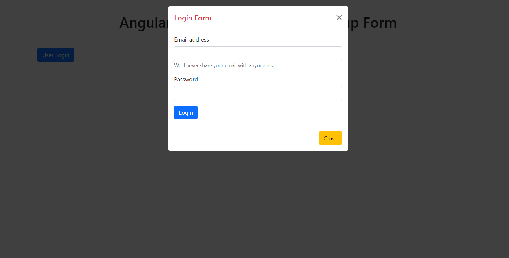
    Hello friends, welcome back to my blog. Today this blog post will tell you, Angular 11 Bootstrap 5 Modal Popup Form.


    Angular 11 Bootstrap Modal Popup

    Angular 11 Bootstrap 5 Modal Popup Form
    Angular 11 Bootstrap 5 Modal Popup Form
    Angular 11 Bootstrap 5 Responsive Modal Popup Form
    Bootstrap 5 Responsive Modal Popup Form

    Angular 11 came and Bootstrap 5 also and very soon Angular 12 will come. If you are new then you must check below two links:

    1. Angular11 Basic Tutorials
    2. Bootstrap 5

    Friends now I proceed onwards and here is the working code snippet and please use carefully this to avoid the mistakes:

    1. Firstly friends we need fresh angular 11 setup and for this we need to run below commands but if you already have angular 11 setup then you can avoid below commands. Secondly we should also have latest node version installed on our system:

    npm install -g @angular/cli 
    
    ng new angularboot5 //Create new Angular Project
    
    cd angularboot5 // Go inside the Angular Project Folder

    2. Now friends we need to run below commands into our project terminal to install bootstrap 5 modules into our angular application:

    npm install bootstrap@next

    3. Now friends we just need to add below code into angularboot5/src/app/app.component.html file to get final out on the web browser:

       
    <!-- Button trigger modal -->
    <button type="button" class="btn btn-primary" data-bs-toggle="modal" data-bs-target="#exampleModal">
      User Login
    </button>
    
    <!-- Modal -->
    <div class="modal fade" id="exampleModal" tabindex="-1" aria-labelledby="exampleModalLabel" aria-hidden="true">
      <div class="modal-dialog">
        <div class="modal-content">
          <div class="modal-header">
            <h5 class="modal-title text-danger" id="exampleModalLabel">Login Form</h5>
            <button type="button" class="btn-close" data-bs-dismiss="modal" aria-label="Close"></button>
          </div>
          <div class="modal-body">
            <form>
              <div class="mb-3">
                <label for="exampleInputEmail1" class="form-label">Email address</label>
                <input type="email" class="form-control" id="exampleInputEmail1" aria-describedby="emailHelp">
                <div id="emailHelp" class="form-text">We'll never share your email with anyone else.</div>
              </div>
              <div class="mb-3">
                <label for="exampleInputPassword1" class="form-label">Password</label>
                <input type="password" class="form-control" id="exampleInputPassword1">
              </div>
              <button type="submit" class="btn btn-primary">Login</button>
            </form>
          </div>
          <div class="modal-footer">
            <button type="button" class="btn btn-warning" data-bs-dismiss="modal">Close</button>
          </div>
        </div>
      </div>
    </div>

    4. Now friends we just need to add below code into angularboot5/angular.json file:

    "styles": [
                  ...
                  "node_modules/bootstrap/dist/css/bootstrap.min.css"
              ],
    "scripts": [
                  ...
                   "node_modules/bootstrap/dist/js/bootstrap.min.js"
               ]

    Friends in the end must run ng serve command into your terminal to run the angular 11 project.

    Now we are done friends. If you have any kind of query, suggestion and new requirement then feel free to comment below.

    Note: Friends, In this post, I just tell the basic setup and things, you can change the code according to your requirements.

    I will appreciate that if you will tell your views for this post. Nothing matters if your views will be good or bad because with your views, I will make my next posts more good and helpful.

    Jassa

    Thanks

  • Reactjs Bootstrap 5 Modal Popup Form

    Reactjs Bootstrap 5 Modal Popup Form

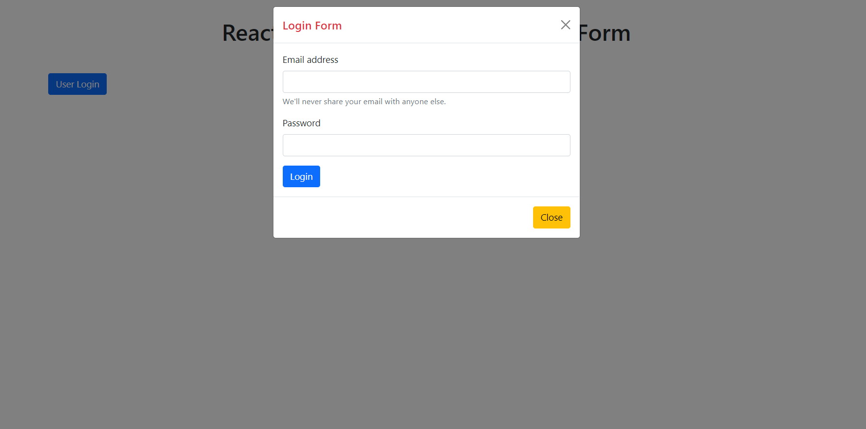
    Hello friends, welcome back to my blog. Today in this blog post, I am going to show you, Reactjs Bootstrap 5 Modal Popup Form.

    Post working : I am opening, Bootstrap5 Modal Popup Form on button click in my Reactjs application.


    React js Modal Popup Form
    Reactjs Bootstrap 5 Modal Popup Form
    Reactjs Bootstrap 5 Modal Popup Form
    Reactjs Bootstrap5 Responsive Modal Popup Form

    For reactjs new comers, please check the below link:

    Reactjs Basic Tutorials

    Bootstrap 5 Tutorials


    Friends now I proceed onwards and here is the working code snippet and please use this carefully to avoid the mistakes:

    1. Firstly, we need fresh reactjs setup and for that, we need to run below commands into out terminal and also we should have latest node version installed on our system:

    npx create-react-app reactboot5
    
    cd reactboot5

    2. Now we need to run below commands into our project terminal to get bootstrap and related modules into our reactjs application:

    npm install bootstrap@next --save
    
    npm start //For start project again

    3. Finally for the main output, we need to add below code into our reactboot5/src/App.js file or if you have fresh setup then you can replace reactboot5/src/App.js file code with below code:

    import React from 'react';
    
    //Importing Bootstrap 5
    import "bootstrap/dist/css/bootstrap.min.css";
    import "bootstrap/dist/js/bootstrap.min.js";
    function App() {
      
      return (
        <div className="App">
        <div class="container p-5">
            
             
             <button type="button" class="btn btn-primary" data-bs-toggle="modal" data-bs-target="#exampleModal">
             User Login
             </button>
    
            
             <div class="modal fade" id="exampleModal" tabindex="-1" aria-labelledby="exampleModalLabel" aria-hidden="true">
             <div class="modal-dialog">
                <div class="modal-content">
                   <div class="modal-header">
                   <h5 class="modal-title text-danger" id="exampleModalLabel">Login Form</h5>
                   <button type="button" class="btn-close" data-bs-dismiss="modal" aria-label="Close"></button>
                   </div>
                   <div class="modal-body">
                   <form>
                      <div class="mb-3">
                         <label for="exampleInputEmail1" class="form-label">Email address</label>
                         <input type="email" class="form-control" id="exampleInputEmail1" aria-describedby="emailHelp" />
                         <div id="emailHelp" class="form-text">We'll never share your email with anyone else.</div>
                      </div>
                      <div class="mb-3">
                         <label for="exampleInputPassword1" class="form-label">Password</label>
                         <input type="password" class="form-control" id="exampleInputPassword1" />
                      </div>
                      <button type="submit" class="btn btn-primary">Login</button>
                   </form>
                   </div>
                   <div class="modal-footer">
                   <button type="button" class="btn btn-warning" data-bs-dismiss="modal">Close</button>
                   </div>
                </div>
             </div>
             </div>
             </div>
          
        </div>
      );
    }
    
    export default App;
    

    Now we are done friends. If you have any kind of query or suggestion or any requirement then feel free to comment below.

    Note: Friends, I just tell the basic setup and things, you can change the code according to your requirements.

    I will appreciate that if you will tell your views for this post. Nothing matters if your views will be good or bad.

    Jassa

    Thanks

  • Vue 3 Bootstrap 5 Modal Popup Form

    Vue 3 Bootstrap 5 Modal Popup Form

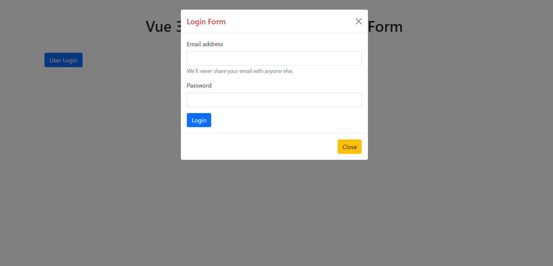
    Hello friends, welcome back to my blog. Today in this blog post, I am going to show you, Vue 3 Bootstrap 5 Modal Popup Form.

    Post Working: In this post, I am opening user login form inside Bootstrap 5 Modal Popup in my Vue3 application.

    Bootstrap 5 in Vuejs

    Vue 3 Bootstrap 5 Modal Popup Form
    Vue 3 Bootstrap 5 Modal Popup Form
    Vuejs Bootstrap 5 Modal Form Responsive
    Vuejs Bootstrap 5 Modal Form Responsive

    Vue 3 and Bootstrap 5 came and if you are new then you must check below two links:

    1. Vuejs
    2. Bootstrap 5

    Friends now I proceed onwards and here is the working code snippet and use this carefully to avoid the mistakes:

    1. Firstly friends we need fresh vue 3 setup and for this we need to run below commands . Secondly we should also have latest node version installed on our system. With below we will have  bootstrap 5 modules in our Vue 3 application:

    npm install -g @vue/cli
    
    vue create vueboot5
    
    cd vueboot5
    
    npm i bootstrap
    
    npm run serve //http://localhost:8080/


    2. Now friends we need to add below code into vueboot5/src/App.vue file to check the final output on browser:

    <template>
     <div class="container p-5">
    <!-- Button trigger modal -->
    <button type="button" class="btn btn-primary" data-bs-toggle="modal" data-bs-target="#exampleModal">
      User Login
    </button>
    
    <!-- Modal -->
    <div class="modal fade" id="exampleModal" tabindex="-1" aria-labelledby="exampleModalLabel" aria-hidden="true">
      <div class="modal-dialog">
        <div class="modal-content">
          <div class="modal-header">
            <h5 class="modal-title text-danger" id="exampleModalLabel">Login Form</h5>
            <button type="button" class="btn-close" data-bs-dismiss="modal" aria-label="Close"></button>
          </div>
          <div class="modal-body">
            <form>
              <div class="mb-3">
                <label for="exampleInputEmail1" class="form-label">Email address</label>
                <input type="email" class="form-control" id="exampleInputEmail1" aria-describedby="emailHelp">
                <div id="emailHelp" class="form-text">We'll never share your email with anyone else.</div>
              </div>
              <div class="mb-3">
                <label for="exampleInputPassword1" class="form-label">Password</label>
                <input type="password" class="form-control" id="exampleInputPassword1">
              </div>
              <button type="submit" class="btn btn-primary">Login</button>
            </form>
          </div>
          <div class="modal-footer">
            <button type="button" class="btn btn-warning" data-bs-dismiss="modal">Close</button>
          </div>
        </div>
      </div>
    </div>
    </div>
    </template>
    <script>
    //importing bootstrap 5
    import "bootstrap/dist/css/bootstrap.min.css";
    import "bootstrap/dist/js/bootstrap.min.js";
    export default {
     
    }
    </script>

    Now we are done friends and If you have any kind of query or suggestion or any requirement then feel free to comment below.

    Note: Friends, I just tell the basic setup and things, you can change the code according to your requirements.

    I will appreciate that if you will tell your views for this post. Nothing matters if your views will be good or bad.

    Jassa

    Thanks

  • Angular 11 PrimeNG Dynamic Products Order List with Filtration and DragDrop Features

    Angular 11 PrimeNG Dynamic Products Order List with Filtration and DragDrop Features

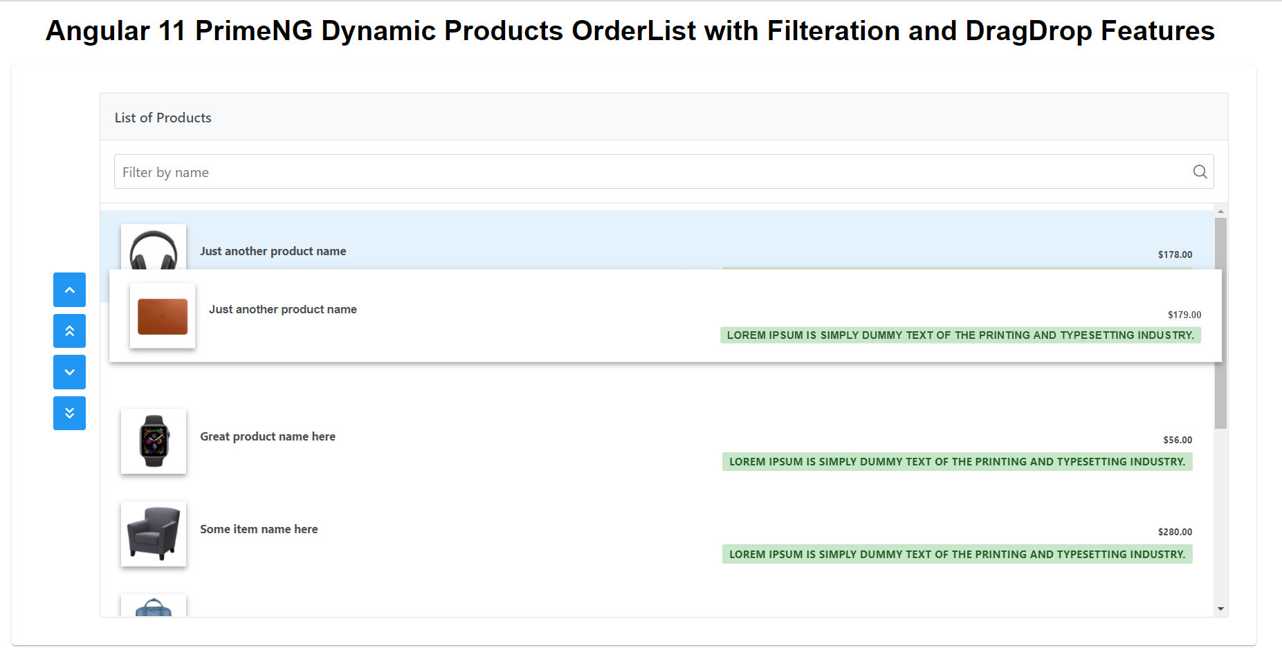
    Hello friends, welcome back to my blog. Today this blog post will tell you, Angular 11 PrimeNG Dynamic Products Order List with Filtration and DragDrop Features.

    About Working: In this post, I am show dynamic product order list with filter and drag drop functionaliy.


    PrimeNG OrderList

    Angular 11 PrimeNG Dynamic Products Order List with Filtration and DragDrop Features
    Angular 11 PrimeNG Dynamic Products Order List with Filtration and DragDrop Features

    Angular 11 came and Bootstrap 5 also and very soon Angular 12 will come and if you are new then you must check below two links:

    1. Angular11 Basic Tutorials
    2. PrimeNG
    3. Bootstrap 5

    Friends now I proceed onwards and here is the working code snippet and please use carefully this to avoid the mistakes:

    1. Firstly friends we need fresh angular 11 setup and for this we need to run below commands but if you already have angular 11 setup then you can avoid below commands. Secondly we should also have latest node version installed on our system:

    npm install -g @angular/cli 
    
    ng new angularprimeng //Create new Angular Project
    
    cd angularprimeng // Go inside the Angular Project Folder

    2. Now friends we need to run below commands into our project terminal to install primeng  modules into our angular application:

    npm install primeng --save
    
    npm install primeicons --save 
    
    npm install @angular/cdk --save
    
    npm install primeflex --save //for flex layout

    3. Now friends we just need to add below code into angularprimeng/src/app/app.component.html file to get final out on the web browser:

    <!-- Oderlist with Dynamic Products -->
    <p-orderList [value]="products" [listStyle]="{'height':'auto'}" header="List of Products" filterBy="product_title" filterPlaceholder="Filter by name" dragdrop="true">
        <ng-template let-product pTemplate="item">
            <div>
                <img src="{{product.product_image}}" style="display:inline-block;margin:2px 0 2px 2px" width="48">
                <div style="font-size:14px;float:right;margin:15px 5px 0 0">{{product.product_title}}</div>
            </div>
        </ng-template>
    </p-orderList>

    4. Now friends we just need to add below code into angularprimeng/angular.json file:

     "styles": [
                  "src/styles.css",
                  "node_modules/primeng/resources/themes/saga-blue/theme.css",
                  "node_modules/primeng/resources/primeng.min.css",
                  "node_modules/primeflex/primeflex.css",
                  "node_modules/primeicons/primeicons.css",
                ],
    ...

    5. Now friends we just need to add below code into angularprimeng/src/app/app.module.ts file:

    ...
    import { BrowserAnimationsModule } from '@angular/platform-browser/animations';
    import { HttpClientModule } from '@angular/common/http';
    import {ButtonModule} from 'primeng/button';
    import {OrderListModule} from 'primeng/orderlist';
    
    @NgModule({
      ...
      imports: [
        ...
        BrowserAnimationsModule,
        HttpClientModule,
        ButtonModule,
        OrderListModule
      ],
      providers: [],
      bootstrap: [AppComponent]
    })
    export class AppModule { }
    

    6. Now friends we just need to add below code into angularprimeng/src/app/app.module.ts file:

    ...
    import { HttpClient } from '@angular/common/http';
    
    export class AppComponent {
     ...
      products:any;
      
      constructor(private http: HttpClient){
        //get request
        this.http.get('https://www.testjsonapi.com/products/').subscribe(data => {
          //data storing for use in html component
          this.products = data;
              }, error => console.error(error));
      }
    }

    Friends in the end must run ng serve command into your terminal to run the angular 11 project.

    Now we are done friends. If you have any kind of query, suggestion and new requirement then feel free to comment below.

    Note: Friends, In this post, I just tell the basic setup and things, you can change the code according to your requirements.

    I will appreciate that if you will tell your views for this post. Nothing matters if your views will be good or bad because with your views, I will make my next posts more good and helpful.

    Jassa

    Thanks

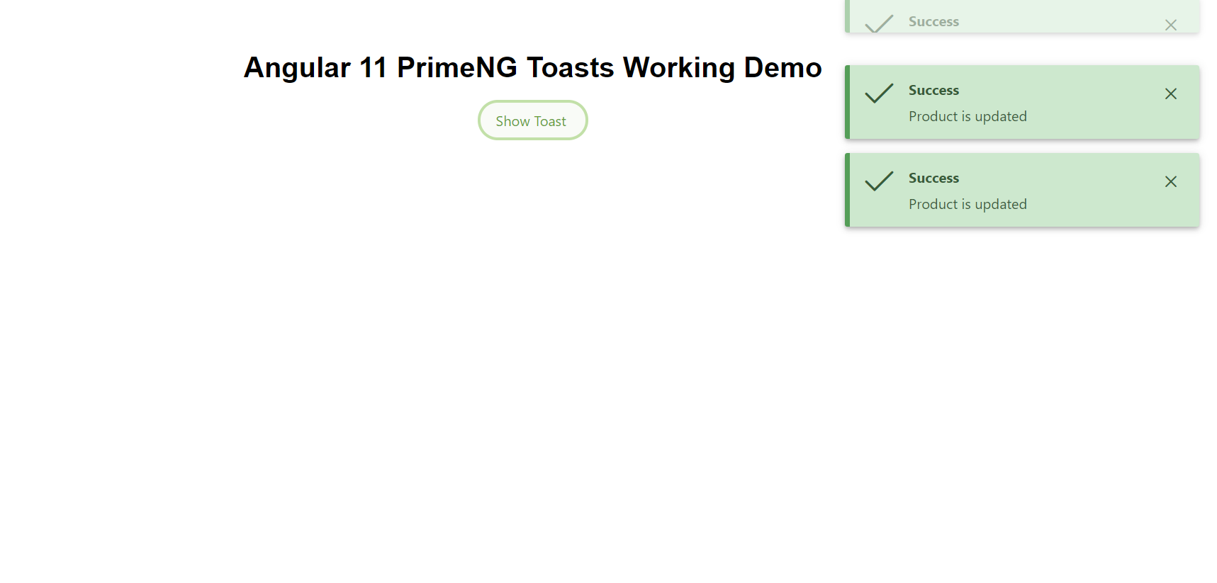
  • Angular 11 PrimeNG Toasts Working Demo on Button Click

    Angular 11 PrimeNG Toasts Working Demo on Button Click

    Hello friends, welcome back to my blog. Today this blog post will tell you, Angular 11 PrimeNG Toasts Working Demo on Button Click.

    About Working: In this post, I am opening PrimeNG Toasts alert or notifications on button click.


    PrimeNG Toasts

    Angular 11 PrimeNG Toasts Working Demo on Button Click
    Angular 11 PrimeNG Toasts Working Demo on Button Click

    Angular 11 came and Bootstrap 5 also and very soon Angular 12 will come and if you are new then you must check below two links:

    1. Angular11 Basic Tutorials
    2. PrimeNG
    3. Bootstrap 5

    Friends now I proceed onwards and here is the working code snippet and please use carefully this to avoid the mistakes:

    1. Firstly friends we need fresh angular 11 setup and for this we need to run below commands but if you already have angular 11 setup then you can avoid below commands. Secondly we should also have latest node version installed on our system:

    npm install -g @angular/cli 
    
    ng new angularprimeng //Create new Angular Project
    
    cd angularprimeng // Go inside the Angular Project Folder

    2. Now friends we need to run below commands into our project terminal to install primeng  modules into our angular application:

    npm install primeng --save
    
    npm install primeicons --save 
    
    npm install @angular/cdk --save
    
    npm install primeflex --save //for flex layout

    3. Now friends we just need to add below code into angularprimeng/src/app/app.component.html file to get final out on the web browser:

    <p-toast></p-toast><!--Toast Html-->
    <button pButton type="button" (click)="showtoast()" class="p-button-rounded p-button-text p-button-success p-mr-2">Show Toast</button>

    4. Now friends we just need to add below code into angularprimeng/angular.json file:

     "styles": [
                  "src/styles.css",
                  "node_modules/primeng/resources/themes/saga-blue/theme.css",
                  "node_modules/primeng/resources/primeng.min.css",
                  "node_modules/primeflex/primeflex.css",
                  "node_modules/primeicons/primeicons.css",
                ],
    ...

    5. Now friends we just need to add below code into angularprimeng/src/app/app.component.ts file:

    ...
    import { MessageService } from 'primeng/api';
    export class AppComponent {
      constructor(private messageService: MessageService){
        
      //button click event
      showtoast()
      {
    
       //Message type and style
       this.messageService.add({severity:'success', summary: 'Success', detail:'Product is updated'});
      }
    }

    6. Now friends we just need to add below code into angularprimeng/src/app/app.module.ts file:

    ...//Importing PrimeNG Modules for Toast Working
    import { BrowserAnimationsModule } from '@angular/platform-browser/animations';
    import {ButtonModule} from 'primeng/button';
    import {ToastModule} from 'primeng/toast';
    
    @NgModule({
     ...
      imports: [
       ...
        BrowserAnimationsModule,
        ButtonModule,
        ToastModule
      ]...
    export class AppModule { }
    

    Friends in the end must run ng serve command into your terminal to run the angular 11 project.

    Now we are done friends. If you have any kind of query, suggestion and new requirement then feel free to comment below.

    Note: Friends, In this post, I just tell the basic setup and things, you can change the code according to your requirements.

    I will appreciate that if you will tell your views for this post. Nothing matters if your views will be good or bad because with your views, I will make my next posts more good and helpful.

    Jassa

    Thanks

  • How to access webcam in Ionic 5?

    How to access webcam in Ionic 5?

    Hello to all, welcome back to my blog. Today in this blog post, I am going to show you, How to access webcam in Ionic 5?

    Ionic 5 Access Webcam

    Ionic Live Webcam Preview
    Ionic Live Webcam Preview

    Ionic5, Angular11 and Bootstrap 5 came and if you are new then you must check below links:

    1. Angular11 Basic Tutorials
    2. Ionic 5
    3. Bootstrap 5
    4. For more Angular Free Templates click here

    Friends now I proceed onwards and here is the working code snippet and use this carefully to avoid the mistakes:

    1. Firstly friends we need fresh Ionic 5 angular 11 setup and for this we need to run below commands but if you already have  Ionic 5 angular 11 setup then you can avoid below commands. Secondly we should also have latest node version installed on our system:

    Guys you can skip this first step if you already have ionic 5 fresh setup:

    npm install -g @ionic/cli
    
    ionic start myapp blank
    
    cd myapp

    2. Now friends we need to run below commands into our project terminal to install ngx-webcam access  modules into our ionic application: 

    npm i ngx-webcam
    
    ionic serve

    3. Now friends we need to add below code into myapp/src/app/app.component.html file:

    <webcam [height]="500" [width]="500" [trigger]="triggerObservable" (imageCapture)="handleImage($event)"></webcam>
    
    <!-- Button Takes Photo -->
    <button class="actionBtn" (click)="triggerSnapshot();">Take A Snapshot</button>
    
    <!-- Snapshot Div where image will be shown -->
    <div class="snapshot" *ngIf="webcamImage">
      <h2>Take your image or get another</h2>
      <img [src]="webcamImage.imageAsDataUrl"/>
    </div>

    4. Now friends we need to add below code into myapp/src/app/app.module.ts file:

    ...
    import {WebcamModule} from 'ngx-webcam';
    ...
    imports: [
        ...
        WebcamModule
    ]

    5. Now friends we need to add below code into myapp/src/app/app.component.ts file:

    ...
    import {WebcamImage} from 'ngx-webcam';
    import {Subject, Observable} from 'rxjs';
    ...
    export class AppComponent {
    ...
       // latest snapshot
       public webcamImage: WebcamImage = null;
    
       // webcam snapshot trigger
       private trigger: Subject<void> = new Subject<void>();
       triggerSnapshot(): void {
        this.trigger.next();
       }
       handleImage(webcamImage: WebcamImage): void {
        console.info('received webcam image', webcamImage);
        this.webcamImage = webcamImage;
       }
      
       public get triggerObservable(): Observable<void> {
        return this.trigger.asObservable();
       }
    }

    Now we are done friends  also and If you have any kind of query or suggestion or any requirement then feel free to comment below. In my next post I will come with more Ionic 5 working demos.

    Note: Friends, I just tell the basic setup and things, you can change the code according to your requirements. For better understanding must watch video above.

    I will appreciate that if you will tell your views for this post. Nothing matters if your views will be good or bad.

    Jassa

    Thanks

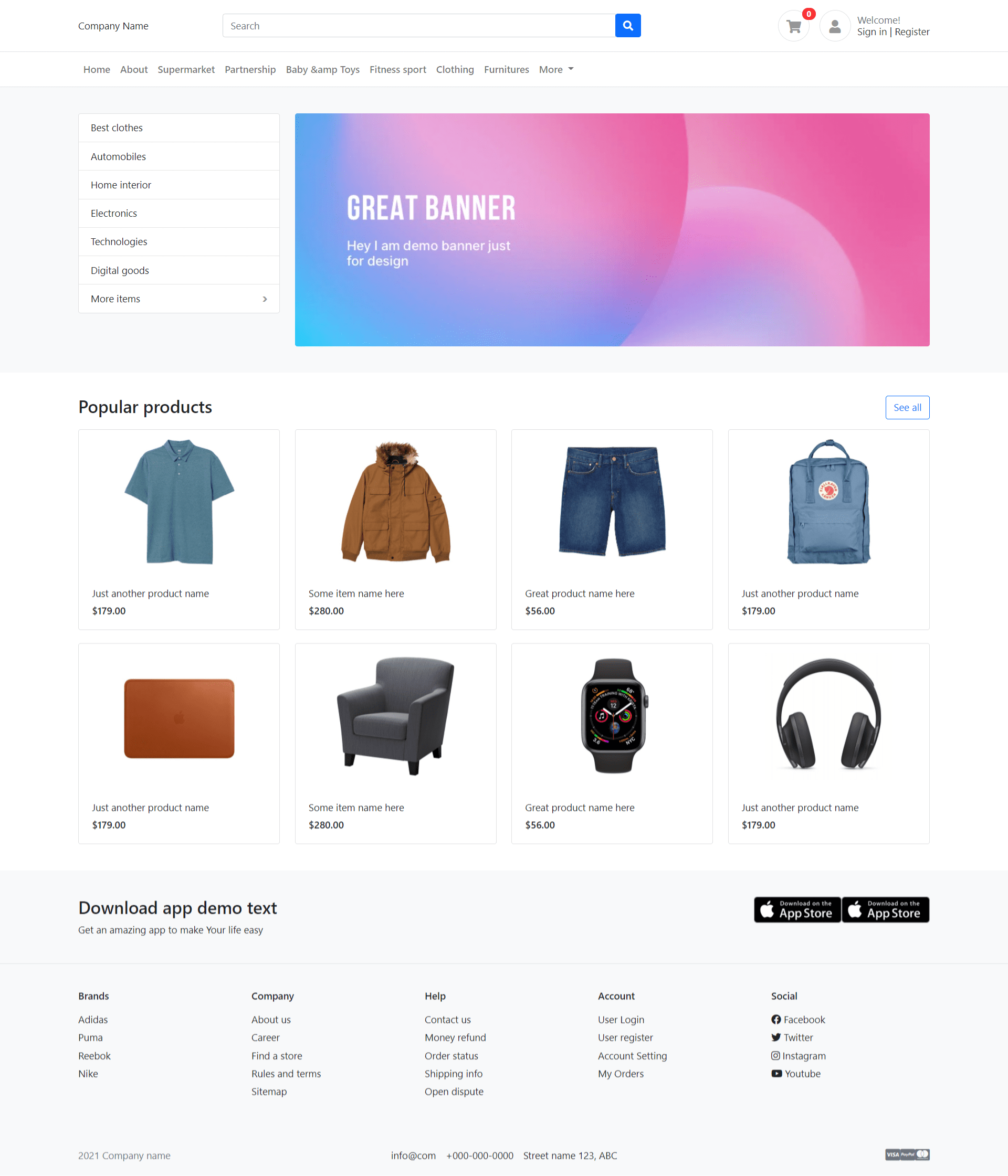
  • How to build an eCommerce website using bootstrap 5?

    How to build an eCommerce website using bootstrap 5?

    Hello friends, welcome back to my blog. Today this blog post will tell you, How to build an eCommerce website using bootstrap 5?

    In this post, guys we will get below things:

    • Bootstrap 5 Free Ecommerce Template Creation.
    • Bootstrap Template Fully Responsive.

    Bootstrap EcommerceTemplate Working Video

    How to build an eCommerce website using bootstrap 5?
    How to build an eCommerce website using bootstrap 5?

    Angular 11 came and Bootstrap 5 also and very soon Angular 12 will come and if you are new then you must check below two links:

    1. Angular11 Basic Tutorials
    2. Bootstrap 5

    Friends now I proceed onwards and here is the working code snippet for How to create responsive website using Bootstrap 5? and please use carefully this to avoid the mistakes:

    1. Friends please do the below two points very first:

    a). Very first please create `ecommerce`  folder and inside `ecommerce` folder please create `assets` folder

    b). Now please download zip(in this zip file there are js, css and images for html bootstrap template) file from below path and extract zip and please put all the zip file folders in “ecommerce/assets” folder(which we will get from zip file):

    https://therichpost.com/ng-b5.zip

    2. Now friends we need to create ecommerce.html file inside `ecommerce` folder and add below inside that file:

    <!doctype html>
    <html lang="en">
    <head>
      <meta charset="utf-8">
      <title>Ecommerce Site</title>
      <meta name="viewport" content="width=device-width, initial-scale=1">
      <link rel="icon" type="image/x-icon" href="assets/images/items/1.jpg">
      <!-- Custom styles for this template -->
      <link href="assets/css/bootstrap.css" rel="stylesheet">
      <link href="assets/css/ui.css" rel="stylesheet">
      <link href="assets/css/responsive.css" rel="stylesheet">
      <link href="assets/css/all.min.css" rel="stylesheet">
      
      <script src="assets/js/bootstrap.min.js"></script>
    </head>
    <body>
    <header class="section-header">
    
        <section class="header-main border-bottom">
            <div class="container">
        <div class="row align-items-center">
            <div class="col-lg-2 col-4">
                Therichpost
            </div>
            <div class="col-lg-6 col-sm-12">
                <form action="#" class="search">
                    <div class="input-group w-100">
                        <input type="text" class="form-control" placeholder="Search">
                        <div class="input-group-append">
                          <button class="btn btn-primary" type="submit">
                            <i class="fa fa-search"></i>
                          </button>
                        </div>
                    </div>
                </form> <!-- search-wrap .end// -->
            </div> <!-- col.// -->
            <div class="col-lg-4 col-sm-6 col-12">
                <div class="widgets-wrap float-md-end">
                    <div class="widget-header  me-3">
                        <a href="#" class="icon icon-sm rounded-circle border"><i class="fa fa-shopping-cart"></i></a>
                        <span class="badge badge-pill badge-danger notify">0</span>
                    </div>
                    <div class="widget-header icontext">
                        <a href="#" class="icon icon-sm rounded-circle border"><i class="fa fa-user"></i></a>
                        <div class="text">
                            <span class="text-muted">Welcome!</span>
                            <div> 
                                <a href="#">Sign in</a> |  
                                <a href="#"> Register</a>
                            </div>
                        </div>
                    </div>
        
                </div> <!-- widgets-wrap.// -->
            </div> <!-- col.// -->
        </div> <!-- row.// -->
            </div> <!-- container.// -->
        </section> <!-- header-main .// -->


        <nav class="navbar navbar-main navbar-expand-lg navbar-light border-bottom">
          <div class="container">
        
            <button class="navbar-toggler" type="button" data-bs-toggle="collapse" data-bs-target="#navbarNav" aria-controls="navbarNav" aria-expanded="false" aria-label="Toggle navigation">
              <span class="navbar-toggler-icon"></span>
            </button>
        
            <div class="collapse navbar-collapse" id="navbarNav">
              <ul class="navbar-nav">
                  <li class="nav-item dropdown">
                   <a class="nav-link" href="#">Home</a>
                </li>
                <li class="nav-item">
                  <a class="nav-link" href="#">About</a>
                </li>
                <li class="nav-item">
                  <a class="nav-link" href="#">Supermarket</a>
                </li>
                <li class="nav-item">
                  <a class="nav-link" href="#">Partnership</a>
                </li>
                <li class="nav-item">
                  <a class="nav-link" href="#">Baby &amp; Toys</a>
                </li>
                <li class="nav-item">
                  <a class="nav-link" href="#">Fitness sport</a>
                </li>
                <li class="nav-item">
                  <a class="nav-link" href="#">Clothing</a>
                </li>
                <li class="nav-item">
                  <a class="nav-link" href="#">Furnitures</a>
                </li>
                <li class="nav-item dropdown">
                  <a class="nav-link dropdown-toggle" href="#" id="navbarDropdown" role="button" data-bs-toggle="dropdown" aria-expanded="false">
                    More
                  </a>
                  <ul class="dropdown-menu" aria-labelledby="navbarDropdown">
                    <li><a class="dropdown-item" href="#">Foods and Drink</a></li>
                    <li><a class="dropdown-item" href="#">Home interior</a></li>
                    <li><hr class="dropdown-divider"></li>
                    <li><a class="dropdown-item" href="#">Home interior 2</a></li>
                  </ul>
                </li>
              </ul>
            </div> <!-- collapse .// -->
          </div> <!-- container .// -->
        </nav>
        
        </header> <!-- section-header.// -->
        
        
        <!-- ========================= SECTION MAIN ========================= -->
        <section class="section-main bg padding-y">
        <div class="container">
        
        <div class="row">
            <aside class="col-md-3">
                <nav class="card">
                    <ul class="menu-category">
                        <li><a href="#">Best clothes</a></li>
                        <li><a href="#">Automobiles</a></li>
                        <li><a href="#">Home interior</a></li>
                        <li><a href="#">Electronics</a></li>
                        <li><a href="#">Technologies</a></li>
                        <li><a href="#">Digital goods</a></li>
                        <li class="has-submenu"><a href="#">More items</a>
                            <ul class="submenu">
                                <li><a href="#">Submenu name</a></li>
                                <li><a href="#">Great submenu</a></li>
                                <li><a href="#">Another menu</a></li>
                                <li><a href="#">Some others</a></li>
                            </ul>
                        </li>
                    </ul>
                </nav>
            </aside> <!-- col.// -->
            <div class="col-md-9">
                <article class="banner-wrap">
                    <img src="assets/images/2.jpg" class="w-100 rounded">
                </article>
            </div> <!-- col.// -->
        </div> <!-- row.// -->
        </div> <!-- container //  -->
        </section>
        <!-- ========================= SECTION MAIN END// ========================= -->
        
        <!-- ========================= SECTION  ========================= -->
        <section class="section-name padding-y-sm">
        <div class="container">
        
        <header class="section-heading">
            <a href="#" class="btn btn-outline-primary float-end">See all</a>
            <h3 class="section-title">Popular products</h3>
        </header><!-- sect-heading -->
        
            
        <div class="row">
            <div class="col-md-3">
                <div href="#" class="card card-product-grid">
                    <a href="#" class="img-wrap"> <img src="assets/images/items/1.jpg"> </a>
                    <figcaption class="info-wrap">
                        <a href="#" class="title">Just another product name</a>
                        <div class="price mt-1">$179.00</div> <!-- price-wrap.// -->
                    </figcaption>
                </div>
            </div> <!-- col.// -->
            <div class="col-md-3">
                <div href="#" class="card card-product-grid">
                    <a href="#" class="img-wrap"> <img src="assets/images/items/2.jpg"> </a>
                    <figcaption class="info-wrap">
                        <a href="#" class="title">Some item name here</a>
                        <div class="price mt-1">$280.00</div> <!-- price-wrap.// -->
                    </figcaption>
                </div>
            </div> <!-- col.// -->
            <div class="col-md-3">
                <div href="#" class="card card-product-grid">
                    <a href="#" class="img-wrap"> <img src="assets/images/items/3.jpg"> </a>
                    <figcaption class="info-wrap">
                        <a href="#" class="title">Great product name here</a>
                        <div class="price mt-1">$56.00</div> <!-- price-wrap.// -->
                    </figcaption>
                </div>
            </div> <!-- col.// -->
            <div class="col-md-3">
                <div href="#" class="card card-product-grid">
                    <a href="#" class="img-wrap"> <img src="assets/images/items/4.jpg"> </a>
                    <figcaption class="info-wrap">
                        <a href="#" class="title">Just another product name</a>
                        <div class="price mt-1">$179.00</div> <!-- price-wrap.// -->
                    </figcaption>
                </div>
            </div> <!-- col.// -->
            <div class="col-md-3">
                <div href="#" class="card card-product-grid">
                    <a href="#" class="img-wrap"> <img src="assets/images/items/5.jpg"> </a>
                    <figcaption class="info-wrap">
                        <a href="#" class="title">Just another product name</a>
                        <div class="price mt-1">$179.00</div> <!-- price-wrap.// -->
                    </figcaption>
                </div>
            </div> <!-- col.// -->
            <div class="col-md-3">
                <div href="#" class="card card-product-grid">
                    <a href="#" class="img-wrap"> <img src="assets/images/items/6.jpg"> </a>
                    <figcaption class="info-wrap">
                        <a href="#" class="title">Some item name here</a>
                        <div class="price mt-1">$280.00</div> <!-- price-wrap.// -->
                    </figcaption>
                </div>
            </div> <!-- col.// -->
            <div class="col-md-3">
                <div href="#" class="card card-product-grid">
                    <a href="#" class="img-wrap"> <img src="assets/images/items/7.jpg"> </a>
                    <figcaption class="info-wrap">
                        <a href="#" class="title">Great product name here</a>
                        <div class="price mt-1">$56.00</div> <!-- price-wrap.// -->
                    </figcaption>
                </div>
            </div> <!-- col.// -->
            <div class="col-md-3">
                <div href="#" class="card card-product-grid">
                    <a href="#" class="img-wrap"> <img src="assets/images/items/9.jpg"> </a>
                    <figcaption class="info-wrap">
                        <a href="#" class="title">Just another product name</a>
                        <div class="price mt-1">$179.00</div> <!-- price-wrap.// -->
                    </figcaption>
                </div>
            </div> <!-- col.// -->
        </div> <!-- row.// -->
        
        </div><!-- container // -->
        </section>
        <!-- ========================= SECTION  END// ========================= -->
        
        
        <!-- ========================= SECTION  ========================= -->
        <section class="section-name padding-y bg">
        <div class="container">
        
        <div class="row">
        <div class="col-md-6">
            <h3>Download app demo text</h3>
            <p>Get an amazing app  to make Your life easy</p>
        </div>
        <div class="col-md-6 text-md-end">
            <a href="#"><img src="assets/images/misc/appstore.png" height="40"></a>
            <a href="#"><img src="assets/images/misc/appstore.png" height="40"></a>
        </div>
        </div> <!-- row.// -->
        </div><!-- container // -->
        </section>
        <!-- ========================= SECTION  END// ======================= -->


        <!-- ========================= FOOTER ========================= -->
      <footer class="section-footer border-top bg">
        <div class="container">
          <section class="footer-top  padding-y">
            <div class="row">
              <aside class="col-md col-6">
                <h6 class="title">Brands</h6>
                <ul class="list-unstyled">
                  <li> <a href="#">Adidas</a></li>
                  <li> <a href="#">Puma</a></li>
                  <li> <a href="#">Reebok</a></li>
                  <li> <a href="#">Nike</a></li>
                </ul>
              </aside>
              <aside class="col-md col-6">
                <h6 class="title">Company</h6>
                <ul class="list-unstyled">
                  <li> <a href="#">About us</a></li>
                  <li> <a href="#">Career</a></li>
                  <li> <a href="#">Find a store</a></li>
                  <li> <a href="#">Rules and terms</a></li>
                  <li> <a href="#">Sitemap</a></li>
                </ul>
              </aside>
              <aside class="col-md col-6">
                <h6 class="title">Help</h6>
                <ul class="list-unstyled">
                  <li> <a href="#">Contact us</a></li>
                  <li> <a href="#">Money refund</a></li>
                  <li> <a href="#">Order status</a></li>
                  <li> <a href="#">Shipping info</a></li>
                  <li> <a href="#">Open dispute</a></li>
                </ul>
              </aside>
              <aside class="col-md col-6">
                <h6 class="title">Account</h6>
                <ul class="list-unstyled">
                  <li> <a href="#"> User Login </a></li>
                  <li> <a href="#"> User register </a></li>
                  <li> <a href="#"> Account Setting </a></li>
                  <li> <a href="#"> My Orders </a></li>
                </ul>
              </aside>
              <aside class="col-md">
                <h6 class="title">Social</h6>
                <ul class="list-unstyled">
                  <li><a href="#"> <i class="fab fa-facebook"></i> Facebook </a></li>
                  <li><a href="#"> <i class="fab fa-twitter"></i> Twitter </a></li>
                  <li><a href="#"> <i class="fab fa-instagram"></i> Instagram </a></li>
                  <li><a href="#"> <i class="fab fa-youtube"></i> Youtube </a></li>
                </ul>
              </aside>
            </div> <!-- row.// -->
          </section>	<!-- footer-top.// -->
      
          <section class="footer-bottom row">
            <div class="col-md-2">
              <p class="text-muted">   2021 Company name </p>
            </div>
            <div class="col-md-8 text-md-center">
              <span  class="px-2">info@com</span>
              <span  class="px-2">+000-000-0000</span>
              <span  class="px-2">Street name 123, ABC</span>
            </div>
            <div class="col-md-2 text-md-end text-muted">
              <i class="fab fa-lg fa-cc-visa"></i> 
              <i class="fab fa-lg fa-cc-paypal"></i> 
              <i class="fab fa-lg fa-cc-mastercard"></i>
            </div>
          </section>
        </div><!-- //container -->
      </footer>
      <!-- ========================= FOOTER END // ========================= -->
    </body>
    </html>

    Guys in the end open your ecommerce.html file into your browser and check the output.

    Now we are done friends. If you have any kind of query, suggestion and new requirement then feel free to comment below.

    Note: Friends, In this post, I just tell the basic setup and things, you can change the code according to your requirements.

    I will appreciate that if you will tell your views for this post. Nothing matters if your views will be good or bad because with your views, I will make my next posts more good and helpful.

    Jassa

    Thanks

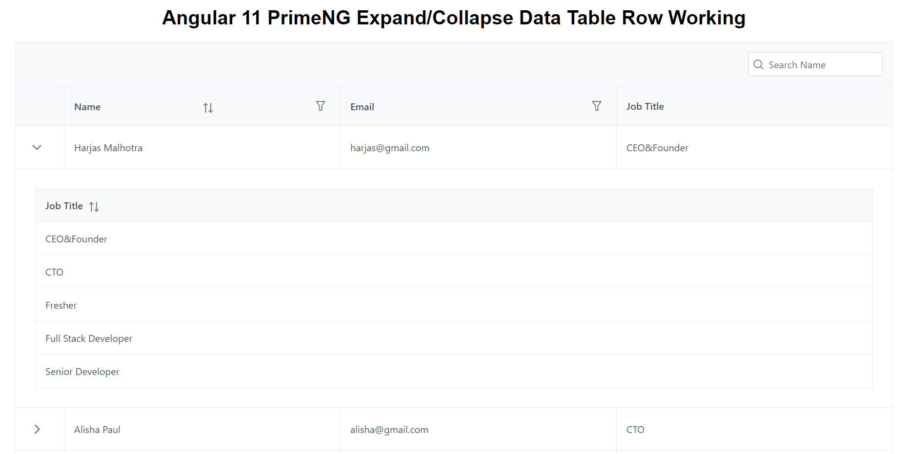
  • Angular 11 PrimeNG Expand Collapse Data Table Row Working Demo

    Angular 11 PrimeNG Expand Collapse Data Table Row Working Demo

    Hello friends, welcome back to my blog. Today this blog post will tell you, Angular 11 PrimeNG Expand Collapse Data Table Row Working Demo.

    About Working: In this post, I am doing PrimeNG Data Table row expand collapse functionality. I am getting dynamic data for demo working. I will also come with more good demos. Please share your queries related to PrimeNG Data Table.


    PrimeNG Data Table Row Expand with Dynamic Data

    Guys for testing PrimeNG table with dynamic data, please use this WEB API.


    Angular 11 PrimeNG Expand Collapse Data Table Row Working Demo
    Angular 11 PrimeNG Expand Collapse Data Table Row Working Demo

    Angular 11 came and Bootstrap 5 also and very soon Angular 12 will come and if you are new then you must check below two links:

    1. Angular11 Basic Tutorials
    2. PrimeNG
    3. Bootstrap 5

    Friends now I proceed onwards and here is the working code snippet and please use carefully this to avoid the mistakes:

    1. Firstly friends we need fresh angular 11 setup and for this we need to run below commands but if you already have angular 11 setup then you can avoid below commands. Secondly we should also have latest node version installed on our system:

    npm install -g @angular/cli 
    
    ng new angularprimeng //Create new Angular Project
    
    cd angularprimeng // Go inside the Angular Project Folder

    2. Now friends we need to run below commands into our project terminal to install primeng  modules into our angular application:

    npm install primeng --save
    
    npm install primeicons --save 
    
    npm install @angular/cdk --save
    
    npm install primeflex --save //for flex layout

    3. Now friends we just need to add below code into angularprimeng/src/app/app.component.html file to get final out on the web browser:

    <div class="card">
        <h1 class="p-text-center">Angular 11 PrimeNG Expand/Collapse Data Table Row Working</h1>
       
      <p-table #dt2 [value]="customers" dataKey="id"
          [rows]="5" [showCurrentPageReport]="true" [rowsPerPageOptions]="[5,10,15]" [loading]="loading" styleClass="p-datatable-customers p-datatable-gridlines"
          [paginator]="true" currentPageReportTemplate="Showing {first} to {last} of {totalRecords} entries"
          [globalFilterFields]="['name','customers.name']">
          <ng-template pTemplate="caption">
            <div class="p-d-flex">
                <span class="p-input-icon-left p-ml-auto">
                    <i class="pi pi-search"></i>
                    <input class="p-inputtext p-component" pInputText type="text" (input)="dt2.filterGlobal($event.target.value, 'contains')" placeholder="Search Name" />
                </span>
            </div>
        </ng-template>
          <ng-template pTemplate="header">
            <tr>
                <th style="width: 5rem"></th>
                <th pSortableColumn="name">
                    <div class="p-d-flex p-jc-between p-ai-center">
                        Name 
                        <p-sortIcon field="name"></p-sortIcon>
                        <p-columnFilter type="text" field="name" display="menu"></p-columnFilter>
                    </div>
                </th>
                  <th>
                    <div class="p-d-flex p-jc-between p-ai-center">
                        Email 
                        <p-columnFilter type="text" field="email" display="menu"></p-columnFilter>
                    </div>
                  </th>
                  <th>Job Title</th>
    
                  
              </tr>
             
          </ng-template>
          <ng-template pTemplate="body" let-customer let-expanded="expanded">
              <tr>
                <td>
                    <button type="button" pButton pRipple [pRowToggler]="customer" class="p-button-text p-button-rounded p-button-plain" [icon]="expanded ? 'pi pi-chevron-down' : 'pi pi-chevron-right'"></button>
                </td>
                  <td>
                      {{customer.name}}
                  </td>
                  <td>
                     
                      {{customer.email}}
                  </td>
                  
                  <td>
                       {{customer.job_title}}
                  </td>
                  
              </tr>
          </ng-template>
          <ng-template pTemplate="emptymessage">
              <tr>
                  <td colspan="5">No customers found.</td>
              </tr>
          </ng-template>
    
          <!--Expand Row-->
          <ng-template pTemplate="rowexpansion">
            <tr>
                <td colspan="4">
                    <div class="p-p-3">
                        <p-table [value]="customers" dataKey="id">
                            <ng-template pTemplate="header">
                                <tr>
                                    <th pSortableColumn="job_title">Job Title<p-sortIcon field="job_title"></p-sortIcon> </th>


                                </tr>
                            </ng-template>
                            <ng-template pTemplate="body" let-customer>
                                <tr>
                                    <td> {{customer.job_title}}</td>


                                </tr>
                            </ng-template>
                            <ng-template pTemplate="emptymessage">
                                <tr cl>
                                    <td class="p-text-center" colspan="3">There are no data for this user yet.</td>
                                </tr>
                            </ng-template>
                        </p-table>
                    </div>
                </td>
            </tr>
        </ng-template>
      </p-table>
    </div>

    4. Now friends we just need to add below code into angularprimeng/angular.json file:

     "styles": [
                  "src/styles.css",
                  "node_modules/primeng/resources/themes/saga-blue/theme.css",
                  "node_modules/primeng/resources/primeng.min.css",
                  "node_modules/primeflex/primeflex.css",
                  "node_modules/primeicons/primeicons.css",
                ],
    ...

    5. Now friends we just need to add below code into angularprimeng/src/app/app.component.ts file:

    ...
    import { HttpClient } from '@angular/common/http';
    export class AppComponent {
      
      //data variable
      customers:any;
      loading: boolean = true;
      constructor(private http: HttpClient){
        //get request from web api and you can also use this web api for testing
    
        this.http.get('https://www.testjsonapi.com/users/').subscribe(data => {
          //data storing for use in html component
          this.loading = false;
          this.customers = data;
              }, error => console.error(error));
      }
      ngOnInit() {


    }
    
    }

    6. Now friends we just need to add below code into angularprimeng/src/app/app.module.ts file:

    ...
    import { BrowserAnimationsModule } from '@angular/platform-browser/animations';
    import {TableModule} from 'primeng/table';
    import {DropdownModule} from 'primeng/dropdown';
    import { HttpClientModule } from '@angular/common/http';
    import {ButtonModule} from 'primeng/button';
    
    @NgModule({
     ...
      imports: [
       ...
        BrowserAnimationsModule,
        TableModule,
        DropdownModule,
        HttpClientModule,
        ButtonModule
      ],
      ...

    Friends in the end must run ng serve command into your terminal to run the angular 11 project.

    Now we are done friends. If you have any kind of query, suggestion and new requirement then feel free to comment below.

    Note: Friends, In this post, I just tell the basic setup and things, you can change the code according to your requirements.

    I will appreciate that if you will tell your views for this post. Nothing matters if your views will be good or bad because with your views, I will make my next posts more good and helpful.

    Jassa

    Thanks

  • Ionic 5 Angular 11 Bootstrap 5 Ecommerce Template Free Download

    Ionic 5 Angular 11 Bootstrap 5 Ecommerce Template Free Download

    Hello to all, welcome back to my blog. Today in this blog post, I am going to show you, Ionic 5 Angular 11 Bootstrap 5 Ecommerce Template Free Download.

    Ionic 5 Templates

    Ionic 5 Angular 11 Bootstrap 5 Ecommerce Template Free Download
    Ionic 5 Angular 11 Bootstrap 5 Ecommerce Template Free Download

    Ionic5, Angular11 and Bootstrap 5 came and if you are new then you must check below links:

    1. Angular11 Basic Tutorials
    2. Ionic 5
    3. Bootstrap 5
    4. For more Angular Free Templates click here

    Friends now I proceed onwards and here is the working code snippet and use this carefully to avoid the mistakes:

    1. Firstly friends we need fresh Ionic 5 angular 11 setup and for this we need to run below commands but if you already have  Ionic 5 angular 11 setup then you can avoid below commands. Secondly we should also have latest node version installed on our system:

    Guys you can skip this first step if you already have ionic 5 fresh setup:

    npm install -g @ionic/cli
    
    ionic start myapp blank
    
    cd myapp
    
    ionic serve

    2. Now friends, please download zip(in this zip file there are js, css and images for angular bootstrap template) file from below path and extract zip and please put all the zip file folders in “src/assets” folder(which we will get from zip file):

    https://therichpost.com/ng-b5.zip

    3. Now friends please add below code into myapp/src/index.html file:

    ...
    <head>
    ...
    <!-- Custom styles for this template -->
      <link href="assets/css/bootstrap.css" rel="stylesheet">
      <link href="assets/css/ui.css" rel="stylesheet">
      <link href="assets/css/responsive.css" rel="stylesheet">
      <link href="assets/css/all.min.css" rel="stylesheet">
      <script src="assets/js/bootstrap.min.js"></script>
    </head>

    4. Now friends we need to add below code into myapp/src/app/app.component.html file:

    <ion-content [scrollEvents]="true">
    <header class="section-header">
    
      <section class="header-main border-bottom">
          <div class="container">
      <div class="row align-items-center">
          <div class="col-lg-2 col-4">
              Therichpost
          </div>
          <div class="col-lg-6 col-sm-12">
              <form action="#" class="search">
                  <div class="input-group w-100">
                      <input type="text" class="form-control" placeholder="Search">
                      <div class="input-group-append">
                        <button class="btn btn-primary" type="submit">
                          <i class="fa fa-search"></i>
                        </button>
                      </div>
                  </div>
              </form> <!-- search-wrap .end// -->
          </div> <!-- col.// -->
          <div class="col-lg-4 col-sm-6 col-12">
              <div class="widgets-wrap float-md-end">
                  <div class="widget-header  me-3">
                      <a href="#" class="icon icon-sm rounded-circle border"><i class="fa fa-shopping-cart"></i></a>
                      <span class="badge badge-pill badge-danger notify">0</span>
                  </div>
                  <div class="widget-header icontext">
                      <a href="#" class="icon icon-sm rounded-circle border"><i class="fa fa-user"></i></a>
                      <div class="text">
                          <span class="text-muted">Welcome!</span>
                          <div> 
                              <a href="#">Sign in</a> |  
                              <a href="#"> Register</a>
                          </div>
                      </div>
                  </div>
      
              </div> <!-- widgets-wrap.// -->
          </div> <!-- col.// -->
      </div> <!-- row.// -->
          </div> <!-- container.// -->
      </section> <!-- header-main .// -->


      <nav class="navbar navbar-main navbar-expand-lg navbar-light border-bottom">
        <div class="container">
      
          <button class="navbar-toggler" type="button" data-bs-toggle="collapse" data-bs-target="#navbarNav" aria-controls="navbarNav" aria-expanded="false" aria-label="Toggle navigation">
            <span class="navbar-toggler-icon"></span>
          </button>
      
          <div class="collapse navbar-collapse" id="navbarNav">
            <ul class="navbar-nav">
                <li class="nav-item dropdown">
                 <a class="nav-link" href="#">Home</a>
              </li>
              <li class="nav-item">
                <a class="nav-link" href="#">About</a>
              </li>
              <li class="nav-item">
                <a class="nav-link" href="#">Supermarket</a>
              </li>
              <li class="nav-item">
                <a class="nav-link" href="#">Partnership</a>
              </li>
              <li class="nav-item">
                <a class="nav-link" href="#">Baby &amp Toys</a>
              </li>
              <li class="nav-item">
                <a class="nav-link" href="#">Fitness sport</a>
              </li>
              <li class="nav-item">
                <a class="nav-link" href="#">Clothing</a>
              </li>
              <li class="nav-item">
                <a class="nav-link" href="#">Furnitures</a>
              </li>
              <li class="nav-item dropdown">
                <a class="nav-link dropdown-toggle" href="#" id="navbarDropdown" role="button" data-bs-toggle="dropdown" aria-expanded="false">
                  More
                </a>
                <ul class="dropdown-menu" aria-labelledby="navbarDropdown">
                  <li><a class="dropdown-item" href="#">Foods and Drink</a></li>
                  <li><a class="dropdown-item" href="#">Home interior</a></li>
                  <li><hr class="dropdown-divider"></li>
                  <li><a class="dropdown-item" href="#">Home interior 2</a></li>
                </ul>
              </li>
            </ul>
          </div> <!-- collapse .// -->
        </div> <!-- container .// -->
      </nav>
      
      </header> <!-- section-header.// -->
      
      
      <!-- ========================= SECTION MAIN ========================= -->
      <section class="section-main bg padding-y">
      <div class="container">
      
      <div class="row">
          <aside class="col-md-3">
              <nav class="card">
                  <ul class="menu-category">
                      <li><a href="#">Best clothes</a></li>
                      <li><a href="#">Automobiles</a></li>
                      <li><a href="#">Home interior</a></li>
                      <li><a href="#">Electronics</a></li>
                      <li><a href="#">Technologies</a></li>
                      <li><a href="#">Digital goods</a></li>
                      <li class="has-submenu"><a href="#">More items</a>
                          <ul class="submenu">
                              <li><a href="#">Submenu name</a></li>
                              <li><a href="#">Great submenu</a></li>
                              <li><a href="#">Another menu</a></li>
                              <li><a href="#">Some others</a></li>
                          </ul>
                      </li>
                  </ul>
              </nav>
          </aside> <!-- col.// -->
          <div class="col-md-9">
              <article class="banner-wrap">
                  <img src="assets/images/2.jpg" class="w-100 rounded">
              </article>
          </div> <!-- col.// -->
      </div> <!-- row.// -->
      </div> <!-- container //  -->
      </section>
      <!-- ========================= SECTION MAIN END// ========================= -->
      
      <!-- ========================= SECTION  ========================= -->
      <section class="section-name padding-y-sm">
      <div class="container">
      
      <header class="section-heading">
          <a href="#" class="btn btn-outline-primary float-end">See all</a>
          <h3 class="section-title">Popular products</h3>
      </header><!-- sect-heading -->
      
          
      <div class="row">
          <div class="col-md-3">
              <div href="#" class="card card-product-grid">
                  <a href="#" class="img-wrap"> <img src="assets/images/items/1.jpg"> </a>
                  <figcaption class="info-wrap">
                      <a href="#" class="title">Just another product name</a>
                      <div class="price mt-1">$179.00</div> <!-- price-wrap.// -->
                  </figcaption>
              </div>
          </div> <!-- col.// -->
          <div class="col-md-3">
              <div href="#" class="card card-product-grid">
                  <a href="#" class="img-wrap"> <img src="assets/images/items/2.jpg"> </a>
                  <figcaption class="info-wrap">
                      <a href="#" class="title">Some item name here</a>
                      <div class="price mt-1">$280.00</div> <!-- price-wrap.// -->
                  </figcaption>
              </div>
          </div> <!-- col.// -->
          <div class="col-md-3">
              <div href="#" class="card card-product-grid">
                  <a href="#" class="img-wrap"> <img src="assets/images/items/3.jpg"> </a>
                  <figcaption class="info-wrap">
                      <a href="#" class="title">Great product name here</a>
                      <div class="price mt-1">$56.00</div> <!-- price-wrap.// -->
                  </figcaption>
              </div>
          </div> <!-- col.// -->
          <div class="col-md-3">
              <div href="#" class="card card-product-grid">
                  <a href="#" class="img-wrap"> <img src="assets/images/items/4.jpg"> </a>
                  <figcaption class="info-wrap">
                      <a href="#" class="title">Just another product name</a>
                      <div class="price mt-1">$179.00</div> <!-- price-wrap.// -->
                  </figcaption>
              </div>
          </div> <!-- col.// -->
          <div class="col-md-3">
              <div href="#" class="card card-product-grid">
                  <a href="#" class="img-wrap"> <img src="assets/images/items/5.jpg"> </a>
                  <figcaption class="info-wrap">
                      <a href="#" class="title">Just another product name</a>
                      <div class="price mt-1">$179.00</div> <!-- price-wrap.// -->
                  </figcaption>
              </div>
          </div> <!-- col.// -->
          <div class="col-md-3">
              <div href="#" class="card card-product-grid">
                  <a href="#" class="img-wrap"> <img src="assets/images/items/6.jpg"> </a>
                  <figcaption class="info-wrap">
                      <a href="#" class="title">Some item name here</a>
                      <div class="price mt-1">$280.00</div> <!-- price-wrap.// -->
                  </figcaption>
              </div>
          </div> <!-- col.// -->
          <div class="col-md-3">
              <div href="#" class="card card-product-grid">
                  <a href="#" class="img-wrap"> <img src="assets/images/items/7.jpg"> </a>
                  <figcaption class="info-wrap">
                      <a href="#" class="title">Great product name here</a>
                      <div class="price mt-1">$56.00</div> <!-- price-wrap.// -->
                  </figcaption>
              </div>
          </div> <!-- col.// -->
          <div class="col-md-3">
              <div href="#" class="card card-product-grid">
                  <a href="#" class="img-wrap"> <img src="assets/images/items/9.jpg"> </a>
                  <figcaption class="info-wrap">
                      <a href="#" class="title">Just another product name</a>
                      <div class="price mt-1">$179.00</div> <!-- price-wrap.// -->
                  </figcaption>
              </div>
          </div> <!-- col.// -->
      </div> <!-- row.// -->
      
      </div><!-- container // -->
      </section>
      <!-- ========================= SECTION  END// ========================= -->
      
      
      <!-- ========================= SECTION  ========================= -->
      <section class="section-name padding-y bg">
      <div class="container">
      
      <div class="row">
      <div class="col-md-6">
          <h3>Download app demo text</h3>
          <p>Get an amazing app  to make Your life easy</p>
      </div>
      <div class="col-md-6 text-md-end">
          <a href="#"><img src="assets/images/misc/appstore.png" height="40"></a>
          <a href="#"><img src="assets/images/misc/appstore.png" height="40"></a>
      </div>
      </div> <!-- row.// -->
      </div><!-- container // -->
      </section>
      <!-- ========================= SECTION  END// ======================= -->


      <!-- ========================= FOOTER ========================= -->
    <footer class="section-footer border-top bg">
      <div class="container">
        <section class="footer-top  padding-y">
          <div class="row">
            <aside class="col-md col-6">
              <h6 class="title">Brands</h6>
              <ul class="list-unstyled">
                <li> <a href="#">Adidas</a></li>
                <li> <a href="#">Puma</a></li>
                <li> <a href="#">Reebok</a></li>
                <li> <a href="#">Nike</a></li>
              </ul>
            </aside>
            <aside class="col-md col-6">
              <h6 class="title">Company</h6>
              <ul class="list-unstyled">
                <li> <a href="#">About us</a></li>
                <li> <a href="#">Career</a></li>
                <li> <a href="#">Find a store</a></li>
                <li> <a href="#">Rules and terms</a></li>
                <li> <a href="#">Sitemap</a></li>
              </ul>
            </aside>
            <aside class="col-md col-6">
              <h6 class="title">Help</h6>
              <ul class="list-unstyled">
                <li> <a href="#">Contact us</a></li>
                <li> <a href="#">Money refund</a></li>
                <li> <a href="#">Order status</a></li>
                <li> <a href="#">Shipping info</a></li>
                <li> <a href="#">Open dispute</a></li>
              </ul>
            </aside>
            <aside class="col-md col-6">
              <h6 class="title">Account</h6>
              <ul class="list-unstyled">
                <li> <a href="#"> User Login </a></li>
                <li> <a href="#"> User register </a></li>
                <li> <a href="#"> Account Setting </a></li>
                <li> <a href="#"> My Orders </a></li>
              </ul>
            </aside>
            <aside class="col-md">
              <h6 class="title">Social</h6>
              <ul class="list-unstyled">
                <li><a href="#"> <i class="fab fa-facebook"></i> Facebook </a></li>
                <li><a href="#"> <i class="fab fa-twitter"></i> Twitter </a></li>
                <li><a href="#"> <i class="fab fa-instagram"></i> Instagram </a></li>
                <li><a href="#"> <i class="fab fa-youtube"></i> Youtube </a></li>
              </ul>
            </aside>
          </div> <!-- row.// -->
        </section>	<!-- footer-top.// -->
    
        <section class="footer-bottom row">
          <div class="col-md-2">
            <p class="text-muted">   2021 Company name </p>
          </div>
          <div class="col-md-8 text-md-center">
            <span  class="px-2">info@com</span>
            <span  class="px-2">+000-000-0000</span>
            <span  class="px-2">Street name 123, ABC</span>
          </div>
          <div class="col-md-2 text-md-end text-muted">
            <i class="fab fa-lg fa-cc-visa"></i> 
            <i class="fab fa-lg fa-cc-paypal"></i> 
            <i class="fab fa-lg fa-cc-mastercard"></i>
          </div>
        </section>
      </div><!-- //container -->
    </footer>
    <!-- ========================= FOOTER END // ========================= -->
    </ion-content>


    Now we are done friends  also and If you have any kind of query or suggestion or any requirement then feel free to comment below. In my next post I will come with more Ionic 5 Free Templates.

    Note: Friends, I just tell the basic setup and things, you can change the code according to your requirements. For better understanding must watch video above.

    I will appreciate that if you will tell your views for this post. Nothing matters if your views will be good or bad.

    Jassa

    Thanks

  • React 17 Bootstrap 5 Ecommerce Template Free Download

    React 17 Bootstrap 5 Ecommerce Template Free Download

    Hello my friends, welcome back to my blog. Today in this blog post, I am going to show you, React 17 Bootstrap 5 Ecommerce Template Free Download.

    Reactjs Free Responsvie Templates

    React 17 Bootstrap 5 Ecommerce Template Free Download
    React 17 Bootstrap 5 Ecommerce Template Free Download

    For react js new comers, please check the below links:

    1. Reactjs Tutorials
    2. Bootstrap 5

    Friends now I proceed onwards and here is the working code snippet and please use this carefully to avoid the mistakes:

    1. Firstly friends we need fresh reactjs setup and for that we need to run below commands into our terminal and also w should have latest node version installed on our system:

    Guys you can skip this first step if you already have reactjs fresh setup:

    npx create-react-app reacttemplate
    
    cd reacttemplate
    
    npm start // run the project


    2. Now friends, please download zip(in this zip file there are js, css and images for ecommerce template) file from below path and extract zip and get all the folders.

    Create assets folder inside reacttemplate/public folder.

    Now please put that folders(which we will get from zip file) in “assets” folder.

    https://therichpost.com/ng-b5.zip

    3. Now friends please add below inside  reacttemplate/public/index.html file:

    ...
    <head>
      <link href="assets/css/bootstrap.css" rel="stylesheet">
        <link href="assets/css/ui.css" rel="stylesheet">
        <link href="assets/css/responsive.css" rel="stylesheet">
       
        <link href="assets/css/all.min.css" rel="stylesheet">
        
        <script src="assets/js/bootstrap.min.js" type="text/javascript"></script>
      </head>
    ...
    

    4. Finally friends we need to add below code into our reacttemplate/src/App.js file to get final output on web browser:

    import React from 'react';
    function App() {
      
      return (
        <div className="App">
         <header class="section-header">
    
             <section class="header-main border-bottom">
                <div class="container">
             <div class="row align-items-center">
                <div class="col-lg-2 col-4">
                   Therichpost.com
                </div>
                <div class="col-lg-6 col-sm-12">
                   <form action="#" class="search">
                         <div class="input-group w-100">
                            <input type="text" class="form-control" placeholder="Search" />
                            <div class="input-group-append">
                               <button class="btn btn-primary" type="submit">
                               <i class="fa fa-search"></i>
                               </button>
                            </div>
                         </div>
                   </form>
                </div> 
                <div class="col-lg-4 col-sm-6 col-12">
                   <div class="widgets-wrap float-md-end">
                         <div class="widget-header  me-3">
                            <a href="#" class="icon icon-sm rounded-circle border"><i class="fa fa-shopping-cart"></i></a>
                            <span class="badge badge-pill badge-danger notify">0</span>
                         </div>
                         <div class="widget-header icontext">
                            <a href="#" class="icon icon-sm rounded-circle border"><i class="fa fa-user"></i></a>
                            <div class="text">
                               <span class="text-muted">Welcome!</span>
                               <div> 
                                     <a href="#">Sign in</a> |  
                                     <a href="#"> Register</a>
                               </div>
                            </div>
                         </div>
    
                   </div> 
                </div> 
             </div> 
                </div> 
             </section> 


             <nav class="navbar navbar-main navbar-expand-lg navbar-light border-bottom">
             <div class="container">
    
                <button class="navbar-toggler" type="button" data-bs-toggle="collapse" data-bs-target="#navbarNav" aria-controls="navbarNav" aria-expanded="false" aria-label="Toggle navigation">
                   <span class="navbar-toggler-icon"></span>
                </button>
    
                <div class="collapse navbar-collapse" id="navbarNav">
                   <ul class="navbar-nav">
                      <li class="nav-item dropdown">
                      <a class="nav-link" href="#">Home</a>
                   </li>
                   <li class="nav-item">
                      <a class="nav-link" href="#">About</a>
                   </li>
                   <li class="nav-item">
                      <a class="nav-link" href="#">Supermarket</a>
                   </li>
                   <li class="nav-item">
                      <a class="nav-link" href="#">Partnership</a>
                   </li>
                   <li class="nav-item">
                      <a class="nav-link" href="#">Baby &amp; Toys</a>
                   </li>
                   <li class="nav-item">
                      <a class="nav-link" href="#">Fitness sport</a>
                   </li>
                   <li class="nav-item">
                      <a class="nav-link" href="#">Clothing</a>
                   </li>
                   <li class="nav-item">
                      <a class="nav-link" href="#">Furnitures</a>
                   </li>
                   <li class="nav-item dropdown">
                      <a class="nav-link dropdown-toggle" href="#" id="navbarDropdown" role="button" data-bs-toggle="dropdown" aria-expanded="false">
                         More
                      </a>
                      <ul class="dropdown-menu" aria-labelledby="navbarDropdown">
                         <li><a class="dropdown-item" href="#">Foods and Drink</a></li>
                         <li><a class="dropdown-item" href="#">Home interior</a></li>
                         <li><hr class="dropdown-divider" /></li>
                         <li><a class="dropdown-item" href="#">Home interior 2</a></li>
                      </ul>
                   </li>
                   </ul>
                </div> 
             </div> 
             </nav>
    
             </header>


             <section class="section-main bg padding-y">
             <div class="container">
    
             <div class="row">
                <aside class="col-md-3">
                   <nav class="card">
                         <ul class="menu-category">
                            <li><a href="#">Best clothes</a></li>
                            <li><a href="#">Automobiles</a></li>
                            <li><a href="#">Home interior</a></li>
                            <li><a href="#">Electronics</a></li>
                            <li><a href="#">Technologies</a></li>
                            <li><a href="#">Digital goods</a></li>
                            <li class="has-submenu"><a href="#">More items</a>
                               <ul class="submenu">
                                     <li><a href="#">Submenu name</a></li>
                                     <li><a href="#">Great submenu</a></li>
                                     <li><a href="#">Another menu</a></li>
                                     <li><a href="#">Some others</a></li>
                               </ul>
                            </li>
                         </ul>
                   </nav>
                </aside>
                <div class="col-md-9">
                   <article class="banner-wrap">
                         <img src="assets/images/2.jpg" class="w-100 rounded" />
                   </article>
                </div> 
             </div>
             </div> 
             </section>
            
             <section class="section-name padding-y-sm">
             <div class="container">
    
             <header class="section-heading">
                <a href="#" class="btn btn-outline-primary float-end">See all</a>
                <h3 class="section-title">Popular products</h3>
             </header>
    
                
             <div class="row">
                <div class="col-md-3">
                   <div href="#" class="card card-product-grid">
                         <a href="#" class="img-wrap"> <img src="assets/images/items/1.jpg" /> </a>
                         <figcaption class="info-wrap">
                            <a href="#" class="title">Just another product name</a>
                            <div class="price mt-1">$179.00</div> 
                         </figcaption>
                   </div>
                </div> 
                <div class="col-md-3">
                   <div href="#" class="card card-product-grid">
                         <a href="#" class="img-wrap"> <img src="assets/images/items/2.jpg" /> </a>
                         <figcaption class="info-wrap">
                            <a href="#" class="title">Some item name here</a>
                            <div class="price mt-1">$280.00</div> 
                         </figcaption>
                   </div>
                </div> 
                <div class="col-md-3">
                   <div href="#" class="card card-product-grid">
                         <a href="#" class="img-wrap"> <img src="assets/images/items/3.jpg" /> </a>
                         <figcaption class="info-wrap">
                            <a href="#" class="title">Great product name here</a>
                            <div class="price mt-1">$56.00</div> 
                         </figcaption>
                   </div>
                </div> 
                <div class="col-md-3">
                   <div href="#" class="card card-product-grid">
                         <a href="#" class="img-wrap"> <img src="assets/images/items/4.jpg" /> </a>
                         <figcaption class="info-wrap">
                            <a href="#" class="title">Just another product name</a>
                            <div class="price mt-1">$179.00</div>
                         </figcaption>
                   </div>
                </div> 
                <div class="col-md-3">
                   <div href="#" class="card card-product-grid">
                         <a href="#" class="img-wrap"> <img src="assets/images/items/5.jpg" /> </a>
                         <figcaption class="info-wrap">
                            <a href="#" class="title">Just another product name</a>
                            <div class="price mt-1">$179.00</div> 
                         </figcaption>
                   </div>
                </div> 
                <div class="col-md-3">
                   <div href="#" class="card card-product-grid">
                         <a href="#" class="img-wrap"> <img src="assets/images/items/6.jpg" /> </a>
                         <figcaption class="info-wrap">
                            <a href="#" class="title">Some item name here</a>
                            <div class="price mt-1">$280.00</div>
                         </figcaption>
                   </div>
                </div> 
                <div class="col-md-3">
                   <div href="#" class="card card-product-grid">
                         <a href="#" class="img-wrap"> <img src="assets/images/items/7.jpg" /> </a>
                         <figcaption class="info-wrap">
                            <a href="#" class="title">Great product name here</a>
                            <div class="price mt-1">$56.00</div> 
                         </figcaption>
                   </div>
                </div> 
                <div class="col-md-3">
                   <div href="#" class="card card-product-grid">
                         <a href="#" class="img-wrap"> <img src="assets/images/items/9.jpg" /> </a>
                         <figcaption class="info-wrap">
                            <a href="#" class="title">Just another product name</a>
                            <div class="price mt-1">$179.00</div> 
                         </figcaption>
                   </div>
                </div>
             </div> 
    
             </div>
             </section>


             <section class="section-name padding-y bg">
             <div class="container">
    
             <div class="row">
             <div class="col-md-6">
                <h3>Download app demo text</h3>
                <p>Get an amazing app  to make Your life easy</p>
             </div>
             <div class="col-md-6 text-md-end">
                <a href="#"><img src="assets/images/misc/appstore.png" height="40" /></a>
                <a href="#"><img src="assets/images/misc/appstore.png" height="40" /></a>
             </div>
             </div> 
             </div>
             </section>
             
             <footer class="section-footer border-top bg">
             <div class="container">
             <section class="footer-top  padding-y">
                <div class="row">
                   <aside class="col-md col-6">
                   <h6 class="title">Brands</h6>
                   <ul class="list-unstyled">
                      <li> <a href="#">Adidas</a></li>
                      <li> <a href="#">Puma</a></li>
                      <li> <a href="#">Reebok</a></li>
                      <li> <a href="#">Nike</a></li>
                   </ul>
                   </aside>
                   <aside class="col-md col-6">
                   <h6 class="title">Company</h6>
                   <ul class="list-unstyled">
                      <li> <a href="#">About us</a></li>
                      <li> <a href="#">Career</a></li>
                      <li> <a href="#">Find a store</a></li>
                      <li> <a href="#">Rules and terms</a></li>
                      <li> <a href="#">Sitemap</a></li>
                   </ul>
                   </aside>
                   <aside class="col-md col-6">
                   <h6 class="title">Help</h6>
                   <ul class="list-unstyled">
                      <li> <a href="#">Contact us</a></li>
                      <li> <a href="#">Money refund</a></li>
                      <li> <a href="#">Order status</a></li>
                      <li> <a href="#">Shipping info</a></li>
                      <li> <a href="#">Open dispute</a></li>
                   </ul>
                   </aside>
                   <aside class="col-md col-6">
                   <h6 class="title">Account</h6>
                   <ul class="list-unstyled">
                      <li> <a href="#"> User Login </a></li>
                      <li> <a href="#"> User register </a></li>
                      <li> <a href="#"> Account Setting </a></li>
                      <li> <a href="#"> My Orders </a></li>
                   </ul>
                   </aside>
                   <aside class="col-md">
                   <h6 class="title">Social</h6>
                   <ul class="list-unstyled">
                      <li><a href="#"> <i class="fab fa-facebook"></i> Facebook </a></li>
                      <li><a href="#"> <i class="fab fa-twitter"></i> Twitter </a></li>
                      <li><a href="#"> <i class="fab fa-instagram"></i> Instagram </a></li>
                      <li><a href="#"> <i class="fab fa-youtube"></i> Youtube </a></li>
                   </ul>
                   </aside>
                </div> 
             </section>	
    
             <section class="footer-bottom row">
                <div class="col-md-2">
                   <p class="text-muted">   2021 Company name </p>
                </div>
                <div class="col-md-8 text-md-center">
                   <span  class="px-2">info@com</span>
                   <span  class="px-2">+000-000-0000</span>
                   <span  class="px-2">Street name 123, ABC</span>
                </div>
                <div class="col-md-2 text-md-end text-muted">
                   <i class="fab fa-lg fa-cc-visa"></i> 
                   <i class="fab fa-lg fa-cc-paypal"></i> 
                   <i class="fab fa-lg fa-cc-mastercard"></i>
                </div>
             </section>
             </div>
             </footer>
          
        </div>
      );
    }
    
    export default App;
    

    Now we are done friends also and If you have any kind of query or suggestion or any requirement then feel free to comment below. Guys I will come with more React-Bootstrap free templates.

    Note: Friends, I just tell the basic setup and things, you can change the code according to your requirements. For better understanding must watch video above.

    I will appreciate that if you will tell your views for this post. Nothing matters if your views will be good or bad.

    Jassa

    Thanks