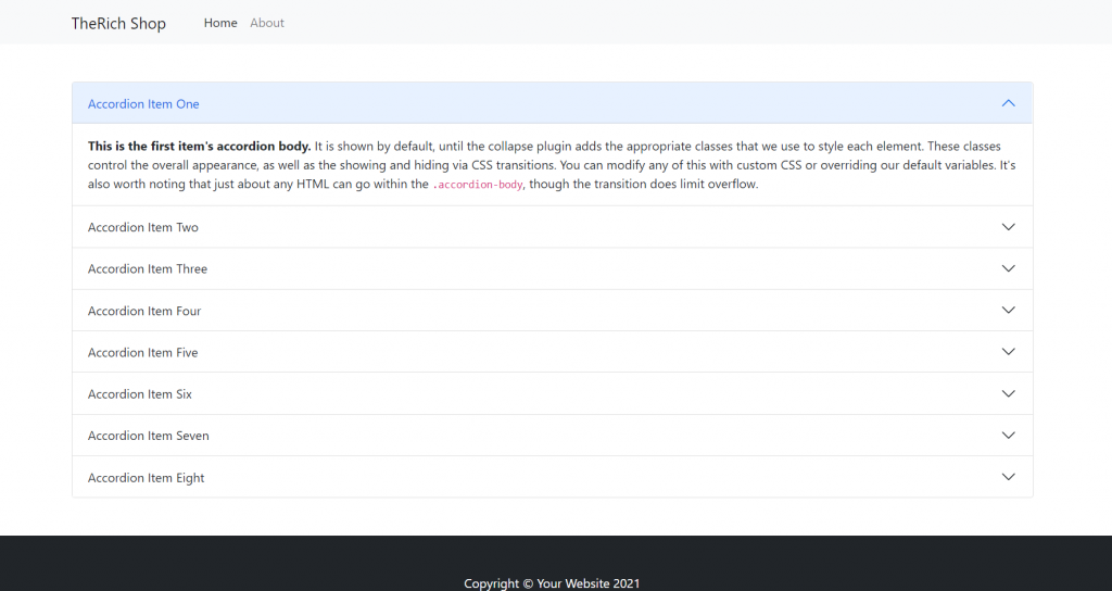
Hello friends, welcome back to my blog. Today in this blog post, I am going to show you, Vue 3 Bootstrap 5 Accordion with Dynamic Items.
Guy’s with this post we will learn below things:
- Make custom array data in Vue 3.
- Generate dynamic content v-for looping.
- Generate dynamic ID’s & Classes to html elements in Vue 3.
- Bootstrap 5 accordion with dynamic data.

Vue 3 and Bootstrap 5 came and if you are new then you must check below two links:
Friends now I proceed onwards and here is the working code snippet and use this carefully to avoid the mistakes:
1. Firstly friends we need fresh vue 3 setup and for this we need to run below commands . Secondly we should also have latest node version installed on our system. With below we will have bootstrap 5 modules in our Vue 3 application:
npm install -g @vue/cli

vue create vueboot5

cd vueboot5

npm i bootstrap

npm i @popperjs/core

npm run serve //http://localhost:8080/
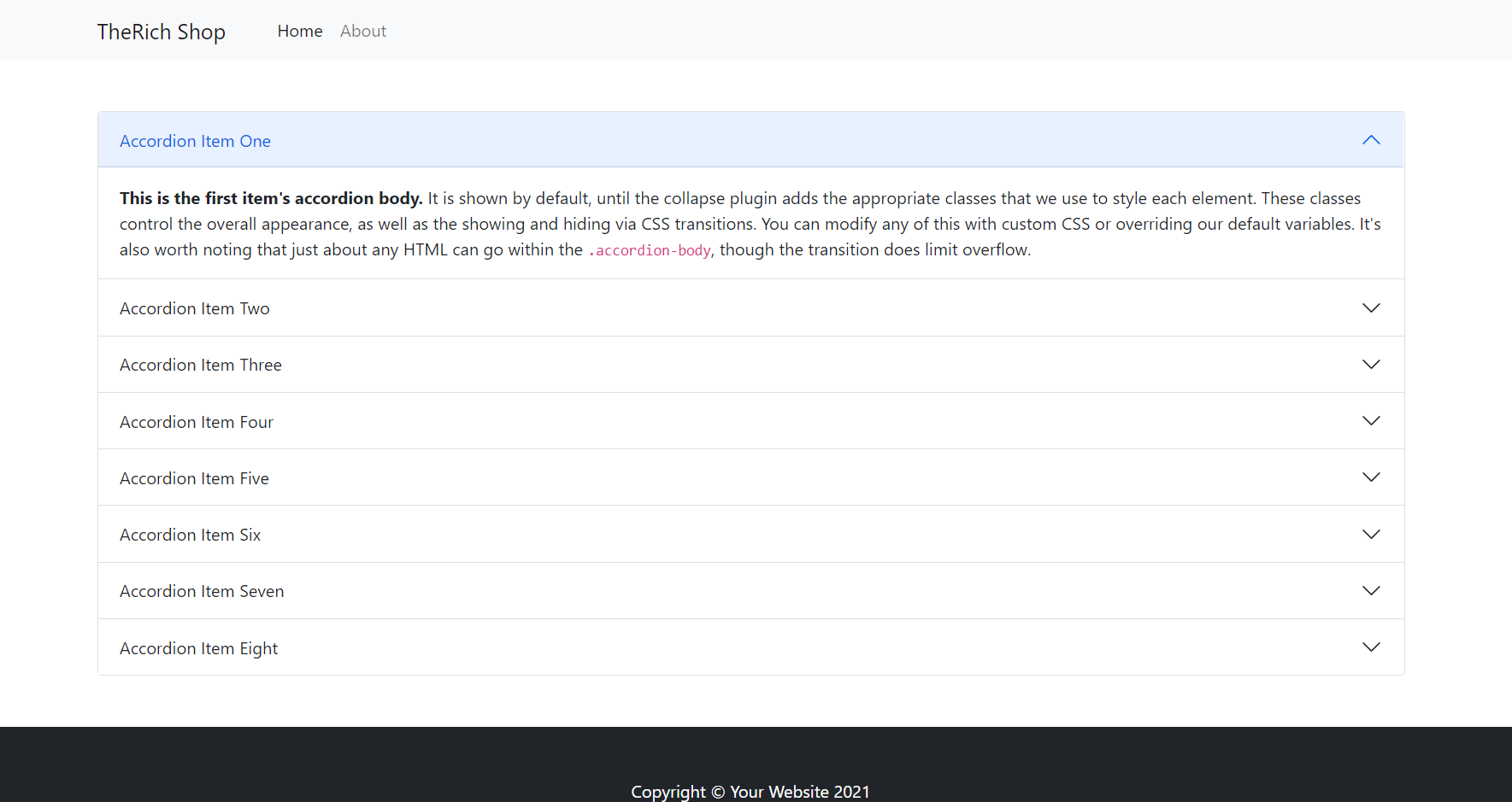
2. Now friends we need to add below code into vueboot5/src/App.vue file to check the final output on browser:
<template>
   <div class="container p-5">
    <div class="accordion" id="accordionExample">
        <div class="accordion-item" v-for="(item, index) in items" :key="item.id">
          <h2 class="accordion-header" :id="'heading'+item">
            <button class="accordion-button" :class="{ 'collapsed': index !== 0 }" type="button" data-bs-toggle="collapse" :data-bs-target="'#collapse'+item" aria-expanded="true" :aria-controls="'collapse'+item">
              Accordion Item {{item}}
            </button>
          </h2>
          <div :id="'collapse'+item" class="accordion-collapse collapse" :class="{ 'show': index === 0 }" :aria-labelledby="'heading'+item" data-bs-parent="#accordionExample">
            <div class="accordion-body">
              <strong>This is the first item's accordion body.</strong> It is shown by default, until the collapse plugin adds the appropriate classes that we use to style each element. These classes control the overall appearance, as well as the showing and hiding via CSS transitions. You can modify any of this with custom CSS or overriding our default variables. It's also worth noting that just about any HTML can go within the <code>.accordion-body</code>, though the transition does limit overflow.
            </div>
          </div>
        </div>


      </div>

    </div>
</template>

<script>

//importing bootstrap 5 Modules
import "bootstrap/dist/css/bootstrap.min.css";
import "bootstrap/dist/js/bootstrap.min.js";

export default {
   //Custom array data to make accordion dynamic
   data () {
        return{
          items: [
            'One',
            'Two',
            'Three',
            'Four',
            'Five',
            'Six',
            'Seven',
            'Eight'
          ]
        }
   }
}
</script>
Now we are done friends and If you have any kind of query or suggestion or any requirement then feel free to comment below.
Note: Friends, I just tell the basic setup and things, you can change the code according to your requirements.
I will appreciate that if you will tell your views for this post. Nothing matters if your views will be good or bad.
Jassa
Thanks

Leave a Reply
You must be logged in to post a comment.