
Hello my friends, welcome back to my blog. Today in this blog post, I am going to show you, Reactjs Free Ecommerce Template Fully Responsive.
Guy’s with this we will cover below things:
- Reactjs Bootstrap Responsive Ecommerce Template Creation.
- React Bootstrap Responsive Toggle Navbar.
- React Sliding Sidebar.
For react js new comers, please check the below links:
Friends now I proceed onwards and here is the working code snippet and please use this carefully to avoid the mistakes:
1. Firstly friends we need fresh reactjs setup and for that we need to run below commands into our terminal and also w should have latest node version installed on our system:
Guys you can skip this first step if you already have reactjs fresh setup:
npx create-react-app reacttemplate

cd reacttemplate

npm i bootstrap@4.3.1

npm i popper.js

npm start // run the project
2. Now friends, please download zip(in this zip file there are js, css, fonts and images for landing template) file from below path and extract zip and get all the folders.
Create `assets` folder inside reacttemplate/public folder.
Now please put that folders(which we will get from zip file) in “reacttemplate/public/assets” folder.
https://therichpost.com/ecommercecssimages.zip
3. Now friends please add below inside reacttemplate/public/index.html file:
...
<head>
...
<!-- slider stylesheet -->
  <link rel="stylesheet" type="text/css" href="https://cdnjs.cloudflare.com/ajax/libs/OwlCarousel2/2.3.4/assets/owl.carousel.min.css" />

  <!-- bootstrap core css -->


  <!-- fonts style -->
  <link href="https://fonts.googleapis.com/css?family=Poppins:400,600,700&display=swap" rel="stylesheet">

  <!-- Custom styles for this template -->
  <link href="assets/css/style.css" rel="stylesheet" />
  <!-- responsive style -->
  <link href="assets/css/responsive.css" rel="stylesheet" />


  </head>
4. Finally friends we need to add below code into our reacttemplate/src/App.js file to get final output on web browser:
import React, { Component } from 'react';
import "bootstrap/dist/css/bootstrap.min.css"
import "bootstrap/dist/js/bootstrap.min.js"
export default class App extends Component {
openNav() {
document.getElementById("myNav").classList.toggle("menu_width");
document
.querySelector(".custom_menu-btn")
.classList.toggle("menu_btn-style");
}
render() {
return (
<div>
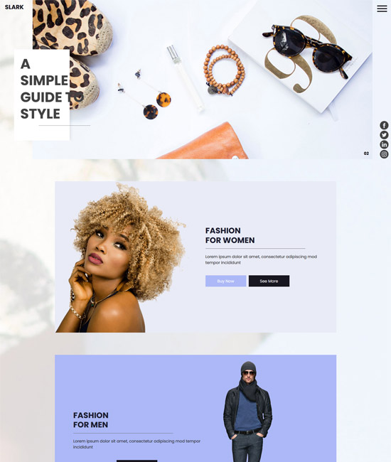
<div class="hero_area">
<div class="logo_box">
<a class="navbar-brand" href="#">
<span>
Slark
</span>
</a>
</div>
<section class=" slider_section position-relative">
<div id="carouselExampleIndicators" class="carousel slide" data-ride="carousel">
<ol class="carousel-indicators">
<li data-target="#carouselExampleIndicators" data-slide-to="0" class="active">01</li>
<li data-target="#carouselExampleIndicators" data-slide-to="1">02</li>
<li data-target="#carouselExampleIndicators" data-slide-to="2">03</li>
</ol>
<div class="carousel-inner">
<div class="carousel-item active">
<div class="detail-box">
<h1>
A <br />
simple <br />
guide to <br />
style
</h1>
</div>
</div>
<div class="carousel-item">
<div class="detail-box">
<h1>
A <br />
simple <br />
guide to <br />
style
</h1>
</div>
</div>
<div class="carousel-item">
<div class="detail-box">
<h1>
A <br />
simple <br />
guide to <br />
style
</h1>
</div>
</div>
</div>
</div>
</section>
<div class="menu_box">
<div class="navbar-collapse" id="">
<div class="custom_menu-btn">
<button onClick={this.openNav}>
<span class="s-1"> </span>
<span class="s-2"> </span>
<span class="s-3"> </span>
</button>
</div>
<div id="myNav" class="overlay">
<div class="overlay-content">
<a href="https://therichpost.com">Home</a>
<a href="https://therichpost.com">Men</a>
<a href="https://therichpost.com">Women</a>
<a href="https://therichpost.com">Contact Us</a>
</div>
</div>
</div>
<div class="social_container">
<div class="social-box">
<div>
<a href="https://therichpost.com">
<img src="assets/images/fb-top.png" alt="" />
</a>
</div>
<div>
<a href="https://therichpost.com">
<img src="assets/images/twitter-top.png" alt="" />
</a>
</div>
<div>
<a href="https://therichpost.com">
<img src="assets/images/linkedin-top.png" alt="" />
</a>
</div>
<div>
<a href="https://therichpost.com">
<img src="assets/images/instagram-top.png" alt="" />
</a>
</div>
</div>
</div>
</div>
</div>
<section class="women_section layout_padding">
<div class="container">
<div class="box">
<div class="row">
<div class="col-md-6">
<div class="img-box">
<img src="assets/images/women-img.png" alt="" />
</div>
</div>
<div class="col-md-6">
<div class="detail-box">
<div class="heading_container">
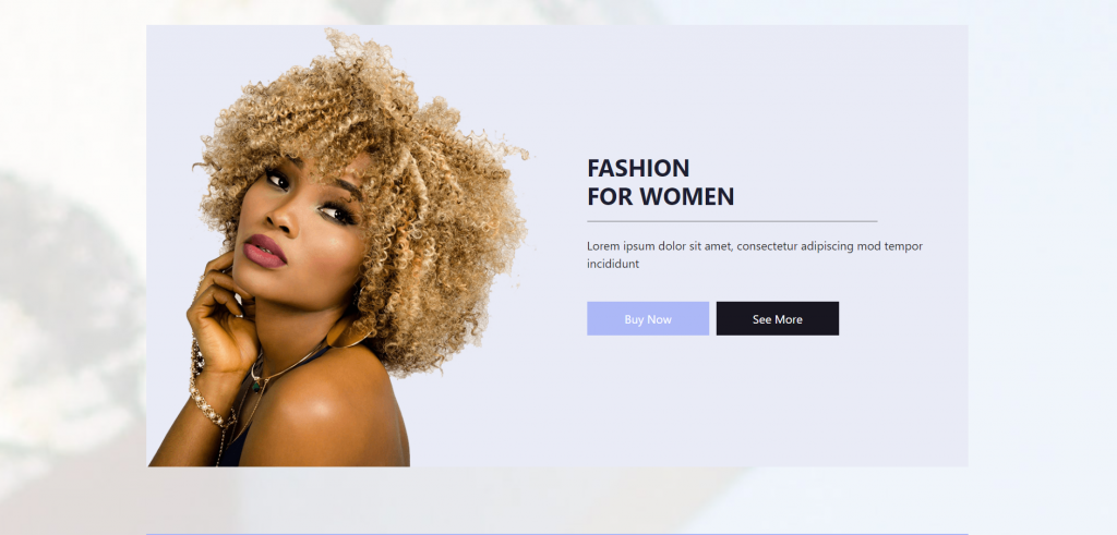
<h2>
Fashion <br />
for women
</h2>
</div>
<p>
Lorem ipsum dolor sit amet, consectetur adipiscing mod tempor incididunt
</p>
<div class="btn-box">
<a href="https://therichpost.com" class="btn1">
Buy Now
</a>
<a href="https://therichpost.com" class="btn2">
See More
</a>
</div>
</div>
</div>
</div>
</div>
</div>
</section>
<section class="men_section layout_padding-bottom">
<div class="container">
<div class="box">
<div class="row">
<div class="col-md-7">
<div class="detail-box">
<div class="heading_container">
<h2>
Fashion <br />
for men
</h2>
</div>
<p>
Lorem ipsum dolor sit amet, consectetur adipiscing mod tempor incididunt
</p>
<div class="btn-box">
<a href="#" class="btn1">
Buy Now
</a>
<a href="#" class="btn2">
See More
</a>
</div>
</div>
</div>
<div class="col-md-5">
<div class="img-box">
<img src="assets/images/men-img.png" alt="" />
</div>
</div>
</div>
</div>
</div>
</section>
<section class="modern_section layout_padding-bottom">
<div class="container">
<div class="box layout_padding">
<div class="row">
<div class="col-md-7">
<div class="detail-box">
<div class="heading_container">
<h2>
Modern <br />
bag and glasses
</h2>
</div>
<p>
Lorem ipsum dolor sit amet, consectetur adipiscing elit, sed do eiusmod tempor incididunt
</p>
<div class="btn-box">
<a href="#" class="btn1">
Buy Now
</a>
<a href="#" class="btn2">
See More
</a>
</div>
</div>
</div>
<div class="col-md-5">
<div class="img_container">
<div class="img-box">
<img src="assets/images/glass.png" alt="" />
</div>
<div class="img-box">
<img src="assets/images/purse.png" alt="" />
</div>
</div>
</div>
</div>
</div>
</div>
</section>
<section class="shop_section layout_padding-bottom">
<div class="container">
<div class="box">
<div class="img-box">
<img src="assets/images/slider-img.jpg" alt="" />
<div class="detail-box">
<div class="heading_container">
<h2>
About our shop
</h2>
</div>
<p>
Lorem ipsum dolor sit amet, consectetur adipiscing elit, sed do eiusmod tempor incididunt
</p>
<a href="#" class="">
Read More
</a>
</div>
</div>
</div>
</div>
</section>
<section class="client_section">
<div class="container">
<div id="carouselExample2Indicators" class="carousel slide" data-ride="carousel">
<ol class="carousel-indicators">
<li data-target="#carouselExample2Indicators" data-slide-to="0" class="active"></li>
<li data-target="#carouselExample2Indicators" data-slide-to="1"></li>
<li data-target="#carouselExample2Indicators" data-slide-to="2"></li>
</ol>
<div class="carousel-inner">
<div class="carousel-item active">
<div class="box">
<div class="heading_container">
<h2>
says customers
</h2>
</div>
<div class="row">
<div class="col-md-6">
<div class="detail-box">
<h5>
Jack sumit
</h5>
<p>
Lorem ipsum dolor sit amet, consectetur adipiscing elit, sed do eiusmod tempor incididunt
</p>
</div>
</div>
<div class="col-md-6">
<div class="img-box">
<img src="assets/images/client.jpg" alt="" />
</div>
</div>
</div>
</div>
</div>
<div class="carousel-item">
<div class="box">
<div class="heading_container">
<h2>
says customers
</h2>
</div>
<div class="row">
<div class="col-md-6">
<div class="detail-box">
<h5>
Jack sumit
</h5>
<p>
Lorem ipsum dolor sit amet, consectetur adipiscing elit, sed do eiusmod tempor incididunt
</p>
</div>
</div>
<div class="col-md-6">
<div class="img-box">
<img src="assets/images/client.jpg" alt="" />
</div>
</div>
</div>
</div>
</div>
</div>
</div>
</div>
</section>
<section class="subscribe_section layout_padding">
<div class="container">
<div class="box">
<div class="row">
<div class="col-md-8 mx-auto">
<div class="subscribe_form ">
<div class="heading_container">
<h2>
subscribe our newsletter
</h2>
</div>
<p>
Lorem ipsum dolor sit amet, consectetur adipiscing elit, sed do eiusmod tempor
</p>
<form>
<input type="email" placeholder="Enter your email" />
<button>
subscribe
</button>
</form>
</div>
</div>
</div>
</div>
</div>
</section>
<section class="contact_section layout_padding-bottom">
<div class="container">
<div class="box layout_padding2">
<div class="row">
<div class="col-lg-6 col-md-8 mx-auto">
<div class="contact-form">
<div class="heading_container">
<h2>
Request a call back
</h2>
</div>
<form>
<div>
<input type="text" placeholder="Full Name " />
</div>
<div>
<input type="text" placeholder="Phone Number" />
</div>
<div>
<input type="email" placeholder="Email Address" />
</div>
<div>
<input type="text" placeholder="Message" class="input_message" />
</div>
<div class="d-flex justify-content-center">
<button type="button" class="btn_on-hover">
Send
</button>
</div>
</form>
</div>
</div>
</div>
</div>
</div>
</section>
<section class="info_section layout_padding">
<div class="container">
<div class="row">
<div class="col-lg-3 col-md-4">
<h5>
Category
</h5>
<p>
Contrary to popular belief, Lorem Ipsum is not simply random text. It has roots in a piece of classical Latin literature from 45 BC, making it overContrary to popular belief, Lorem Ipsum is not simply random text. It has roots in a piece of classical Latin literature from 45 BC, making it </p>
</div>
<div class="col-md-7 offset-md-1 offset-lg-2 col-lg-6">
<div class="row">
<div class="col-md-5 ">
<h5>
Useful Links
</h5>
<ul>
<li>
<a href="https://therichpost.com">
Contrary
</a>
</li>
<li>
<a href="https://therichpost.com">
to popular belief,
</a>
</li>
<li>
<a href="https://therichpost.com">
Lorem Ipsum is
</a>
</li>
<li>
<a href="https://therichpost.com">
not simply
</a>
</li>
<li>
<a href="https://therichpost.com">
random text. It
</a>
</li>
</ul>
</div>
<div class="col-md-6">
<h5>
Contact Us
</h5>
<div class="info_link-box">
<a href="#">
<span>+01 1234567890</span>
</a>
<a href="#">
<span>+01 1234567890</span>
</a>
<a href="#">
<span> <span class="__cf_email__">[email protected]</span></span>
</a>
</div>
</div>
</div>
<div class="info_container">
<div class="row">
<div class="col-md-5 ">
<h5>
Follow Us
</h5>
</div>
<div class="col-md-6 mb-0">
<div class="info_social">
<div>
<a href="https://therichpost.com">
<img src="assets/images/fb.png" alt="" />
</a>
</div>
<div>
<a href="https://therichpost.com">
<img src="assets/images/twitter.png" alt="" />
</a>
</div>
<div>
<a href="https://therichpost.com">
<img src="assets/images/linkedin.png" alt="" />
</a>
</div>
<div>
<a href="https://therichpost.com">
<img src="assets/images/instagram.png" alt="" />
</a>
</div>
</div>
</div>
</div>
</div>
</div>
</div>
</div>
</section>
<section class="container-fluid footer_section">
<p>
© 2021 All Rights Reserved. Design by
<a href="https://therichpost.com">Free Html Templates</a>
</p>
</section>
</div>
);
} }
Now we are done friends also and If you have any kind of query or suggestion or any requirement then feel free to comment below. Guys I will come with more React-Bootstrap free templates.
Note: Friends, I just tell the basic setup and things, you can change the code according to your requirements. For better understanding must watch video above.
I will appreciate that if you will tell your views for this post. Nothing matters if your views will be good or bad.
Jassa
Thanks
Leave a Reply