
Hello my friends, welcome back to my blog. Today in this blog post, I am going to show you, Reactjs Bootstrap 5 Healthcare Template Free.
Guy’s with this we will cover below things:
For react js new comers, please check the below links:
Friends now I proceed onwards and here is the working code snippet and please use this carefully to avoid the mistakes:
1. Firstly friends we need fresh reactjs setup and for that we need to run below commands into our terminal and also w should have latest node version installed on our system:
Guys you can skip this first step if you already have reactjs fresh setup:
npx create-react-app reacttemplate

cd reacttemplate

npm start // run the project
2. Now friends, please download zip(in this zip file there are js, css, fonts and images for landing template) file from below path and extract zip and get all the folders.
Create `assets` folder inside reacttemplate/public folder.
Now please put that folders(which we will get from zip file) in “reacttemplate/public/assets” folder.
https://therichpost.com/health-templat.zip
3. Now friends please add below inside reacttemplate/public/index.html file:
...
<head>
...
<!-- ===============================================-->
<!-- Stylesheets-->
<!-- ===============================================-->
<link href="assets/css/theme.min.css" rel="stylesheet" />
<!-- ===============================================-->
<!-- JavaScripts-->
<!-- ===============================================-->
<script src="assets/js/popper.min.js"></script>
<script src="assets/js/bootstrap.min.js"></script>
<script src="assets/js/is.min.js"></script>
<script src="https://polyfill.io/v3/polyfill.min.js?features=window.scroll"></script>
<script src="assets/js/theme.js"></script>
<link href="https://fonts.googleapis.com/css2?family=Mulish:ital,wght@0,300;0,400;0,500;0,600;0,700;0,800;0,900;1,300;1,400;1,500&display=swap" rel="stylesheet">
<style>
.articlebg
{
background-image:url('assets/images/article-bg.png');background-position:right center;background-size:auto;
}
.dot2ng
{
background-image:url('assets/images/dot-2.png');background-position:left top;background-size:initial;margin-top:120px;margin-left:-35px;
}
.dot1bg
{
background-image:url('assets/images/dot.png');background-position:left bottom;background-size:auto;filter:contrast(1.5);
}
.dot2bg2
{
background-image:url('assets/images/dot-2.png');background-position:right top;background-size:auto;margin-top:-75px;
}
.dotbg
{
background-image:url('assets/images/dot.png');background-position:left;background-size:auto;margin-top:-105px;
}
.dot2bg3
{
background-image:url('assets/images/dot-2.png');background-position:center right;background-size:auto;margin-left:-180px;margin-top:20px;
}
.servicesbg
{
background-image:url('assets/images/services-bg.png');background-position:center left;background-size:auto;
}
.dotbg2
{
background-image:url('assets/images/dot.png');background-position:right bottom;background-size:auto;margin-top:50px;
}
.dotbg3
{
background-image:url('assets/images/dot.png');background-position:right top;background-size:auto;margin-left:-30px;margin-top:10px;filter:contrast(1.5);
}
.dot2bg4
{
background-image:url('assets/images/dot-2.png');background-position:left bottom;background-size:auto;margin-left:-35px;margin-top:-65px;filter:contrast(1.5);
}
</style>
</head>
...
4. Finally friends we need to add below code into our reacttemplate/src/App.js file to get final output on web browser:
import React from 'react';
class Home extends React.Component {
render() {
return (
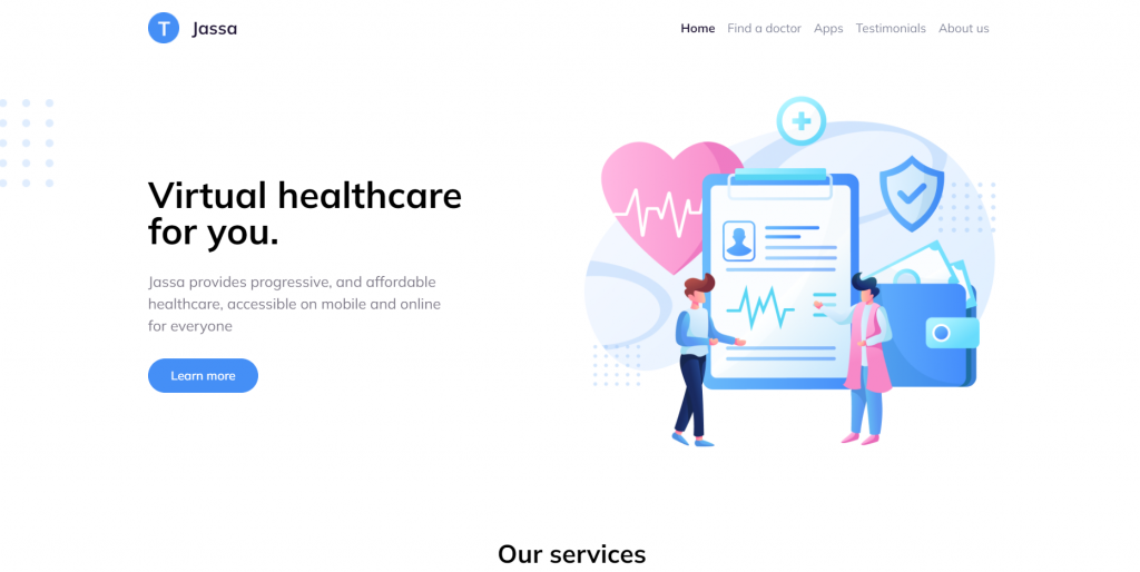
<main class="main" id="top">
<nav class="navbar navbar-expand-lg navbar-light fixed-top py-3" data-navbar-on-scroll="data-navbar-on-scroll">
<div class="container"><a class="navbar-brand d-flex align-items-center fw-bold fs-2" href="#"><img class="d-inline-block me-3" src="assets/images/logo.png" alt="" />Jassa</a><button class="navbar-toggler collapsed" type="button" data-bs-toggle="collapse" data-bs-target="#navbarSupportedContent" aria-controls="navbarSupportedContent" aria-expanded="false" aria-label="Toggle navigation"><span class="navbar-toggler-icon"></span></button>
<div class="collapse navbar-collapse border-top border-lg-0 mt-4 mt-lg-0" id="navbarSupportedContent">
<ul class="navbar-nav ms-auto pt-2 pt-lg-0">
<li class="nav-item"><a class="nav-link fw-bold active" aria-current="page" href="#">Home</a></li>
<li class="nav-item"><a class="nav-link" href="#">Find a doctor</a></li>
<li class="nav-item"><a class="nav-link" href="#">Apps</a></li>
<li class="nav-item"><a class="nav-link" href="#testimonial">Testimonials</a></li>
<li class="nav-item"><a class="nav-link" href="#about">About us</a></li>
</ul>
</div>
</div>
</nav>
<section class="py-0">
<div class="bg-holder dotbg"></div>
<div class="container position-relative">
<div class="row align-items-center">
<div class="col-md-5 col-lg-6 order-md-1 pt-8"><img class="img-fluid" src="assets/images/hero-header.png" alt="" /></div>
<div class="col-md-7 col-lg-6 text-center text-md-start pt-5 pt-md-9">
<h1 class="mb-4 display-3 fw-bold">Virtual healthcare <br class="d-block d-lg-none d-xl-block" />for you.</h1>
<p class="mt-3 mb-4 fs-1">Jassa provides progressive, and affordable<br class="d-none d-lg-block" />healthcare, accessible on mobile and online<br class="d-none d-lg-block" />for everyone</p><a class="btn btn-lg btn-primary rounded-pill hover-top" href="#" role="button">Learn more</a>
</div>
</div>
</div>
</section>
<section class="py-8">
<div class="bg-holder servicesbg"></div>
<div class="bg-holder dot2bg3"></div>
<div class="container-lg">
<div class="row justify-content-center">
<div class="col-3 text-center">
<h2 class="fw-bold">Our services</h2>
<hr class="w-25 mx-auto text-dark" style={{height:"2px"}} />
</div>
</div>
<div class="row justify-content-center">
<div class="col-sm-9 col-xl-8 text-center">
<p>We provide to you the best choiches for you. Adjust it to your health needs and make sure your undergo treatment with our highly qualified doctors you can consult with us which type of service is suitable for your health</p>
</div>
</div>
<div class="row justify-content-center h-100 pt-7 g-4">
<div class="col-sm-9 col-md-4">
<div class="card h-100 w-100 shadow rounded-lg p-3 p-md-2 p-lg-3 p-xl-5">
<div class="card-body text-center text-md-start">
<div class="py-3"><img class="img-fluid" src="assets/images/search.png" height="90" alt="" /></div>
<div class="py-3">
<h4 class="fw-bold card-title">Search doctor</h4>
<p class="card-text">Choose your doctor from thousands of specialist, general, and trusted hospitals</p>
</div>
</div>
</div>
</div>
<div class="col-sm-9 col-md-4">
<div class="card h-100 w-100 shadow rounded-lg p-3 p-md-2 p-lg-3 p-xl-5">
<div class="card-body text-center text-md-start">
<div class="py-3"><img class="img-fluid" src="assets/images/online-pharmacy.png" height="90" alt="" /></div>
<div class="py-3">
<h4 class="fw-bold card-title">Online pharmacy</h4>
<p class="card-text">Buy your medicines with our mobile application with a simple delivery system</p>
</div>
</div>
</div>
</div>
<div class="col-sm-9 col-md-4">
<div class="card h-100 w-100 shadow rounded-lg p-3 p-md-2 p-lg-3 p-xl-5">
<div class="card-body text-center text-md-start">
<div class="py-3"><img class="img-fluid" src="assets/images/consultation.png" height="90" alt="" /></div>
<div class="py-3">
<h4 class="fw-bold card-title">Consultation</h4>
<p class="card-text">Free consultation with our trusted doctors and get the best recomendations</p>
</div>
</div>
</div>
</div>
<div class="col-sm-9 col-md-4">
<div class="card h-100 w-100 shadow rounded-lg p-3 p-md-2 p-lg-3 p-xl-5">
<div class="card-body text-center text-md-start">
<div class="py-3"><img class="img-fluid" src="assets/images/details-info.png" height="90" alt="" /></div>
<div class="py-3">
<h4 class="fw-bold card-title">Details info</h4>
<p class="card-text">You can get 24/7 urgent care for yourself or your children and your lovely family</p>
</div>
</div>
</div>
</div>
<div class="col-sm-9 col-md-4">
<div class="card h-100 w-100 shadow rounded-lg p-3 p-md-2 p-lg-3 p-xl-5">
<div class="card-body text-center text-md-start">
<div class="py-3"><img class="img-fluid" src="assets/images/emergency-care.png" height="90" alt="" /></div>
<div class="py-3">
<h4 class="fw-bold card-title">Emergency care</h4>
<p class="card-text">Track and save your medical history and health data </p>
</div>
</div>
</div>
</div>
<div class="col-sm-9 col-md-4">
<div class="card h-100 w-100 shadow rounded-lg p-3 p-md-2 p-lg-3 p-xl-5">
<div class="card-body text-center text-md-start">
<div class="py-3"><img class="img-fluid" src="assets/images/tracking.png" height="90" alt="" /></div>
<div class="py-3">
<h4 class="fw-bold card-title">Tracking</h4>
<p class="card-text">Track and save your medical history and health data </p>
</div>
</div>
</div>
</div>
<div class="text-center py-4"><button class="btn btn-lg btn-outline-primary rounded-pill" type="submit">Learn more </button></div>
</div>
</div>
</section>
<section class="py-6 py-lg-8" id="about">
<div class="bg-holder dotbg2"></div>
<div class="container">
<div class="row g-xl-0 align-items-center">
<div class="col-md-6"><img class="img-fluid mb-5 mb-md-0" src="assets/images/about-1.png" width="480" alt="" /></div>
<div class="col-md-6 text-center text-md-start">
<h2 class="fw-bold lh-base">Leading healthcare <br />providers</h2>
<hr class="text-dark mx-auto mx-md-0" style={{height:"2px",width:"50px"}} />
<p class="pt-3">Jassa provides progressive, and affordable healthcare, accessible on mobile and online for everyone. To us, it’s not just work. We take pride in the solutions we deliver</p>
<div class="py-3"><button class="btn btn-lg btn-outline-primary rounded-pill" type="submit">Learn more </button></div>
</div>
</div>
</div>
</section>
<section class="py-6 py-lg-8">
<div class="container">
<div class="row g-xl-0 align-items-center">
<div class="col-md-6 order-md-1 text-md-end"><img class="img-fluid mb-5 mb-md-0" src="assets/images/about-1.png" width="480" alt="" /></div>
<div class="col-md-6 text-center text-md-start order-md-0">
<h2 class="fw-bold lh-base">Download our <br />mobile apps</h2>
<hr class="text-dark mx-auto mx-md-0" style={{height:"2px",width:"50px"}} />
<p class="pt-3">Our dedicated patient engagement app and web portal allow you to access information instantaneously (no tedeous form, long calls, or administrative hassle) and securely</p>
<div class="py-3"><button class="btn btn-lg btn-outline-primary rounded-pill" type="submit">Learn more <svg class="bi bi-arrow-down-short" xmlns="http://www.w3.org/2000/svg" width="16" height="16" fill="currentColor" viewBox="0 0 16 16">
<path fill-rule="evenodd" d="M8 4a.5.5 0 0 1 .5.5v5.793l2.146-2.147a.5.5 0 0 1 .708.708l-3 3a.5.5 0 0 1-.708 0l-3-3a.5.5 0 1 1 .708-.708L7.5 10.293V4.5A.5.5 0 0 1 8 4z"></path>
</svg></button></div>
</div>
</div>
</div>
</section>
<section class="py-8" id="testimonial">
<div class="container">
<div class="bg-holder z-index-1 dotbg3"></div>
<div class="bg-holder z-index-1 dot2bg4"></div>
<div class="carousel slide" id="carouselExampleDark" data-bs-ride="carousel">
<div class="carousel-inner">
<div class="carousel-item active" data-bs-interval="10000">
<div class="row h-100">
<div class="col-12">
<div class="card text-white bg-primary-gradient">
<div class="card-body p-4 p-md-4 p-lg-7">
<h2 class="fw-bold text-white text-center">What our customer are saying</h2>
<hr class="mx-auto" style={{height:"2px",width:"50px"}} />
<div class="d-md-flex align-items-md-center mt-5 text-center text-md-start"><img class="img-fluid me-4 me-md-3 me-lg-4" src="assets/images/user-1.png" width="100" alt="" />
<div class="w-md-25 my-3">
<h5 class="mb-0 fw-medium text-white">Jassa</h5>
<p class="fw-normal mb-0">Founder Circle</p>
</div>
<div class="w-md-75">
<p class="card-text ms-md-5">“Our dedicated patient engagement app and web portal allow you to access information instantaneously (no tedeous form, long calls, or administrative hassle) and securely”</p>
</div>
</div>
</div>
</div>
</div>
</div>
</div>
<div class="carousel-item" data-bs-interval="2000">
<div class="row h-100">
<div class="col-12">
<div class="card text-white bg-primary-gradient">
<div class="card-body p-4 p-md-4 p-lg-7">
<h2 class="fw-bold text-white text-center">Our dear customers said about us</h2>
<hr class="mx-auto" style={{height:"2px",width:"50px"}} />
<div class="d-md-flex align-items-md-center mt-5 text-center text-md-start"><img class="img-fluid me-4 me-md-3 me-lg-4" src="assets/images/user-2.png" width="100" alt="" />
<div class="w-md-25 my-3">
<h5 class="mb-0 fw-medium text-white">Jassa</h5>
<p class="fw-normal mb-0">UI/UX Designer</p>
</div>
<div class="w-md-75">
<p class="card-text ms-md-5">“Our dedicated patient engagement app and web portal allow you to access information instantaneously (no tedeous form, long calls, or administrative hassle) and securely”</p>
</div>
</div>
</div>
</div>
</div>
</div>
</div>
<div class="carousel-item">
<div class="row h-100">
<div class="col-12">
<div class="card text-white bg-primary-gradient">
<div class="card-body p-4 p-md-4 p-lg-7">
<h2 class="fw-bold text-white text-center">Our dear customers said about us</h2>
<hr class="mx-auto" style={{height:"2px",width:"50px"}} />
<div class="d-md-flex align-items-md-center mt-5 text-center text-md-start"><img class="img-fluid me-4 me-md-3 me-lg-4" src="assets/images/user-3.png" width="100" alt="" />
<div class="w-md-25 my-3">
<h5 class="mb-0 fw-medium text-white">Jassa</h5>
<p class="fw-normal mb-0">Web Designer</p>
</div>
<div class="w-md-75">
<p class="card-text ms-md-5">“Our dedicated patient engagement app and web portal allow you to access information instantaneously (no tedeous form, long calls, or administrative hassle) and securely”</p>
</div>
</div>
</div>
</div>
</div>
</div>
</div>
</div>
<div class="row mt-4 flex-center">
<div class="col-4 col-sm-5 text-end position-relative z-index-2"><a class="carousel-control-prev carousel-icon z-index-2" href="#carouselExampleDark" role="button" data-bs-slide="prev"><span class="carousel-control-prev-icon" aria-hidden="true"></span><span class="visually-hidden">Previous</span></a></div>
<div class="col-auto position-relative z-index-2">
<ol class="carousel-indicators">
<li class="active" data-bs-target="#carouselExampleDark" data-bs-slide-to="0"></li>
<li data-bs-target="#carouselExampleDark" data-bs-slide-to="1"></li>
<li data-bs-target="#carouselExampleDark" data-bs-slide-to="2"></li>
</ol>
</div>
<div class="col-4 col-sm-5 position-relative z-index-2"><a class="carousel-control-next carousel-icon z-index-2" href="#carouselExampleDark" role="button" data-bs-slide="next"><span class="carousel-control-next-icon" aria-hidden="true"></span><span class="visually-hidden">Next</span></a></div>
</div>
</div>
</div>
</section>
<section>
<div class="bg-holder articlebg"></div>
<div class="container-lg">
<div class="bg-holder dot2ng"></div>
<div class="row flex-center">
<div class="col-auto text-center">
<h2 class="fw-bold">Check out our latest article</h2>
<hr class="mx-auto text-dark" style={{height:"2px",width:"50px"}} />
</div>
</div>
<div class="row h-100 justify-content-center pt-6">
<div class="col-12 col-sm-9 col-md-4 mt-4">
<div class="card h-100 rounded-3 shadow"><img src="assets/images/article-1.png" alt="" />
<div class="card-body p-4 text-center text-md-start">
<h5 class="fw-bold">Disease detection</h5>
<p class="card-text">In this case, the role of the health laboratory is very important to do a disease detection...</p><a class="stretched-link text-decoration-none" href="#" role="button">Read more<svg class="bi bi-arrow-right-short" xmlns="http://www.w3.org/2000/svg" width="16" height="16" fill="currentColor" viewBox="0 0 16 16">
<path fill-rule="evenodd" d="M4 8a.5.5 0 0 1 .5-.5h5.793L8.146 5.354a.5.5 0 1 1 .708-.708l3 3a.5.5 0 0 1 0 .708l-3 3a.5.5 0 0 1-.708-.708L10.293 8.5H4.5A.5.5 0 0 1 4 8z"></path>
</svg></a>
</div>
</div>
</div>
<div class="col-12 col-sm-9 col-md-4 mt-4">
<div class="card h-100 rounded-3 shadow"><img src="assets/images/article-2.png" alt="" />
<div class="card-body p-4 text-center text-md-start">
<h5 class="fw-bold">Herbal medicines </h5>
<p class="card-text">Herbal medicine is very widely used at this time because of its very good for your health...</p><a class="stretched-link text-decoration-none" href="#" role="button">Read more<svg class="bi bi-arrow-right-short" xmlns="http://www.w3.org/2000/svg" width="16" height="16" fill="currentColor" viewBox="0 0 16 16">
<path fill-rule="evenodd" d="M4 8a.5.5 0 0 1 .5-.5h5.793L8.146 5.354a.5.5 0 1 1 .708-.708l3 3a.5.5 0 0 1 0 .708l-3 3a.5.5 0 0 1-.708-.708L10.293 8.5H4.5A.5.5 0 0 1 4 8z"></path>
</svg></a>
</div>
</div>
</div>
<div class="col-12 col-sm-9 col-md-4 mt-4">
<div class="card h-100 rounded-3 shadow"><img src="assets/images/article-3.png" alt="" />
<div class="card-body p-4 text-center text-md-start">
<h5 class="fw-bold">Natural care </h5>
<p class="card-text">A healthy lifestyle should start from now and also for your skin health.There are some...</p><a class="stretched-link text-decoration-none" href="#" role="button">Read more<svg class="bi bi-arrow-right-short" xmlns="http://www.w3.org/2000/svg" width="16" height="16" fill="currentColor" viewBox="0 0 16 16">
<path fill-rule="evenodd" d="M4 8a.5.5 0 0 1 .5-.5h5.793L8.146 5.354a.5.5 0 1 1 .708-.708l3 3a.5.5 0 0 1 0 .708l-3 3a.5.5 0 0 1-.708-.708L10.293 8.5H4.5A.5.5 0 0 1 4 8z"></path>
</svg></a>
</div>
</div>
</div>
<div class="text-center pt-4 z-index-2"><button class="btn btn-lg btn-outline-primary rounded-pill z-index-2 hover-top" type="submit">View all</button></div>
</div>
</div>
</section>
<section class="py-6 pt-7 bg-primary-gradient">
<div class="bg-holder dot1bg"></div>
<div class="bg-holder dot2bg2"></div>
<div class="container">
<div class="row">
<div class="col-12 col-lg-4 order-0 order-sm-0 pe-6"><a class="text-decoration-none" href="#"><img class="img-fluid me-2" src="assets/images/footer-logo.png" alt="" /><span class="fw-bold fs-1 text-light">Jassa</span></a>
<p class="mt-3 text-white">Jassa provides progressive, and affordable healthcare, accessible on mobile and online for everyone</p>
</div>
<div class="col-4 col-md-4 col-lg mb-3 order-2 order-sm-1">
<h6 class="lh-lg fw-bold text-light">Company</h6>
<ul class="list-unstyled mb-md-4 mb-lg-0">
<li class="lh-lg"><a class="text-light fs--1 text-decoration-none" href="#!">About</a></li>
<li class="lh-lg"><a class="text-light fs--1 text-decoration-none" href="#!">Testimonials</a></li>
<li class="lh-lg"><a class="text-light fs--1 text-decoration-none" href="#!">Find a doctor</a></li>
<li class="lh-lg"><a class="text-light fs--1 text-decoration-none" href="#!">Apps</a></li>
</ul>
</div>
<div class="col-4 col-md-4 col-lg mb-3 order-3 order-sm-2">
<h6 class="lh-lg fw-bold text-light"> Region </h6>
<ul class="list-unstyled mb-md-4 mb-lg-0">
<li class="lh-lg"><a class="text-light fs--1 text-decoration-none" href="#!">Indonesia</a></li>
<li class="lh-lg"><a class="text-light fs--1 text-decoration-none" href="#!">Singapore</a></li>
<li class="lh-lg"><a class="text-light fs--1 text-decoration-none" href="#!">Guide</a></li>
<li class="lh-lg"><a class="text-light fs--1 text-decoration-none" href="#!">Hongkong</a></li>
<li class="lh-lg"><a class="text-light fs--1 text-decoration-none" href="#!">Canada</a></li>
</ul>
</div>
<div class="col-4 col-md-4 col-lg mb-3 order-1 order-sm-3">
<h6 class="lh-lg fw-bold text-light">Help </h6>
<ul class="list-unstyled mb-md-4 mb-lg-0">
<li class="lh-lg"><a class="text-light fs--1 text-decoration-none" href="#!">Help center</a></li>
<li class="lh-lg"><a class="text-light fs--1 text-decoration-none" href="#!">Contact support</a></li>
<li class="lh-lg"><a class="text-light fs--1 text-decoration-none" href="#!">Guide</a></li>
<li class="lh-lg"><a class="text-light fs--1 text-decoration-none" href="#!">Instructions</a></li>
<li class="lh-lg"><a class="text-light fs--1 text-decoration-none" href="#!">How it works</a></li>
</ul>
</div>
</div>
</div>
</section>
<section class="py-2">
<div class="container">
<div class="row">
<div class="col-12">
<div class="text-center">
<p class="mb-0">© This template is made with <svg class="bi bi-suit-heart-fill" xmlns="http://www.w3.org/2000/svg" width="16" height="16" fill="#458FF6" viewBox="0 0 16 16">
<path d="M4 1c2.21 0 4 1.755 4 3.92C8 2.755 9.79 1 12 1s4 1.755 4 3.92c0 3.263-3.234 4.414-7.608 9.608a.513.513 0 0 1-.784 0C3.234 9.334 0 8.183 0 4.92 0 2.755 1.79 1 4 1z"></path>
</svg> by <a class="text-black" href="https://therichpost.com/" target="_blank">Jassa </a></p>
</div>
</div>
</div>
</div>
</section>
</main>
)
};
}
export default Home;
Now we are done friends also and If you have any kind of query or suggestion or any requirement then feel free to comment below. Guys I will come with more React-Bootstrap free templates.
Note: Friends, I just tell the basic setup and things, you can change the code according to your requirements. For better understanding must watch video above.
I will appreciate that if you will tell your views for this post. Nothing matters if your views will be good or bad.
Jassa
Thanks
Leave a Reply