
Hello friends, welcome back to my blog. Today in this blog post, I am going to tell you, Laravel 8 Multipurpose Ecommerce Template Free.
Guys if you are new in Laravel8 the please check below link for Laravel basics information:
Laravel Basics Tutorial for beginners
Here is the code snippet for Laravel 8 Multipurpose Ecommerce Template Free and please use carefully and avoid the mistakes.:
1. Guys please create the “assets” folder inside laravelproject/public folder.
2. Please download this zip file(https://therichpost.com/e-shop2.zip) and inside this zip file you will get CSS, js, images etc folders and place those all the folders inside laravelproject/public/assets folder.
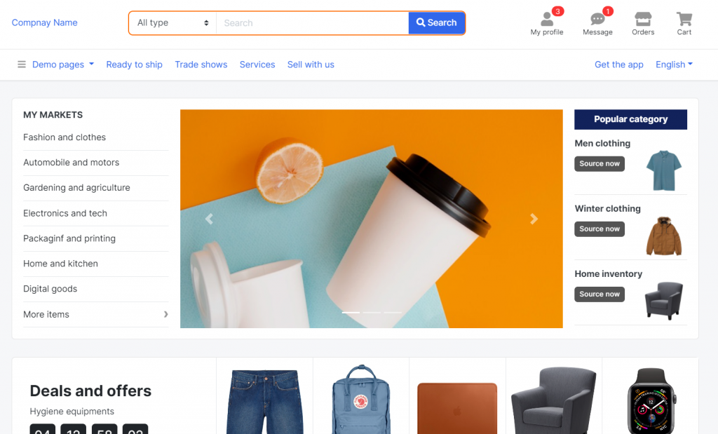
3. In the end friends here is the code below and you can add into your resources/views/ welcome.blade.php file:
...
<head>
<meta charset="utf-8">
<meta name="viewport" content="width=device-width, initial-scale=1">
<title>Laravel</title>
<!-- Custom styles for this template -->
<link href="assets/css/bootstrap.css" rel="stylesheet">
<link href="assets/css/ui.css" rel="stylesheet">
<link href="assets/css/responsive.css" rel="stylesheet">
<link href="assets/css/all.min.css" rel="stylesheet">
<script src="assets/js/jquery.min.js" type="text/javascript"></script>
<script src="assets/js/bootstrap.bundle.min.js" type="text/javascript"></script>
</head>
<body>
<header class="section-header">
<section class="header-main border-bottom">
<div class="container">
<div class="row align-items-center">
<div class="col-xl-2 col-lg-3 col-md-12">
<a href="#" class="brand-wrap">
Compnay Name
</a> <!-- brand-wrap.// -->
</div>
<div class="col-xl-6 col-lg-5 col-md-6">
<form action="#" class="search-header">
<div class="input-group w-100">
<select class="custom-select border-right" name="category_name">
<option value="">All type</option><option value="codex">Special</option>
<option value="comments">Only best</option>
<option value="content">Latest</option>
</select>
<input type="text" class="form-control" placeholder="Search">
<div class="input-group-append">
<button class="btn btn-primary" type="submit">
<i class="fa fa-search"></i> Search
</button>
</div>
</div>
</form> <!-- search-wrap .end// -->
</div> <!-- col.// -->
<div class="col-xl-4 col-lg-4 col-md-6">
<div class="widgets-wrap float-md-right">
<div class="widget-header mr-3">
<a href="#" class="widget-view">
<div class="icon-area">
<i class="fa fa-user"></i>
<span class="notify">3</span>
</div>
<small class="text"> My profile </small>
</a>
</div>
<div class="widget-header mr-3">
<a href="#" class="widget-view">
<div class="icon-area">
<i class="fa fa-comment-dots"></i>
<span class="notify">1</span>
</div>
<small class="text"> Message </small>
</a>
</div>
<div class="widget-header mr-3">
<a href="#" class="widget-view">
<div class="icon-area">
<i class="fa fa-store"></i>
</div>
<small class="text"> Orders </small>
</a>
</div>
<div class="widget-header">
<a href="#" class="widget-view">
<div class="icon-area">
<i class="fa fa-shopping-cart"></i>
</div>
<small class="text"> Cart </small>
</a>
</div>
</div> <!-- widgets-wrap.// -->
</div> <!-- col.// -->
</div> <!-- row.// -->
</div> <!-- container.// -->
</section> <!-- header-main .// -->
<nav class="navbar navbar-main navbar-expand-lg border-bottom">
<div class="container">
<button class="navbar-toggler" type="button" data-toggle="collapse" data-target="#main_nav" aria-controls="main_nav" aria-expanded="false" aria-label="Toggle navigation">
<span class="navbar-toggler-icon"></span>
</button>
<div class="collapse navbar-collapse" id="main_nav">
<ul class="navbar-nav">
<li class="nav-item dropdown">
<a class="nav-link dropdown-toggle" data-toggle="dropdown" href="#"> <i class="fa fa-bars text-muted mr-2"></i> Demo pages </a>
<div class="dropdown-menu dropdown-large">
<nav class="row">
<div class="col-6">
<a href="page-index-1.html">Home page 1</a>
<a href="page-index-2.html">Home page 2</a>
<a href="page-category.html">All category</a>
<a href="page-listing-large.html">Listing list</a>
<a href="page-listing-grid.html">Listing grid</a>
<a href="page-shopping-cart.html">Shopping cart</a>
<a href="page-detail-product.html">Product detail</a>
<a href="page-content.html">Page content</a>
<a href="page-user-login.html">Page login</a>
<a href="page-user-register.html">Page register</a>
</div>
<div class="col-6">
<a href="page-profile-main.html">Profile main</a>
<a href="page-profile-orders.html">Profile orders</a>
<a href="page-profile-seller.html">Profile seller</a>
<a href="page-profile-wishlist.html">Profile wishlist</a>
<a href="page-profile-setting.html">Profile setting</a>
<a href="page-profile-address.html">Profile address</a>
<a href="rtl-page-index-1.html">RTL home page</a>
<a href="page-components.html" target="_blank">More components</a>
</div>
</nav> <!-- row end .// -->
</div> <!-- dropdown-menu dropdown-large end.// -->
</li>
<li class="nav-item">
<a class="nav-link" href="#">Ready to ship</a>
</li>
<li class="nav-item">
<a class="nav-link" href="#">Trade shows</a>
</li>
<li class="nav-item">
<a class="nav-link" href="#">Services</a>
</li>
<li class="nav-item">
<a class="nav-link" href="#">Sell with us</a>
</li>
</ul>
<ul class="navbar-nav ml-md-auto">
<li class="nav-item">
<a class="nav-link" href="#">Get the app</a>
</li>
<li class="nav-item dropdown">
<a class="nav-link dropdown-toggle" href="http://example.com" data-toggle="dropdown">English</a>
<div class="dropdown-menu dropdown-menu-right">
<a class="dropdown-item" href="#">Russian</a>
<a class="dropdown-item" href="#">French</a>
<a class="dropdown-item" href="#">Spanish</a>
<a class="dropdown-item" href="#">Chinese</a>
</div>
</li>
</ul>
</div> <!-- collapse .// -->
</div> <!-- container .// -->
</nav>
</header> <!-- section-header.// -->
<div class="container">
<!-- ========================= SECTION MAIN ========================= -->
<section class="section-main padding-y">
<main class="card">
<div class="card-body">
<div class="row">
<aside class="col-lg col-md-3 flex-lg-grow-0">
<nav class="nav-home-aside">
<h6 class="title-category">MY MARKETS <i class="d-md-none icon fa fa-chevron-down"></i></h6>
<ul class="menu-category">
<li><a href="#">Fashion and clothes</a></li>
<li><a href="#">Automobile and motors</a></li>
<li><a href="#">Gardening and agriculture</a></li>
<li><a href="#">Electronics and tech</a></li>
<li><a href="#">Packaginf and printing</a></li>
<li><a href="#">Home and kitchen</a></li>
<li><a href="#">Digital goods</a></li>
<li class="has-submenu"><a href="#">More items</a>
<ul class="submenu">
<li><a href="#">Submenu name</a></li>
<li><a href="#">Great submenu</a></li>
<li><a href="#">Another menu</a></li>
<li><a href="#">Some others</a></li>
</ul>
</li>
</ul>
</nav>
</aside> <!-- col.// -->
<div class="col-md-9 col-xl-7 col-lg-7">
<!-- ================== COMPONENT SLIDER BOOTSTRAP ================== -->
<div id="carousel1_indicator" class="slider-home-banner carousel slide" data-ride="carousel">
<ol class="carousel-indicators">
<li data-target="#carousel1_indicator" data-slide-to="0" class="active"></li>
<li data-target="#carousel1_indicator" data-slide-to="1"></li>
<li data-target="#carousel1_indicator" data-slide-to="2"></li>
</ol>
<div class="carousel-inner">
<div class="carousel-item active">
<img src="assets/images/banners/slide1.jpg" alt="First slide">
</div>
<div class="carousel-item">
<img src="assets/images/banners/slide2.jpg" alt="Second slide">
</div>
<div class="carousel-item">
<img src="assets/images/banners/slide3.jpg" alt="Third slide">
</div>
</div>
<a class="carousel-control-prev" href="#carousel1_indicator" role="button" data-slide="prev">
<span class="carousel-control-prev-icon" aria-hidden="true"></span>
<span class="sr-only">Previous</span>
</a>
<a class="carousel-control-next" href="#carousel1_indicator" role="button" data-slide="next">
<span class="carousel-control-next-icon" aria-hidden="true"></span>
<span class="sr-only">Next</span>
</a>
</div>
<!-- ================== COMPONENT SLIDER BOOTSTRAP end.// ================== .// -->
</div> <!-- col.// -->
<div class="col-md d-none d-lg-block flex-grow-1">
<aside class="special-home-right">
<h6 class="bg-blue text-center text-white mb-0 p-2">Popular category</h6>
<div class="card-banner border-bottom">
<div class="py-3" style="width:80%">
<h6 class="card-title">Men clothing</h6>
<a href="#" class="btn btn-secondary btn-sm"> Source now </a>
</div>
<img src="assets/images/items/1.jpg" height="80" class="img-bg">
</div>
<div class="card-banner border-bottom">
<div class="py-3" style="width:80%">
<h6 class="card-title">Winter clothing </h6>
<a href="#" class="btn btn-secondary btn-sm"> Source now </a>
</div>
<img src="assets/images/items/2.jpg" height="80" class="img-bg">
</div>
<div class="card-banner border-bottom">
<div class="py-3" style="width:80%">
<h6 class="card-title">Home inventory</h6>
<a href="#" class="btn btn-secondary btn-sm"> Source now </a>
</div>
<img src="assets/images/items/6.jpg" height="80" class="img-bg">
</div>
</aside>
</div> <!-- col.// -->
</div> <!-- row.// -->
</div> <!-- card-body.// -->
</main> <!-- card.// -->
</section>
<!-- ========================= SECTION MAIN END// ========================= -->
<!-- =============== SECTION DEAL =============== -->
<section class="padding-bottom">
<div class="card card-deal">
<div class="col-heading content-body">
<header class="section-heading">
<h3 class="section-title">Deals and offers</h3>
<p>Hygiene equipments</p>
</header><!-- sect-heading -->
<div class="timer">
<div> <span class="num">04</span> <small>Days</small></div>
<div> <span class="num">12</span> <small>Hours</small></div>
<div> <span class="num">58</span> <small>Min</small></div>
<div> <span class="num">02</span> <small>Sec</small></div>
</div>
</div> <!-- col.// -->
<div class="row no-gutters items-wrap">
<div class="col-md col-6">
<figure class="card-product-grid card-sm">
<a href="#" class="img-wrap">
<img src="assets/images/items/3.jpg">
</a>
<div class="text-wrap p-3">
<a href="#" class="title">Summer clothes</a>
<span class="badge badge-danger"> -20% </span>
</div>
</figure>
</div> <!-- col.// -->
<div class="col-md col-6">
<figure class="card-product-grid card-sm">
<a href="#" class="img-wrap">
<img src="assets/images/items/4.jpg">
</a>
<div class="text-wrap p-3">
<a href="#" class="title">Some category</a>
<span class="badge badge-danger"> -5% </span>
</div>
</figure>
</div> <!-- col.// -->
<div class="col-md col-6">
<figure class="card-product-grid card-sm">
<a href="#" class="img-wrap">
<img src="assets/images/items/5.jpg">
</a>
<div class="text-wrap p-3">
<a href="#" class="title">Another category</a>
<span class="badge badge-danger"> -20% </span>
</div>
</figure>
</div> <!-- col.// -->
<div class="col-md col-6">
<figure class="card-product-grid card-sm">
<a href="#" class="img-wrap">
<img src="assets/images/items/6.jpg">
</a>
<div class="text-wrap p-3">
<a href="#" class="title">Home apparel</a>
<span class="badge badge-danger"> -15% </span>
</div>
</figure>
</div> <!-- col.// -->
<div class="col-md col-6">
<figure class="card-product-grid card-sm">
<a href="#" class="img-wrap">
<img src="assets/images/items/7.jpg">
</a>
<div class="text-wrap p-3">
<a href="#" class="title text-truncate">Smart watches</a>
<span class="badge badge-danger"> -10% </span>
</div>
</figure>
</div> <!-- col.// -->
</div>
</div>
</section>
<!-- =============== SECTION DEAL // END =============== -->
<!-- =============== SECTION 1 =============== -->
<section class="padding-bottom">
<header class="section-heading heading-line">
<h4 class="title-section text-uppercase">Apparel</h4>
</header>
<div class="card card-home-category">
<div class="row no-gutters">
<div class="col-md-3">
<div class="home-category-banner bg-light-orange">
<h5 class="title">Best trending clothes only for summer</h5>
<p>Consectetur adipisicing elit, sed do eiusmod tempor incididunt ut labore et dolore magna aliqua. </p>
<a href="#" class="btn btn-outline-primary rounded-pill">Source now</a>
<img src="assets/images/items/2.jpg" class="img-bg">
</div>
</div> <!-- col.// -->
<div class="col-md-9">
<ul class="row no-gutters bordered-cols">
<li class="col-6 col-lg-3 col-md-4">
<a href="#" class="item">
<div class="card-body">
<h6 class="title">Well made women clothes with trending collection </h6>
<img class="img-sm float-right" src="assets/images/items/1.jpg">
<p class="text-muted"><i class="fa fa-map-marker-alt"></i> Guanjou, China</p>
</div>
</a>
</li>
<li class="col-6 col-lg-3 col-md-4">
<a href="#" class="item">
<div class="card-body">
<h6 class="title">Great clothes with trending collection </h6>
<img class="img-sm float-right" src="assets/images/items/2.jpg">
<p class="text-muted"><i class="fa fa-map-marker-alt"></i> Beijing, China</p>
</div>
</a>
</li>
<li class="col-6 col-lg-3 col-md-4">
<a href="#" class="item">
<div class="card-body">
<h6 class="title">Demo clothes with sample collection </h6>
<img class="img-sm float-right" src="assets/images/items/3.jpg">
<p class="text-muted"><i class="fa fa-map-marker-alt"></i> Tokyo, Japan</p>
</div>
</a>
</li>
<li class="col-6 col-lg-3 col-md-4">
<a href="#" class="item">
<div class="card-body">
<h6 class="title">Home and kitchen electronic stuff collection </h6>
<img class="img-sm float-right" src="assets/images/items/4.jpg">
<p class="text-muted"><i class="fa fa-map-marker-alt"></i> Tashkent, Uzb</p>
</div>
</a>
</li>
<li class="col-6 col-lg-3 col-md-4">
<a href="#" class="item">
<div class="card-body">
<h6 class="title">Home and kitchen electronic stuff collection </h6>
<img class="img-sm float-right" src="assets/images/items/5.jpg">
<p class="text-muted"><i class="fa fa-map-marker-alt"></i> London, Britain</p>
</div>
</a>
</li>
<li class="col-6 col-lg-3 col-md-4">
<a href="#" class="item">
<div class="card-body">
<h6 class="title">Home and kitchen electronic stuff collection </h6>
<img class="img-sm float-right" src="assets/images/items/6.jpg">
<p class="text-muted"><i class="fa fa-map-marker-alt"></i> Guanjou, China</p>
</div>
</a>
</li>
<li class="col-6 col-lg-3 col-md-4">
<a href="#" class="item">
<div class="card-body">
<h6 class="title">Well made clothes with trending collection </h6>
<img class="img-sm float-right" src="assets/images/items/7.jpg">
<p class="text-muted"><i class="fa fa-map-marker-alt"></i> Hong Kong, China</p>
</div>
</a>
</li>
<li class="col-6 col-lg-3 col-md-4">
<a href="#" class="item">
<div class="card-body">
<h6 class="title">Home and kitchen interior stuff collection </h6>
<img class="img-sm float-right" src="assets/images/items/6.jpg">
<p class="text-muted"><i class="fa fa-map-marker-alt"></i> Guanjou, China</p>
</div>
</a>
</li>
</ul>
</div> <!-- col.// -->
</div> <!-- row.// -->
</div> <!-- card.// -->
</section>
<!-- =============== SECTION 1 END =============== -->
<!-- =============== SECTION 2 =============== -->
<section class="padding-bottom">
<header class="section-heading heading-line">
<h4 class="title-section text-uppercase">Electronics</h4>
</header>
<div class="card card-home-category">
<div class="row no-gutters">
<div class="col-md-3">
<div class="home-category-banner bg-light-orange">
<h5 class="title">Machinery items for manufacturers</h5>
<p>Consectetur adipisicing elit, sed do eiusmod tempor incididunt ut labore et dolore magna aliqua. </p>
<a href="#" class="btn btn-outline-primary rounded-pill">Source now</a>
<img src="assets/images/items/14.jpg" class="img-bg">
</div>
</div> <!-- col.// -->
<div class="col-md-9">
<ul class="row no-gutters bordered-cols">
<li class="col-6 col-lg-3 col-md-4">
<a href="#" class="item">
<div class="card-body">
<h6 class="title">Well made electronic stuff collection </h6>
<img class="img-sm float-right" src="assets/images/items/7.jpg">
<p class="text-muted"><i class="fa fa-map-marker-alt"></i> Tokyo, Japan</p>
</div>
</a>
</li>
<li class="col-6 col-lg-3 col-md-4">
<a href="#" class="item">
<div class="card-body">
<h6 class="title">Another demo text for item stuff goes here </h6>
<img class="img-sm float-right" src="assets/images/items/8.jpg">
<p class="text-muted"><i class="fa fa-map-marker-alt"></i> Hong Kong, China</p>
</div>
</a>
</li>
<li class="col-6 col-lg-3 col-md-4">
<a href="#" class="item">
<div class="card-body">
<h6 class="title">Home and kitchen electronic stuff collection </h6>
<img class="img-sm float-right" src="assets/images/items/9.jpg">
<p class="text-muted"><i class="fa fa-map-marker-alt"></i> Tashkent, Uzb</p>
</div>
</a>
</li>
<li class="col-6 col-lg-3 col-md-4">
<a href="#" class="item">
<div class="card-body">
<h6 class="title">Group of electronic stuff collection </h6>
<img class="img-sm float-right" src="assets/images/items/10.jpg">
<p class="text-muted"><i class="fa fa-map-marker-alt"></i> Guanjou, China</p>
</div>
</a>
</li>
<li class="col-6 col-lg-3 col-md-4">
<a href="#" class="item">
<div class="card-body">
<h6 class="title">Home and kitchen electronic stuff collection </h6>
<img class="img-sm float-right" src="assets/images/items/11.jpg">
<p class="text-muted"><i class="fa fa-map-marker-alt"></i> Guanjou, China</p>
</div>
</a>
</li>
<li class="col-6 col-lg-3 col-md-4">
<a href="#" class="item">
<div class="card-body">
<h6 class="title">Home and kitchen electronic stuff collection </h6>
<img class="img-sm float-right" src="assets/images/items/12.jpg">
<p class="text-muted"><i class="fa fa-map-marker-alt"></i> Guanjou, China</p>
</div>
</a>
</li>
<li class="col-6 col-lg-3 col-md-4">
<a href="#" class="item">
<div class="card-body">
<h6 class="title">Home and kitchen electronic stuff collection </h6>
<img class="img-sm float-right" src="assets/images/items/1.jpg">
<p class="text-muted"><i class="fa fa-map-marker-alt"></i> Guanjou, China</p>
</div>
</a>
</li>
<li class="col-6 col-lg-3 col-md-4">
<a href="#" class="item">
<div class="card-body">
<h6 class="title">Home and kitchen electronic stuff collection </h6>
<img class="img-sm float-right" src="assets/images/items/2.jpg">
<p class="text-muted"><i class="fa fa-map-marker-alt"></i> Guanjou, China</p>
</div>
</a>
</li>
</ul>
</div> <!-- col.// -->
</div> <!-- row.// -->
</div> <!-- card.// -->
</section>
<!-- =============== SECTION 2 END =============== -->
<!-- =============== SECTION REQUEST =============== -->
<section class="padding-bottom">
<header class="section-heading heading-line">
<h4 class="title-section text-uppercase">Request for Quotation</h4>
</header>
<div class="row">
<div class="col-md-8">
<div class="card-banner banner-quote overlay-gradient" style="background-image: url('assets/images/banners/banner9.jpg');">
<div class="card-img-overlay white">
<h3 class="card-title">An easy way to send request to suppliers</h3>
<p class="card-text" style="max-width: 400px">Lorem ipsum dolor sit amet, consectetur adipisicing elit, sed do eiusmod
tempor incididunt.</p>
<a href="" class="btn btn-primary rounded-pill">Learn more</a>
</div>
</div>
</div> <!-- col // -->
<div class="col-md-4">
<div class="card card-body">
<h4 class="title py-3">One Request, Multiple Quotes</h4>
<form>
<div class="form-group">
<input class="form-control" name="" placeholder="What are you looking for?" type="text">
</div>
<div class="form-group">
<div class="input-group">
<input class="form-control" placeholder="Quantity" name="" type="text">
<select class="custom-select form-control">
<option>Pieces</option>
<option>Litres</option>
<option>Tons</option>
<option>Gramms</option>
</select>
</div>
</div>
<div class="form-group text-muted">
<p>Select template type:</p>
<label class="form-check form-check-inline">
<input class="form-check-input" type="checkbox" value="option1">
<span class="form-check-label">Request price</span>
</label>
<label class="form-check form-check-inline">
<input class="form-check-input" type="checkbox" value="option2">
<span class="form-check-label">Request a sample</span>
</label>
</div>
<div class="form-group">
<button class="btn btn-warning">Request for quote</button>
</div>
</form>
</div>
</div> <!-- col // -->
</div> <!-- row // -->
</section>
<!-- =============== SECTION REQUEST .//END =============== -->
<!-- =============== SECTION ITEMS =============== -->
<section class="padding-bottom-sm">
<header class="section-heading heading-line">
<h4 class="title-section text-uppercase">Recommended items</h4>
</header>
<div class="row row-sm">
<div class="col-xl-2 col-lg-3 col-md-4 col-6">
<div class="card card-sm card-product-grid">
<a href="#" class="img-wrap"> <img src="assets/images/items/1.jpg"> </a>
<figcaption class="info-wrap">
<a href="#" class="title">Just another product name</a>
<div class="price mt-1">$179.00</div> <!-- price-wrap.// -->
</figcaption>
</div>
</div> <!-- col.// -->
<div class="col-xl-2 col-lg-3 col-md-4 col-6">
<div class="card card-sm card-product-grid">
<a href="#" class="img-wrap"> <img src="assets/images/items/2.jpg"> </a>
<figcaption class="info-wrap">
<a href="#" class="title">Some item name here</a>
<div class="price mt-1">$280.00</div> <!-- price-wrap.// -->
</figcaption>
</div>
</div> <!-- col.// -->
<div class="col-xl-2 col-lg-3 col-md-4 col-6">
<div class="card card-sm card-product-grid">
<a href="#" class="img-wrap"> <img src="assets/images/items/3.jpg"> </a>
<figcaption class="info-wrap">
<a href="#" class="title">Great product name here</a>
<div class="price mt-1">$56.00</div> <!-- price-wrap.// -->
</figcaption>
</div>
</div> <!-- col.// -->
<div class="col-xl-2 col-lg-3 col-md-4 col-6">
<div class="card card-sm card-product-grid">
<a href="#" class="img-wrap"> <img src="assets/images/items/4.jpg"> </a>
<figcaption class="info-wrap">
<a href="#" class="title">Just another product name</a>
<div class="price mt-1">$179.00</div> <!-- price-wrap.// -->
</figcaption>
</div>
</div> <!-- col.// -->
<div class="col-xl-2 col-lg-3 col-md-4 col-6">
<div class="card card-sm card-product-grid">
<a href="#" class="img-wrap"> <img src="assets/images/items/5.jpg"> </a>
<figcaption class="info-wrap">
<a href="#" class="title">Just another product name</a>
<div class="price mt-1">$179.00</div> <!-- price-wrap.// -->
</figcaption>
</div>
</div> <!-- col.// -->
<div class="col-xl-2 col-lg-3 col-md-4 col-6">
<div class="card card-sm card-product-grid">
<a href="#" class="img-wrap"> <img src="assets/images/items/6.jpg"> </a>
<figcaption class="info-wrap">
<a href="#" class="title">Some item name here</a>
<div class="price mt-1">$280.00</div> <!-- price-wrap.// -->
</figcaption>
</div>
</div> <!-- col.// -->
<div class="col-xl-2 col-lg-3 col-md-4 col-6">
<div class="card card-sm card-product-grid">
<a href="#" class="img-wrap"> <img src="assets/images/items/7.jpg"> </a>
<figcaption class="info-wrap">
<a href="#" class="title">Great product name here</a>
<div class="price mt-1">$56.00</div> <!-- price-wrap.// -->
</figcaption>
</div>
</div> <!-- col.// -->
<div class="col-xl-2 col-lg-3 col-md-4 col-6">
<div class="card card-sm card-product-grid">
<a href="#" class="img-wrap"> <img src="assets/images/items/9.jpg"> </a>
<figcaption class="info-wrap">
<a href="#" class="title">Just another product name</a>
<div class="price mt-1">$179.00</div> <!-- price-wrap.// -->
</figcaption>
</div>
</div> <!-- col.// -->
<div class="col-xl-2 col-lg-3 col-md-4 col-6">
<div class="card card-sm card-product-grid">
<a href="#" class="img-wrap"> <img src="assets/images/items/4.jpg"> </a>
<figcaption class="info-wrap">
<a href="#" class="title">Just another product name</a>
<div class="price mt-1">$179.00</div> <!-- price-wrap.// -->
</figcaption>
</div>
</div> <!-- col.// -->
<div class="col-xl-2 col-lg-3 col-md-4 col-6">
<div class="card card-sm card-product-grid">
<a href="#" class="img-wrap"> <img src="assets/images/items/5.jpg"> </a>
<figcaption class="info-wrap">
<a href="#" class="title">Just another product name</a>
<div class="price mt-1">$179.00</div> <!-- price-wrap.// -->
</figcaption>
</div>
</div> <!-- col.// -->
<div class="col-xl-2 col-lg-3 col-md-4 col-6">
<div class="card card-sm card-product-grid">
<a href="#" class="img-wrap"> <img src="assets/images/items/6.jpg"> </a>
<figcaption class="info-wrap">
<a href="#" class="title">Some item name here</a>
<div class="price mt-1">$280.00</div> <!-- price-wrap.// -->
</figcaption>
</div>
</div> <!-- col.// -->
<div class="col-xl-2 col-lg-3 col-md-4 col-6">
<div class="card card-sm card-product-grid">
<a href="#" class="img-wrap"> <img src="assets/images/items/7.jpg"> </a>
<figcaption class="info-wrap">
<a href="#" class="title">Great product name here</a>
<div class="price mt-1">$56.00</div> <!-- price-wrap.// -->
</figcaption>
</div>
</div> <!-- col.// -->
</div> <!-- row.// -->
</section>
<!-- =============== SECTION ITEMS .//END =============== -->
<!-- =============== SECTION SERVICES =============== -->
<section class="padding-bottom">
<header class="section-heading heading-line">
<h4 class="title-section text-uppercase">Trade services</h4>
</header>
<div class="row">
<div class="col-md-3 col-sm-6">
<article class="card card-post">
<img src="assets/images/posts/1.jpg" class="card-img-top">
<div class="card-body">
<h6 class="title">Trade Assurance</h6>
<p class="small text-uppercase text-muted">Order protection</p>
</div>
</article> <!-- card.// -->
</div> <!-- col.// -->
<div class="col-md-3 col-sm-6">
<article class="card card-post">
<img src="assets/images/posts/2.jpg" class="card-img-top">
<div class="card-body">
<h6 class="title">Pay anytime</h6>
<p class="small text-uppercase text-muted">Finance solution</p>
</div>
</article> <!-- card.// -->
</div> <!-- col.// -->
<div class="col-md-3 col-sm-6">
<article class="card card-post">
<img src="assets/images/posts/3.jpg" class="card-img-top">
<div class="card-body">
<h6 class="title">Inspection solution</h6>
<p class="small text-uppercase text-muted">Easy Inspection</p>
</div>
</article> <!-- card.// -->
</div> <!-- col.// -->
<div class="col-md-3 col-sm-6">
<article class="card card-post">
<img src="assets/images/posts/4.jpg" class="card-img-top">
<div class="card-body">
<h6 class="title">Ocean and Air Shipping</h6>
<p class="small text-uppercase text-muted">Logistic services</p>
</div>
</article> <!-- card.// -->
</div> <!-- col.// -->
</div> <!-- row.// -->
</section>
<!-- =============== SECTION SERVICES .//END =============== -->
<!-- =============== SECTION REGION =============== -->
<section class="padding-bottom">
<header class="section-heading heading-line">
<h4 class="title-section text-uppercase">Choose region</h4>
</header>
<ul class="row mt-4">
<li class="col-md col-6"><a href="#" class="icontext"> <img class="icon-flag-sm" src="assets/images/icons/flags/CN.png"> <span>China</span> </a></li>
<li class="col-md col-6"><a href="#" class="icontext"> <img class="icon-flag-sm" src="assets/images/icons/flags/DE.png"> <span>Germany</span> </a></li>
<li class="col-md col-6"><a href="#" class="icontext"> <img class="icon-flag-sm" src="assets/images/icons/flags/AU.png"> <span>Australia</span> </a></li>
<li class="col-md col-6"><a href="#" class="icontext"> <img class="icon-flag-sm" src="assets/images/icons/flags/RU.png"> <span>Russia</span> </a></li>
<li class="col-md col-6"><a href="#" class="icontext"> <img class="icon-flag-sm" src="assets/images/icons/flags/IN.png"> <span>India</span> </a></li>
<li class="col-md col-6"><a href="#" class="icontext"> <img class="icon-flag-sm" src="assets/images/icons/flags/GB.png"> <span>England</span> </a></li>
<li class="col-md col-6"><a href="#" class="icontext"> <img class="icon-flag-sm" src="assets/images/icons/flags/TR.png"> <span>Turkey</span> </a></li>
<li class="col-md col-6"><a href="#" class="icontext"> <img class="icon-flag-sm" src="assets/images/icons/flags/UZ.png"> <span>Uzbekistan</span> </a></li>
<li class="col-md col-6"><a href="#" class="icontext"> <i class="mr-3 fa fa-ellipsis-h"></i> <span>More regions</span> </a></li>
</ul>
</section>
<!-- =============== SECTION REGION .//END =============== -->
<article class="my-4">
<img src="assets/images/banners/ad-sm.png" class="w-100">
</article>
</div>
<!-- container end.// -->
<!-- ========================= SECTION SUBSCRIBE ========================= -->
<section class="section-subscribe padding-y-lg">
<div class="container">
<p class="pb-2 text-center text-white">Delivering the latest product trends and industry news straight to your inbox</p>
<div class="row justify-content-md-center">
<div class="col-lg-5 col-md-6">
<form class="form-row">
<div class="col-md-8 col-7">
<input class="form-control border-0" placeholder="Your Email" type="email">
</div> <!-- col.// -->
<div class="col-md-4 col-5">
<button type="submit" class="btn btn-block btn-warning"> <i class="fa fa-envelope"></i> Subscribe </button>
</div> <!-- col.// -->
</form>
<small class="form-text text-white-50">We’ll never share your email address with a third-party. </small>
</div> <!-- col-md-6.// -->
</div>
</div>
</section>
<!-- ========================= SECTION SUBSCRIBE END// ========================= -->
<!-- ========================= FOOTER ========================= -->
<footer class="section-footer bg-secondary">
<div class="container">
<section class="footer-top padding-y-lg text-white">
<div class="row">
<aside class="col-md col-6">
<h6 class="title">Brands</h6>
<ul class="list-unstyled">
<li> <a href="#">Adidas</a></li>
<li> <a href="#">Puma</a></li>
<li> <a href="#">Reebok</a></li>
<li> <a href="#">Nike</a></li>
</ul>
</aside>
<aside class="col-md col-6">
<h6 class="title">Company</h6>
<ul class="list-unstyled">
<li> <a href="#">About us</a></li>
<li> <a href="#">Career</a></li>
<li> <a href="#">Find a store</a></li>
<li> <a href="#">Rules and terms</a></li>
<li> <a href="#">Sitemap</a></li>
</ul>
</aside>
<aside class="col-md col-6">
<h6 class="title">Help</h6>
<ul class="list-unstyled">
<li> <a href="#">Contact us</a></li>
<li> <a href="#">Money refund</a></li>
<li> <a href="#">Order status</a></li>
<li> <a href="#">Shipping info</a></li>
<li> <a href="#">Open dispute</a></li>
</ul>
</aside>
<aside class="col-md col-6">
<h6 class="title">Account</h6>
<ul class="list-unstyled">
<li> <a href="#"> User Login </a></li>
<li> <a href="#"> User register </a></li>
<li> <a href="#"> Account Setting </a></li>
<li> <a href="#"> My Orders </a></li>
</ul>
</aside>
<aside class="col-md">
<h6 class="title">Social</h6>
<ul class="list-unstyled">
<li><a href="#"> <i class="fab fa-facebook"></i> Facebook </a></li>
<li><a href="#"> <i class="fab fa-twitter"></i> Twitter </a></li>
<li><a href="#"> <i class="fab fa-instagram"></i> Instagram </a></li>
<li><a href="#"> <i class="fab fa-youtube"></i> Youtube </a></li>
</ul>
</aside>
</div> <!-- row.// -->
</section> <!-- footer-top.// -->
<section class="footer-bottom text-center">
<p class="text-muted"> © 2021 Company name, All rights reserved </p>
<br>
</section>
</div><!-- //container -->
</footer>
<!-- ========================= FOOTER END // ========================= -->
</body>
</html>
Now we are done friends and please run your Laravel 8 project and see the User Sign In Forms. Also and If you have any kind of query or suggestion or any requirement then feel free to comment below.
Note: Friends, I just tell the basic setup and things, you can change the code according to your requirements. I will come with more Laravel 8 demos in my coming posts.
I will appreciate that if you will tell your views for this post. Nothing matters if your views will be good or bad.
Jassa
Thanks
Leave a Reply