
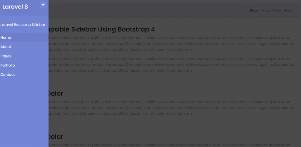
Hello friends, welcome back to my blog. Today in this blog post, I am going to tell you, Laravel 8 Collapsible Sidebar Using Bootstrap 4.
Guys if you are new in Laravel8 the please check below link for Laravel basics information:
Laravel Basics Tutorial for beginners
Here is the code snippet for Laravel 8 Collapsible Sidebar Using Bootstrap 4 and please use carefully and avoid the mistakes.:
1. Friends here is the code below and you can add into your resources/views/ welcome.blade.php file:
Guys for demo purpose, I have used this code into my welcome blade and I have used Direct CDN to make working example.
...
    <head>
       ...

        <link rel="stylesheet" href="https://maxcdn.bootstrapcdn.com/bootstrap/4.5.2/css/bootstrap.min.css">
        <script src="https://ajax.googleapis.com/ajax/libs/jquery/3.5.1/jquery.min.js"></script>
        <script src="https://cdnjs.cloudflare.com/ajax/libs/popper.js/1.16.0/umd/popper.min.js"></script>
        <script src="https://maxcdn.bootstrapcdn.com/bootstrap/4.5.2/js/bootstrap.min.js"></script>

        <!-- Font Awesome JS -->
        <script defer src="https://use.fontawesome.com/releases/v5.0.13/js/solid.js"></script>
        <script defer src="https://use.fontawesome.com/releases/v5.0.13/js/fontawesome.js"></script>

  <script>
    $(document).ready(function () {

        $('#dismiss, .overlay').on('click', function () {
            $('#sidebar').removeClass('active');
            $('.overlay').removeClass('active');
        });
        $('#sidebarCollapse').on('click', function () {
            $('#sidebar').addClass('active');
            $('.overlay').addClass('active');
            $('.collapse.in').toggleClass('in');
            $('a[aria-expanded=true]').attr('aria-expanded', 'false');
        });
    });
    </script>


  <style>
 /*
    DEMO STYLE
*/
@import "https://fonts.googleapis.com/css?family=Poppins:300,400,500,600,700";
body {
    font-family: 'Poppins', sans-serif;
    background: #fafafa!important;
}
p {
    font-family: 'Poppins', sans-serif;
    font-size: 1.1em;
    font-weight: 300;
    line-height: 1.7em;
    color: #999;
}
a,
a:hover,
a:focus {
    color: inherit;
    text-decoration: none;
    transition: all 0.3s;
}
.navbar {
    padding: 15px 10px;
    background: #eaecf8!important;
    border: none;
    border-radius: 0;
    margin-bottom: 40px;
    box-shadow: 1px 1px 3px rgba(0, 0, 0, 0.1);
}
.navbar-btn {
    box-shadow: none;
    outline: none !important;
    border: none;
}
.line {
    width: 100%;
    height: 1px;
    border-bottom: 1px dashed #ddd;
    margin: 40px 0;
}
/* ---------------------------------------------------
    SIDEBAR STYLE
----------------------------------------------------- */
#sidebar {
    width: 250px;
    position: fixed;
    top: 0;
    left: -250px;
    height: 100vh;
    z-index: 999;
    background: #7386D5;
    color: #fff;
    transition: all 0.3s;
    box-shadow: 3px 3px 3px rgba(0, 0, 0, 0.2);
}
#sidebar.active {
    left: 0;
}
#dismiss {
    width: 35px;
    height: 35px;
    line-height: 35px;
    text-align: center;
    background: #7386D5;
    position: absolute;
    top: 10px;
    right: 10px;
    cursor: pointer;
    -webkit-transition: all 0.3s;
    -o-transition: all 0.3s;
    transition: all 0.3s;
}
#dismiss:hover {
    background: #fff;
    color: #7386D5;
}
.overlay {
    display: none;
    position: fixed;
    width: 100vw;
    height: 100vh;
    background: rgba(0, 0, 0, 0.7);
    z-index: 998;
    opacity: 0;
    transition: all 0.5s ease-in-out;
}
.overlay.active {
    display: block;
    opacity: 1;
}
#sidebar .sidebar-header {
    padding: 20px;
    background: #6d7fcc;
}
#sidebar ul.components {
    padding: 20px 0;
    border-bottom: 1px solid #47748b;
}
#sidebar ul p {
    color: #fff;
    padding: 10px;
}
#sidebar ul li a {
    padding: 10px;
    font-size: 1.1em;
    display: block;
    color: #fff;
    text-decoration: none;
}
#sidebar ul li a:hover {
    color: #7386D5;
    background: #fff;
}
#sidebar ul li.active>a,
a[aria-expanded="true"] {
    color: #fff;
    background: #6d7fcc;
}
a[data-toggle="collapse"] {
    position: relative;
}
.dropdown-toggle::after {
    display: block;
    position: absolute;
    top: 50%;
    right: 20px;
    transform: translateY(-50%);
}
ul ul a {
    font-size: 0.9em !important;
    padding-left: 30px !important;
    background: #6d7fcc;
}
ul.CTAs {
    padding: 20px;
}
ul.CTAs a {
    text-align: center;
    font-size: 0.9em !important;
    display: block;
    border-radius: 5px;
    margin-bottom: 5px;
}
a.download {
    background: #fff;
    color: #7386D5;
}
a.article,
a.article:hover {
    background: #6d7fcc !important;
    color: #fff !important;
}
/* ---------------------------------------------------
    CONTENT STYLE
----------------------------------------------------- */
#content {
    width: 100%;
    padding: 20px;
    min-height: 100vh;
    transition: all 0.3s;
    position: absolute;
    top: 0;
    right: 0;
}
  </style>

    </head>
    <body>

    <div class="wrapper">
  <!-- Sidebar  -->
  <nav id="sidebar">
      <div id="dismiss">
          <i class="fas fa-arrow-left"></i>
      </div>

      <div class="sidebar-header">
          <h3>Laravel 8</h3>
      </div>

      <ul class="list-unstyled components">
          <p>Laravel Bootstrap Sidebar</p>
          <li class="active">
              <a href="#homeSubmenu" data-toggle="collapse" aria-expanded="false">Home</a>
              <ul class="collapse list-unstyled" id="homeSubmenu">
                  <li>
                      <a href="#">Home 1</a>
                  </li>
                  <li>
                      <a href="#">Home 2</a>
                  </li>
                  <li>
                      <a href="#">Home 3</a>
                  </li>
              </ul>
          </li>
          <li>
              <a href="#">About</a>
              <a href="#pageSubmenu" data-toggle="collapse" aria-expanded="false">Pages</a>
              <ul class="collapse list-unstyled" id="pageSubmenu">
                  <li>
                      <a href="#">Page 1</a>
                  </li>
                  <li>
                      <a href="#">Page 2</a>
                  </li>
                  <li>
                      <a href="#">Page 3</a>
                  </li>
              </ul>
          </li>
          <li>
              <a href="#">Portfolio</a>
          </li>
          <li>
              <a href="#">Contact</a>
          </li>
      </ul>


  </nav>

  <!-- Page Content  -->
  <div id="content">

      <nav class="navbar navbar-expand-lg navbar-light bg-light">
          <div class="container-fluid">

              <button type="button" id="sidebarCollapse" class="btn btn-primary">
                  <i class="fas fa-align-left"></i>
                  <span>Toggle Sidebar</span>
              </button>
              <button class="btn btn-dark d-inline-block d-lg-none ml-auto" type="button" data-toggle="collapse" data-target="#navbarSupportedContent" aria-controls="navbarSupportedContent" aria-expanded="false" aria-label="Toggle navigation">
                  <i class="fas fa-align-justify"></i>
              </button>

              <div class="collapse navbar-collapse" id="navbarSupportedContent">
                  <ul class="nav navbar-nav ml-auto">
                      <li class="nav-item active">
                          <a class="nav-link" href="#">Page</a>
                      </li>
                      <li class="nav-item">
                          <a class="nav-link" href="#">Page</a>
                      </li>
                      <li class="nav-item">
                          <a class="nav-link" href="#">Page</a>
                      </li>
                      <li class="nav-item">
                          <a class="nav-link" href="#">Page</a>
                      </li>
                  </ul>
              </div>
          </div>
      </nav>

      <h2>Laravel 8 Collapsible Sidebar Using Bootstrap 4</h2>
      <p>Lorem ipsum dolor sit amet, consectetur adipisicing elit, sed do eiusmod tempor incididunt ut labore et dolore magna aliqua. Ut enim ad minim veniam, quis nostrud exercitation ullamco laboris nisi ut aliquip ex ea commodo consequat. Duis aute irure dolor in reprehenderit in voluptate velit esse cillum dolore eu fugiat nulla pariatur. Excepteur sint occaecat cupidatat non proident, sunt in culpa qui officia deserunt mollit anim id est laborum.</p>
      <p>Lorem ipsum dolor sit amet, consectetur adipisicing elit, sed do eiusmod tempor incididunt ut labore et dolore magna aliqua. Ut enim ad minim veniam, quis nostrud exercitation ullamco laboris nisi ut aliquip ex ea commodo consequat. Duis aute irure dolor in reprehenderit in voluptate velit esse cillum dolore eu fugiat nulla pariatur. Excepteur sint occaecat cupidatat non proident, sunt in culpa qui officia deserunt mollit anim id est laborum.</p>

      <div class="line"></div>

      <h2>Lorem Ipsum Dolor</h2>
      <p>Lorem ipsum dolor sit amet, consectetur adipisicing elit, sed do eiusmod tempor incididunt ut labore et dolore magna aliqua. Ut enim ad minim veniam, quis nostrud exercitation ullamco laboris nisi ut aliquip ex ea commodo consequat. Duis aute irure dolor in reprehenderit in voluptate velit esse cillum dolore eu fugiat nulla pariatur. Excepteur sint occaecat cupidatat non proident, sunt in culpa qui officia deserunt mollit anim id est laborum.</p>

      <div class="line"></div>

      <h3>Lorem Ipsum Dolor</h3>
      <p>Lorem ipsum dolor sit amet, consectetur adipisicing elit, sed do eiusmod tempor incididunt ut labore et dolore magna aliqua. Ut enim ad minim veniam, quis nostrud exercitation ullamco laboris nisi ut aliquip ex ea commodo consequat. Duis aute irure dolor in reprehenderit in voluptate velit esse cillum dolore eu fugiat nulla pariatur. Excepteur sint occaecat cupidatat non proident, sunt in culpa qui officia deserunt mollit anim id est laborum.</p>
  </div>
</div>

<div class="overlay"></div>

    </body>
</html>
Now we are done friends and please run your Laravel 8 project and see the Responsive Sidebar Home Page. Also and If you have any kind of query or suggestion or any requirement then feel free to comment below.
Note: Friends, I just tell the basic setup and things, you can change the code according to your requirements. I will come with more Laravel 8 demos in my coming posts.
I will appreciate that if you will tell your views for this post. Nothing matters if your views will be good or bad.
Jassa
Thanks
Leave a Reply