
Hello to all, welcome back to therichpost.com. Today in this post, I will tell you, How to make simple sidebar template with Bootstrap 4 and Angular 9?
Guys here you can get more Angular 11 Free Templates:
Guys here is the updated code snippet for Angular 11 Bootstrap 5 Sidebar Template: How to make simple sidebar template with Bootstrap 5 and Angular 11?
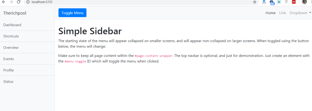
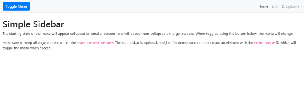
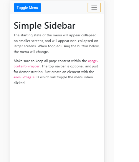
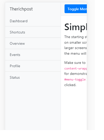
Below you can see working images of Angular bootstrap toggle sidebar navigation menu. During click on Toggle menu, sidebar navigation will show and hide.
Here is the code snippet for How to make simple sidebar template with Bootstrap 4 and Angular 9? and please follow carefully:
1. Guys very first, we need to run below commands into our terminal to get angular 9 on our system and also we have latest node version installed:
npm install -g @angular/cli

ng new angularbootstrap //Create new Angular Project

$ cd angularbootstrap // Go inside the Angular Project Folder

ng serve --open // Run and Open the Angular Project

http://localhost:4200/ // Working Angular Project Url
2. Now guys, we need to run below commands to install bootstrap 4 and jquery into our angular 9 application:
npm install --save bootstrap

npm i jquery

npm install popper.js --save
3. Now guys we need to add below code into our angular.json file to call the bootstrap and jquery styles scripts:
"styles": [
              "src/styles.css",
        "node_modules/bootstrap/dist/css/bootstrap.min.css"
            ],
            "scripts": [
      "node_modules/jquery/dist/jquery.min.js",
      "node_modules/bootstrap/dist/js/bootstrap.min.js",
      "node_modules/popper.js/dist/umd/popper.min.js"]
4. Now friends we need to add below code into our src\app\app.component.html file:
<div class="d-flex" id="wrapper">

    <!-- Sidebar -->
    <div class="bg-light border-right" id="sidebar-wrapper">
      <div class="sidebar-heading">Therichpost </div>
      <div class="list-group list-group-flush">
        <a href="#" class="list-group-item list-group-item-action bg-light">Dashboard</a>
        <a href="#" class="list-group-item list-group-item-action bg-light">Shortcuts</a>
        <a href="#" class="list-group-item list-group-item-action bg-light">Overview</a>
        <a href="#" class="list-group-item list-group-item-action bg-light">Events</a>
        <a href="#" class="list-group-item list-group-item-action bg-light">Profile</a>
        <a href="#" class="list-group-item list-group-item-action bg-light">Status</a>
      </div>
    </div>
    <!-- /#sidebar-wrapper -->

    <!-- Page Content -->
    <div id="page-content-wrapper">

      <nav class="navbar navbar-expand-lg navbar-light bg-light border-bottom">
        <button class="btn btn-primary" id="menu-toggle">Toggle Menu</button>

        <button class="navbar-toggler" type="button" data-toggle="collapse" data-target="#navbarSupportedContent" aria-controls="navbarSupportedContent" aria-expanded="false" aria-label="Toggle navigation">
          <span class="navbar-toggler-icon"></span>
        </button>

        <div class="collapse navbar-collapse" id="navbarSupportedContent">
          <ul class="navbar-nav ml-auto mt-2 mt-lg-0">
            <li class="nav-item active">
              <a class="nav-link" href="#">Home <span class="sr-only">(current)</span></a>
            </li>
            <li class="nav-item">
              <a class="nav-link" href="#">Link</a>
            </li>
            <li class="nav-item dropdown">
              <a class="nav-link dropdown-toggle" href="#" id="navbarDropdown" role="button" data-toggle="dropdown" aria-haspopup="true" aria-expanded="false">
                Dropdown
              </a>
              <div class="dropdown-menu dropdown-menu-right" aria-labelledby="navbarDropdown">
                <a class="dropdown-item" href="#">Action</a>
                <a class="dropdown-item" href="#">Another action</a>
                <div class="dropdown-divider"></div>
                <a class="dropdown-item" href="#">Something else here</a>
              </div>
            </li>
          </ul>
        </div>
      </nav>

      <div class="container-fluid">
        <h1 class="mt-4">Simple Sidebar</h1>
        <p>The starting state of the menu will appear collapsed on smaller screens, and will appear non-collapsed on larger screens. When toggled using the button below, the menu will change.</p>
        <p>Make sure to keep all page content within the <code>#page-content-wrapper</code>. The top navbar is optional, and just for demonstration. Just create an element with the <code>#menu-toggle</code> ID which will toggle the menu when clicked.</p>
      </div>
    </div>
    <!-- /#page-content-wrapper -->

  </div>
  <!-- /#wrapper -->
5. Now guys we need to add below code into our src\app\app.component.ts file:
import { Component } from '@angular/core';
import * as $ from 'jquery';
@Component({
  selector: 'app-root',
  templateUrl: './app.component.html',
  styleUrls: ['./app.component.css']
})
export class AppComponent {
  title = 'angularbootstrap';
   ngOnInit() {
                //Toggle Click Function
    $("#menu-toggle").click(function(e) {
      e.preventDefault();
      $("#wrapper").toggleClass("toggled");
    });
  }

}
6. Now guys we need to add below code into our src\app\app.component.css file:
body {
  overflow-x: hidden;
}

#sidebar-wrapper {
  min-height: 100vh;
  margin-left: -15rem;
  -webkit-transition: margin .25s ease-out;
  -moz-transition: margin .25s ease-out;
  -o-transition: margin .25s ease-out;
  transition: margin .25s ease-out;
}

#sidebar-wrapper .sidebar-heading {
  padding: 0.875rem 1.25rem;
  font-size: 1.2rem;
}

#sidebar-wrapper .list-group {
  width: 15rem;
}

#page-content-wrapper {
  min-width: 100vw;
}

#wrapper.toggled #sidebar-wrapper {
  margin-left: 0;
}

@media (min-width: 768px) {
  #sidebar-wrapper {
    margin-left: 0;
  }

  #page-content-wrapper {
    min-width: 0;
    width: 100%;
  }

  #wrapper.toggled #sidebar-wrapper {
    margin-left: -15rem;
  }
}
This is it guys and please run ng serve command and check the output on browser. If you have any kind of query then please do comment below.
Note: Friends, In this post, I just tell the basic setup and things, you can change the code according to your requirements.
I will appreciate that if you will tell your views for this post. Nothing matters if your views will be good or bad because with your views, I will make my next posts more good and helpful.
Jassa
Thank you
Leave a Reply