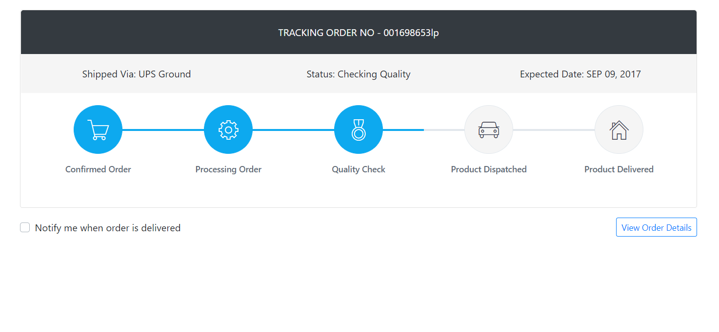
Hello friends, welcome back to my blog. Today in this blog post, I am going to show you, Create shop order tracking page in Reactjs Application.
For reactjs new comers, please check the below link:
Friends now I proceed onwards and here is the working code snippet and please use this carefully to avoid the mistakes:
1. Firstly, we need fresh reactjs setup and for that, we need to run below commands into out terminal and also we should have latest node version installed on our system:
npx create-react-app reacttemplate

cd reacttemplate

npm start
2. Now we need to run below commands into our project terminal to get bootstrap and related modules into our reactjs application:
npm install bootstrap --save

npm start //For start project again
3. Finally for the main output, we need to add below code into our reacttemplate/src/App.js file or if you have fresh setup then you can replace reacttemplate/src/App.js file code with below code:
import React from "react";

import './App.css'

//Bootstrap for responsiveness
import 'bootstrap/dist/css/bootstrap.min.css';

class App extends React.Component {


  render() {
    return (
      <div className="main_container">

            <h1>Therichpost.com</h1>


        <div class="container padding-bottom-3x mb-1">
        <div class="card mb-3">
          <div class="p-4 text-center text-white text-lg bg-dark rounded-top"><span class="text-uppercase">Tracking Order No - </span><span class="text-medium">001698653lp</span></div>
          <div class="d-flex flex-wrap flex-sm-nowrap justify-content-between py-3 px-2 bg-secondary">
            <div class="w-100 text-center py-1 px-2"><span class="text-medium">Shipped Via:</span> UPS Ground</div>
            <div class="w-100 text-center py-1 px-2"><span class="text-medium">Status:</span> Checking Quality</div>
            <div class="w-100 text-center py-1 px-2"><span class="text-medium">Expected Date:</span> APR 27, 2021</div>
          </div>
          <div class="card-body">
            <div class="steps d-flex flex-wrap flex-sm-nowrap justify-content-between padding-top-2x padding-bottom-1x">
              <div class="step completed">
                <div class="step-icon-wrap">
                  <div class="step-icon"><i class="pe-7s-cart"></i></div>
                </div>
                <h4 class="step-title">Confirmed Order</h4>
              </div>
              <div class="step completed">
                <div class="step-icon-wrap">
                  <div class="step-icon"><i class="pe-7s-config"></i></div>
                </div>
                <h4 class="step-title">Processing Order</h4>
              </div>
              <div class="step completed">
                <div class="step-icon-wrap">
                  <div class="step-icon"><i class="pe-7s-medal"></i></div>
                </div>
                <h4 class="step-title">Quality Check</h4>
              </div>
              <div class="step">
                <div class="step-icon-wrap">
                  <div class="step-icon"><i class="pe-7s-car"></i></div>
                </div>
                <h4 class="step-title">Product Dispatched</h4>
              </div>
              <div class="step">
                <div class="step-icon-wrap">
                  <div class="step-icon"><i class="pe-7s-home"></i></div>
                </div>
                <h4 class="step-title">Product Delivered</h4>
              </div>
            </div>
          </div>
        </div>
        <div class="d-flex flex-wrap flex-md-nowrap justify-content-center justify-content-sm-between align-items-center">
          <div class="custom-control custom-checkbox mr-3">
            <input class="custom-control-input" type="checkbox" id="notify_me" checked="" />
            <label class="custom-control-label" for="notify_me">Notify me when order is delivered</label>
          </div>
          <div class="text-left text-sm-right"><a class="btn btn-outline-primary btn-rounded btn-sm" href="#">View Order Details</a></div>
        </div>
      </div>

      </div>
    );
  }
}
export default App;
4. Now friends, we need to below code into our reacttemplate/src/App.css file for some custom styling:
@import url("https://cdn.jsdelivr.net/npm/pixeden-stroke-7-icon@1.2.3/pe-icon-7-stroke/dist/pe-icon-7-stroke.min.css");
body{margin-top:20px;}

.steps .step {
    display: block;
    width: 100%;
    margin-bottom: 35px;
    text-align: center
}

.steps .step .step-icon-wrap {
    display: block;
    position: relative;
    width: 100%;
    height: 80px;
    text-align: center
}

.steps .step .step-icon-wrap::before,
.steps .step .step-icon-wrap::after {
    display: block;
    position: absolute;
    top: 50%;
    width: 50%;
    height: 3px;
    margin-top: -1px;
    background-color: #e1e7ec;
    content: '';
    z-index: 1
}

.steps .step .step-icon-wrap::before {
    left: 0
}

.steps .step .step-icon-wrap::after {
    right: 0
}

.steps .step .step-icon {
    display: inline-block;
    position: relative;
    width: 80px;
    height: 80px;
    border: 1px solid #e1e7ec;
    border-radius: 50%;
    background-color: #f5f5f5;
    color: #374250;
    font-size: 38px;
    line-height: 81px;
    z-index: 5
}

.steps .step .step-title {
    margin-top: 16px;
    margin-bottom: 0;
    color: #606975;
    font-size: 14px;
    font-weight: 500
}

.steps .step:first-child .step-icon-wrap::before {
    display: none
}

.steps .step:last-child .step-icon-wrap::after {
    display: none
}

.steps .step.completed .step-icon-wrap::before,
.steps .step.completed .step-icon-wrap::after {
    background-color: #0da9ef
}

.steps .step.completed .step-icon {
    border-color: #0da9ef;
    background-color: #0da9ef;
    color: #fff
}

@media (max-width: 576px) {
    .flex-sm-nowrap .step .step-icon-wrap::before,
    .flex-sm-nowrap .step .step-icon-wrap::after {
        display: none
    }
}

@media (max-width: 768px) {
    .flex-md-nowrap .step .step-icon-wrap::before,
    .flex-md-nowrap .step .step-icon-wrap::after {
        display: none
    }
}

@media (max-width: 991px) {
    .flex-lg-nowrap .step .step-icon-wrap::before,
    .flex-lg-nowrap .step .step-icon-wrap::after {
        display: none
    }
}

@media (max-width: 1200px) {
    .flex-xl-nowrap .step .step-icon-wrap::before,
    .flex-xl-nowrap .step .step-icon-wrap::after {
        display: none
    }
}

.bg-faded, .bg-secondary {
    background-color: #f5f5f5 !important;
}
Now we are done friends. If you have any kind of query or suggestion or any requirement then feel free to comment below.
Note: Friends, I just tell the basic setup and things, you can change the code according to your requirements.
I will appreciate that if you will tell your views for this post. Nothing matters if your views will be good or bad.
Jassa
Thanks
Leave a Reply
You must be logged in to post a comment.