
Hello friends, welcome back to my blog. Today in this blog post, I am going to tell you, Angular Material with Flex Responsive Layout Working Demo.
Angular 13 came and if you are new then you must check below two links:
Friends here is the code snippet and please use this carefully to avoid mistakes:
1. Firstly friends we need fresh angular 13 setup and for this we need to run below commands but if you already have angular 13 setup then you can avoid below commands. Secondly we should also have latest node version installed on our system:
npm install -g @angular/cli

ng new angularmaterial

cd angularmaterial

ng serve --o

//Here is the url, you need to run into your browser and see working angular test project
http://localhost:4200/
2. Now friends we need to run below command into our project terminal to get angular material and its related modules:
ng add @angular/material

ng serve --o
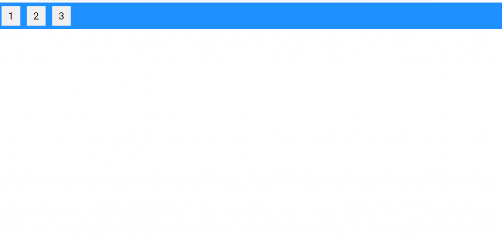
3. Finally friends we need to add below code into our project/src/app/app.component.html file to get the final output on web browser:
<div class="flex-container">
  <div>1</div>
  <div>2</div>
  <div>3</div>
</div>
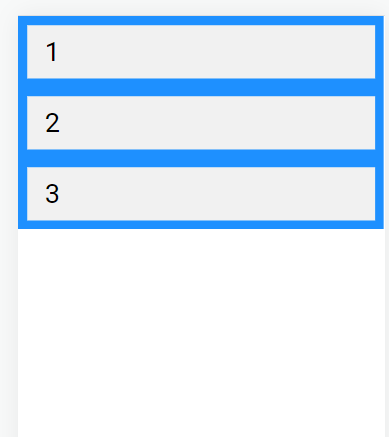
4. Now friends in last we need to add below code inside project/src/app/app.component.css file:
.flex-container {
    display: flex;
    background-color: DodgerBlue;
  }

  .flex-container > div {
    background-color: #f1f1f1;
    margin: 10px;
    padding: 20px;
    font-size: 30px;
  }


  /*Mobile Query */
  @media only screen and (max-width: 480px) {
    .flex-container {
        display: flex;
        flex-direction: column;
      }
  }

   /*Tablet Query */
   @media only screen and (min-width: 481px) and (max-width: 768px) {
    .flex-container {
        display: flex;
        flex-direction: column;
      }
  }
Now we are done friends. If you have any kind of query or suggestion or requirement then feel free to comment below.
Note: Friends, In this post, I just tell the basic setup and things, you can change the code according to your requirements.
I will appreciate that if you will tell your views for this post. Nothing matters if your views will be good or bad because with your views, I will make my next posts more good and helpful.
Jassa
Thanks
Leave a Reply