Year: 2021

  • Reactjs Bootstrap 4 News Magazine Carousel

    Reactjs Bootstrap 4 News Magazine Carousel

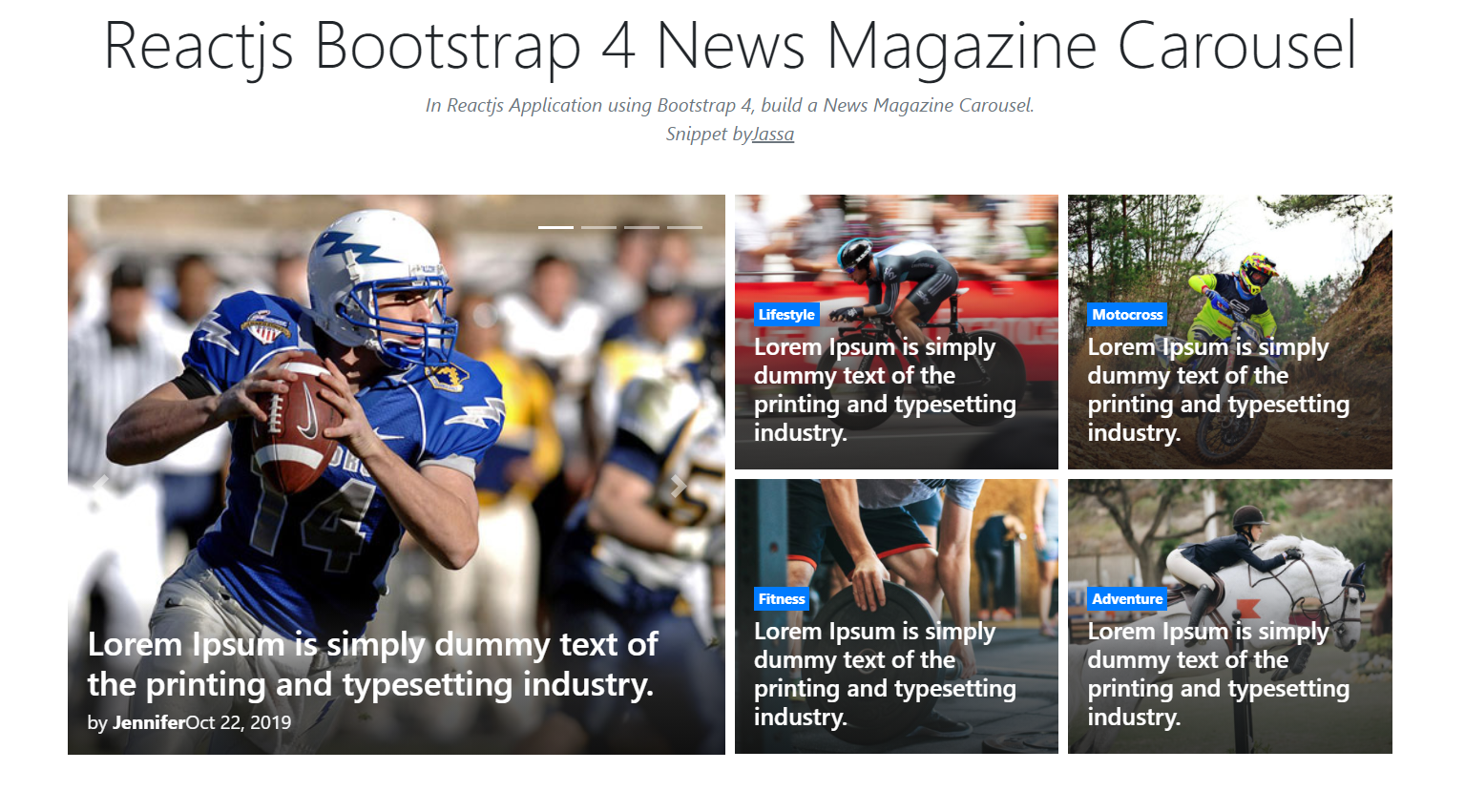
    Hello friends, welcome back to my blog. Today in this blog post, I am going to show you, Reactjs Bootstrap 4 News Magazine Carousel.

    Reactjs Bootstrap 4 News Magazine Carousel
    Reactjs Bootstrap

    For reactjs new comers, please check the below link:

    Reactjs Basic Tutorials


    Friends now I proceed onwards and here is the working code snippet for Reactjs Bootstrap 4 News Magazine Carousel and please use this carefully to avoid the mistakes:

    1. Firstly, we need fresh reactjs setup and for that, we need to run below commands into out terminal and also we should have latest node version installed on our system:

    npx create-react-app reacttepmate
    
    cd reacttepmate
    
    npm start


    2. Now we need to run below commands into our project terminal to get bootstrap and related modules into our reactjs application:

    npm install bootstrap --save
    
    npm install jquery --save
    
    npm start //For start project again


    3. Finally for the main output, we need to add below code into our reacttemplate/src/App.js file or if you have fresh setup then you can replace reacttemplate/src/App.js file code with below code:

    import React from 'react';
    
    import './App.css';
    import 'bootstrap/dist/css/bootstrap.min.css';
    import 'bootstrap/dist/js/bootstrap.min.js';
    
    
    class Home extends React.Component {
      
     
      render() {
       
        return (
         
            <div className="maincontainer">
             
             
              <div class="container">
            
                    <div class="row">
                        <div class="col-12 pb-5">
                          
                            <section class="row">
                               
                                <div class="col-12 col-md-6 pb-0 pb-md-3 pt-2 pr-md-1">
                                    <div id="featured" class="carousel slide carousel" data-ride="carousel">
                                        
                                        <ol class="carousel-indicators top-indicator">
                                            <li data-target="#featured" data-slide-to="0" class="active"></li>
                                            <li data-target="#featured" data-slide-to="1"></li>
                                            <li data-target="#featured" data-slide-to="2"></li>
                                            <li data-target="#featured" data-slide-to="3"></li>
                                        </ol>
                                        
                                        
                                        <div class="carousel-inner">
                                            
                                            <div class="carousel-item active">
                                                <div class="card border-0 rounded-0 text-light overflow zoom">
                                                    <div class="position-relative">
                                                       
                                                        <div class="ratio_left-cover-1 image-wrapper">
                                                            <a href="#">
                                                                <img class="img-fluid w-100"
                                                                    src="https://therichpost.com/wp-content/uploads/2021/03/Reactjs-Bootstrap-4-News-Magazine-Carousel.png"
                                                                    alt="Bootstrap news template" />
                                                            </a>
                                                        </div>
                                                        <div class="position-absolute p-2 p-lg-3 b-0 w-100 bg-shadow">
                                                          
                                                            <a href="#">
                                                                <h2 class="h3 post-title text-white my-1">Lorem Ipsum is simply dummy text of the printing and typesetting industry.</h2>
                                                            </a>
                                                           
                                                            <div class="news-meta">
                                                                <span class="news-author">by <a class="text-white font-weight-bold" href="#">Jennifer</a></span>
                                                                <span class="news-date">Oct 22, 2019</span>
                                                            </div>
                                                        </div>
                                                    </div>
                                                </div>
                                            </div>
                                            
                                           
                                            <div class="carousel-item">
                                                <div class="card border-0 rounded-0 text-light overflow zoom">
                                                    <div class="position-relative">
                                                       
                                                        <div class="ratio_left-cover-1 image-wrapper">
                                                            <a href="#">
                                                                <img class="img-fluid w-100"
                                                                    src="https://therichpost.com/wp-content/uploads/2021/03/Reactjs-Bootstrap-4-News-Magazine-Carousel.png"
                                                                    alt="Bootstrap news theme" />
                                                            </a>
                                                        </div>
                                                        <div class="position-absolute p-2 p-lg-3 b-0 w-100 bg-shadow">
                                                           
                                                            <a href="#">
                                                                <h2 class="h3 post-title text-white my-1">Lorem Ipsum is simply dummy text of the printing and typesetting industry.</h2>
                                                            </a>
                                                           
                                                            <div class="news-meta">
                                                                <span class="news-author">by <a class="text-white font-weight-bold" href="#">Jassa</a></span>
                                                                <span class="news-date">Oct 22, 2019</span>
                                                            </div>
                                                        </div>
                                                    </div>
                                                </div>
                                            </div>
                                            
                                          
                                            <div class="carousel-item">
                                                <div class="card border-0 rounded-0 text-light overflow zoom">
                                                    <div class="position-relative">
                                                       
                                                        <div class="ratio_left-cover-1 image-wrapper">
                                                            <a href="#">
                                                                <img class="img-fluid w-100"
                                                                    src="https://therichpost.com/wp-content/uploads/2021/03/Reactjs-Bootstrap-4-News-Magazine-Carousel.png"
                                                                    alt="Bootstrap blog template" />
                                                            </a>
                                                        </div>
                                                        <div class="position-absolute p-2 p-lg-3 b-0 w-100 bg-shadow">
                                                        
                                                            <a href="#">
                                                                <h2 class="h3 post-title text-white my-1">Lorem Ipsum is simply dummy text of the printing and typesetting industry.</h2>
                                                            </a>
                                                         
                                                            <div class="news-meta">
                                                                <span class="news-author">by <a class="text-white font-weight-bold" href="#">Jassa</a></span>
                                                                <span class="news-date">Oct 22, 2019</span>
                                                            </div>
                                                        </div>
                                                    </div>
                                                </div>
                                            </div>
                                            
                                           
                                            <div class="carousel-item">
                                                <div class="card border-0 rounded-0 text-light overflow zoom">
                                                    <div class="position-relative">
                                                       
                                                        <div class="ratio_left-cover-1 image-wrapper">
                                                            <a href="#">
                                                                <img class="img-fluid w-100"
                                                                    src="https://therichpost.com/wp-content/uploads/2021/03/Reactjs-Bootstrap-4-News-Magazine-Carousel.png"
                                                                    alt="Bootstrap portal template" />
                                                            </a>
                                                        </div>
                                                        <div class="position-absolute p-2 p-lg-3 b-0 w-100 bg-shadow">
                                                           
                                                            <a href="#">
                                                                <h2 class="h3 post-title text-white my-1">Lorem Ipsum is simply dummy text of the printing and typesetting industry.</h2>
                                                            </a>
                                                           
                                                            <div class="news-meta">
                                                                <span class="news-author">by <a class="text-white font-weight-bold" href="#">Jassa</a></span>
                                                                <span class="news-date">Oct 22, 2019</span>
                                                            </div>
                                                        </div>
                                                    </div>
                                                </div>
                                            </div>
                                          
                                        </div>
                                       
                                    </div>
                                    
                                  
                                    <a class="carousel-control-prev" href="#featured" role="button" data-slide="prev">
                                        <span class="carousel-control-prev-icon" aria-hidden="true"></span>
                                        <span class="sr-only">Previous</span>
                                    </a>
                                    <a class="carousel-control-next" href="#featured" role="button" data-slide="next">
                                        <span class="carousel-control-next-icon" aria-hidden="true"></span>
                                        <span class="sr-only">Next</span>
                                    </a>
                                </div>
                               
                                <div class="col-12 col-md-6 pt-2 pl-md-1 mb-3 mb-lg-4">
                                    <div class="row">
                                       
                                        <div class="col-6 pb-1 pt-0 pr-1">
                                            <div class="card border-0 rounded-0 text-white overflow zoom">
                                                <div class="position-relative">
                                                    
                                                    <div class="ratio_right-cover-2 image-wrapper">
                                                        <a href="#">
                                                            <img class="img-fluid"
                                                                src="https://therichpost.com/wp-content/uploads/2021/03/Reactjs-Bootstrap-4-News-Magazine-Carousel.png"
                                                                alt="simple blog template bootstrap" />
                                                        </a>
                                                    </div>
                                                    <div class="position-absolute p-2 p-lg-3 b-0 w-100 bg-shadow">
                                                     
                                                        <a class="p-1 badge badge-primary rounded-0" href="#">Lifestyle</a>
    
                                                       
                                                        <a href="#">
                                                            <h2 class="h5 text-white my-1">Lorem Ipsum is simply dummy text of the printing and typesetting industry.</h2>
                                                        </a>
                                                    </div>
                                                </div>
                                            </div>
                                        </div>
                                        
                                      
                                        <div class="col-6 pb-1 pl-1 pt-0">
                                            <div class="card border-0 rounded-0 text-white overflow zoom">
                                                <div class="position-relative">
                                                   
                                                    <div class="ratio_right-cover-2 image-wrapper">
                                                        <a href="#">
                                                            <img class="img-fluid"
                                                                src="https://therichpost.com/wp-content/uploads/2021/03/Reactjs-Bootstrap-4-News-Magazine-Carousel.png"
                                                                alt="bootstrap templates for blog" />
                                                        </a>
                                                    </div>
                                                    <div class="position-absolute p-2 p-lg-3 b-0 w-100 bg-shadow">
                                                       
                                                        <a class="p-1 badge badge-primary rounded-0" href="#">Motocross</a>
                                                        
                                                        <a href="#">
                                                            <h2 class="h5 text-white my-1">Lorem Ipsum is simply dummy text of the printing and typesetting industry.</h2>
                                                        </a>
                                                    </div>
                                                </div>
                                            </div>
                                        </div>
                                        
                                       
                                        <div class="col-6 pb-1 pr-1 pt-1">
                                            <div class="card border-0 rounded-0 text-white overflow zoom">
                                                <div class="position-relative">
                                                   
                                                    <div class="ratio_right-cover-2 image-wrapper">
                                                        <a href="#">
                                                            <img class="img-fluid"
                                                                src="https://therichpost.com/wp-content/uploads/2021/03/Reactjs-Bootstrap-4-News-Magazine-Carousel.png"
                                                                alt="bootstrap blog wordpress theme" />
                                                        </a>
                                                    </div>
                                                    <div class="position-absolute p-2 p-lg-3 b-0 w-100 bg-shadow">
                                                      
                                                        <a class="p-1 badge badge-primary rounded-0" href="#">Fitness</a>
                                                       
                                                        <a href="#">
                                                            <h2 class="h5 text-white my-1">Lorem Ipsum is simply dummy text of the printing and typesetting industry.</h2>
                                                        </a>
                                                    </div>
                                                </div>
                                            </div>
                                        </div>
                                        
                                       
                                        <div class="col-6 pb-1 pl-1 pt-1">
                                            <div class="card border-0 rounded-0 text-white overflow zoom">
                                                <div class="position-relative">
                                                    
                                                    <div class="ratio_right-cover-2 image-wrapper">
                                                        <a href="#">
                                                            <img class="img-fluid"
                                                                src="https://therichpost.com/wp-content/uploads/2021/03/Reactjs-Bootstrap-4-News-Magazine-Carousel.png"
                                                                alt="blog website templates bootstrap" />
                                                        </a>
                                                    </div>
                                                    <div class="position-absolute p-2 p-lg-3 b-0 w-100 bg-shadow">
                                                       
                                                        <a class="p-1 badge badge-primary rounded-0" href="#">Adventure</a>
                                                       
                                                        <a href="#">
                                                            <h2 class="h5 text-white my-1">Lorem Ipsum is simply dummy text of the printing and typesetting industry.</h2>
                                                        </a>
                                                    </div>
                                                </div>
                                            </div>
                                        </div>
                                       
                                    </div>
                                </div>
                              
                            </section>
                           
                        </div>
                    </div>
                   </div>
                    
              </div> 


    )
    };
    }
    
    export default Home;


    4. Now Friends we need to add below code into our reacttemplate/src/App.css file :

    .b-0 {
      bottom: 0;
    }
    .bg-shadow {
      background: rgba(76, 76, 76, 0);
      background: -webkit-gradient(left top, left bottom, color-stop(0%, rgba(179, 171, 171, 0)), color-stop(49%, rgba(48, 48, 48, 0.37)), color-stop(100%, rgba(19, 19, 19, 0.8)));
      background: linear-gradient(to bottom, rgba(179, 171, 171, 0) 0%, rgba(48, 48, 48, 0.71) 49%, rgba(19, 19, 19, 0.8) 100%);
      filter: progid:DXImageTransform.Microsoft.gradient( startColorstr='#4c4c4c', endColorstr='#131313', GradientType=0 );
    }
    .top-indicator {
      right: 0;
      top: 1rem;
      bottom: inherit;
      left: inherit;
      margin-right: 1rem;
    }
    .overflow {
      position: relative;
      overflow: hidden;
    }
    .zoom img {
      transition: all 0.2s linear;
    }
    .zoom:hover img {
      -webkit-transform: scale(1.1);
      transform: scale(1.1);
    }
    .carousel-indicators {
      position: absolute;
      right: 0;
      bottom: 0;
      z-index: 15;
      display: flex;
      justify-content: center;
      padding-left: 0;
      margin-left: 15%;
      list-style: none;
      height: 27px;
    }


    Now we are done friends. If you have any kind of query or suggestion or any requirement then feel free to comment below.

    Note: Friends, I just tell the basic setup and things, you can change the code according to your requirements.

    I will appreciate that if you will tell your views for this post. Nothing matters if your views will be good or bad.

    Jassa

    Thanks

  • Laravel 8 Bootstrap 4 Navbar with Icons Top

    Laravel 8 Bootstrap 4 Navbar with Icons Top

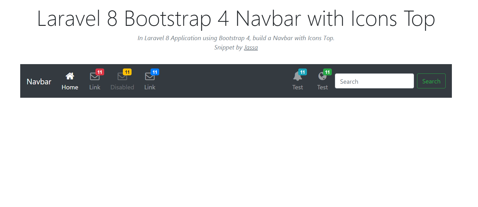
    Hello friends, welcome back to my blog. Today in this blog post, I am going to tell you, Laravel 8 Bootstrap 4 Navbar with Icons Top.

    Laravel 8 Bootstrap 4 Navbar with Icons Top
    Laravel 8 Bootstrap 4
    Laravel 8

    Guys if you are new in Laravel8 the please check below link for Laravel basics information:

    Laravel Basics Tutorial for beginners

    Here you can check more Laravel 8 Working live Demos:

    Laravel Demos


    Here is the code snippet for Laravel 8 Bootstrap 4 Navbar with Icons Top and please use carefully and avoid the mistakes.:


    1. Friends here is the code below and you can add into your resources/views/ welcome.blade.php file:

    Guys for demo purpose, I have used this code into my welcome blade and I have used Direct CDN to make working example:

    ...
        <head>
        ...
           
             <link rel="stylesheet" href="https://maxcdn.bootstrapcdn.com/bootstrap/4.5.2/css/bootstrap.min.css">
            <script src="https://ajax.googleapis.com/ajax/libs/jquery/3.5.1/jquery.min.js"></script>
           
            <script src="https://maxcdn.bootstrapcdn.com/bootstrap/4.5.2/js/bootstrap.min.js"></script>
                  
            <!-- Font Awesome JS -->
            <link rel="stylesheet" href="https://use.fontawesome.com/releases/v5.5.0/css/all.css">
        <style>
        @import url("//maxcdn.bootstrapcdn.com/font-awesome/4.7.0/css/font-awesome.min.css");
    
    .navbar-icon-top .navbar-nav .nav-link > .fa {
      position: relative;
      width: 36px;
      font-size: 24px;
    }
    
    .navbar-icon-top .navbar-nav .nav-link > .fa > .badge {
      font-size: 0.75rem;
      position: absolute;
      right: 0;
      font-family: sans-serif;
    }
    
    .navbar-icon-top .navbar-nav .nav-link > .fa {
      top: 3px;
      line-height: 12px;
    }
    
    .navbar-icon-top .navbar-nav .nav-link > .fa > .badge {
      top: -10px;
    }
    
    @media (min-width: 576px) {
      .navbar-icon-top.navbar-expand-sm .navbar-nav .nav-link {
        text-align: center;
        display: table-cell;
        height: 70px;
        vertical-align: middle;
        padding-top: 0;
        padding-bottom: 0;
      }
    
      .navbar-icon-top.navbar-expand-sm .navbar-nav .nav-link > .fa {
        display: block;
        width: 48px;
        margin: 2px auto 4px auto;
        top: 0;
        line-height: 24px;
      }
    
      .navbar-icon-top.navbar-expand-sm .navbar-nav .nav-link > .fa > .badge {
        top: -7px;
      }
    }
    
    @media (min-width: 768px) {
      .navbar-icon-top.navbar-expand-md .navbar-nav .nav-link {
        text-align: center;
        display: table-cell;
        height: 70px;
        vertical-align: middle;
        padding-top: 0;
        padding-bottom: 0;
      }
    
      .navbar-icon-top.navbar-expand-md .navbar-nav .nav-link > .fa {
        display: block;
        width: 48px;
        margin: 2px auto 4px auto;
        top: 0;
        line-height: 24px;
      }
    
      .navbar-icon-top.navbar-expand-md .navbar-nav .nav-link > .fa > .badge {
        top: -7px;
      }
    }
    
    @media (min-width: 992px) {
      .navbar-icon-top.navbar-expand-lg .navbar-nav .nav-link {
        text-align: center;
        display: table-cell;
        height: 70px;
        vertical-align: middle;
        padding-top: 0;
        padding-bottom: 0;
      }
    
      .navbar-icon-top.navbar-expand-lg .navbar-nav .nav-link > .fa {
        display: block;
        width: 48px;
        margin: 2px auto 4px auto;
        top: 0;
        line-height: 24px;
      }
    
      .navbar-icon-top.navbar-expand-lg .navbar-nav .nav-link > .fa > .badge {
        top: -7px;
      }
    }
    
    @media (min-width: 1200px) {
      .navbar-icon-top.navbar-expand-xl .navbar-nav .nav-link {
        text-align: center;
        display: table-cell;
        height: 70px;
        vertical-align: middle;
        padding-top: 0;
        padding-bottom: 0;
      }
    
      .navbar-icon-top.navbar-expand-xl .navbar-nav .nav-link > .fa {
        display: block;
        width: 48px;
        margin: 2px auto 4px auto;
        top: 0;
        line-height: 24px;
      }
    
      .navbar-icon-top.navbar-expand-xl .navbar-nav .nav-link > .fa > .badge {
        top: -7px;
      }
    }
        </style>
    
                    
        </head>
        <body>
       ...
    <div class="container">
      
      <nav class="navbar navbar-icon-top navbar-expand-lg navbar-dark bg-dark">
       <a class="navbar-brand" href="#">Navbar</a>
       <button class="navbar-toggler" type="button" data-toggle="collapse" data-target="#navbarSupportedContent" aria-controls="navbarSupportedContent" aria-expanded="false" aria-label="Toggle navigation">
         <span class="navbar-toggler-icon"></span>
       </button>
     
       <div class="collapse navbar-collapse" id="navbarSupportedContent">
         <ul class="navbar-nav mr-auto">
           <li class="nav-item active">
             <a class="nav-link" href="#">
               <i class="fa fa-home"></i>
               Home
               <span class="sr-only">(current)</span>
               </a>
           </li>
           <li class="nav-item">
             <a class="nav-link" href="#">
               <i class="fa fa-envelope-o">
                 <span class="badge badge-danger">11</span>
               </i>
               Link
             </a>
           </li>
           <li class="nav-item">
             <a class="nav-link disabled" href="#">
               <i class="fa fa-envelope-o">
                 <span class="badge badge-warning">11</span>
               </i>
               Disabled
             </a>
           </li>
           <li class="nav-item">
             <a class="nav-link" href="#">
               <i class="fa fa-envelope-o">
                 <span class="badge badge-primary">11</span>
               </i>
               Link
             </a>
             
           </li>
         </ul>
         <ul class="navbar-nav ">
           <li class="nav-item">
             <a class="nav-link" href="#">
               <i class="fa fa-bell">
                 <span class="badge badge-info">11</span>
               </i>
               Test
             </a>
           </li>
           <li class="nav-item">
             <a class="nav-link" href="#">
               <i class="fa fa-globe">
                 <span class="badge badge-success">11</span>
               </i>
               Test
             </a>
           </li>
         </ul>
         <form class="form-inline my-2 my-lg-0">
           <input class="form-control mr-sm-2" type="text" placeholder="Search" aria-label="Search">
           <button class="btn btn-outline-success my-2 my-sm-0" type="submit">Search</button>
         </form>
       </div>
     </nav>
      
      </div> 
      <!--container end.//-->
            
        </body>
    </html>


    Now we are done friends and please run your Laravel 8 project and see the Navbar with ICONS TOP Working Demo.  Also and If you have any kind of query or suggestion or any requirement then feel free to comment below.

    Note: Friends, I just tell the basic setup and things, you can change the code according to your requirements. I will come with more Laravel 8 demos.

    I will appreciate that if you will tell your views for this post. Nothing matters if your views will be good or bad.

    Jassa

    Thanks

  • Angular 11 Bootstrap 4 News Magazine Carousel

    Angular 11 Bootstrap 4 News Magazine Carousel

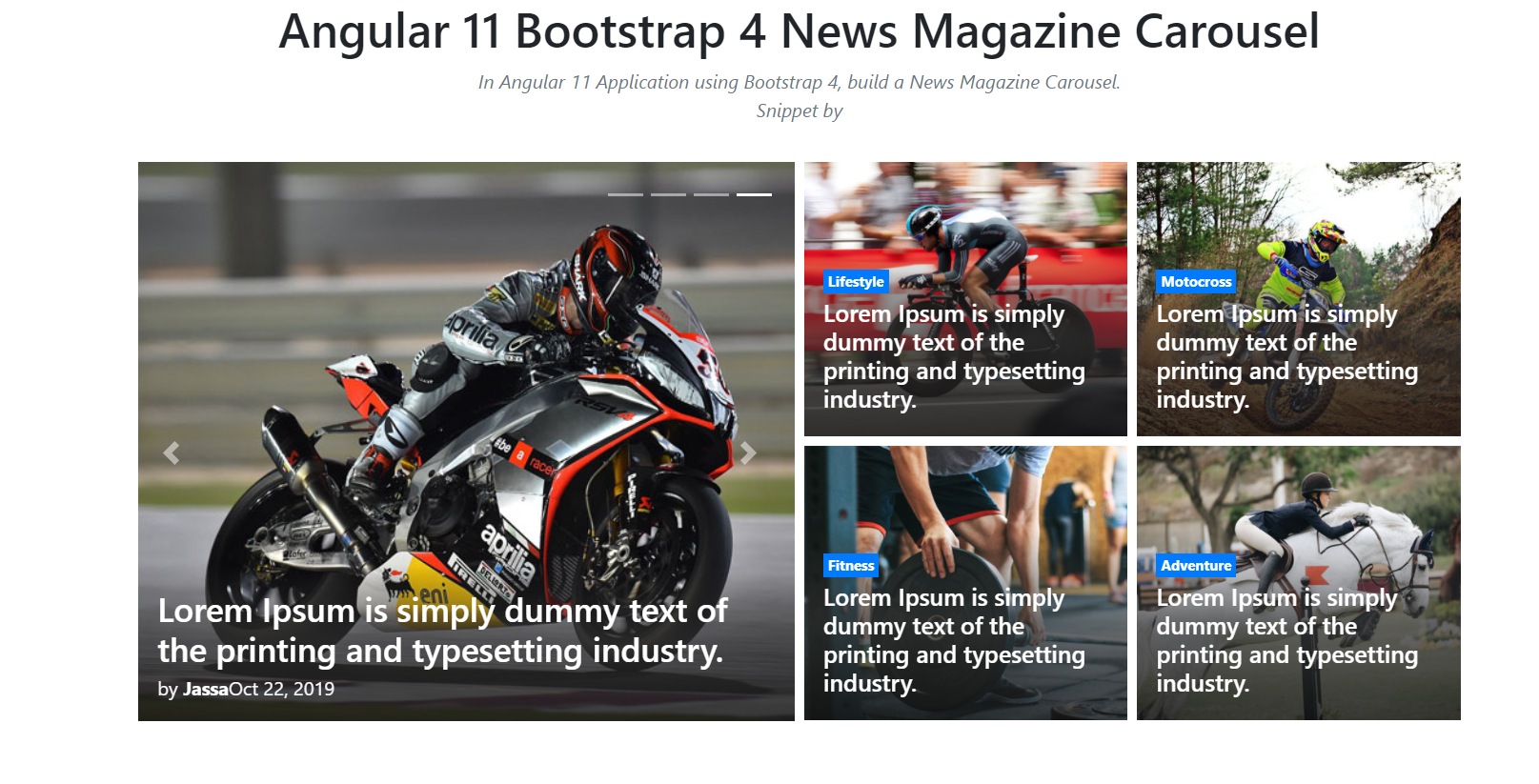
    Hello friends, welcome back to my blog. Today in this blog post, I am going to tell you, Angular 11 Bootstrap 4 News Magazine Carousel.

    Angular 11 came and if you are new then you must check below two links:

    1. Angular11 Basic Tutorials

    Friends now I proceed onwards and here is the working code snippet for Angular 11 Bootstrap 4 News Magazine Carousel and please use carefully this to avoid the mistakes:

    Angular 11 Bootstrap 4 News Magazine Carousel
    Angular 11 Bootstrap 4

    1. Firstly friends we need fresh angular 11 setup and for this we need to run below commands but if you already have angular 11 setup then you can avoid below commands. Secondly we should also have latest node version installed on our system:

    npm install -g @angular/cli 
    
    ng new angularnav //Create new Angular Project
    
    cd angularnav // Go inside the Angular Project Folder
    
    ng serve --open // Run and Open the Angular Project
    
    http://localhost:4200/ // Working Angular Project Url


    2. Now friends, here we need to run below commands into our project terminal to install bootstrap and jquery modules into our angular application:

    npm install --save bootstrap
    
    npm i jquery --save 


    3. Now friends, here we need to add below  into our angular.json file:

    ...
     "styles": [
                  "src/styles.css",
                  "node_modules/bootstrap/dist/css/bootstrap.min.css"
                 
                  
                ],
                "scripts": [
                  "node_modules/jquery/dist/jquery.min.js", 
                  
                  "node_modules/bootstrap/dist/js/bootstrap.min.js"


                ]
    ...


    4. Now friends we just need to add below code into src/app/app.component.html file to get final out on the web browser:

    <!--Container-->
    <div class="container">
      <!--Start code-->
      <div class="row">
          <div class="col-12 pb-5">
              <!--SECTION START-->
              <section class="row">
                  <!--Start slider news-->
                  <div class="col-12 col-md-6 pb-0 pb-md-3 pt-2 pr-md-1">
                      <div id="featured" class="carousel slide carousel" data-ride="carousel">
                          <!--dots navigate-->
                          <ol class="carousel-indicators top-indicator">
                              <li data-target="#featured" data-slide-to="0" class="active"></li>
                              <li data-target="#featured" data-slide-to="1"></li>
                              <li data-target="#featured" data-slide-to="2"></li>
                              <li data-target="#featured" data-slide-to="3"></li>
                          </ol>
                          
                          <!--carousel inner-->
                          <div class="carousel-inner">
                              <!--Item slider-->
                              <div class="carousel-item active">
                                  <div class="card border-0 rounded-0 text-light overflow zoom">
                                      <div class="position-relative">
                                          <!--thumbnail img-->
                                          <div class="ratio_left-cover-1 image-wrapper">
                                              <a href="#">
                                                  <img class="img-fluid w-100"
                                                       src="https://therichpost.com/wp-content/uploads/2021/03/Angular-11-Bootstrap-4-News-Magazine-Carousel.png"
                                                       alt="Bootstrap news template">
                                              </a>
                                          </div>
                                          <div class="position-absolute p-2 p-lg-3 b-0 w-100 bg-shadow">
                                              <!--title-->
                                              <a href="#">
                                                  <h2 class="h3 post-title text-white my-1">Lorem Ipsum is simply dummy text of the printing and typesetting industry.</h2>
                                              </a>
                                              <!-- meta title -->
                                              <div class="news-meta">
                                                  <span class="news-author">by <a class="text-white font-weight-bold" href="#">Jennifer</a></span>
                                                  <span class="news-date">Oct 22, 2019</span>
                                              </div>
                                          </div>
                                      </div>
                                  </div>
                              </div>
                              
                              <!--Item slider-->
                              <div class="carousel-item">
                                  <div class="card border-0 rounded-0 text-light overflow zoom">
                                      <div class="position-relative">
                                          <!--thumbnail img-->
                                          <div class="ratio_left-cover-1 image-wrapper">
                                              <a href="#">
                                                  <img class="img-fluid w-100"
                                                       src="https://therichpost.com/wp-content/uploads/2021/03/Angular-11-Bootstrap-4-News-Magazine-Carousel.png"
                                                       alt="Bootstrap news theme">
                                              </a>
                                          </div>
                                          <div class="position-absolute p-2 p-lg-3 b-0 w-100 bg-shadow">
                                              <!--title-->
                                              <a href="#">
                                                  <h2 class="h3 post-title text-white my-1">Lorem Ipsum is simply dummy text of the printing and typesetting industry.</h2>
                                              </a>
                                              <!-- meta title -->
                                              <div class="news-meta">
                                                  <span class="news-author">by <a class="text-white font-weight-bold" href="#">Jassa</a></span>
                                                  <span class="news-date">Oct 22, 2019</span>
                                              </div>
                                          </div>
                                      </div>
                                  </div>
                              </div>
                              
                              <!--Item slider-->
                              <div class="carousel-item">
                                  <div class="card border-0 rounded-0 text-light overflow zoom">
                                      <div class="position-relative">
                                          <!--thumbnail img-->
                                          <div class="ratio_left-cover-1 image-wrapper">
                                              <a href="#">
                                                  <img class="img-fluid w-100"
                                                       src="https://therichpost.com/wp-content/uploads/2021/03/Angular-11-Bootstrap-4-News-Magazine-Carousel.png"
                                                       alt="Bootstrap blog template">
                                              </a>
                                          </div>
                                          <div class="position-absolute p-2 p-lg-3 b-0 w-100 bg-shadow">
                                              <!--title-->
                                              <a href="#">
                                                  <h2 class="h3 post-title text-white my-1">Lorem Ipsum is simply dummy text of the printing and typesetting industry.</h2>
                                              </a>
                                              <!-- meta title -->
                                              <div class="news-meta">
                                                  <span class="news-author">by <a class="text-white font-weight-bold" href="#">Jassa</a></span>
                                                  <span class="news-date">Oct 22, 2019</span>
                                              </div>
                                          </div>
                                      </div>
                                  </div>
                              </div>
                              
                              <!--Item slider-->
                              <div class="carousel-item">
                                  <div class="card border-0 rounded-0 text-light overflow zoom">
                                      <div class="position-relative">
                                          <!--thumbnail img-->
                                          <div class="ratio_left-cover-1 image-wrapper">
                                              <a href="#">
                                                  <img class="img-fluid w-100"
                                                       src="https://therichpost.com/wp-content/uploads/2021/03/Angular-11-Bootstrap-4-News-Magazine-Carousel.png"
                                                       alt="Bootstrap portal template">
                                              </a>
                                          </div>
                                          <div class="position-absolute p-2 p-lg-3 b-0 w-100 bg-shadow">
                                              <!--title-->
                                              <a href="#">
                                                  <h2 class="h3 post-title text-white my-1">Lorem Ipsum is simply dummy text of the printing and typesetting industry.</h2>
                                              </a>
                                              <!-- meta title -->
                                              <div class="news-meta">
                                                  <span class="news-author">by <a class="text-white font-weight-bold" href="#">Jassa</a></span>
                                                  <span class="news-date">Oct 22, 2019</span>
                                              </div>
                                          </div>
                                      </div>
                                  </div>
                              </div>
                              <!--end item slider-->
                          </div>
                          <!--end carousel inner-->
                      </div>
                      
                      <!--navigation-->
                      <a class="carousel-control-prev" href="#featured" role="button" data-slide="prev">
                          <span class="carousel-control-prev-icon" aria-hidden="true"></span>
                          <span class="sr-only">Previous</span>
                      </a>
                      <a class="carousel-control-next" href="#featured" role="button" data-slide="next">
                          <span class="carousel-control-next-icon" aria-hidden="true"></span>
                          <span class="sr-only">Next</span>
                      </a>
                  </div>
                  <!--End slider news-->
                  
                  <!--Start box news-->
                  <div class="col-12 col-md-6 pt-2 pl-md-1 mb-3 mb-lg-4">
                      <div class="row">
                          <!--news box-->
                          <div class="col-6 pb-1 pt-0 pr-1">
                              <div class="card border-0 rounded-0 text-white overflow zoom">
                                  <div class="position-relative">
                                      <!--thumbnail img-->
                                      <div class="ratio_right-cover-2 image-wrapper">
                                          <a href="#">
                                              <img class="img-fluid"
                                                   src="https://therichpost.com/wp-content/uploads/2021/03/Angular-11-Bootstrap-4-News-Magazine-Carousel.png"
                                                   alt="simple blog template bootstrap">
                                          </a>
                                      </div>
                                      <div class="position-absolute p-2 p-lg-3 b-0 w-100 bg-shadow">
                                          <!-- category -->
                                          <a class="p-1 badge badge-primary rounded-0" href="#">Lifestyle</a>
    
                                          <!--title-->
                                          <a href="#">
                                              <h2 class="h5 text-white my-1">Lorem Ipsum is simply dummy text of the printing and typesetting industry.</h2>
                                          </a>
                                      </div>
                                  </div>
                              </div>
                          </div>
                          
                          <!--news box-->
                          <div class="col-6 pb-1 pl-1 pt-0">
                              <div class="card border-0 rounded-0 text-white overflow zoom">
                                  <div class="position-relative">
                                      <!--thumbnail img-->
                                      <div class="ratio_right-cover-2 image-wrapper">
                                          <a href="#">
                                              <img class="img-fluid"
                                                   src="https://therichpost.com/wp-content/uploads/2021/03/Angular-11-Bootstrap-4-News-Magazine-Carousel.png"
                                                   alt="bootstrap templates for blog">
                                          </a>
                                      </div>
                                      <div class="position-absolute p-2 p-lg-3 b-0 w-100 bg-shadow">
                                          <!-- category -->
                                          <a class="p-1 badge badge-primary rounded-0" href="#">Motocross</a>
                                          <!--title-->
                                          <a href="#">
                                              <h2 class="h5 text-white my-1">Lorem Ipsum is simply dummy text of the printing and typesetting industry.</h2>
                                          </a>
                                      </div>
                                  </div>
                              </div>
                          </div>
                          
                          <!--news box-->
                          <div class="col-6 pb-1 pr-1 pt-1">
                              <div class="card border-0 rounded-0 text-white overflow zoom">
                                  <div class="position-relative">
                                      <!--thumbnail img-->
                                      <div class="ratio_right-cover-2 image-wrapper">
                                          <a href="#">
                                              <img class="img-fluid"
                                                   src="https://therichpost.com/wp-content/uploads/2021/03/Angular-11-Bootstrap-4-News-Magazine-Carousel.png"
                                                   alt="bootstrap blog wordpress theme">
                                          </a>
                                      </div>
                                      <div class="position-absolute p-2 p-lg-3 b-0 w-100 bg-shadow">
                                          <!-- category -->
                                          <a class="p-1 badge badge-primary rounded-0" href="#">Fitness</a>
                                          <!--title-->
                                          <a href="#">
                                              <h2 class="h5 text-white my-1">Lorem Ipsum is simply dummy text of the printing and typesetting industry.</h2>
                                          </a>
                                      </div>
                                  </div>
                              </div>
                          </div>
                          
                          <!--news box-->
                          <div class="col-6 pb-1 pl-1 pt-1">
                              <div class="card border-0 rounded-0 text-white overflow zoom">
                                  <div class="position-relative">
                                      <!--thumbnail img-->
                                      <div class="ratio_right-cover-2 image-wrapper">
                                          <a href="#">
                                              <img class="img-fluid"
                                                   src="https://therichpost.com/wp-content/uploads/2021/03/Angular-11-Bootstrap-4-News-Magazine-Carousel.png"
                                                   alt="blog website templates bootstrap">
                                          </a>
                                      </div>
                                      <div class="position-absolute p-2 p-lg-3 b-0 w-100 bg-shadow">
                                          <!-- category -->
                                          <a class="p-1 badge badge-primary rounded-0" href="#">Adventure</a>
                                          <!--title-->
                                          <a href="#">
                                              <h2 class="h5 text-white my-1">Lorem Ipsum is simply dummy text of the printing and typesetting industry.</h2>
                                          </a>
                                      </div>
                                  </div>
                              </div>
                          </div>
                          <!--end news box-->
                      </div>
                  </div>
                  <!--End box news-->
              </section>
              <!--END SECTION-->
          </div>
      </div>
      <!--end code-->


    5. Now friends we just need to add below code into src/app/app.component.css file:

    .b-0 {
      bottom: 0;
    }
    .bg-shadow {
      background: rgba(76, 76, 76, 0);
      background: -webkit-gradient(left top, left bottom, color-stop(0%, rgba(179, 171, 171, 0)), color-stop(49%, rgba(48, 48, 48, 0.37)), color-stop(100%, rgba(19, 19, 19, 0.8)));
      background: linear-gradient(to bottom, rgba(179, 171, 171, 0) 0%, rgba(48, 48, 48, 0.71) 49%, rgba(19, 19, 19, 0.8) 100%);
      filter: progid:DXImageTransform.Microsoft.gradient( startColorstr='#4c4c4c', endColorstr='#131313', GradientType=0 );
    }
    .top-indicator {
      right: 0;
      top: 1rem;
      bottom: inherit;
      left: inherit;
      margin-right: 1rem;
    }
    .overflow {
      position: relative;
      overflow: hidden;
    }
    .zoom img {
      transition: all 0.2s linear;
    }
    .zoom:hover img {
      -webkit-transform: scale(1.1);
      transform: scale(1.1);
    }


    Friends in the end must run ng serve command into your terminal to run the angular 11 project.

    Now we are done friends. If you have any kind of query, suggestion and new requirement then feel free to comment below.

    Note: Friends, In this post, I just tell the basic setup and things, you can change the code according to your requirements.

    I will appreciate that if you will tell your views for this post. Nothing matters if your views will be good or bad because with your views, I will make my next posts more good and helpful.

    Jassa

    Thanks

  • Vuejs Bootstrap 4 Navbar with Icons Top

    Vuejs Bootstrap 4 Navbar with Icons Top

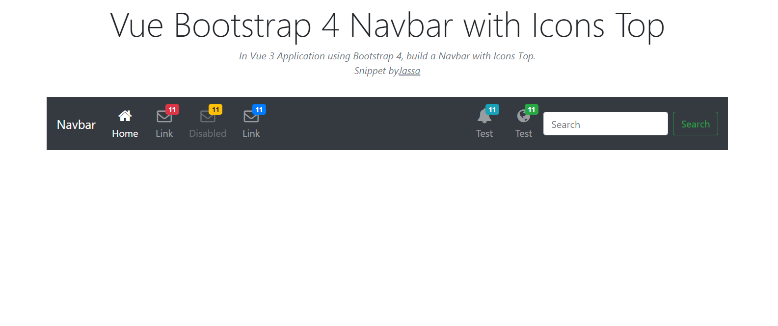
    Hello my friends, welcome back to my blog. Today in this blog post, I am going to show you, Vuejs Bootstrap 4 Navbar with Icons Top.

    Vuejs Bootstrap 4 Navbar with Icons Top
    Vuejsv3 Bootstrap 4
    Vuejs Bootstrap 4 Responsvie Navbar

    Vuejs3 came and if you are new then you must check below link::
    Vuejs


    Friends now I proceed onwards and here is the code snippet for Vuejs Bootstrap 4 Navbar with Icons Top and please use this carefully to avoid the mistakes:

    1. Firstly friends we need fresh vuejs(Vue 3) setup and for that we need to run below commands into our terminal and also w should have latest node version installed on our system:

    Guys you can skip this first step if you already have vuejs fresh setup:

    npm install -g @vue/cli
    
    vue create vuenav
    
    cd vuenav
    
    npm install bootstrap --save
    
    npm i jquery --save
    
    npm run serve //http://localhost:8080/

    2. Finally guys we need to add below code into our src/App.vue file to get final output on web browser:

    <template>
    <div class="container">
      
      <nav class="navbar navbar-icon-top navbar-expand-lg navbar-dark bg-dark">
       <a class="navbar-brand" href="#">Therichpost</a>
       <button class="navbar-toggler" type="button" data-toggle="collapse" data-target="#navbarSupportedContent" aria-controls="navbarSupportedContent" aria-expanded="false" aria-label="Toggle navigation">
         <span class="navbar-toggler-icon"></span>
       </button>
     
       <div class="collapse navbar-collapse" id="navbarSupportedContent">
         <ul class="navbar-nav mr-auto">
           <li class="nav-item active">
             <a class="nav-link" href="#">
               <i class="fa fa-home"></i>
               Home
               <span class="sr-only">(current)</span>
               </a>
           </li>
           <li class="nav-item">
             <a class="nav-link" href="#">
               <i class="fa fa-envelope-o">
                 <span class="badge badge-danger">11</span>
               </i>
               Link
             </a>
           </li>
           <li class="nav-item">
             <a class="nav-link disabled" href="#">
               <i class="fa fa-envelope-o">
                 <span class="badge badge-warning">11</span>
               </i>
               Disabled
             </a>
           </li>
           <li class="nav-item">
             <a class="nav-link" href="#">
               <i class="fa fa-envelope-o">
                 <span class="badge badge-primary">11</span>
               </i>
               Link
             </a>
             
           </li>
         </ul>
         <ul class="navbar-nav ">
           <li class="nav-item">
             <a class="nav-link" href="#">
               <i class="fa fa-bell">
                 <span class="badge badge-info">11</span>
               </i>
               Test
             </a>
           </li>
           <li class="nav-item">
             <a class="nav-link" href="#">
               <i class="fa fa-globe">
                 <span class="badge badge-success">11</span>
               </i>
               Test
             </a>
           </li>
         </ul>
         <form class="form-inline my-2 my-lg-0">
           <input class="form-control mr-sm-2" type="text" placeholder="Search" aria-label="Search">
           <button class="btn btn-outline-success my-2 my-sm-0" type="submit">Search</button>
         </form>
       </div>
     </nav>
      
      </div> 
      <!--container end.//-->
      
    
    </template>
    <script>
    //Bootstrap
    
    import 'bootstrap/dist/css/bootstrap.min.css';
    import 'bootstrap/dist/js/bootstrap.min.js';
    import './App.css';
    import 'jquery/dist/jquery.min.js'; 
    
    export default {
     
      
    }
    </script>


    3. Now guys we need to add below code into our src/App.css file:

    @import url("//maxcdn.bootstrapcdn.com/font-awesome/4.7.0/css/font-awesome.min.css");
    
    .navbar-icon-top .navbar-nav .nav-link > .fa {
      position: relative;
      width: 36px;
      font-size: 24px;
    }
    
    .navbar-icon-top .navbar-nav .nav-link > .fa > .badge {
      font-size: 0.75rem;
      position: absolute;
      right: 0;
      font-family: sans-serif;
    }
    
    .navbar-icon-top .navbar-nav .nav-link > .fa {
      top: 3px;
      line-height: 12px;
    }
    
    .navbar-icon-top .navbar-nav .nav-link > .fa > .badge {
      top: -10px;
    }
    
    @media (min-width: 576px) {
      .navbar-icon-top.navbar-expand-sm .navbar-nav .nav-link {
        text-align: center;
        display: table-cell;
        height: 70px;
        vertical-align: middle;
        padding-top: 0;
        padding-bottom: 0;
      }
    
      .navbar-icon-top.navbar-expand-sm .navbar-nav .nav-link > .fa {
        display: block;
        width: 48px;
        margin: 2px auto 4px auto;
        top: 0;
        line-height: 24px;
      }
    
      .navbar-icon-top.navbar-expand-sm .navbar-nav .nav-link > .fa > .badge {
        top: -7px;
      }
    }
    
    @media (min-width: 768px) {
      .navbar-icon-top.navbar-expand-md .navbar-nav .nav-link {
        text-align: center;
        display: table-cell;
        height: 70px;
        vertical-align: middle;
        padding-top: 0;
        padding-bottom: 0;
      }
    
      .navbar-icon-top.navbar-expand-md .navbar-nav .nav-link > .fa {
        display: block;
        width: 48px;
        margin: 2px auto 4px auto;
        top: 0;
        line-height: 24px;
      }
    
      .navbar-icon-top.navbar-expand-md .navbar-nav .nav-link > .fa > .badge {
        top: -7px;
      }
    }
    
    @media (min-width: 992px) {
      .navbar-icon-top.navbar-expand-lg .navbar-nav .nav-link {
        text-align: center;
        display: table-cell;
        height: 70px;
        vertical-align: middle;
        padding-top: 0;
        padding-bottom: 0;
      }
    
      .navbar-icon-top.navbar-expand-lg .navbar-nav .nav-link > .fa {
        display: block;
        width: 48px;
        margin: 2px auto 4px auto;
        top: 0;
        line-height: 24px;
      }
    
      .navbar-icon-top.navbar-expand-lg .navbar-nav .nav-link > .fa > .badge {
        top: -7px;
      }
    }
    
    @media (min-width: 1200px) {
      .navbar-icon-top.navbar-expand-xl .navbar-nav .nav-link {
        text-align: center;
        display: table-cell;
        height: 70px;
        vertical-align: middle;
        padding-top: 0;
        padding-bottom: 0;
      }
    
      .navbar-icon-top.navbar-expand-xl .navbar-nav .nav-link > .fa {
        display: block;
        width: 48px;
        margin: 2px auto 4px auto;
        top: 0;
        line-height: 24px;
      }
    
      .navbar-icon-top.navbar-expand-xl .navbar-nav .nav-link > .fa > .badge {
        top: -7px;
      }
    }


    Now we are done friends also and If you have any kind of query or suggestion or any requirement then feel free to comment below.

    Note: Friends, I just tell the basic setup and things, you can change the code according to your requirements. I will come with more demo which will helpful to all.

    I will appreciate that if you will tell your views for this post. Nothing matters if your views will be good or bad.

    Jassa

    Thanks

  • Reactjs Bootstrap 4 Navbar with Icons Top

    Reactjs Bootstrap 4 Navbar with Icons Top

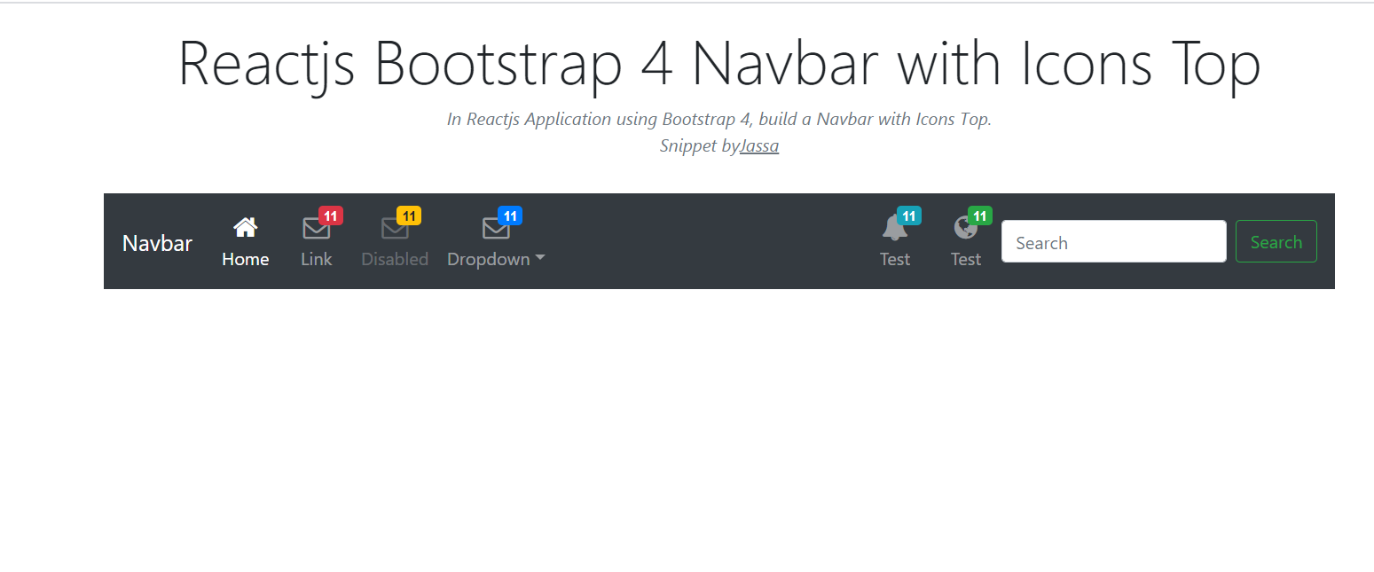
    Hello friends, welcome back to my blog. Today in this blog post, I am going to show you, Reactjs Bootstrap 4 Navbar with Icons Top.

    Reactjs Bootstrap 4 Navbar with Icons Top
    Reactjs Bootstrap 4 Navbar with Icons Top
    React Bootstrap Responsive Navbar

    For reactjs new comers, please check the below link:

    Reactjs Basic Tutorials


    Friends now I proceed onwards and here is the working code snippet for Reactjs Bootstrap 4 Navbar with Icons Top and please use this carefully to avoid the mistakes:

    1. Firstly, we need fresh reactjs setup and for that, we need to run below commands into out terminal and also we should have latest node version installed on our system:

    npx create-react-app reacttepmate
    
    cd reacttepmate
    
    npm start


    2. Now we need to run below commands into our project terminal to get bootstrap and related modules into our reactjs application:

    npm install bootstrap --save
    
    npm install jquery --save
    
    npm start //For start project again


    3. Finally for the main output, we need to add below code into our reacttemplate/src/App.js file or if you have fresh setup then you can replace reacttemplate/src/App.js file code with below code:

    import React from 'react';
    
    import './App.css';
    import 'bootstrap/dist/css/bootstrap.min.css';
    import 'bootstrap/dist/js/bootstrap.min.js'; import 'jquery/dist/jquery.min.js';
    class Home extends React.Component {
      
     
      render() {
       
        return (
         
            <div className="maincontainer">
            
             
              <div class="container">
              <nav class="navbar navbar-icon-top navbar-expand-lg navbar-dark bg-dark">
                        <a class="navbar-brand" href="#">Therichpost</a>
                        <button class="navbar-toggler" type="button" data-toggle="collapse" data-target="#navbarSupportedContent" aria-controls="navbarSupportedContent" aria-expanded="false" aria-label="Toggle navigation">
                            <span class="navbar-toggler-icon"></span>
                        </button>
                        
                        <div class="collapse navbar-collapse" id="navbarSupportedContent">
                            <ul class="navbar-nav mr-auto">
                            <li class="nav-item active">
                                <a class="nav-link" href="#">
                                <i class="fa fa-home"></i>
                                Home
                                <span class="sr-only">(current)</span>
                                </a>
                            </li>
                            <li class="nav-item">
                                <a class="nav-link" href="#">
                                <i class="fa fa-envelope-o">
                                    <span class="badge badge-danger">11</span>
                                </i>
                                Link
                                </a>
                            </li>
                            <li class="nav-item">
                                <a class="nav-link disabled" href="#">
                                <i class="fa fa-envelope-o">
                                    <span class="badge badge-warning">11</span>
                                </i>
                                Disabled
                                </a>
                            </li>
                            <li class="nav-item">
                                <a class="nav-link" href="#">
                                <i class="fa fa-envelope-o">
                                    <span class="badge badge-primary">11</span>
                                </i>
                                Link
                                </a>
                               
                            </li>
                            </ul>
                            <ul class="navbar-nav ">
                            <li class="nav-item">
                                <a class="nav-link" href="#">
                                <i class="fa fa-bell">
                                    <span class="badge badge-info">11</span>
                                </i>
                                Test
                                </a>
                            </li>
                            <li class="nav-item">
                                <a class="nav-link" href="#">
                                <i class="fa fa-globe">
                                    <span class="badge badge-success">11</span>
                                </i>
                                Test
                                </a>
                            </li>
                            </ul>
                            <form class="form-inline my-2 my-lg-0">
                            <input class="form-control mr-sm-2" type="text" placeholder="Search" aria-label="Search" />
                            <button class="btn btn-outline-success my-2 my-sm-0" type="submit">Search</button>
                            </form>
                        </div>
                        </nav>
                    
                    </div> 
                 
            </div>
         
          
    )
    };
    }
    
    export default Home;


    4. Now Friends we need to add below code into our reacttemplate/src/App.css file :

    @import url("//maxcdn.bootstrapcdn.com/font-awesome/4.7.0/css/font-awesome.min.css");
    
    .navbar-icon-top .navbar-nav .nav-link > .fa {
      position: relative;
      width: 36px;
      font-size: 24px;
    }
    
    .navbar-icon-top .navbar-nav .nav-link > .fa > .badge {
      font-size: 0.75rem;
      position: absolute;
      right: 0;
      font-family: sans-serif;
    }
    
    .navbar-icon-top .navbar-nav .nav-link > .fa {
      top: 3px;
      line-height: 12px;
    }
    
    .navbar-icon-top .navbar-nav .nav-link > .fa > .badge {
      top: -10px;
    }
    
    @media (min-width: 576px) {
      .navbar-icon-top.navbar-expand-sm .navbar-nav .nav-link {
        text-align: center;
        display: table-cell;
        height: 70px;
        vertical-align: middle;
        padding-top: 0;
        padding-bottom: 0;
      }
    
      .navbar-icon-top.navbar-expand-sm .navbar-nav .nav-link > .fa {
        display: block;
        width: 48px;
        margin: 2px auto 4px auto;
        top: 0;
        line-height: 24px;
      }
    
      .navbar-icon-top.navbar-expand-sm .navbar-nav .nav-link > .fa > .badge {
        top: -7px;
      }
    }
    
    @media (min-width: 768px) {
      .navbar-icon-top.navbar-expand-md .navbar-nav .nav-link {
        text-align: center;
        display: table-cell;
        height: 70px;
        vertical-align: middle;
        padding-top: 0;
        padding-bottom: 0;
      }
    
      .navbar-icon-top.navbar-expand-md .navbar-nav .nav-link > .fa {
        display: block;
        width: 48px;
        margin: 2px auto 4px auto;
        top: 0;
        line-height: 24px;
      }
    
      .navbar-icon-top.navbar-expand-md .navbar-nav .nav-link > .fa > .badge {
        top: -7px;
      }
    }
    
    @media (min-width: 992px) {
      .navbar-icon-top.navbar-expand-lg .navbar-nav .nav-link {
        text-align: center;
        display: table-cell;
        height: 70px;
        vertical-align: middle;
        padding-top: 0;
        padding-bottom: 0;
      }
    
      .navbar-icon-top.navbar-expand-lg .navbar-nav .nav-link > .fa {
        display: block;
        width: 48px;
        margin: 2px auto 4px auto;
        top: 0;
        line-height: 24px;
      }
    
      .navbar-icon-top.navbar-expand-lg .navbar-nav .nav-link > .fa > .badge {
        top: -7px;
      }
    }
    
    @media (min-width: 1200px) {
      .navbar-icon-top.navbar-expand-xl .navbar-nav .nav-link {
        text-align: center;
        display: table-cell;
        height: 70px;
        vertical-align: middle;
        padding-top: 0;
        padding-bottom: 0;
      }
    
      .navbar-icon-top.navbar-expand-xl .navbar-nav .nav-link > .fa {
        display: block;
        width: 48px;
        margin: 2px auto 4px auto;
        top: 0;
        line-height: 24px;
      }
    
      .navbar-icon-top.navbar-expand-xl .navbar-nav .nav-link > .fa > .badge {
        top: -7px;
      }
    }


    Now we are done friends. If you have any kind of query or suggestion or any requirement then feel free to comment below.

    Note: Friends, I just tell the basic setup and things, you can change the code according to your requirements.

    I will appreciate that if you will tell your views for this post. Nothing matters if your views will be good or bad.

    Jassa

    Thanks

  • Angular 11 Bootstrap 4 Navbar with Icon Top

    Angular 11 Bootstrap 4 Navbar with Icon Top

    Hello friends, welcome back to my blog. Today in this blog post, I am going to tell you, Angular 11 Bootstrap 4 Navbar with Icon Top.

    Angular 11 came and if you are new then you must check below two links:

    1. Angular11 Basic Tutorials

    Friends now I proceed onwards and here is the working code snippet for Angular 11 Bootstrap 4 Navbar with Icon Top and please use carefully this to avoid the mistakes:

    Angular 11 Bootstrap 4 Navbar with Icon Top
    Angular 11 Bootstrap 4 Navbar with Icon Top
    Angular 11 Bootstrap 4 Navbar with Icon Top Demo 2
    Angular 11 Bootstrap 4 Responsive Navbar

    1. Firstly friends we need fresh angular 11 setup and for this we need to run below commands but if you already have angular 11 setup then you can avoid below commands. Secondly we should also have latest node version installed on our system:

    npm install -g @angular/cli 
    
    ng new angularnav //Create new Angular Project
    
    cd angularnav // Go inside the Angular Project Folder
    
    ng serve --open // Run and Open the Angular Project
    
    http://localhost:4200/ // Working Angular Project Url


    2. Now friends, here we need to run below commands into our project terminal to install bootstrap and jquery modules into our angular application:

    npm install --save bootstrap
    
    npm i jquery --save 


    3. Now friends, here we need to add below  into our angular.json file:

    ...
     "styles": [
                  "src/styles.css",
                  "node_modules/bootstrap/dist/css/bootstrap.min.css"
                 
                  
                ],
                "scripts": [
                  "node_modules/jquery/dist/jquery.min.js", 
                  
                  "node_modules/bootstrap/dist/js/bootstrap.min.js"


                ]
    ...


    4. Now friends we just need to add below code into src/app/app.component.html file to get final out on the web browser:

    <nav class="navbar navbar-icon-top navbar-expand-lg navbar-dark bg-dark">
       <a class="navbar-brand" href="#">Navbar</a>
       <button class="navbar-toggler" type="button" data-toggle="collapse" data-target="#navbarSupportedContent" aria-controls="navbarSupportedContent" aria-expanded="false" aria-label="Toggle navigation">
         <span class="navbar-toggler-icon"></span>
       </button>
     
       <div class="collapse navbar-collapse" id="navbarSupportedContent">
         <ul class="navbar-nav mr-auto">
           <li class="nav-item active">
             <a class="nav-link" href="#">
               <i class="fa fa-home"></i>
               Home
               <span class="sr-only">(current)</span>
               </a>
           </li>
           <li class="nav-item">
             <a class="nav-link" href="#">
               <i class="fa fa-envelope-o">
                 <span class="badge badge-danger">11</span>
               </i>
               Link
             </a>
           </li>
           <li class="nav-item">
             <a class="nav-link disabled" href="#">
               <i class="fa fa-envelope-o">
                 <span class="badge badge-warning">11</span>
               </i>
               Disabled
             </a>
           </li>
           <li class="nav-item dropdown">
             <a class="nav-link dropdown-toggle" href="#" id="navbarDropdown" role="button" data-toggle="dropdown" aria-haspopup="true" aria-expanded="false">
               <i class="fa fa-envelope-o">
                 <span class="badge badge-primary">11</span>
               </i>
               Dropdown
             </a>
             <div class="dropdown-menu" aria-labelledby="navbarDropdown">
               <a class="dropdown-item" href="#">Action</a>
               <a class="dropdown-item" href="#">Another action</a>
               <div class="dropdown-divider"></div>
               <a class="dropdown-item" href="#">Something else here</a>
             </div>
           </li>
         </ul>
         <ul class="navbar-nav ">
           <li class="nav-item">
             <a class="nav-link" href="#">
               <i class="fa fa-bell">
                 <span class="badge badge-info">11</span>
               </i>
               Test
             </a>
           </li>
           <li class="nav-item">
             <a class="nav-link" href="#">
               <i class="fa fa-globe">
                 <span class="badge badge-success">11</span>
               </i>
               Test
             </a>
           </li>
         </ul>
         <form class="form-inline my-2 my-lg-0">
           <input class="form-control mr-sm-2" type="text" placeholder="Search" aria-label="Search">
           <button class="btn btn-outline-success my-2 my-sm-0" type="submit">Search</button>
         </form>
       </div>
     </nav>


    5. Now friends we just need to add below code into src/app/app.component.css file:

    @import url("//maxcdn.bootstrapcdn.com/font-awesome/4.7.0/css/font-awesome.min.css");
    
    .navbar-icon-top .navbar-nav .nav-link > .fa {
      position: relative;
      width: 36px;
      font-size: 24px;
    }
    
    .navbar-icon-top .navbar-nav .nav-link > .fa > .badge {
      font-size: 0.75rem;
      position: absolute;
      right: 0;
      font-family: sans-serif;
    }
    
    .navbar-icon-top .navbar-nav .nav-link > .fa {
      top: 3px;
      line-height: 12px;
    }
    
    .navbar-icon-top .navbar-nav .nav-link > .fa > .badge {
      top: -10px;
    }
    
    @media (min-width: 576px) {
      .navbar-icon-top.navbar-expand-sm .navbar-nav .nav-link {
        text-align: center;
        display: table-cell;
        height: 70px;
        vertical-align: middle;
        padding-top: 0;
        padding-bottom: 0;
      }
    
      .navbar-icon-top.navbar-expand-sm .navbar-nav .nav-link > .fa {
        display: block;
        width: 48px;
        margin: 2px auto 4px auto;
        top: 0;
        line-height: 24px;
      }
    
      .navbar-icon-top.navbar-expand-sm .navbar-nav .nav-link > .fa > .badge {
        top: -7px;
      }
    }
    
    @media (min-width: 768px) {
      .navbar-icon-top.navbar-expand-md .navbar-nav .nav-link {
        text-align: center;
        display: table-cell;
        height: 70px;
        vertical-align: middle;
        padding-top: 0;
        padding-bottom: 0;
      }
    
      .navbar-icon-top.navbar-expand-md .navbar-nav .nav-link > .fa {
        display: block;
        width: 48px;
        margin: 2px auto 4px auto;
        top: 0;
        line-height: 24px;
      }
    
      .navbar-icon-top.navbar-expand-md .navbar-nav .nav-link > .fa > .badge {
        top: -7px;
      }
    }
    
    @media (min-width: 992px) {
      .navbar-icon-top.navbar-expand-lg .navbar-nav .nav-link {
        text-align: center;
        display: table-cell;
        height: 70px;
        vertical-align: middle;
        padding-top: 0;
        padding-bottom: 0;
      }
    
      .navbar-icon-top.navbar-expand-lg .navbar-nav .nav-link > .fa {
        display: block;
        width: 48px;
        margin: 2px auto 4px auto;
        top: 0;
        line-height: 24px;
      }
    
      .navbar-icon-top.navbar-expand-lg .navbar-nav .nav-link > .fa > .badge {
        top: -7px;
      }
    }
    
    @media (min-width: 1200px) {
      .navbar-icon-top.navbar-expand-xl .navbar-nav .nav-link {
        text-align: center;
        display: table-cell;
        height: 70px;
        vertical-align: middle;
        padding-top: 0;
        padding-bottom: 0;
      }
    
      .navbar-icon-top.navbar-expand-xl .navbar-nav .nav-link > .fa {
        display: block;
        width: 48px;
        margin: 2px auto 4px auto;
        top: 0;
        line-height: 24px;
      }
    
      .navbar-icon-top.navbar-expand-xl .navbar-nav .nav-link > .fa > .badge {
        top: -7px;
      }
    }


    Friends in the end must run ng serve command into your terminal to run the angular 11 project.

    Now we are done friends. If you have any kind of query, suggestion and new requirement then feel free to comment below.

    Note: Friends, In this post, I just tell the basic setup and things, you can change the code according to your requirements.

    I will appreciate that if you will tell your views for this post. Nothing matters if your views will be good or bad because with your views, I will make my next posts more good and helpful.

    Jassa

    Thanks

  • Laravel 8 User Registration Form Code Snippet

    Laravel 8 User Registration Form Code Snippet

    Hello friends, welcome back to my blog. Today in this blog post, I am going to tell you, Laravel 8 User Registration Form Code Snippet.

    Laravel 8 User Registration Form Code Snippet
    Laravel 8 Bootstrap 4

    Guys if you are new in Laravel8 the please check below link for Laravel basics information:

    Laravel Basics Tutorial for beginners

    Here you can check more Laravel 8 Working live Demos:

    Laravel Demos


    Here is the code snippet for Laravel 8 User Registration Form Code Snippet and please use carefully and avoid the mistakes.:


    1. Friends here is the code below and you can add into your resources/views/ welcome.blade.php file:

    Guys for demo purpose, I have used this code into my welcome blade and I have used Direct CDN to make working example:

    ...
        <head>
        ...
           
            <link rel="stylesheet" href="https://maxcdn.bootstrapcdn.com/bootstrap/4.5.2/css/bootstrap.min.css">
          
            <link rel="stylesheet" href="https://stackpath.bootstrapcdn.com/font-awesome/4.7.0/css/font-awesome.min.css">
            <link rel="stylesheet" href="https://use.fontawesome.com/releases/v5.5.0/css/all.css">
      
        <style>
         .divider-text {
        position: relative;
        text-align: center;
        margin-top: 15px;
        margin-bottom: 15px;
    }
    .divider-text span {
        padding: 7px;
        font-size: 12px;
        position: relative;   
        z-index: 2;
    }
    .divider-text:after {
        content: "";
        position: absolute;
        width: 100%;
        border-bottom: 1px solid #ddd;
        top: 55%;
        left: 0;
        z-index: 1;
    }
    
    .btn-facebook {
        background-color: #405D9D;
        color: #fff;
    }
    .btn-twitter {
        background-color: #42AEEC;
        color: #fff;
    }
        </style>
    
                    
        </head>
        <body>
       ...
      <div class="container">
      
      <div class="card bg-light">
      <article class="card-body mx-auto" style="max-width: 400px;">
          <h4 class="card-title mt-3 text-center">Create Account</h4>
          <p class="text-center">Get started with your free account</p>
          <p>
              <a href="#" class="btn btn-block btn-twitter"> <i class="fab fa-twitter"></i>   Login via Twitter</a>
              <a href="#" class="btn btn-block btn-facebook"> <i class="fab fa-facebook-f"></i>   Login via facebook</a>
          </p>
          <p class="divider-text">
              <span class="bg-light">OR</span>
          </p>
          <form>
          <div class="form-group input-group">
              <div class="input-group-prepend">
                  <span class="input-group-text"> <i class="fa fa-user"></i> </span>
               </div>
              <input name="" class="form-control" placeholder="Full name" type="text">
          </div> <!-- form-group// -->
          <div class="form-group input-group">
              <div class="input-group-prepend">
                  <span class="input-group-text"> <i class="fa fa-envelope"></i> </span>
               </div>
              <input name="" class="form-control" placeholder="Email address" type="email">
          </div> <!-- form-group// -->
          <div class="form-group input-group">
              <div class="input-group-prepend">
                  <span class="input-group-text"> <i class="fa fa-phone"></i> </span>
              </div>
              <select class="custom-select" style="max-width: 80px;">
                  <option selected="">+91</option>
                  <option value="1">+001</option>
                  <option value="2">+020</option>
                  <option value="3">+011</option>
              </select>
              <input name="" class="form-control" placeholder="Phone number" type="text">
          </div> <!-- form-group// -->
          <div class="form-group input-group">
              <div class="input-group-prepend">
                  <span class="input-group-text"> <i class="fa fa-building"></i> </span>
              </div>
              <select class="form-control">
                  <option selected=""> Select job type</option>
                  <option>Web Developer</option>
                  <option>Full Stack Developer</option>
                  <option>Mean Stack</option>
              </select>
          </div> <!-- form-group end.// -->
          <div class="form-group input-group">
              <div class="input-group-prepend">
                  <span class="input-group-text"> <i class="fa fa-lock"></i> </span>
              </div>
              <input class="form-control" placeholder="Create password" type="password">
          </div> <!-- form-group// -->
          <div class="form-group input-group">
              <div class="input-group-prepend">
                  <span class="input-group-text"> <i class="fa fa-lock"></i> </span>
              </div>
              <input class="form-control" placeholder="Repeat password" type="password">
          </div> <!-- form-group// -->                                      
          <div class="form-group">
              <button type="button" class="btn btn-primary btn-block"> Create Account  </button>
          </div> <!-- form-group// -->      
          <p class="text-center">Have an account? <a href="#">Log In</a> </p>                                                                 
      </form>
      </article>
      </div> <!-- card.// -->
      
      </div> 
      <!--container end.//-->
            
        </body>
    </html>


    Now we are done friends and please run your Laravel 8 project and see the New User Registration Form Working Demo.  Also and If you have any kind of query or suggestion or any requirement then feel free to comment below.

    Note: Friends, I just tell the basic setup and things, you can change the code according to your requirements. I will come with more Laravel 8 demos.

    I will appreciate that if you will tell your views for this post. Nothing matters if your views will be good or bad.

    Jassa

    Thanks

  • Vue User Registration Form Code Snippet

    Vue User Registration Form Code Snippet

    Hello my friends, welcome back to my blog. Today in this blog post, I am going to show you, Vue User Registration Form Code Snippet.

    Vue User Registration Form Code Snippet
    Vue 3 Bootstrap 4

    Vuejs3 came and if you are new then you must check below link::
    Vuejs


    Friends now I proceed onwards and here is the code snippet for Vue User Registration Form Code Snippet and please use this carefully to avoid the mistakes:

    1. Firstly friends we need fresh vuejs(Vue 3) setup and for that we need to run below commands into our terminal and also w should have latest node version installed on our system:

    Guys you can skip this first step if you already have vuejs fresh setup:

    npm install -g @vue/cli
    
    vue create vueform
    
    cd vueform
    
    npm install bootstrap --save
    
    npm i jquery --save
    
    npm run serve //http://localhost:8080/

    2. Finally guys we need to add below code into our src/App.vue file to get final output on web browser:

    <template>
    <div class="container">
      
      <div class="card bg-light">
      <article class="card-body mx-auto" style="max-width: 400px;">
          <h4 class="card-title mt-3 text-center">Create Account</h4>
          <p class="text-center">Get started with your free account</p>
          <p>
              <a href="#" class="btn btn-block btn-twitter"> <i class="fab fa-twitter"></i>   Login via Twitter</a>
              <a href="#" class="btn btn-block btn-facebook"> <i class="fab fa-facebook-f"></i>   Login via facebook</a>
          </p>
          <p class="divider-text">
              <span class="bg-light">OR</span>
          </p>
          <form>
          <div class="form-group input-group">
              <div class="input-group-prepend">
                  <span class="input-group-text"> <i class="fa fa-user"></i> </span>
               </div>
              <input name="" class="form-control" placeholder="Full name" type="text">
          </div> <!-- form-group// -->
          <div class="form-group input-group">
              <div class="input-group-prepend">
                  <span class="input-group-text"> <i class="fa fa-envelope"></i> </span>
               </div>
              <input name="" class="form-control" placeholder="Email address" type="email">
          </div> <!-- form-group// -->
          <div class="form-group input-group">
              <div class="input-group-prepend">
                  <span class="input-group-text"> <i class="fa fa-phone"></i> </span>
              </div>
              <select class="custom-select" style="max-width: 120px;">
                  <option selected="">+91</option>
                  <option value="1">+001</option>
                  <option value="2">+020</option>
                  <option value="3">+011</option>
              </select>
              <input name="" class="form-control" placeholder="Phone number" type="text">
          </div> <!-- form-group// -->
          <div class="form-group input-group">
              <div class="input-group-prepend">
                  <span class="input-group-text"> <i class="fa fa-building"></i> </span>
              </div>
              <select class="form-control">
                  <option selected=""> Select job type</option>
                  <option>Web Developer</option>
                  <option>Full Stack Developer</option>
                  <option>Mean Stack</option>
              </select>
          </div> <!-- form-group end.// -->
          <div class="form-group input-group">
              <div class="input-group-prepend">
                  <span class="input-group-text"> <i class="fa fa-lock"></i> </span>
              </div>
              <input class="form-control" placeholder="Create password" type="password">
          </div> <!-- form-group// -->
          <div class="form-group input-group">
              <div class="input-group-prepend">
                  <span class="input-group-text"> <i class="fa fa-lock"></i> </span>
              </div>
              <input class="form-control" placeholder="Repeat password" type="password">
          </div> <!-- form-group// -->                                      
          <div class="form-group">
              <button type="button" class="btn btn-primary btn-block"> Create Account  </button>
          </div> <!-- form-group// -->      
          <p class="text-center">Have an account? <a href="#">Log In</a> </p>                                                                 
      </form>
      </article>
      </div> <!-- card.// -->
      
      </div> 
      <!--container end.//-->
      
    
    </template>
    <script>
    //Bootstrap
    
    import 'bootstrap/dist/css/bootstrap.min.css';
    
    import './App.css';
     
    
    export default {
    
      
    }
    </script>


    3. Now guys we need to add below code into our src/App.css file:

    .divider-text {
        position: relative;
        text-align: center;
        margin-top: 15px;
        margin-bottom: 15px;
    }
    .divider-text span {
        padding: 7px;
        font-size: 12px;
        position: relative;   
        z-index: 2;
    }
    .divider-text:after {
        content: "";
        position: absolute;
        width: 100%;
        border-bottom: 1px solid #ddd;
        top: 55%;
        left: 0;
        z-index: 1;
    }
    
    .btn-facebook {
        background-color: #405D9D;
        color: #fff;
    }
    .btn-twitter {
        background-color: #42AEEC;
        color: #fff;
    }

    4. Now guys we need to add below code into our public/index.html file:

    ...
    <head>
    ...
     <link rel="stylesheet" href="https://use.fontawesome.com/releases/v5.5.0/css/all.css">
        
    </head>


    Now we are done friends also and If you have any kind of query or suggestion or any requirement then feel free to comment below.

    Note: Friends, I just tell the basic setup and things, you can change the code according to your requirements. I will come with more demo which will helpful to all.

    I will appreciate that if you will tell your views for this post. Nothing matters if your views will be good or bad.

    Jassa

    Thanks

  • Reactjs User Registration Form Code Snippet

    Reactjs User Registration Form Code Snippet

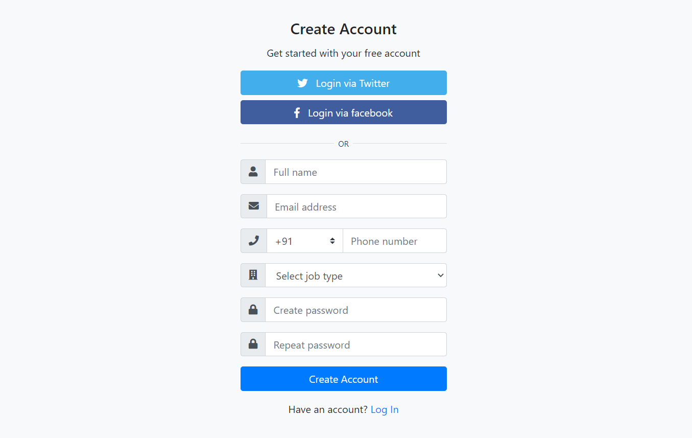
    Hello friends, welcome back to my blog. Today in this blog post, I am going to show you, Reactjs User Registration Form Code Snippet.

    Reactjs User Registration Form Code Snippet
    Reactjs Bootstrap 4

    For reactjs new comers, please check the below link:

    Reactjs Basic Tutorials


    Friends now I proceed onwards and here is the working code snippet for Reactjs User Registration Form Code Snippet and please use this carefully to avoid the mistakes:

    1. Firstly, we need fresh reactjs setup and for that, we need to run below commands into out terminal and also we should have latest node version installed on our system:

    npx create-react-app reacttepmate
    
    cd reacttepmate
    
    npm start


    2. Now we need to run below commands into our project terminal to get bootstrap and related modules into our reactjs application:

    npm install bootstrap --save
    
    npm install jquery --save
    
    npm start //For start project again


    3. Finally for the main output, we need to add below code into our reacttemplate/src/App.js file or if you have fresh setup then you can replace reacttemplate/src/App.js file code with below code:

    import React from 'react';
    
    import './App.css';
    import 'bootstrap/dist/css/bootstrap.min.css';
     
      render() {
       
        return (
         
            <div className="maincontainer">
             
             
              <div class="container">
      
                    <div class="card bg-light">
                    <article class="card-body mx-auto" style={{maxWidth: "400px"}}>
                        <h4 class="card-title mt-3 text-center">Create Account</h4>
                        <p class="text-center">Get started with your free account</p>
                        <p>
                            <a href="#" class="btn btn-block btn-twitter"> <i class="fab fa-twitter"></i>   Login via Twitter</a>
                            <a href="#" class="btn btn-block btn-facebook"> <i class="fab fa-facebook-f"></i>   Login via facebook</a>
                        </p>
                        <p class="divider-text">
                            <span class="bg-light">OR</span>
                        </p>
                        <form>
                        <div class="form-group input-group">
                            <div class="input-group-prepend">
                                <span class="input-group-text"> <i class="fa fa-user"></i> </span>
                            </div>
                            <input name="" class="form-control" placeholder="Full name" type="text" />
                        </div> 
                        <div class="form-group input-group">
                            <div class="input-group-prepend">
                                <span class="input-group-text"> <i class="fa fa-envelope"></i> </span>
                            </div>
                            <input name="" class="form-control" placeholder="Email address" type="email" />
                        </div>
                        <div class="form-group input-group">
                            <div class="input-group-prepend">
                                <span class="input-group-text"> <i class="fa fa-phone"></i> </span>
                            </div>
                            <select class="custom-select" style={{maxWidth: "120px"}}>
                                <option selected="">+91</option>
                                <option value="1">+001</option>
                                <option value="2">+020</option>
                                <option value="3">+011</option>
                            </select>
                            <input name="" class="form-control" placeholder="Phone number" type="text" />
                        </div> 
                        <div class="form-group input-group">
                            <div class="input-group-prepend">
                                <span class="input-group-text"> <i class="fa fa-building"></i> </span>
                            </div>
                            <select class="form-control">
                                <option selected=""> Select job type</option>
                                <option>Web Developer</option>
                                <option>Full Stack Developer</option>
                                <option>Mean Stack</option>
                            </select>
                        </div> 
                        <div class="form-group input-group">
                            <div class="input-group-prepend">
                                <span class="input-group-text"> <i class="fa fa-lock"></i> </span>
                            </div>
                            <input class="form-control" placeholder="Create password" type="password" />
                        </div> 
                        <div class="form-group input-group">
                            <div class="input-group-prepend">
                                <span class="input-group-text"> <i class="fa fa-lock"></i> </span>
                            </div>
                            <input class="form-control" placeholder="Repeat password" type="password" />
                        </div>                                       
                        <div class="form-group">
                            <button type="button" class="btn btn-primary btn-block"> Create Account  </button>
                        </div>     
                        <p class="text-center">Have an account? <a href="#">Log In</a> </p>                                                                 
                    </form>
                    </article>
                    </div> 
                    
                    </div> 
                 
            </div>
         
          
    )
    };
    }
    
    export default Home;


    4. Now Friends we need to add below code into our reacttemplate/src/App.css file :

    .divider-text {
        position: relative;
        text-align: center;
        margin-top: 15px;
        margin-bottom: 15px;
    }
    .divider-text span {
        padding: 7px;
        font-size: 12px;
        position: relative;   
        z-index: 2;
    }
    .divider-text:after {
        content: "";
        position: absolute;
        width: 100%;
        border-bottom: 1px solid #ddd;
        top: 55%;
        left: 0;
        z-index: 1;
    }
    
    .btn-facebook {
        background-color: #c4d4f7!important;
        color: #fff;
    }
    .btn-twitter {
        background-color: #42AEEC!important;
        color: #fff;
    }

    5. Now Friends we need to add below code into our reacttemplate/public/index.html file :

    ...
    <head>
    ...
    <!-- Font Awesome JS -->
      <link rel="stylesheet" href="https://stackpath.bootstrapcdn.com/font-awesome/4.7.0/css/font-awesome.min.css">
      <link rel="stylesheet" href="https://use.fontawesome.com/releases/v5.5.0/css/all.css">
     
    ...
    </head>


    Now we are done friends. If you have any kind of query or suggestion or any requirement then feel free to comment below.

    Note: Friends, I just tell the basic setup and things, you can change the code according to your requirements.

    I will appreciate that if you will tell your views for this post. Nothing matters if your views will be good or bad.

    Jassa

    Thanks

  • Angular User Registration Form Code Snippet

    Angular User Registration Form Code Snippet

    Hello friends, welcome back to my blog. Today in this blog post, I am going to tell you, Angular User Registration Form Code Snippet.

    Angular 11 came and if you are new then you must check below two links:

    1. Angular11 Basic Tutorials

    Friends now I proceed onwards and here is the working code snippet for Angular User Registration Form Code Snippet and please use carefully this to avoid the mistakes:

    Angular User Registration Form Code Snippet
    Angular User Registration Form Code Snippet

    1. Firstly friends we need fresh angular 11 setup and for this we need to run below commands but if you already have angular 11 setup then you can avoid below commands. Secondly we should also have latest node version installed on our system:

    npm install -g @angular/cli 
    
    ng new angularform //Create new Angular Project
    
    cd angularform // Go inside the Angular Project Folder
    
    ng serve --open // Run and Open the Angular Project
    
    http://localhost:4200/ // Working Angular Project Url


    2. Now friends, here we need to run below commands into our project terminal to install bootstrap and jquery modules into our angular application:

    npm install --save bootstrap
    
    npm i jquery --save 


    3. Now friends, here we need to add below  into our angular.json file:

    ...
     "styles": [
                  "src/styles.css",
                  "node_modules/bootstrap/dist/css/bootstrap.min.css"
                 
                  
                ],
                "scripts": [
                  "node_modules/jquery/dist/jquery.min.js", 
                  
                  "node_modules/bootstrap/dist/js/bootstrap.min.js"


                ]
    ...


    4. Now friends we just need to add below code into src/app/app.component.html file to get final out on the web browser:

    <div class="container">
      
      <div class="card bg-light">
      <article class="card-body mx-auto" style="max-width: 400px;">
          <h4 class="card-title mt-3 text-center">Create Account</h4>
          <p class="text-center">Get started with your free account</p>
          <p>
              <a href="#" class="btn btn-block btn-twitter"> <i class="fab fa-twitter"></i>   Login via Twitter</a>
              <a href="#" class="btn btn-block btn-facebook"> <i class="fab fa-facebook-f"></i>   Login via facebook</a>
          </p>
          <p class="divider-text">
              <span class="bg-light">OR</span>
          </p>
          <form>
          <div class="form-group input-group">
              <div class="input-group-prepend">
                  <span class="input-group-text"> <i class="fa fa-user"></i> </span>
               </div>
              <input name="" class="form-control" placeholder="Full name" type="text">
          </div> <!-- form-group// -->
          <div class="form-group input-group">
              <div class="input-group-prepend">
                  <span class="input-group-text"> <i class="fa fa-envelope"></i> </span>
               </div>
              <input name="" class="form-control" placeholder="Email address" type="email">
          </div> <!-- form-group// -->
          <div class="form-group input-group">
              <div class="input-group-prepend">
                  <span class="input-group-text"> <i class="fa fa-phone"></i> </span>
              </div>
              <select class="custom-select" style="max-width: 120px;">
                  <option selected="">+91</option>
                  <option value="1">+001</option>
                  <option value="2">+020</option>
                  <option value="3">+011</option>
              </select>
              <input name="" class="form-control" placeholder="Phone number" type="text">
          </div> <!-- form-group// -->
          <div class="form-group input-group">
              <div class="input-group-prepend">
                  <span class="input-group-text"> <i class="fa fa-building"></i> </span>
              </div>
              <select class="form-control">
                  <option selected=""> Select job type</option>
                  <option>Web Developer</option>
                  <option>Full Stack Developer</option>
                  <option>Mean Stack</option>
              </select>
          </div> <!-- form-group end.// -->
          <div class="form-group input-group">
              <div class="input-group-prepend">
                  <span class="input-group-text"> <i class="fa fa-lock"></i> </span>
              </div>
              <input class="form-control" placeholder="Create password" type="password">
          </div> <!-- form-group// -->
          <div class="form-group input-group">
              <div class="input-group-prepend">
                  <span class="input-group-text"> <i class="fa fa-lock"></i> </span>
              </div>
              <input class="form-control" placeholder="Repeat password" type="password">
          </div> <!-- form-group// -->                                      
          <div class="form-group">
              <button type="button" class="btn btn-primary btn-block"> Create Account  </button>
          </div> <!-- form-group// -->      
          <p class="text-center">Have an account? <a href="#">Log In</a> </p>                                                                 
      </form>
      </article>
      </div> <!-- card.// -->
      
      </div> 
      <!--container end.//-->

    5. Now friends we just need to add below code into src/app/app.component.css:

    .divider-text {
        position: relative;
        text-align: center;
        margin-top: 15px;
        margin-bottom: 15px;
    }
    .divider-text span {
        padding: 7px;
        font-size: 12px;
        position: relative;   
        z-index: 2;
    }
    .divider-text:after {
        content: "";
        position: absolute;
        width: 100%;
        border-bottom: 1px solid #ddd;
        top: 55%;
        left: 0;
        z-index: 1;
    }
    
    .btn-facebook {
        background-color: #405D9D;
        color: #fff;
    }
    .btn-twitter {
        background-color: #42AEEC;
        color: #fff;
    }


    6. Now friends we just need to add below code into src/index.html file:

    ...
    <head>
    ...
    <!-- Font Awesome JS -->
      <link rel="stylesheet" href="https://stackpath.bootstrapcdn.com/font-awesome/4.7.0/css/font-awesome.min.css">
      <link rel="stylesheet" href="https://use.fontawesome.com/releases/v5.5.0/css/all.css">
     
    ...
    </head>


    Friends in the end must run ng serve command into your terminal to run the angular 11 project.

    Now we are done friends. If you have any kind of query, suggestion and new requirement then feel free to comment below.

    Note: Friends, In this post, I just tell the basic setup and things, you can change the code according to your requirements.

    I will appreciate that if you will tell your views for this post. Nothing matters if your views will be good or bad because with your views, I will make my next posts more good and helpful.

    Jassa

    Thanks