Year: 2021

  • Vue 3 Bootstrap 5 Ecommerce Template Free Download

    Vue 3 Bootstrap 5 Ecommerce Template Free Download

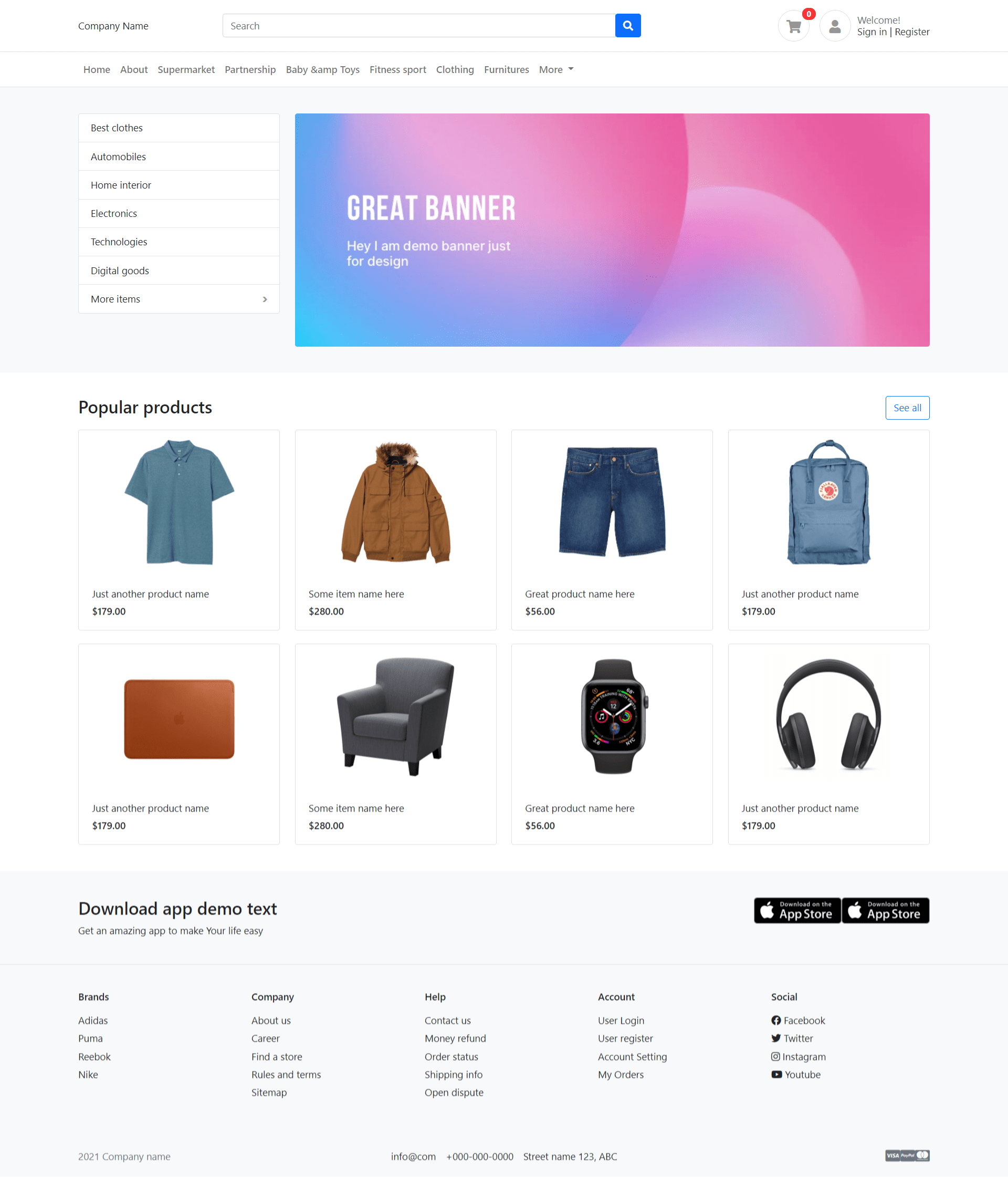
    Hello my friends, welcome back to my blog. Today in this blog post, I am going to show you, Vue 3 Bootstrap 5 Ecommerce Template Free Download.

    Vuejs Free Templates

    Vue 3 Bootstrap 5 Ecommerce Template Free Download
    Vue 3 Bootstrap 5 Ecommerce Template Free Download

    Vue 3 and Bootstrap 5 came and if you are new then you must check below links:

    1. Vue3 Tutorials
    2. Bootstrap 5

    Friends now I proceed onwards and here is the working code snippet and please use this carefully to avoid the mistakes:

    1. Firstly friends we need fresh vuejs(Vue 3) setup and for that we need to run below commands into our terminal and also w should have latest node version installed on our system:

    Guys you can skip this first step if you already have vuejs fresh setup:

    npm install -g @vue/cli
    
    vue create vueecommerce
    
    cd vueecommerce
    
    npm run serve //http://localhost:8080/

    2. Now friends, please download zip(in this zip file there are js, css and images for ecommerce template) file from below path and extract zip and get all the folders.

    Create ‘assets’ folder inside vueecommerce/public folder.

    Now please put that folders(which we will get from zip file) in “assets” folder.

    https://therichpost.com/ng-b5.zip

    3. Now friends please add below inside  vuecommerce/public/index.html file:

    ...
    <head>
       <link href="assets/css/bootstrap.css" rel="stylesheet">
        <link href="assets/css/ui.css" rel="stylesheet">
        <link href="assets/css/responsive.css" rel="stylesheet">
       
        <link href="assets/css/all.min.css" rel="stylesheet">
        
        <script src="assets/js/bootstrap.min.js" type="text/javascript"></script>
      </head>
    ...

    4. Finally friends we need to add below code into our src/App.vue file to get final output on web browser:

    <template>
     <header class="section-header">
    
        <section class="header-main border-bottom">
            <div class="container">
        <div class="row align-items-center">
            <div class="col-lg-2 col-4">
                Therichpost.com
            </div>
            <div class="col-lg-6 col-sm-12">
                <form action="#" class="search">
                    <div class="input-group w-100">
                        <input type="text" class="form-control" placeholder="Search">
                        <div class="input-group-append">
                          <button class="btn btn-primary" type="submit">
                            <i class="fa fa-search"></i>
                          </button>
                        </div>
                    </div>
                </form> <!-- search-wrap .end// -->
            </div> <!-- col.// -->
            <div class="col-lg-4 col-sm-6 col-12">
                <div class="widgets-wrap float-md-end">
                    <div class="widget-header  me-3">
                        <a href="#" class="icon icon-sm rounded-circle border"><i class="fa fa-shopping-cart"></i></a>
                        <span class="badge badge-pill badge-danger notify">0</span>
                    </div>
                    <div class="widget-header icontext">
                        <a href="#" class="icon icon-sm rounded-circle border"><i class="fa fa-user"></i></a>
                        <div class="text">
                            <span class="text-muted">Welcome!</span>
                            <div> 
                                <a href="#">Sign in</a> |  
                                <a href="#"> Register</a>
                            </div>
                        </div>
                    </div>
        
                </div> <!-- widgets-wrap.// -->
            </div> <!-- col.// -->
        </div> <!-- row.// -->
            </div> <!-- container.// -->
        </section> <!-- header-main .// -->


        <nav class="navbar navbar-main navbar-expand-lg navbar-light border-bottom">
          <div class="container">
        
            <button class="navbar-toggler" type="button" data-bs-toggle="collapse" data-bs-target="#navbarNav" aria-controls="navbarNav" aria-expanded="false" aria-label="Toggle navigation">
              <span class="navbar-toggler-icon"></span>
            </button>
        
            <div class="collapse navbar-collapse" id="navbarNav">
              <ul class="navbar-nav">
                  <li class="nav-item dropdown">
                   <a class="nav-link" href="#">Home</a>
                </li>
                <li class="nav-item">
                  <a class="nav-link" href="#">About</a>
                </li>
                <li class="nav-item">
                  <a class="nav-link" href="#">Supermarket</a>
                </li>
                <li class="nav-item">
                  <a class="nav-link" href="#">Partnership</a>
                </li>
                <li class="nav-item">
                  <a class="nav-link" href="#">Baby &amp; Toys</a>
                </li>
                <li class="nav-item">
                  <a class="nav-link" href="#">Fitness sport</a>
                </li>
                <li class="nav-item">
                  <a class="nav-link" href="#">Clothing</a>
                </li>
                <li class="nav-item">
                  <a class="nav-link" href="#">Furnitures</a>
                </li>
                <li class="nav-item dropdown">
                  <a class="nav-link dropdown-toggle" href="#" id="navbarDropdown" role="button" data-bs-toggle="dropdown" aria-expanded="false">
                    More
                  </a>
                  <ul class="dropdown-menu" aria-labelledby="navbarDropdown">
                    <li><a class="dropdown-item" href="#">Foods and Drink</a></li>
                    <li><a class="dropdown-item" href="#">Home interior</a></li>
                    <li><hr class="dropdown-divider"></li>
                    <li><a class="dropdown-item" href="#">Home interior 2</a></li>
                  </ul>
                </li>
              </ul>
            </div> <!-- collapse .// -->
          </div> <!-- container .// -->
        </nav>
        
        </header> <!-- section-header.// -->
        
        
        <!-- ========================= SECTION MAIN ========================= -->
        <section class="section-main bg padding-y">
        <div class="container">
        
        <div class="row">
            <aside class="col-md-3">
                <nav class="card">
                    <ul class="menu-category">
                        <li><a href="#">Best clothes</a></li>
                        <li><a href="#">Automobiles</a></li>
                        <li><a href="#">Home interior</a></li>
                        <li><a href="#">Electronics</a></li>
                        <li><a href="#">Technologies</a></li>
                        <li><a href="#">Digital goods</a></li>
                        <li class="has-submenu"><a href="#">More items</a>
                            <ul class="submenu">
                                <li><a href="#">Submenu name</a></li>
                                <li><a href="#">Great submenu</a></li>
                                <li><a href="#">Another menu</a></li>
                                <li><a href="#">Some others</a></li>
                            </ul>
                        </li>
                    </ul>
                </nav>
            </aside> <!-- col.// -->
            <div class="col-md-9">
                <article class="banner-wrap">
                    <img src="assets/images/2.jpg" class="w-100 rounded">
                </article>
            </div> <!-- col.// -->
        </div> <!-- row.// -->
        </div> <!-- container //  -->
        </section>
        <!-- ========================= SECTION MAIN END// ========================= -->
        
        <!-- ========================= SECTION  ========================= -->
        <section class="section-name padding-y-sm">
        <div class="container">
        
        <header class="section-heading">
            <a href="#" class="btn btn-outline-primary float-end">See all</a>
            <h3 class="section-title">Popular products</h3>
        </header><!-- sect-heading -->
        
            
        <div class="row">
            <div class="col-md-3">
                <div href="#" class="card card-product-grid">
                    <a href="#" class="img-wrap"> <img src="assets/images/items/1.jpg"> </a>
                    <figcaption class="info-wrap">
                        <a href="#" class="title">Just another product name</a>
                        <div class="price mt-1">$179.00</div> <!-- price-wrap.// -->
                    </figcaption>
                </div>
            </div> <!-- col.// -->
            <div class="col-md-3">
                <div href="#" class="card card-product-grid">
                    <a href="#" class="img-wrap"> <img src="assets/images/items/2.jpg"> </a>
                    <figcaption class="info-wrap">
                        <a href="#" class="title">Some item name here</a>
                        <div class="price mt-1">$280.00</div> <!-- price-wrap.// -->
                    </figcaption>
                </div>
            </div> <!-- col.// -->
            <div class="col-md-3">
                <div href="#" class="card card-product-grid">
                    <a href="#" class="img-wrap"> <img src="assets/images/items/3.jpg"> </a>
                    <figcaption class="info-wrap">
                        <a href="#" class="title">Great product name here</a>
                        <div class="price mt-1">$56.00</div> <!-- price-wrap.// -->
                    </figcaption>
                </div>
            </div> <!-- col.// -->
            <div class="col-md-3">
                <div href="#" class="card card-product-grid">
                    <a href="#" class="img-wrap"> <img src="assets/images/items/4.jpg"> </a>
                    <figcaption class="info-wrap">
                        <a href="#" class="title">Just another product name</a>
                        <div class="price mt-1">$179.00</div> <!-- price-wrap.// -->
                    </figcaption>
                </div>
            </div> <!-- col.// -->
            <div class="col-md-3">
                <div href="#" class="card card-product-grid">
                    <a href="#" class="img-wrap"> <img src="assets/images/items/5.jpg"> </a>
                    <figcaption class="info-wrap">
                        <a href="#" class="title">Just another product name</a>
                        <div class="price mt-1">$179.00</div> <!-- price-wrap.// -->
                    </figcaption>
                </div>
            </div> <!-- col.// -->
            <div class="col-md-3">
                <div href="#" class="card card-product-grid">
                    <a href="#" class="img-wrap"> <img src="assets/images/items/6.jpg"> </a>
                    <figcaption class="info-wrap">
                        <a href="#" class="title">Some item name here</a>
                        <div class="price mt-1">$280.00</div> <!-- price-wrap.// -->
                    </figcaption>
                </div>
            </div> <!-- col.// -->
            <div class="col-md-3">
                <div href="#" class="card card-product-grid">
                    <a href="#" class="img-wrap"> <img src="assets/images/items/7.jpg"> </a>
                    <figcaption class="info-wrap">
                        <a href="#" class="title">Great product name here</a>
                        <div class="price mt-1">$56.00</div> <!-- price-wrap.// -->
                    </figcaption>
                </div>
            </div> <!-- col.// -->
            <div class="col-md-3">
                <div href="#" class="card card-product-grid">
                    <a href="#" class="img-wrap"> <img src="assets/images/items/9.jpg"> </a>
                    <figcaption class="info-wrap">
                        <a href="#" class="title">Just another product name</a>
                        <div class="price mt-1">$179.00</div> <!-- price-wrap.// -->
                    </figcaption>
                </div>
            </div> <!-- col.// -->
        </div> <!-- row.// -->
        
        </div><!-- container // -->
        </section>
        <!-- ========================= SECTION  END// ========================= -->
        
        
        <!-- ========================= SECTION  ========================= -->
        <section class="section-name padding-y bg">
        <div class="container">
        
        <div class="row">
        <div class="col-md-6">
            <h3>Download app demo text</h3>
            <p>Get an amazing app  to make Your life easy</p>
        </div>
        <div class="col-md-6 text-md-end">
            <a href="#"><img src="assets/images/misc/appstore.png" height="40"></a>
            <a href="#"><img src="assets/images/misc/appstore.png" height="40"></a>
        </div>
        </div> <!-- row.// -->
        </div><!-- container // -->
        </section>
        <!-- ========================= SECTION  END// ======================= -->


        <!-- ========================= FOOTER ========================= -->
      <footer class="section-footer border-top bg">
        <div class="container">
          <section class="footer-top  padding-y">
            <div class="row">
              <aside class="col-md col-6">
                <h6 class="title">Brands</h6>
                <ul class="list-unstyled">
                  <li> <a href="#">Adidas</a></li>
                  <li> <a href="#">Puma</a></li>
                  <li> <a href="#">Reebok</a></li>
                  <li> <a href="#">Nike</a></li>
                </ul>
              </aside>
              <aside class="col-md col-6">
                <h6 class="title">Company</h6>
                <ul class="list-unstyled">
                  <li> <a href="#">About us</a></li>
                  <li> <a href="#">Career</a></li>
                  <li> <a href="#">Find a store</a></li>
                  <li> <a href="#">Rules and terms</a></li>
                  <li> <a href="#">Sitemap</a></li>
                </ul>
              </aside>
              <aside class="col-md col-6">
                <h6 class="title">Help</h6>
                <ul class="list-unstyled">
                  <li> <a href="#">Contact us</a></li>
                  <li> <a href="#">Money refund</a></li>
                  <li> <a href="#">Order status</a></li>
                  <li> <a href="#">Shipping info</a></li>
                  <li> <a href="#">Open dispute</a></li>
                </ul>
              </aside>
              <aside class="col-md col-6">
                <h6 class="title">Account</h6>
                <ul class="list-unstyled">
                  <li> <a href="#"> User Login </a></li>
                  <li> <a href="#"> User register </a></li>
                  <li> <a href="#"> Account Setting </a></li>
                  <li> <a href="#"> My Orders </a></li>
                </ul>
              </aside>
              <aside class="col-md">
                <h6 class="title">Social</h6>
                <ul class="list-unstyled">
                  <li><a href="#"> <i class="fab fa-facebook"></i> Facebook </a></li>
                  <li><a href="#"> <i class="fab fa-twitter"></i> Twitter </a></li>
                  <li><a href="#"> <i class="fab fa-instagram"></i> Instagram </a></li>
                  <li><a href="#"> <i class="fab fa-youtube"></i> Youtube </a></li>
                </ul>
              </aside>
            </div> <!-- row.// -->
          </section>	<!-- footer-top.// -->
      
          <section class="footer-bottom row">
            <div class="col-md-2">
              <p class="text-muted">   2021 Company name </p>
            </div>
            <div class="col-md-8 text-md-center">
              <span  class="px-2">info@com</span>
              <span  class="px-2">+000-000-0000</span>
              <span  class="px-2">Street name 123, ABC</span>
            </div>
            <div class="col-md-2 text-md-end text-muted">
              <i class="fab fa-lg fa-cc-visa"></i> 
              <i class="fab fa-lg fa-cc-paypal"></i> 
              <i class="fab fa-lg fa-cc-mastercard"></i>
            </div>
          </section>
        </div><!-- //container -->
      </footer>
      <!-- ========================= FOOTER END // ========================= -->
    </template>

    Now we are done friends also and If you have any kind of query or suggestion or any requirement then feel free to comment below. Guys I will come with more Vuejs Bootstrap 5 free templates.

    Note: Friends, I just tell the basic setup and things, you can change the code according to your requirements. For better understanding must watch video above.

    I will appreciate that if you will tell your views for this post. Nothing matters if your views will be good or bad.

    Jassa

    Thanks

  • Laravel 8 Bootstrap 5 Ecommerce Template Free Download

    Laravel 8 Bootstrap 5 Ecommerce Template Free Download

    Hello friends, welcome back on blog. Today in this blog post, I am going to tell you, Laravel 8 Bootstrap 5 Ecommerce Template Free Download.

    Laravel 8 Ecommerce Template

    Laravel 8 Bootstrap 5 Ecommerce Template Free Download
    Laravel 8 Bootstrap 5 Ecommerce Template Free Download

    Guys if you are new in Laravel 8 and Bootstrap 5 the please check below links for Laravel basics information:

    1. Laravel Basics Tutorial for beginners
    2. Bootstrap 5

    Here is the code snippet and please use carefully:

    1. Friends here is the code below and you can add into your resources/views/ welcome.blade.php file:

    Guys for demo purpose, I have used this code into my welcome blade:

    <!DOCTYPE html>
    <html lang="en">
    <head>
    <title>Ecommerce Template</title>
    <meta charset="UTF-8">
    <meta name="viewport" content="width=device-width, initial-scale=1">
    
      <link href="assets/css/bootstrap.css" rel="stylesheet">
      <link href="assets/css/ui.css" rel="stylesheet">
      <link href="assets/css/responsive.css" rel="stylesheet">
      <link href="assets/css/all.min.css" rel="stylesheet">
      <script src="assets/js/bootstrap.min.js"></script>
    </head>
    <body>
    
    <header class="section-header">
    
        <section class="header-main border-bottom">
            <div class="container">
        <div class="row align-items-center">
            <div class="col-lg-2 col-4">
                Therichpost.com
            </div>
            <div class="col-lg-6 col-sm-12">
                <form action="#" class="search">
                    <div class="input-group w-100">
                        <input type="text" class="form-control" placeholder="Search">
                        <div class="input-group-append">
                          <button class="btn btn-primary" type="submit">
                            <i class="fa fa-search"></i>
                          </button>
                        </div>
                    </div>
                </form> <!-- search-wrap .end// -->
            </div> <!-- col.// -->
            <div class="col-lg-4 col-sm-6 col-12">
                <div class="widgets-wrap float-md-end">
                    <div class="widget-header  me-3">
                        <a href="#" class="icon icon-sm rounded-circle border"><i class="fa fa-shopping-cart"></i></a>
                        <span class="badge badge-pill badge-danger notify">0</span>
                    </div>
                    <div class="widget-header icontext">
                        <a href="#" class="icon icon-sm rounded-circle border"><i class="fa fa-user"></i></a>
                        <div class="text">
                            <span class="text-muted">Welcome!</span>
                            <div> 
                                <a href="#">Sign in</a> |  
                                <a href="#"> Register</a>
                            </div>
                        </div>
                    </div>
        
                </div> <!-- widgets-wrap.// -->
            </div> <!-- col.// -->
        </div> <!-- row.// -->
            </div> <!-- container.// -->
        </section> <!-- header-main .// -->


        <nav class="navbar navbar-main navbar-expand-lg navbar-light border-bottom">
          <div class="container">
        
            <button class="navbar-toggler" type="button" data-bs-toggle="collapse" data-bs-target="#navbarNav" aria-controls="navbarNav" aria-expanded="false" aria-label="Toggle navigation">
              <span class="navbar-toggler-icon"></span>
            </button>
        
            <div class="collapse navbar-collapse" id="navbarNav">
              <ul class="navbar-nav">
                  <li class="nav-item dropdown">
                   <a class="nav-link" href="#">Home</a>
                </li>
                <li class="nav-item">
                  <a class="nav-link" href="#">About</a>
                </li>
                <li class="nav-item">
                  <a class="nav-link" href="#">Supermarket</a>
                </li>
                <li class="nav-item">
                  <a class="nav-link" href="#">Partnership</a>
                </li>
                <li class="nav-item">
                  <a class="nav-link" href="#">Baby &amp Toys</a>
                </li>
                <li class="nav-item">
                  <a class="nav-link" href="#">Fitness sport</a>
                </li>
                <li class="nav-item">
                  <a class="nav-link" href="#">Clothing</a>
                </li>
                <li class="nav-item">
                  <a class="nav-link" href="#">Furnitures</a>
                </li>
                <li class="nav-item dropdown">
                  <a class="nav-link dropdown-toggle" href="#" id="navbarDropdown" role="button" data-bs-toggle="dropdown" aria-expanded="false">
                    More
                  </a>
                  <ul class="dropdown-menu" aria-labelledby="navbarDropdown">
                    <li><a class="dropdown-item" href="#">Foods and Drink</a></li>
                    <li><a class="dropdown-item" href="#">Home interior</a></li>
                    <li><hr class="dropdown-divider"></li>
                    <li><a class="dropdown-item" href="#">Home interior 2</a></li>
                  </ul>
                </li>
              </ul>
            </div> <!-- collapse .// -->
          </div> <!-- container .// -->
        </nav>
        
        </header> <!-- section-header.// -->
        
        
        <!-- ========================= SECTION MAIN ========================= -->
        <section class="section-main bg padding-y">
        <div class="container">
        
        <div class="row">
            <aside class="col-md-3">
                <nav class="card">
                    <ul class="menu-category">
                        <li><a href="#">Best clothes</a></li>
                        <li><a href="#">Automobiles</a></li>
                        <li><a href="#">Home interior</a></li>
                        <li><a href="#">Electronics</a></li>
                        <li><a href="#">Technologies</a></li>
                        <li><a href="#">Digital goods</a></li>
                        <li class="has-submenu"><a href="#">More items</a>
                            <ul class="submenu">
                                <li><a href="#">Submenu name</a></li>
                                <li><a href="#">Great submenu</a></li>
                                <li><a href="#">Another menu</a></li>
                                <li><a href="#">Some others</a></li>
                            </ul>
                        </li>
                    </ul>
                </nav>
            </aside> <!-- col.// -->
            <div class="col-md-9">
                <article class="banner-wrap">
                    <img src="assets/images/2.jpg" class="w-100 rounded">
                </article>
            </div> <!-- col.// -->
        </div> <!-- row.// -->
        </div> <!-- container //  -->
        </section>
        <!-- ========================= SECTION MAIN END// ========================= -->
        
        <!-- ========================= SECTION  ========================= -->
        <section class="section-name padding-y-sm">
        <div class="container">
        
        <header class="section-heading">
            <a href="#" class="btn btn-outline-primary float-end">See all</a>
            <h3 class="section-title">Popular products</h3>
        </header><!-- sect-heading -->
        
            
        <div class="row">
            <div class="col-md-3">
                <div href="#" class="card card-product-grid">
                    <a href="#" class="img-wrap"> <img src="assets/images/items/1.jpg"> </a>
                    <figcaption class="info-wrap">
                        <a href="#" class="title">Just another product name</a>
                        <div class="price mt-1">$179.00</div> <!-- price-wrap.// -->
                    </figcaption>
                </div>
            </div> <!-- col.// -->
            <div class="col-md-3">
                <div href="#" class="card card-product-grid">
                    <a href="#" class="img-wrap"> <img src="assets/images/items/2.jpg"> </a>
                    <figcaption class="info-wrap">
                        <a href="#" class="title">Some item name here</a>
                        <div class="price mt-1">$280.00</div> <!-- price-wrap.// -->
                    </figcaption>
                </div>
            </div> <!-- col.// -->
            <div class="col-md-3">
                <div href="#" class="card card-product-grid">
                    <a href="#" class="img-wrap"> <img src="assets/images/items/3.jpg"> </a>
                    <figcaption class="info-wrap">
                        <a href="#" class="title">Great product name here</a>
                        <div class="price mt-1">$56.00</div> <!-- price-wrap.// -->
                    </figcaption>
                </div>
            </div> <!-- col.// -->
            <div class="col-md-3">
                <div href="#" class="card card-product-grid">
                    <a href="#" class="img-wrap"> <img src="assets/images/items/4.jpg"> </a>
                    <figcaption class="info-wrap">
                        <a href="#" class="title">Just another product name</a>
                        <div class="price mt-1">$179.00</div> <!-- price-wrap.// -->
                    </figcaption>
                </div>
            </div> <!-- col.// -->
            <div class="col-md-3">
                <div href="#" class="card card-product-grid">
                    <a href="#" class="img-wrap"> <img src="assets/images/items/5.jpg"> </a>
                    <figcaption class="info-wrap">
                        <a href="#" class="title">Just another product name</a>
                        <div class="price mt-1">$179.00</div> <!-- price-wrap.// -->
                    </figcaption>
                </div>
            </div> <!-- col.// -->
            <div class="col-md-3">
                <div href="#" class="card card-product-grid">
                    <a href="#" class="img-wrap"> <img src="assets/images/items/6.jpg"> </a>
                    <figcaption class="info-wrap">
                        <a href="#" class="title">Some item name here</a>
                        <div class="price mt-1">$280.00</div> <!-- price-wrap.// -->
                    </figcaption>
                </div>
            </div> <!-- col.// -->
            <div class="col-md-3">
                <div href="#" class="card card-product-grid">
                    <a href="#" class="img-wrap"> <img src="assets/images/items/7.jpg"> </a>
                    <figcaption class="info-wrap">
                        <a href="#" class="title">Great product name here</a>
                        <div class="price mt-1">$56.00</div> <!-- price-wrap.// -->
                    </figcaption>
                </div>
            </div> <!-- col.// -->
            <div class="col-md-3">
                <div href="#" class="card card-product-grid">
                    <a href="#" class="img-wrap"> <img src="assets/images/items/9.jpg"> </a>
                    <figcaption class="info-wrap">
                        <a href="#" class="title">Just another product name</a>
                        <div class="price mt-1">$179.00</div> <!-- price-wrap.// -->
                    </figcaption>
                </div>
            </div> <!-- col.// -->
        </div> <!-- row.// -->
        
        </div><!-- container // -->
        </section>
        <!-- ========================= SECTION  END// ========================= -->
        
        
        <!-- ========================= SECTION  ========================= -->
        <section class="section-name padding-y bg">
        <div class="container">
        
        <div class="row">
        <div class="col-md-6">
            <h3>Download app demo text</h3>
            <p>Get an amazing app  to make Your life easy</p>
        </div>
        <div class="col-md-6 text-md-end">
            <a href="#"><img src="assets/images/misc/appstore.png" height="40"></a>
            <a href="#"><img src="assets/images/misc/appstore.png" height="40"></a>
        </div>
        </div> <!-- row.// -->
        </div><!-- container // -->
        </section>
        <!-- ========================= SECTION  END// ======================= -->


        <!-- ========================= FOOTER ========================= -->
      <footer class="section-footer border-top bg">
        <div class="container">
          <section class="footer-top  padding-y">
            <div class="row">
              <aside class="col-md col-6">
                <h6 class="title">Brands</h6>
                <ul class="list-unstyled">
                  <li> <a href="#">Adidas</a></li>
                  <li> <a href="#">Puma</a></li>
                  <li> <a href="#">Reebok</a></li>
                  <li> <a href="#">Nike</a></li>
                </ul>
              </aside>
              <aside class="col-md col-6">
                <h6 class="title">Company</h6>
                <ul class="list-unstyled">
                  <li> <a href="#">About us</a></li>
                  <li> <a href="#">Career</a></li>
                  <li> <a href="#">Find a store</a></li>
                  <li> <a href="#">Rules and terms</a></li>
                  <li> <a href="#">Sitemap</a></li>
                </ul>
              </aside>
              <aside class="col-md col-6">
                <h6 class="title">Help</h6>
                <ul class="list-unstyled">
                  <li> <a href="#">Contact us</a></li>
                  <li> <a href="#">Money refund</a></li>
                  <li> <a href="#">Order status</a></li>
                  <li> <a href="#">Shipping info</a></li>
                  <li> <a href="#">Open dispute</a></li>
                </ul>
              </aside>
              <aside class="col-md col-6">
                <h6 class="title">Account</h6>
                <ul class="list-unstyled">
                  <li> <a href="#"> User Login </a></li>
                  <li> <a href="#"> User register </a></li>
                  <li> <a href="#"> Account Setting </a></li>
                  <li> <a href="#"> My Orders </a></li>
                </ul>
              </aside>
              <aside class="col-md">
                <h6 class="title">Social</h6>
                <ul class="list-unstyled">
                  <li><a href="#"> <i class="fab fa-facebook"></i> Facebook </a></li>
                  <li><a href="#"> <i class="fab fa-twitter"></i> Twitter </a></li>
                  <li><a href="#"> <i class="fab fa-instagram"></i> Instagram </a></li>
                  <li><a href="#"> <i class="fab fa-youtube"></i> Youtube </a></li>
                </ul>
              </aside>
            </div> <!-- row.// -->
          </section>	<!-- footer-top.// -->
      
          <section class="footer-bottom row">
            <div class="col-md-2">
              <p class="text-muted">   2021 Company name </p>
            </div>
            <div class="col-md-8 text-md-center">
              <span  class="px-2">info@com</span>
              <span  class="px-2">+000-000-0000</span>
              <span  class="px-2">Street name 123, ABC</span>
            </div>
            <div class="col-md-2 text-md-end text-muted">
              <i class="fab fa-lg fa-cc-visa"></i> 
              <i class="fab fa-lg fa-cc-paypal"></i> 
              <i class="fab fa-lg fa-cc-mastercard"></i>
            </div>
          </section>
        </div><!-- //container -->
      </footer>
      <!-- ========================= FOOTER END // ========================= -->
    
    </body>
    </html>


    2. Now friends, please do the following steps because this is the most important:

    1. Please make “assets” folder inside public folder.

    2. Please download css files, images, fonts and script files from below url and please all that files inside “public/assets” folder.

    https://therichpost.com/ng-b5.zip


    Now we are done friends and please run your Laravel 8 project and see the ecommerce site home page.  Also and If you have any kind of query or suggestion or any requirement then feel free to comment below.

    Note: Friends, I just tell the basic setup and things, you can change the code according to your requirements. For better understanding must watch video above.

    I will appreciate that if you will tell your views for this post. Nothing matters if your views will be good or bad.

    Jassa

    Thanks

  • Angular 11 Bootstrap 5 Ecommerce Template Free Download

    Angular 11 Bootstrap 5 Ecommerce Template Free Download

    Hello to all, welcome back to my blog. Today in this blog post, I am going to show you, Angular 11 Bootstrap 5 Ecommerce Template Free Download.

    Angular 11 templates

    Angular 11 Bootstrap 5 Ecommerce Template Free Download
    Angular 11 Bootstrap 5 Ecommerce Template Free Download

    Angular11 and Bootstrap 5 came and if you are new then you must check below links:

    1. Angular11 Basic Tutorials
    2. Bootstrap 5
    3. For more Angular Free Templates click here

    Friends now I proceed onwards and here is the working code snippet and use this carefully to avoid the mistakes:

    1. Firstly friends we need fresh angular 11 setup and for this we need to run below commands but if you already have angular 11 setup then you can avoid below commands. Secondly we should also have latest node version installed on our system:

    Guys you can skip this first step if you already have angular 11 fresh setup:

    npm install -g @angular/cli 
    
    ng new angularbootstrap //Create new Angular Project
    
    cd angularbootstrap  // Go inside the Angular Project Folder
    
    ng serve --open // Run and Open the Angular Project
    
    http://localhost:4200/ // Working Angular Project Url

    2. Now friends, please download zip(in this zip file there are js, css and images for angular bootstrap template) file from below path and extract zip and please put all the zip file folders in “src/assets” folder(which we will get from zip file):

    Here is the updated post link:

    Angular 16 Free Responsive Ecommerce Website Shop Page Template with Grid View

    3. Now friends please add below code into angularbootstrap/src/index.html file:

    ...
    <head>
    ...
    <!-- Custom styles for this template -->
      <link href="assets/css/bootstrap.css" rel="stylesheet">
      <link href="assets/css/ui.css" rel="stylesheet">
      <link href="assets/css/responsive.css" rel="stylesheet">
      <link href="assets/css/all.min.css" rel="stylesheet">
      <script src="assets/js/bootstrap.min.js"></script>
    </head>

    4. Now friends we need to add below code into angularbootstrap/src/app/app.component.html file:

    <header class="section-header">
    
        <section class="header-main border-bottom">
            <div class="container">
        <div class="row align-items-center">
            <div class="col-lg-2 col-4">
                Therichpost.com
            </div>
            <div class="col-lg-6 col-sm-12">
                <form action="#" class="search">
                    <div class="input-group w-100">
                        <input type="text" class="form-control" placeholder="Search">
                        <div class="input-group-append">
                          <button class="btn btn-primary" type="submit">
                            <i class="fa fa-search"></i>
                          </button>
                        </div>
                    </div>
                </form> <!-- search-wrap .end// -->
            </div> <!-- col.// -->
            <div class="col-lg-4 col-sm-6 col-12">
                <div class="widgets-wrap float-md-end">
                    <div class="widget-header  me-3">
                        <a href="#" class="icon icon-sm rounded-circle border"><i class="fa fa-shopping-cart"></i></a>
                        <span class="badge badge-pill badge-danger notify">0</span>
                    </div>
                    <div class="widget-header icontext">
                        <a href="#" class="icon icon-sm rounded-circle border"><i class="fa fa-user"></i></a>
                        <div class="text">
                            <span class="text-muted">Welcome!</span>
                            <div> 
                                <a href="#">Sign in</a> |  
                                <a href="#"> Register</a>
                            </div>
                        </div>
                    </div>
        
                </div> <!-- widgets-wrap.// -->
            </div> <!-- col.// -->
        </div> <!-- row.// -->
            </div> <!-- container.// -->
        </section> <!-- header-main .// -->


        <nav class="navbar navbar-main navbar-expand-lg navbar-light border-bottom">
          <div class="container">
        
            <button class="navbar-toggler" type="button" data-bs-toggle="collapse" data-bs-target="#navbarNav" aria-controls="navbarNav" aria-expanded="false" aria-label="Toggle navigation">
              <span class="navbar-toggler-icon"></span>
            </button>
        
            <div class="collapse navbar-collapse" id="navbarNav">
              <ul class="navbar-nav">
                  <li class="nav-item dropdown">
                   <a class="nav-link" href="#">Home</a>
                </li>
                <li class="nav-item">
                  <a class="nav-link" href="#">About</a>
                </li>
                <li class="nav-item">
                  <a class="nav-link" href="#">Supermarket</a>
                </li>
                <li class="nav-item">
                  <a class="nav-link" href="#">Partnership</a>
                </li>
                <li class="nav-item">
                  <a class="nav-link" href="#">Baby &amp Toys</a>
                </li>
                <li class="nav-item">
                  <a class="nav-link" href="#">Fitness sport</a>
                </li>
                <li class="nav-item">
                  <a class="nav-link" href="#">Clothing</a>
                </li>
                <li class="nav-item">
                  <a class="nav-link" href="#">Furnitures</a>
                </li>
                <li class="nav-item dropdown">
                  <a class="nav-link dropdown-toggle" href="#" id="navbarDropdown" role="button" data-bs-toggle="dropdown" aria-expanded="false">
                    More
                  </a>
                  <ul class="dropdown-menu" aria-labelledby="navbarDropdown">
                    <li><a class="dropdown-item" href="#">Foods and Drink</a></li>
                    <li><a class="dropdown-item" href="#">Home interior</a></li>
                    <li><hr class="dropdown-divider"></li>
                    <li><a class="dropdown-item" href="#">Home interior 2</a></li>
                  </ul>
                </li>
              </ul>
            </div> <!-- collapse .// -->
          </div> <!-- container .// -->
        </nav>
        
        </header> <!-- section-header.// -->
        
        
        <!-- ========================= SECTION MAIN ========================= -->
        <section class="section-main bg padding-y">
        <div class="container">
        
        <div class="row">
            <aside class="col-md-3">
                <nav class="card">
                    <ul class="menu-category">
                        <li><a href="#">Best clothes</a></li>
                        <li><a href="#">Automobiles</a></li>
                        <li><a href="#">Home interior</a></li>
                        <li><a href="#">Electronics</a></li>
                        <li><a href="#">Technologies</a></li>
                        <li><a href="#">Digital goods</a></li>
                        <li class="has-submenu"><a href="#">More items</a>
                            <ul class="submenu">
                                <li><a href="#">Submenu name</a></li>
                                <li><a href="#">Great submenu</a></li>
                                <li><a href="#">Another menu</a></li>
                                <li><a href="#">Some others</a></li>
                            </ul>
                        </li>
                    </ul>
                </nav>
            </aside> <!-- col.// -->
            <div class="col-md-9">
                <article class="banner-wrap">
                    <img src="assets/images/2.jpg" class="w-100 rounded">
                </article>
            </div> <!-- col.// -->
        </div> <!-- row.// -->
        </div> <!-- container //  -->
        </section>
        <!-- ========================= SECTION MAIN END// ========================= -->
        
        <!-- ========================= SECTION  ========================= -->
        <section class="section-name padding-y-sm">
        <div class="container">
        
        <header class="section-heading">
            <a href="#" class="btn btn-outline-primary float-end">See all</a>
            <h3 class="section-title">Popular products</h3>
        </header><!-- sect-heading -->
        
            
        <div class="row">
            <div class="col-md-3">
                <div href="#" class="card card-product-grid">
                    <a href="#" class="img-wrap"> <img src="assets/images/items/1.jpg"> </a>
                    <figcaption class="info-wrap">
                        <a href="#" class="title">Just another product name</a>
                        <div class="price mt-1">$179.00</div> <!-- price-wrap.// -->
                    </figcaption>
                </div>
            </div> <!-- col.// -->
            <div class="col-md-3">
                <div href="#" class="card card-product-grid">
                    <a href="#" class="img-wrap"> <img src="assets/images/items/2.jpg"> </a>
                    <figcaption class="info-wrap">
                        <a href="#" class="title">Some item name here</a>
                        <div class="price mt-1">$280.00</div> <!-- price-wrap.// -->
                    </figcaption>
                </div>
            </div> <!-- col.// -->
            <div class="col-md-3">
                <div href="#" class="card card-product-grid">
                    <a href="#" class="img-wrap"> <img src="assets/images/items/3.jpg"> </a>
                    <figcaption class="info-wrap">
                        <a href="#" class="title">Great product name here</a>
                        <div class="price mt-1">$56.00</div> <!-- price-wrap.// -->
                    </figcaption>
                </div>
            </div> <!-- col.// -->
            <div class="col-md-3">
                <div href="#" class="card card-product-grid">
                    <a href="#" class="img-wrap"> <img src="assets/images/items/4.jpg"> </a>
                    <figcaption class="info-wrap">
                        <a href="#" class="title">Just another product name</a>
                        <div class="price mt-1">$179.00</div> <!-- price-wrap.// -->
                    </figcaption>
                </div>
            </div> <!-- col.// -->
            <div class="col-md-3">
                <div href="#" class="card card-product-grid">
                    <a href="#" class="img-wrap"> <img src="assets/images/items/5.jpg"> </a>
                    <figcaption class="info-wrap">
                        <a href="#" class="title">Just another product name</a>
                        <div class="price mt-1">$179.00</div> <!-- price-wrap.// -->
                    </figcaption>
                </div>
            </div> <!-- col.// -->
            <div class="col-md-3">
                <div href="#" class="card card-product-grid">
                    <a href="#" class="img-wrap"> <img src="assets/images/items/6.jpg"> </a>
                    <figcaption class="info-wrap">
                        <a href="#" class="title">Some item name here</a>
                        <div class="price mt-1">$280.00</div> <!-- price-wrap.// -->
                    </figcaption>
                </div>
            </div> <!-- col.// -->
            <div class="col-md-3">
                <div href="#" class="card card-product-grid">
                    <a href="#" class="img-wrap"> <img src="assets/images/items/7.jpg"> </a>
                    <figcaption class="info-wrap">
                        <a href="#" class="title">Great product name here</a>
                        <div class="price mt-1">$56.00</div> <!-- price-wrap.// -->
                    </figcaption>
                </div>
            </div> <!-- col.// -->
            <div class="col-md-3">
                <div href="#" class="card card-product-grid">
                    <a href="#" class="img-wrap"> <img src="assets/images/items/9.jpg"> </a>
                    <figcaption class="info-wrap">
                        <a href="#" class="title">Just another product name</a>
                        <div class="price mt-1">$179.00</div> <!-- price-wrap.// -->
                    </figcaption>
                </div>
            </div> <!-- col.// -->
        </div> <!-- row.// -->
        
        </div><!-- container // -->
        </section>
        <!-- ========================= SECTION  END// ========================= -->
        
        
        <!-- ========================= SECTION  ========================= -->
        <section class="section-name padding-y bg">
        <div class="container">
        
        <div class="row">
        <div class="col-md-6">
            <h3>Download app demo text</h3>
            <p>Get an amazing app  to make Your life easy</p>
        </div>
        <div class="col-md-6 text-md-end">
            <a href="#"><img src="assets/images/misc/appstore.png" height="40"></a>
            <a href="#"><img src="assets/images/misc/appstore.png" height="40"></a>
        </div>
        </div> <!-- row.// -->
        </div><!-- container // -->
        </section>
        <!-- ========================= SECTION  END// ======================= -->


        <!-- ========================= FOOTER ========================= -->
      <footer class="section-footer border-top bg">
        <div class="container">
          <section class="footer-top  padding-y">
            <div class="row">
              <aside class="col-md col-6">
                <h6 class="title">Brands</h6>
                <ul class="list-unstyled">
                  <li> <a href="#">Adidas</a></li>
                  <li> <a href="#">Puma</a></li>
                  <li> <a href="#">Reebok</a></li>
                  <li> <a href="#">Nike</a></li>
                </ul>
              </aside>
              <aside class="col-md col-6">
                <h6 class="title">Company</h6>
                <ul class="list-unstyled">
                  <li> <a href="#">About us</a></li>
                  <li> <a href="#">Career</a></li>
                  <li> <a href="#">Find a store</a></li>
                  <li> <a href="#">Rules and terms</a></li>
                  <li> <a href="#">Sitemap</a></li>
                </ul>
              </aside>
              <aside class="col-md col-6">
                <h6 class="title">Help</h6>
                <ul class="list-unstyled">
                  <li> <a href="#">Contact us</a></li>
                  <li> <a href="#">Money refund</a></li>
                  <li> <a href="#">Order status</a></li>
                  <li> <a href="#">Shipping info</a></li>
                  <li> <a href="#">Open dispute</a></li>
                </ul>
              </aside>
              <aside class="col-md col-6">
                <h6 class="title">Account</h6>
                <ul class="list-unstyled">
                  <li> <a href="#"> User Login </a></li>
                  <li> <a href="#"> User register </a></li>
                  <li> <a href="#"> Account Setting </a></li>
                  <li> <a href="#"> My Orders </a></li>
                </ul>
              </aside>
              <aside class="col-md">
                <h6 class="title">Social</h6>
                <ul class="list-unstyled">
                  <li><a href="#"> <i class="fab fa-facebook"></i> Facebook </a></li>
                  <li><a href="#"> <i class="fab fa-twitter"></i> Twitter </a></li>
                  <li><a href="#"> <i class="fab fa-instagram"></i> Instagram </a></li>
                  <li><a href="#"> <i class="fab fa-youtube"></i> Youtube </a></li>
                </ul>
              </aside>
            </div> <!-- row.// -->
          </section>	<!-- footer-top.// -->
      
          <section class="footer-bottom row">
            <div class="col-md-2">
              <p class="text-muted">   2021 Company name </p>
            </div>
            <div class="col-md-8 text-md-center">
              <span  class="px-2">info@com</span>
              <span  class="px-2">+000-000-0000</span>
              <span  class="px-2">Street name 123, ABC</span>
            </div>
            <div class="col-md-2 text-md-end text-muted">
              <i class="fab fa-lg fa-cc-visa"></i> 
              <i class="fab fa-lg fa-cc-paypal"></i> 
              <i class="fab fa-lg fa-cc-mastercard"></i>
            </div>
          </section>
        </div><!-- //container -->
      </footer>
      <!-- ========================= FOOTER END // ========================= -->

    Now we are done friends  also and If you have any kind of query or suggestion or any requirement then feel free to comment below. In my next post I will come with more Bootstrap 5 Free Templates.

    Note: Friends, I just tell the basic setup and things, you can change the code according to your requirements. For better understanding must watch video above.

    I will appreciate that if you will tell your views for this post. Nothing matters if your views will be good or bad.

    Jassa

    Thanks

  • Reactjs Bootstrap 5 Toasts Push Notifications Working Demo

    Reactjs Bootstrap 5 Toasts Push Notifications Working Demo

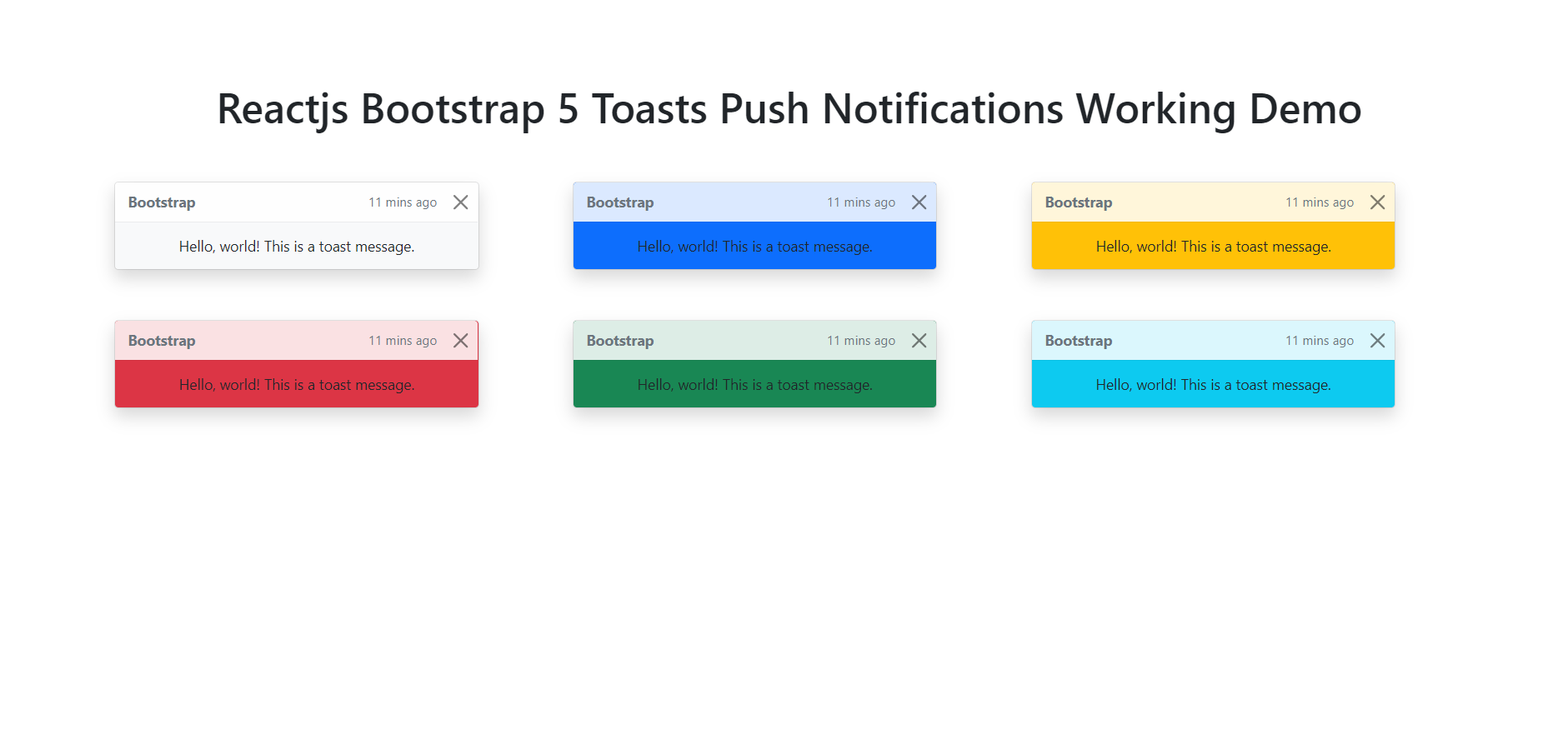
    Hello friends, welcome back to my blog. Today in this blog post, I am going to show you, Reactjs Bootstrap 5 Toasts Push Notifications Working Demo.


    Reactjs Bootstrap 5 Toasts Push Notifications Working Demo
    Reactjs Bootstrap 5 Toasts Push Notifications Working Demo

    For reactjs new comers, please check the below link:

    Reactjs Basic Tutorials

    Bootstrap 5 Tutorials


    Friends now I proceed onwards and here is the working code snippet and please use this carefully to avoid the mistakes:

    1. Firstly, we need fresh reactjs setup and for that, we need to run below commands into out terminal and also we should have latest node version installed on our system:

    npx create-react-app reactboot5
    
    cd reactboot5

    2. Now we need to run below commands into our project terminal to get bootstrap and related modules into our reactjs application:

    npm install bootstrap@next --save
    
    npm start //For start project again

    3. Finally for the main output, we need to add below code into our reactboot5/src/App.js file or if you have fresh setup then you can replace reactboot5/src/App.js file code with below code:

    import React, { useEffect } from 'react';
    //calling bootstrap modules
    import 'bootstrap/dist/css/bootstrap.min.css';
    import 'bootstrap/dist/js/bootstrap.min.js';
    import { Toast } from 'bootstrap/dist/js/bootstrap.esm.min.js'
    function App() {
      useEffect(() => {
      //init toast
        Array.from(document.querySelectorAll('.toast'))
        .forEach(toastNode => new Toast(toastNode))
      })
      return (
        <div className="App p-5">
          <div class="toast show bg-light" role="alert" aria-live="assertive" aria-atomic="true">
            <div class="toast-header">
                <strong class="me-auto">Bootstrap</strong>
                <small>11 mins ago</small>
                <button type="button" class="btn-close" data-bs-dismiss="toast" aria-label="Close"></button>
            </div>
            <div class="toast-body">
                Hello, world! This is a toast message.
            </div>
            </div>
        </div>
      );
    }
    
    export default App;
    

    Now we are done friends. If you have any kind of query or suggestion or any requirement then feel free to comment below.

    Note: Friends, I just tell the basic setup and things, you can change the code according to your requirements.

    I will appreciate that if you will tell your views for this post. Nothing matters if your views will be good or bad.

    Jassa

    Thanks

  • Vue 3 Bootstrap 5 Toasts Push Notifications Working Demo

    Vue 3 Bootstrap 5 Toasts Push Notifications Working Demo

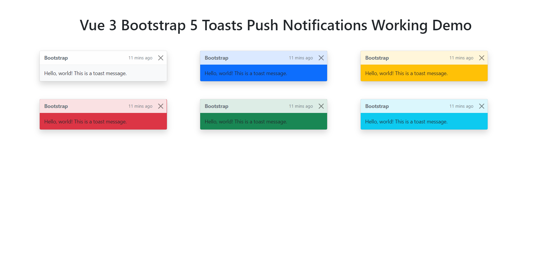
    Hello friends, welcome back to my blog. Today in this blog post, I am going to show you, Vue 3 Bootstrap 5 Toasts Push Notifications Working Demo.


    Vue 3 Bootstrap 5 Toasts Push Notifications Working Demo
    Vue 3 Bootstrap 5 Toasts Push Notifications Working Demo

    Vue 3 and Bootstrap 5 came and if you are new then you must check below two links:

    1. Vuejs
    2. Bootstrap 5

    Friends now I proceed onwards and here is the working code snippet and use this carefully to avoid the mistakes:

    1. Firstly friends we need fresh vue 3 setup and for this we need to run below commands . Secondly we should also have latest node version installed on our system. With below we will have  bootstrap 5 modules in our Vue 3 application:

    npm install -g @vue/cli
    
    vue create vueboot5
    
    cd vueboot5
    
    npm i bootstrap@next
    
    npm run serve //http://localhost:8080/


    2. Now friends we need to add below code into vueboot5/src/App.vue file to check the final output on browser:

    <template>
     <div class="toast show bg-light" role="alert" aria-live="assertive" aria-atomic="true">
            <div class="toast-header">
                <strong class="me-auto">Bootstrap</strong>
                <small>11 mins ago</small>
                <button type="button" class="btn-close" data-bs-dismiss="toast" aria-label="Close"></button>
            </div>
            <div class="toast-body">
                Hello, world! This is a toast message.
            </div>
            </div>
    </template>
    
    <script>
    //callling bootstrap modules
    import "bootstrap/dist/css/bootstrap.min.css";
    import "bootstrap/dist/js/bootstrap.min.js";
    import { Toast } from 'bootstrap/dist/js/bootstrap.esm.min.js'
    export default {
      mounted() {
    
         //inti toast
         Array.from(document.querySelectorAll('.toast'))
        .forEach(toastNode => new Toast(toastNode))
    }
    }
    </script>

    Now we are done friends and If you have any kind of query or suggestion or any requirement then feel free to comment below.

    Note: Friends, I just tell the basic setup and things, you can change the code according to your requirements.

    I will appreciate that if you will tell your views for this post. Nothing matters if your views will be good or bad.

    Jassa

    Thanks

  • Angular 11 Bootstrap 5 Toasts Push Notifications Working Demo

    Angular 11 Bootstrap 5 Toasts Push Notifications Working Demo

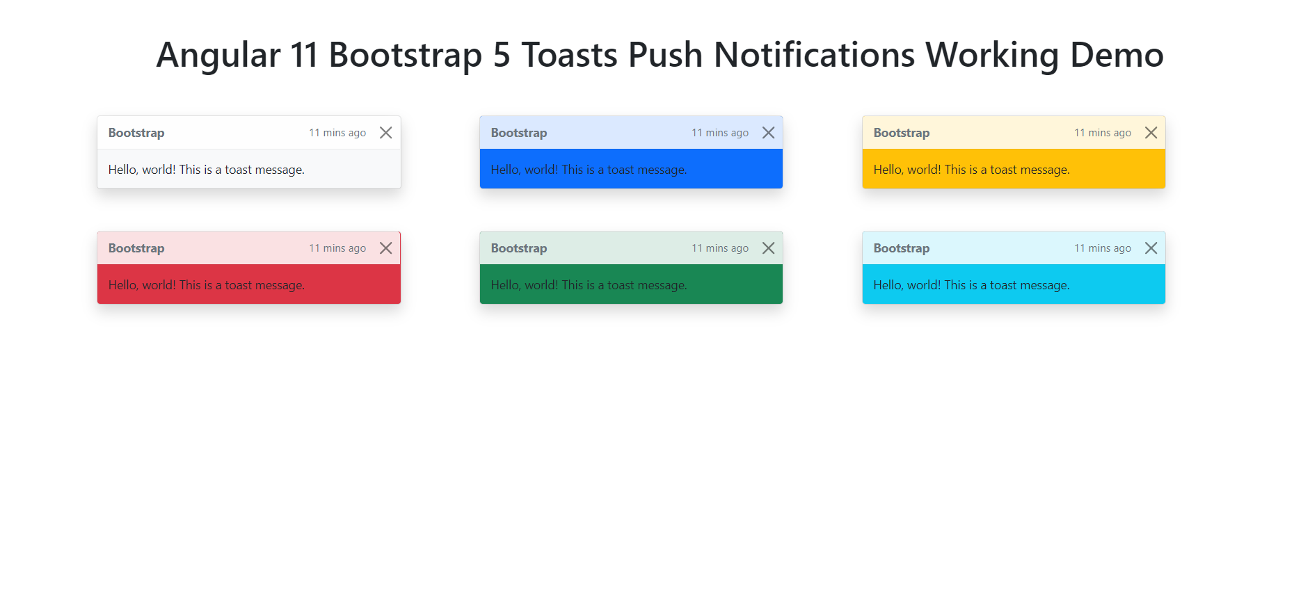
    Hello friends, welcome back to my blog. Today this blog post will tell you, Angular 11 Bootstrap 5 Toasts Push Notifications Working Demo.

    Guys we can use this same in Angular 12 Bootstrap 5 Toasts as well and here is working vide:

    Angular 12 Bootstrap 5 Toasts Working

    Bootstrap 5 Toasts

    Angular 11 Bootstrap 5 Toasts Push Notifications Working Demo
    Angular 11 Bootstrap 5 Toasts Push Notifications Working Demo

    Angular 11 came and Bootstrap 5 also and very soon Angular 12 will come and if you are new then you must check below two links:

    1. Angular11 Basic Tutorials
    2. Bootstrap 5

    Friends now I proceed onwards and here is the working code snippet and please use carefully this to avoid the mistakes:

    1. Firstly friends we need fresh angular 11 setup and for this we need to run below commands but if you already have angular 11 setup then you can avoid below commands. Secondly we should also have latest node version installed on our system:

    npm install -g @angular/cli 
    
    ng new angularboot5 //Create new Angular Project
    
    cd angularboot5 // Go inside the Angular Project Folder

    2. Now friends we need to run below commands into our project terminal to install bootstrap 5 modules into our angular application:

    npm install bootstrap@next

    3. Now friends we just need to add below code into angularboot5/src/app/app.component.html file to get final out on the web browser:

    <div class="toast show bg-light" role="alert" aria-live="assertive" aria-atomic="true">
          <div class="toast-header">
          
            <strong class="me-auto">Bootstrap</strong>
            <small>11 mins ago</small>
            <button type="button" class="btn-close" data-bs-dismiss="toast" aria-label="Close"></button>
          </div>
          <div class="toast-body">
            Hello, world! This is a toast message.
          </div>
    </div>

    4. Now friends we just need to add below code into angularboot5/angular.json file:

    "styles": [
                  ...
                  "node_modules/bootstrap/dist/css/bootstrap.min.css"
              ],
    "scripts": [
                  ...
                   "node_modules/bootstrap/dist/js/bootstrap.min.js"
               ]

    5. Now friends we just need to add below code into angularboot5/src/app/app.component.ts file:

    ...
    //calling toast module
    import { Toast } from 'node_modules/bootstrap/dist/js/bootstrap.esm.min.js'
    
    
    export class AppComponent {
      ...
    
      ngOnInit() {
    
        //init toast
        Array.from(document.querySelectorAll('.toast'))
        .forEach(toastNode => new Toast(toastNode))
        
      }
    }
    

    Friends in the end must run ng serve command into your terminal to run the angular 11 project.

    Now we are done friends. If you have any kind of query, suggestion and new requirement then feel free to comment below.

    Note: Friends, In this post, I just tell the basic setup and things, you can change the code according to your requirements.

    I will appreciate that if you will tell your views for this post. Nothing matters if your views will be good or bad because with your views, I will make my next posts more good and helpful.

    Jassa

    Thanks

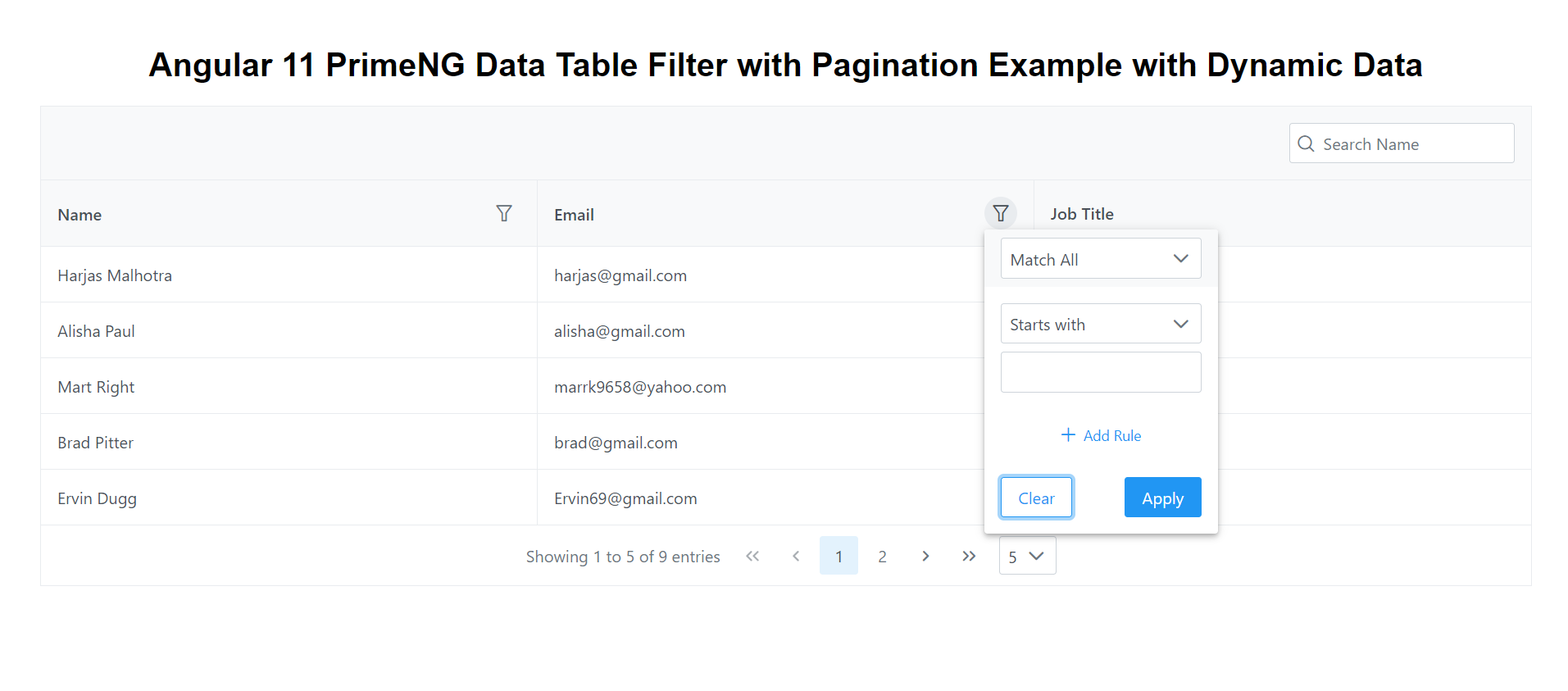
  • Angular 11 PrimeNG Data Table Filter Pagination Working Example with Dynamic Data

    Angular 11 PrimeNG Data Table Filter Pagination Working Example with Dynamic Data

    Hello friends, welcome back to my blog. Today this blog post will tell you, Angular 11 PrimeNG Data Table Filter Pagination Working Example with Dynamic Data.


    PrimeNG Data Table with Dynamic Data

    Guys for testing PrimeNG table with dynamic data, please use this WEB API.


    Angular 11 PrimeNG Data Table Filter Pagination Working Example with Dynamic Data
    Angular 11 PrimeNG Data Table Filter Pagination Working Example with Dynamic Data

    Angular 11 came and Bootstrap 5 also and very soon Angular 12 will come and if you are new then you must check below two links:

    1. Angular11 Basic Tutorials
    2. PrimeNG
    3. Bootstrap 5

    Friends now I proceed onwards and here is the working code snippet and please use carefully this to avoid the mistakes:

    1. Firstly friends we need fresh angular 11 setup and for this we need to run below commands but if you already have angular 11 setup then you can avoid below commands. Secondly we should also have latest node version installed on our system:

    npm install -g @angular/cli 
    
    ng new angularprimeng //Create new Angular Project
    
    cd angularprimeng // Go inside the Angular Project Folder

    2. Now friends we need to run below commands into our project terminal to install primeng  modules into our angular application:

    npm install primeng --save
    
    npm install primeicons --save 
    
    npm install @angular/cdk --save
    
    npm install primeflex --save //for flex layout

    3. Now friends we just need to add below code into angularprimeng/src/app/app.component.html file to get final out on the web browser:

    <div class="card">
        <h1 class="p-text-center">Angular 11 PrimeNG Data Table Filter with Pagination Example with Dynamic Data</h1>
       
      <p-table #dt2 [value]="customers" dataKey="name"
          [rows]="5" [showCurrentPageReport]="true" [rowsPerPageOptions]="[5,10,15]" [loading]="loading" styleClass="p-datatable-customers p-datatable-gridlines"
          [paginator]="true" currentPageReportTemplate="Showing {first} to {last} of {totalRecords} entries"
          [globalFilterFields]="['name','customers.name']">
          <ng-template pTemplate="caption">
            <div class="p-d-flex">
                <span class="p-input-icon-left p-ml-auto">
                    <i class="pi pi-search"></i>
                    <input class="p-inputtext p-component" pInputText type="text" (input)="dt2.filterGlobal($event.target.value, 'contains')" placeholder="Search Name" />
                </span>
            </div>
        </ng-template>
          <ng-template pTemplate="header">
            <tr>
                <th>
                    <div class="p-d-flex p-jc-between p-ai-center">
                        Name 
                        <p-columnFilter type="text" field="name" display="menu"></p-columnFilter>
                    </div>
                </th>
                  <th>
                    <div class="p-d-flex p-jc-between p-ai-center">
                        Email 
                        <p-columnFilter type="text" field="email" display="menu"></p-columnFilter>
                    </div>
                  </th>
                  <th>Job Title</th>
    
                  
              </tr>
             
          </ng-template>
          <ng-template pTemplate="body" let-customer>
              <tr>
                  <td>
                      {{customer.name}}
                  </td>
                  <td>
                     
                      {{customer.email}}
                  </td>
                  
                  <td>
                       {{customer.job_title}}
                  </td>
                  
              </tr>
          </ng-template>
          <ng-template pTemplate="emptymessage">
              <tr>
                  <td colspan="5">No customers found.</td>
              </tr>
          </ng-template>
      </p-table>
    </div>

    4. Now friends we just need to add below code into angularprimeng/angular.json file:

     "styles": [
                  "src/styles.css",
                  "node_modules/primeng/resources/themes/saga-blue/theme.css",
                  "node_modules/primeng/resources/primeng.min.css",
                  "node_modules/primeflex/primeflex.css",
                  "node_modules/primeicons/primeicons.css",
                ],
    ...

    5. Now friends we just need to add below code into angularprimeng/src/app/app.component.ts file:

    ...
    import { HttpClient } from '@angular/common/http';
    export class AppComponent {
      
      //data variable
      customers:any;
      loading: boolean = true;
      constructor(private http: HttpClient){
        //get request from web api and you can also use this web api for testing
    
        this.http.get('https://www.testjsonapi.com/users/').subscribe(data => {
          //data storing for use in html component
          this.loading = false;
          this.customers = data;
              }, error => console.error(error));
      }
      ngOnInit() {


    }
    
    }

    6. Now friends we just need to add below code into angularprimeng/src/app/app.module.ts file:

    ...
    import { BrowserAnimationsModule } from '@angular/platform-browser/animations';
    import {TableModule} from 'primeng/table';
    import {DropdownModule} from 'primeng/dropdown';
    import { HttpClientModule } from '@angular/common/http';
    
    @NgModule({
     ...
      imports: [
       ...
        BrowserAnimationsModule,
        TableModule,
        DropdownModule,
        HttpClientModule
      ],
      ...
    

    Friends in the end must run ng serve command into your terminal to run the angular 11 project.

    Now we are done friends. If you have any kind of query, suggestion and new requirement then feel free to comment below.

    Note: Friends, In this post, I just tell the basic setup and things, you can change the code according to your requirements.

    I will appreciate that if you will tell your views for this post. Nothing matters if your views will be good or bad because with your views, I will make my next posts more good and helpful.

    Jassa

    Thanks

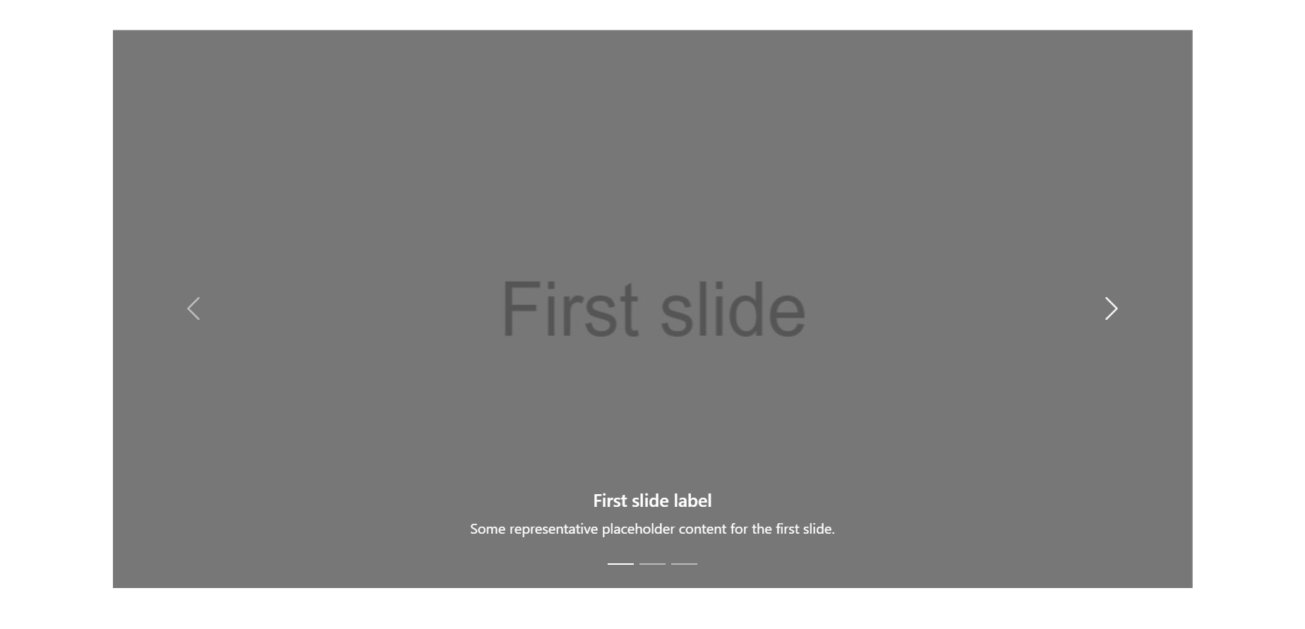
  • Reactjs Bootstrap 5 Carousel Slider Working Example

    Reactjs Bootstrap 5 Carousel Slider Working Example

    Hello friends, welcome back to my blog. Today in this blog post, I am going to show you, Reactjs Bootstrap 5 Carousel Slider Working Example.


    Guys please watch below video to check how to add bootstrap 5 carousel in reactjs application?:

    Add Bootstrap 5 slider in Reactjs Application

    Reactjs Bootstrap 5 Carousel Slider Working Example
    Reactjs Bootstrap 5 Carousel Slider Working Example

    For reactjs new comers, please check the below link:

    Reactjs Basic Tutorials

    Bootstrap 5 Tutorials


    Friends now I proceed onwards and here is the working code snippet and please use this carefully to avoid the mistakes:

    1. Firstly, we need fresh reactjs setup and for that, we need to run below commands into out terminal and also we should have latest node version installed on our system:

    npx create-react-app reactboot5
    
    cd reactboot5

    2. Now we need to run below commands into our project terminal to get bootstrap and related modules into our reactjs application:

    npm install bootstrap@next --save
    
    npm install --save @popperjs/core
    
    npm start //For start project again

    3. Finally for the main output, we need to add below code into our reactboot5/src/App.js file or if you have fresh setup then you can replace reactboot5/src/App.js file code with below code:

    import './App.css';
    import 'bootstrap/dist/css/bootstrap.min.css';
    import 'bootstrap/dist/js/bootstrap.min.js';
    function App() {
      return (
        <div className="App p-5">
          <div className="container p-5">
          <div id="carouselExampleCaptions" class="carousel slide" data-bs-ride="carousel">
            <div class="carousel-indicators">
              <button type="button" data-bs-target="#carouselExampleCaptions" data-bs-slide-to="0" class="active" aria-current="true" aria-label="Slide 1"></button>
              <button type="button" data-bs-target="#carouselExampleCaptions" data-bs-slide-to="1" aria-label="Slide 2"></button>
              <button type="button" data-bs-target="#carouselExampleCaptions" data-bs-slide-to="2" aria-label="Slide 3"></button>
            </div>
            <div class="carousel-inner">
              <div class="carousel-item active">
                <img src="https://therichpost.com/wp-content/uploads/2021/05/Slider-One-Carousel.png" class="d-block w-100" alt="..." />
                <div class="carousel-caption d-none d-md-block">
                  <h5>First slide label</h5>
                  <p>Some representative placeholder content for the first slide.</p>
                </div>
              </div>
              <div class="carousel-item">
                <img src="https://therichpost.com/wp-content/uploads/2021/05/Slider-Second-Carousel.png" class="d-block w-100" alt="..." />
                <div class="carousel-caption d-none d-md-block">
                  <h5>Second slide label</h5>
                  <p>Some representative placeholder content for the second slide.</p>
                </div>
              </div>
              <div class="carousel-item">
                <img src="https://therichpost.com/wp-content/uploads/2021/05/Slider-Third-Carousel.png" class="d-block w-100" alt="..." />
                <div class="carousel-caption d-none d-md-block">
                  <h5>Third slide label</h5>
                  <p>Some representative placeholder content for the third slide.</p>
                </div>
              </div>
            </div>
            <button class="carousel-control-prev" type="button" data-bs-target="#carouselExampleCaptions" data-bs-slide="prev">
              <span class="carousel-control-prev-icon" aria-hidden="true"></span>
              <span class="visually-hidden">Previous</span>
            </button>
            <button class="carousel-control-next" type="button" data-bs-target="#carouselExampleCaptions" data-bs-slide="next">
              <span class="carousel-control-next-icon" aria-hidden="true"></span>
              <span class="visually-hidden">Next</span>
            </button>
          </div>
          </div>
        </div>
      );
    }
    
    export default App;
    

    Now we are done friends. If you have any kind of query or suggestion or any requirement then feel free to comment below.

    Note: Friends, I just tell the basic setup and things, you can change the code according to your requirements.

    I will appreciate that if you will tell your views for this post. Nothing matters if your views will be good or bad.

    Jassa

    Thanks

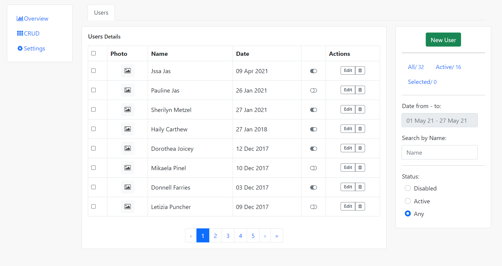
  • Angular 11 Bootstrap 5 User Crud Template

    Angular 11 Bootstrap 5 User Crud Template

    Hello friends, welcome back to my blog. Today this blog post will tell you, Angular 11 Bootstrap 5 User Crud Template.

    In this post, guys we will cover below things:

    • Bootstrap 5 Angular 11 Free Template Creation.
    • Angular Bootstrap Sidebar Template Fully Responsive.
    • Angular User Crud Template.

    Angular11 Crud

    Angular 11 Bootstrap 5 User Crud Template
    Angular 11 Bootstrap 5 User Crud Template
    Angular 11 Bootstrap 5 Modal Popup
    Bootstrap 5 Modal Popup in Angular 11

    Angular 11 came and Bootstrap 5 also and very soon Angular 12 will come and if you are new then you must check below two links:

    1. Angular11 Basic Tutorials
    2. Bootstrap 5

    Friends now I proceed onwards and here is the working code snippet and please use carefully this to avoid the mistakes:

    1. Firstly friends we need fresh angular 11 setup and for this we need to run below commands but if you already have angular 11 setup then you can avoid below commands. Secondly we should also have latest node version installed on our system:

    npm install -g @angular/cli 
    
    ng new angularboot5 //Create new Angular Project
    
    cd angularboot5 // Go inside the Angular Project Folder

    2. Now friends we need to run below commands into our project terminal to install bootstrap 5 modules into our angular application:

    npm install bootstrap@next

    3. Now friends we just need to add below code into angularboot5/src/app/app.component.html file to get final out on the web browser:

    <div class="container">
    <div class="row flex-lg-nowrap">
    <div class="col-12 col-lg-auto mb-3" style="width: 200px">
      <div class="card p-3">
      <div class="e-navlist e-navlist--active-bg">
        <ul class="nav">
        <li class="nav-item"><a class="nav-link px-2 active" href="#"><i class="fa fa-fw fa-bar-chart mr-1"></i><span>Overview</span></a></li>
        <li class="nav-item"><a class="nav-link px-2" href="#"><i class="fa fa-fw fa-th mr-1"></i><span>CRUD</span></a></li>
        <li class="nav-item"><a class="nav-link px-2" href="#"><i class="fa fa-fw fa-cog mr-1"></i><span>Settings</span></a></li>
        </ul>
      </div>
      </div>
    </div>
    
    <div class="col">
      <div class="e-tabs mb-3 px-3">
      <ul class="nav nav-tabs">
        <li class="nav-item"><a class="nav-link active" href="#">Users</a></li>
      </ul>
      </div>
    
      <div class="row flex-lg-nowrap">
      <div class="col mb-3">
        <div class="e-panel card">
        <div class="card-body">
          <div class="card-title">
          <h6 class="mr-2"><span>Users</span><small class="px-1">Details</small></h6>
          </div>
          <div class="e-table">
          <div class="table-responsive table-lg mt-3">
            <table class="table table-bordered">
            <thead>
              <tr>
              <th class="align-top">
                <div class="custom-control custom-control-inline custom-checkbox custom-control-nameless m-0">
                <input type="checkbox" class="custom-control-input" id="all-items" />
                <label class="custom-control-label" for="all-items"></label>
                </div>
              </th>
              <th>Photo</th>
              <th class="max-width">Name</th>
              <th class="sortable">Date</th>
              <th> </th>
              <th>Actions</th>
              </tr>
            </thead>
            <tbody>
              <tr>
              <td class="align-middle">
                <div class="custom-control custom-control-inline custom-checkbox custom-control-nameless m-0 align-top">
                <input type="checkbox" class="custom-control-input" id="item-1" />
                <label class="custom-control-label" for="item-1"></label>
                </div>
              </td>
              <td class="align-middle text-center">
                <div class="bg-light d-inline-flex justify-content-center align-items-center align-top itemdiv" ><i class="fa fa-fw fa-photo" ></i></div>
              </td>
              <td class="text-nowrap align-middle">Jssa Jas</td>
              <td class="text-nowrap align-middle"><span>09 Apr 2021</span></td>
              <td class="text-center align-middle"><i class="fa fa-fw text-secondary cursor-pointer fa-toggle-on"></i></td>
              <td class="text-center align-middle">
                <div class="btn-group align-top">
                  <button class="btn btn-sm btn-outline-secondary badge" type="button" data-bs-toggle="modal" data-bs-target="#userformmodal">Edit</button>
                  <button class="btn btn-sm btn-outline-secondary badge" type="button"><i class="fa fa-trash"></i></button>
                </div>
              </td>
              </tr>
              <tr>
              <td class="align-middle">
                <div class="custom-control custom-control-inline custom-checkbox custom-control-nameless m-0 align-top">
                <input type="checkbox" class="custom-control-input" id="item-2" />
                <label class="custom-control-label" for="item-2"></label>
                </div>
              </td>
              <td class="align-middle text-center">
                <div class="bg-light d-inline-flex justify-content-center align-items-center align-top itemdiv" ><i class="fa fa-fw fa-photo" ></i></div>
              </td>
              <td class="text-nowrap align-middle">Pauline Jas</td>
              <td class="text-nowrap align-middle"><span>26 Jan 2021</span></td>
              <td class="text-center align-middle"><i class="fa fa-fw text-secondary cursor-pointer fa-toggle-off"></i></td>
              <td class="text-center align-middle">
                <div class="btn-group align-top">
                  <button class="btn btn-sm btn-outline-secondary badge" type="button" data-bs-toggle="modal" data-bs-target="#userformmodal">Edit</button>
                  <button class="btn btn-sm btn-outline-secondary badge" type="button"><i class="fa fa-trash"></i></button>
                </div>
              </td>
              </tr>
              <tr>
              <td class="align-middle">
                <div class="custom-control custom-control-inline custom-checkbox custom-control-nameless m-0 align-top">
                <input type="checkbox" class="custom-control-input" id="item-3" />
                <label class="custom-control-label" for="item-3"></label>
                </div>
              </td>
              <td class="align-middle text-center">
                <div class="bg-light d-inline-flex justify-content-center align-items-center align-top itemdiv" ><i class="fa fa-fw fa-photo" ></i></div>
              </td>
              <td class="text-nowrap align-middle">Sherilyn Metzel</td>
              <td class="text-nowrap align-middle"><span>27 Jan 2021</span></td>
              <td class="text-center align-middle"><i class="fa fa-fw text-secondary cursor-pointer fa-toggle-on"></i></td>
              <td class="text-center align-middle">
                <div class="btn-group align-top">
                  <button class="btn btn-sm btn-outline-secondary badge" type="button" data-bs-toggle="modal" data-bs-target="#userformmodal">Edit</button>
                  <button class="btn btn-sm btn-outline-secondary badge" type="button"><i class="fa fa-trash"></i></button>
                </div>
              </td>
              </tr>
              <tr>
              <td class="align-middle">
                <div class="custom-control custom-control-inline custom-checkbox custom-control-nameless m-0 align-top">
                <input type="checkbox" class="custom-control-input" id="item-4" />
                <label class="custom-control-label" for="item-4"></label>
                </div>
              </td>
              <td class="align-middle text-center">
                <div class="bg-light d-inline-flex justify-content-center align-items-center align-top itemdiv" ><i class="fa fa-fw fa-photo" ></i></div>
              </td>
              <td class="text-nowrap align-middle">Terrie Boaler</td>
              <td class="text-nowrap align-middle"><span>20 Jan 2021</span></td>
              <td class="text-center align-middle"><i class="fa fa-fw text-secondary cursor-pointer fa-toggle-on"></i></td>
              <td class="text-center align-middle">
                <div class="btn-group align-top">
                  <button class="btn btn-sm btn-outline-secondary badge" type="button" data-bs-toggle="modal" data-bs-target="#userformmodal">Edit</button>
                  <button class="btn btn-sm btn-outline-secondary badge" type="button"><i class="fa fa-trash"></i></button>
                </div>
              </td>
              </tr>
              <tr>
              <td class="align-middle">
                <div class="custom-control custom-control-inline custom-checkbox custom-control-nameless m-0 align-top">
                <input type="checkbox" class="custom-control-input" id="item-5" />
                <label class="custom-control-label" for="item-5"></label>
                </div>
              </td>
              <td class="align-middle text-center">
                <div class="bg-light d-inline-flex justify-content-center align-items-center align-top itemdiv" ><i class="fa fa-fw fa-photo" ></i></div>
              </td>
              <td class="text-nowrap align-middle">Rutter Pude</td>
              <td class="text-nowrap align-middle"><span>13 Jan 2021</span></td>
              <td class="text-center align-middle"><i class="fa fa-fw text-secondary cursor-pointer fa-toggle-off"></i></td>
              <td class="text-center align-middle">
                <div class="btn-group align-top">
                  <button class="btn btn-sm btn-outline-secondary badge" type="button" data-bs-toggle="modal" data-bs-target="#userformmodal">Edit</button>
                  <button class="btn btn-sm btn-outline-secondary badge" type="button"><i class="fa fa-trash"></i></button>
                </div>
              </td>
              </tr>
              <tr>
              <td class="align-middle">
                <div class="custom-control custom-control-inline custom-checkbox custom-control-nameless m-0 align-top">
                <input type="checkbox" class="custom-control-input" id="item-6" />
                <label class="custom-control-label" for="item-6"></label>
                </div>
              </td>
              <td class="align-middle text-center">
                <div class="bg-light d-inline-flex justify-content-center align-items-center align-top itemdiv" ><i class="fa fa-fw fa-photo" ></i></div>
              </td>
              <td class="text-nowrap align-middle">Clifford Benjamin</td>
              <td class="text-nowrap align-middle"><span>25 Jan 2020</span></td>
              <td class="text-center align-middle"><i class="fa fa-fw text-secondary cursor-pointer fa-toggle-on"></i></td>
              <td class="text-center align-middle">
                <div class="btn-group align-top">
                  <button class="btn btn-sm btn-outline-secondary badge" type="button" data-bs-toggle="modal" data-bs-target="#userformmodal">Edit</button>
                  <button class="btn btn-sm btn-outline-secondary badge" type="button"><i class="fa fa-trash"></i></button>
                </div>
              </td>
              </tr>
              <tr>
              <td class="align-middle">
                <div class="custom-control custom-control-inline custom-checkbox custom-control-nameless m-0 align-top">
                <input type="checkbox" class="custom-control-input" id="item-7" />
                <label class="custom-control-label" for="item-7"></label>
                </div>
              </td>
              <td class="align-middle text-center">
                <div class="bg-light d-inline-flex justify-content-center align-items-center align-top itemdiv" ><i class="fa fa-fw fa-photo" ></i></div>
              </td>
              <td class="text-nowrap align-middle">Thedric Romans</td>
              <td class="text-nowrap align-middle"><span>12 Jan 2019</span></td>
              <td class="text-center align-middle"><i class="fa fa-fw text-secondary cursor-pointer fa-toggle-off"></i></td>
              <td class="text-center align-middle">
                <div class="btn-group align-top">
                  <button class="btn btn-sm btn-outline-secondary badge" type="button" data-bs-toggle="modal" data-bs-target="#userformmodal">Edit</button>
                  <button class="btn btn-sm btn-outline-secondary badge" type="button"><i class="fa fa-trash"></i></button>
                </div>
              </td>
              </tr>
              <tr>
              <td class="align-middle">
                <div class="custom-control custom-control-inline custom-checkbox custom-control-nameless m-0 align-top">
                <input type="checkbox" class="custom-control-input" id="item-8" />
                <label class="custom-control-label" for="item-8"></label>
                </div>
              </td>
              <td class="align-middle text-center">
                <div class="bg-light d-inline-flex justify-content-center align-items-center align-top itemdiv" ><i class="fa fa-fw fa-photo" ></i></div>
              </td>
              <td class="text-nowrap align-middle">Haily Carthew</td>
              <td class="text-nowrap align-middle"><span>27 Jan 2018</span></td>
              <td class="text-center align-middle"><i class="fa fa-fw text-secondary cursor-pointer fa-toggle-on"></i></td>
              <td class="text-center align-middle">
                <div class="btn-group align-top">
                  <button class="btn btn-sm btn-outline-secondary badge" type="button" data-bs-toggle="modal" data-bs-target="#userformmodal">Edit</button>
                  <button class="btn btn-sm btn-outline-secondary badge" type="button"><i class="fa fa-trash"></i></button>
                </div>
              </td>
              </tr>
              <tr>
              <td class="align-middle">
                <div class="custom-control custom-control-inline custom-checkbox custom-control-nameless m-0 align-top">
                <input type="checkbox" class="custom-control-input" id="item-9" />
                <label class="custom-control-label" for="item-9"></label>
                </div>
              </td>
              <td class="align-middle text-center">
                <div class="bg-light d-inline-flex justify-content-center align-items-center align-top itemdiv" ><i class="fa fa-fw fa-photo" ></i></div>
              </td>
              <td class="text-nowrap align-middle">Dorothea Joicey</td>
              <td class="text-nowrap align-middle"><span>12 Dec 2017</span></td>
              <td class="text-center align-middle"><i class="fa fa-fw text-secondary cursor-pointer fa-toggle-on"></i></td>
              <td class="text-center align-middle">
                <div class="btn-group align-top">
                  <button class="btn btn-sm btn-outline-secondary badge" type="button" data-bs-toggle="modal" data-bs-target="#userformmodal">Edit</button>
                  <button class="btn btn-sm btn-outline-secondary badge" type="button"><i class="fa fa-trash"></i></button>
                </div>
              </td>
              </tr>
              <tr>
              <td class="align-middle">
                <div class="custom-control custom-control-inline custom-checkbox custom-control-nameless m-0 align-top">
                <input type="checkbox" class="custom-control-input" id="item-10" />
                <label class="custom-control-label" for="item-10"></label>
                </div>
              </td>
              <td class="align-middle text-center">
                <div class="bg-light d-inline-flex justify-content-center align-items-center align-top itemdiv" ><i class="fa fa-fw fa-photo" ></i></div>
              </td>
              <td class="text-nowrap align-middle">Mikaela Pinel</td>
              <td class="text-nowrap align-middle"><span>10 Dec 2017</span></td>
              <td class="text-center align-middle"><i class="fa fa-fw text-secondary cursor-pointer fa-toggle-off"></i></td>
              <td class="text-center align-middle">
                <div class="btn-group align-top">
                  <button class="btn btn-sm btn-outline-secondary badge" type="button" data-bs-toggle="modal" data-bs-target="#userformmodal">Edit</button>
                  <button class="btn btn-sm btn-outline-secondary badge" type="button"><i class="fa fa-trash"></i></button>
                </div>
              </td>
              </tr>
              <tr>
              <td class="align-middle">
                <div class="custom-control custom-control-inline custom-checkbox custom-control-nameless m-0 align-top">
                <input type="checkbox" class="custom-control-input" id="item-11" />
                <label class="custom-control-label" for="item-11"></label>
                </div>
              </td>
              <td class="align-middle text-center">
                <div class="bg-light d-inline-flex justify-content-center align-items-center align-top itemdiv" ><i class="fa fa-fw fa-photo" ></i></div>
              </td>
              <td class="text-nowrap align-middle">Donnell Farries</td>
              <td class="text-nowrap align-middle"><span>03 Dec 2017</span></td>
              <td class="text-center align-middle"><i class="fa fa-fw text-secondary cursor-pointer fa-toggle-on"></i></td>
              <td class="text-center align-middle">
                <div class="btn-group align-top">
                  <button class="btn btn-sm btn-outline-secondary badge" type="button" data-bs-toggle="modal" data-bs-target="#userformmodal">Edit</button>
                  <button class="btn btn-sm btn-outline-secondary badge" type="button"><i class="fa fa-trash"></i></button>
                </div>
              </td>
              </tr>
              <tr>
              <td class="align-middle">
                <div class="custom-control custom-control-inline custom-checkbox custom-control-nameless m-0 align-top">
                <input type="checkbox" class="custom-control-input" id="item-12" />
                <label class="custom-control-label" for="item-12"></label>
                </div>
              </td>
              <td class="align-middle text-center">
                <div class="bg-light d-inline-flex justify-content-center align-items-center align-top itemdiv" ><i class="fa fa-fw fa-photo" ></i></div>
              </td>
              <td class="text-nowrap align-middle">Letizia Puncher</td>
              <td class="text-nowrap align-middle"><span>09 Dec 2017</span></td>
              <td class="text-center align-middle"><i class="fa fa-fw text-secondary cursor-pointer fa-toggle-off"></i></td>
              <td class="text-center align-middle">
                <div class="btn-group align-top">
                  <button class="btn btn-sm btn-outline-secondary badge" type="button" data-bs-toggle="modal" data-bs-target="#userformmodal">Edit</button>
                  <button class="btn btn-sm btn-outline-secondary badge" type="button"><i class="fa fa-trash"></i></button>
                </div>
              </td>
              </tr>
            </tbody>
            </table>
          </div>
          <div class="d-flex justify-content-center">
            <nav aria-label="Page navigation example">
              <ul class="pagination mt-3 mb-0">
                <li class="disabled page-item"><a href="#" class="page-link">‹</a></li>
                <li class="active page-item"><a href="#" class="page-link">1</a></li>
                <li class="page-item"><a href="#" class="page-link">2</a></li>
                <li class="page-item"><a href="#" class="page-link">3</a></li>
                <li class="page-item"><a href="#" class="page-link">4</a></li>
                <li class="page-item"><a href="#" class="page-link">5</a></li>
                <li class="page-item"><a href="#" class="page-link">›</a></li>
                <li class="page-item"><a href="#" class="page-link">»</a></li>
              </ul>
          </nav>
          </div>
          </div>
        </div>
        </div>
      </div>
      <div class="col-12 col-lg-3 mb-3">
        <div class="card">
        <div class="card-body">
          <div class="text-center px-xl-3">
          <button class="btn btn-success" type="button" data-bs-toggle="modal" data-bs-target="#userformmodal">New User</button>
          </div>
          <hr class="my-3" />
          <div class="e-navlist e-navlist--active-bold">
          <ul class="nav">
            <li class="nav-item active"><a href="" class="nav-link"><span>All</span> <small>/ 32</small></a></li>
            <li class="nav-item"><a href="" class="nav-link"><span>Active</span> <small>/ 16</small></a></li>
            <li class="nav-item"><a href="" class="nav-link"><span>Selected</span> <small>/ 0</small></a></li>
          </ul>
          </div>
          <hr class="my-3"/>
          <div>
          <div class="input-group mb-3">
            <label class="form-label">Date from - to:</label>
            <div>
            <input id="dates-range" class="form-control flatpickr-input" placeholder="01 May 21 - 27 May 21" type="text" readonly="readonly" />
            </div>
          </div>
          <div class="input-group mb-3">
            <label class="form-label">Search by Name:</label>
            <div><input class="form-control w-100" type="text" placeholder="Name" value="" /></div>
          </div>
          </div>
          <hr class="my-3" />
          <div class="">
          <label class="form-label">Status:</label>
          <div class="px-2">
            <div class="custom-control custom-radio form-check">
            <input type="radio" class="form-check-input" name="user-status" id="users-status-disabled" />
            <label class="form-label" for="users-status-disabled">Disabled</label>
            </div>
          </div>
          <div class="px-2">
            <div class="custom-control custom-radio form-check">
            <input type="radio" class="form-check-input" name="user-status" id="users-status-active" />
            <label class="form-label" for="users-status-active">Active</label>
            </div>
          </div>
          <div class="px-2">
            <div class="custom-control custom-radio form-check">
            <input type="radio" class="form-check-input" name="user-status" id="users-status-any" checked="" />
            <label class="form-label" for="users-status-any">Any</label>
            </div>
          </div>
          </div>
        </div>
        </div>
      </div>
      </div>
    
      <!--Modal-->        
      
      <div class="modal fade" aria-labelledby="userformmodalLabel" aria-hidden="true" tabindex="-1" id="userformmodal">
      <div class="modal-dialog modal-lg" role="document">
        <div class="modal-content">
        <div class="modal-header">
          <h5 class="modal-title">Create User</h5>
          <button type="button" class="btn-close" data-bs-dismiss="modal" aria-label="Close">
         
          </button>
        </div>
        <div class="modal-body">
          <div class="py-1">
          <form class="form" novalidate="">
            <div class="row">
            <div class="col">
              <div class="row">
              <div class="col">
                <div class="mb-3">
                <label class="form-label">Full Name</label>
                <input class="form-control" type="text" name="name" placeholder="John Smith" value="John Smith" />
                </div>
              </div>
              <div class="col">
                <div class="mb-3">
                  <label class="form-label">Username</label>
                <input class="form-control" type="text" name="username" placeholder="johnny.s" value="johnny.s" />
                </div>
              </div>
              </div>
              <div class="row">
              <div class="col">
                <div class="mb-3">
                  <label class="form-label">Email</label>
                <input class="form-control" type="text" placeholder="user@example.com" />
                </div>
              </div>
              </div>
              <div class="row">
              <div class="col mb-3">
                <div class="mb-3">
                  <label class="form-label">About</label>
                <textarea class="form-control" rows="5" placeholder="My Bio"></textarea>
                </div>
              </div>
              </div>
            </div>
            </div>
            <div class="row">
            <div class="col-12 col-sm-6 mb-3">
              <div class="mb-2"><b>Change Password</b></div>
              <div class="row">
              <div class="col">
                <div class="mb-3">
                  <label class="form-label">Current Password</label>
                <input class="form-control" type="password" placeholder="••••••" />
                </div>
              </div>
              </div>
              <div class="row">
              <div class="col">
                <div class="mb-3">
                  <label class="form-label">New Password</label>
                <input class="form-control" type="password" placeholder="••••••" />
                </div>
              </div>
              <div class="col">
                <div class="mb-3">
                  <label class="form-label">Confirm <span class="d-none d-xl-inline">Password</span></label>
                <input class="form-control" type="password" placeholder="••••••" /></div>
              </div>
              </div>
            </div>
            <div class="col-12 col-sm-5 offset-sm-1 mb-3">
              <div class="mb-2"><b>Keeping in Touch</b></div>
              <div class="row">
              <div class="col">
                <label>Email Notifications</label>
                <div class="custom-controls-stacked px-2">
                <div class="custom-control custom-checkbox form-check">
                  <input type="checkbox" class="form-check-input custom-control-input" id="notifications-blog" checked="" />
                  <label class="custom-control-label form-check-label" for="notifications-blog">Blog posts</label>
                </div>
                <div class="custom-control custom-checkbox form-check">
                  <input type="checkbox" class="form-check-input custom-control-input" id="notifications-news" checked="" />
                  <label class="custom-control-label form-check-label" for="notifications-news">Newsletter</label>
                </div>
                <div class="custom-control custom-checkbox form-check">
                  <input type="checkbox" class="form-check-input custom-control-input" id="notifications-offers" checked="" />
                  <label class="custom-control-label form-check-label" for="notifications-offers">Personal Offers</label>
                </div>
                </div>
              </div>
              </div>
            </div>
            </div>
            <div class="row">
            <div class="col d-flex justify-content-end">
              <button class="btn btn-primary" data-bs-dismiss="modal" type="buton" aria-label="Close">Save Changes</button>
            </div>
            </div>
          </form>
    
          </div>
        </div>
        </div>
      </div>
      </div>
    </div>
    </div>

    4. Now friends we just need to add below code into angularboot5/angular.json file:

    "styles": [
                  ...
                  "node_modules/bootstrap/dist/css/bootstrap.min.css"
              ],
    "scripts": [
                  ...
                   "node_modules/bootstrap/dist/js/bootstrap.min.js"
               ]

    5. Now friends we just need to add below code into angularboot5/src/app/app.component.css file to add custom styles:

    @import url("https://maxcdn.bootstrapcdn.com/font-awesome/4.3.0/css/font-awesome.min.css");
        body{
            margin-top:20px!important;
            background:#f8f8f8!important;
        }
        .fa-photo
        {
            opacity: 0.8;
        }
        .itemdiv
        {
            width: 35px; height: 35px; border-radius: 3px;
        }
        .btn-outline-secondary {
        color: #6c757d!important;
        border-color: #6c757d!important;
        }
        .btn-outline-secondary:hover {
        color: #fff!important;
        border-color: #ffffff!important;
        }

    Friends in the end must run ng serve command into your terminal to run the angular 11 project.

    Guys click here to check the Angular 11 Crud tutorials with service.

    Now we are done friends. If you have any kind of query, suggestion and new requirement then feel free to comment below.

    Note: Friends, In this post, I just tell the basic setup and things, you can change the code according to your requirements.

    I will appreciate that if you will tell your views for this post. Nothing matters if your views will be good or bad because with your views, I will make my next posts more good and helpful.

    Jassa

    Thanks

  • Vue 3 User Form with Floating Label

    Vue 3 User Form with Floating Label

    Hello my friends, welcome back to my blog. Today in this blog post, I am going to show you, Vue 3 User Form with Floating Label.

    Vuejs Form

    Vue 3 User Form with Floating Label
    Vue 3 User Form with Floating Label

    Vue 3 came and if you are new then you must check below link::
    Vuejs


    Friends now I proceed onwards and here is the working code snippet for and please use this carefully to avoid the mistakes:

    1. Firstly friends we need fresh vuejs(Vue 3) setup and for that we need to run below commands into our terminal and also w should have latest node version installed on our system:

    npm install -g @vue/cli
    
    vue create vuepage
    
    cd vuepage
    
    npm install bootstrap --save
    
    npm run serve //http://localhost:8080/

    2. Now friends please create new file “App.css” inside src folder and add below code inside it:

    @import url("https://fonts.googleapis.com/css?family=Quicksand:300,400,500,600,700&display=swap");
    html {
      font-size: 10px;
    }
    .btn-get {
      font-size: 1.8rem;
      font-family: "Quicksand", sans-serif;
      color: #fff !important;
      text-transform: capitalize;
      background-image: -webkit-gradient(linear, left top, right top, from(#b70b83), to(#33077f));
      background-image: linear-gradient(to right, #b70b83, #33077f);
      padding: 10px 20px 10px;
      position: relative;
      border: 0;
      border-radius: 5px;
      overflow: hidden;
      text-transform: capitalize !important;
    }
    
    .btn-get::before {
      position: absolute;
      content: '';
      top: 0;
      height: 100%;
      width: 0;
      left: 0;
      background-image: -webkit-gradient(linear, left top, right top, from(#33077f), to(#b70b83));
      background-image: linear-gradient(to right, #33077f, #b70b83);
      -webkit-transition: .5s ease-out;
      transition: .5s ease-out;
    }
    
    .btn-get:hover::before {
      width: 100%;
    }
    
    .btn-get span {
      position: relative;
      z-index: 2;
    }
    
    
    .main__form .form-group {
      position: relative;
      margin-bottom: 2rem;
    }
    
    .main__form .form-group label {
      font-family: "Quicksand", sans-serif;
      font-size: 1.6rem;
      color: #575757;
      padding: 0 2.5rem;
      position: absolute;
      top: 50%;
      -webkit-transform: translateY(-50%);
              transform: translateY(-50%);
      z-index: 0;
      -webkit-transition: .3s all;
      transition: .3s all;
    }
    
    .main__form .form-group input,
    .main__form .form-group textarea {
      font-size: 1.6rem;
      border-color: #f7f7f7;
      padding: 0 2.5rem;
      position: relative;
      z-index: 1;
      background: transparent;
    }
    
    .main__form .form-group input:not(:placeholder-shown) + label,
    .main__form .form-group textarea:not(:placeholder-shown) + label {
      top: 2%;
      background: #fff;
      z-index: 2;
      font-weight: 600;
    }
    
    .main__form .form-group input:focus,
    .main__form .form-group textarea:focus {
      outline: none;
      -webkit-box-shadow: none;
              box-shadow: none;
    }
    
    .main__form .form-group input:focus::-webkit-input-placeholder,
    .main__form .form-group textarea:focus::-webkit-input-placeholder {
      color: #999;
    }
    
    .main__form .form-group input:focus:-ms-input-placeholder,
    .main__form .form-group textarea:focus:-ms-input-placeholder {
      color: #999;
    }
    
    .main__form .form-group input:focus::-ms-input-placeholder,
    .main__form .form-group textarea:focus::-ms-input-placeholder {
      color: #999;
    }
    
    .main__form .form-group input:focus::placeholder,
    .main__form .form-group textarea:focus::placeholder {
      color: #999;
    }
    
    .main__form .form-group input:focus + label,
    .main__form .form-group textarea:focus + label {
      background: #fff;
      z-index: 2;
      top: 2%;
      font-weight: 600;
    }
    
    .main__form .form-group input::-webkit-input-placeholder,
    .main__form .form-group textarea::-webkit-input-placeholder {
      color: transparent;
    }
    
    .main__form .form-group input:-ms-input-placeholder,
    .main__form .form-group textarea:-ms-input-placeholder {
      color: transparent;
    }
    
    .main__form .form-group input::-ms-input-placeholder,
    .main__form .form-group textarea::-ms-input-placeholder {
      color: transparent;
    }
    
    .main__form .form-group input::placeholder,
    .main__form .form-group textarea::placeholder {
      color: transparent;
    }
    
    .main__form .form-group input {
      height: 6rem;
    }
    
    .main__form .form-group.form-message label {
     font-family: "Quicksand", sans-serif;
      font-size: 1.6rem;
      color: #575757;
      padding: 2.5rem;
      position: absolute;
      top: -5%;
      -webkit-transform: unset;
              transform: unset;
      z-index: 0;
      -webkit-transition: .3s all;
      transition: .3s all;
    }
    
    .main__form .form-group.form-message textarea {
      padding: 2.5rem;
    }
    
    .main__form .form-group.form-message textarea:not(:placeholder-shown) + label {
      top: -8% !important;
      background: #fff;
      z-index: 2;
      font-weight: 600;
      padding: 0 2.5rem !important;
    }
    
    .main__form .form-group.form-message textarea:focus {
      outline: none;
      -webkit-box-shadow: none;
              box-shadow: none;
    }
    
    .main__form .form-group.form-message textarea:focus::-webkit-input-placeholder {
      color: #999;
    }
    
    .main__form .form-group.form-message textarea:focus:-ms-input-placeholder {
      color: #999;
    }
    
    .main__form .form-group.form-message textarea:focus::-ms-input-placeholder {
      color: #999;
    }
    
    .main__form .form-group.form-message textarea:focus::placeholder {
      color: #999;
    }
    
    .main__form .form-group.form-message textarea:focus + label {
      background: #fff;
      z-index: 2;
      top: -8% !important;
      font-weight: 600;
      padding: 0 2.5rem !important;
    }
    
    .main__form label.btn-attached {
      background: #b30b83;
      padding: 11px 42px;
      border-radius: 3px;
      color: #fff;
      font-size: 1.6rem;
      -webkit-transition: .3s all;
      transition: .3s all;
    }
    
    .main__form label.btn-attached:hover {
      cursor: pointer;
      background: #33077f;
    }
    
    .main__form .form-groups.form-check {
      margin: 1.5rem 0;
    }
    
    .main__form .form-groups.form-check input {
      position: relative;
    }
    
    .main__form .form-groups.form-check label {
      font-size: 1.4rem;
      color: #718399;
    }
    
    .main__form button.btn.btn-get {
      position: relative;
      top: 0px;
      margin: 0 0 -80px;
      font-size:20px;
    }
    
    
    .project__form {
      font-size: 1.6rem;
    }
    
    .project__form h3 {
       font-family: "Quicksand", sans-serif;;
      font-size: 4.1rem;
      color: #272727;
      line-height: 8.8rem;
      color: #fff;
    }
    
    .project__form::before {
      display: none;
    }
    
    .ready__started {
      background: linear-gradient(150deg, #b70b83, #33077f);
      background-size: 200% 200%;
      -webkit-animation: AnimationGradient 5s ease infinite;
              animation: AnimationGradient 5s ease infinite;
      padding: 0rem 0 5rem;
      position: relative;
    }
    
    .ready__started::before {
     
      content: '';
      position: absolute;
      bottom: 0;
      width: 100%;
      height: 100%;
      top: 0;
    }
    
    .ready__started p {
      color: #fff;
    }
    
    .ready__started-box {
      background: #fff;
      padding: 3rem;
      border-radius: 5px;
      margin-top: 0rem;
    }
    
    .ready__started-box h3 {
      font-size: 5rem;
      font-family: "Quicksand", sans-serif;
      font-weight:900;
    }
    
    .ready__started-box p {
      color: #272727;
      font-size: 2.2rem;
      font-family: "Quicksand", sans-serif;
    }
    
    @-webkit-keyframes AnimationGradient {
      0% {
        background-position: 26% 0%;
      }
      50% {
        background-position: 75% 100%;
      }
      100% {
        background-position: 26% 0%;
      }
    }
    
    @keyframes AnimationGradient {
      0% {
        background-position: 26% 0%;
      }
      50% {
        background-position: 75% 100%;
      }
      100% {
        background-position: 26% 0%;
      }
    }
    
    section.ready__started.project__form {
      margin-bottom: 40rem;
    }
    
    section.ready__started.project__form .ready__started-box {
      position: relative;
      margin-bottom: -40rem;
      -webkit-box-shadow: 0 3px 3.2rem rgba(0, 0, 0, 0.08);
              box-shadow: 0 3px 3.2rem rgba(0, 0, 0, 0.08);
    }

    3. Finally friends we need to add below code into our src/App.vue file to get final output on web browser:

    <template>
        <section class="ready__started project__form">
            <div class="container">
                <h3 class="text-center">Vuejs Build Form With Floating Labels</h3>
                <p class="text-center"> How to make form with floating labels in vuejs application?</p>
                <div class="ready__started-box">
                    <form class="main__form">
                        <div class="row">
                            <div class="col-md-6">
                                <div class="form-group">
                                    <input type="text" class="form-control" id="firstName" aria-describedby="firstName" placeholder="Jassa" required />
                                    <label for="firstName">First Name*</label>
                                </div>
                            </div>
                            <div class="col-md-6">
                                <div class="form-group">
                                    <input type="text" class="form-control" id="lastName" aria-describedby="lastName" placeholder="Jas" required />
                                    <label for="lastName">Last Name*</label>
                                </div>
                            </div>
                        </div>
                        <div class="row">
                            <div class="col-md-6">
                                <div class="form-group">
                                    <input type="email" class="form-control" id="email" aria-describedby="email" placeholder="therichposts@gmail.com" required />
                                    <label for="email">Email*</label>
                                </div>
                            </div>
                            <div class="col-md-6">
                                <div class="form-group">
                                    <input type="text" class="form-control" id="contactNumber" aria-describedby="contactNumber" placeholder="xxx-xxx-xxxx" required />
                                    <label for="contactNumber">Contact Number*</label>
                                </div>
                            </div>
                        </div>
                        <div class="row">
                            <div class="col-md-6">
                                <div class="form-group">
                                    <input type="text" class="form-control" id="company" aria-describedby="company" placeholder="Company Name" required />
                                    <label for="company">Company*</label>
                                </div>
                            </div>
                            <div class="col-md-6">
                                <div class="form-group">
                                    <input type="text" class="form-control" id="webSite" aria-describedby="webSite" placeholder="https://therichpost.com" required />
                                    <label for="webSite">Website*</label>
                                </div>
                            </div>
                        </div>
                        <div class="form-group form-message">
                            <textarea class="form-control" id="message" rows="6" placeholder="Message"></textarea>
                            <label for="message">Message</label>
                        </div>
                        <div class="form-groups">
                            <label class="btn-attached" for="attached_file"><i class="fa fa-paperclip" aria-hidden="true"></i> Attach File</label>
                            <input style="display: none" type="file" class="form-control-file" id="attached_file" />
                        </div>
                        <div class="form-groups form-check">
                            <input type="checkbox" class="form-check-input" id="checkBox" />
                            <label class="form-check-label" for="checkBox">Check out our Privacy Policy.</label>
                        </div>
                        <div class="text-center">
                            <button type="submit" class=" btn btn-get"><span> Submit Now!</span></button></div>
                    </form>
                </div>
            </div>
        </section>
    </template>
    <script>
    //Bootstrap
    import 'bootstrap/dist/css/bootstrap.min.css';
    import './App.css'; 


    export default {
         
      
    }
    </script>

    Now we are done friends also and If you have any kind of query or suggestion or any requirement then feel free to comment below.

    Note: Friends, I just tell the basic setup and things, you can change the code according to your requirements. For better understanding must watch video above.

    I will appreciate that if you will tell your views for this post. Nothing matters if your views will be good or bad.

    Jassa

    Thanks