Year: 2021

  • Angular 12 Datatable with Dynamic Data

    Angular 12 Datatable with Dynamic Data

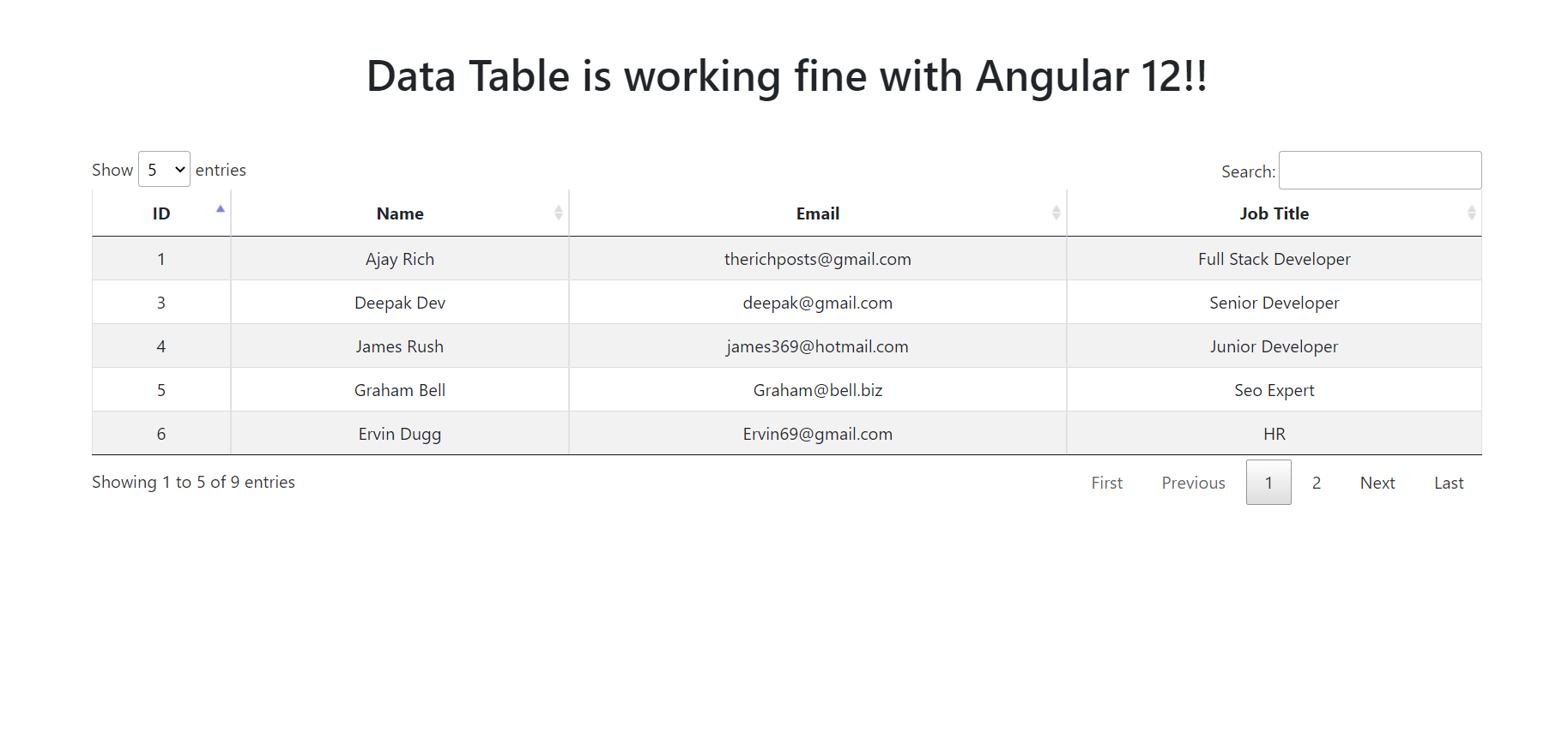
    Hello friends, welcome back to my blog. Today in this blog post, I am going to show you, Angular 12 Datatable with Dynamic Data.

    Angular Datatable
    Angular 12 Datatable with Dynamic Data
    Angular 12 Datatable with Dynamic Data

    Angular12 came and if you are new then you must check below link:

    1. Angular12 Basic Tutorials

    Friends now I proceed onwards and here is the working code snippet and please use carefully this to avoid the mistakes:

    1. Firstly friends we need fresh angular 12 setup and for this we need to run below commands but if you already have angular 12 setup then you can avoid below commands. Secondly we should also have latest node version installed on our system:

    npm install -g @angular/cli 
    
    ng new angulardatatable //Create new Angular Project
    
    cd angulardatatable // Go inside the Angular Project Folder

    2. Now friends, here we need to run below commands into our project terminal to install datatable modules, bootstrap(for good looks), jquery  modules into our angular application:

    I am also adding bootstrap to make datatable looks good.

    npm install jquery --save
    
    npm install datatables.net --save
    
    npm install datatables.net-dt --save
    
    npm install angular-datatables --save
    
    npm install @types/jquery --save-dev
    
    npm install @types/datatables.net --save-dev
    
    npm install bootstrap --save

    3. After done with commands add below code into you angular.json file:

    ...
    "styles": [
                  ...
                  "node_modules/datatables.net-dt/css/jquery.dataTables.css",
                  "node_modules/bootstrap/dist/css/bootstrap.min.css",
                ],
                "scripts": [
                "node_modules/jquery/dist/jquery.js",
                "node_modules/datatables.net/js/jquery.dataTables.js",
                "node_modules/bootstrap/dist/js/bootstrap.js",
                ]
    ...

    4. Now friends we need to  add below code into your src/app/app.module.ts file:

    ...
    import {DataTablesModule} from 'angular-datatables';
    import { HttpClientModule } from '@angular/common/http';
    ...
    imports: [
    ...
    DataTablesModule,
    HttpClientModule
    ]

    5. Now friends we just need to add below code into src/app/app.component.ts file:

    ...
    import { HttpClient } from '@angular/common/http';
    export class AppComponent {
     ...
      data:any;
      constructor(private http: HttpClient){
      //get request from web api
      this.http.get('https://www.testjsonapi.com/users/').subscribe(data => {
      
        this.data = data;
    
      setTimeout(()=>{   
        $('#datatableexample').DataTable( {
          pagingType: 'full_numbers',
          pageLength: 5,
          processing: true,
          lengthMenu : [5, 10, 25]
      } );
      }, 1);
            }, error => console.error(error));
    }
    
    
    }
    

    6. Now friends we need to add below code into app.component.html file to get final output on web browser:

    <table class="table table-striped table-bordered table-sm row-border hover" id="datatableexample">
      <thead>
        <tr>
          <th>ID</th>
          <th>Name</th>
          <th>Email</th>
          <th>Job Title</th>
        </tr>
      </thead>
      <tbody>
       <tr *ngFor="let group of data">
             <td>{{group.id}}</td>
             <td>{{group.name}}</td>
             <td>{{group.email}}</td>
             <td>{{group.job_title}}</td>
         </tr>
      </tbody>
    </table>

    Now we are done friends and please run ng serve command and if you have any kind of query then please do comment below.

    Note: Friends, I just tell the basic setup and things, you can change the code according to your requirements. For better understanding must watch video above.

    I will appreciate that if you will tell your views for this post. Nothing matters if your views will be good or bad.

    Jassa

    Thanks

  • Angular 12 FullCalendar Working Demo

    Angular 12 FullCalendar Working Demo

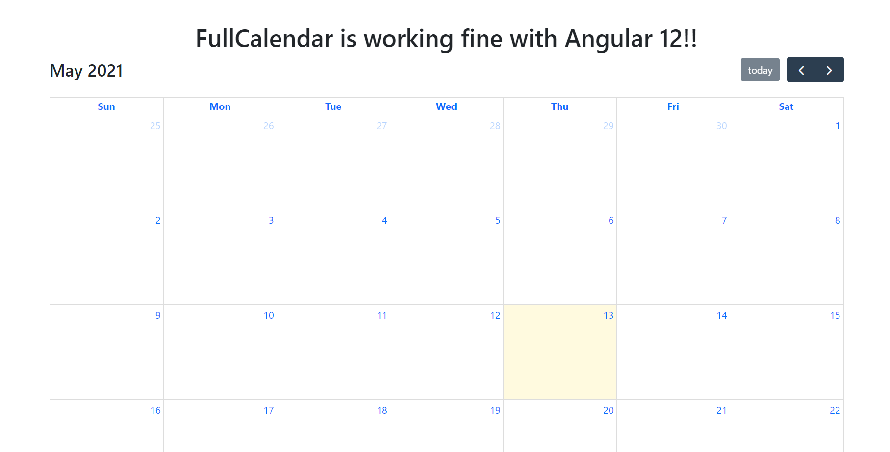
    Hello to all, welcome to therichpost.com. In this post, I will tell you, Angular 12 FullCalendar Working Demo.

    The main purpose of making this post is fullcalendar has been updated to version 5.

    Angular Full Calendar
    Angular 12 FullCalendar Working Demo
    Angular 12 FullCalendar Working Demo

    Angular12 came and if you are new then you must check below two links:

    1. Angular 12 Tutorials

    Here is the code snippet and please use carefully:

    1. Very first guys, here are common basics steps to add angular 12 application on your machine and also we must have latest nodejs version(14.17.0) installed for angular 12:

    $ npm install -g @angular/cli
    
    $ ng new angularfullcalendar // Set Angular 11 Application on your pc
    
    cd angularfullcalendar // Go inside project folder

    2. Now run below commands to set fullcalendar modules into our angular 12 application:

    npm install --save @fullcalendar/angular @fullcalendar/daygrid
    npm i @fullcalendar/interaction

    3. Now we will add below code into our angularfullcalendar/src/app/app.module.ts file:

    ...
    import { FullCalendarModule } from '@fullcalendar/angular'; 
    import dayGridPlugin from '@fullcalendar/daygrid'; 
    import interactionPlugin from '@fullcalendar/interaction'; 
    FullCalendarModule.registerPlugins([ 
      dayGridPlugin,
      interactionPlugin
    ]);
    ...
      imports: [
        ...
      FullCalendarModule 
      ],
     ...

    4. Now we will add below code into our angularfullcalendar/src/app/app.component.ts file:

    ...
    import { CalendarOptions } from '@fullcalendar/angular'; // useful for typechecking
    export class AppComponent {
      ...
      calendarOptions: CalendarOptions = {
        initialView: 'dayGridMonth',
        dateClick: this.handleDateClick.bind(this), // bind is important!
        events: [
          { title: 'event 1', date: '2020-06-27' },
          { title: 'event 2', date: '2020-06-30' }
        ]
      };
      handleDateClick(arg) {
        alert('date click! ' + arg.dateStr)
      }
    }
    

    5. Finally we will add below code into our angularfullcalendar/src/app/app.component.html file:

    <full-calendar [options]="calendarOptions"></full-calendar>

    Now we are done friends and please run ng serve command and if you have any kind of query then please do comment below.

    Note: Friends, I just tell the basic setup and things, you can change the code according to your requirements. For better understanding must watch video above.

    I will appreciate that if you will tell your views for this post. Nothing matters if your views will be good or bad.

    Jassa

    Thanks

  • How to add bootstrap 5 in angular 12 application?

    How to add bootstrap 5 in angular 12 application?

    Hello friends, welcome back to my blog. Today in this blog post, I am going to tell you, How to add bootstrap 5 in angular 12 application?

    Here is the tutorial link for update angular version to 12: Update Angular 11 to Angular 12

    Add Bootstrap 5 in Angular 12

    Guy’s here are the more demos related to Angular 12 with Bootstrap 5:

    1. Bootstrap 5 Popover working in Angular 12
    2. Bootstrap 5 Tooltip working in Angular 12
    3. Bootstrap5 Modal with Forms in Angular 12


    Add Bootstrap 5 in Angular 12
    Add Bootstrap 5 in Angular 12
    Package.json file
    After run the npm bootstrap command which I have given below, you will see this code inside your package.json file

    Angular 12 came and Bootstrap 5 also and if you are new then you must check below two links:

    1. Angular 12 Tutorials
    2. Angular12 Free Templates
    3. Bootstrap 5

    Friends now I proceed onwards and here is the working code snippet for How to add bootstrap 5 in angular 12 application? and please use carefully this to avoid the mistakes:

    1. Firstly friends we need fresh angular 12 setup and for this we need to run below commands but if you already have angular 12 setup then you can avoid below commands. Secondly we should also have latest node version installed on our system:

    npm install -g @angular/cli 
    
    ng new angularboot5 //Create new Angular Project
    
    cd angularboot5 // Go inside the Angular Project Folder

    2. Now friends, here we need to run below commands into our project terminal to install bootstrap 5 modules into our angular application:

    npm install bootstrap
    
    npm i @popperjs/core

    3. Now friends we just need to add below code into src/app/app.component.html file to get final out on the web browser:

    <div class="container  text-center mt-5 mb-5">
      <h1>Bootstrap 5 is working fine with Angular 12!!</h1>
    </div>

    4. Now friends we just need to add below code into angular.json file:

    "styles": [
                  ...
                  "node_modules/bootstrap/dist/css/bootstrap.min.css"
              ],
    "scripts": [
                  ...
                   "node_modules/bootstrap/dist/js/bootstrap.min.js"
               ]

    Friends in the end must run ng serve command into your terminal to run the angular 12 project.

    Now we are done friends. If you have any kind of query, suggestion and new requirement then feel free to comment below.

    Note: Friends, In this post, I just tell the basic setup and things, you can change the code according to your requirements.

    I will appreciate that if you will tell your views for this post. Nothing matters if your views will be good or bad because with your views, I will make my next posts more good and helpful.

    Jassa

    Thanks

  • How to update angular version to 12?

    How to update angular version to 12?

    Hello guys, how are you? Welcome back to my blog therichpost.com. Today in this blog post, I will tell you How to update angular version to 12?

    Guys today I very happy because Angular12 finally came and here I will tell you to update angular version to 12 and Angular12 updating requirements.

    How to update angular version to 12?
    How to update angular version to 12?

    1. Friends very first we need to run below query inside our terminal to update our angular version to 12 and guys we also need latest node version(14.17.0) install into our system. We can not use older version of Nodejs with Angular 12:

    ng update @angular/core@12 @angular/cli@12

    2. After run above command open your package.json file and you will like below image:

    Angular 12 Package Json file
    Angular 12 Package Json file

    Friends in the end must run ng serve command into your terminal to run the angular 12 project.

    Running Angular 12

    Now guys I will come with more Angular 12 demos and Snippets.

    Jassa

    Thanks

  • Reactjs Datatable with Export Buttons Print CSV Copy with Dynamic Data

    Reactjs Datatable with Export Buttons Print CSV Copy with Dynamic Data

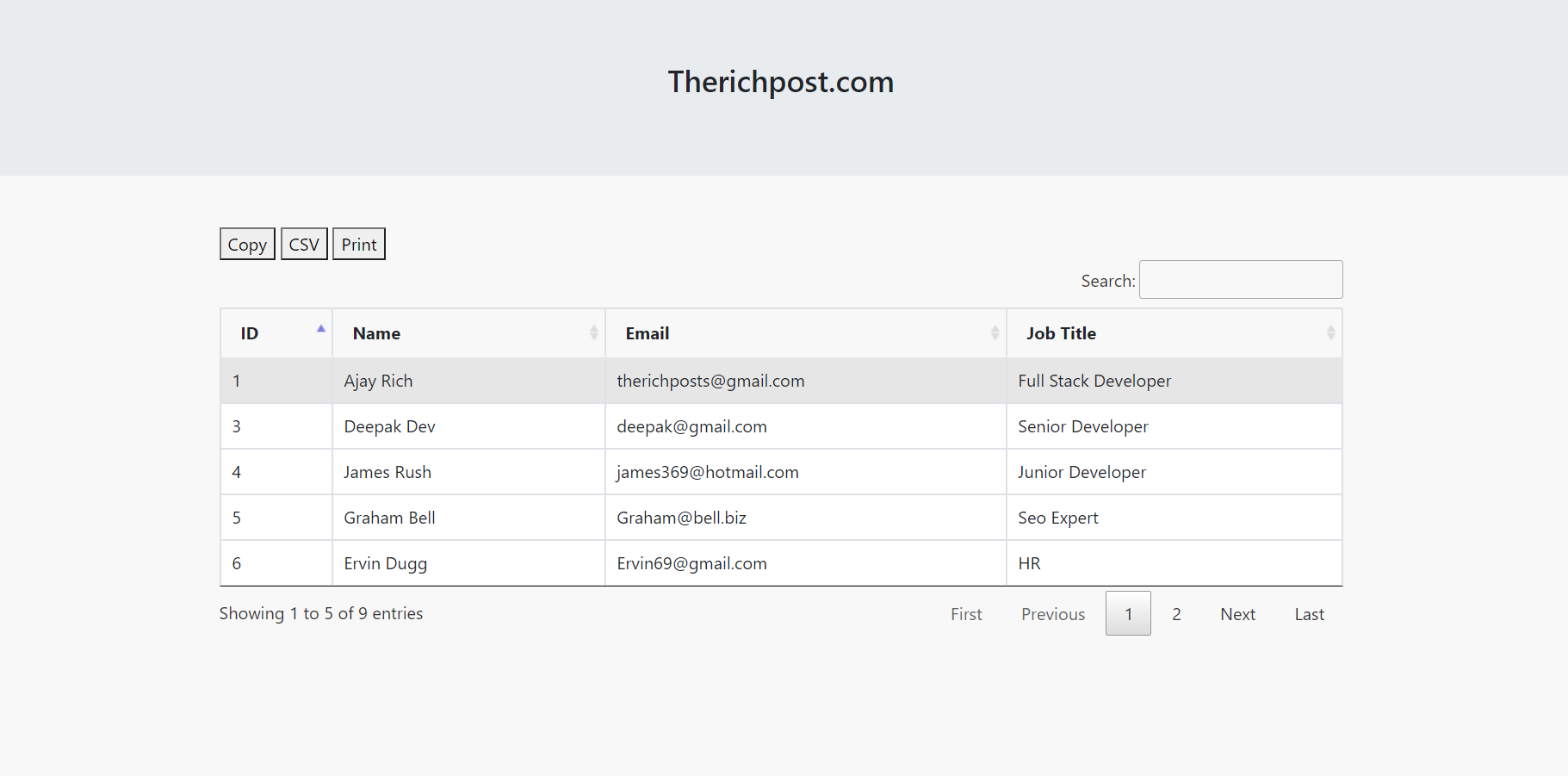
    Hello friends, welcome back to my blog. Today in this blog post, I am going to show you, Reactjs Datatable with Export Buttons Print CSV Copy with Dynamic Data.

    Friends with this post, we will cover with below functionalities. I am making this post because my blog viewers told me many time to make post on React js data table with export buttons.

    1. How to fetch and show api json data in reactjs application?
    2. How to use jquery datatable in reactjs application?
    3. Reactjs datatable with dynamic data.
    4. React js datatable with export buttons.
    React js Data Table with Export Buttons
    Reactjs Datatable with Export Buttons Print CSV Copy with Dynamic Data
    Reactjs Datatable with Export Buttons Print CSV Copy with Dynamic Data

    For reactjs new comers, please check the below link:

    Reactjs Basic Tutorials


    Friends now I proceed onwards and here is the working code snippet please use this carefully to avoid the mistakes:

    1. Firstly friends we need fresh reactjs setup and for that we need to run below commands into our terminal and also w should have latest node version installed on our system:

    npx create-react-app reactdatatable
    
    cd reactdatatable
    
    npm start // run the project

    2. Now we need to run below commands to get bootstrap(for good layout), datatable and axios(to post data request to web api)  modules into our react js app:

    npm install datatables.net --save
    
    npm install datatables.net-dt --save
    
    npm install datatables.net-buttons --save
    
    npm install datatables.net-buttons-dt --save
    
    npm install @types/datatables.net-buttons --save-dev
    
    npm install bootstrap --save
    
    npm install axios --save
    
    npm install jquery --save
    
    npm start

    3. Now friends, after are done with commands, now please open reactdatatable/src/App.js file and add below code inside it:

    import React from 'react';
    //Bootstrap and jQuery libraries
    import 'bootstrap/dist/css/bootstrap.min.css';
    import 'jquery/dist/jquery.min.js';
    
    //Datatable Modules
    import "datatables.net-dt/js/dataTables.dataTables"
    import "datatables.net-dt/css/jquery.dataTables.min.css"
    import "datatables.net-buttons/js/dataTables.buttons.js"
    import "datatables.net-buttons/js/buttons.colVis.js"
    import "datatables.net-buttons/js/buttons.flash.js"
    import "datatables.net-buttons/js/buttons.html5.js"
    import "datatables.net-buttons/js/buttons.print.js"
    import "datatables.net-dt/css/jquery.dataTables.min.css"
    import $ from 'jquery'; 
    
    //For API Requests
    import axios from 'axios';
    
    class App extends React.Component {
    
      // State array variable to save and show data
      constructor(props) {
        super(props)
          this.state = {
            data: [],
           
          }}
      componentDidMount() {
           //Get all users details in bootstrap table
            axios.get('https://www.testjsonapi.com/users/').then(res => 
            {
              //Storing users detail in state array object
              this.setState({data: res.data});
            
            }); 
        //initialize datatable
        $(document).ready(function () {
            setTimeout(function(){
            $('#example').DataTable(
                {
                    pagingType: 'full_numbers',
                      pageLength: 5,
                      processing: true,
                      dom: 'Bfrtip',
                          buttons: ['copy', 'csv', 'print'
                          ]
                }
            );
            } ,
            1000
            );
        });
     }
      render(){
        //Datatable HTML
      return (
        <div className="MainDiv">
        
              <h3>Therichpost.com</h3>
        
          
          <div className="container p-5">
              
              <table id="example" class="table table-hover table-bordered">
              <thead>
                <tr>
                  <th>ID</th>
                  <th>Name</th>
                  <th>Email</th>
                  <th>Job Title</th>
                </tr>
              </thead>
              <tbody>
              {this.state.data.map((result) => {
                return (
                 
                     <tr>
                      <td>{result.id}</td>
                      <td>{result.name}</td>
                      <td>{result.email}</td>
                      <td>{result.job_title}</td>
                    </tr>
                 
                )
              })}
               
                
              </tbody>
            </table>
              
            </div>
          </div>
      );
    }
    }
    export default App;

    Now we are done friends. If you have any kind of query or suggestion or any requirement then feel free to comment below.

    Note: Friends, I just tell the basic setup and things, you can change the code according to your requirements. For better understanding must watch video above.

    I will appreciate that if you will tell your views for this post. Nothing matters if your views will good or bad.

    Jassa

    Thanks

  • Vue 3 Datatable with Export Buttons Print Csv Copy with Dynamic Data

    Vue 3 Datatable with Export Buttons Print Csv Copy with Dynamic Data

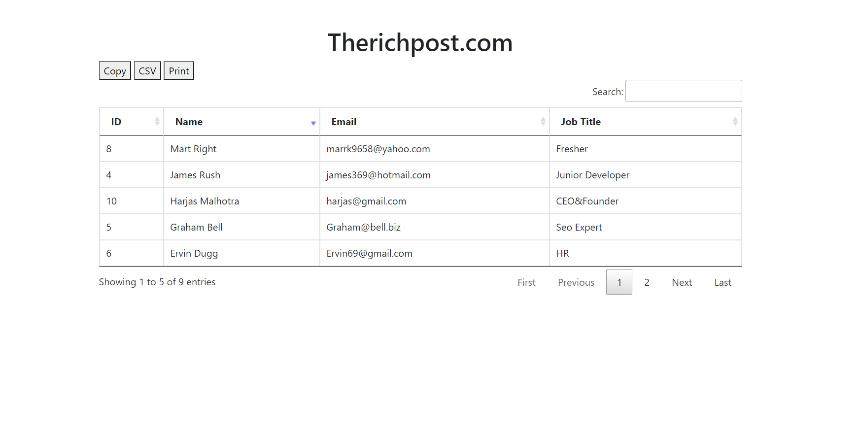
    Hello friends, welcome back to my blog. Today in this blog post, I am going to show you, Vue 3 Datatable with Export Buttons Print Csv Copy with Dynamic Data

    Friends with this post, we will cover with below functionalities. I am making this post because my blog viewers told me many time to make post on vue data table with export buttons.

    1. How to fetch and show api json data in vuejs application?
    2. How to use jquery datatable in vuejs application?
    3. Veujs datatable with dynamic data.
    4. Vue js datatable with export buttons

    Vuejs Datatable
    Vue 3 Datatable with Export Buttons Print Csv Copy with Dynamic Data
    Vue 3 Datatable with Export Buttons Print Csv Copy with Dynamic Data

    Vue 3 came and if you are new then you must check below two link:

    1. Vue3 Tutorials

    Friends now I proceed onwards and here is the working code snippet and use this carefully to avoid the mistakes:

    1. Firstly friends we need fresh vue 3 setup and for this we need to run below commands . Secondly we should also have latest node version installed on our system. With below we will have datatable, jquery, bootstrap and axios modules in our Vue 3 application:

    npm install -g @vue/cli
    
    vue create vuedatatable
    
    cd vuedatatable
    
    npm install datatables.net --save
    
    npm install datatables.net-dt --save
    
    npm install datatables.net-buttons --save
    
    npm install datatables.net-buttons-dt --save
    
    npm install @types/datatables.net-buttons --save-dev
    
    npm install jquery --save
    npm i bootstrap
    npm i axios
    
    npm run serve //http://localhost:8080/


    2. Now friends we need to add below code into src/App.vue file to check the final output on browser:

    <template>
    
      <h1 class="text-center">Therichpost.com</h1>
       
       <table class="table table-hover table-bordered" id="example">
        <thead>
          <tr>
            <th>ID</th>
            <th>Name</th>
            <th>Email</th>
            <th>Job Title</th>
          </tr>
        </thead>
        <tbody>
          <tr v-for="user in users" :key="user.id">
            <td>{{user.id}}</td>
            <td>{{user.name}}</td>
            <td>{{user.email}}</td>
            <td>{{user.job_title}}</td>
          </tr>
          
        </tbody>
      </table>
      
      
    </template>
    
    <script>
    //Bootstrap and jQuery libraries
    import 'bootstrap/dist/css/bootstrap.min.css'; //for table good looks
    import 'jquery/dist/jquery.min.js';
    //Datatable Modules
    import "datatables.net-dt/js/dataTables.dataTables"
    import "datatables.net-dt/css/jquery.dataTables.min.css"
    import "datatables.net-buttons/js/dataTables.buttons.js"
    import "datatables.net-buttons/js/buttons.colVis.js"
    import "datatables.net-buttons/js/buttons.flash.js"
    import "datatables.net-buttons/js/buttons.html5.js"
    import "datatables.net-buttons/js/buttons.print.js"
    import $ from 'jquery'; 
    import axios from 'axios'; //for api calling
    export default {
     
      mounted(){
        //Web api calling for dynamic data and you can also use into your demo project
        axios
        .get("https://www.testjsonapi.com/users/")
        .then((res)=>
        {
          this.users = res.data;
          setTimeout(function(){
          $('#example').DataTable(
              {
                  pagingType: 'full_numbers',
                    pageLength: 5,
                    processing: true,
                    dom: 'Bfrtip',
                        buttons: ['copy', 'csv', 'print'
                        ]
              }
          );
          },
            1000
            );
        })
      },
      data: function() {
            return {
                users:[]
            }
        },
    }
    </script>


    Now we are done friends  also and If you have any kind of query or suggestion or any requirement then feel free to comment below.

    Note: Friends, I just tell the basic setup and things, you can change the code according to your requirements. For better understanding must watch video above.

    I will appreciate that if you will tell your views for this post. Nothing matters if your views will be good or bad.

    Jassa

    Thanks

  • Reactjs Bootstrap 5 Free Responsive Template

    Reactjs Bootstrap 5 Free Responsive Template

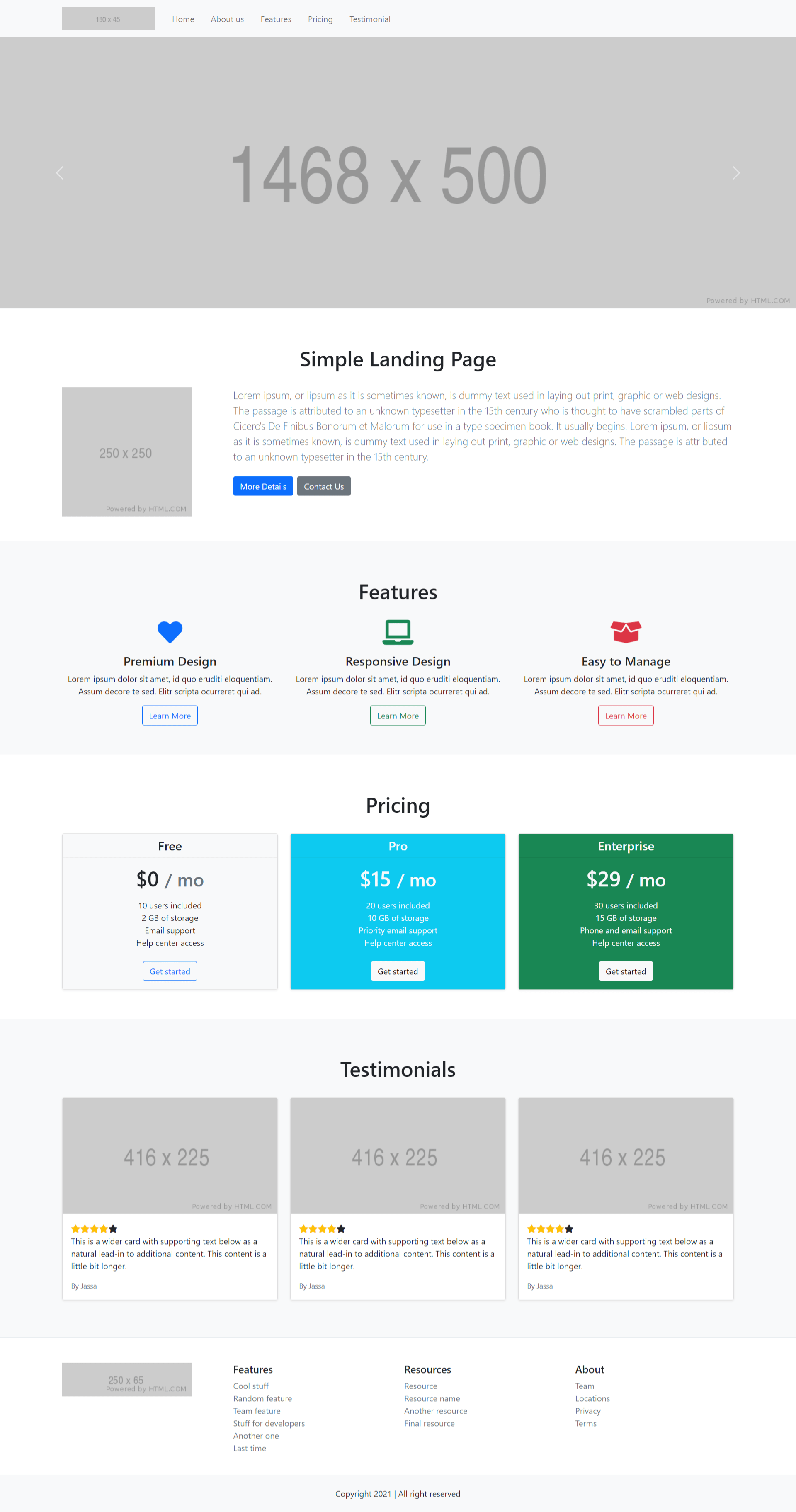
    Hello friends, welcome back to my blog. Today in this blog post, I am going to show you, Reactjs Bootstrap 5 Free Responsive Template.

    Guys in this post we will below things:

    1. React js Bootstrap 5 Responsive Template Creation.
    2. Implement Bootstrap 5 Carousel Slider in Reactjs Application.
    3. Implement Bootstrap 5 Toggle Navigation in Reactjs Application.

    React Free Templates
    Reactjs Bootstrap 5 Free Responsive Template
    Reactjs Bootstrap 5 Free Responsive Template

    For reactjs and bootstrap 5 new comers, please check the below link:

    Reactjs Basic Tutorials

    Bootstrap 5 Tutorials


    Friends now I proceed onwards and here is the working code snippet and please use this carefully to avoid the mistakes:

    1. Firstly, we need fresh reactjs setup and for that, we need to run below commands into out terminal and also we should have latest node version installed on our system:

    npx create-react-app reactboot5
    
    cd reactboot5

    2. Now we need to run below commands into our project terminal to get bootstrap and related modules into our reactjs application:

    npm install bootstrap@next --save
    
    npm start //For start project again

    3. Finally for the main output, we need to add below code into our reactboot5/src/App.js file or if you have fresh setup then you can replace reactboot5/src/App.js file code with below code:

    import React from 'react';
    import "bootstrap/dist/css/bootstrap.min.css";
    import "bootstrap/dist/js/bootstrap.min.js";
    import "./App.css";
    function App() {
      
      return (
        <div className="App">
        <header>
      
      <nav class="navbar navbar-expand-lg navbar-light bg-light">
          <div class="container">
              <a class="navbar-brand" target="_blank" href="#">
                  <img class="img-fluid" src="https://via.placeholder.com/180x45" />
              </a>
              <button class="navbar-toggler" type="button" data-bs-toggle="collapse" data-bs-target="#navbarText" aria-controls="navbarText" aria-expanded="false" aria-label="Toggle navigation">
                <span class="navbar-toggler-icon"></span>
              </button>
              <div class="collapse navbar-collapse" id="navbarText">
                <ul class="navbar-nav me-auto mb-2 mb-lg-0">
                      <li class="nav-item active">
                          <a class="nav-link p-3" href="#">Home <span class="sr-only">(current)</span></a>
                      </li>
                      <li class="nav-item">
                          <a class="nav-link p-3" href="#about-us">About us</a>
                      </li>
                      <li class="nav-item">
                          <a class="nav-link p-3" href="#features">Features</a>
                      </li>
                      <li class="nav-item">
                          <a class="nav-link p-3" href="#pricing">Pricing</a>
                      </li>
                      <li class="nav-item">
                          <a class="nav-link p-3" href="#testimonial">Testimonial</a>
                      </li>
                  </ul>
              </div>
          </div>
      </nav>
    </header>
    <main>
      <section>
        
          <div id="carouselExampleControls" class="carousel slide" data-bs-ride="carousel">
              <div class="carousel-inner">
                  <div class="carousel-item active">
                      <a target="_blank" href="#"><img src="https://via.placeholder.com/1468x500" class="d-block w-100" alt="..." /></a>
                  </div>
                  <div class="carousel-item">
                      <a target="_blank" href="#"><img src="https://via.placeholder.com/1468x500" class="d-block w-100" alt="..." /></a>
                  </div>
                  <div class="carousel-item">
                      <a target="_blank" href="#"><img src="https://via.placeholder.com/1468x500" class="d-block w-100" alt="..." /></a>
                  </div>
              </div>
              <a class="carousel-control-prev" href="#carouselExampleControls" role="button" data-bs-target="#carouselExampleControls" data-bs-slide="prev">
                  <span class="carousel-control-prev-icon" aria-hidden="true"></span>
                  <span class="sr-only">Previous</span>
              </a>
              <a class="carousel-control-next" href="#carouselExampleControls" role="button" data-bs-target="#carouselExampleControls" data-bs-slide="next">
                  <span class="carousel-control-next-icon" aria-hidden="true"></span>
                  <span class="sr-only">Next</span>
              </a>
          </div>
      </section>
      <section id="about-us" class="py-5">
          <div class="container">
              <div class="text-center py-4">
                  <h1>Simple Landing Page</h1>
              </div>
              <div class="row">
                  <div class="col-md-3">
                      <a target="_blank" href="#">
                          <img src="https://via.placeholder.com/250x250" class="d-block img-fluid" alt="..." />
                      </a>
                  </div>
                  <div class="col-md-9">
                      <p class="lead text-muted">Lorem ipsum, or lipsum as it is sometimes known, is dummy text used in laying out print, graphic or web designs. The passage is attributed to an unknown typesetter in the 15th century who is thought to have scrambled parts of Cicero's De Finibus Bonorum et Malorum for use in a type specimen book. It usually begins. Lorem ipsum, or lipsum as it is sometimes known, is dummy text used in laying out print, graphic or web designs. The passage is attributed to an unknown typesetter in the 15th century.</p>
                      <p>
                          <a href="#" class="btn btn-primary my-2 me-2">More Details</a>
                          <a href="#" class="btn btn-secondary my-2">Contact Us</a>
                      </p>
                  </div>
              </div>
          </div>
      </section>
    
      <section id="features" class="py-5 bg-light">
          <div class="container">
              <div class="text-center py-4">
                  <h1>Features</h1>
              </div>
              <div class="row">
                  <div class="col-md-4 col-sm-4 mb-2">
                      <div class="box-part text-center">
                          <i class="text-primary fas fa-heart fa-3x mb-3" aria-hidden="true"></i>
                          <div class="title">
                              <h4>Premium Design</h4>
                          </div>
                          <div class="text mb-3">
                              <span>Lorem ipsum dolor sit amet, id quo eruditi eloquentiam. Assum decore te sed. Elitr scripta ocurreret qui ad.</span>
                          </div>
                          <a class="btn btn-outline-primary" href="#">Learn More</a>
                      </div>
                  </div>
                  <div class="col-md-4 col-sm-4 mb-2">
                      <div class="box-part text-center">
                          <i class="text-success fas fa-laptop fa-3x mb-3" aria-hidden="true"></i>
                          <div class="title">
                              <h4>Responsive Design</h4>
                          </div>
                          <div class="text mb-3">
                              <span>Lorem ipsum dolor sit amet, id quo eruditi eloquentiam. Assum decore te sed. Elitr scripta ocurreret qui ad.</span>
                          </div>
                          <a class="btn btn-outline-success" href="#">Learn More</a>
                      </div>
                  </div>
                  <div class="col-md-4 col-sm-4 mb-2">
                      <div class="box-part text-center">
                          <i class="text-danger fas fa-box-open fa-3x mb-3" aria-hidden="true"></i>
                          <div class="title">
                              <h4>Easy to Manage</h4>
                          </div>
                          <div class="text mb-3">
                              <span>Lorem ipsum dolor sit amet, id quo eruditi eloquentiam. Assum decore te sed. Elitr scripta ocurreret qui ad.</span>
                          </div>
                          <a class="btn btn-outline-danger" href="#">Learn More</a>
                      </div>
                  </div>
              </div>
          </div>
      </section>
    
      <section id="pricing" class="py-5">
          <div class="container">
            <div class="row text-center">
              <div class="py-4">
                  <h1>Pricing</h1>
              </div>
              
                  <div class="col-sm-4 mb-2">
                    <div class="card shadow-sm">
                      <div class="card-header bg-light">
                          <h4 class="my-0 font-weight-normal">Free</h4>
                      </div>
                      <div class="card-body bg-light">
                          <h1 class="card-title pricing-card-title">$0 <small class="text-muted">/ mo</small></h1>
                          <ul class="list-unstyled mt-3 mb-4">
                              <li>10 users included</li>
                              <li>2 GB of storage</li>
                              <li>Email support</li>
                              <li>Help center access</li>
                          </ul>
                          <button type="button" class="btn btn-block btn-outline-primary">Get started</button>
                      </div>
                    </div>
                  </div>
                  <div class="col-sm-4 mb-2">
                    <div class="card shadow-sm">
                      <div class="card-header bg-info text-light">
                          <h4 class="my-0 font-weight-normal">Pro</h4>
                      </div>
                      <div class="card-body bg-info text-light">
                          <h1 class="card-title pricing-card-title">$15 <small>/ mo</small></h1>
                          <ul class="list-unstyled mt-3 mb-4">
                              <li>20 users included</li>
                              <li>10 GB of storage</li>
                              <li>Priority email support</li>
                              <li>Help center access</li>
                          </ul>
                          <button type="button" class="btn btn-block btn-light">Get started</button>
                      </div>
                    </div>
                  </div>
                  <div class="col-sm-4 mb-2">
                    <div class="card shadow-sm">
                      <div class="card-header bg-success text-light">
                          <h4 class="my-0 font-weight-normal">Enterprise</h4>
                      </div>
                      <div class="card-body bg-success text-light">
                          <h1 class="card-title pricing-card-title">$29 <small>/ mo</small></h1>
                          <ul class="list-unstyled mt-3 mb-4">
                              <li>30 users included</li>
                              <li>15 GB of storage</li>
                              <li>Phone and email support</li>
                              <li>Help center access</li>
                          </ul>
                          <button type="button" class="btn btn-block btn-light">Get started</button>
                      </div>
                    </div>
                  </div>
              
          </div>
        </div>
      </section>
    
      <section id="testimonial" class="py-5 bg-light">
          <div class="container">
              <div class="text-center py-4">
                  <h1>Testimonials</h1>
              </div>
             
                    <div class="row">
                     
                        
                              <div class="col-md-4">
                                  <div class="card mb-4 shadow-sm">
                                      <a href="#">
                                          <img class="img-fluid" src="https://via.placeholder.com/416x225" alt="" />
                                      </a>
                                      <div class="card-body">
                                          <div class="stars d-inline">
                                              <span class="fas fa-star text-warning"></span>
                                              <span class="fas fa-star text-warning"></span>
                                              <span class="fas fa-star text-warning"></span>
                                              <span class="fas fa-star text-warning"></span>
                                              <span class="fas fa-star"></span>
                                          </div>
                                          <p class="card-text">This is a wider card with supporting text below as a natural lead-in to additional content. This content is a little bit longer.</p>
                                          <div class="d-flex justify-content-between align-items-center">
                                              <small class="text-muted">By Jassa</small>
                                          </div>
                                      </div>
                                  </div>
                              </div>
              </div>
          </div>
      </section>
    
    </main>
    <footer class="pt-4 pt-md-5 border-top">
      <div class="container">
          <div class="row">
              <div class="col-12 col-md">
                  <a href="#">
                      <img class="img-fluid" src="https://via.placeholder.com/250x65" />
                  </a>
              </div>
              <div class="col-6 col-md">
                  <h5>Features</h5>
                  <ul class="list-unstyled text-small">
                      <li><a class="text-muted" href="#">Cool stuff</a></li>
                      <li><a class="text-muted" href="#">Random feature</a></li>
                      <li><a class="text-muted" href="#">Team feature</a></li>
                      <li><a class="text-muted" href="#">Stuff for developers</a></li>
                      <li><a class="text-muted" href="#">Another one</a></li>
                      <li><a class="text-muted" href="#">Last time</a></li>
                  </ul>
              </div>
              <div class="col-6 col-md">
                  <h5>Resources</h5>
                  <ul class="list-unstyled text-small">
                      <li><a class="text-muted" href="#">Resource</a></li>
                      <li><a class="text-muted" href="#">Resource name</a></li>
                      <li><a class="text-muted" href="#">Another resource</a></li>
                      <li><a class="text-muted" href="#">Final resource</a></li>
                  </ul>
              </div>
              <div class="col-6 col-md">
                  <h5>About</h5>
                  <ul class="list-unstyled text-small">
                      <li><a class="text-muted" href="#">Team</a></li>
                      <li><a class="text-muted" href="#">Locations</a></li>
                      <li><a class="text-muted" href="#">Privacy</a></li>
                      <li><a class="text-muted" href="#">Terms</a></li>
                  </ul>
              </div>
          </div>
      </div>
      <div class="text-center py-4 bg-light mt-4">Copyright 2021 | All right reserved</div>
    </footer>
          
        </div>
      );
    }
    
    export default App;
    

    4. Now we need to add below code into our reactboot5/src/App.css file:

    a{
        text-decoration: none!important;
      }

    5. Now we need to add below code into our reactboot5/public/index.html file for icons:

    ...
    <head>
    ...
     <link href="https://use.fontawesome.com/releases/v5.7.0/css/all.css" rel="stylesheet">
      </head>

    Now we are done friends. If you have any kind of query or suggestion or any requirement then feel free to comment below.

    Note: Friends, I just tell the basic setup and things, you can change the code according to your requirements.

    I will appreciate that if you will tell your views for this post. Nothing matters if your views will be good or bad.

    Jassa

    Thanks

  • Vue 3 Bootstrap 5 Responsive Template Free Download

    Vue 3 Bootstrap 5 Responsive Template Free Download

    Hello friends, welcome back to my blog. Today in this blog post, I am going to show you, Vue 3 Bootstrap 5 Responsive Template Free Download.

    Guys in this post, we will cover below things:

    1. Vuejs Bootstrap 5 Responsive Template Creation.
    2. Implement Bootstrap 5 Carousel Slider in Vue 3 Application.
    3. Implement Bootstrap 5 Toggle Navigation in Vue 3 Application.
    Bootstrap 5 in Vuejs

    Vue 3 Bootstrap 5 Responsive Template Free Download
    Vue 3 Bootstrap 5 Responsive Template Free Download

    Vue 3 and Bootstrap 5 came and if you are new then you must check below two links:

    1. Vuejs
    2. Bootstrap 5

    Friends now I proceed onwards and here is the working code snippet and use this carefully to avoid the mistakes:

    1. Firstly friends we need fresh vue 3 setup and for this we need to run below commands . Secondly we should also have latest node version installed on our system. With below we will have  bootstrap 5 modules in our Vue 3 application:

    npm install -g @vue/cli
    
    vue create vueboot5
    
    cd vueboot5
    
    npm i bootstrap@next
    
    npm run serve //http://localhost:8080/


    2. Now friends we need to add below code into vueboot5/src/App.vue file to check the final output on browser:

    <template>
     <header>
      <nav class="navbar navbar-expand-lg navbar-light bg-light">
          <div class="container">
              <a class="navbar-brand" target="_blank" href="#">
                  <img class="img-fluid" src="https://via.placeholder.com/180x45">
              </a>
              <button class="navbar-toggler" type="button" data-bs-toggle="collapse" data-bs-target="#navbarText" aria-controls="navbarText" aria-expanded="false" aria-label="Toggle navigation">
                <span class="navbar-toggler-icon"></span>
              </button>
              <div class="collapse navbar-collapse" id="navbarText">
                <ul class="navbar-nav me-auto mb-2 mb-lg-0">
                      <li class="nav-item active">
                          <a class="nav-link p-3" href="#">Home <span class="sr-only">(current)</span></a>
                      </li>
                      <li class="nav-item">
                          <a class="nav-link p-3" href="#about-us">About us</a>
                      </li>
                      <li class="nav-item">
                          <a class="nav-link p-3" href="#features">Features</a>
                      </li>
                      <li class="nav-item">
                          <a class="nav-link p-3" href="#pricing">Pricing</a>
                      </li>
                      <li class="nav-item">
                          <a class="nav-link p-3" href="#testimonial">Testimonial</a>
                      </li>
                  </ul>
              </div>
          </div>
      </nav>
    </header>
    <main>
      <section>
          <div id="carouselExampleControls" class="carousel slide" data-bs-ride="carousel">
              <div class="carousel-inner">
                  <div class="carousel-item active">
                      <a target="_blank" href="#"><img src="https://via.placeholder.com/1468x500" class="d-block w-100" alt="..."></a>
                  </div>
                  <div class="carousel-item">
                      <a target="_blank" href="#"><img src="https://via.placeholder.com/1468x500" class="d-block w-100" alt="..."></a>
                  </div>
                  <div class="carousel-item">
                      <a target="_blank" href="#"><img src="https://via.placeholder.com/1468x500" class="d-block w-100" alt="..."></a>
                  </div>
              </div>
              <a class="carousel-control-prev" href="#carouselExampleControls" role="button" data-bs-target="#carouselExampleControls" data-bs-slide="prev">
                  <span class="carousel-control-prev-icon" aria-hidden="true"></span>
                  <span class="sr-only">Previous</span>
              </a>
              <a class="carousel-control-next" href="#carouselExampleControls" role="button" data-bs-target="#carouselExampleControls" data-bs-slide="next">
                  <span class="carousel-control-next-icon" aria-hidden="true"></span>
                  <span class="sr-only">Next</span>
              </a>
          </div>
      </section>
      <section id="about-us" class="py-5">
          <div class="container">
              <div class="text-center py-4">
                  <h1>Simple Landing Page</h1>
              </div>
              <div class="row">
                  <div class="col-md-3">
                      <a target="_blank" href="#">
                          <img src="https://via.placeholder.com/250x250" class="d-block img-fluid" alt="...">
                      </a>
                  </div>
                  <div class="col-md-9">
                      <p class="lead text-muted">Lorem ipsum, or lipsum as it is sometimes known, is dummy text used in laying out print, graphic or web designs. The passage is attributed to an unknown typesetter in the 15th century who is thought to have scrambled parts of Cicero's De Finibus Bonorum et Malorum for use in a type specimen book. It usually begins. Lorem ipsum, or lipsum as it is sometimes known, is dummy text used in laying out print, graphic or web designs. The passage is attributed to an unknown typesetter in the 15th century.</p>
                      <p>
                          <a href="#" class="btn btn-primary my-2 me-2">More Details</a>
                          <a href="#" class="btn btn-secondary my-2">Contact Us</a>
                      </p>
                  </div>
              </div>
          </div>
      </section>
    
      <section id="features" class="py-5 bg-light">
          <div class="container">
              <div class="text-center py-4">
                  <h1>Features</h1>
              </div>
              <div class="row">
                  <div class="col-md-4 col-sm-4 mb-2">
                      <div class="box-part text-center">
                          <i class="text-primary fas fa-heart fa-3x mb-3" aria-hidden="true"></i>
                          <div class="title">
                              <h4>Premium Design</h4>
                          </div>
                          <div class="text mb-3">
                              <span>Lorem ipsum dolor sit amet, id quo eruditi eloquentiam. Assum decore te sed. Elitr scripta ocurreret qui ad.</span>
                          </div>
                          <a class="btn btn-outline-primary" href="#">Learn More</a>
                      </div>
                  </div>
                  <div class="col-md-4 col-sm-4 mb-2">
                      <div class="box-part text-center">
                          <i class="text-success fas fa-laptop fa-3x mb-3" aria-hidden="true"></i>
                          <div class="title">
                              <h4>Responsive Design</h4>
                          </div>
                          <div class="text mb-3">
                              <span>Lorem ipsum dolor sit amet, id quo eruditi eloquentiam. Assum decore te sed. Elitr scripta ocurreret qui ad.</span>
                          </div>
                          <a class="btn btn-outline-success" href="#">Learn More</a>
                      </div>
                  </div>
                  <div class="col-md-4 col-sm-4 mb-2">
                      <div class="box-part text-center">
                          <i class="text-danger fas fa-box-open fa-3x mb-3" aria-hidden="true"></i>
                          <div class="title">
                              <h4>Easy to Manage</h4>
                          </div>
                          <div class="text mb-3">
                              <span>Lorem ipsum dolor sit amet, id quo eruditi eloquentiam. Assum decore te sed. Elitr scripta ocurreret qui ad.</span>
                          </div>
                          <a class="btn btn-outline-danger" href="#">Learn More</a>
                      </div>
                  </div>
              </div>
          </div>
      </section>
    
      <section id="pricing" class="py-5">
          <div class="container">
            <div class="row text-center">
              <div class="py-4">
                  <h1>Pricing</h1>
              </div>
              
                  <div class="col-sm-4 mb-2">
                    <div class="card shadow-sm">
                      <div class="card-header bg-light">
                          <h4 class="my-0 font-weight-normal">Free</h4>
                      </div>
                      <div class="card-body bg-light">
                          <h1 class="card-title pricing-card-title">$0 <small class="text-muted">/ mo</small></h1>
                          <ul class="list-unstyled mt-3 mb-4">
                              <li>10 users included</li>
                              <li>2 GB of storage</li>
                              <li>Email support</li>
                              <li>Help center access</li>
                          </ul>
                          <button type="button" class="btn btn-block btn-outline-primary">Get started</button>
                      </div>
                    </div>
                  </div>
                  <div class="col-sm-4 mb-2">
                    <div class="card shadow-sm">
                      <div class="card-header bg-info text-light">
                          <h4 class="my-0 font-weight-normal">Pro</h4>
                      </div>
                      <div class="card-body bg-info text-light">
                          <h1 class="card-title pricing-card-title">$15 <small>/ mo</small></h1>
                          <ul class="list-unstyled mt-3 mb-4">
                              <li>20 users included</li>
                              <li>10 GB of storage</li>
                              <li>Priority email support</li>
                              <li>Help center access</li>
                          </ul>
                          <button type="button" class="btn btn-block btn-light">Get started</button>
                      </div>
                    </div>
                  </div>
                  <div class="col-sm-4 mb-2">
                    <div class="card shadow-sm">
                      <div class="card-header bg-success text-light">
                          <h4 class="my-0 font-weight-normal">Enterprise</h4>
                      </div>
                      <div class="card-body bg-success text-light">
                          <h1 class="card-title pricing-card-title">$29 <small>/ mo</small></h1>
                          <ul class="list-unstyled mt-3 mb-4">
                              <li>30 users included</li>
                              <li>15 GB of storage</li>
                              <li>Phone and email support</li>
                              <li>Help center access</li>
                          </ul>
                          <button type="button" class="btn btn-block btn-light">Get started</button>
                      </div>
                    </div>
                  </div>
              
          </div>
        </div>
      </section>
    
      <section id="testimonial" class="py-5 bg-light">
          <div class="container">
              <div class="text-center py-4">
                  <h1>Testimonials</h1>
              </div>
             
                    <div class="row">
                     
                        
                              <div class="col-md-4">
                                  <div class="card mb-4 shadow-sm">
                                      <a href="#">
                                          <img class="img-fluid" src="https://via.placeholder.com/416x225" alt="">
                                      </a>
                                      <div class="card-body">
                                          <div class="stars d-inline">
                                              <span class="fas fa-star text-warning"></span>
                                              <span class="fas fa-star text-warning"></span>
                                              <span class="fas fa-star text-warning"></span>
                                              <span class="fas fa-star text-warning"></span>
                                              <span class="fas fa-star"></span>
                                          </div>
                                          <p class="card-text">This is a wider card with supporting text below as a natural lead-in to additional content. This content is a little bit longer.</p>
                                          <div class="d-flex justify-content-between align-items-center">
                                              <small class="text-muted">By Jassa</small>
                                          </div>
                                      </div>
                                  </div>
                              </div>
              </div>
          </div>
      </section>
    
    </main>
    <footer class="pt-4 pt-md-5 border-top">
      <div class="container">
          <div class="row">
              <div class="col-12 col-md">
                  <a href="#">
                      <img class="img-fluid" src="https://via.placeholder.com/250x65">
                  </a>
              </div>
              <div class="col-6 col-md">
                  <h5>Features</h5>
                  <ul class="list-unstyled text-small">
                      <li><a class="text-muted" href="#">Cool stuff</a></li>
                      <li><a class="text-muted" href="#">Random feature</a></li>
                      <li><a class="text-muted" href="#">Team feature</a></li>
                      <li><a class="text-muted" href="#">Stuff for developers</a></li>
                      <li><a class="text-muted" href="#">Another one</a></li>
                      <li><a class="text-muted" href="#">Last time</a></li>
                  </ul>
              </div>
              <div class="col-6 col-md">
                  <h5>Resources</h5>
                  <ul class="list-unstyled text-small">
                      <li><a class="text-muted" href="#">Resource</a></li>
                      <li><a class="text-muted" href="#">Resource name</a></li>
                      <li><a class="text-muted" href="#">Another resource</a></li>
                      <li><a class="text-muted" href="#">Final resource</a></li>
                  </ul>
              </div>
              <div class="col-6 col-md">
                  <h5>About</h5>
                  <ul class="list-unstyled text-small">
                      <li><a class="text-muted" href="#">Team</a></li>
                      <li><a class="text-muted" href="#">Locations</a></li>
                      <li><a class="text-muted" href="#">Privacy</a></li>
                      <li><a class="text-muted" href="#">Terms</a></li>
                  </ul>
              </div>
          </div>
      </div>
      <div class="text-center py-4 bg-light mt-4">Copyright 2021 | All right reserved</div>
    </footer>
    </template>
    <script>
    import "./App.css";
    import "bootstrap/dist/css/bootstrap.min.css";
    import "bootstrap/dist/js/bootstrap.min.js";
    export default {
     
    }
    </script>

    3. Now friends please create new file “App.css” inside vueboot5/src folder and add below code inside it:

    a
    {
        text-decoration: none!important;
    }

    4. Now friends we need to add below code into vueboot5/public/index.html file for icons:

    ...
    <head>
     <link href="https://use.fontawesome.com/releases/v5.7.0/css/all.css" rel="stylesheet">
    </head>

    Now we are done friends and If you have any kind of query or suggestion or any requirement then feel free to comment below.

    Note: Friends, I just tell the basic setup and things, you can change the code according to your requirements.

    I will appreciate that if you will tell your views for this post. Nothing matters if your views will be good or bad.

    Jassa

    Thanks

  • Angular 11 Bootstrap 5 Admin Dashboard Template Free

    Angular 11 Bootstrap 5 Admin Dashboard Template Free

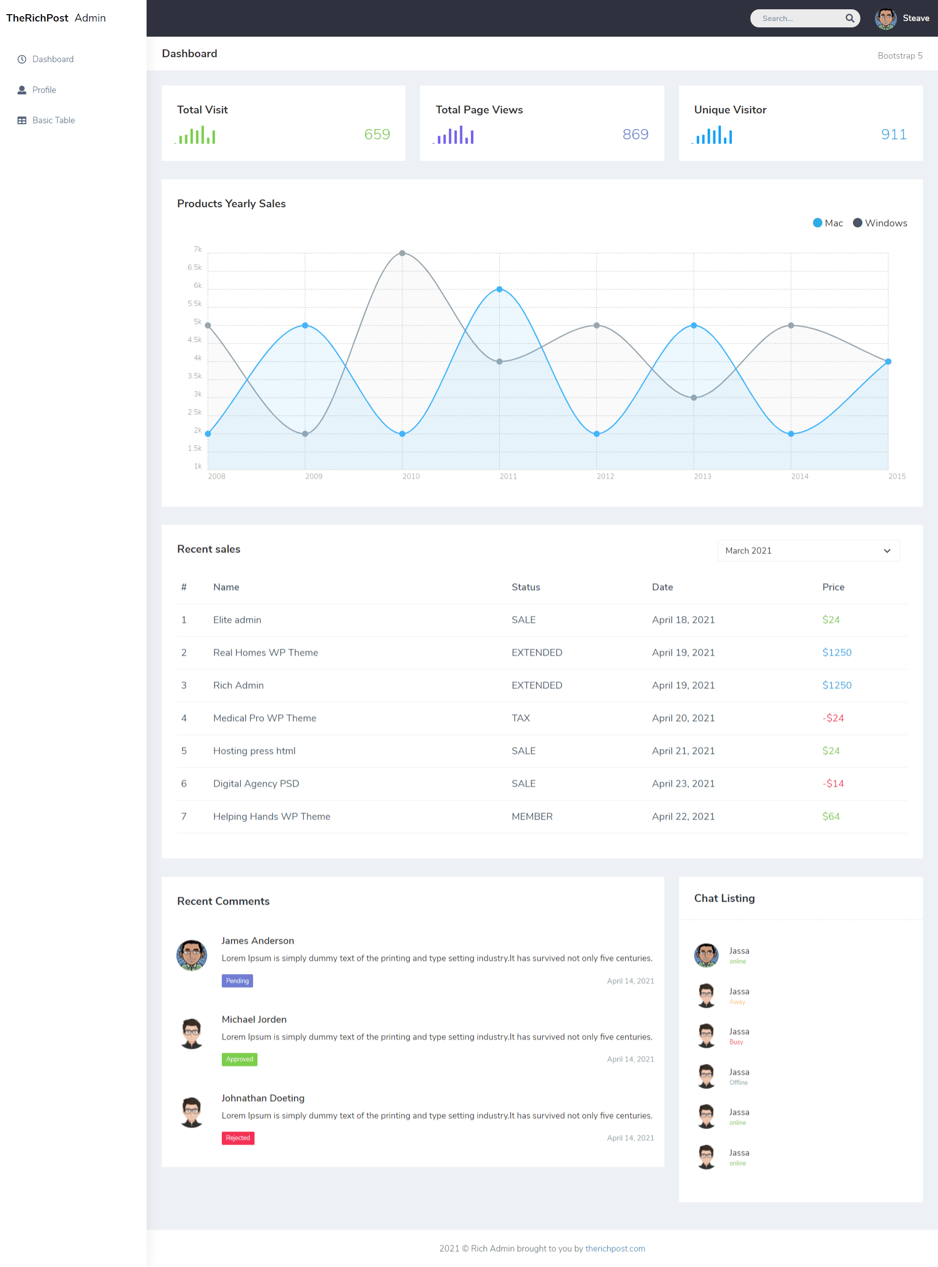
    Hello to all, welcome back to my blog. Today in this blog post, I am going to show you, Angular 11 Bootstrap 5 Admin Dashboard Template Free.

    Angular 11 templates

    Angular 11 Bootstrap 5 Admin Dashboard Template Free
    Angular 11 Bootstrap 5 Admin Dashboard Template Free

    Angular11 and Bootstrap 5 came and if you are new then you must check below links:

    1. Angular11 Basic Tutorials
    2. Bootstrap 5
    3. For more Angular Free Templates click here

    Friends now I proceed onwards and here is the working code snippet and use this carefully to avoid the mistakes:

    1. Firstly friends we need fresh angular 11 setup and for this we need to run below commands but if you already have angular 11 setup then you can avoid below commands. Secondly we should also have latest node version installed on our system:

    Guys you can skip this first step if you already have angular 11 fresh setup:

    npm install -g @angular/cli 
    
    ng new angularbootstrap //Create new Angular Project
    
    cd angularbootstrap  // Go inside the Angular Project Folder
    
    ng serve --open // Run and Open the Angular Project
    
    http://localhost:4200/ // Working Angular Project Url

    2. Now friends, please download zip(in this zip file there are js, css and images etc for angular bootstrap template) file from below path and extract zip and please put all the zip file folders in “src/assets” folder(which we will get from zip file):

    https://therichpost.com/bootstrap5admin.zip

    3. Now friends please add below code into angularbootstrap/src/index.html file:

    ...
    <head>
     ...
      <!-- Custom styles for this template -->
       <!-- Custom CSS -->
       <link href="assets/css/chartist.min.css" rel="stylesheet">
       <link rel="stylesheet" href="assets/css/chartist-plugin-tooltip.css">
       <!-- Custom CSS -->
       <link href="assets/css/style.min.css" rel="stylesheet">
        <!-- All Jquery -->
        <!-- ============================================================== -->
       
        <!-- Bootstrap tether Core JavaScript -->
        <script src="assets/js/bootstrap.bundle.min.js"></script>
        
        <!--This page JavaScript -->
        <!--chartis chart-->
        <script src="assets/js/jquery.min.js"></script>
        <script src="assets/js/chartist.min.js"></script>
        <script src="assets/js/chartist-plugin-tooltip.min.js"></script>
        <script src="assets/js/jquery.sparkline.min.js"></script>
         <!--Custom JavaScript -->
         <script src="assets/js/custom.js"></script>
    </head>
    ...

    4. Now friends we need to add below code into angularbootstrap/src/app/app.component.html file:

    <!-- ============================================================== -->
        <!-- Preloader -->
        <!-- ============================================================== -->
        <div class="preloader">
          <div class="lds-ripple">
              <div class="lds-pos"></div>
              <div class="lds-pos"></div>
          </div>
      </div>
      <!-- ============================================================== -->
      <!-- Main wrapper -->
      <!-- ============================================================== -->
      <div id="main-wrapper" data-layout="vertical" data-navbarbg="skin5" data-sidebartype="full"
          data-sidebar-position="absolute" data-header-position="absolute" data-boxed-layout="full">
          <!-- ============================================================== -->
          <!-- Topbar header -->
          <!-- ============================================================== -->
          <header class="topbar" data-navbarbg="skin5">
              <nav class="navbar top-navbar navbar-expand-md navbar-dark">
                  <div class="navbar-header" data-logobg="skin6">
                      <!-- ============================================================== -->
                      <!-- Logo -->
                      <!-- ============================================================== -->
                      <a class="navbar-brand" href="#">
                          <!-- Logo icon -->
                          <b class="logo-icon">
                              <!-- Dark Logo icon -->
                              TheRichPost
                          </b>
                          <!--End Logo icon -->
                          <!-- Logo text -->
                          <span class="logo-text">
                              <!-- dark Logo text -->
                             Admin
                          </span>
                      </a>
                      <!-- ============================================================== -->
                      <!-- End Logo -->
                      <!-- ============================================================== -->
                      <!-- ============================================================== -->
                      <!-- toggle and nav items -->
                      <!-- ============================================================== -->
                      <a class="nav-toggler waves-effect waves-light text-dark d-block d-md-none"
                          href="javascript:void(0)"><i class="ti-menu ti-close"></i></a>
                  </div>
                  <!-- ============================================================== -->
                  <!-- End Logo -->
                  <!-- ============================================================== -->
                  <div class="navbar-collapse collapse" id="navbarSupportedContent" data-navbarbg="skin5">
                     
                      <!-- ============================================================== -->
                      <!-- Right side toggle and nav items -->
                      <!-- ============================================================== -->
                      <ul class="navbar-nav ms-auto d-flex align-items-center">
    
                          <!-- ============================================================== -->
                          <!-- Search -->
                          <!-- ============================================================== -->
                          <li class=" in">
                              <form role="search" class="app-search d-none d-md-block me-3">
                                  <input type="text" placeholder="Search..." class="form-control mt-0">
                                  <a href="" class="active">
                                      <i class="fa fa-search"></i>
                                  </a>
                              </form>
                          </li>
                          <!-- ============================================================== -->
                          <!-- User profile and search -->
                          <!-- ============================================================== -->
                          <li>
                              <a class="profile-pic" href="#">
                                  <img src="https://therichpost.com/wp-content/uploads/2021/03/avatar2.png" alt="user-img" width="36"
                                      class="img-circle"><span class="text-white font-medium">Steave</span></a>
                          </li>
                          <!-- ============================================================== -->
                          <!-- User profile and search -->
                          <!-- ============================================================== -->
                      </ul>
                  </div>
              </nav>
          </header>
          <!-- ============================================================== -->
          <!-- End Topbar header -->
          <!-- ============================================================== -->
          <!-- ============================================================== -->
          <!-- Left Sidebar -->
          <!-- ============================================================== -->
          <aside class="left-sidebar" data-sidebarbg="skin6">
              <!-- Sidebar scroll-->
              <div class="scroll-sidebar">
                  <!-- Sidebar navigation-->
                  <nav class="sidebar-nav">
                      <ul id="sidebarnav">
                          <!-- User Profile-->
                          <li class="sidebar-item pt-2">
                              <a class="sidebar-link waves-effect waves-dark sidebar-link" href="#"
                                  aria-expanded="false">
                                  <i class="far fa-clock" aria-hidden="true"></i>
                                  <span class="hide-menu">Dashboard</span>
                              </a>
                          </li>
                          <li class="sidebar-item">
                              <a class="sidebar-link waves-effect waves-dark sidebar-link" href="#"
                                  aria-expanded="false">
                                  <i class="fa fa-user" aria-hidden="true"></i>
                                  <span class="hide-menu">Profile</span>
                              </a>
                          </li>
                          <li class="sidebar-item">
                              <a class="sidebar-link waves-effect waves-dark sidebar-link" href="#"
                                  aria-expanded="false">
                                  <i class="fa fa-table" aria-hidden="true"></i>
                                  <span class="hide-menu">Basic Table</span>
                              </a>
                          </li>
                         
                      </ul>
    
                  </nav>
                  <!-- End Sidebar navigation -->
              </div>
              <!-- End Sidebar scroll-->
          </aside>
          <!-- ============================================================== -->
          <!-- End Left Sidebar -->
          <!-- ============================================================== -->
          <!-- ============================================================== -->
          <!-- Page wrapper  -->
          <!-- ============================================================== -->
          <div class="page-wrapper">
              <!-- ============================================================== -->
              <!-- Bread crumb -->
              <!-- ============================================================== -->
              <div class="page-breadcrumb bg-white">
                  <div class="row align-items-center">
                      <div class="col-lg-3 col-md-4 col-sm-4 col-xs-12">
                          <h4 class="page-title">Dashboard</h4>
                      </div>
                      <div class="col-lg-9 col-sm-8 col-md-8 col-xs-12">
                          <div class="d-md-flex">
                              <ol class="breadcrumb ms-auto">
                                  <li><a href="#" class="fw-normal">Bootstrap 5</a></li>
                              </ol>
                             
                          </div>
                      </div>
                  </div>
                  <!-- /.col-lg-12 -->
              </div>
              <!-- ============================================================== -->
              <!-- End Bread -->
              <!-- ============================================================== -->
              <!-- ============================================================== -->
              <!-- Container fluid  -->
              <!-- ============================================================== -->
              <div class="container-fluid">
                  <!-- ============================================================== -->
                  <!-- Three charts -->
                  <!-- ============================================================== -->
                  <div class="row justify-content-center">
                      <div class="col-lg-4 col-md-12">
                          <div class="white-box analytics-info">
                              <h3 class="box-title">Total Visit</h3>
                              <ul class="list-inline two-part d-flex align-items-center mb-0">
                                  <li>
                                      <div id="sparklinedash"><canvas width="67" height="30"
                                              style="display: inline-block; width: 67px; height: 30px; vertical-align: top;"></canvas>
                                      </div>
                                  </li>
                                  <li class="ms-auto"><span class="counter text-success">659</span></li>
                              </ul>
                          </div>
                      </div>
                      <div class="col-lg-4 col-md-12">
                          <div class="white-box analytics-info">
                              <h3 class="box-title">Total Page Views</h3>
                              <ul class="list-inline two-part d-flex align-items-center mb-0">
                                  <li>
                                      <div id="sparklinedash2"><canvas width="67" height="30"
                                              style="display: inline-block; width: 67px; height: 30px; vertical-align: top;"></canvas>
                                      </div>
                                  </li>
                                  <li class="ms-auto"><span class="counter text-purple">869</span></li>
                              </ul>
                          </div>
                      </div>
                      <div class="col-lg-4 col-md-12">
                          <div class="white-box analytics-info">
                              <h3 class="box-title">Unique Visitor</h3>
                              <ul class="list-inline two-part d-flex align-items-center mb-0">
                                  <li>
                                      <div id="sparklinedash3"><canvas width="67" height="30"
                                              style="display: inline-block; width: 67px; height: 30px; vertical-align: top;"></canvas>
                                      </div>
                                  </li>
                                  <li class="ms-auto"><span class="counter text-info">911</span>
                                  </li>
                              </ul>
                          </div>
                      </div>
                  </div>
                  <!-- ============================================================== -->
                  <!-- PRODUCTS YEARLY SALES -->
                  <!-- ============================================================== -->
                  <div class="row">
                      <div class="col-md-12 col-lg-12 col-sm-12 col-xs-12">
                          <div class="white-box">
                              <h3 class="box-title">Products Yearly Sales</h3>
                              <div class="d-md-flex">
                                  <ul class="list-inline d-flex ms-auto">
                                      <li class="ps-3">
                                          <h5><i class="fa fa-circle me-1 text-info"></i>Mac</h5>
                                      </li>
                                      <li class="ps-3">
                                          <h5><i class="fa fa-circle me-1 text-inverse"></i>Windows</h5>
                                      </li>
                                  </ul>
                              </div>
                              <div id="ct-visits" style="height: 405px;">
                                  <div class="chartist-tooltip" style="top: -17px; left: -12px;"><span
                                          class="chartist-tooltip-value">6</span>
                                  </div>
                              </div>
                          </div>
                      </div>
                  </div>
                  <!-- ============================================================== -->
                  <!-- RECENT SALES -->
                  <!-- ============================================================== -->
                  <div class="row">
                      <div class="col-md-12 col-lg-12 col-sm-12">
                          <div class="white-box">
                              <div class="d-md-flex mb-3">
                                  <h3 class="box-title mb-0">Recent sales</h3>
                                  <div class="col-md-3 col-sm-4 col-xs-6 ms-auto">
                                      <select class="form-select shadow-none row border-top">
                                          <option>March 2021</option>
                                          <option>April 2021</option>
                                          <option>May 2021</option>
                                          <option>June 2021</option>
                                          <option>July 2021</option>
                                      </select>
                                  </div>
                              </div>
                              <div class="table-responsive">
                                  <table class="table no-wrap">
                                      <thead>
                                          <tr>
                                              <th class="border-top-0">#</th>
                                              <th class="border-top-0">Name</th>
                                              <th class="border-top-0">Status</th>
                                              <th class="border-top-0">Date</th>
                                              <th class="border-top-0">Price</th>
                                          </tr>
                                      </thead>
                                      <tbody>
                                          <tr>
                                              <td>1</td>
                                              <td class="txt-oflo">Elite admin</td>
                                              <td>SALE</td>
                                              <td class="txt-oflo">April 18, 2021</td>
                                              <td><span class="text-success">$24</span></td>
                                          </tr>
                                          <tr>
                                              <td>2</td>
                                              <td class="txt-oflo">Real Homes WP Theme</td>
                                              <td>EXTENDED</td>
                                              <td class="txt-oflo">April 19, 2021</td>
                                              <td><span class="text-info">$1250</span></td>
                                          </tr>
                                          <tr>
                                              <td>3</td>
                                              <td class="txt-oflo">Rich Admin</td>
                                              <td>EXTENDED</td>
                                              <td class="txt-oflo">April 19, 2021</td>
                                              <td><span class="text-info">$1250</span></td>
                                          </tr>
                                          <tr>
                                              <td>4</td>
                                              <td class="txt-oflo">Medical Pro WP Theme</td>
                                              <td>TAX</td>
                                              <td class="txt-oflo">April 20, 2021</td>
                                              <td><span class="text-danger">-$24</span></td>
                                          </tr>
                                          <tr>
                                              <td>5</td>
                                              <td class="txt-oflo">Hosting press html</td>
                                              <td>SALE</td>
                                              <td class="txt-oflo">April 21, 2021</td>
                                              <td><span class="text-success">$24</span></td>
                                          </tr>
                                          <tr>
                                              <td>6</td>
                                              <td class="txt-oflo">Digital Agency PSD</td>
                                              <td>SALE</td>
                                              <td class="txt-oflo">April 23, 2021</td>
                                              <td><span class="text-danger">-$14</span></td>
                                          </tr>
                                          <tr>
                                              <td>7</td>
                                              <td class="txt-oflo">Helping Hands WP Theme</td>
                                              <td>MEMBER</td>
                                              <td class="txt-oflo">April 22, 2021</td>
                                              <td><span class="text-success">$64</span></td>
                                          </tr>
                                      </tbody>
                                  </table>
                              </div>
                          </div>
                      </div>
                  </div>
                  <!-- ============================================================== -->
                  <!-- Recent Comments -->
                  <!-- ============================================================== -->
                  <div class="row">
                      <!-- .col -->
                      <div class="col-md-12 col-lg-8 col-sm-12">
                          <div class="card white-box p-0">
                              <div class="card-body">
                                  <h3 class="box-title mb-0">Recent Comments</h3>
                              </div>
                              <div class="comment-widgets">
                                  <!-- Comment Row -->
                                  <div class="d-flex flex-row comment-row p-3 mt-0">
                                      <div class="p-2"><img src="https://therichpost.com/wp-content/uploads/2021/03/avatar2.png" alt="user" width="50" class="rounded-circle"></div>
                                      <div class="comment-text ps-2 ps-md-3 w-100">
                                          <h5 class="font-medium">James Anderson</h5>
                                          <span class="mb-3 d-block">Lorem Ipsum is simply dummy text of the printing and type setting industry.It has survived not only five centuries. </span>
                                          <div class="comment-footer d-md-flex align-items-center">
                                               <span class="badge bg-primary rounded">Pending</span>
                                               
                                              <div class="text-muted fs-2 ms-auto mt-2 mt-md-0">April 14, 2021</div>
                                          </div>
                                      </div>
                                  </div>
                                  <!-- Comment Row -->
                                  <div class="d-flex flex-row comment-row p-3">
                                      <div class="p-2"><img src="https://therichpost.com/wp-content/uploads/2021/03/avatar7.png" alt="user" width="50" class="rounded-circle"></div>
                                      <div class="comment-text ps-2 ps-md-3 active w-100">
                                          <h5 class="font-medium">Michael Jorden</h5>
                                          <span class="mb-3 d-block">Lorem Ipsum is simply dummy text of the printing and type setting industry.It has survived not only five centuries. </span>
                                          <div class="comment-footer d-md-flex align-items-center">
    
                                              <span class="badge bg-success rounded">Approved</span>
                                              
                                              <div class="text-muted fs-2 ms-auto mt-2 mt-md-0">April 14, 2021</div>
                                          </div>
                                      </div>
                                  </div>
                                  <!-- Comment Row -->
                                  <div class="d-flex flex-row comment-row p-3">
                                      <div class="p-2"><img src="https://therichpost.com/wp-content/uploads/2021/03/avatar7.png" alt="user" width="50" class="rounded-circle"></div>
                                      <div class="comment-text ps-2 ps-md-3 w-100">
                                          <h5 class="font-medium">Johnathan Doeting</h5>
                                          <span class="mb-3 d-block">Lorem Ipsum is simply dummy text of the printing and type setting industry.It has survived not only five centuries. </span>
                                          <div class="comment-footer d-md-flex align-items-center">
    
                                              <span class="badge rounded bg-danger">Rejected</span>
                                              
                                              <div class="text-muted fs-2 ms-auto mt-2 mt-md-0">April 14, 2021</div>
                                          </div>
                                      </div>
                                  </div>
                              </div>
                          </div>
                      </div>
                      <div class="col-lg-4 col-md-12 col-sm-12">
                          <div class="card white-box p-0">
                              <div class="card-heading">
                                  <h3 class="box-title mb-0">Chat Listing</h3>
                              </div>
                              <div class="card-body">
                                  <ul class="chatonline">
                                      <li>
                                          <div class="call-chat">
                                              <button class="btn btn-success text-white btn-circle btn me-1" type="button">
                                                  <i class="fas fa-phone"></i>
                                              </button>
                                              <button class="btn btn-info btn-circle btn" type="button">
                                                  <i class="far fa-comments text-white"></i>
                                              </button>
                                          </div>
                                          <a href="javascript:void(0)" class="d-flex align-items-center"><img
                                                  src="https://therichpost.com/wp-content/uploads/2021/03/avatar2.png" alt="user-img" class="img-circle">
                                              <div class="ms-2">
                                                  <span class="text-dark">Jassa <small
                                                          class="d-block text-success d-block">online</small></span>
                                              </div>
                                          </a>
                                      </li>
                                      <li>
                                          <div class="call-chat">
                                              <button class="btn btn-success text-white btn-circle btn me-1" type="button">
                                                  <i class="fas fa-phone"></i>
                                              </button>
                                              <button class="btn btn-info btn-circle btn" type="button">
                                                  <i class="far fa-comments text-white"></i>
                                              </button>
                                          </div>
                                          <a href="javascript:void(0)" class="d-flex align-items-center"><img
                                                  src="https://therichpost.com/wp-content/uploads/2021/03/avatar7.png" alt="user-img" class="img-circle">
                                              <div class="ms-2">
                                                  <span class="text-dark">Jassa
                                                       <small class="d-block text-warning">Away</small></span>
                                              </div>
                                          </a>
                                      </li>
                                      <li>
                                          <div class="call-chat">
                                              <button class="btn btn-success text-white btn-circle btn me-1" type="button">
                                                  <i class="fas fa-phone"></i>
                                              </button>
                                              <button class="btn btn-info btn-circle btn" type="button">
                                                  <i class="far fa-comments text-white"></i>
                                              </button>
                                          </div>
                                          <a href="javascript:void(0)" class="d-flex align-items-center"><img
                                                  src="https://therichpost.com/wp-content/uploads/2021/03/avatar7.png" alt="user-img" class="img-circle">
                                              <div class="ms-2">
                                                  <span class="text-dark">Jassa <small class="d-block text-danger">Busy</small></span>
                                              </div>
                                          </a>
                                      </li>
                                      <li>
                                          <div class="call-chat">
                                              <button class="btn btn-success text-white btn-circle btn me-1" type="button">
                                                  <i class="fas fa-phone"></i>
                                              </button>
                                              <button class="btn btn-info btn-circle btn" type="button">
                                                  <i class="far fa-comments text-white"></i>
                                              </button>
                                          </div>
                                          <a href="javascript:void(0)" class="d-flex align-items-center"><img
                                                  src="https://therichpost.com/wp-content/uploads/2021/03/avatar7.png" alt="user-img" class="img-circle">
                                              <div class="ms-2">
                                                  <span class="text-dark">Jassa <small class="d-block text-muted">Offline</small></span>
                                              </div>
                                          </a>
                                      </li>
                                      <li>
                                          <div class="call-chat">
                                              <button class="btn btn-success text-white btn-circle btn me-1" type="button">
                                                  <i class="fas fa-phone"></i>
                                              </button>
                                              <button class="btn btn-info btn-circle btn" type="button">
                                                  <i class="far fa-comments text-white"></i>
                                              </button>
                                          </div>
                                          <a href="javascript:void(0)" class="d-flex align-items-center"><img
                                                  src="https://therichpost.com/wp-content/uploads/2021/03/avatar7.png" alt="user-img"
                                                  class="img-circle">
                                              <div class="ms-2">
                                                  <span class="text-dark">Jassa <small class="d-block text-success">online</small></span>
                                              </div>
                                          </a>
                                      </li>
                                      <li>
                                          <div class="call-chat">
                                              <button class="btn btn-success text-white btn-circle btn me-1" type="button">
                                                  <i class="fas fa-phone"></i>
                                              </button>
                                              <button class="btn btn-info btn-circle btn" type="button">
                                                  <i class="far fa-comments text-white"></i>
                                              </button>
                                          </div>
                                          <a href="javascript:void(0)" class="d-flex align-items-center"><img
                                                  src="https://therichpost.com/wp-content/uploads/2021/03/avatar7.png" alt="user-img" class="img-circle">
                                              <div class="ms-2">
                                                  <span class="text-dark">Jassa<small class="d-block text-success">online</small></span>
                                              </div>
                                          </a>
                                      </li>
                                  </ul>
                              </div>
                          </div>
                      </div>
                      <!-- /.col -->
                  </div>
              </div>
              <!-- ============================================================== -->
              <!-- End Container fluid  -->
              <!-- ============================================================== -->
              <!-- ============================================================== -->
              <!-- footer -->
              <!-- ============================================================== -->
              <footer class="footer text-center"> 2021 © Rich Admin brought to you by <a
                      href="https://www.therichpost.com/">therichpost.com</a>
              </footer>
              <!-- ============================================================== -->
              <!-- End footer -->
              <!-- ============================================================== -->
          </div>
          <!-- ============================================================== -->
          <!-- End Page wrapper  -->
          <!-- ============================================================== -->
      </div>
      <!-- ============================================================== -->
      <!-- End Wrapper -->
      <!-- ============================================================== -->


    Now we are done friends  also and If you have any kind of query or suggestion or any requirement then feel free to comment below. In my next post I will come with more Bootstrap 5 Free Templates.

    Note: Friends, I just tell the basic setup and things, you can change the code according to your requirements. For better understanding must watch video above.

    I will appreciate that if you will tell your views for this post. Nothing matters if your views will be good or bad.

    Jassa

    Thanks

  • Angular 11 Bootstrap 5 Free Responsive Template

    Angular 11 Bootstrap 5 Free Responsive Template

    Hello friends, welcome back to my blog. Today this blog post will tell you, Angular 11 Bootstrap 5 Free Responsive Template.

    In this post, guys we will cover below things:

    • Bootstrap 5 Angular 11 Free Template Creation.
    • Bootstrap 5 Carousel Slider Integration in Angular 11.
    • Angular 11 Bootstrap 5 Responsive Navbar.

    Angular Bootstrap Responsive Template

    Angular 11 Bootstrap 5 Free Responsive Template
    Angular 11 Bootstrap 5 Free Responsive Template

    Angular11 came and Bootstrap5 also and very soon Angular 12 will come and if you are new then you must check below two links:

    1. Angular11 Basic Tutorials
    2. Bootstrap 5

    Friends now I proceed onwards and here is the working code snippet and please use carefully this to avoid the mistakes:

    1. Firstly friends we need fresh angular 11 setup and for this we need to run below commands but if you already have angular 11 setup then you can avoid below commands. Secondly we should also have latest node version installed on our system:

    npm install -g @angular/cli 
    
    ng new angularboot5 //Create new Angular Project
    
    cd angularboot5 // Go inside the Angular Project Folder

    2. Now friends we need to run below commands into our project terminal to install bootstrap 5 modules into our angular application:

    npm install bootstrap@next

    3. Now friends we just need to add below code into angularboot5/src/app/app.component.html file to get final out on the web browser:

    <header>
      <!--Responsive Navbar -->
      <nav class="navbar navbar-expand-lg navbar-light bg-light">
          <div class="container">
              <a class="navbar-brand" target="_blank" href="#">
                  <img class="img-fluid" src="https://via.placeholder.com/180x45">
              </a>
              <button class="navbar-toggler" type="button" data-bs-toggle="collapse" data-bs-target="#navbarText" aria-controls="navbarText" aria-expanded="false" aria-label="Toggle navigation">
                <span class="navbar-toggler-icon"></span>
              </button>
              <div class="collapse navbar-collapse" id="navbarText">
                <ul class="navbar-nav me-auto mb-2 mb-lg-0">
                      <li class="nav-item active">
                          <a class="nav-link p-3" href="#">Home <span class="sr-only">(current)</span></a>
                      </li>
                      <li class="nav-item">
                          <a class="nav-link p-3" href="#about-us">About us</a>
                      </li>
                      <li class="nav-item">
                          <a class="nav-link p-3" href="#features">Features</a>
                      </li>
                      <li class="nav-item">
                          <a class="nav-link p-3" href="#pricing">Pricing</a>
                      </li>
                      <li class="nav-item">
                          <a class="nav-link p-3" href="#testimonial">Testimonial</a>
                      </li>
                  </ul>
              </div>
          </div>
      </nav>
    </header>
    <main>
      <section>
          <!--Carousel Slider -->
          <div id="carouselExampleControls" class="carousel slide" data-bs-ride="carousel">
              <div class="carousel-inner">
                  <div class="carousel-item active">
                      <a target="_blank" href="#"><img src="https://via.placeholder.com/1468x500" class="d-block w-100" alt="..."></a>
                  </div>
                  <div class="carousel-item">
                      <a target="_blank" href="#"><img src="https://via.placeholder.com/1468x500" class="d-block w-100" alt="..."></a>
                  </div>
                  <div class="carousel-item">
                      <a target="_blank" href="#"><img src="https://via.placeholder.com/1468x500" class="d-block w-100" alt="..."></a>
                  </div>
              </div>
              <a class="carousel-control-prev" href="#carouselExampleControls" role="button" data-bs-target="#carouselExampleControls" data-bs-slide="prev">
                  <span class="carousel-control-prev-icon" aria-hidden="true"></span>
                  <span class="sr-only">Previous</span>
              </a>
              <a class="carousel-control-next" href="#carouselExampleControls" role="button" data-bs-target="#carouselExampleControls" data-bs-slide="next">
                  <span class="carousel-control-next-icon" aria-hidden="true"></span>
                  <span class="sr-only">Next</span>
              </a>
          </div>
      </section>
      <section id="about-us" class="py-5">
          <div class="container">
              <div class="text-center py-4">
                  <h1>Simple Landing Page</h1>
              </div>
              <div class="row">
                  <div class="col-md-3">
                      <a target="_blank" href="#">
                          <img src="https://via.placeholder.com/250x250" class="d-block img-fluid" alt="...">
                      </a>
                  </div>
                  <div class="col-md-9">
                      <p class="lead text-muted">Lorem ipsum, or lipsum as it is sometimes known, is dummy text used in laying out print, graphic or web designs. The passage is attributed to an unknown typesetter in the 15th century who is thought to have scrambled parts of Cicero's De Finibus Bonorum et Malorum for use in a type specimen book. It usually begins. Lorem ipsum, or lipsum as it is sometimes known, is dummy text used in laying out print, graphic or web designs. The passage is attributed to an unknown typesetter in the 15th century.</p>
                      <p>
                          <a href="#" class="btn btn-primary my-2 me-2">More Details</a>
                          <a href="#" class="btn btn-secondary my-2">Contact Us</a>
                      </p>
                  </div>
              </div>
          </div>
      </section>
    
      <section id="features" class="py-5 bg-light">
          <div class="container">
              <div class="text-center py-4">
                  <h1>Features</h1>
              </div>
              <div class="row">
                  <div class="col-md-4 col-sm-4 mb-2">
                      <div class="box-part text-center">
                          <i class="text-primary fas fa-heart fa-3x mb-3" aria-hidden="true"></i>
                          <div class="title">
                              <h4>Premium Design</h4>
                          </div>
                          <div class="text mb-3">
                              <span>Lorem ipsum dolor sit amet, id quo eruditi eloquentiam. Assum decore te sed. Elitr scripta ocurreret qui ad.</span>
                          </div>
                          <a class="btn btn-outline-primary" href="#">Learn More</a>
                      </div>
                  </div>
                  <div class="col-md-4 col-sm-4 mb-2">
                      <div class="box-part text-center">
                          <i class="text-success fas fa-laptop fa-3x mb-3" aria-hidden="true"></i>
                          <div class="title">
                              <h4>Responsive Design</h4>
                          </div>
                          <div class="text mb-3">
                              <span>Lorem ipsum dolor sit amet, id quo eruditi eloquentiam. Assum decore te sed. Elitr scripta ocurreret qui ad.</span>
                          </div>
                          <a class="btn btn-outline-success" href="#">Learn More</a>
                      </div>
                  </div>
                  <div class="col-md-4 col-sm-4 mb-2">
                      <div class="box-part text-center">
                          <i class="text-danger fas fa-box-open fa-3x mb-3" aria-hidden="true"></i>
                          <div class="title">
                              <h4>Easy to Manage</h4>
                          </div>
                          <div class="text mb-3">
                              <span>Lorem ipsum dolor sit amet, id quo eruditi eloquentiam. Assum decore te sed. Elitr scripta ocurreret qui ad.</span>
                          </div>
                          <a class="btn btn-outline-danger" href="#">Learn More</a>
                      </div>
                  </div>
              </div>
          </div>
      </section>
    
      <section id="pricing" class="py-5">
          <div class="container">
            <div class="row text-center">
              <div class="py-4">
                  <h1>Pricing</h1>
              </div>
              
                  <div class="col-sm-4 mb-2">
                    <div class="card shadow-sm">
                      <div class="card-header bg-light">
                          <h4 class="my-0 font-weight-normal">Free</h4>
                      </div>
                      <div class="card-body bg-light">
                          <h1 class="card-title pricing-card-title">$0 <small class="text-muted">/ mo</small></h1>
                          <ul class="list-unstyled mt-3 mb-4">
                              <li>10 users included</li>
                              <li>2 GB of storage</li>
                              <li>Email support</li>
                              <li>Help center access</li>
                          </ul>
                          <button type="button" class="btn btn-block btn-outline-primary">Get started</button>
                      </div>
                    </div>
                  </div>
                  <div class="col-sm-4 mb-2">
                    <div class="card shadow-sm">
                      <div class="card-header bg-info text-light">
                          <h4 class="my-0 font-weight-normal">Pro</h4>
                      </div>
                      <div class="card-body bg-info text-light">
                          <h1 class="card-title pricing-card-title">$15 <small>/ mo</small></h1>
                          <ul class="list-unstyled mt-3 mb-4">
                              <li>20 users included</li>
                              <li>10 GB of storage</li>
                              <li>Priority email support</li>
                              <li>Help center access</li>
                          </ul>
                          <button type="button" class="btn btn-block btn-light">Get started</button>
                      </div>
                    </div>
                  </div>
                  <div class="col-sm-4 mb-2">
                    <div class="card shadow-sm">
                      <div class="card-header bg-success text-light">
                          <h4 class="my-0 font-weight-normal">Enterprise</h4>
                      </div>
                      <div class="card-body bg-success text-light">
                          <h1 class="card-title pricing-card-title">$29 <small>/ mo</small></h1>
                          <ul class="list-unstyled mt-3 mb-4">
                              <li>30 users included</li>
                              <li>15 GB of storage</li>
                              <li>Phone and email support</li>
                              <li>Help center access</li>
                          </ul>
                          <button type="button" class="btn btn-block btn-light">Get started</button>
                      </div>
                    </div>
                  </div>
              
          </div>
        </div>
      </section>
    
      <section id="testimonial" class="py-5 bg-light">
          <div class="container">
              <div class="text-center py-4">
                  <h1>Testimonials</h1>
              </div>
             
                    <div class="row">
                     
                        
                              <div class="col-md-4">
                                  <div class="card mb-4 shadow-sm">
                                      <a href="#">
                                          <img class="img-fluid" src="https://via.placeholder.com/416x225" alt="">
                                      </a>
                                      <div class="card-body">
                                          <div class="stars d-inline">
                                              <span class="fas fa-star text-warning"></span>
                                              <span class="fas fa-star text-warning"></span>
                                              <span class="fas fa-star text-warning"></span>
                                              <span class="fas fa-star text-warning"></span>
                                              <span class="fas fa-star"></span>
                                          </div>
                                          <p class="card-text">This is a wider card with supporting text below as a natural lead-in to additional content. This content is a little bit longer.</p>
                                          <div class="d-flex justify-content-between align-items-center">
                                              <small class="text-muted">By Jassa</small>
                                          </div>
                                      </div>
                                  </div>
                              </div>
                             
                              <div class="col-md-4">
                                  <div class="card mb-4 shadow-sm">
                                      <a href="#">
                                          <img class="img-fluid" src="https://via.placeholder.com/416x225" alt="">
                                      </a>
                                      <div class="card-body">
                                          <div class="stars d-inline">
                                              <span class="fas fa-star text-warning"></span>
                                              <span class="fas fa-star text-warning"></span>
                                              <span class="fas fa-star text-warning"></span>
                                              <span class="fas fa-star text-warning"></span>
                                              <span class="fas fa-star"></span>
                                          </div>
                                          <p class="card-text">This is a wider card with supporting text below as a natural lead-in to additional content. This content is a little bit longer.</p>
                                          <div class="d-flex justify-content-between align-items-center">
                                              <small class="text-muted">By Jassa</small>
                                          </div>
                                      </div>
                                  </div>
                              </div>
                           
                              <div class="col-md-4">
                                  <div class="card mb-4 shadow-sm">
                                      <a href="#">
                                          <img class="img-fluid" src="https://via.placeholder.com/416x225" alt="">
                                      </a>
                                      <div class="card-body">
                                          <div class="stars d-inline">
                                              <span class="fas fa-star text-warning"></span>
                                              <span class="fas fa-star text-warning"></span>
                                              <span class="fas fa-star text-warning"></span>
                                              <span class="fas fa-star text-warning"></span>
                                              <span class="fas fa-star"></span>
                                          </div>
                                          <p class="card-text">This is a wider card with supporting text below as a natural lead-in to additional content. This content is a little bit longer.</p>
                                          <div class="d-flex justify-content-between align-items-center">
                                              <small class="text-muted">By Jassa</small>
                                          </div>
                                      </div>
                                  </div>
                              </div>
              </div>
          </div>
      </section>
    
    </main>
    <footer class="pt-4 pt-md-5 border-top">
      <div class="container">
          <div class="row">
              <div class="col-12 col-md">
                  <a href="#">
                      <img class="img-fluid" src="https://via.placeholder.com/250x65">
                  </a>
              </div>
              <div class="col-6 col-md">
                  <h5>Features</h5>
                  <ul class="list-unstyled text-small">
                      <li><a class="text-muted" href="#">Cool stuff</a></li>
                      <li><a class="text-muted" href="#">Random feature</a></li>
                      <li><a class="text-muted" href="#">Team feature</a></li>
                      <li><a class="text-muted" href="#">Stuff for developers</a></li>
                      <li><a class="text-muted" href="#">Another one</a></li>
                      <li><a class="text-muted" href="#">Last time</a></li>
                  </ul>
              </div>
              <div class="col-6 col-md">
                  <h5>Resources</h5>
                  <ul class="list-unstyled text-small">
                      <li><a class="text-muted" href="#">Resource</a></li>
                      <li><a class="text-muted" href="#">Resource name</a></li>
                      <li><a class="text-muted" href="#">Another resource</a></li>
                      <li><a class="text-muted" href="#">Final resource</a></li>
                  </ul>
              </div>
              <div class="col-6 col-md">
                  <h5>About</h5>
                  <ul class="list-unstyled text-small">
                      <li><a class="text-muted" href="#">Team</a></li>
                      <li><a class="text-muted" href="#">Locations</a></li>
                      <li><a class="text-muted" href="#">Privacy</a></li>
                      <li><a class="text-muted" href="#">Terms</a></li>
                  </ul>
              </div>
          </div>
      </div>
      <div class="text-center py-4 bg-light mt-4">Copyright 2021 | All right reserved</div>
    </footer>

    4. Now friends we just need to add below code into angularboot5/angular.json file:

    "styles": [
                  ...
                  "node_modules/bootstrap/dist/css/bootstrap.min.css"
              ],
    "scripts": [
                  ...
                   "node_modules/bootstrap/dist/js/bootstrap.min.js"
               ]

    5. Now friends we just need to add below code into angularboot5/src/app/app.component.css file to add custom styles:

    a{
        text-decoration: none!important;
      }

    6. Now friends we just need to add below code into angularboot5/src/index.html file to add fontawesome icons:

    <!DOCTYPE html>
    <html lang="">
      <head>
       ...
        <link href="https://use.fontawesome.com/releases/v5.7.0/css/all.css" rel="stylesheet">
     
      </head>
    ...
    

    Friends in the end must run ng serve command into your terminal to run the angular 11 project.

    Guys click here to check the Angular 11 Bootstrap 5 Free Templates.

    Now we are done friends. If you have any kind of query, suggestion and new requirement then feel free to comment below.

    Note: Friends, In this post, I just tell the basic setup and things, you can change the code according to your requirements.

    I will appreciate that if you will tell your views for this post. Nothing matters if your views will be good or bad because with your views, I will make my next posts more good and helpful.

    Jassa

    Thanks