Hello guys how are you? Welcome back to my blog. Today in this blog post I will show you Working demo of a multi-select tag input using Next.js and Tailwind CSS.
For react js new comers, please check the below links:
Guys here is the code snippet and please use carefully:
Step 1: Create a New Next.js Project
If you haven’t already, create a new Next.js project:
npx create-next-app@latest my-multiselect-demo
cd my-multiselect-demo
Step 2: Install Necessary Dependencies
Install the necessary dependencies. For this example, we’ll use react-select, a popular library for creating multi-select components in React.
npm install react-select
Step 3: Create the Multi-Select Component
Create a new component called MultiSelect.js inside the components folder (you can create the folder if it doesn’t exist).
// components/MultiSelect.js
import React from 'react';
import Select from 'react-select';

const MultiSelect = ({ options, selectedOptions, onChange }) => {
  return (
    <Select
      isMulti
      value={selectedOptions}
      onChange={onChange}
      options={options}
      className="w-full"
      classNamePrefix="react-select"
    />
  );
};

export default MultiSelect;
Step 4: Apply Tailwind CSS Styles
Add some custom styles for the react-select component in your globals.css or directly in a component file if you are using module-based styling.
/* global.css */
.react-select__control {
  @apply border-gray-300 rounded-lg shadow-sm;
}

.react-select__multi-value {
  @apply bg-blue-500 text-white;
}

.react-select__multi-value__remove {
  @apply text-white hover:bg-blue-700;
}
Step 5: Use the Multi-Select Component in a Page
Open the page.js file and replace the content with the following code to use your MultiSelect component.
import { useState } from 'react';
import MultiSelect from '../components/MultiSelect';

export default function Home() {
  const options = [
    { value: 'tag1', label: 'Tag 1' },
    { value: 'tag2', label: 'Tag 2' },
    { value: 'tag3', label: 'Tag 3' },
    { value: 'tag4', label: 'Tag 4' },
  ];

  const [selectedOptions, setSelectedOptions] = useState([]);

  const handleChange = (selected) => {
    setSelectedOptions(selected);
  };

  return (
    <div className="min-h-screen bg-gray-100 flex items-center justify-center">
      <div className="w-full max-w-md mx-auto bg-white p-8 rounded-xl shadow-md">
        <h1 className="text-2xl font-bold mb-4">Multi-Select Tags</h1>
        <MultiSelect options={options} selectedOptions={selectedOptions} onChange={handleChange} />
        <div className="mt-4">
          <h2 className="text-lg font-semibold">Selected Tags:</h2>
          <ul>
            {selectedOptions.map((option) => (
              <li key={option.value} className="mt-2">
                {option.label}
              </li>
            ))}
          </ul>
        </div>
      </div>
    </div>
  );
}
Step 6: Run the Application
Finally, run your Next.js application:
npm run dev
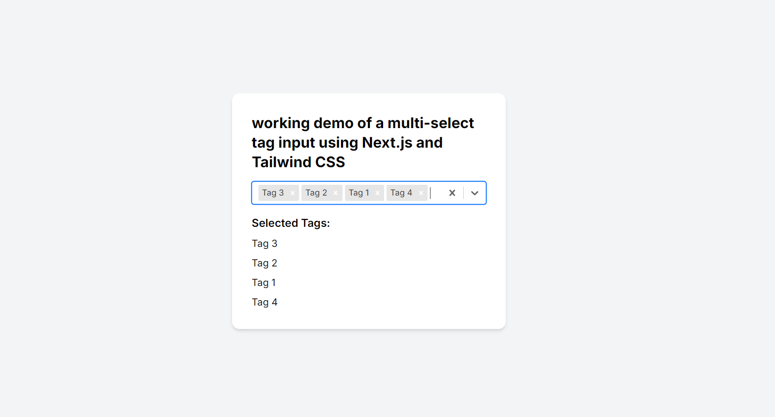
Visit http://localhost:3000 in your browser to see the multi-select tags in action.
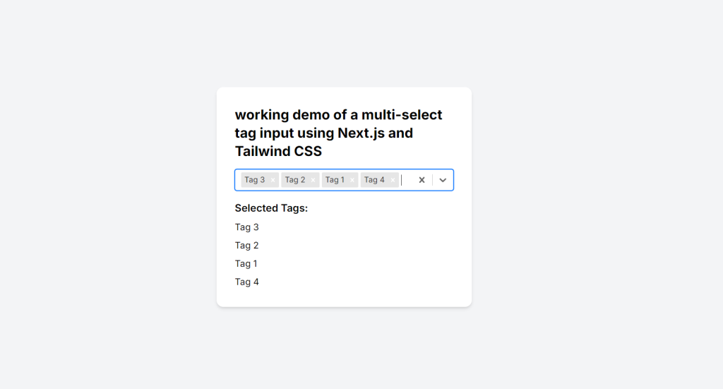
This setup provides a simple multi-select tag input using react-select styled with Tailwind CSS, integrated into a Next.js application. The component allows you to select multiple tags, and the selected options will be displayed below the multi-select input.
This is it guys and if you will have any kind of query, suggestion or requirement then feel free to comment below.
Thanks
Ajay
Leave a Reply
You must be logged in to post a comment.