Hello friends, welcome back to my blog. Today in this blog post, I am going to show you, Reactjs Shopping Template Free.
For reactjs new comers, please check the below link:
Friends now I proceed onwards and here is the working code snippet for Reactjs Responsive Sidebar Template Free and please use this carefully to avoid the mistakes:
1. Firstly, we need fresh reactjs setup and for that, we need to run below commands into out terminal and also we should have latest node version installed on our system:
npx create-react-app reacttepmate

cd reacttepmate

npm start
2. Now we need to run below commands into our project terminal to get bootstrap and related modules into our reactjs application:
npm install bootstrap --save

npm install jquery --save

npm install popper.js --save

npm start //For start project again
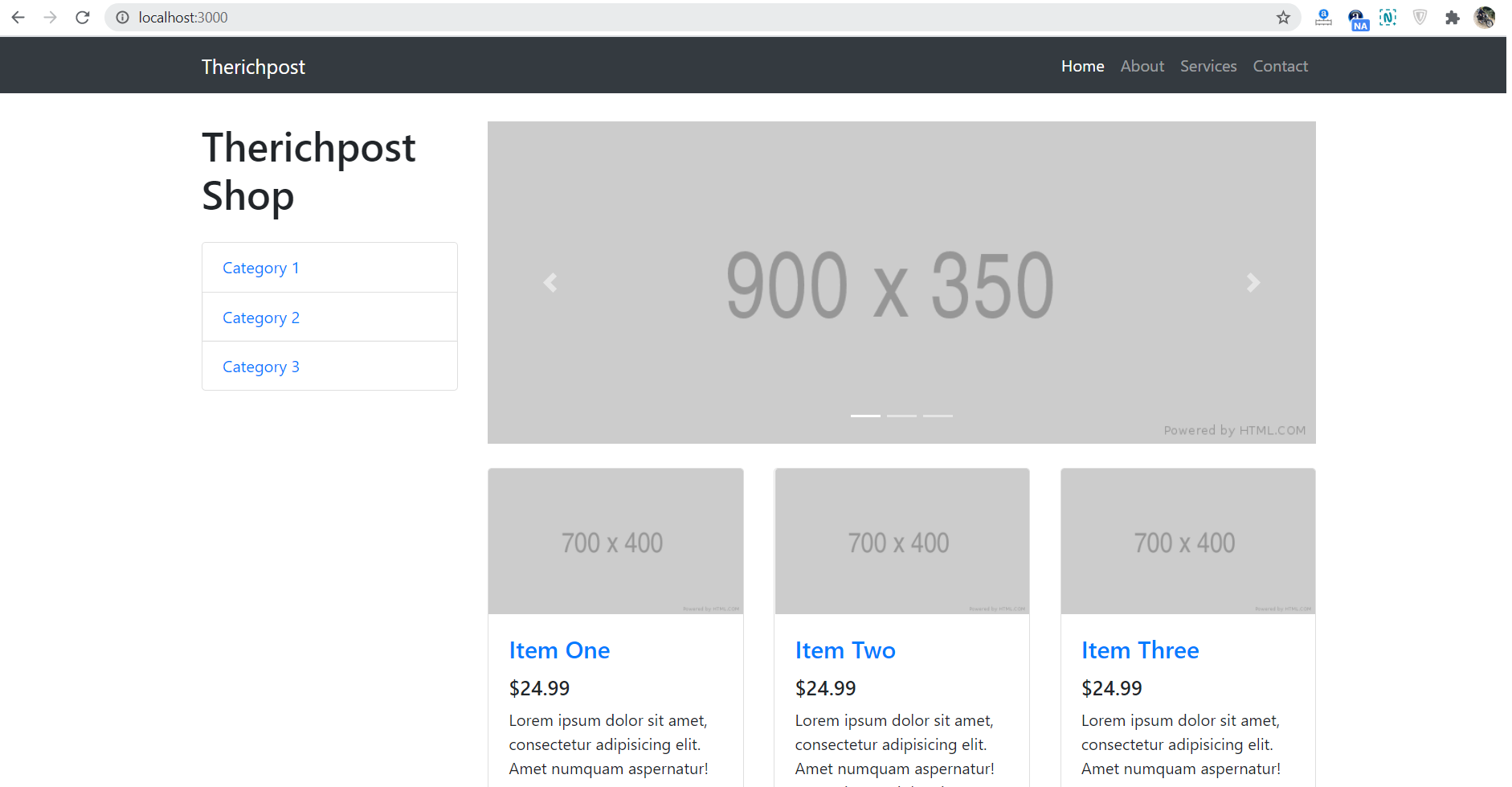
3. Finally for the main output, we need to add below code into our projectname/src/App.json file or if you have fresh setup then you can replace projectname/src/App.js file code with below code:
import React from 'react';
import './App.css';
//Bootstrap4.5
import 'bootstrap/dist/css/bootstrap.min.css';
import 'bootstrap/dist/js/bootstrap.min.js';
class App extends React.Component {
render() {
return (
<div className="MainDiv">
<nav class="navbar navbar-expand-lg navbar-dark bg-dark fixed-top">
<div class="container">
<a class="navbar-brand" href="#">Therichpost</a>
<button class="navbar-toggler" type="button" data-toggle="collapse" data-target="#navbarResponsive" aria-controls="navbarResponsive" aria-expanded="false" aria-label="Toggle navigation">
<span class="navbar-toggler-icon"></span>
</button>
<div class="collapse navbar-collapse" id="navbarResponsive">
<ul class="navbar-nav ml-auto">
<li class="nav-item active">
<a class="nav-link" href="#">Home
<span class="sr-only">(current)</span>
</a>
</li>
<li class="nav-item">
<a class="nav-link" href="#">About</a>
</li>
<li class="nav-item">
<a class="nav-link" href="#">Services</a>
</li>
<li class="nav-item">
<a class="nav-link" href="#">Contact</a>
</li>
</ul>
</div>
</div>
</nav>
<div class="container">
<div class="row">
<div class="col-lg-3">
<h1 class="my-4">Therichpost Shop</h1>
<div class="list-group">
<a href="#" class="list-group-item">Category 1</a>
<a href="#" class="list-group-item">Category 2</a>
<a href="#" class="list-group-item">Category 3</a>
</div>
</div>
<div class="col-lg-9">
<div id="carouselExampleIndicators" class="carousel slide my-4" data-ride="carousel">
<ol class="carousel-indicators">
<li data-target="#carouselExampleIndicators" data-slide-to="0" class="active"></li>
<li data-target="#carouselExampleIndicators" data-slide-to="1"></li>
<li data-target="#carouselExampleIndicators" data-slide-to="2"></li>
</ol>
<div class="carousel-inner" role="listbox">
<div class="carousel-item active">
<img class="d-block img-fluid" src="http://placehold.it/900x350" alt="First slide" />
</div>
<div class="carousel-item">
<img class="d-block img-fluid" src="http://placehold.it/900x350" alt="Second slide" />
</div>
<div class="carousel-item">
<img class="d-block img-fluid" src="http://placehold.it/900x350" alt="Third slide" />
</div>
</div>
<a class="carousel-control-prev" href="#carouselExampleIndicators" role="button" data-slide="prev">
<span class="carousel-control-prev-icon" aria-hidden="true"></span>
<span class="sr-only">Previous</span>
</a>
<a class="carousel-control-next" href="#carouselExampleIndicators" role="button" data-slide="next">
<span class="carousel-control-next-icon" aria-hidden="true"></span>
<span class="sr-only">Next</span>
</a>
</div>
<div class="row">
<div class="col-lg-4 col-md-6 mb-4">
<div class="card h-100">
<a href="#"><img class="card-img-top" src="http://placehold.it/700x400" alt="" /></a>
<div class="card-body">
<h4 class="card-title">
<a href="#">Item One</a>
</h4>
<h5>$24.99</h5>
<p class="card-text">Lorem ipsum dolor sit amet, consectetur adipisicing elit. Amet numquam aspernatur!</p>
</div>
<div class="card-footer">
<small class="text-muted">★ ★ ★ ★ ☆</small>
</div>
</div>
</div>
<div class="col-lg-4 col-md-6 mb-4">
<div class="card h-100">
<a href="#"><img class="card-img-top" src="http://placehold.it/700x400" alt="" /></a>
<div class="card-body">
<h4 class="card-title">
<a href="#">Item Two</a>
</h4>
<h5>$24.99</h5>
<p class="card-text">Lorem ipsum dolor sit amet, consectetur adipisicing elit. Amet numquam aspernatur! Lorem ipsum dolor sit amet.</p>
</div>
<div class="card-footer">
<small class="text-muted">★ ★ ★ ★ ☆</small>
</div>
</div>
</div>
<div class="col-lg-4 col-md-6 mb-4">
<div class="card h-100">
<a href="#"><img class="card-img-top" src="http://placehold.it/700x400" alt="" /></a>
<div class="card-body">
<h4 class="card-title">
<a href="#">Item Three</a>
</h4>
<h5>$24.99</h5>
<p class="card-text">Lorem ipsum dolor sit amet, consectetur adipisicing elit. Amet numquam aspernatur!</p>
</div>
<div class="card-footer">
<small class="text-muted">★ ★ ★ ★ ☆</small>
</div>
</div>
</div>
<div class="col-lg-4 col-md-6 mb-4">
<div class="card h-100">
<a href="#"><img class="card-img-top" src="http://placehold.it/700x400" alt="" /></a>
<div class="card-body">
<h4 class="card-title">
<a href="#">Item Four</a>
</h4>
<h5>$24.99</h5>
<p class="card-text">Lorem ipsum dolor sit amet, consectetur adipisicing elit. Amet numquam aspernatur!</p>
</div>
<div class="card-footer">
<small class="text-muted">★ ★ ★ ★ ☆</small>
</div>
</div>
</div>
<div class="col-lg-4 col-md-6 mb-4">
<div class="card h-100">
<a href="#"><img class="card-img-top" src="http://placehold.it/700x400" alt="" /></a>
<div class="card-body">
<h4 class="card-title">
<a href="#">Item Five</a>
</h4>
<h5>$24.99</h5>
<p class="card-text">Lorem ipsum dolor sit amet, consectetur adipisicing elit. Amet numquam aspernatur! Lorem ipsum dolor sit amet.</p>
</div>
<div class="card-footer">
<small class="text-muted">★ ★ ★ ★ ☆</small>
</div>
</div>
</div>
<div class="col-lg-4 col-md-6 mb-4">
<div class="card h-100">
<a href="#"><img class="card-img-top" src="http://placehold.it/700x400" alt="" /></a>
<div class="card-body">
<h4 class="card-title">
<a href="#">Item Six</a>
</h4>
<h5>$24.99</h5>
<p class="card-text">Lorem ipsum dolor sit amet, consectetur adipisicing elit. Amet numquam aspernatur!</p>
</div>
<div class="card-footer">
<small class="text-muted">★ ★ ★ ★ ☆</small>
</div>
</div>
</div>
</div>
</div>
</div>
</div>
<footer class="py-5 bg-dark">
<div class="container">
<p class="m-0 text-center text-white">Copyright © Your Website 2020</p>
</div>
</footer>
</div>
);
}
}
export default App;
4. Now friends, we need to below code into our projectname/src/App.css file for some custom styling:
body{padding-top: 60px;}
Now we are done friends. If you have any kind of query or suggestion or any requirement then feel free to comment below.
Note: Friends, I just tell the basic setup and things, you can change the code according to your requirements. For better understanding must watch video above.
I will appreciate that if you will tell your views for this post. Nothing matters if your views will be good or bad.
Jassa
Thanks
Leave a Reply
You must be logged in to post a comment.