
Hello friends, welcome back to my blog. Today in this blog post, I am going to show you, Reactjs Login & Registration Forms inside Bootstrap Modal.
In this, we will done:
- Animated Login and register forms inside bootstrap modal popup.
- Forms input fields placeholder animation.
- Prevent Bootstrap Modal from disappearing when clicking outside.
For reactjs new comers, please check the below link:
Friends now I proceed onwards and here is the working code snippet for Reactjs Login & Registration Forms inside Bootstrap Modal and please use this carefully to avoid the mistakes:
1. Firstly, we need fresh reactjs setup and for that, we need to run below commands into out terminal and also we should have latest node version installed on our system:
npx create-react-app reacttemplate

cd reacttemplate

npm start
2. Now we need to run below commands into our project terminal to get bootstrap and related modules into our reactjs application:
npm install bootstrap --save

npm install jquery --save

npm start //For start project again
3. Finally for the main output, we need to add below code into our reacttemplate/src/App.js file or if you have fresh setup then you can replace reacttemplate/src/App.js file code with below code:
import React from "react";
import './App.css'
import 'bootstrap/dist/css/bootstrap.min.css';
import 'bootstrap/dist/js/bootstrap.min.js';
class App extends React.Component {
render() {
return (
<div className="main_container">
<div class="container">
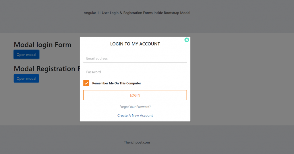
<h2>Modal login Form</h2>
<button type="button" class="btn btn-primary" data-toggle="modal" data-target="#sem-login">
Open modal
</button>
<br/>
<br/>
<h2>Modal Registration Form</h2>
<button type="button" class="btn btn-primary" data-toggle="modal" data-target="#sem-reg">
Open modal
</button>
<div class="modal fade seminor-login-modal" data-backdrop="static" id="sem-reg">
<div class="modal-dialog modal-dialog-centered">
<div class="modal-content">
<div class="modal-body seminor-login-modal-body">
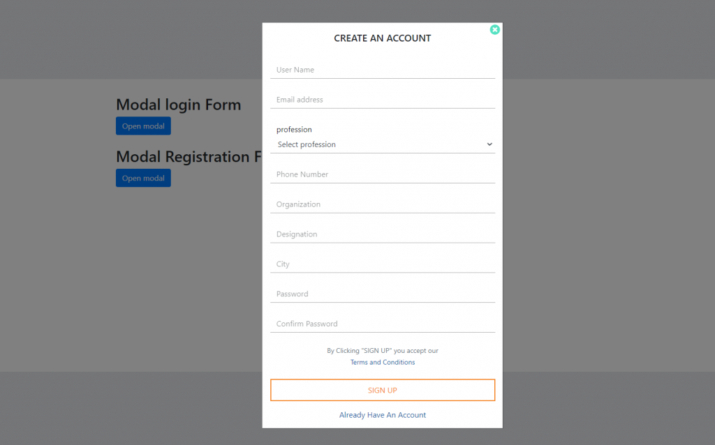
<h5 class="modal-title text-center">CREATE AN ACCOUNT</h5>
<button type="button" class="close" data-dismiss="modal">
<span><i class="fa fa-times-circle" aria-hidden="true"></i></span>
</button>
<form class="seminor-login-form">
<div class="form-group">
<input type="name" class="form-control" required autocomplete="off" />
<label class="form-control-placeholder" for="name">User Name</label>
</div>
<div class="form-group">
<input type="email" class="form-control" required autocomplete="off" />
<label class="form-control-placeholder" for="name">Email address</label>
</div>
<div class="form-group">
<label class="select-form-control-placeholder" for="sel1">profession</label>
<select class="form-control" id="sel1" name="sellist1">
<option>Select profession</option>
<option>Students</option>
<option>Research Scholar</option>
<option>Professor</option>
<option>Others</option>
</select>
</div>
<div class="form-group">
<input type="tel" class="form-control" required autocomplete="off" />
<label class="form-control-placeholder" for="name">Phone Number</label>
</div>
<div class="form-group">
<input type="text" class="form-control" required autocomplete="off" />
<label class="form-control-placeholder" for="name">Organization</label>
</div>
<div class="form-group">
<input type="text" class="form-control" required autocomplete="off" />
<label class="form-control-placeholder" for="name">Designation</label>
</div>
<div class="form-group">
<input type="text" class="form-control" required autocomplete="off" />
<label class="form-control-placeholder" for="name">City</label>
</div>
<div class="form-group">
<input type="password" class="form-control" required autocomplete="off" />
<label class="form-control-placeholder" for="password">Password</label>
</div>
<div class="form-group">
<input type="password" class="form-control" required autocomplete="off" />
<label class="form-control-placeholder" for="password">Confirm Password</label>
</div>
<div class="form-group forgot-pass-fau text-center ">
<a href="#" class="text-secondary">
By Clicking "SIGN UP" you accept our<br />
<span class="text-primary-fau">Terms and Conditions</span>
</a>
</div>
<div class="btn-check-log">
<button type="submit" class="btn-check-login">SIGN UP</button>
</div>
<div class="create-new-fau text-center pt-3">
<a href="#" class="text-primary-fau"><span data-toggle="modal" data-target="#sem-login" data-dismiss="modal">Already Have An Account</span></a>
</div>
</form>
</div>
</div>
</div>
</div>
<div class="modal fade seminor-login-modal" data-backdrop="static" id="sem-login">
<div class="modal-dialog modal-dialog-centered">
<div class="modal-content">
<div class="modal-body seminor-login-modal-body">
<h5 class="modal-title text-center">LOGIN TO MY ACCOUNT</h5>
<button type="button" class="close" data-dismiss="modal">
<span><i class="fa fa-times-circle" aria-hidden="true"></i></span>
</button>
<form class="seminor-login-form">
<div class="form-group">
<input type="email" class="form-control" required autocomplete="off" />
<label class="form-control-placeholder" for="name">Email address</label>
</div>
<div class="form-group">
<input type="password" class="form-control" required autocomplete="off" />
<label class="form-control-placeholder" for="password">Password</label>
</div>
<div class="form-group">
<label class="container-checkbox">
Remember Me On This Computer
<input type="checkbox" checked="checked" required />
<span class="checkmark-box"></span>
</label>
</div>
<div class="btn-check-log">
<button type="submit" class="btn-check-login">LOGIN</button>
</div>
<div class="forgot-pass-fau text-center pt-3">
<a href="#" class="text-secondary">Forgot Your Password?</a>
</div>
<div class="create-new-fau text-center pt-3">
<a href="#" class="text-primary-fau"><span data-toggle="modal" data-target="#sem-reg" data-dismiss="modal">Create A New Account</span></a>
</div>
</form>
</div>
</div>
</div>
</div>
</div>
</div>
);
}
}
export default App;
4. Now friends, we need to below code into our reacttemplate/src/App.css file for some custom styling:
@import url('https://stackpath.bootstrapcdn.com/font-awesome/4.7.0/css/font-awesome.min.css');
.seminor-login-modal-body .close{
  position: relative;
  top: -45px;
  left: 10px;
 color: #1cd8ad;
 }
 .seminor-login-modal-body .close{
     opacity:0.75;
 }

 .seminor-login-modal-body .close:focus, .seminor-login-modal-body .close:hover {
     color: #39e8b0;
  opacity: 1;
  text-decoration: none;
  outline:0;
 }

 .seminor-login-modal .modal-dialog .modal-content{
     border-radius:0px;
 }

 /* form animation */
 .seminor-login-form .form-group {
   position: relative;
   margin-bottom: 1.5em !important;
 }
 .seminor-login-form .form-control{
  border: 0px solid #ced4da !important;
  border-bottom:1px solid #adadad !important;
  border-radius:0 !important;
 }
 .seminor-login-form .form-control:focus, .seminor-login-form .form-control:active{
  outline:none !important;
  outline-width: 0;
  border-color: #adadad !important;
  box-shadow: 0 0 0 0.2rem transparent;
 }
 *:focus {
  outline: none;
 }
 .seminor-login-form{
  padding: 2em 0 0;
 }

 .form-control-placeholder {
 position: absolute;
 top: 0;
 padding: 7px 0 0 13px;
 transition: all 200ms;
 opacity: 0.5;
 border-top: 0px;
 border-left: 0;
 border-right: 0;
 }

 .form-control:focus + .form-control-placeholder,
 .form-control:valid + .form-control-placeholder {
 font-size: 75%;
 -webkit-transform: translate3d(0, -100%, 0);
        transform: translate3d(0, -100%, 0);
 opacity: 1;
 }

 .container-checkbox input {
  position: absolute;
  opacity: 0;
  cursor: pointer;
 }
 .checkmark-box {
  position: absolute;
  top: -5px;
  left: 0;
  height: 25px;
  width: 25px;
  background-color: #adadad;
 }
 .container-checkbox {
  display: block;
  position: relative;
  padding-left: 40px;
  margin-bottom: 20px;
  cursor: pointer;
  font-size: 14px;
  font-weight: bold;
  -webkit-user-select: none;
  -moz-user-select: none;
  -ms-user-select: none;
  user-select: none;
  line-height: 1.1;
 }
 .container-checkbox input:checked ~ .checkmark-box:after {
  color: #fff;
 }
 .container-checkbox input:checked ~ .checkmark-box:after {
  display: block;
 }
 .container-checkbox .checkmark-box:after {
  left: 10px;
  top: 4px;
  width: 7px;
  height: 15px;
  border: solid white;
  border-width: 0 3px 3px 0;
  -webkit-transform: rotate(45deg);
  -ms-transform: rotate(45deg);
  transform: rotate(45deg);
 }
 .checkmark:after, .checkmark-box:after {
  content: "";
  position: absolute;
  display: none;
 }
 .container-checkbox input:checked ~ .checkmark-box {
  background-color: #f58220;
  border: 0px solid transparent;
 }
 .btn-check-log .btn-check-login {
  font-size: 16px;
  padding: 10px 0;
 }
 button.btn-check-login:hover {
     color: #fff;
     background-color: #f58220;
     border: 2px solid #f58220;
 }
 .btn-check-login {
  color: #f58220;
  background-color: transparent;
  border: 2px solid #f58220;
  transition: all ease-in-out .3s;
 }
 .btn-check-login {
  display: inline-block;
  padding: 12px 0;
  margin-bottom: 0;
  line-height: 1.42857143;
  text-align: center;
  white-space: nowrap;
  vertical-align: middle;
  -ms-touch-action: manipulation;
  touch-action: manipulation;
  cursor: pointer;
  -webkit-user-select: none;
  -moz-user-select: none;
  -ms-user-select: none;
  user-select: none;
  background-image: none;
  border-radius: 0;
  width: 100%;
 }
 .forgot-pass-fau a {
     text-decoration: none !important;
     font-size: 14px;
 }
 .text-primary-fau {
     color: #1959a2;
 }

 .select-form-control-placeholder{
   font-size: 100%;
     padding: 7px 0 0 13px;
     margin: 0;
 }

.modal
{
  overflow-y: scroll;
}
Now we are done friends. If you have any kind of query or suggestion or any requirement then feel free to comment below.
Note: Friends, I just tell the basic setup and things, you can change the code according to your requirements.
I will appreciate that if you will tell your views for this post. Nothing matters if your views will be good or bad.
Jassa
Thanks
Leave a Reply