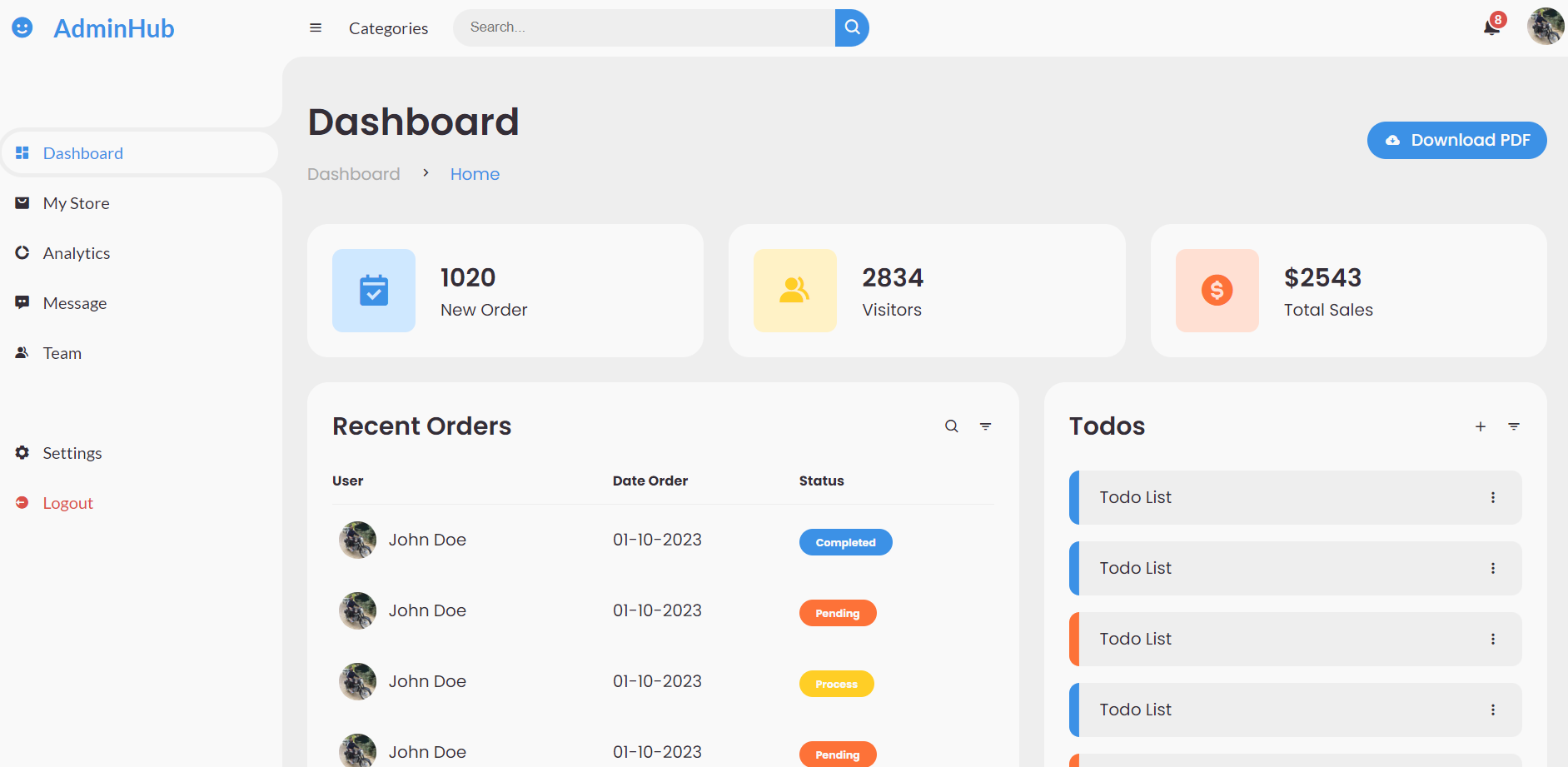
Hello my friends, welcome back to my blog. Today in this blog post, I am going to show you, Create your own Admin Dashboard Template with Reactjs Html CSS.
For react js new comers, please check the below links:
Friends now I proceed onwards and here is the working code snippet and please use this carefully to avoid the mistakes:
1. Firstly friends we need fresh reactjs setup and for that we need to run below commands into our terminal and also w should have latest node version installed on our system:
Guys you can skip this first step if you already have reactjs fresh setup:
npx create-react-app reacttemplate

cd reacttemplate

npm start // run the project
2. Now friends please add below inside reacttemplate/public/index.html file:
<!DOCTYPE html>
<html lang="en">
  <head>
    ...
    <title>React App</title>
     <!--
    - favicon
    -->
    ...
 <link href='https://unpkg.com/boxicons@2.0.9/css/boxicons.min.css' rel='stylesheet'>
  </head>
 ...
3. Finally friends we need to add below code into our reacttemplate/src/App.js file to get final output on web browser:
import React, { useState } from "react";
import "./App.css"
function App() {
  const [isActive, setActive] = useState(false);
  const toggleClass = () => {
    setActive(!isActive);
  };
  return (
    <div className="App">

      <section id="sidebar"  className={isActive ? 'hide': null} >
        <a href="#" class="brand">
          <i class='bx bxs-smile'></i>
          <span class="text">AdminHub</span>
        </a>
        <ul class="side-menu top">
          <li class="active">
            <a href="#">
              <i class='bx bxs-dashboard' ></i>
              <span class="text">Dashboard</span>
            </a>
          </li>
          <li>
            <a href="#">
              <i class='bx bxs-shopping-bag-alt' ></i>
              <span class="text">My Store</span>
            </a>
          </li>
          <li>
            <a href="#">
              <i class='bx bxs-doughnut-chart' ></i>
              <span class="text">Analytics</span>
            </a>
          </li>
          <li>
            <a href="#">
              <i class='bx bxs-message-dots' ></i>
              <span class="text">Message</span>
            </a>
          </li>
          <li>
            <a href="#">
              <i class='bx bxs-group' ></i>
              <span class="text">Team</span>
            </a>
          </li>
        </ul>
        <ul class="side-menu">
          <li>
            <a href="#">
              <i class='bx bxs-cog' ></i>
              <span class="text">Settings</span>
            </a>
          </li>
          <li>
            <a href="#" class="logout">
              <i class='bx bxs-log-out-circle' ></i>
              <span class="text">Logout</span>
            </a>
          </li>
        </ul>
      </section>

      <section id="content">

        <nav>
          <i  class='bx bx-menu'  onClick={toggleClass}  ></i>
          <a href="#" class="nav-link">Categories</a>
          <form action="#">
            <div class="form-input">
              <input type="search" placeholder="Search..." />
              <button type="button" class="search-btn"><i class='bx bx-search' ></i></button>
            </div>
          </form>
          <a href="#" class="notification">
            <i class='bx bxs-bell' ></i>
            <span class="num">8</span>
          </a>
          <a href="#" class="profile">
            <img src="https://secure.gravatar.com/avatar/d09eaad01aea86c51b4f892b4f8abf6f?s=100&d=wavatar&r=g" />
          </a>
        </nav>

        <main>
          <div class="head-title">
            <div class="left">
              <h1>Dashboard</h1>
              <ul class="breadcrumb">
                <li>
                  <a href="#">Dashboard</a>
                </li>
                <li><i class='bx bx-chevron-right' ></i></li>
                <li>
                  <a class="active" href="#">Home</a>
                </li>
              </ul>
            </div>
            <a href="#" class="btn-download">
              <i class='bx bxs-cloud-download' ></i>
              <span class="text">Download PDF</span>
            </a>
          </div>

          <ul class="box-info">
            <li>
              <i class='bx bxs-calendar-check' ></i>
              <span class="text">
                <h3>1020</h3>
                <p>New Order</p>
              </span>
            </li>
            <li>
              <i class='bx bxs-group' ></i>
              <span class="text">
                <h3>2834</h3>
                <p>Visitors</p>
              </span>
            </li>
            <li>
              <i class='bx bxs-dollar-circle' ></i>
              <span class="text">
                <h3>$2543</h3>
                <p>Total Sales</p>
              </span>
            </li>
          </ul>


          <div class="table-data">
            <div class="order">
              <div class="head">
                <h3>Recent Orders</h3>
                <i class='bx bx-search' ></i>
                <i class='bx bx-filter' ></i>
              </div>
              <table>
                <thead>
                  <tr>
                    <th>User</th>
                    <th>Date Order</th>
                    <th>Status</th>
                  </tr>
                </thead>
                <tbody>
                  <tr>
                    <td>
                      <img src="https://secure.gravatar.com/avatar/d09eaad01aea86c51b4f892b4f8abf6f?s=100&d=wavatar&r=g" />
                      <p>John Doe</p>
                    </td>
                    <td>01-10-2023</td>
                    <td><span class="status completed">Completed</span></td>
                  </tr>
                  <tr>
                    <td>
                      <img src="https://secure.gravatar.com/avatar/d09eaad01aea86c51b4f892b4f8abf6f?s=100&d=wavatar&r=g" />
                      <p>John Doe</p>
                    </td>
                    <td>01-10-2023</td>
                    <td><span class="status pending">Pending</span></td>
                  </tr>
                  <tr>
                    <td>
                      <img src="https://secure.gravatar.com/avatar/d09eaad01aea86c51b4f892b4f8abf6f?s=100&d=wavatar&r=g" />
                      <p>John Doe</p>
                    </td>
                    <td>01-10-2023</td>
                    <td><span class="status process">Process</span></td>
                  </tr>
                  <tr>
                    <td>
                      <img src="https://secure.gravatar.com/avatar/d09eaad01aea86c51b4f892b4f8abf6f?s=100&d=wavatar&r=g" />
                      <p>John Doe</p>
                    </td>
                    <td>01-10-2023</td>
                    <td><span class="status pending">Pending</span></td>
                  </tr>
                  <tr>
                    <td>
                      <img src="https://secure.gravatar.com/avatar/d09eaad01aea86c51b4f892b4f8abf6f?s=100&d=wavatar&r=g" />
                      <p>John Doe</p>
                    </td>
                    <td>01-10-2023</td>
                    <td><span class="status completed">Completed</span></td>
                  </tr>
                </tbody>
              </table>
            </div>
            <div class="todo">
              <div class="head">
                <h3>Todos</h3>
                <i class='bx bx-plus' ></i>
                <i class='bx bx-filter' ></i>
              </div>
              <ul class="todo-list">
                <li class="completed">
                  <p>Todo List</p>
                  <i class='bx bx-dots-vertical-rounded' ></i>
                </li>
                <li class="completed">
                  <p>Todo List</p>
                  <i class='bx bx-dots-vertical-rounded' ></i>
                </li>
                <li class="not-completed">
                  <p>Todo List</p>
                  <i class='bx bx-dots-vertical-rounded' ></i>
                </li>
              </ul>
            </div>
          </div>
        </main>

      </section>

    </div>
  );
}

export default App;
4. In the end friends we need to add below code into our reacttemplate/src/App.css file to get custom styles:
@import url('https://fonts.googleapis.com/css2?family=Lato:wght@400;700&family=Poppins:wght@400;500;600;700&display=swap');

* {
  margin: 0;
  padding: 0;
  box-sizing: border-box;
}

a {
  text-decoration: none;
}

li {
  list-style: none;
}

:root {
  --poppins: 'Poppins', sans-serif;
  --lato: 'Lato', sans-serif;

  --light: #F9F9F9;
  --blue: #3C91E6;
  --light-blue: #CFE8FF;
  --grey: #eee;
  --dark-grey: #AAAAAA;
  --dark: #342E37;
  --red: #DB504A;
  --yellow: #FFCE26;
  --light-yellow: #FFF2C6;
  --orange: #FD7238;
  --light-orange: #FFE0D3;
}

html {
  overflow-x: hidden;
}

body.dark {
  --light: #0C0C1E;
  --grey: #060714;
  --dark: #FBFBFB;
}

body {
  background: var(--grey);
  overflow-x: hidden;
}


/* SIDEBAR */
#sidebar {
  position: fixed;
  top: 0;
  left: 0;
  width: 280px;
  height: 100%;
  background: var(--light);
  z-index: 2000;
  font-family: var(--lato);
  transition: .3s ease;
  overflow-x: hidden;
  scrollbar-width: none;
}
#sidebar::--webkit-scrollbar {
  display: none;
}
#sidebar.hide {
  width: 60px;
}
#sidebar .brand {
  font-size: 24px;
  font-weight: 700;
  height: 56px;
  display: flex;
  align-items: center;
  color: var(--blue);
  position: sticky;
  top: 0;
  left: 0;
  background: var(--light);
  z-index: 500;
  padding-bottom: 20px;
  box-sizing: content-box;
}
#sidebar .brand .bx {
  min-width: 60px;
  display: flex;
  justify-content: center;
}
#sidebar .side-menu {
  width: 100%;
  margin-top: 48px;
}
#sidebar .side-menu li {
  height: 48px;
  background: transparent;
  margin-left: 6px;
  border-radius: 48px 0 0 48px;
  padding: 4px;
}
#sidebar .side-menu li.active {
  background: var(--grey);
  position: relative;
}
#sidebar .side-menu li.active::before {
  content: '';
  position: absolute;
  width: 40px;
  height: 40px;
  border-radius: 50%;
  top: -40px;
  right: 0;
  box-shadow: 20px 20px 0 var(--grey);
  z-index: -1;
}
#sidebar .side-menu li.active::after {
  content: '';
  position: absolute;
  width: 40px;
  height: 40px;
  border-radius: 50%;
  bottom: -40px;
  right: 0;
  box-shadow: 20px -20px 0 var(--grey);
  z-index: -1;
}
#sidebar .side-menu li a {
  width: 100%;
  height: 100%;
  background: var(--light);
  display: flex;
  align-items: center;
  border-radius: 48px;
  font-size: 16px;
  color: var(--dark);
  white-space: nowrap;
  overflow-x: hidden;
}
#sidebar .side-menu.top li.active a {
  color: var(--blue);
}
#sidebar.hide .side-menu li a {
  width: calc(48px - (4px * 2));
  transition: width .3s ease;
}
#sidebar .side-menu li a.logout {
  color: var(--red);
}
#sidebar .side-menu.top li a:hover {
  color: var(--blue);
}
#sidebar .side-menu li a .bx {
  min-width: calc(60px  - ((4px + 6px) * 2));
  display: flex;
  justify-content: center;
}
/* SIDEBAR */


/* CONTENT */
#content {
  position: relative;
  width: calc(100% - 280px);
  left: 280px;
  transition: .3s ease;
}
#sidebar.hide ~ #content {
  width: calc(100% - 60px);
  left: 60px;
}


/* NAVBAR */
#content nav {
  height: 56px;
  background: var(--light);
  padding: 0 24px;
  display: flex;
  align-items: center;
  grid-gap: 24px;
  font-family: var(--lato);
  position: sticky;
  top: 0;
  left: 0;
  z-index: 1000;
}
#content nav::before {
  content: '';
  position: absolute;
  width: 40px;
  height: 40px;
  bottom: -40px;
  left: 0;
  border-radius: 50%;
  box-shadow: -20px -20px 0 var(--light);
}
#content nav a {
  color: var(--dark);
}
#content nav .bx.bx-menu {
  cursor: pointer;
  color: var(--dark);
}
#content nav .nav-link {
  font-size: 16px;
  transition: .3s ease;
}
#content nav .nav-link:hover {
  color: var(--blue);
}
#content nav form {
  max-width: 400px;
  width: 100%;
  margin-right: auto;
}
#content nav form .form-input {
  display: flex;
  align-items: center;
  height: 36px;
}
#content nav form .form-input input {
  flex-grow: 1;
  padding: 0 16px;
  height: 100%;
  border: none;
  background: var(--grey);
  border-radius: 36px 0 0 36px;
  outline: none;
  width: 100%;
  color: var(--dark);
}
#content nav form .form-input button {
  width: 36px;
  height: 100%;
  display: flex;
  justify-content: center;
  align-items: center;
  background: var(--blue);
  color: var(--light);
  font-size: 18px;
  border: none;
  outline: none;
  border-radius: 0 36px 36px 0;
  cursor: pointer;
}
#content nav .notification {
  font-size: 20px;
  position: relative;
}
#content nav .notification .num {
  position: absolute;
  top: -6px;
  right: -6px;
  width: 20px;
  height: 20px;
  border-radius: 50%;
  border: 2px solid var(--light);
  background: var(--red);
  color: var(--light);
  font-weight: 700;
  font-size: 12px;
  display: flex;
  justify-content: center;
  align-items: center;
}
#content nav .profile img {
  width: 36px;
  height: 36px;
  object-fit: cover;
  border-radius: 50%;
}
#content nav .switch-mode {
  display: block;
  min-width: 50px;
  height: 25px;
  border-radius: 25px;
  background: var(--grey);
  cursor: pointer;
  position: relative;
}
#content nav .switch-mode::before {
  content: '';
  position: absolute;
  top: 2px;
  left: 2px;
  bottom: 2px;
  width: calc(25px - 4px);
  background: var(--blue);
  border-radius: 50%;
  transition: all .3s ease;
}
#content nav #switch-mode:checked + .switch-mode::before {
  left: calc(100% - (25px - 4px) - 2px);
}
/* NAVBAR */


/* MAIN */
#content main {
  width: 100%;
  padding: 36px 24px;
  font-family: var(--poppins);
  max-height: calc(100vh - 56px);
  overflow-y: auto;
}
#content main .head-title {
  display: flex;
  align-items: center;
  justify-content: space-between;
  grid-gap: 16px;
  flex-wrap: wrap;
}
#content main .head-title .left h1 {
  font-size: 36px;
  font-weight: 600;
  margin-bottom: 10px;
  color: var(--dark);
}
#content main .head-title .left .breadcrumb {
  display: flex;
  align-items: center;
  grid-gap: 16px;
}
#content main .head-title .left .breadcrumb li {
  color: var(--dark);
}
#content main .head-title .left .breadcrumb li a {
  color: var(--dark-grey);
  pointer-events: none;
}
#content main .head-title .left .breadcrumb li a.active {
  color: var(--blue);
  pointer-events: unset;
}
#content main .head-title .btn-download {
  height: 36px;
  padding: 0 16px;
  border-radius: 36px;
  background: var(--blue);
  color: var(--light);
  display: flex;
  justify-content: center;
  align-items: center;
  grid-gap: 10px;
  font-weight: 500;
}


#content main .box-info {
  display: grid;
  grid-template-columns: repeat(auto-fit, minmax(240px, 1fr));
  grid-gap: 24px;
  margin-top: 36px;
}
#content main .box-info li {
  padding: 24px;
  background: var(--light);
  border-radius: 20px;
  display: flex;
  align-items: center;
  grid-gap: 24px;
}
#content main .box-info li .bx {
  width: 80px;
  height: 80px;
  border-radius: 10px;
  font-size: 36px;
  display: flex;
  justify-content: center;
  align-items: center;
}
#content main .box-info li:nth-child(1) .bx {
  background: var(--light-blue);
  color: var(--blue);
}
#content main .box-info li:nth-child(2) .bx {
  background: var(--light-yellow);
  color: var(--yellow);
}
#content main .box-info li:nth-child(3) .bx {
  background: var(--light-orange);
  color: var(--orange);
}
#content main .box-info li .text h3 {
  font-size: 24px;
  font-weight: 600;
  color: var(--dark);
}
#content main .box-info li .text p {
  color: var(--dark);
}


#content main .table-data {
  display: flex;
  flex-wrap: wrap;
  grid-gap: 24px;
  margin-top: 24px;
  width: 100%;
  color: var(--dark);
}
#content main .table-data > div {
  border-radius: 20px;
  background: var(--light);
  padding: 24px;
  overflow-x: auto;
}
#content main .table-data .head {
  display: flex;
  align-items: center;
  grid-gap: 16px;
  margin-bottom: 24px;
}
#content main .table-data .head h3 {
  margin-right: auto;
  font-size: 24px;
  font-weight: 600;
}
#content main .table-data .head .bx {
  cursor: pointer;
}

#content main .table-data .order {
  flex-grow: 1;
  flex-basis: 500px;
}
#content main .table-data .order table {
  width: 100%;
  border-collapse: collapse;
}
#content main .table-data .order table th {
  padding-bottom: 12px;
  font-size: 13px;
  text-align: left;
  border-bottom: 1px solid var(--grey);
}
#content main .table-data .order table td {
  padding: 16px 0;
}
#content main .table-data .order table tr td:first-child {
  display: flex;
  align-items: center;
  grid-gap: 12px;
  padding-left: 6px;
}
#content main .table-data .order table td img {
  width: 36px;
  height: 36px;
  border-radius: 50%;
  object-fit: cover;
}
#content main .table-data .order table tbody tr:hover {
  background: var(--grey);
}
#content main .table-data .order table tr td .status {
  font-size: 10px;
  padding: 6px 16px;
  color: var(--light);
  border-radius: 20px;
  font-weight: 700;
}
#content main .table-data .order table tr td .status.completed {
  background: var(--blue);
}
#content main .table-data .order table tr td .status.process {
  background: var(--yellow);
}
#content main .table-data .order table tr td .status.pending {
  background: var(--orange);
}


#content main .table-data .todo {
  flex-grow: 1;
  flex-basis: 300px;
}
#content main .table-data .todo .todo-list {
  width: 100%;
}
#content main .table-data .todo .todo-list li {
  width: 100%;
  margin-bottom: 16px;
  background: var(--grey);
  border-radius: 10px;
  padding: 14px 20px;
  display: flex;
  justify-content: space-between;
  align-items: center;
}
#content main .table-data .todo .todo-list li .bx {
  cursor: pointer;
}
#content main .table-data .todo .todo-list li.completed {
  border-left: 10px solid var(--blue);
}
#content main .table-data .todo .todo-list li.not-completed {
  border-left: 10px solid var(--orange);
}
#content main .table-data .todo .todo-list li:last-child {
  margin-bottom: 0;
}
/* MAIN */
/* CONTENT */


@media screen and (max-width: 768px) {
  #sidebar {
    width: 200px;
  }

  #content {
    width: calc(100% - 60px);
    left: 200px;
  }

  #content nav .nav-link {
    display: none;
  }
}


@media screen and (max-width: 576px) {
  #content nav form .form-input input {
    display: none;
  }

  #content nav form .form-input button {
    width: auto;
    height: auto;
    background: transparent;
    border-radius: none;
    color: var(--dark);
  }

  #content nav form.show .form-input input {
    display: block;
    width: 100%;
  }
  #content nav form.show .form-input button {
    width: 36px;
    height: 100%;
    border-radius: 0 36px 36px 0;
    color: var(--light);
    background: var(--red);
  }

  #content nav form.show ~ .notification,
  #content nav form.show ~ .profile {
    display: none;
  }

  #content main .box-info {
    grid-template-columns: 1fr;
  }

  #content main .table-data .head {
    min-width: 420px;
  }
  #content main .table-data .order table {
    min-width: 420px;
  }
  #content main .table-data .todo .todo-list {
    min-width: 420px;
  }
}
Now we are done friends also and If you have any kind of query or suggestion or any requirement then feel free to comment below. Guys I will come with more React-Bootstrap free templates.
Note: Friends, I just tell the basic setup and things, you can change the code according to your requirements. For better understanding must watch video above.
I will appreciate that if you will tell your views for this post. Nothing matters if your views will be good or bad.
Jassa
Thanks
Leave a Reply
You must be logged in to post a comment.