
Hello friends, welcome back to my blog. Today this blog post will tell you, Create your own Admin Dashboard Template with Angular 15 Html CSS.
Angular15 came and Bootstrap 5 also. If you are new then you must check below two links:
Friends now I proceed onwards and here is the working code snippet and please use carefully this to avoid the mistakes:
1. Firstly friends we need fresh angular 15 setup and for this we need to run below commands but if you already have angular 15 setup then you can avoid below commands. Secondly we should also have latest node version installed on our system:
npm install -g @angular/cli

ng new angularboot5 //Create new Angular Project

cd angularboot5 // Go inside the Angular Project Folder
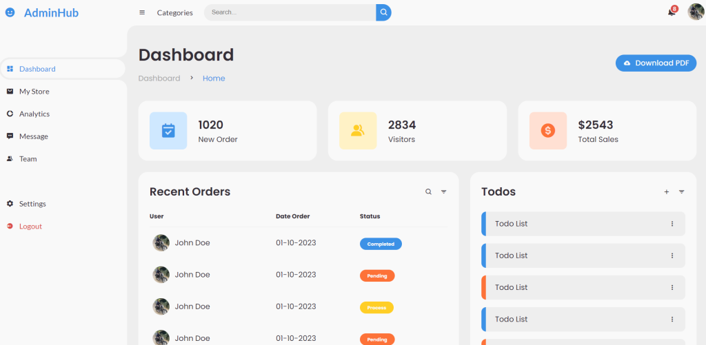
2. Now friends we just need to add below code into angularboot5/src/app/app.component.html file to get final out on the web browser:
<!-- SIDEBAR -->
<section id="sidebar" [ngClass]="status ? 'hide' : ''">
  <a href="#" class="brand">
    <i class='bx bxs-smile'></i>
    <span class="text">AdminHub</span>
  </a>
  <ul class="side-menu top">
    <li class="active">
      <a href="#">
        <i class='bx bxs-dashboard' ></i>
        <span class="text">Dashboard</span>
      </a>
    </li>
    <li>
      <a href="#">
        <i class='bx bxs-shopping-bag-alt' ></i>
        <span class="text">My Store</span>
      </a>
    </li>
    <li>
      <a href="#">
        <i class='bx bxs-doughnut-chart' ></i>
        <span class="text">Analytics</span>
      </a>
    </li>
    <li>
      <a href="#">
        <i class='bx bxs-message-dots' ></i>
        <span class="text">Message</span>
      </a>
    </li>
    <li>
      <a href="#">
        <i class='bx bxs-group' ></i>
        <span class="text">Team</span>
      </a>
    </li>
  </ul>
  <ul class="side-menu">
    <li>
      <a href="#">
        <i class='bx bxs-cog' ></i>
        <span class="text">Settings</span>
      </a>
    </li>
    <li>
      <a href="#" class="logout">
        <i class='bx bxs-log-out-circle' ></i>
        <span class="text">Logout</span>
      </a>
    </li>
  </ul>
</section>
<!-- SIDEBAR -->


<!-- CONTENT -->
<section id="content">
  <!-- NAVBAR -->
  <nav>
    <i (click)="addToggle()" class='bx bx-menu' ></i>
    <a href="#" class="nav-link">Categories</a>
    <form action="#">
      <div class="form-input">
        <input type="search" placeholder="Search...">
        <button type="button" class="search-btn"><i class='bx bx-search' ></i></button>
      </div>
    </form>
    <a href="#" class="notification">
      <i class='bx bxs-bell' ></i>
      <span class="num">8</span>
    </a>
    <a href="#" class="profile">
      <img src="https://secure.gravatar.com/avatar/d09eaad01aea86c51b4f892b4f8abf6f?s=100&d=wavatar&r=g">
    </a>
  </nav>
  <!-- NAVBAR -->

  <!-- MAIN -->
  <main>
    <div class="head-title">
      <div class="left">
        <h1>Dashboard</h1>
        <ul class="breadcrumb">
          <li>
            <a href="#">Dashboard</a>
          </li>
          <li><i class='bx bx-chevron-right' ></i></li>
          <li>
            <a class="active" href="#">Home</a>
          </li>
        </ul>
      </div>
      <a href="#" class="btn-download">
        <i class='bx bxs-cloud-download' ></i>
        <span class="text">Download PDF</span>
      </a>
    </div>

    <ul class="box-info">
      <li>
        <i class='bx bxs-calendar-check' ></i>
        <span class="text">
          <h3>1020</h3>
          <p>New Order</p>
        </span>
      </li>
      <li>
        <i class='bx bxs-group' ></i>
        <span class="text">
          <h3>2834</h3>
          <p>Visitors</p>
        </span>
      </li>
      <li>
        <i class='bx bxs-dollar-circle' ></i>
        <span class="text">
          <h3>$2543</h3>
          <p>Total Sales</p>
        </span>
      </li>
    </ul>


    <div class="table-data">
      <div class="order">
        <div class="head">
          <h3>Recent Orders</h3>
          <i class='bx bx-search' ></i>
          <i class='bx bx-filter' ></i>
        </div>
        <table>
          <thead>
            <tr>
              <th>User</th>
              <th>Date Order</th>
              <th>Status</th>
            </tr>
          </thead>
          <tbody>
            <tr>
              <td>
                <img src="https://secure.gravatar.com/avatar/d09eaad01aea86c51b4f892b4f8abf6f?s=100&d=wavatar&r=g">
                <p>John Doe</p>
              </td>
              <td>01-10-2023</td>
              <td><span class="status completed">Completed</span></td>
            </tr>
            <tr>
              <td>
                <img src="https://secure.gravatar.com/avatar/d09eaad01aea86c51b4f892b4f8abf6f?s=100&d=wavatar&r=g">
                <p>John Doe</p>
              </td>
              <td>01-10-2023</td>
              <td><span class="status pending">Pending</span></td>
            </tr>
            <tr>
              <td>
                <img src="https://secure.gravatar.com/avatar/d09eaad01aea86c51b4f892b4f8abf6f?s=100&d=wavatar&r=g">
                <p>John Doe</p>
              </td>
              <td>01-10-2023</td>
              <td><span class="status process">Process</span></td>
            </tr>
            <tr>
              <td>
                <img src="https://secure.gravatar.com/avatar/d09eaad01aea86c51b4f892b4f8abf6f?s=100&d=wavatar&r=g">
                <p>John Doe</p>
              </td>
              <td>01-10-2023</td>
              <td><span class="status pending">Pending</span></td>
            </tr>
            <tr>
              <td>
                <img src="https://secure.gravatar.com/avatar/d09eaad01aea86c51b4f892b4f8abf6f?s=100&d=wavatar&r=g">
                <p>John Doe</p>
              </td>
              <td>01-10-2023</td>
              <td><span class="status completed">Completed</span></td>
            </tr>
          </tbody>
        </table>
      </div>
      <div class="todo">
        <div class="head">
          <h3>Todos</h3>
          <i class='bx bx-plus' ></i>
          <i class='bx bx-filter' ></i>
        </div>
        <ul class="todo-list">
          <li class="completed">
            <p>Todo List</p>
            <i class='bx bx-dots-vertical-rounded' ></i>
          </li>
          <li class="completed">
            <p>Todo List</p>
            <i class='bx bx-dots-vertical-rounded' ></i>
          </li>
          <li class="not-completed">
            <p>Todo List</p>
            <i class='bx bx-dots-vertical-rounded' ></i>
          </li>
          <li class="completed">
            <p>Todo List</p>
            <i class='bx bx-dots-vertical-rounded' ></i>
          </li>
          <li class="not-completed">
            <p>Todo List</p>
            <i class='bx bx-dots-vertical-rounded' ></i>
          </li>
        </ul>
      </div>
    </div>
  </main>
  <!-- MAIN -->
</section>
<!-- CONTENT -->
3. Now friends we just need to add below stylesheet url code into angularboot5/src/index.html file for font awesome icons:
...
<head>
 <!-- Boxicons -->
  <link href='https://unpkg.com/boxicons@2.0.9/css/boxicons.min.css' rel='stylesheet'>
</head>
...
4. Now friends we just need to add below code into angularboot5/src/app/app.component.ts file for toggle show hide funciton and chartjs:
...
export class AppComponent {


//Sidebar toggle show hide function
status = false;
addToggle()
{
  this.status = !this.status;
}

}
5. Now friends we just need to add below code into angularboot5/src/styles.css file:
@import url('https://fonts.googleapis.com/css2?family=Lato:wght@400;700&family=Poppins:wght@400;500;600;700&display=swap');

* {
  margin: 0;
  padding: 0;
  box-sizing: border-box;
}

a {
  text-decoration: none;
}

li {
  list-style: none;
}

:root {
  --poppins: 'Poppins', sans-serif;
  --lato: 'Lato', sans-serif;

  --light: #F9F9F9;
  --blue: #3C91E6;
  --light-blue: #CFE8FF;
  --grey: #eee;
  --dark-grey: #AAAAAA;
  --dark: #342E37;
  --red: #DB504A;
  --yellow: #FFCE26;
  --light-yellow: #FFF2C6;
  --orange: #FD7238;
  --light-orange: #FFE0D3;
}

html {
  overflow-x: hidden;
}

body.dark {
  --light: #0C0C1E;
  --grey: #060714;
  --dark: #FBFBFB;
}

body {
  background: var(--grey);
  overflow-x: hidden;
}


/* SIDEBAR */
#sidebar {
  position: fixed;
  top: 0;
  left: 0;
  width: 280px;
  height: 100%;
  background: var(--light);
  z-index: 2000;
  font-family: var(--lato);
  transition: .3s ease;
  overflow-x: hidden;
  scrollbar-width: none;
}
#sidebar::--webkit-scrollbar {
  display: none;
}
#sidebar.hide {
  width: 60px;
}
#sidebar .brand {
  font-size: 24px;
  font-weight: 700;
  height: 56px;
  display: flex;
  align-items: center;
  color: var(--blue);
  position: sticky;
  top: 0;
  left: 0;
  background: var(--light);
  z-index: 500;
  padding-bottom: 20px;
  box-sizing: content-box;
}
#sidebar .brand .bx {
  min-width: 60px;
  display: flex;
  justify-content: center;
}
#sidebar .side-menu {
  width: 100%;
  margin-top: 48px;
}
#sidebar .side-menu li {
  height: 48px;
  background: transparent;
  margin-left: 6px;
  border-radius: 48px 0 0 48px;
  padding: 4px;
}
#sidebar .side-menu li.active {
  background: var(--grey);
  position: relative;
}
#sidebar .side-menu li.active::before {
  content: '';
  position: absolute;
  width: 40px;
  height: 40px;
  border-radius: 50%;
  top: -40px;
  right: 0;
  box-shadow: 20px 20px 0 var(--grey);
  z-index: -1;
}
#sidebar .side-menu li.active::after {
  content: '';
  position: absolute;
  width: 40px;
  height: 40px;
  border-radius: 50%;
  bottom: -40px;
  right: 0;
  box-shadow: 20px -20px 0 var(--grey);
  z-index: -1;
}
#sidebar .side-menu li a {
  width: 100%;
  height: 100%;
  background: var(--light);
  display: flex;
  align-items: center;
  border-radius: 48px;
  font-size: 16px;
  color: var(--dark);
  white-space: nowrap;
  overflow-x: hidden;
}
#sidebar .side-menu.top li.active a {
  color: var(--blue);
}
#sidebar.hide .side-menu li a {
  width: calc(48px - (4px * 2));
  transition: width .3s ease;
}
#sidebar .side-menu li a.logout {
  color: var(--red);
}
#sidebar .side-menu.top li a:hover {
  color: var(--blue);
}
#sidebar .side-menu li a .bx {
  min-width: calc(60px  - ((4px + 6px) * 2));
  display: flex;
  justify-content: center;
}
/* SIDEBAR */


/* CONTENT */
#content {
  position: relative;
  width: calc(100% - 280px);
  left: 280px;
  transition: .3s ease;
}
#sidebar.hide ~ #content {
  width: calc(100% - 60px);
  left: 60px;
}


/* NAVBAR */
#content nav {
  height: 56px;
  background: var(--light);
  padding: 0 24px;
  display: flex;
  align-items: center;
  grid-gap: 24px;
  font-family: var(--lato);
  position: sticky;
  top: 0;
  left: 0;
  z-index: 1000;
}
#content nav::before {
  content: '';
  position: absolute;
  width: 40px;
  height: 40px;
  bottom: -40px;
  left: 0;
  border-radius: 50%;
  box-shadow: -20px -20px 0 var(--light);
}
#content nav a {
  color: var(--dark);
}
#content nav .bx.bx-menu {
  cursor: pointer;
  color: var(--dark);
}
#content nav .nav-link {
  font-size: 16px;
  transition: .3s ease;
}
#content nav .nav-link:hover {
  color: var(--blue);
}
#content nav form {
  max-width: 400px;
  width: 100%;
  margin-right: auto;
}
#content nav form .form-input {
  display: flex;
  align-items: center;
  height: 36px;
}
#content nav form .form-input input {
  flex-grow: 1;
  padding: 0 16px;
  height: 100%;
  border: none;
  background: var(--grey);
  border-radius: 36px 0 0 36px;
  outline: none;
  width: 100%;
  color: var(--dark);
}
#content nav form .form-input button {
  width: 36px;
  height: 100%;
  display: flex;
  justify-content: center;
  align-items: center;
  background: var(--blue);
  color: var(--light);
  font-size: 18px;
  border: none;
  outline: none;
  border-radius: 0 36px 36px 0;
  cursor: pointer;
}
#content nav .notification {
  font-size: 20px;
  position: relative;
}
#content nav .notification .num {
  position: absolute;
  top: -6px;
  right: -6px;
  width: 20px;
  height: 20px;
  border-radius: 50%;
  border: 2px solid var(--light);
  background: var(--red);
  color: var(--light);
  font-weight: 700;
  font-size: 12px;
  display: flex;
  justify-content: center;
  align-items: center;
}
#content nav .profile img {
  width: 36px;
  height: 36px;
  object-fit: cover;
  border-radius: 50%;
}
#content nav .switch-mode {
  display: block;
  min-width: 50px;
  height: 25px;
  border-radius: 25px;
  background: var(--grey);
  cursor: pointer;
  position: relative;
}
#content nav .switch-mode::before {
  content: '';
  position: absolute;
  top: 2px;
  left: 2px;
  bottom: 2px;
  width: calc(25px - 4px);
  background: var(--blue);
  border-radius: 50%;
  transition: all .3s ease;
}
#content nav #switch-mode:checked + .switch-mode::before {
  left: calc(100% - (25px - 4px) - 2px);
}
/* NAVBAR */


/* MAIN */
#content main {
  width: 100%;
  padding: 36px 24px;
  font-family: var(--poppins);
  max-height: calc(100vh - 56px);
  overflow-y: auto;
}
#content main .head-title {
  display: flex;
  align-items: center;
  justify-content: space-between;
  grid-gap: 16px;
  flex-wrap: wrap;
}
#content main .head-title .left h1 {
  font-size: 36px;
  font-weight: 600;
  margin-bottom: 10px;
  color: var(--dark);
}
#content main .head-title .left .breadcrumb {
  display: flex;
  align-items: center;
  grid-gap: 16px;
}
#content main .head-title .left .breadcrumb li {
  color: var(--dark);
}
#content main .head-title .left .breadcrumb li a {
  color: var(--dark-grey);
  pointer-events: none;
}
#content main .head-title .left .breadcrumb li a.active {
  color: var(--blue);
  pointer-events: unset;
}
#content main .head-title .btn-download {
  height: 36px;
  padding: 0 16px;
  border-radius: 36px;
  background: var(--blue);
  color: var(--light);
  display: flex;
  justify-content: center;
  align-items: center;
  grid-gap: 10px;
  font-weight: 500;
}


#content main .box-info {
  display: grid;
  grid-template-columns: repeat(auto-fit, minmax(240px, 1fr));
  grid-gap: 24px;
  margin-top: 36px;
}
#content main .box-info li {
  padding: 24px;
  background: var(--light);
  border-radius: 20px;
  display: flex;
  align-items: center;
  grid-gap: 24px;
}
#content main .box-info li .bx {
  width: 80px;
  height: 80px;
  border-radius: 10px;
  font-size: 36px;
  display: flex;
  justify-content: center;
  align-items: center;
}
#content main .box-info li:nth-child(1) .bx {
  background: var(--light-blue);
  color: var(--blue);
}
#content main .box-info li:nth-child(2) .bx {
  background: var(--light-yellow);
  color: var(--yellow);
}
#content main .box-info li:nth-child(3) .bx {
  background: var(--light-orange);
  color: var(--orange);
}
#content main .box-info li .text h3 {
  font-size: 24px;
  font-weight: 600;
  color: var(--dark);
}
#content main .box-info li .text p {
  color: var(--dark);
}


#content main .table-data {
  display: flex;
  flex-wrap: wrap;
  grid-gap: 24px;
  margin-top: 24px;
  width: 100%;
  color: var(--dark);
}
#content main .table-data > div {
  border-radius: 20px;
  background: var(--light);
  padding: 24px;
  overflow-x: auto;
}
#content main .table-data .head {
  display: flex;
  align-items: center;
  grid-gap: 16px;
  margin-bottom: 24px;
}
#content main .table-data .head h3 {
  margin-right: auto;
  font-size: 24px;
  font-weight: 600;
}
#content main .table-data .head .bx {
  cursor: pointer;
}

#content main .table-data .order {
  flex-grow: 1;
  flex-basis: 500px;
}
#content main .table-data .order table {
  width: 100%;
  border-collapse: collapse;
}
#content main .table-data .order table th {
  padding-bottom: 12px;
  font-size: 13px;
  text-align: left;
  border-bottom: 1px solid var(--grey);
}
#content main .table-data .order table td {
  padding: 16px 0;
}
#content main .table-data .order table tr td:first-child {
  display: flex;
  align-items: center;
  grid-gap: 12px;
  padding-left: 6px;
}
#content main .table-data .order table td img {
  width: 36px;
  height: 36px;
  border-radius: 50%;
  object-fit: cover;
}
#content main .table-data .order table tbody tr:hover {
  background: var(--grey);
}
#content main .table-data .order table tr td .status {
  font-size: 10px;
  padding: 6px 16px;
  color: var(--light);
  border-radius: 20px;
  font-weight: 700;
}
#content main .table-data .order table tr td .status.completed {
  background: var(--blue);
}
#content main .table-data .order table tr td .status.process {
  background: var(--yellow);
}
#content main .table-data .order table tr td .status.pending {
  background: var(--orange);
}


#content main .table-data .todo {
  flex-grow: 1;
  flex-basis: 300px;
}
#content main .table-data .todo .todo-list {
  width: 100%;
}
#content main .table-data .todo .todo-list li {
  width: 100%;
  margin-bottom: 16px;
  background: var(--grey);
  border-radius: 10px;
  padding: 14px 20px;
  display: flex;
  justify-content: space-between;
  align-items: center;
}
#content main .table-data .todo .todo-list li .bx {
  cursor: pointer;
}
#content main .table-data .todo .todo-list li.completed {
  border-left: 10px solid var(--blue);
}
#content main .table-data .todo .todo-list li.not-completed {
  border-left: 10px solid var(--orange);
}
#content main .table-data .todo .todo-list li:last-child {
  margin-bottom: 0;
}
/* MAIN */
/* CONTENT */


@media screen and (max-width: 768px) {
  #sidebar {
    width: 200px;
  }

  #content {
    width: calc(100% - 60px);
    left: 200px;
  }

  #content nav .nav-link {
    display: none;
  }
}


@media screen and (max-width: 576px) {
  #content nav form .form-input input {
    display: none;
  }

  #content nav form .form-input button {
    width: auto;
    height: auto;
    background: transparent;
    border-radius: none;
    color: var(--dark);
  }

  #content nav form.show .form-input input {
    display: block;
    width: 100%;
  }
  #content nav form.show .form-input button {
    width: 36px;
    height: 100%;
    border-radius: 0 36px 36px 0;
    color: var(--light);
    background: var(--red);
  }

  #content nav form.show ~ .notification,
  #content nav form.show ~ .profile {
    display: none;
  }

  #content main .box-info {
    grid-template-columns: 1fr;
  }

  #content main .table-data .head {
    min-width: 420px;
  }
  #content main .table-data .order table {
    min-width: 420px;
  }
  #content main .table-data .todo .todo-list {
    min-width: 420px;
  }
}
Friends in the end must run ng serve command into your terminal to run the angular 15 project(localhost:4200).
Now we are done friends. If you have any kind of query, suggestion and new requirement then feel free to comment below.
Note: Friends, In this post, I just tell the basic setup and things, you can change the code according to your requirements.
I will appreciate that if you will tell your views for this post. Nothing matters if your views will be good or bad because with your views, I will make my next posts more good and helpful.
Jassa
Thanks
Leave a Reply