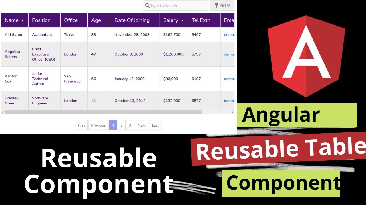
Building a custom reusable table component in Angular 17 involves creating a component that can be used across your application to display tabular data. Angular’s component-based architecture, along with its support for input properties and content projection, makes it relatively straightforward to implement such a reusable component. Here’s a step-by-step guide to help you create a basic reusable table component:
1. Generate the Table Component
First, generate your table component using Angular CLI:
ng generate component custom-table
This command creates a new component named custom-table in your Angular project.
2. Define Inputs for Your Table Component
In your table component (custom-table.component.ts), define inputs that your table will accept to customize its data. For a simple table, you might start with columns and data arrays.
import { Component, Input } from '@angular/core';

@Component({
  selector: 'app-custom-table',
  templateUrl: './custom-table.component.html',
  styleUrls: ['./custom-table.component.css']
})
export class CustomTableComponent {
  @Input() columns: string[] = [];
  @Input() data: any[] = [];
}
3. Create the Table Template
In the template file (custom-table.component.html), use Angular’s structural directives to dynamically create your table based on the inputs.
<table>
  <thead>
    <tr>
      <th *ngFor="let column of columns">{{ column }}</th>
    </tr>
  </thead>
  <tbody>
    <tr *ngFor="let row of data">
      <td *ngFor="let column of columns">{{ row[column] }}</td>
    </tr>
  </tbody>
</table>
4. Styling the Component
Use the component’s CSS file (custom-table.component.css) to style your table. This can include basic styling or more complex, responsive table designs.
table {
  width: 100%;
  border-collapse: collapse;
}

th, td {
  border: 1px solid #ddd;
  padding: 8px;
}

th {
  background-color: #f2f2f2;
}
5. Using Your Table Component
To use your new table component, simply include it in the template of a parent component, providing it with the columns and data it requires via property bindings.
<app-custom-table [columns]="['ID', 'Name', 'Age']" [data]="users"></app-custom-table>
Ensure you have the users array defined in your parent component’s TypeScript file.
6. Making the Component More Flexible
Consider adding more features to make your table component more versatile, such as:
- Custom templates for cells using Angular
<ng-template>andContentChild. - Sorting and filtering capabilities.
- Pagination or virtual scrolling for handling large datasets.
- Input for custom classes or styles to enhance flexibility.
7. Testing Your Component
Don’t forget to write unit and integration tests for your component to ensure it works correctly in different scenarios and with various data inputs.
This guide gives you a starting point for creating a reusable table component in Angular 17. Depending on your requirements, you can extend this component with more inputs and features to suit your application’s needs.

Leave a Reply
You must be logged in to post a comment.