
Hello guys how are you? Welcome back to my blog. Guys today we will do Basic Page Layout in Bootstrap 5 for Beginners.
Creating a basic page layout using Bootstrap 5 is a great way to get started with responsive web design. Bootstrap is a popular CSS framework that includes a range of ready-to-use components and utilities that make web development faster and easier. Here, I’ll guide you through creating a simple page layout suitable for beginners, including a navigation bar, a content section, and a footer.
For react js new comers, please check the below links:
Step 1: Set Up Your HTML File
First, you need to create an HTML file and include Bootstrap 5. You can link directly to Bootstrap’s CDN to get started quickly without needing to download anything.
Create an index.html file and include the following code:
<!DOCTYPE html>
<html lang="en">
<head>
    <meta charset="UTF-8">
    <meta name="viewport" content="width=device-width, initial-scale=1.0">
    <title>Basic Bootstrap Page</title>
    <link href="https://cdn.jsdelivr.net/npm/bootstrap@5.3.0/dist/css/bootstrap.min.css" rel="stylesheet">
</head>
<body>

    <!-- Content will go here -->

    <!-- Bootstrap JS with Popper.js -->
    <script src="https://cdn.jsdelivr.net/npm/bootstrap@5.3.0/dist/js/bootstrap.bundle.min.js"></script>
</body>
</html>
Step 2: Add a Navigation Bar
Bootstrap’s navbar component is responsive and customizable. Add the following HTML inside the <body> tag to create a basic navigation bar:
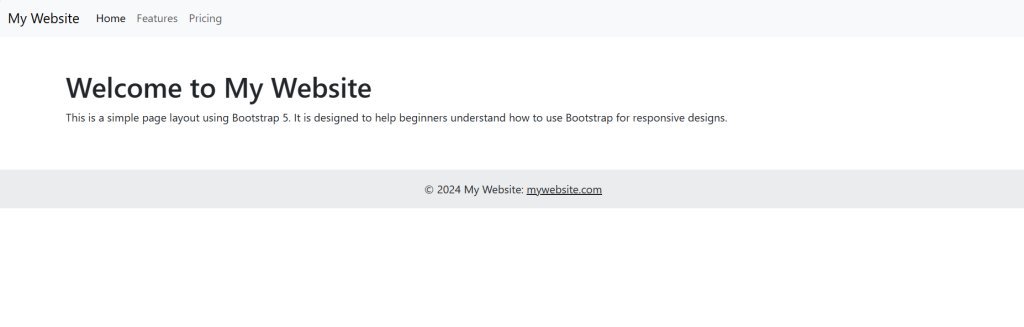
<nav class="navbar navbar-expand-lg navbar-light bg-light">
    <div class="container-fluid">
        <a class="navbar-brand" href="#">My Website</a>
        <button class="navbar-toggler" type="button" data-bs-toggle="collapse" data-bs-target="#navbarNav" aria-controls="navbarNav" aria-expanded="false" aria-label="Toggle navigation">
            <span class="navbar-toggler-icon"></span>
        </button>
        <div class="collapse navbar-collapse" id="navbarNav">
            <ul class="navbar-nav">
                <li class="nav-item">
                    <a class="nav-link active" aria-current="page" href="#">Home</a>
                </li>
                <li class="nav-item">
                    <a class="nav-link" href="#">Features</a>
                </li>
                <li class="nav-item">
                    <a class="nav-link" href="#">Pricing</a>
                </li>
            </ul>
        </div>
    </div>
</nav>
Step 3: Add a Content Section
Below the navbar, you can add a content section. Use Bootstrap’s container class to ensure proper alignment and padding:
<div class="container mt-5">
    <h1>Welcome to My Website</h1>
    <p>This is a simple page layout using Bootstrap 5. It is designed to help beginners understand how to use Bootstrap for responsive designs.</p>
</div>
Step 4: Add a Footer
Footers are important for providing copyright information, links, and other details. Add this below your content section:
<footer class="bg-light text-center text-lg-start mt-5">
    <div class="text-center p-3" style="background-color: rgba(0, 0, 0, 0.05);">
        © 2024 My Website:
        <a class="text-dark" href="#">mywebsite.com</a>
    </div>
</footer>
Step 5: Customize Your Page
You can customize the look of your page by adding custom styles in the <head> section of your HTML file or in a separate CSS file. Here’s a basic example:
<style>
    body {
        min-height: 100vh;
        display: flex;
        flex-direction: column;
    }

    footer {
        margin-top: auto;
    }
</style>
This CSS ensures that the footer is pushed to the bottom of the page if there isn’t enough content to naturally push it down.
Step 6: View Your Page
Save your HTML file and open it in a web browser to view your basic Bootstrap 5 layout. Resize the browser window to see how it responds to different screen sizes.
Bootstrap 5 makes it easy to build responsive and attractive websites. As you become more familiar with its components and utilities, you can further enhance your pages with additional Bootstrap features like modals, cards, and carousels.
This is it guys and if you will have any kind of query, suggestion or requirement then feel free to comment below.
Thanks
Ajay
Leave a Reply