
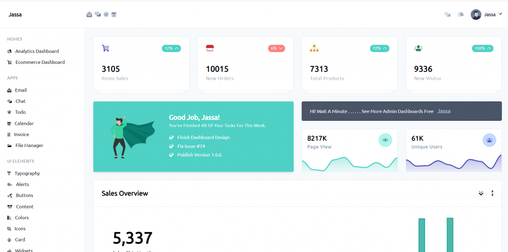
Hello friends, welcome back to my blog. Today in this blog post, I am going to show you, ASP.NET Core 5 Responsive Admin Dashboard Template Using Tailwind CSS.
Same working demo in Angular 12:
.Net Core 5 came and if you are new then you must check below two links:
Friends now I proceed onwards and here is the working code snippet and use this carefully to avoid the mistakes:
1. Firstly friends we need .net core 5 installed on our machine and for this please check below link:
https://dotnet.microsoft.com/download
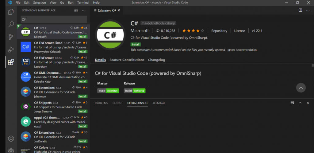
2. Now guy’s we need to install c# extension inside our visual studio code editor and for this please check below images:
3. Now guy’s create `demo` folder and open that folder inside visual studio code and run below command to get fresh project setup of .net code 5:
dotnet new webApp -o testproject
4. Now guy’s add below code inside testproject/Pages/Index.cshtml file to check output on web browser:
@page
@model IndexModel
@{
ViewData["Title"] = "Home page";
}
<!-- start navbar -->
<div class="md:fixed md:w-full md:top-0 md:z-20 flex flex-row flex-wrap items-center bg-white p-6 border-b border-gray-300">
<!-- logo -->
<div class="flex-none w-56 flex flex-row items-center">
<a href="https://therichpost.com" target="_blank">
<strong class="capitalize ml-1 flex-1">Jassa</strong>
</a>
<button id="sliderBtn" class="flex-none text-right text-gray-900 hidden md:block">
<i class="fad fa-list-ul"></i>
</button>
</div>
<!-- end logo -->
<!-- navbar content toggle -->
<button id="navbarToggle" class="hidden md:block md:fixed right-0 mr-6">
<i class="fad fa-chevron-double-down"></i>
</button>
<!-- end navbar content toggle -->
<!-- navbar content -->
<div id="navbar" class="animated md:hidden md:fixed md:top-0 md:w-full md:left-0 md:mt-16 md:border-t md:border-b md:border-gray-200 md:p-10 md:bg-white flex-1 pl-3 flex flex-row flex-wrap justify-between items-center md:flex-col md:items-center">
<!-- left -->
<div class="text-gray-600 md:w-full md:flex md:flex-row md:justify-evenly md:pb-10 md:mb-10 md:border-b md:border-gray-200">
<a class="mr-2 transition duration-500 ease-in-out hover:text-gray-900" href="#" title="email"><i class="fad fa-envelope-open-text"></i></a>
<a class="mr-2 transition duration-500 ease-in-out hover:text-gray-900" href="#" title="email"><i class="fad fa-comments-alt"></i></a>
<a class="mr-2 transition duration-500 ease-in-out hover:text-gray-900" href="#" title="email"><i class="fad fa-check-circle"></i></a>
<a class="mr-2 transition duration-500 ease-in-out hover:text-gray-900" href="#" title="email"><i class="fad fa-calendar-exclamation"></i></a>
</div>
<!-- end left -->
<!-- right -->
<div class="flex flex-row-reverse items-center">
<!-- user -->
<div class="dropdown relative md:static">
<button class="menu-btn focus:outline-none focus:shadow-outline flex flex-wrap items-center">
<div class="w-8 h-8 overflow-hidden rounded-full">
<img class="w-full h-full object-cover" src="img/user.svg" >
</div>
<div class="ml-2 capitalize flex ">
<h1 class="text-sm text-gray-800 font-semibold m-0 p-0 leading-none">Jassa</h1>
<i class="fad fa-chevron-down ml-2 text-xs leading-none"></i>
</div>
</button>
<button class="hidden fixed top-0 left-0 z-10 w-full h-full menu-overflow"></button>
<div class="text-gray-500 menu hidden md:mt-10 md:w-full rounded bg-white shadow-md absolute z-20 right-0 w-40 mt-5 py-2 animated faster">
<!-- item -->
<a class="px-4 py-2 block capitalize font-medium text-sm tracking-wide bg-white hover:bg-gray-200 hover:text-gray-900 transition-all duration-300 ease-in-out" href="#">
<i class="fad fa-user-edit text-xs mr-1"></i>
edit my profile
</a>
<!-- end item -->
<!-- item -->
<a class="px-4 py-2 block capitalize font-medium text-sm tracking-wide bg-white hover:bg-gray-200 hover:text-gray-900 transition-all duration-300 ease-in-out" href="#">
<i class="fad fa-inbox-in text-xs mr-1"></i>
my inbox
</a>
<!-- end item -->
<!-- item -->
<a class="px-4 py-2 block capitalize font-medium text-sm tracking-wide bg-white hover:bg-gray-200 hover:text-gray-900 transition-all duration-300 ease-in-out" href="#">
<i class="fad fa-badge-check text-xs mr-1"></i>
tasks
</a>
<!-- end item -->
<!-- item -->
<a class="px-4 py-2 block capitalize font-medium text-sm tracking-wide bg-white hover:bg-gray-200 hover:text-gray-900 transition-all duration-300 ease-in-out" href="#">
<i class="fad fa-comment-alt-dots text-xs mr-1"></i>
chats
</a>
<!-- end item -->
<hr>
<!-- item -->
<a class="px-4 py-2 block capitalize font-medium text-sm tracking-wide bg-white hover:bg-gray-200 hover:text-gray-900 transition-all duration-300 ease-in-out" href="#">
<i class="fad fa-user-times text-xs mr-1"></i>
log out
</a>
<!-- end item -->
</div>
</div>
<!-- end user -->
<!-- notifcation -->
<div class="dropdown relative mr-5 md:static">
<button class="text-gray-500 menu-btn p-0 m-0 hover:text-gray-900 focus:text-gray-900 focus:outline-none transition-all ease-in-out duration-300">
<i class="fad fa-bells"></i>
</button>
<button class="hidden fixed top-0 left-0 z-10 w-full h-full menu-overflow"></button>
<div class="menu hidden rounded bg-white md:right-0 md:w-full shadow-md absolute z-20 right-0 w-84 mt-5 py-2 animated faster">
<!-- top -->
<div class="px-4 py-2 flex flex-row justify-between items-center capitalize font-semibold text-sm">
<h1>notifications</h1>
<div class="bg-teal-100 border border-teal-200 text-teal-500 text-xs rounded px-1">
<strong>5</strong>
</div>
</div>
<hr>
<!-- end top -->
<!-- body -->
<!-- item -->
<a class="flex flex-row items-center justify-start px-4 py-4 block capitalize font-medium text-sm tracking-wide bg-white hover:bg-gray-200 transition-all duration-300 ease-in-out" href="#">
<div class="px-3 py-2 rounded mr-3 bg-gray-100 border border-gray-300">
<i class="fad fa-birthday-cake text-sm"></i>
</div>
<div class="flex-1 flex flex-rowbg-green-100">
<div class="flex-1">
<h1 class="text-sm font-semibold">poll..</h1>
<p class="text-xs text-gray-500">text here also</p>
</div>
<div class="text-right text-xs text-gray-500">
<p>4 min ago</p>
</div>
</div>
</a>
<hr>
<!-- end item -->
<!-- item -->
<a class="flex flex-row items-center justify-start px-4 py-4 block capitalize font-medium text-sm tracking-wide bg-white hover:bg-gray-200 transition-all duration-300 ease-in-out" href="#">
<div class="px-3 py-2 rounded mr-3 bg-gray-100 border border-gray-300">
<i class="fad fa-user-circle text-sm"></i>
</div>
<div class="flex-1 flex flex-rowbg-green-100">
<div class="flex-1">
<h1 class="text-sm font-semibold">jassa..</h1>
<p class="text-xs text-gray-500">text here also</p>
</div>
<div class="text-right text-xs text-gray-500">
<p>78 min ago</p>
</div>
</div>
</a>
<hr>
<!-- end item -->
<!-- item -->
<a class="flex flex-row items-center justify-start px-4 py-4 block capitalize font-medium text-sm tracking-wide bg-white hover:bg-gray-200 transition-all duration-300 ease-in-out" href="#">
<div class="px-3 py-2 rounded mr-3 bg-gray-100 border border-gray-300">
<i class="fad fa-images text-sm"></i>
</div>
<div class="flex-1 flex flex-rowbg-green-100">
<div class="flex-1">
<h1 class="text-sm font-semibold">new imag..</h1>
<p class="text-xs text-gray-500">text here also</p>
</div>
<div class="text-right text-xs text-gray-500">
<p>65 min ago</p>
</div>
</div>
</a>
<hr>
<!-- end item -->
<!-- item -->
<a class="flex flex-row items-center justify-start px-4 py-4 block capitalize font-medium text-sm tracking-wide bg-white hover:bg-gray-200 transition-all duration-300 ease-in-out" href="#">
<div class="px-3 py-2 rounded mr-3 bg-gray-100 border border-gray-300">
<i class="fad fa-alarm-exclamation text-sm"></i>
</div>
<div class="flex-1 flex flex-rowbg-green-100">
<div class="flex-1">
<h1 class="text-sm font-semibold">time is up..</h1>
<p class="text-xs text-gray-500">text here also</p>
</div>
<div class="text-right text-xs text-gray-500">
<p>1 min ago</p>
</div>
</div>
</a>
<!-- end item -->
<!-- end body -->
<!-- bottom -->
<hr>
<div class="px-4 py-2 mt-2">
<a href="#" class="border border-gray-300 block text-center text-xs uppercase rounded p-1 hover:text-teal-500 transition-all ease-in-out duration-500">
view all
</a>
</div>
<!-- end bottom -->
</div>
</div>
<!-- end notifcation -->
<!-- messages -->
<div class="dropdown relative mr-5 md:static">
<button class="text-gray-500 menu-btn p-0 m-0 hover:text-gray-900 focus:text-gray-900 focus:outline-none transition-all ease-in-out duration-300">
<i class="fad fa-comments"></i>
</button>
<button class="hidden fixed top-0 left-0 z-10 w-full h-full menu-overflow"></button>
<div class="menu hidden md:w-full md:right-0 rounded bg-white shadow-md absolute z-20 right-0 w-84 mt-5 py-2 animated faster">
<!-- top -->
<div class="px-4 py-2 flex flex-row justify-between items-center capitalize font-semibold text-sm">
<h1>messages</h1>
<div class="bg-teal-100 border border-teal-200 text-teal-500 text-xs rounded px-1">
<strong>3</strong>
</div>
</div>
<hr>
<!-- end top -->
<!-- body -->
<!-- item -->
<a class="flex flex-row items-center justify-start px-4 py-4 block capitalize font-medium text-sm tracking-wide bg-white hover:bg-gray-200 transition-all duration-300 ease-in-out" href="#">
<div class="w-10 h-10 rounded-full overflow-hidden mr-3 bg-gray-100 border border-gray-300">
<img class="w-full h-full object-cover" src="img/user1.jpg" alt="">
</div>
<div class="flex-1 flex flex-rowbg-green-100">
<div class="flex-1">
<h1 class="text-sm font-semibold">jassa said</h1>
<p class="text-xs text-gray-500">yeah i know</p>
</div>
<div class="text-right text-xs text-gray-500">
<p>4 min ago</p>
</div>
</div>
</a>
<hr>
<!-- end item -->
<!-- item -->
<a class="flex flex-row items-center justify-start px-4 py-4 block capitalize font-medium text-sm tracking-wide bg-white hover:bg-gray-200 transition-all duration-300 ease-in-out" href="#">
<div class="w-10 h-10 rounded-full overflow-hidden mr-3 bg-gray-100 border border-gray-300">
<img class="w-full h-full object-cover" src="img/user2.jpg" alt="">
</div>
<div class="flex-1 flex flex-rowbg-green-100">
<div class="flex-1">
<h1 class="text-sm font-semibold">sull Jassa</h1>
<p class="text-xs text-gray-500">for sure</p>
</div>
<div class="text-right text-xs text-gray-500">
<p>1 day ago</p>
</div>
</div>
</a>
<hr>
<!-- end item -->
<!-- item -->
<a class="flex flex-row items-center justify-start px-4 py-4 block capitalize font-medium text-sm tracking-wide bg-white hover:bg-gray-200 transition-all duration-300 ease-in-out" href="#">
<div class="w-10 h-10 rounded-full overflow-hidden mr-3 bg-gray-100 border border-gray-300">
<img class="w-full h-full object-cover" src="img/user3.jpg" alt="">
</div>
<div class="flex-1 flex flex-rowbg-green-100">
<div class="flex-1">
<h1 class="text-sm font-semibold">mick</h1>
<p class="text-xs text-gray-500">is typing ....</p>
</div>
<div class="text-right text-xs text-gray-500">
<p>31 feb</p>
</div>
</div>
</a>
<!-- end item -->
<!-- end body -->
<!-- bottom -->
<hr>
<div class="px-4 py-2 mt-2">
<a href="#" class="border border-gray-300 block text-center text-xs uppercase rounded p-1 hover:text-teal-500 transition-all ease-in-out duration-500">
view all
</a>
</div>
<!-- end bottom -->
</div>
</div>
<!-- end messages -->
</div>
<!-- end right -->
</div>
<!-- end navbar content -->
</div>
<!-- end navbar -->
<!-- strat wrapper -->
<div class="h-screen flex flex-row flex-wrap">
<!-- start sidebar -->
<div id="sideBar" class="relative flex flex-col flex-wrap bg-white border-r border-gray-300 p-6 flex-none w-64 md:-ml-64 md:fixed md:top-0 md:z-30 md:h-screen md:shadow-xl animated faster">
<!-- sidebar content -->
<div class="flex flex-col">
<!-- sidebar toggle -->
<div class="text-right hidden md:block mb-4">
<button id="sideBarHideBtn">
<i class="fad fa-times-circle"></i>
</button>
</div>
<!-- end sidebar toggle -->
<p class="uppercase text-xs text-gray-600 mb-4 tracking-wider">homes</p>
<!-- link -->
<a href="https://therichpost.com/best-angular-ecommerce-templates-free/" target="_blank" class="mb-3 capitalize font-medium text-sm hover:text-teal-600 transition ease-in-out duration-500">
<i class="fad fa-chart-pie text-xs mr-2"></i>
Analytics dashboard
</a>
<!-- end link -->
<!-- link -->
<a href="https://therichpost.com/best-angular-ecommerce-templates-free/" target="_blank" class="mb-3 capitalize font-medium text-sm hover:text-teal-600 transition ease-in-out duration-500">
<i class="fad fa-shopping-cart text-xs mr-2"></i>
ecommerce dashboard
</a>
<!-- end link -->
<p class="uppercase text-xs text-gray-600 mb-4 mt-4 tracking-wider">apps</p>
<!-- link -->
<a href="#" class="mb-3 capitalize font-medium text-sm hover:text-teal-600 transition ease-in-out duration-500">
<i class="fad fa-envelope-open-text text-xs mr-2"></i>
email
</a>
<!-- end link -->
<!-- link -->
<a href="#" class="mb-3 capitalize font-medium text-sm hover:text-teal-600 transition ease-in-out duration-500">
<i class="fad fa-comments text-xs mr-2"></i>
chat
</a>
<!-- end link -->
<!-- link -->
<a href="#" class="mb-3 capitalize font-medium text-sm hover:text-teal-600 transition ease-in-out duration-500">
<i class="fad fa-shield-check text-xs mr-2"></i>
todo
</a>
<!-- end link -->
<!-- link -->
<a href="#" class="mb-3 capitalize font-medium text-sm hover:text-teal-600 transition ease-in-out duration-500">
<i class="fad fa-calendar-edit text-xs mr-2"></i>
calendar
</a>
<!-- end link -->
<!-- link -->
<a href="#" class="mb-3 capitalize font-medium text-sm hover:text-teal-600 transition ease-in-out duration-500">
<i class="fad fa-file-invoice-dollar text-xs mr-2"></i>
invoice
</a>
<!-- end link -->
<!-- link -->
<a href="#" class="mb-3 capitalize font-medium text-sm hover:text-teal-600 transition ease-in-out duration-500">
<i class="fad fa-folder-open text-xs mr-2"></i>
file manager
</a>
<!-- end link -->
<p class="uppercase text-xs text-gray-600 mb-4 mt-4 tracking-wider">UI Elements</p>
<!-- link -->
<a href="#" class="mb-3 capitalize font-medium text-sm hover:text-teal-600 transition ease-in-out duration-500">
<i class="fad fa-text text-xs mr-2"></i>
typography
</a>
<!-- end link -->
<!-- link -->
<a href="#" class="mb-3 capitalize font-medium text-sm hover:text-teal-600 transition ease-in-out duration-500">
<i class="fad fa-whistle text-xs mr-2"></i>
alerts
</a>
<!-- end link -->
<!-- link -->
<a href="#" class="mb-3 capitalize font-medium text-sm hover:text-teal-600 transition ease-in-out duration-500">
<i class="fad fa-cricket text-xs mr-2"></i>
buttons
</a>
<!-- end link -->
<!-- link -->
<a href="#" class="mb-3 capitalize font-medium text-sm hover:text-teal-600 transition ease-in-out duration-500">
<i class="fad fa-box-open text-xs mr-2"></i>
Content
</a>
<!-- end link -->
<!-- link -->
<a href="#" class="mb-3 capitalize font-medium text-sm hover:text-teal-600 transition ease-in-out duration-500">
<i class="fad fa-swatchbook text-xs mr-2"></i>
colors
</a>
<!-- end link -->
<!-- link -->
<a href="#" class="mb-3 capitalize font-medium text-sm hover:text-teal-600 transition ease-in-out duration-500">
<i class="fad fa-atom-alt text-xs mr-2"></i>
icons
</a>
<!-- end link -->
<!-- link -->
<a href="#" class="mb-3 capitalize font-medium text-sm hover:text-teal-600 transition ease-in-out duration-500">
<i class="fad fa-club text-xs mr-2"></i>
card
</a>
<!-- end link -->
<!-- link -->
<a href="#" class="mb-3 capitalize font-medium text-sm hover:text-teal-600 transition ease-in-out duration-500">
<i class="fad fa-cheese-swiss text-xs mr-2"></i>
Widgets
</a>
<!-- end link -->
<!-- link -->
<a href="#" class="mb-3 capitalize font-medium text-sm hover:text-teal-600 transition ease-in-out duration-500">
<i class="fad fa-computer-classic text-xs mr-2"></i>
Components
</a>
<!-- end link -->
</div>
<!-- end sidebar content -->
</div>
<!-- end sidbar -->
<!-- strat content -->
<div class="bg-gray-100 flex-1 p-6 md:mt-16">
<!-- General Report -->
<div class="grid grid-cols-4 gap-6 xl:grid-cols-1">
<!-- card -->
<div class="report-card">
<div class="card">
<div class="card-body flex flex-col">
<!-- top -->
<div class="flex flex-row justify-between items-center">
<div class="h6 text-indigo-700 fad fa-shopping-cart"></div>
<span class="rounded-full text-white badge bg-teal-400 text-xs">
12%
<i class="fal fa-chevron-up ml-1"></i>
</span>
</div>
<!-- end top -->
<!-- bottom -->
<div class="mt-8">
<h1 class="h5 num-4"></h1>
<p>items sales</p>
</div>
<!-- end bottom -->
</div>
</div>
<div class="footer bg-white p-1 mx-4 border border-t-0 rounded rounded-t-none"></div>
</div>
<!-- end card -->
<!-- card -->
<div class="report-card">
<div class="card">
<div class="card-body flex flex-col">
<!-- top -->
<div class="flex flex-row justify-between items-center">
<div class="h6 text-red-700 fad fa-store"></div>
<span class="rounded-full text-white badge bg-red-400 text-xs">
6%
<i class="fal fa-chevron-down ml-1"></i>
</span>
</div>
<!-- end top -->
<!-- bottom -->
<div class="mt-8">
<h1 class="h5 num-4"></h1>
<p>new orders</p>
</div>
<!-- end bottom -->
</div>
</div>
<div class="footer bg-white p-1 mx-4 border border-t-0 rounded rounded-t-none"></div>
</div>
<!-- end card -->
<!-- card -->
<div class="report-card">
<div class="card">
<div class="card-body flex flex-col">
<!-- top -->
<div class="flex flex-row justify-between items-center">
<div class="h6 text-yellow-600 fad fa-sitemap"></div>
<span class="rounded-full text-white badge bg-teal-400 text-xs">
72%
<i class="fal fa-chevron-up ml-1"></i>
</span>
</div>
<!-- end top -->
<!-- bottom -->
<div class="mt-8">
<h1 class="h5 num-4"></h1>
<p>total Products</p>
</div>
<!-- end bottom -->
</div>
</div>
<div class="footer bg-white p-1 mx-4 border border-t-0 rounded rounded-t-none"></div>
</div>
<!-- end card -->
<!-- card -->
<div class="report-card">
<div class="card">
<div class="card-body flex flex-col">
<!-- top -->
<div class="flex flex-row justify-between items-center">
<div class="h6 text-green-700 fad fa-users"></div>
<span class="rounded-full text-white badge bg-teal-400 text-xs">
150%
<i class="fal fa-chevron-up ml-1"></i>
</span>
</div>
<!-- end top -->
<!-- bottom -->
<div class="mt-8">
<h1 class="h5 num-4"></h1>
<p>new Visitor</p>
</div>
<!-- end bottom -->
</div>
</div>
<div class="footer bg-white p-1 mx-4 border border-t-0 rounded rounded-t-none"></div>
</div>
<!-- end card -->
</div>
<!-- End General Report -->
<!-- strat Analytics -->
<div class="mt-6 grid grid-cols-2 gap-6 xl:grid-cols-1">
<!-- update section -->
<div class="card bg-teal-400 border-teal-400 shadow-md text-white">
<div class="card-body flex flex-row">
<!-- image -->
<div class="img-wrapper w-40 h-40 flex justify-center items-center">
<img src="img/happy.svg" alt="img title">
</div>
<!-- end image -->
<!-- info -->
<div class="py-2 ml-10">
<h1 class="h6">Good Job, Jassa!</h1>
<p class="text-white text-xs">You've finished all of your tasks for this week.</p>
<ul class="mt-4">
<li class="text-sm font-light"><i class="fad fa-check-double mr-2 mb-2"></i> Finish Dashboard Design</li>
<li class="text-sm font-light"><i class="fad fa-check-double mr-2 mb-2"></i> Fix Issue #74</li>
<li class="text-sm font-light"><i class="fad fa-check-double mr-2"></i> Publish version 1.0.6</li>
</ul>
</div>
<!-- end info -->
</div>
</div>
<!-- end update section -->
<!-- carts -->
<div class="flex flex-col">
<!-- alert -->
<div class="alert alert-dark mb-6">
Hi! Wait A Minute . . . . . . see more admin dashboards free
<a class="ml-2" target="_blank" href="https://therichpost.com">jassa</a>
</div>
<!-- end alert -->
<!-- charts -->
<div class="grid grid-cols-2 gap-6 h-full">
<div class="card">
<div class="py-3 px-4 flex flex-row justify-between">
<h1 class="h6">
<span class="num-4"></span>k
<p>page view</p>
</h1>
<div class="bg-teal-200 text-teal-700 border-teal-300 border w-10 h-10 rounded-full flex justify-center items-center">
<i class="fad fa-eye"></i>
</div>
</div>
<div class="analytics_1"></div>
</div>
<div class="card">
<div class="py-3 px-4 flex flex-row justify-between">
<h1 class="h6">
<span class="num-2"></span>k
<p>Unique Users</p>
</h1>
<div class="bg-indigo-200 text-indigo-700 border-indigo-300 border w-10 h-10 rounded-full flex justify-center items-center">
<i class="fad fa-users-crown"></i>
</div>
</div>
<div class="analytics_1"></div>
</div>
</div>
<!-- charts -->
</div>
<!-- end charts -->
</div>
<!-- end Analytics -->
<!-- Sales Overview -->
<div class="card mt-6">
<!-- header -->
<div class="card-header flex flex-row justify-between">
<h1 class="h6">Sales Overview</h1>
<div class="flex flex-row justify-center items-center">
<a href="">
<i class="fad fa-chevron-double-down mr-6"></i>
</a>
<a href="">
<i class="fad fa-ellipsis-v"></i>
</a>
</div>
</div>
<!-- end header -->
<!-- body -->
<div class="card-body grid grid-cols-2 gap-6 lg:grid-cols-1">
<div class="p-8">
<h1 class="h2">5,337</h1>
<p class="text-black font-medium">Sales this month</p>
<div class="mt-20 mb-2 flex items-center">
<div class="py-1 px-3 rounded bg-green-200 text-green-900 mr-3">
<i class="fa fa-caret-up"></i>
</div>
<p class="text-black"><span class="num-2 text-green-400"></span><span class="text-green-400">% more sales</span> in comparison to last month.</p>
</div>
<div class="flex items-center">
<div class="py-1 px-3 rounded bg-red-200 text-red-900 mr-3">
<i class="fa fa-caret-down"></i>
</div>
<p class="text-black"><span class="num-2 text-red-400"></span><span class="text-red-400">% revenue per sale</span> in comparison to last month.</p>
</div>
<a href="#" class="btn-shadow mt-6">view details</a>
</div>
<div class="">
<div id="sealsOverview"></div>
</div>
</div>
<!-- end body -->
</div>
<!-- end Sales Overview -->
<!-- start numbers -->
<div class="grid grid-cols-5 gap-6 xl:grid-cols-2">
<!-- card -->
<div class="card mt-6">
<div class="card-body flex items-center">
<div class="px-3 py-2 rounded bg-indigo-600 text-white mr-3">
<i class="fad fa-wallet"></i>
</div>
<div class="flex flex-col">
<h1 class="font-semibold"><span class="num-2"></span> Sales</h1>
<p class="text-xs"><span class="num-2"></span> payments</p>
</div>
</div>
</div>
<!-- end card -->
<!-- card -->
<div class="card mt-6">
<div class="card-body flex items-center">
<div class="px-3 py-2 rounded bg-green-600 text-white mr-3">
<i class="fad fa-shopping-cart"></i>
</div>
<div class="flex flex-col">
<h1 class="font-semibold"><span class="num-2"></span> Orders</h1>
<p class="text-xs"><span class="num-2"></span> items</p>
</div>
</div>
</div>
<!-- end card -->
<!-- card -->
<div class="card mt-6 xl:mt-1">
<div class="card-body flex items-center">
<div class="px-3 py-2 rounded bg-yellow-600 text-white mr-3">
<i class="fad fa-blog"></i>
</div>
<div class="flex flex-col">
<h1 class="font-semibold"><span class="num-2"></span> posts</h1>
<p class="text-xs"><span class="num-2"></span> active</p>
</div>
</div>
</div>
<!-- end card -->
<!-- card -->
<div class="card mt-6 xl:mt-1">
<div class="card-body flex items-center">
<div class="px-3 py-2 rounded bg-red-600 text-white mr-3">
<i class="fad fa-comments"></i>
</div>
<div class="flex flex-col">
<h1 class="font-semibold"><span class="num-2"></span> comments</h1>
<p class="text-xs"><span class="num-2"></span> approved</p>
</div>
</div>
</div>
<!-- end card -->
<!-- card -->
<div class="card mt-6 xl:mt-1 xl:col-span-2">
<div class="card-body flex items-center">
<div class="px-3 py-2 rounded bg-pink-600 text-white mr-3">
<i class="fad fa-user"></i>
</div>
<div class="flex flex-col">
<h1 class="font-semibold"><span class="num-2"></span> memebrs</h1>
<p class="text-xs"><span class="num-2"></span> online</p>
</div>
</div>
</div>
<!-- end card -->
</div>
<!-- end nmbers -->
<!-- start quick Info -->
<div class="grid grid-cols-3 gap-6 mt-6 xl:grid-cols-1">
<!-- Browser Stats -->
<div class="card">
<div class="card-header">Browser Stats</div>
<!-- brawser -->
<div class="p-6 flex flex-row justify-between items-center text-gray-600 border-b">
<div class="flex items-center">
<i class="fab fa-chrome mr-4"></i>
<h1>google chrome</h1>
</div>
<div>
<span class="num-2"></span>%
</div>
</div>
<!-- end brawser -->
<!-- brawser -->
<div class="p-6 flex flex-row justify-between items-center text-gray-600 border-b">
<div class="flex items-center">
<i class="fab fa-firefox mr-4"></i>
<h1>firefox</h1>
</div>
<div>
<span class="num-2"></span>%
</div>
</div>
<!-- end brawser -->
<!-- brawser -->
<div class="p-6 flex flex-row justify-between items-center text-gray-600 border-b">
<div class="flex items-center">
<i class="fab fa-internet-explorer mr-4"></i>
<h1>internet explorer</h1>
</div>
<div>
<span class="num-2"></span>%
</div>
</div>
<!-- end brawser -->
<!-- brawser -->
<div class="p-6 flex flex-row justify-between items-center text-gray-600 border-b-0">
<div class="flex items-center">
<i class="fab fa-safari mr-4"></i>
<h1>safari</h1>
</div>
<div>
<span class="num-2"></span>%
</div>
</div>
<!-- end brawser -->
</div>
<!-- end Browser Stats -->
<!-- Start Recent Sales -->
<div class="card col-span-2 xl:col-span-1">
<div class="card-header">Recent Sales</div>
<table class="table-auto w-full text-left">
<thead>
<tr>
<th class="px-4 py-2 border-r"></th>
<th class="px-4 py-2 border-r">product</th>
<th class="px-4 py-2 border-r">price</th>
<th class="px-4 py-2">date</th>
</tr>
</thead>
<tbody class="text-gray-600">
<tr>
<td class="border border-l-0 px-4 py-2 text-center text-green-500"><i class="fad fa-circle"></i></td>
<td class="border border-l-0 px-4 py-2">Lightning to USB-C Adapter Lightning.</td>
<td class="border border-l-0 px-4 py-2">$<span class="num-2"></span></td>
<td class="border border-l-0 border-r-0 px-4 py-2"><span class="num-2"></span> minutes ago</td>
</tr>
<tr>
<td class="border border-l-0 px-4 py-2 text-center text-yellow-500"><i class="fad fa-circle"></i></td>
<td class="border border-l-0 px-4 py-2">Apple iPhone 8.</td>
<td class="border border-l-0 px-4 py-2">$<span class="num-2"></span></td>
<td class="border border-l-0 border-r-0 px-4 py-2"><span class="num-2"></span> minutes ago</td>
</tr>
<tr>
<td class="border border-l-0 px-4 py-2 text-center text-green-500"><i class="fad fa-circle"></i></td>
<td class="border border-l-0 px-4 py-2">Apple MacBook Pro.</td>
<td class="border border-l-0 px-4 py-2">$<span class="num-2"></span></td>
<td class="border border-l-0 border-r-0 px-4 py-2"><span class="num-2"></span> minutes ago</td>
</tr>
<tr>
<td class="border border-l-0 px-4 py-2 text-center text-red-500"><i class="fad fa-circle"></i></td>
<td class="border border-l-0 px-4 py-2">Samsung Galaxy S9.</td>
<td class="border border-l-0 px-4 py-2">$<span class="num-2"></span></td>
<td class="border border-l-0 border-r-0 px-4 py-2"><span class="num-2"></span> minutes ago</td>
</tr>
<tr>
<td class="border border-l-0 px-4 py-2 text-center text-yellow-500"><i class="fad fa-circle"></i></td>
<td class="border border-l-0 px-4 py-2">Samsung Galaxy S8 256GB.</td>
<td class="border border-l-0 px-4 py-2">$<span class="num-2"></span></td>
<td class="border border-l-0 border-r-0 px-4 py-2"><span class="num-2"></span> minutes ago</td>
</tr>
<tr>
<td class="border border-l-0 border-b-0 px-4 py-2 text-center text-green-500"><i class="fad fa-circle"></i></td>
<td class="border border-l-0 border-b-0 px-4 py-2">apple watch.</td>
<td class="border border-l-0 border-b-0 px-4 py-2">$<span class="num-2"></span></td>
<td class="border border-l-0 border-b-0 border-r-0 px-4 py-2"><span class="num-2"></span> minutes ago</td>
</tr>
</tbody>
</table>
</div>
<!-- End Recent Sales -->
</div>
<!-- end quick Info -->
</div>
<!-- end content -->
</div>
<!-- end wrapper -->
5. Now guy’s add below code inside testproject/Pages/Shared/_Layout.cshtml file to check output on web browser:
<!DOCTYPE html>
<html lang="en">
<head>
    <meta charset="utf-8" />
    <meta name="viewport" content="width=device-width, initial-scale=1.0" />
    <title>@ViewData["Title"] - testproject</title>


   <link rel="stylesheet" href="https://kit-pro.fontawesome.com/releases/v5.12.1/css/pro.min.css">
   <link rel="stylesheet" type="text/css" href="~/css/style.css">
   <!-- script -->
   <script src="https://cdn.jsdelivr.net/npm/apexcharts"></script>
   <script src="~/js/scripts.js"></script>
   <!-- end script -->
</head>
<body class="bg-gray-100">
   @RenderBody()

</body>
</html>
6. Now friends, please download zip(in this zip file there are js, css, fonts and images for website template) file from below path and extract zip and get all the folders and place them inside wwwroot folder:
https://therichpost.com/tailwind-css.zip
7. Now guy’s in the end please run below command inside your project terminal and check the output:
dotnet watch run //http://localhost:5000/
Now we are done friends also and If you have any kind of query or suggestion or any requirement then feel free to comment below.
Note: Friends, I just tell the basic setup and things, you can change the code according to your requirements.
Jassa
Thanks
Leave a Reply