
Hello guys how are you? Welcome back to my blog. Today in this post I will show you Angular 18 Free Admin Dashboard Template Working Demo.
Angular 18 came. If you are new then you must check below two links:
Now guys here is the complete code snippet and please follow carefully:
STEP 1: SET UP YOUR ANGULAR PROJECT
- Install Angular CLI (if not already installed):
npm install -g @angular/cli
2. Create a new Angular project:
ng new admin-dashboard
3. Navigate to the project directory:
cd admin-dashboard
STEP 2: INSTALL Bootstrap 5 AND ICONS
npm install bootstrap
npm install bootstrap-icons
npm install chart.js
STEP 3: CONFIGURE Bootstrap
in angular.json:
"styles": [
              "node_modules/bootstrap-icons/font/bootstrap-icons.css",
              "node_modules/bootstrap/dist/css/bootstrap.min.css",
              "src/styles.css"
            ],
            "scripts": [
               "node_modules/bootstrap/dist/js/bootstrap.bundle.min.js"
            ],
STEP 4: CREATE THE ADMIN DASHBOARD LAYOUT Components:
ng generate component components/navbar
ng generate component components/sidebar
ng generate component components/dashboard
Create the basic structure for the admin dashboard in dashboard.component.html:
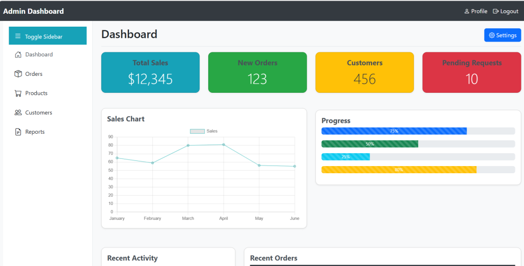
<div class="d-flex justify-content-between flex-wrap flex-md-nowrap align-items-center pt-3 pb-2 mb-3 border-bottom">
  <h1 class="h2">Dashboard</h1>
  <button class="btn btn-primary" (click)="emitSettingsEvent()">
    <i class="bi bi-gear"></i> Settings
  </button>
</div>

<div class="row mb-4">
  <div class="col-md-3">
    <div class="card shadow-sm text-center card-sales">
      <div class="card-body">
        <h5 class="card-title">Total Sales</h5>
        <p class="card-text display-4">$12,345</p>
      </div>
    </div>
  </div>
  <div class="col-md-3">
    <div class="card shadow-sm text-center card-orders">
      <div class="card-body">
        <h5 class="card-title">New Orders</h5>
        <p class="card-text display-4">123</p>
      </div>
    </div>
  </div>
  <div class="col-md-3">
    <div class="card shadow-sm text-center card-customers">
      <div class="card-body">
        <h5 class="card-title">Customers</h5>
        <p class="card-text display-4">456</p>
      </div>
    </div>
  </div>
  <div class="col-md-3">
    <div class="card shadow-sm text-center card-requests">
      <div class="card-body">
        <h5 class="card-title">Pending Requests</h5>
        <p class="card-text display-4">10</p>
      </div>
    </div>
  </div>
</div>

<div class="row mb-4">
  <div class="col-md-6">
    <div class="card shadow-sm">
      <div class="card-body">
        <h5 class="card-title">Sales Chart</h5>
        <canvas id="salesChart"></canvas>
      </div>
    </div>
  </div>
  <div class="col-md-6">
    <div class="card shadow-sm">
      <div class="card-body">
        <h5 class="card-title">Progress</h5>
        <div class="progress">
          <div class="progress-bar progress-bar-striped progress-bar-animated" role="progressbar" style="width: 75%;" aria-valuenow="75" aria-valuemin="0" aria-valuemax="100">75%</div>
        </div>
        <div class="progress">
          <div class="progress-bar progress-bar-striped progress-bar-animated bg-success" role="progressbar" style="width: 50%;" aria-valuenow="50" aria-valuemin="0" aria-valuemax="100">50%</div>
        </div>
        <div class="progress">
          <div class="progress-bar progress-bar-striped progress-bar-animated bg-info" role="progressbar" style="width: 25%;" aria-valuenow="25" aria-valuemin="0" aria-valuemax="100">25%</div>
        </div>
        <div class="progress">
          <div class="progress-bar progress-bar-striped progress-bar-animated bg-warning" role="progressbar" style="width: 80%;" aria-valuenow="80" aria-valuemin="0" aria-valuemax="100">80%</div>
        </div>
      </div>
    </div>
  </div>
</div>

<div class="row mb-4">
  <div class="col-md-4">
    <div class="card shadow-sm">
      <div class="card-body">
        <h5 class="card-title">Recent Activity</h5>
        <ul class="list-group list-group-flush">
          <li class="list-group-item">Order #1234 placed</li>
          <li class="list-group-item">Customer #567 registered</li>
          <li class="list-group-item">Product #890 added</li>
          <li class="list-group-item">Order #345 shipped</li>
        </ul>
      </div>
    </div>
  </div>
  <div class="col-md-8">
    <div class="card shadow-sm">
      <div class="card-body">
        <h5 class="card-title">Recent Orders</h5>
        <div class="table-responsive">
          <table class="table table-striped">
            <thead>
              <tr>
                <th>Order ID</th>
                <th>Customer</th>
                <th>Date</th>
                <th>Status</th>
                <th>Total</th>
              </tr>
            </thead>
            <tbody>
              <tr>
                <td>#1234</td>
                <td>John Doe</td>
                <td>2024-06-01</td>
                <td>Shipped</td>
                <td>$100.00</td>
              </tr>
              <tr>
                <td>#5678</td>
                <td>Jane Smith</td>
                <td>2024-06-02</td>
                <td>Pending</td>
                <td>$200.00</td>
              </tr>
              <!-- Add more rows as needed -->
            </tbody>
          </table>
        </div>
      </div>
    </div>
  </div>
</div>

<div class="row mb-4">
  <div class="col-md-6">
    <div class="card shadow-sm">
      <div class="card-body">
        <h5 class="card-title">Performance</h5>
        <canvas id="performanceChart"></canvas>
      </div>
    </div>
  </div>
  <div class="col-md-6">
    <div class="card shadow-sm">
      <div class="card-body">
        <h5 class="card-title">Notifications</h5>
        <ul class="list-group list-group-flush">
          <li class="list-group-item">New order received</li>
          <li class="list-group-item">Product added</li>
          <li class="list-group-item">Customer registered</li>
          <li class="list-group-item">Shipment delivered</li>
        </ul>
      </div>
    </div>
  </div>
</div>
update dashboard.component.ts file:
import { Component, AfterViewInit, Output, EventEmitter } from '@angular/core';
import { Chart } from 'chart.js/auto';
@Component({
  selector: 'app-dashboard',
  standalone: true,
  imports: [],
  templateUrl: './dashboard.component.html',
  styleUrl: './dashboard.component.css'
})
export class DashboardComponent {
  @Output() settingsEvent = new EventEmitter<void>();

  ngAfterViewInit(): void {
    this.initializeCharts();
  }

  initializeCharts() {
    this.createSalesChart();
    this.createPerformanceChart();
  }

  createSalesChart() {
    const ctx = (document.getElementById('salesChart') as HTMLCanvasElement).getContext('2d');
    if (ctx) {
      new Chart(ctx, {
        type: 'line',
        data: {
          labels: ['January', 'February', 'March', 'April', 'May', 'June'],
          datasets: [{
            label: 'Sales',
            data: [65, 59, 80, 81, 56, 55],
            borderColor: 'rgba(75, 192, 192, 1)',
            borderWidth: 1,
            fill: false
          }]
        },
        options: {
          responsive: true,
          scales: {
            y: {
              beginAtZero: true
            }
          }
        }
      });
    }
  }

  createPerformanceChart() {
    const ctx = (document.getElementById('performanceChart') as HTMLCanvasElement).getContext('2d');
    if (ctx) {
      new Chart(ctx, {
        type: 'doughnut',
        data: {
          labels: ['Completed', 'Pending', 'In Progress', 'On Hold'],
          datasets: [{
            label: 'Performance',
            data: [300, 50, 100, 20],
            backgroundColor: ['#28a745', '#ffc107', '#17a2b8', '#dc3545'],
            hoverOffset: 4
          }]
        },
        options: {
          responsive: true
        }
      });
    }
  }

  emitSettingsEvent() {
    this.settingsEvent.emit();
  }
}
Update nvabr.component.html file:
<nav class="navbar navbar-expand-lg navbar-dark bg-dark">
  <div class="container-fluid">
    <a class="navbar-brand" href="#">Admin Dashboard</a>
    <button class="navbar-toggler" type="button" data-bs-toggle="collapse" data-bs-target="#navbarNav" aria-controls="navbarNav" aria-expanded="false" aria-label="Toggle navigation">
      <span class="navbar-toggler-icon"></span>
    </button>
    <div class="collapse navbar-collapse" id="navbarNav">
      <ul class="navbar-nav ms-auto">
        <li class="nav-item">
          <a class="nav-link" href="#"><i class="bi bi-person"></i> Profile</a>
        </li>
        <li class="nav-item">
          <a class="nav-link" href="#"><i class="bi bi-box-arrow-right"></i> Logout</a>
        </li>
      </ul>
    </div>
  </div>
</nav>
Update sidebar.component.html file:
<div class="d-flex flex-column flex-shrink-0 p-3 sidebar" [class.closed]="isSidebarClosed">
  <button class="toggle-btn" (click)="toggleSidebar()">
    <i class="bi bi-list icon"></i>
    <span *ngIf="!isSidebarClosed">Toggle Sidebar</span>
  </button>
  <ul class="nav nav-pills flex-column mb-auto">
    <li class="nav-item">
      <a href="#" class="nav-link" aria-current="page">
        <i class="bi bi-house-door icon"></i>
        <span *ngIf="!isSidebarClosed">Dashboard</span>
      </a>
    </li>
    <li>
      <a href="#" class="nav-link link-dark">
        <i class="bi bi-box-seam icon"></i>
        <span *ngIf="!isSidebarClosed">Orders</span>
      </a>
    </li>
    <li>
      <a href="#" class="nav-link link-dark">
        <i class="bi bi-cart icon"></i>
        <span *ngIf="!isSidebarClosed">Products</span>
      </a>
    </li>
    <li>
      <a href="#" class="nav-link link-dark">
        <i class="bi bi-people icon"></i>
        <span *ngIf="!isSidebarClosed">Customers</span>
      </a>
    </li>
    <li>
      <a href="#" class="nav-link link-dark">
        <i class="bi bi-file-earmark-text icon"></i>
        <span *ngIf="!isSidebarClosed">Reports</span>
      </a>
    </li>
  </ul>
</div>
Update sidebar.component.ts file:
import { Component, EventEmitter, Output } from '@angular/core';
import { CommonModule } from '@angular/common';

@Component({
  selector: 'app-sidebar',
  standalone: true,
  imports: [CommonModule],
  templateUrl: './sidebar.component.html',
  styleUrl: './sidebar.component.css'
})
export class SidebarComponent {
  @Output() toggle = new EventEmitter<boolean>();
  isSidebarClosed = false;

  toggleSidebar() {
    this.isSidebarClosed = !this.isSidebarClosed;
    this.toggle.emit(this.isSidebarClosed);
  }
}
Update sidebar.component.css file:
.sidebar {
  height: 100vh;
  transition: width 0.3s;
  width: 250px;
  overflow-x: hidden;
}

.sidebar.closed {
  width: 80px;
}

.sidebar .nav-link {
  white-space: nowrap;
  overflow: hidden;
  text-overflow: ellipsis;
  padding: 0.75rem 1rem;
}

.sidebar.closed .nav-link {
  text-align: center;
}

.toggle-btn {
  margin-left: auto;
  margin-right: auto;
  display: block;
}

.bi {
  font-size: 1.25rem;
  margin-right: 10px;
}

.sidebar.closed .bi {
  margin-right: 0;
}
Update app.component.html file:
<app-navbar></app-navbar>
<div class="container-fluid">
  <div class="row">
    <app-sidebar class="col-auto" [class.sidebar-collapsed]="isSidebarClosed" (toggle)="handleSidebarToggle($event)"></app-sidebar>
    <main class="col" [class.main-expanded]="isSidebarClosed">
      <app-dashboard (settingsEvent)="openSettingsModal()"></app-dashboard>
    </main>
  </div>
</div>

<!-- Settings Modal -->
<div class="modal fade" id="settingsModal" tabindex="-1" aria-labelledby="settingsModalLabel" aria-hidden="true">
  <div class="modal-dialog modal-lg">
    <div class="modal-content">
      <div class="modal-header">
        <h5 class="modal-title" id="settingsModalLabel">Settings</h5>
        <button type="button" class="btn-close" data-bs-dismiss="modal" aria-label="Close"></button>
      </div>
      <div class="modal-body">
        <!-- Settings Form -->
        <form>
          <div class="mb-3">
            <label for="setting1" class="form-label">Setting 1</label>
            <input type="text" class="form-control" id="setting1">
          </div>
          <div class="mb-3">
            <label for="setting2" class="form-label">Setting 2</label>
            <input type="text" class="form-control" id="setting2">
          </div>
          <div class="mb-3">
            <label for="setting3" class="form-label">Setting 3</label>
            <input type="text" class="form-control" id="setting3">
          </div>
        </form>
      </div>
      <div class="modal-footer">
        <button type="button" class="btn btn-secondary" data-bs-dismiss="modal">Close</button>
        <button type="button" class="btn btn-primary">Save changes</button>
      </div>
    </div>
  </div>
</div>
Update app.component.ts file:
import { Component, ApplicationRef  } from '@angular/core';
import { CommonModule } from '@angular/common';
import { RouterOutlet } from '@angular/router';
import { NavbarComponent } from "./components/navbar/navbar.component";
import { SidebarComponent } from "./components/sidebar/sidebar.component";
import { DashboardComponent } from "./components/dashboard/dashboard.component";
// Ensure Bootstrap JS is properly imported
declare var bootstrap: any;

@Component({
    selector: 'app-root',
    standalone: true,
    templateUrl: './app.component.html',
    styleUrl: './app.component.css',
    imports: [CommonModule, RouterOutlet, NavbarComponent, SidebarComponent, DashboardComponent]
})
export class AppComponent {
  title = 'admin-dashboard';
  isSidebarClosed = false;

  handleSidebarToggle(isClosed: boolean) {
    this.isSidebarClosed = isClosed;
  }

  openSettingsModal() {
    const settingsModal = new bootstrap.Modal(document.getElementById('settingsModal'), {
      keyboard: false
    });
    settingsModal.show();
  }
}
Update app.component.css file:
.main-expanded {
    margin-left: 80px;
    transition: margin-left 0.3s;
  }
Update styles.css file:
body {
  font-family: 'Segoe UI', Tahoma, Geneva, Verdana, sans-serif;
  background-color: #f8f9fa;
  margin: 0;
  padding: 0;
}

.navbar {
  background-color: #343a40 !important;
}

.navbar-brand {
  font-weight: bold;
  color: #ffffff !important;
}

.navbar-nav .nav-link {
  font-size: 1rem;
  color: #ffffff !important;
}

.card {
  border-radius: 0.75rem;
  margin-bottom: 1.5rem;
  transition: transform 0.2s ease, box-shadow 0.2s ease;
}

.card:hover {
  transform: translateY(-5px);
  box-shadow: 0 4px 8px rgba(0,0,0,0.1);
}

.card-title {
  font-size: 1.25rem;
  font-weight: bold;
  color: #495057;
}

.card-text.display-4 {
  font-size: 2.5rem;
}

.table thead th {
  background-color: #343a40;
  color: white;
}

.table-striped tbody tr:nth-of-type(odd) {
  background-color: rgba(0,0,0,.05);
}

.sidebar {
  background-color: #ffffff;
  border-right: 1px solid #dee2e6;
}

.sidebar .nav-link {
  color: #495057;
  display: flex;
  align-items: center;
  padding: 10px 20px;
  transition: background-color 0.2s ease;
}

.sidebar .nav-link.active,
.sidebar .nav-link:hover {
  background-color: #17a2b8;
  color: #ffffff;
}

.main-expanded {
  margin-left: 80px;
  transition: margin-left 0.3s;
}

.toggle-btn {
  background-color: #17a2b8;
  color: #ffffff;
  border: none;
  width: 100%;
  text-align: left;
  padding: 10px 15px;
  display: flex;
  align-items: center;
  transition: background-color 0.2s ease;
}

.toggle-btn:hover {
  background-color: #138496;
}

.card-sales {
  background-color: #17a2b8;
  color: #ffffff;
}

.card-orders {
  background-color: #28a745;
  color: #ffffff;
}

.card-customers {
  background-color: #ffc107;
  color: #343a40;
}

.card-requests {
  background-color: #dc3545;
  color: #ffffff;
}

.icon {
  margin-right: 10px;
}

.progress {
  height: 20px;
  margin-bottom: 1rem;
}

@media (max-width: 768px) {
  .sidebar {
    width: 100%;
    height: auto;
  }
}
Run Your Application
ng serve
Navigate to http://localhost:4200/
Note: Friends, In this post, I just tell the basic setup and things, you can change the code according to your requirements.
I will appreciate that if you will tell your views for this post. Nothing matters if your views will be good or bad because with your views, I will make my next posts more good and helpful.
Jassa
Thanks
Leave a Reply
You must be logged in to post a comment.