
Hello to all, welcome to therichpost.com. In this post, I will tell you, Angular 17 Material Data Table with Custom Button Click Event Functionality Working Demo.
Post Working
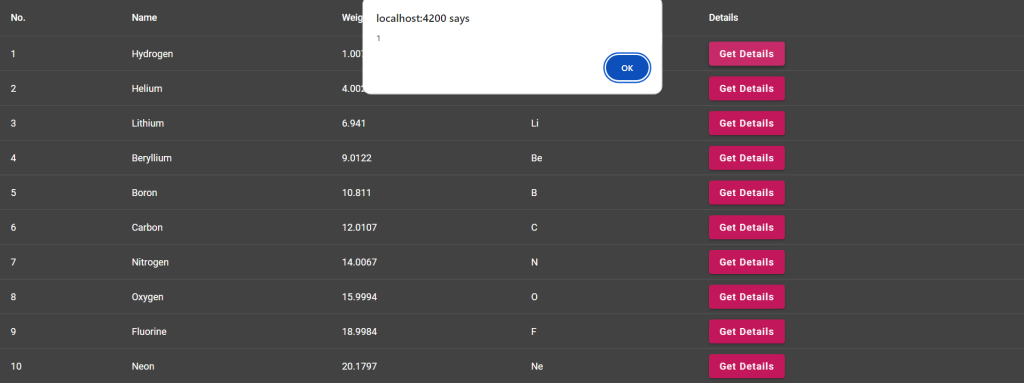
In this post, I am working with material angular datatable with custom button and when I will click on that custom button then I will get popup alert with dynamic row data.
Guy’s Angular 17 came and if you are new in Angular 17 then please check below links:
Here is the working code snippet and please follow carefully:
1. Here are the basics commands to install angular 11 on your system:
npm install -g @angular/cli

ng new angularpopup //Create new Angular Project

$ cd angularpopup // Go inside the Angular Project Folder

ng serve --open // Run and Open the Angular Project

http://localhost:4200/ // Working Angular Project Url
2. After done with above, you need to run below command to add @angular/material into your angular 8 application:
ng add @angular/material
3. Now you need to add below code into your src/app/app.component.ts file:
import { Component } from '@angular/core';
import { CommonModule } from '@angular/common';
import { RouterOutlet } from '@angular/router';
import {MatTableModule} from '@angular/material/table';
import {  MatButtonModule } from '@angular/material/button'

export interface PeriodicElement {
  name: string;
  position: number;
  weight: number;
  symbol: string;
}

const ELEMENT_DATA: PeriodicElement[] = [
  {position: 1, name: 'Hydrogen', weight: 1.0079, symbol: 'H'},
  {position: 2, name: 'Helium', weight: 4.0026, symbol: 'He'},
  {position: 3, name: 'Lithium', weight: 6.941, symbol: 'Li'},
  {position: 4, name: 'Beryllium', weight: 9.0122, symbol: 'Be'},
  {position: 5, name: 'Boron', weight: 10.811, symbol: 'B'},
  {position: 6, name: 'Carbon', weight: 12.0107, symbol: 'C'},
  {position: 7, name: 'Nitrogen', weight: 14.0067, symbol: 'N'},
  {position: 8, name: 'Oxygen', weight: 15.9994, symbol: 'O'},
  {position: 9, name: 'Fluorine', weight: 18.9984, symbol: 'F'},
  {position: 10, name: 'Neon', weight: 20.1797, symbol: 'Ne'},
];

@Component({
  selector: 'app-root',
  standalone: true,
  imports: [CommonModule, RouterOutlet, MatTableModule, MatButtonModule],
  templateUrl: './app.component.html',
  styleUrl: './app.component.css'
})
export class AppComponent {
  title = 'angular17material';
  displayedColumns: string[] = ['position', 'name', 'weight', 'symbol', "getdetails"];
  dataSource = ELEMENT_DATA;
  getRecord(name: any)
  {
    alert(name);
  }
}
4. Now you need to add below code into src/app/app.component.html file:
<table mat-table [dataSource]="dataSource" class="mat-elevation-z8">

  <!--- Note that these columns can be defined in any order.
        The actual rendered columns are set as a property on the row definition" -->

  <!-- Position Column -->
  <ng-container matColumnDef="position">
    <th mat-header-cell *matHeaderCellDef> No. </th>
    <td mat-cell *matCellDef="let element"> {{element.position}} </td>
  </ng-container>

  <!-- Name Column -->
  <ng-container matColumnDef="name">
    <th mat-header-cell *matHeaderCellDef> Name </th>
    <td mat-cell *matCellDef="let element"> {{element.name}} </td>
  </ng-container>

  <!-- Weight Column -->
  <ng-container matColumnDef="weight">
    <th mat-header-cell *matHeaderCellDef> Weight </th>
    <td mat-cell *matCellDef="let element"> {{element.weight}} </td>
  </ng-container>

  <!-- Symbol Column -->
  <ng-container matColumnDef="symbol">
    <th mat-header-cell *matHeaderCellDef> Symbol </th>
    <td mat-cell *matCellDef="let element"> {{element.symbol}} </td>
  </ng-container>

    <!-- Get Details -->
    <ng-container matColumnDef="getdetails">
      <th mat-header-cell *matHeaderCellDef> Details </th>
      <td mat-cell *matCellDef="let element"> <button mat-raised-button color="primary" (click)="getRecord(element.position)">Get Details</button> </td>
    </ng-container>

  <tr mat-header-row *matHeaderRowDef="displayedColumns"></tr>
  <tr mat-row *matRowDef="let row; columns: displayedColumns;"></tr>
</table>
5. Now you need to add below code into src/app/app.component.css file:
table {width: 100%;}
In the end, don’t forgot to run ng serve command. If you have any query then do comment below.
Note: Friends, I just tell the basic setup and things, you can change the code according to your requirements. For better understanding please watch the above video.
I will appreciate that if you will tell your views for this post. Nothing matters if your views will be good or bad.
Jassa
Thank you.
Leave a Reply