Hello friends, welcome back to my blog. Today in this blog post, I am going to show you, BootstrapVue – How to prevent accordion to close while clicking on sibling divs?
Guy’s here you can see more Vue 3 Bootstrap 5 working example:
- Bootstrap 5 Popover working in Vue 3.
- Bootstrap 5 Tooltip working in Vue 3.
- Bootstrap5 Popup Modal with Forms in Vue 3.

Vue 3 and Bootstrap 5 came and if you are new then you must check below two links:
Friends now I proceed onwards and here is the working code snippet and use this carefully to avoid the mistakes:
1. Firstly friends we need fresh vue setup and for this we need to run below commands . Secondly we should also have latest node version installed on our system. With below we will have bootstrap-vue modules in our Vue 2 application:
npm install -g @vue/cli

vue create vuedemo //select vue 2

cd vuedemo

npm install vue bootstrap bootstrap-vue

npm run serve //http://localhost:8080/
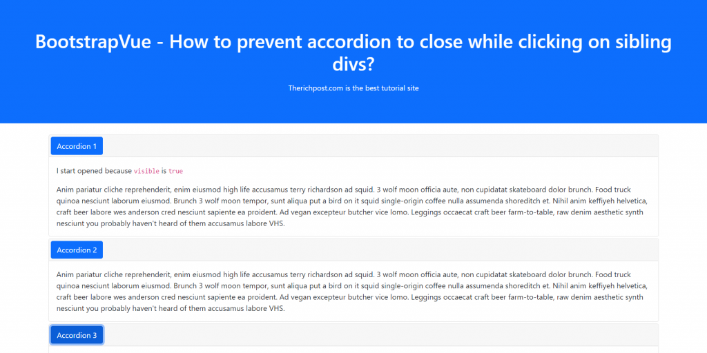
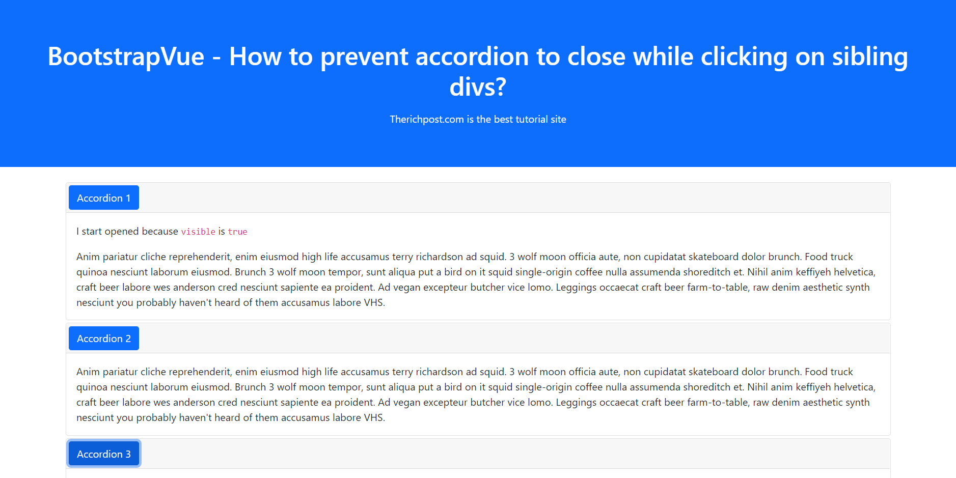
2. Now friends we need to add below code into src/App.vue file to check the final output on browser:
<template>
  <div>
      <b-container>
      <div class="accordion" role="tablist">
        <b-card no-body class="mb-1">
          <b-card-header header-tag="header" class="p-1" role="tab">
            <b-button block v-b-toggle.accordion-1 variant="primary">Accordion 1</b-button>
          </b-card-header>
          <b-collapse id="accordion-1" visible role="tabpanel">
            <b-card-body>
              <b-card-text>I start opened because <code>visible</code> is <code>true</code></b-card-text>
              <b-card-text>{{ text }}</b-card-text>
            </b-card-body>
          </b-collapse>
        </b-card>

        <b-card no-body class="mb-1">
          <b-card-header header-tag="header" class="p-1" role="tab">
            <b-button block v-b-toggle.accordion-2 variant="primary">Accordion 2</b-button>
          </b-card-header>
          <b-collapse id="accordion-2" role="tabpanel">
            <b-card-body>
              <b-card-text>{{ text }}</b-card-text>
            </b-card-body>
          </b-collapse>
        </b-card>

        <b-card no-body class="mb-1">
          <b-card-header header-tag="header" class="p-1" role="tab">
            <b-button block v-b-toggle.accordion-3 variant="primary">Accordion 3</b-button>
          </b-card-header>
          <b-collapse id="accordion-3" role="tabpanel">
            <b-card-body>
              <b-card-text>{{ text }}</b-card-text>
            </b-card-body>
          </b-collapse>
        </b-card>
      </div>
    </b-container>
  </div>
</template>

<script>
  export default {
    data() {
      return {
        text: `
          Anim pariatur cliche reprehenderit, enim eiusmod high life accusamus terry
          richardson ad squid. 3 wolf moon officia aute, non cupidatat skateboard dolor
          brunch. Food truck quinoa nesciunt laborum eiusmod. Brunch 3 wolf moon
          tempor, sunt aliqua put a bird on it squid single-origin coffee nulla
          assumenda shoreditch et. Nihil anim keffiyeh helvetica, craft beer labore
          wes anderson cred nesciunt sapiente ea proident. Ad vegan excepteur butcher
          vice lomo. Leggings occaecat craft beer farm-to-table, raw denim aesthetic
          synth nesciunt you probably haven't heard of them accusamus labore VHS.
        `
      }
    }
  }
</script>
3. Guys now add below code inside src/main js file to get bootstrap-vue styles and scripts:
import Vue from 'vue'
import App from './App.vue'
import { BootstrapVue, IconsPlugin } from 'bootstrap-vue'

// Import Bootstrap an BootstrapVue CSS files (order is important)
import 'bootstrap/dist/css/bootstrap.css'
import 'bootstrap-vue/dist/bootstrap-vue.css'

// Make BootstrapVue available throughout your project
Vue.use(BootstrapVue)
// Optionally install the BootstrapVue icon components plugin
Vue.use(IconsPlugin)

Vue.config.productionTip = false

new Vue({
  render: h => h(App),
}).$mount('#app')
Now we are done friends also and If you have any kind of query or suggestion or any requirement then feel free to comment below.
Note: Friends, I just tell the basic setup and things, you can change the code according to your requirements.
I will appreciate that if you will tell your views for this post. Nothing matters if your views will be good or bad.
Jassa
Thanks

Leave a Reply
You must be logged in to post a comment.