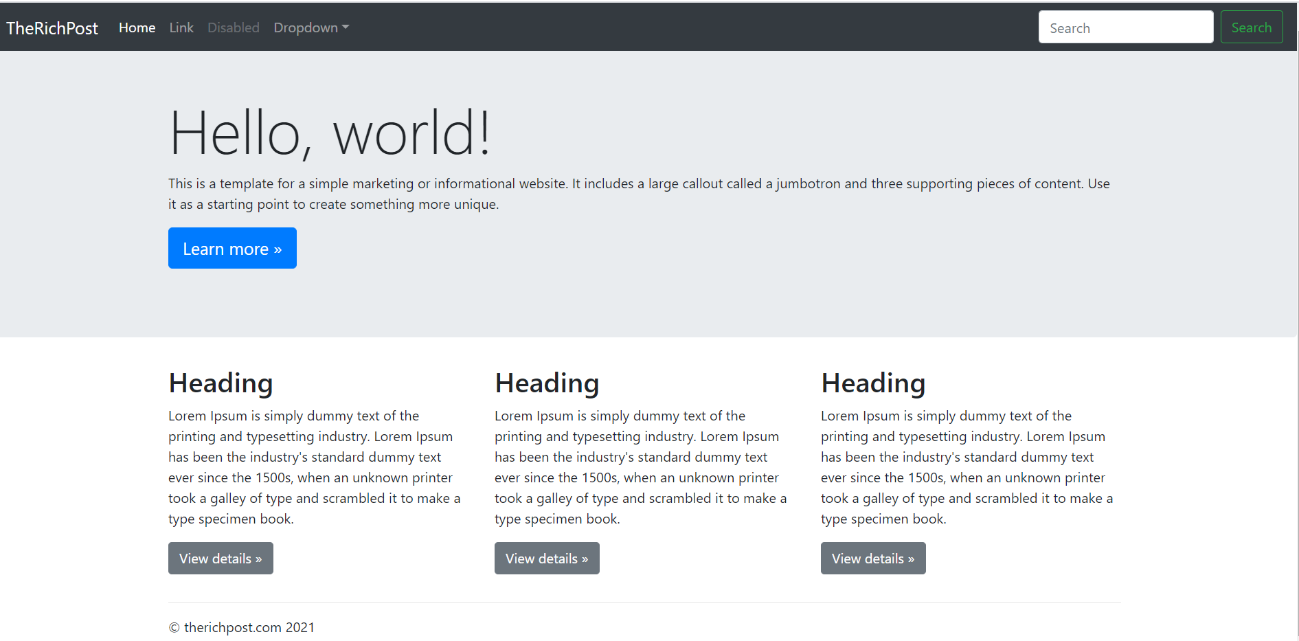
Hello friends, welcome back to my blog. Today in this blog post, I am going to tell you, Angular 11 Integrate Bootstrap Template From Scratch.
Friends in this template integration we will cover below things:
- Template will be fully responsive.
- Toggle navigation support for mobile devices.
- Sticky navbar.
- Component separation in Angular 11.
Angular 11 came and if you are new then you must check below two links:
Angular11 Basic Tutorials
Friends now I proceed onwards and here is the working code snippet for Angular 11 Integrate Bootstrap Template From Scratch and please use carefully this to avoid the mistakes:
1. Firstly friends we need fresh angular 11 setup and for this we need to run below commands but if you already have angular 11 setup then you can avoid below commands. Secondly we should also have latest node version installed on our system:
npm install -g @angular/cli

ng new angularbootstrap //Create new Angular Project

cd angularbootstrap // Go inside the Angular Project Folder

ng serve --open // Run and Open the Angular Project

http://localhost:4200/ // Working Angular Project Url
2. Now friends, here we need to run below commands into our project terminal to install bootstrap and jquery modules into our angular application:
npm install --save bootstrap

npm i jquery --save

npm install popper.js --save
3. Now friends, here we need to add below into our angular.json file:
"styles": [
       ...
  "node_modules/bootstrap/dist/css/bootstrap.min.css"
      ],
"scripts": [
 ...
"node_modules/jquery/dist/jquery.min.js",
"node_modules/bootstrap/dist/js/bootstrap.min.js",
"node_modules/popper.js/dist/umd/popper.min.js"]
3. Now friends, here we need to run below command to run our angular 11 application again:
ng serve --o
4. Now friends we just need to add below code into src/app/app.component.html file to get final out on the web browser:
<nav class="navbar navbar-expand-md navbar-dark fixed-top bg-dark">
<a class="navbar-brand" href="#">TheRichPost</a>
<button class="navbar-toggler" type="button" data-toggle="collapse" data-target="#navbarsExampleDefault" aria-controls="navbarsExampleDefault" aria-expanded="false" aria-label="Toggle navigation">
<span class="navbar-toggler-icon"></span>
</button>
<div class="collapse navbar-collapse" id="navbarsExampleDefault">
<ul class="navbar-nav mr-auto">
<li class="nav-item active">
<a class="nav-link" href="#">Home <span class="sr-only">(current)</span></a>
</li>
<li class="nav-item">
<a class="nav-link" href="#">Link</a>
</li>
<li class="nav-item">
<a class="nav-link disabled" href="#">Disabled</a>
</li>
<li class="nav-item dropdown">
<a class="nav-link dropdown-toggle" href="http://example.com" id="dropdown01" data-toggle="dropdown" aria-haspopup="true" aria-expanded="false">Dropdown</a>
<div class="dropdown-menu" aria-labelledby="dropdown01">
<a class="dropdown-item" href="#">Action</a>
<a class="dropdown-item" href="#">Another action</a>
<a class="dropdown-item" href="#">Something else here</a>
</div>
</li>
</ul>
<form class="form-inline my-2 my-lg-0">
<input class="form-control mr-sm-2" type="text" placeholder="Search" aria-label="Search">
<button class="btn btn-outline-success my-2 my-sm-0" type="submit">Search</button>
</form>
</div>
</nav>
<main role="main">
<!-- Main jumbotron for a primary marketing message or call to action -->
<div class="jumbotron">
<div class="container">
<h1 class="display-3">Hello, world!</h1>
<p>This is a template for a simple marketing or informational website. It includes a large callout called a jumbotron and three supporting pieces of content. Use it as a starting point to create something more unique.</p>
<p><a class="btn btn-primary btn-lg" href="#" role="button">Learn more »</a></p>
</div>
</div>
<div class="container">
<!-- Example row of columns -->
<div class="row">
<div class="col-md-4">
<h2>Heading</h2>
<p>Lorem Ipsum is simply dummy text of the printing and typesetting industry. Lorem Ipsum has been the industry's standard dummy text ever since the 1500s, when an unknown printer took a galley of type and scrambled it to make a type specimen book. </p>
<p><a class="btn btn-secondary" href="#" role="button">View details »</a></p>
</div>
<div class="col-md-4">
<h2>Heading</h2>
<p>Lorem Ipsum is simply dummy text of the printing and typesetting industry. Lorem Ipsum has been the industry's standard dummy text ever since the 1500s, when an unknown printer took a galley of type and scrambled it to make a type specimen book.</p>
<p><a class="btn btn-secondary" href="#" role="button">View details »</a></p>
</div>
</div>
<hr>
</div> <!-- /container -->
</main>
<footer class="container">
<p>© therichpost.com 2021</p>
</footer>
5. Now friends we just need to add below code into src/index.html file:
<head>
 ...
  <style>
    body {
  padding-top: 3.5rem;
}
  </style>
</head>
Now we are done friends. If you have any kind of query, suggestion and new requirement then feel free to comment below.
Note: Friends, In this post, I just tell the basic setup and things, you can change the code according to your requirements. For better live working experience, please check the video on the top.
I will appreciate that if you will tell your views for this post. Nothing matters if your views will be good or bad because with your views, I will make my next posts more good and helpful.
Jassa
Thanks

Leave a Reply
You must be logged in to post a comment.