Year: 2021

  • Angular 12 Release Date ?

    Angular 12 Release Date ?

    Hello guys, how are you. Welcome back to my blog therichpost.com. Today in this blog post, I am going to tell you Angular 12 release date?

    I personally like Angular very much. On my blog, there are almost 500 posts related to Angular.

    What is Angular?

    Angular is an open-source JS web framework. It is use to built single page small and large scale applications and has over 68,000 stars on GitHub. Angular is written in TypeScript and developed by Google. Now Angular11 is active version.

    Angular older versions

    I have shared too many posts related to Angular older versions and here are they:

    1. Angular2
    2. Angular4
    3. Angular6
    4. Angular7
    5. Angular8
    6. Angular9
    7. Angular10
    8. Angular11
    9. Angular12

    Angular 12 release date

    Preview release of Angular 12.0.0 held on 21 April 2021. May be in the end of May 2021 Angular12 will be released. In future, I will share posts and videos related to Angular 12.

    Angular 12 New Features

    1. There will be the support for adding directives to host elements.
    2. Improved test times and debugging with automatic test environment tear down.
    3. Enhanced Build Performance With ngc as a tsc Plug-In Distribution
    4. Support for inline Sass in components.
    5. More to come soon.

    This is Angular 11 playlist on my YouTube Channel:

    Angular Tutorials

    I will update you more about Angular 12 version soon.

    Guys you can also share your views on this post. If you have something more about Angular 12 then comment below.

    Thanks.

    Sharing and Learning.

  • Laravel 8 Bootstrap 5 Admin Dashboard Template For Beginners

    Laravel 8 Bootstrap 5 Admin Dashboard Template For Beginners

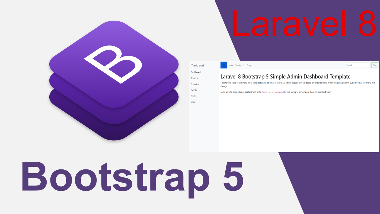
    Hello friends, welcome back to my blog. Today in this blog post, I am going to show you, Laravel 8 Bootstrap 5 Admin Dashboard Template For Beginners.

    Laravel Bootstrap Admin Template
    Laravel 8 Bootstrap 5 Admin Dashboard Template For Beginners
    Laravel 8 Bootstrap 5 Admin Dashboard Template For Beginners

    Guys please check below link for more laravel 8 posts:


    Friends now I proceed onwards and here is the working code snippet and please use this carefully to avoid the mistakes:

    1. Now friends, here is the complete working code snippet and I have added inside my laravel 8 projectname/resources/views/ welcome.blade.php file for showing you working example but you can add according to your requirement:

    I have added bootstrap 5 cdn’s for template working. Guys this is very easy to implement.

    <!DOCTYPE html>
    <html lang="en">
    <head>
    <title>Admin Template</title>
    <meta charset="UTF-8">
    <meta name="viewport" content="width=device-width, initial-scale=1">
    
    <!--CDN Links-->
    <link href="https://cdn.jsdelivr.net/npm/bootstrap@5.0.0-beta3/dist/css/bootstrap.min.css" rel="stylesheet">
    <script src="https://cdn.jsdelivr.net/npm/bootstrap@5.0.0-beta3/dist/js/bootstrap.min.js"></script>
    
    <!--Custom Styles-->
    <style>
        body {
        overflow-x: hidden;
      }
      
      #sidebar-wrapper {
        min-height: 100vh;
        margin-left: -15rem;
        -webkit-transition: margin .25s ease-out;
        -moz-transition: margin .25s ease-out;
        -o-transition: margin .25s ease-out;
        transition: margin .25s ease-out;
      }
      
      #sidebar-wrapper .sidebar-heading {
        padding: 0.875rem 1.25rem;
        font-size: 1.2rem;
      }
      
      #sidebar-wrapper .list-group {
        width: 15rem;
      }
      
      #page-content-wrapper {
        min-width: 100vw;
      }
      
      #wrapper.toggled #sidebar-wrapper {
        margin-left: 0;
      }
      
      @media (min-width: 768px) {
        #sidebar-wrapper {
          margin-left: 0;
        }
      
        #page-content-wrapper {
          min-width: 0;
          width: 100%;
        }
        .show
        {
          margin-left: 0!important;
        }
        .hide
        {
          margin-left: -15rem!important;
        }
      }
      @media (max-width: 767px) {
        .show
        {
          margin-left: -15erm!important;
        }
        .hide
        {
          margin-left: -0!important;
        }
      }
    </style>
    <script>
    /* Sidebar Toggle Functionality */  
    function myFunction() {
      var x = document.getElementById("sidebar-wrapper");
      name = "show";
      arr = x.className.split(" ");
      if (arr.indexOf(name) == -1) {
        x.classList.add("show");
        x.classList.remove("hide");
      } else {
        x.classList.remove("show");
        x.classList.add("hide");
      }
    }
    </script>
    </head>
    <body>
    
        <div class="d-flex" id="wrapper">
    
            <!-- Sidebar -->
            <div class="bg-light border-right show" id="sidebar-wrapper">
              <div class="sidebar-heading">Therichpost </div>
              <div class="list-group list-group-flush">
                <a href="#" class="list-group-item list-group-item-action bg-light">Dashboard</a>
                <a href="#" class="list-group-item list-group-item-action bg-light">Shortcuts</a>
                <a href="#" class="list-group-item list-group-item-action bg-light">Overview</a>
                <a href="#" class="list-group-item list-group-item-action bg-light">Events</a>
                <a href="#" class="list-group-item list-group-item-action bg-light">Profile</a>
                <a href="#" class="list-group-item list-group-item-action bg-light">Status</a>
              </div>
            </div>
            <!-- /#sidebar-wrapper -->
          
            <!-- Page Content -->
            <div id="page-content-wrapper">
          
              <nav class="navbar navbar-expand-lg navbar-light bg-light">
               
                <div class="container-fluid">
                  <button class="btn btn-primary" onclick="myFunction()"><span class="navbar-toggler-icon"></span></button>
                  <button class="navbar-toggler" type="button" data-bs-toggle="collapse" data-bs-target="#navbarSupportedContent" aria-controls="navbarSupportedContent" aria-expanded="false" aria-label="Toggle navigation">
                    <span class="navbar-toggler-icon"></span>
                  </button>
                  <div class="collapse navbar-collapse" id="navbarSupportedContent">
                    <ul class="navbar-nav me-auto mb-2 mb-lg-0">
                      <li class="nav-item">
                        <a class="nav-link active" aria-current="page" href="#">Home</a>
                      </li>
                      <li class="nav-item dropdown">
                        <a class="nav-link dropdown-toggle" href="#" id="navbarDropdown" role="button" data-bs-toggle="dropdown" aria-expanded="false">
                          Services
                        </a>
                        <ul class="dropdown-menu" aria-labelledby="navbarDropdown">
                          <li><a class="dropdown-item" href="#">Angular</a></li>
                          <li><a class="dropdown-item" href="#">Reactjs</a></li>
                          <li><hr class="dropdown-divider"></li>
                          <li><a class="dropdown-item" href="#">Free Templates</a></li>
                        </ul>
                      </li>
                      <li class="nav-item">
                        <a class="nav-link" href="#" tabindex="-1">Blog</a>
                      </li>
                    </ul>
                    <form class="d-flex">
                      <input class="form-control me-2" type="search" placeholder="Search" aria-label="Search">
                      <button class="btn btn-outline-success" type="button">Search</button>
                    </form>
                  </div>
                </div>
              </nav>
          
              <div class="container-fluid">
                <h1 class="mt-4">Laravel 8 Bootstrap 5 Simple Admin Dashboard Template</h1>
                <p>The starting state of the menu will appear collapsed on smaller screens, and will appear non-collapsed on larger screens. When toggled using the button below, the menu will change.</p>
                <p>Make sure to keep all page content within the <code>#page-content-wrapper</code>. The top navbar is optional, and just for demonstration.</p>
              </div>
            </div>
            <!-- /#page-content-wrapper -->
          
          </div>
          <!-- /#wrapper -->
    
    </body>
    </html>

    Now we are done friends. If you have any kind of query, suggestion and new requirement then feel free to comment below.

    Note: Friends, In this post, I just tell the basic setup and things, you can change the code according to your requirements.

    I will appreciate that if you will tell your views for this post. Nothing matters if your views will be good or bad because with your views, I will make my next posts more good and helpful.

    Jassa

    Thanks

  • Vue 3 Bootstrap 5 Free Responsive Template

    Vue 3 Bootstrap 5 Free Responsive Template

    Hello friends, welcome back to my blog. Today in this blog post, I am going to show you, Vue 3 Bootstrap 5 Free Responsive Template.

    Bootstrap 5 in Vuejs

    Vuejs-Bootstrap-5-Free-Template
    Vuejs-Bootstrap-5-Free-Template

    Vue 3 and Bootstrap 5 came and if you are new then you must check below two links:

    1. Vuejs
    2. Bootstrap 5

    Friends now I proceed onwards and here is the working code snippet and use this carefully to avoid the mistakes:

    1. Firstly friends we need fresh vue 3 setup and for this we need to run below commands . Secondly we should also have latest node version installed on our system. With below we will have  bootstrap 5 modules in our Vue 3 application:

    npm install -g @vue/cli
    
    vue create vueboot5
    
    cd vueboot5
    
    npm i bootstrap@next
    
    npm run serve //http://localhost:8080/


    2. Now friends we need to add below code into vueboot5/src/App.vue file to check the final output on browser:

    <template>
     <div class="d-flex" id="wrapper">
    
      <!-- Sidebar -->
      <div class="bg-light border-right" id="sidebar-wrapper" v-show='toggle'>
        <div class="sidebar-heading">Therichpost </div>
        <div class="list-group list-group-flush">
          <a href="#" class="list-group-item list-group-item-action bg-light">Dashboard</a>
          <a href="#" class="list-group-item list-group-item-action bg-light">Shortcuts</a>
          <a href="#" class="list-group-item list-group-item-action bg-light">Overview</a>
          <a href="#" class="list-group-item list-group-item-action bg-light">Events</a>
          <a href="#" class="list-group-item list-group-item-action bg-light">Profile</a>
          <a href="#" class="list-group-item list-group-item-action bg-light">Status</a>
        </div>
      </div>
      <!-- /#sidebar-wrapper -->
    
      <!-- Page Content -->
      <div id="page-content-wrapper">
    
        <nav class="navbar navbar-expand-lg navbar-light bg-light">
         
          <div class="container-fluid">
            <button class="btn btn-primary" @click='toggle = !toggle'>Toggle Menu</button>
            <button class="navbar-toggler" type="button" data-bs-toggle="collapse" data-bs-target="#navbarSupportedContent" aria-controls="navbarSupportedContent" aria-expanded="false" aria-label="Toggle navigation">
              <span class="navbar-toggler-icon"></span>
            </button>
            <div class="collapse navbar-collapse" id="navbarSupportedContent">
              <ul class="navbar-nav me-auto mb-2 mb-lg-0">
                <li class="nav-item">
                  <a class="nav-link active" aria-current="page" href="#">Home</a>
                </li>
                <li class="nav-item">
                  <a class="nav-link" href="#">Link</a>
                </li>
                <li class="nav-item dropdown">
                  <a class="nav-link dropdown-toggle" href="#" id="navbarDropdown" role="button" data-bs-toggle="dropdown" aria-expanded="false">
                    Dropdown
                  </a>
                  <ul class="dropdown-menu" aria-labelledby="navbarDropdown">
                    <li><a class="dropdown-item" href="#">Action</a></li>
                    <li><a class="dropdown-item" href="#">Another action</a></li>
                    <li><hr class="dropdown-divider"></li>
                    <li><a class="dropdown-item" href="#">Something else here</a></li>
                  </ul>
                </li>
                <li class="nav-item">
                  <a class="nav-link disabled" href="#" tabindex="-1" aria-disabled="true">Disabled</a>
                </li>
              </ul>
              <form class="d-flex">
                <input class="form-control me-2" type="search" placeholder="Search" aria-label="Search">
                <button class="btn btn-outline-success" type="button">Search</button>
              </form>
            </div>
          </div>
        </nav>
    
        <div class="container-fluid">
          <h1 class="mt-4">Vue 3 Bootstrap 5 Simple Sidebar Template</h1>
          <p>When toggled using the button below, the menu will change.</p>
          <p>Make sure to keep all page content within the <code>#page-content-wrapper</code>. The top navbar is optional, and just for demonstration.</p>
        </div>
      </div>
      <!-- /#page-content-wrapper -->
    
    </div>
    <!-- /#wrapper -->
    </template>
    
    <script>
    
    import "bootstrap/dist/css/bootstrap.min.css";
    import "bootstrap/dist/js/bootstrap.min.js";
    import "./App.css"
    
    export default {
     data () {
       return {
         toggle: true //toggle variable
       }
     },
    }
    </script>

    3. Now friends please create new file “App.css” inside vueboot5/src folder and add below code inside it:

    body {
        overflow-x: hidden;
      }
      
      #sidebar-wrapper {
        min-height: 100vh;
       
        -webkit-transition: margin .25s ease-out;
        -moz-transition: margin .25s ease-out;
        -o-transition: margin .25s ease-out;
        transition: margin .25s ease-out;
      }
      
      #sidebar-wrapper .sidebar-heading {
        padding: 0.875rem 1.25rem;
        font-size: 1.2rem;
      }
      
      #sidebar-wrapper .list-group {
        width: 15rem;
      }
      
      #page-content-wrapper {
        min-width: 100vw;
      }
      
      #wrapper.toggled #sidebar-wrapper {
        margin-left: 0;
      }
      
      @media (min-width: 768px) {
        #sidebar-wrapper {
          margin-left: 0;
        }
      
        #page-content-wrapper {
          min-width: 0;
          width: 100%;
        }
       
       
      }

    Now we are done friends and If you have any kind of query or suggestion or any requirement then feel free to comment below.

    Note: Friends, I just tell the basic setup and things, you can change the code according to your requirements.

    I will appreciate that if you will tell your views for this post. Nothing matters if your views will be good or bad.

    Jassa

    Thanks

  • Angular 11 Ag Grid with Dynamic Data from Web API

    Angular 11 Ag Grid with Dynamic Data from Web API

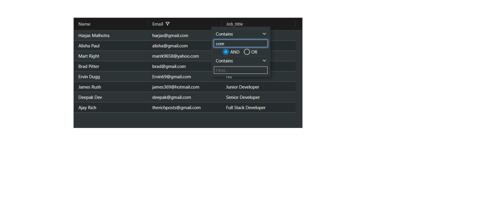
    Hello friends, welcome back to my blog. Today this blog post will tell you, Angular 11 Ag Grid with Dynamic Data from Web API.

    Ag-grid with dynamic data

    Angular 11 Ag Grid with Dynamic Data from Web API
    Angular 11 Ag Grid with Dynamic Data from Web API

    Angular 11 came and Bootstrap 5 also and very soon Angular 12 will come and if you are new then you must check below two links:

    1. Angular11 Basic Tutorials
    2. Bootstrap 5

    Friends now I proceed onwards and here is the working code snippet and please use carefully this to avoid the mistakes:

    1. Firstly friends we need fresh angular 11 setup and for this we need to run below commands but if you already have angular 11 setup then you can avoid below commands. Secondly we should also have latest node version installed on our system:

    npm install -g @angular/cli 
    
    ng new angulardemo //Create new Angular Project
    
    cd angulardemo // Go inside the Angular Project Folder

    2. Now friends, here we need to run below commands into our project terminal to install ag-grid modules into our angular application:

    npm install --save ag-grid-community ag-grid-angular

    3. Now friends we just need to add below code into angulardemo/src/app/app.component.html file to get final out on the web browser:

    <ag-grid-angular
            style="width: 620px; height: 300px;" 
          class="ag-theme-balham-dark"
            [rowData]="rowData"
            [columnDefs]="columnDefs"
            >
    </ag-grid-angular>

    4. Now friends we just need to add below code into angulardemo/angular.json file:

    "styles": [
                 ...
                 "node_modules/ag-grid-community/dist/styles/ag-grid.css",
                 "node_modules/ag-grid-community/dist/styles/ag-theme-balham-dark.min.css"
               ],

    5. Now friends we just need to add below code into angulardemo/src/app/app.module.ts file:

    ...
    import { AgGridModule } from 'ag-grid-angular';
    import { HttpClientModule } from '@angular/common/http';
    
    @NgModule({
     ...
      imports: [
        ...
        HttpClientModule,
        AgGridModule.withComponents([]),
      ]...
    

    6. Now friends we just need to add below code into angulardemo/src/app/app.component.ts file:

    ...
    import { HttpClient } from '@angular/common/http';
    export class AppComponent {
    ...
    //ag-grid columns
      columnDefs = [
        {headerName: 'Name', field: 'name', sortable: true, filter: true },
        {headerName: 'Email', field: 'email', sortable: true, filter: true },
        {headerName: 'Job_title', field: 'job_title', sortable: true, filter: true}
    ];
    
    //data variable
    rowData:any;
      constructor(private http: HttpClient){
        //get request
        this.http.get('https://www.testjsonapi.com/users/').subscribe(data => {
    
          //data storing for use in html component
          this.rowData = data;
              }, error => console.error(error));
      }
    }

    Friends in the end must run ng serve command into your terminal to run the angular 11 project.

    Now we are done friends. If you have any kind of query, suggestion and new requirement then feel free to comment below.

    Note: Friends, In this post, I just tell the basic setup and things, you can change the code according to your requirements.

    I will appreciate that if you will tell your views for this post. Nothing matters if your views will be good or bad because with your views, I will make my next posts more good and helpful.

    Jassa

    Thanks

  • How to create responsive website using Bootstrap 5?

    How to create responsive website using Bootstrap 5?

    Hello friends, welcome back to my blog. Today this blog post will tell you, How to create responsive website using Bootstrap 5?

    In this post, guys we will get below things:

    • Bootstrap 5 Free Template Creation.
    • Bootstrap Sidebar Template Fully Responsive.

    Bootstrap Sidebar Template Working Video

    Bootstrap 5 Template
    Bootstrap 5 Template

    Angular 11 came and Bootstrap 5 also and very soon Angular 12 will come and if you are new then you must check below two links:

    1. Angular11 Basic Tutorials
    2. Bootstrap 5

    Friends now I proceed onwards and here is the working code snippet for How to create responsive website using Bootstrap 5? and please use carefully this to avoid the mistakes:

    1. Firstly friends we need to create test.html file and add below inside that file:

    <!DOCTYPE html>
    <html lang="en">
    <head>
    <title>Page Title</title>
    <meta charset="UTF-8">
    <meta name="viewport" content="width=device-width, initial-scale=1">
    
    <!--CDN Links-->
    <link href="https://cdn.jsdelivr.net/npm/bootstrap@5.0.0-beta3/dist/css/bootstrap.min.css" rel="stylesheet">
    <script src="https://cdn.jsdelivr.net/npm/bootstrap@5.0.0-beta3/dist/js/bootstrap.min.js"></script>
    
    <!--Custom Styles-->
    <style>
        body {
        overflow-x: hidden;
      }
      
      #sidebar-wrapper {
        min-height: 100vh;
        margin-left: -15rem;
        -webkit-transition: margin .25s ease-out;
        -moz-transition: margin .25s ease-out;
        -o-transition: margin .25s ease-out;
        transition: margin .25s ease-out;
      }
      
      #sidebar-wrapper .sidebar-heading {
        padding: 0.875rem 1.25rem;
        font-size: 1.2rem;
      }
      
      #sidebar-wrapper .list-group {
        width: 15rem;
      }
      
      #page-content-wrapper {
        min-width: 100vw;
      }
      
      #wrapper.toggled #sidebar-wrapper {
        margin-left: 0;
      }
      
      @media (min-width: 768px) {
        #sidebar-wrapper {
          margin-left: 0;
        }
      
        #page-content-wrapper {
          min-width: 0;
          width: 100%;
        }
        .show
        {
          margin-left: 0!important;
        }
        .hide
        {
          margin-left: -15rem!important;
        }
      }
      @media (max-width: 767px) {
        .show
        {
          margin-left: -15erm!important;
        }
        .hide
        {
          margin-left: -0!important;
        }
      }
    </style>
    <script>
    /* Sidebar Toggle Functionality */  
    function myFunction() {
      var x = document.getElementById("sidebar-wrapper");
      name = "show";
      arr = x.className.split(" ");
      if (arr.indexOf(name) == -1) {
        x.classList.add("show");
        x.classList.remove("hide");
      } else {
        x.classList.remove("show");
        x.classList.add("hide");
      }
    }
    </script>
    </head>
    <body>
    
        <div class="d-flex" id="wrapper">
    
            <!-- Sidebar -->
            <div class="bg-light border-right show" id="sidebar-wrapper">
              <div class="sidebar-heading">Therichpost </div>
              <div class="list-group list-group-flush">
                <a href="#" class="list-group-item list-group-item-action bg-light">Dashboard</a>
                <a href="#" class="list-group-item list-group-item-action bg-light">Shortcuts</a>
                <a href="#" class="list-group-item list-group-item-action bg-light">Overview</a>
                <a href="#" class="list-group-item list-group-item-action bg-light">Events</a>
                <a href="#" class="list-group-item list-group-item-action bg-light">Profile</a>
                <a href="#" class="list-group-item list-group-item-action bg-light">Status</a>
              </div>
            </div>
            <!-- /#sidebar-wrapper -->
          
            <!-- Page Content -->
            <div id="page-content-wrapper">
          
              <nav class="navbar navbar-expand-lg navbar-light bg-light">
               
                <div class="container-fluid">
                  <button class="btn btn-primary" onclick="myFunction()"><span class="navbar-toggler-icon"></span></button>
                  <button class="navbar-toggler" type="button" data-bs-toggle="collapse" data-bs-target="#navbarSupportedContent" aria-controls="navbarSupportedContent" aria-expanded="false" aria-label="Toggle navigation">
                    <span class="navbar-toggler-icon"></span>
                  </button>
                  <div class="collapse navbar-collapse" id="navbarSupportedContent">
                    <ul class="navbar-nav me-auto mb-2 mb-lg-0">
                      <li class="nav-item">
                        <a class="nav-link active" aria-current="page" href="#">Home</a>
                      </li>
                      <li class="nav-item dropdown">
                        <a class="nav-link dropdown-toggle" href="#" id="navbarDropdown" role="button" data-bs-toggle="dropdown" aria-expanded="false">
                          Services
                        </a>
                        <ul class="dropdown-menu" aria-labelledby="navbarDropdown">
                          <li><a class="dropdown-item" href="#">Angular</a></li>
                          <li><a class="dropdown-item" href="#">Reactjs</a></li>
                          <li><hr class="dropdown-divider"></li>
                          <li><a class="dropdown-item" href="#">Free Templates</a></li>
                        </ul>
                      </li>
                      <li class="nav-item">
                        <a class="nav-link" href="#" tabindex="-1">Blog</a>
                      </li>
                    </ul>
                    <form class="d-flex">
                      <input class="form-control me-2" type="search" placeholder="Search" aria-label="Search">
                      <button class="btn btn-outline-success" type="button">Search</button>
                    </form>
                  </div>
                </div>
              </nav>
          
              <div class="container-fluid">
                <h1 class="mt-4">How to create responsive website using Bootstrap 5?</h1>
                <p>The starting state of the menu will appear collapsed on smaller screens, and will appear non-collapsed on larger screens. When toggled using the button below, the menu will change.</p>
                <p>Make sure to keep all page content within the <code>#page-content-wrapper</code>. The top navbar is optional, and just for demonstration.</p>
              </div>
            </div>
            <!-- /#page-content-wrapper -->
          
          </div>
          <!-- /#wrapper -->
    
    </body>
    </html>
    

    Friends in the end open this html file into your browser and check the output.

    Now we are done friends. If you have any kind of query, suggestion and new requirement then feel free to comment below.

    Note: Friends, In this post, I just tell the basic setup and things, you can change the code according to your requirements.

    I will appreciate that if you will tell your views for this post. Nothing matters if your views will be good or bad because with your views, I will make my next posts more good and helpful.

    Jassa

    Thanks

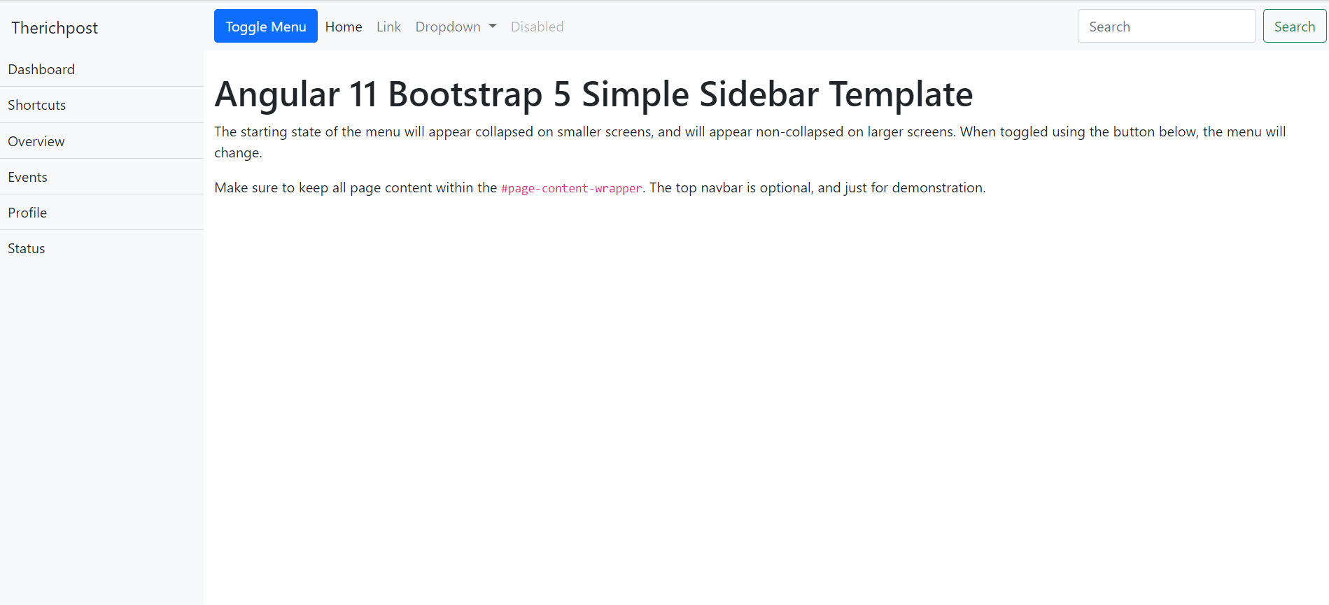
  • How to make simple sidebar template with Bootstrap 5 and Angular 11?

    How to make simple sidebar template with Bootstrap 5 and Angular 11?

    Hello friends, welcome back to my blog. Today this blog post will tell you, How to make simple sidebar template with Bootstrap 5 and Angular 11?

    In this post, guys we will cover below things:

    • Bootstrap 5 Angular 11 Free Template Creation.
    • Angular Bootstrap Sidebar Template Fully Responsive.
    • Angular click event functionality to toggle sidebar.

    Angular Bootstrap Sidebar Template Working Video

    How to make simple sidebar template with Bootstrap 5 and Angular 11?
    How to make simple sidebar template with Bootstrap 5 and Angular 11?

    Angular 11 came and Bootstrap 5 also and very soon Angular 12 will come and if you are new then you must check below two links:

    1. Angular11 Basic Tutorials
    2. Bootstrap 5

    Friends now I proceed onwards and here is the working code snippet and please use carefully this to avoid the mistakes:

    1. Firstly friends we need fresh angular 11 setup and for this we need to run below commands but if you already have angular 11 setup then you can avoid below commands. Secondly we should also have latest node version installed on our system:

    npm install -g @angular/cli 
    
    ng new angularboot5 //Create new Angular Project
    
    cd angularboot5 // Go inside the Angular Project Folder

    2. Now friends we need to run below commands into our project terminal to install bootstrap 5 modules into our angular application:

    npm install bootstrap@next

    3. Now friends we just need to add below code into angularboot5/src/app/app.component.html file to get final out on the web browser:

    <div class="d-flex" id="wrapper">
    
      <!-- Sidebar -->
      <div class="bg-light border-right" id="sidebar-wrapper"  [ngClass]="status ? 'hide' : 'show'">
        <div class="sidebar-heading">Therichpost </div>
        <div class="list-group list-group-flush">
          <a href="#" class="list-group-item list-group-item-action bg-light">Dashboard</a>
          <a href="#" class="list-group-item list-group-item-action bg-light">Shortcuts</a>
          <a href="#" class="list-group-item list-group-item-action bg-light">Overview</a>
          <a href="#" class="list-group-item list-group-item-action bg-light">Events</a>
          <a href="#" class="list-group-item list-group-item-action bg-light">Profile</a>
          <a href="#" class="list-group-item list-group-item-action bg-light">Status</a>
        </div>
      </div>
      <!-- /#sidebar-wrapper -->
    
      <!-- Page Content -->
      <div id="page-content-wrapper">
    
        <nav class="navbar navbar-expand-lg navbar-light bg-light">
         
          <div class="container-fluid">
            <button class="btn btn-primary" (click)="clickEvent()">Toggle Menu</button>
            <button class="navbar-toggler" type="button" data-bs-toggle="collapse" data-bs-target="#navbarSupportedContent" aria-controls="navbarSupportedContent" aria-expanded="false" aria-label="Toggle navigation">
              <span class="navbar-toggler-icon"></span>
            </button>
            <div class="collapse navbar-collapse" id="navbarSupportedContent">
              <ul class="navbar-nav me-auto mb-2 mb-lg-0">
                <li class="nav-item">
                  <a class="nav-link active" aria-current="page" href="#">Home</a>
                </li>
                <li class="nav-item">
                  <a class="nav-link" href="#">Link</a>
                </li>
                <li class="nav-item dropdown">
                  <a class="nav-link dropdown-toggle" href="#" id="navbarDropdown" role="button" data-bs-toggle="dropdown" aria-expanded="false">
                    Dropdown
                  </a>
                  <ul class="dropdown-menu" aria-labelledby="navbarDropdown">
                    <li><a class="dropdown-item" href="#">Action</a></li>
                    <li><a class="dropdown-item" href="#">Another action</a></li>
                    <li><hr class="dropdown-divider"></li>
                    <li><a class="dropdown-item" href="#">Something else here</a></li>
                  </ul>
                </li>
                <li class="nav-item">
                  <a class="nav-link disabled" href="#" tabindex="-1" aria-disabled="true">Disabled</a>
                </li>
              </ul>
              <form class="d-flex">
                <input class="form-control me-2" type="search" placeholder="Search" aria-label="Search">
                <button class="btn btn-outline-success" type="button">Search</button>
              </form>
            </div>
          </div>
        </nav>
    
        <div class="container-fluid">
          <h1 class="mt-4">Angular 11 Bootstrap 5 Simple Sidebar Template</h1>
          <p>The starting state of the menu will appear collapsed on smaller screens, and will appear non-collapsed on larger screens. When toggled using the button below, the menu will change.</p>
          <p>Make sure to keep all page content within the <code>#page-content-wrapper</code>. The top navbar is optional, and just for demonstration.</p>
        </div>
      </div>
      <!-- /#page-content-wrapper -->
    
    </div>
    <!-- /#wrapper -->

    4. Now friends we just need to add below code into angularboot5/angular.json file:

    "styles": [
                  ...
                  "node_modules/bootstrap/dist/css/bootstrap.min.css"
              ],
    "scripts": [
                  ...
                   "node_modules/bootstrap/dist/js/bootstrap.min.js"
               ]

    5. Now friends we just need to add below code into angularboot5/src/app/app.component.css file to add custom styles:

    body {
        overflow-x: hidden;
      }
      
      #sidebar-wrapper {
        min-height: 100vh;
        margin-left: -15rem;
        -webkit-transition: margin .25s ease-out;
        -moz-transition: margin .25s ease-out;
        -o-transition: margin .25s ease-out;
        transition: margin .25s ease-out;
      }
      
      #sidebar-wrapper .sidebar-heading {
        padding: 0.875rem 1.25rem;
        font-size: 1.2rem;
      }
      
      #sidebar-wrapper .list-group {
        width: 15rem;
      }
      
      #page-content-wrapper {
        min-width: 100vw;
      }
      
      #wrapper.toggled #sidebar-wrapper {
        margin-left: 0;
      }
      
      @media (min-width: 768px) {
        #sidebar-wrapper {
          margin-left: 0;
        }
      
        #page-content-wrapper {
          min-width: 0;
          width: 100%;
        }
        .show
        {
          margin-left: 0!important;
        }
        .hide
        {
          margin-left: -15rem!important;
        }
      }
      @media (max-width: 767px) {
        .show
        {
          margin-left: -15rem!important;
        }
        .hide
        {
          margin-left: -0!important;
        }
      }

    6. Now friends we just need to add below code into angularboot5/src/app/app.component.ts file to add custom scripts:

    ...
    export class AppComponent {
     ...
      status: boolean = false;
      clickEvent(){
          this.status = !this.status;       
      }
    }
    

    Friends in the end must run ng serve command into your terminal to run the angular 11 project.

    Now we are done friends. If you have any kind of query, suggestion and new requirement then feel free to comment below.

    Note: Friends, In this post, I just tell the basic setup and things, you can change the code according to your requirements.

    I will appreciate that if you will tell your views for this post. Nothing matters if your views will be good or bad because with your views, I will make my next posts more good and helpful.

    Jassa

    Thanks

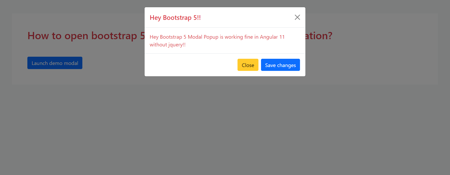
  • How to open bootstrap 5 modal popup on button click in Angular 11?

    How to open bootstrap 5 modal popup on button click in Angular 11?

    Hello friends, welcome back to my blog. Today this blog post will tell you, How to open bootstrap 5 modal popup on button click in Angular 11?

    Add Bootstrap 5 Modal in Angular 11

    How to open bootstrap 5 modal popup on button click in Angular 11?
    How to open bootstrap 5 modal popup on button click in Angular 11?

    Angular 11 came and Bootstrap 5 also and very soon Angular 12 will come and if you are new then you must check below two links:

    1. Angular11 Basic Tutorials
    2. Bootstrap 5

    Friends now I proceed onwards and here is the working code snippet for How to add bootstrap 5 in angular 11 application? and please use carefully this to avoid the mistakes:

    1. Firstly friends we need fresh angular 11 setup and for this we need to run below commands but if you already have angular 11 setup then you can avoid below commands. Secondly we should also have latest node version installed on our system:

    npm install -g @angular/cli 
    
    ng new angularboot5 //Create new Angular Project
    
    cd angularboot5 // Go inside the Angular Project Folder

    2. Now friends, here we need to run below commands into our project terminal to install bootstrap 5 modules into our angular application:

    npm install bootstrap@next

    3. Now friends we just need to add below code into src/app/app.component.html file to get final out on the web browser:

    <!-- Button trigger modal -->
    <button type="button" class="btn btn-primary" data-bs-toggle="modal" data-bs-target="#exampleModal">
      Launch demo modal
    </button>
    
    <!-- Modal -->
    <div class="modal fade" id="exampleModal" tabindex="-1" aria-labelledby="exampleModalLabel" aria-hidden="true">
      <div class="modal-dialog">
        <div class="modal-content">
          <div class="modal-header">
            <h5 class="modal-title text-danger" id="exampleModalLabel">Hey Bootstrap 5!!</h5>
            <button type="button" class="btn-close" data-bs-dismiss="modal" aria-label="Close"></button>
          </div>
          <div class="modal-body text-danger">
           Therichpost.com
          </div>
          <div class="modal-footer">
            <button type="button" class="btn btn-warning" data-bs-dismiss="modal">Close</button>
          </div>
        </div>
      </div>
    </div>

    4. Now friends we just need to add below code into angular.json file:

    "styles": [
                  ...
                  "node_modules/bootstrap/dist/css/bootstrap.min.css"
              ],
    "scripts": [
                  ...
                   "node_modules/bootstrap/dist/js/bootstrap.min.js"
               ]

    Friends in the end must run ng serve command into your terminal to run the angular 11 project.

    Now we are done friends. If you have any kind of query, suggestion and new requirement then feel free to comment below.

    Note: Friends, In this post, I just tell the basic setup and things, you can change the code according to your requirements.

    I will appreciate that if you will tell your views for this post. Nothing matters if your views will be good or bad because with your views, I will make my next posts more good and helpful.

    Jassa

    Thanks

  • Add Bootstrap 5 in React Js Application

    Add Bootstrap 5 in React Js Application

    Hello friends, welcome back to my blog. Today in this blog post, I am going to show you, Add Bootstrap 5 in React Js Application.


    Guys please watch below video to check how to add bootstrap 5 in reactjs application?:

    Add Bootstrap 5 in Reactjs Application

    Add Bootstrap 5 in React Js Application
    Add Bootstrap 5 in React Js Application

    For reactjs new comers, please check the below link:

    Reactjs Basic Tutorials

    Bootstrap 5 Tutorials


    Friends now I proceed onwards and here is the working code snippet and please use this carefully to avoid the mistakes:

    1. Firstly, we need fresh reactjs setup and for that, we need to run below commands into out terminal and also we should have latest node version installed on our system:

    npx create-react-app reactboot5
    
    cd reactboot5

    2. Now we need to run below commands into our project terminal to get bootstrap and related modules into our reactjs application:

    npm install bootstrap --save
    
    npm i @popperjs/core
    
    npm start //For start project again

    3. Finally for the main output, we need to add below code into our reactboot5/src/App.js file or if you have fresh setup then you can replace reactboot5/src/App.js file code with below code:

    //importing bootstrap 5 css
    import 'bootstrap/dist/css/bootstrap.min.css';
    import 'bootstrap/dist/js/bootstrap.min.js';
    function App() {
      return (
        <div className="App">
          
            <div className="container text-center mt-5">
              <h1 className="text-warning">Bootstrap 5 Working Demo in React Js Application</h1>
            </div>
         
          
        </div>
      );
    }
    
    export default App;

    Now we are done friends. If you have any kind of query or suggestion or any requirement then feel free to comment below.

    Note: Friends, I just tell the basic setup and things, you can change the code according to your requirements.

    I will appreciate that if you will tell your views for this post. Nothing matters if your views will be good or bad.

    Jassa

    Thanks

  • How to add bootstrap 5 in Vue 3 application?

    How to add bootstrap 5 in Vue 3 application?

    Hello friends, welcome back to my blog. Today in this blog post, I am going to show you, Vuejs – How to add bootstrap 5 in Vue 3 application?

    Bootstrap 5 in Vuejs

    Guy’s here you can see more Vue 3 Bootstrap 5 working example:

    1. Bootstrap 5 Popover working in Vue 3.
    2. Bootstrap 5 Tooltip working in Vue 3.
    3. Bootstrap5 Popup Modal with Forms in Vue 3.


    How to add bootstrap 5 in Vue 3 application?
    How to add bootstrap 5 in Vue 3?

    Vue 3 and Bootstrap 5 came and if you are new then you must check below two links:

    1. Vuejs
    2. Bootstrap 5

    Friends now I proceed onwards and here is the working code snippet and use this carefully to avoid the mistakes:

    1. Firstly friends we need fresh vue 3 setup and for this we need to run below commands . Secondly we should also have latest node version installed on our system. With below we will have  bootstrap 5 modules in our Vue 3 application:

    npm install -g @vue/cli
    
    vue create vueboot5
    
    cd vueboot5
    
    npm i bootstrap
    
    npm i @popperjs/core
    
    npm run serve //http://localhost:8080/

    2. Now friends we need to add below code into src/App.vue file to check the final output on browser:

    <template>
      <div class="container  text-center mt-5 mb-5">
        <h1 class="mt-5">Bootstrap 5 is working fine with Vuejs!!</h1>
    </div>
    </template>
    
    <script>
    //importing bootstrap 5
    import "bootstrap/dist/css/bootstrap.min.css";
    
    export default {
     
    }
    </script>

    Now we are done friends  also and If you have any kind of query or suggestion or any requirement then feel free to comment below.

    Note: Friends, I just tell the basic setup and things, you can change the code according to your requirements.

    I will appreciate that if you will tell your views for this post. Nothing matters if your views will be good or bad.

    Jassa

    Thanks

  • How to add bootstrap 5 in angular 11 application?

    How to add bootstrap 5 in angular 11 application?

    Hello friends, welcome back to my blog. Today in this blog post, I am going to tell you, How to add bootstrap 5 in angular 11 application?

    Add Bootstrap 5 in Angular 11

    Bootstrap 5 Angular
    Running Bootstrap 5 in Angular 11
    Package.json file
    After run the npm bootstrap command which I have given below, you will see this code inside your package.json file

    Angular 11 came and Bootstrap 5 also and very soon Angular 12 will come and if you are new then you must check below two links:

    1. Angular11 Basic Tutorials
    2. Bootstrap 5

    Friends now I proceed onwards and here is the working code snippet for How to add bootstrap 5 in angular 11 application? and please use carefully this to avoid the mistakes:

    1. Firstly friends we need fresh angular 11 setup and for this we need to run below commands but if you already have angular 11 setup then you can avoid below commands. Secondly we should also have latest node version installed on our system:

    npm install -g @angular/cli 
    
    ng new angularboot5 //Create new Angular Project
    
    cd angularboot5 // Go inside the Angular Project Folder

    2. Now friends, here we need to run below commands into our project terminal to install bootstrap 5 modules into our angular application:

    npm install bootstrap@next

    3. Now friends we just need to add below code into src/app/app.component.html file to get final out on the web browser:

    <div class="container  text-center mt-5 mb-5">
      <h1>Bootstrap 5 is working fine with Angular 11!!</h1>
    </div>

    4. Now friends we just need to add below code into angular.json file:

    "styles": [
                  ...
                  "node_modules/bootstrap/dist/css/bootstrap.min.css"
              ],
    "scripts": [
                  ...
                   "node_modules/bootstrap/dist/js/bootstrap.min.js"
               ]

    Friends in the end must run ng serve command into your terminal to run the angular 11 project.

    Now we are done friends. If you have any kind of query, suggestion and new requirement then feel free to comment below.

    Note: Friends, In this post, I just tell the basic setup and things, you can change the code according to your requirements.

    I will appreciate that if you will tell your views for this post. Nothing matters if your views will be good or bad because with your views, I will make my next posts more good and helpful.

    Jassa

    Thanks