Year: 2021

  • Angular 12 Bootstrap 5 Popover Working Demo

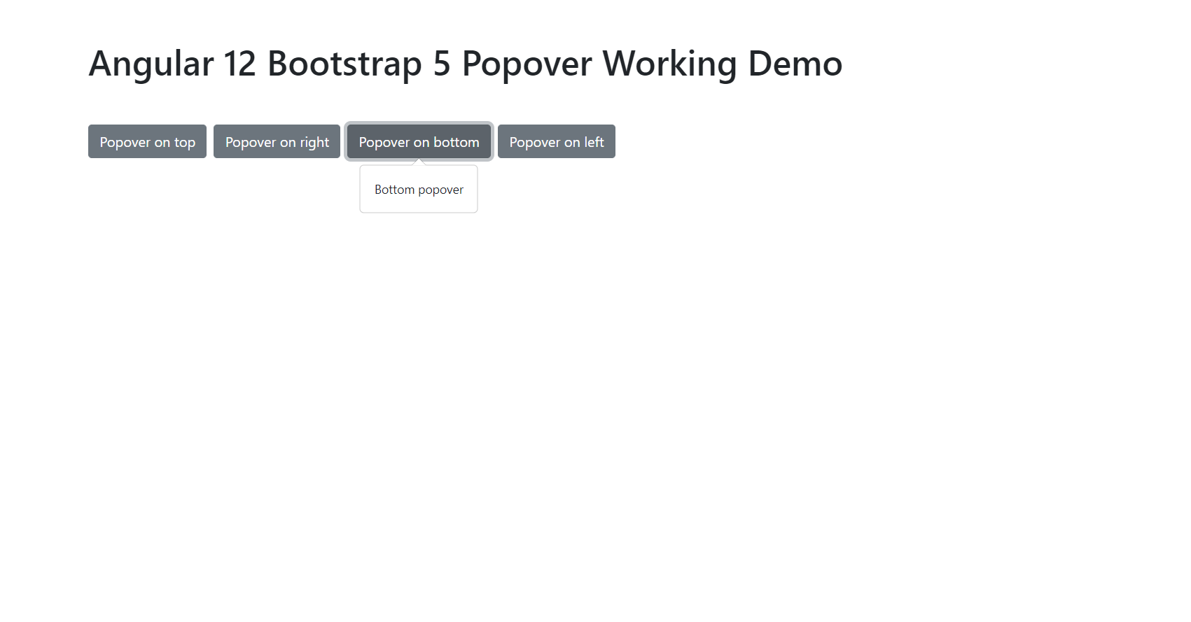
    Angular 12 Bootstrap 5 Popover Working Demo

    Hello friends, welcome back to my blog. Today in this blog post will tell you, Angular 12 Bootstrap 5 Popover Working Demo.


    Bootstrap 5 Popover

    Angular 12 Bootstrap 5 Popover Working Demo
    Angular 12 Bootstrap 5 Popover Working Demo

    Angular 12 came and Bootstrap 5 also and if you are new then you must check below two links:

    1. Angular12 Basic Tutorials
    2. Bootstrap 5

    Friends now I proceed onwards and here is the working code snippet and please use carefully this to avoid the mistakes:

    1. Firstly friends we need fresh angular 12 setup and for this we need to run below commands but if you already have angular 12 setup then you can avoid below commands. Secondly we should also have latest node version installed on our system:

    npm install -g @angular/cli 
    
    ng new angularboot5 //Create new Angular Project
    
    cd angularboot5 // Go inside the Angular Project Folder

    2. Now friends we need to run below commands into our project terminal to install bootstrap 5 modules into our angular application:

    npm install bootstrap
    
    npm i @popperjs/core

    3. Now friends we just need to add below code into angularboot5/src/app/app.component.html file to get final out on the web browser:

    <div class="container p-5">
        <h1 class="mb-5">therichpost.com</h1>
        <button type="button" class="btn btn-secondary me-2" data-bs-container="body" data-bs-toggle="popover" data-bs-placement="top" data-bs-content="Top popover">
          Popover on top
        </button>
        <button type="button" class="btn btn-secondary me-2" data-bs-container="body" data-bs-toggle="popover" data-bs-placement="right" data-bs-content="Right popover">
          Popover on right
        </button>
        <button type="button" class="btn btn-secondary me-2" data-bs-container="body" data-bs-toggle="popover" data-bs-placement="bottom" data-bs-content="Bottom popover">
          Popover on bottom
        </button>
        <button type="button" class="btn btn-secondary me-2" data-bs-container="body" data-bs-toggle="popover" data-bs-placement="left" data-bs-content="Left popover">
          Popover on left
        </button>
      </div>

    4. Now friends we just need to add below code into angularboot5/src/app/app.component.ts file:

    ...
    import { Popover } from 'node_modules/bootstrap/dist/js/bootstrap.esm.min.js'
    
    
    export class AppComponent {
     ...
    
      ngOnInit() {
        Array.from(document.querySelectorAll('button[data-bs-toggle="popover"]'))
        .forEach(popoverNode => new Popover(popoverNode))
        
        
      }
    }
    

    5. Guy’s now add below code into angularboot5/angular.json file:

    "styles": [
                  ...
                  "node_modules/bootstrap/dist/css/bootstrap.min.css"
              ],
    "scripts": [
                  ...
                   "node_modules/bootstrap/dist/js/bootstrap.min.js"
               ]

    Friends in the end must run ng serve command into your terminal to run the angular 12 project(localhost:4200).

    Now we are done friends. If you have any kind of query, suggestion and new requirement then feel free to comment below.

    Note: Friends, In this post, I just tell the basic setup and things, you can change the code according to your requirements.

    I will appreciate that if you will tell your views for this post. Nothing matters if your views will be good or bad because with your views, I will make my next posts more good and helpful.

    Jassa

    Thanks

  • Angular 12 Data Binding Working Tutorial

    Angular 12 Data Binding Working Tutorial

    Hello friends, welcome back to my blog. Today in this blog post will tell you, Angular 12 Data Binding Working Tutorial.

    Guy’s Data Binding is the very good feature of angular. Data Binding helps in communicate between .ts and .html files.


    Data Binding Working Demo

    Angular 12 Data Binding Working Tutorial
    Angular 12 Data Binding Working Tutorial

    Angular 12 came and if you are new then you must check below two links:

    1. Angular12 Basic Tutorials

    Friends now I proceed onwards and here is the working code snippet and please use carefully this to avoid the mistakes:

    1. Firstly friends we need fresh angular 12 setup and for this we need to run below commands but if you already have angular 12 setup then you can avoid below commands. Secondly we should also have latest node version installed on our system:

    npm install -g @angular/cli 
    
    ng new angularbind //Create new Angular Project
    
    cd angularbind // Go inside the Angular Project Folder

    2. Now friends we need to run below commands into our project terminal to start our angular 12 application:

    ng serve --o

    Data Binding Example 1 – Binding select option values:

    1. Guy’s we need to just add below code inside our angularbind/src/app/app.component.ts file:

    ...
    export class AppComponent {
    
    //varibale which will use in html file for data binding
    months = ["January", "February", "March", "April",
                "May", "June", "July", "August", "September",
                "October", "November", "December"];
    }

    2. Guy’s we need to just add below code inside our angularbind/src/app/app.component.html file:

    <select>
      
      <!-- Data Binding with ng directive -->
      <option  *ngFor="let i of months" value="{{i}}">{{i}}</option>
    
    </select>

    Data Binding Example 2 – Button enable/disable on select on change:

    1. Guy’s we need to just add below code inside our angularbind/src/app/app.component.ts file:

    ...
    export class AppComponent {
    
      //Varibale for Button disable and enable
      disableBtn = false;
    
      //months values for select
       months = ["January", "February", "March", "April",
                "May", "June", "July", "August", "September",
                "October", "November", "December"];
    
       //Select onchange binding button attribut enable or disable
       selectOption(value) {
          
            //set condtion
            if(value == "August")
            {
    
                //button enable
                this.disableBtn = true;
            }
            else
            {
    
                //button disable
                this.disableBtn = false;
            }
           
            }
    
    }

    2. Guy’s we need to just add below code inside our angularbind/src/app/app.component.html file:

    <!-- Select with change function which will enable or diable the below button -->
    <select (change)="selectOption($event.target.value)">
      
      <option  *ngFor="let i of months" value="{{i}}">{{i}}</option>
    
    </select>
    <br>
    
    
    <!--button disbale first time on page load -->
    <button type="button" [disabled]="!disableBtn">Button</button>

    Two way Data Binding Example – Bind select value with ngModel and use it multiple ways:

    1. Guy’s we need to just add below code inside our angularbind/src/app/app.component.ts file:

    export class AppComponent {
    ...
    
        //set varibale for ngModel for two way binding
        monthname =  "January";
        
        //Select option values
        months = ["January", "February", "March", "April",
                "May", "June", "July", "August", "September",
                "October", "November", "December"];
    }

    2. Guy’s we need to just add below code inside our angularbind/src/app/app.component.html file:

    <!--Data Binding with ngModel-->
    <select [(ngModel)]="monthname">
      
      <option  *ngFor="let i of months" value="{{i}}">{{i}}</option>
    
    </select>
    
    <br>
    
    <!--Binding Data according to select option value with the help of ngModel-->
    <h5>Month = {{monthname}}</h5>

    Guy’s here you can see one more data binding working example for reactive forms.

    Now we are done friends. If you have any kind of query, suggestion and new requirement then feel free to comment below.

    Note: Friends, In this post, I just tell the basic setup and things, you can change the code according to your requirements.

    I will appreciate that if you will tell your views for this post. Nothing matters if your views will be good or bad because with your views, I will make my next posts more good and helpful.

    Jassa

    Thanks

  • Vue 3 Bootstrap 5 Tooltip Working Example

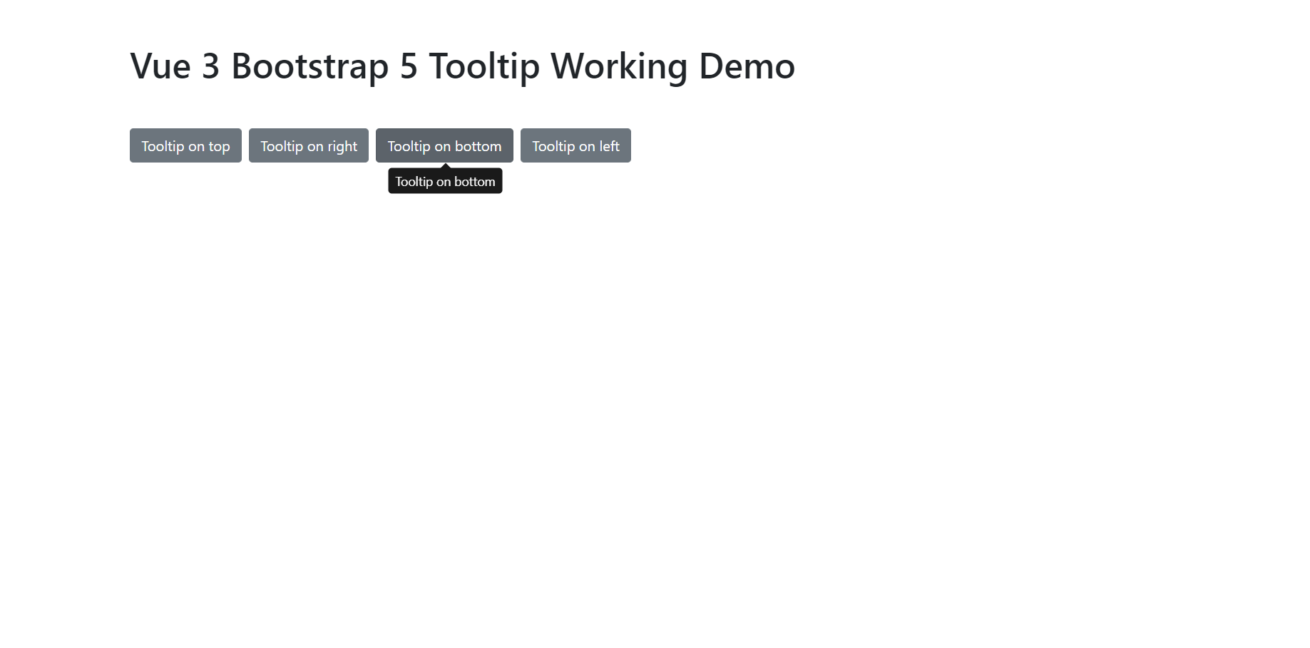
    Vue 3 Bootstrap 5 Tooltip Working Example

    Hello friends, welcome back to my blog. Today in this blog post, I am going to show you, Vue 3 Bootstrap 5 Tooltip Working Example.

    Vuejs Tooltip Working

    Vue 3 Bootstrap 5 Tooltip Working Example
    Vue 3 Bootstrap 5 Tooltip Working Example

    Vue 3 and Bootstrap 5 came and if you are new then you must check below two links:

    1. Vuejs
    2. Bootstrap 5

    Friends now I proceed onwards and here is the working code snippet and use this carefully to avoid the mistakes:

    1. Firstly friends we need fresh vue 3 setup and for this we need to run below commands . Secondly we should also have latest node version installed on our system. With below we will have  bootstrap 5 modules in our Vue 3 application:

    npm install -g @vue/cli
    
    vue create vueboot5
    
    cd vueboot5
    
    npm i bootstrap
    
    npm i @popperjs/core
    
    npm run serve //http://localhost:8080/

    2. Now friends we need to add below code into vueboot5/src/App.vue file to check the final output on browser:

    <template>
      <div className="container p-5">
          <h1 className="mb-5">Therichpost.com</h1>
           <button type="button" class="btn btn-secondary me-2" data-bs-toggle="tooltip" data-bs-placement="top" title="Tooltip on top">
            Tooltip on top
          </button>
          <button type="button" class="btn btn-secondary me-2" data-bs-toggle="tooltip" data-bs-placement="right" title="Tooltip on right">
            Tooltip on right
          </button>
          <button type="button" class="btn btn-secondary me-2" data-bs-toggle="tooltip" data-bs-placement="bottom" title="Tooltip on bottom">
            Tooltip on bottom
          </button>
          <button type="button" class="btn btn-secondary me-2" data-bs-toggle="tooltip" data-bs-placement="left" title="Tooltip on left">
            Tooltip on left
          </button>
        </div>
    </template>
    <script>
    //importing bootstrap 5 Modules
    import "bootstrap/dist/css/bootstrap.min.css";
    import "bootstrap/dist/js/bootstrap.min.js";
    import { Tooltip } from 'bootstrap/dist/js/bootstrap.esm.min.js'
    export default {
      mounted() {
         //inti tooltip
         Array.from(document.querySelectorAll('button[data-bs-toggle="tooltip"]'))
     .forEach(tooltipNode => new Tooltip(tooltipNode))
    }
    }
    </script>

    Now we are done friends and If you have any kind of query or suggestion or any requirement then feel free to comment below.

    Note: Friends, I just tell the basic setup and things, you can change the code according to your requirements.

    I will appreciate that if you will tell your views for this post. Nothing matters if your views will be good or bad.

    Jassa

    Thanks

  • Angular 12 Bootstrap 5 Tooltip Working Example

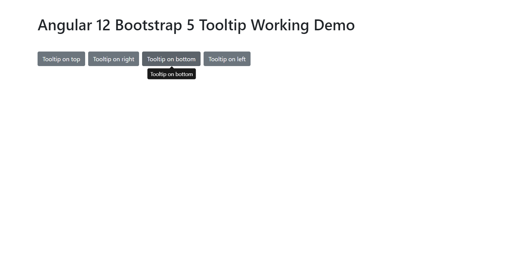
    Angular 12 Bootstrap 5 Tooltip Working Example

    Hello friends, welcome back to my blog. Today in this blog post will tell you, Angular 12 Bootstrap 5 Tooltip Working Example.


    Bootstrap 5 Tooltip

    Angular 12 Bootstrap 5 Tooltip Working Example
    Angular 12 Bootstrap 5 Tooltip Working Example

    Angular 12 came and Bootstrap 5 also and if you are new then you must check below two links:

    1. Angular12 Basic Tutorials
    2. Bootstrap 5

    Friends now I proceed onwards and here is the working code snippet and please use carefully this to avoid the mistakes:

    1. Firstly friends we need fresh angular 12 setup and for this we need to run below commands but if you already have angular 12 setup then you can avoid below commands. Secondly we should also have latest node version installed on our system:

    npm install -g @angular/cli 
    
    ng new angularboot5 //Create new Angular Project
    
    cd angularboot5 // Go inside the Angular Project Folder

    2. Now friends we need to run below commands into our project terminal to install bootstrap 5 modules into our angular application:

    npm install bootstrap
    
    npm i @popperjs/core

    3. Now friends we just need to add below code into angularboot5/src/app/app.component.html file to get final out on the web browser:

    <div class="container p-5">
        <h1 class="mb-5">Therichpost.com</h1>
         <button type="button" class="btn btn-secondary me-2" data-bs-toggle="tooltip" data-bs-placement="top" title="Tooltip on top">
          Tooltip on top
        </button>
        <button type="button" class="btn btn-secondary me-2" data-bs-toggle="tooltip" data-bs-placement="right" title="Tooltip on right">
          Tooltip on right
        </button>
        <button type="button" class="btn btn-secondary me-2" data-bs-toggle="tooltip" data-bs-placement="bottom" title="Tooltip on bottom">
          Tooltip on bottom
        </button>
        <button type="button" class="btn btn-secondary me-2" data-bs-toggle="tooltip" data-bs-placement="left" title="Tooltip on left">
          Tooltip on left
        </button>
      </div>

    4. Now friends we just need to add below code into angularboot5/angular.json file:

    "styles": [
                  ...
                  "node_modules/bootstrap/dist/css/bootstrap.min.css"
              ],
    "scripts": [
                  ...
                   "node_modules/bootstrap/dist/js/bootstrap.min.js"
               ]

    5. Now friends we just need to add below code into angularboot5/src/app/app.component.ts file:

    ...
    import { Tooltip } from 'node_modules/bootstrap/dist/js/bootstrap.esm.min.js'
    
    export class AppComponent {
     ...
      ngOnInit() {
        Array.from(document.querySelectorAll('button[data-bs-toggle="tooltip"]'))
        .forEach(tooltipNode => new Tooltip(tooltipNode))
        
        
      }
    }
    

    Friends in the end must run ng serve command into your terminal to run the angular 12 project(localhost:4200).

    Now we are done friends. If you have any kind of query, suggestion and new requirement then feel free to comment below.

    Note: Friends, In this post, I just tell the basic setup and things, you can change the code according to your requirements.

    I will appreciate that if you will tell your views for this post. Nothing matters if your views will be good or bad because with your views, I will make my next posts more good and helpful.

    Jassa

    Thanks

  • Reactjs Bootstrap 5 Tooltip Working Example

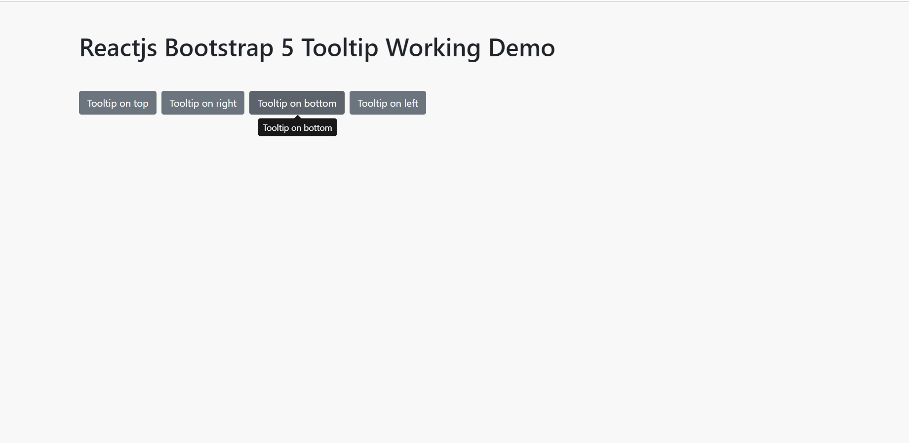
    Reactjs Bootstrap 5 Tooltip Working Example

    Hello friends, welcome back to my blog. Today in this blog post, I am going to show you, Reactjs Bootstrap 5 Tooltip Working Example.

    React Tooltip

    Reactjs Bootstrap 5 Tooltip Working Example
    Reactjs Bootstrap 5 Tooltip Working Example

    For reactjs new comers, please check the below link:

    Reactjs Basic Tutorials

    Bootstrap 5 Tutorials


    Friends now I proceed onwards and here is the working code snippet and please use this carefully to avoid the mistakes:

    1. Firstly, we need fresh reactjs setup and for that, we need to run below commands into out terminal and also we should have latest node version installed on our system:

    npx create-react-app reactboot5
    
    cd reactboot5

    2. Now we need to run below commands into our project terminal to get bootstrap and related modules into our reactjs application:

    npm install bootstrap@next --save
    
    npm i @popperjs/core 
    
    npm start //For start project

    3. Finally for the main output, we need to add below code into our reactboot5/src/App.js file or if you have fresh setup then you can replace reactboot5/src/App.js file code with below code:

    import React, { useEffect } from 'react';
    
    //Bootstrap 5 Modules
    import 'bootstrap/dist/css/bootstrap.min.css';
    import 'bootstrap/dist/js/bootstrap.min.js';
    import { Tooltip } from 'bootstrap/dist/js/bootstrap.esm.min.js'
    
    
    export default function App() {
     
     useEffect(() => {
    
     //init tooltip
     Array.from(document.querySelectorAll('button[data-bs-toggle="tooltip"]'))
     .forEach(tooltipNode => new Tooltip(tooltipNode))
     });
    
      return (
        <div className="container p-5">
          <h1 className="mb-5">Therichpost.com</h1>
           <button type="button" class="btn btn-secondary me-2" data-bs-toggle="tooltip" data-bs-placement="top" title="Tooltip on top">
            Tooltip on top
          </button>
          <button type="button" class="btn btn-secondary me-2" data-bs-toggle="tooltip" data-bs-placement="right" title="Tooltip on right">
            Tooltip on right
          </button>
          <button type="button" class="btn btn-secondary me-2" data-bs-toggle="tooltip" data-bs-placement="bottom" title="Tooltip on bottom">
            Tooltip on bottom
          </button>
          <button type="button" class="btn btn-secondary me-2" data-bs-toggle="tooltip" data-bs-placement="left" title="Tooltip on left">
            Tooltip on left
          </button>
        </div>
      );
    }
    

    Now we are done friends. If you have any kind of query or suggestion or any requirement then feel free to comment below.

    Note: Friends, I just tell the basic setup and things, you can change the code according to your requirements.

    I will appreciate that if you will tell your views for this post. Nothing matters if your views will be good or bad.

    Jassa

    Thanks

  • Reactjs GraphQL Tutorial – Fetching Data

    Reactjs GraphQL Tutorial – Fetching Data

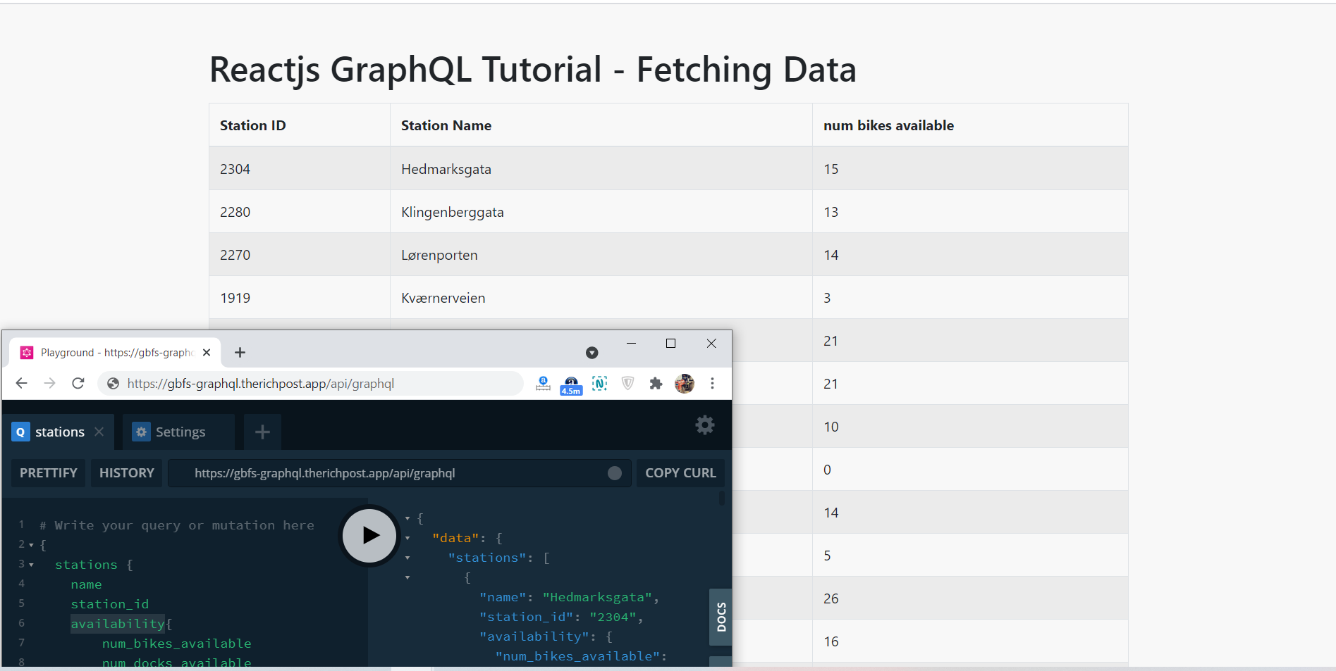
    Hello friends, welcome back to my blog. Today in this blog post, I am going to show you, Reactjs GraphQL Tutorial – Fetching Data.


    React GraphQL
    Reactjs GraphQL Tutorial - Fetching Data
    Reactjs GraphQL Tutorial – Fetching Data

    For reactjs new comers, please check the below links. For application better look I use Bootstrap 5:

    Reactjs Basic Tutorials

    Bootstrap 5 Tutorials


    Friends now I proceed onwards and here is the working code snippet and please use this carefully to avoid the mistakes:

    1. Firstly, we need fresh reactjs setup and for that, we need to run below commands into out terminal and also we should have latest node version installed on our system:

    npx create-react-app reactgql
    
    cd reactgql

    2. Now we need to run below commands into our project terminal to get bootstrap( Optional ), graphql related modules into our reactjs application:

    npm install bootstrap@next --save
    
    npm install @apollo/client graphql
    
    npm start

    3. Finally for the main output, we need to add below code into our reactboot5/src/App.js file or if you have fresh setup then you can replace reactgql/src/App.js file code with below code:

    import React from 'react';
    
    //Bootstrap and graphql libraries
    import 'bootstrap/dist/css/bootstrap.min.css';
    
    import { useQuery, gql } from "@apollo/client";
    
    //set data query
    const STATIONS_QUERY = gql`
      {
        stations {
          name
          station_id
          availability{
              num_bikes_available
              num_docks_available
      }
          
        }
      }
    `;
    
    export default function App() {
      const { data, loading, error } = useQuery(STATIONS_QUERY); //create query
      if (loading) return "Loading..."; //query processing
      if (error) return <pre>{error.message}</pre> //if query has issue
    
      return (
        <div className="container p-5">
          <h1 className="mb-3">Therichpost.com</h1>
          <table class="table table-striped table-hover table-bordered table-lg">
          <thead>
          <tr>
            <th scope="col">Station ID</th>
            <th scope="col">Station Name</th>
            <th>num bikes available</th>
            
          </tr>
        </thead>
        <tbody>
        
            {data.stations.map((station) => (
              <tr>
                <td>{station.station_id}</td>
                <td>{station.name}</td>
                <td>{station.availability.num_bikes_available}</td>
              </tr>
            
            ))}
            </tbody>
          </table>
        </div>
      );
    }
    

    4. Guy’s we need to add below code into our reactgql/src/index.js file for set the Apollo client modules:

    import React from 'react';
    import ReactDOM from 'react-dom';
    import './index.css';
    import { ApolloProvider, ApolloClient, InMemoryCache } from "@apollo/client";
    import App from './App';
    
    //calling api
    const client = new ApolloClient({
      uri: "yourgraphqlURL",
      cache: new InMemoryCache()
    });
    
    ReactDOM.render(
      <ApolloProvider client={client}>
      <App />
    </ApolloProvider>,
      document.getElementById('root')
    );
    

    Now we are done friends. If you have any kind of query or suggestion or any requirement then feel free to comment below.

    Note: Friends, I just tell the basic setup and things, you can change the code according to your requirements.

    I will appreciate that if you will tell your views for this post. Nothing matters if your views will be good or bad.

    Jassa

    Thanks

  • Vue 3 Free Template Download

    Vue 3 Free Template Download

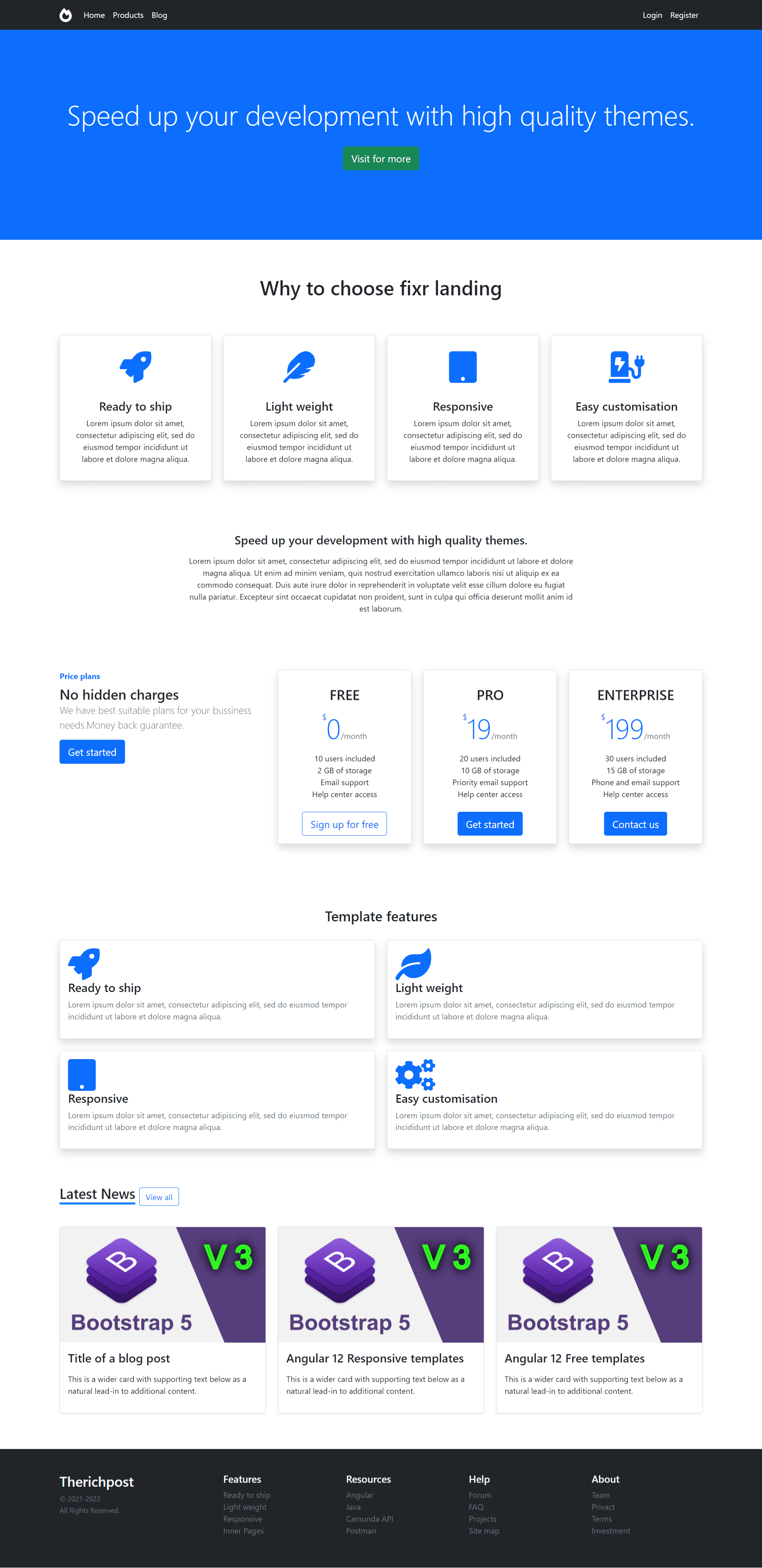
    Hello friends, welcome back to my blog. Today in this blog post, I am going to show you, Vue 3 Free Template Download

    Guys in this post, we will cover below things:

    1. Vuejs Bootstrap 5 Responsive Template Creation.
    2. Implement Bootstrap 5 Toggle Navigation in Vue 3 Application.
    Bootstrap 5 in Vuejs

    Vue 3 Free Template Download
    Vue 3 Free Template Download

    Vue 3 and Bootstrap 5 came and if you are new then you must check below two links:

    1. Vuejs
    2. Bootstrap 5

    Friends now I proceed onwards and here is the working code snippet and use this carefully to avoid the mistakes:

    1. Firstly friends we need fresh vue 3 setup and for this we need to run below commands . Secondly we should also have latest node version installed on our system. With below we will have  bootstrap 5 modules in our Vue 3 application:

    npm install -g @vue/cli
    
    vue create vueboot5
    
    cd vueboot5
    
    npm i bootstrap@next
    
    npm run serve //http://localhost:8080/


    2. Now friends we need to add below code into vueboot5/src/App.vue file to check the final output on browser:

    <template>
       <!-- navbar starts -->
      <nav class="navbar navbar-expand-md navbar-dark fixed-top bg-dark">
        <div class="container">
          <a class="navbar-brand" href="https://www.therichpost.com/"> <h3 class="mb-0"><i class="fas fa-fire-alt"></i></h3></a>
          <button class="navbar-toggler" type="button" data-bs-toggle="collapse" data-bs-target="#navbarSupportedContent" aria-controls="navbarSupportedContent" aria-expanded="false" aria-label="Toggle navigation">
            <span class="navbar-toggler-icon"></span>
          </button>
          <div class="collapse navbar-collapse" id="navbarSupportedContent">
            <ul class="navbar-nav me-auto">
              <li class="nav-item">
                <a class="nav-link p-2 font-weight-bold text-white" href="#">Home </a>
              </li>
              <li class="nav-item">
                <a class="nav-link p-2 font-weight-bold text-white" href="#">Products</a>
              </li>
              <li class="nav-item">
                <a class="nav-link font-weight-bold p-2 text-white" href="#">Blog</a>
              </li>
             
            </ul>
          
           <a class="nav-link text-white p-2 font-weight-bold" href="#">Login</a> 
            <a class="nav-link text-white p-2 font-weight-bold" href="#">Register</a>
        
          </div>
          </div>
        </nav>
    <!-- nav bar ends -->
        
      <div class="jumbotron-odi-hero bg-primary">
      <div class="jumbotron-overlay">
          <div class="container jumbotron-padding  text-center">
          <h1 class="display-4">Speed up your development with high quality themes.</h1>
             <p>
                <a href="https://www.therichpost.com" class="btn btn-lg btn-success btn-circle my-4 mr-3">Visit for more</a>
             </p>
          </div>
        </div>
    </div>
    
    
             <div class="container mt-5" id="about">
                       <h1 class="text-center py-4">Why to choose fixr landing</h1>
                      
                      <div class="row text-center mt-5">
                       <div class="col-md-3 mb-2">
                        <div class="card shadow">
                          <div class="card-body">
                          <div class="py-3 text-center"> <i class="fas fa-rocket card-img-top fa-4x text-primary" aria-hidden="true"></i></div>
                          <div class="card-body">
                            <h4 class="card-title">Ready to ship</h4>
                            <p class="card-text">Lorem ipsum dolor sit amet, consectetur adipiscing elit, sed do eiusmod tempor incididunt ut labore et dolore magna aliqua.</p>
                           </div>
                          </div>
                        </div>
                        </div>
                          <div class="col-md-3 mb-2">
                         <div class="card shadow">
                          <div class="card-body">
                           <div class="py-3 text-center"><i class="fas fa-feather card-img-top fa-4x text-primary" aria-hidden="true"></i></div>
                          <div class="card-body">
                            <h4 class="card-title">Light weight</h4>
                            <p class="card-text">Lorem ipsum dolor sit amet, consectetur adipiscing elit, sed do eiusmod tempor incididunt ut labore et dolore magna aliqua.</p>
                           </div>
                          </div>
                        </div>
                        </div>
                          <div class="col-md-3 mb-2">
                         <div class="card shadow">
                          <div class="card-body">
                          <div class="py-3 text-center"><i class="fa fa-tablet card-img-top fa-4x text-primary" aria-hidden="true"></i></div>
                         
                          <div class="card-body">
                            <h4 class="card-title">Responsive </h4>
                            <p class="card-text">Lorem ipsum dolor sit amet, consectetur adipiscing elit, sed do eiusmod tempor incididunt ut labore et dolore magna aliqua.</p>
                            </div>
                          </div>
                        </div>
                        </div>
    
                                 
                        <div class="col-md-3 mb-2">
                         <div class="card shadow">
                          <div class="card-body">
                          <div class="py-3 text-center"><i class="fas fa-charging-station card-img-top fa-4x text-primary" aria-hidden="true"></i>
                         </div>
                          <div class="card-body">
                            <h4 class="card-title">Easy customisation</h4>
                            <p class="card-text">Lorem ipsum dolor sit amet, consectetur adipiscing elit, sed do eiusmod tempor incididunt ut labore et dolore magna aliqua. </p>
                            </div>
                          </div>
    
                        </div>
                        </div>
                       
                      </div>
                    </div>
                  <div class="container mt-5  text-center">
                     <p class="pt-5 pb-2 h4 text-monospace">Speed up your development with high quality themes.</p>
                    <div class="row">
                     
                      <div class="mx-auto" style="width: 800px;">
                        <p class="text-center"> Lorem ipsum dolor sit amet, consectetur adipiscing elit, sed do eiusmod tempor incididunt ut labore et dolore magna aliqua. Ut enim ad minim veniam, quis nostrud exercitation ullamco laboris nisi ut aliquip ex ea commodo consequat. Duis aute irure dolor in reprehenderit in voluptate velit esse cillum dolore eu fugiat nulla pariatur. Excepteur sint occaecat cupidatat non proident, sunt in culpa qui officia deserunt mollit anim id est laborum.</p>
                      </div>
                      </div>
    
                    </div>
                
                  <!-- price plan starts -->
                 <div class="container mt-5">
                    <div class="row py-5">
                      <div class="col-md-4">
                        <strong class="d-inline-block mb-2 text-primary">Price plans</strong>
                        <h3 class="mb-0">
                          No hidden charges
                       </h3>
                       <p class="lead text-muted">We have best suitable plans for your bussiness needs.Money back guarantee.</p>
                        <button type="button" class="btn btn-lg btn-primary btn-circle mb-2">Get started</button>
                      </div>
                      <div class="col-md-8">
    <div class="row text-center">
                        
                      <div class="col-md-4 mb-2">
                        <div class="card shadow">
                        <div class="card-body">
                          <h3 class="my-3 font-weight-norma text-uppercase">Free</h3>
                         
                          <span class="d-block  text-primary">
                            <span class="align-top">$</span>
                            <span class="display-4 font-weight-bold">0</span>
                            <span class="text-muted">/month</span>
                          </span>
                          <ul class="list-unstyled mt-3 mb-4">
                            <li>10 users included</li>
                            <li>2 GB of storage</li>
                            <li>Email support</li>
                            <li>Help center access</li>
                          </ul>
                          <button type="button" class="btn btn-lg btn-block btn-outline-primary btn-circle">Sign up for free</button>
                        </div>
                      </div>
                    </div>
                      <div class="col-md-4 mb-2">
                       <div class="card shadow">
                        <div class="card-body">
                           <h3 class="my-3 font-weight-norma text-uppercase">Pro</h3>
                           <span class="d-block  text-primary">
                            <span class="align-top">$</span>
                            <span class="display-4 font-weight-bold">19</span>
                            <span class="text-muted">/month</span>
                          </span>
                          <ul class="list-unstyled mt-3 mb-4">
                            <li>20 users included</li>
                            <li>10 GB of storage</li>
                            <li>Priority email support</li>
                            <li>Help center access</li>
                          </ul>
                          <button type="button" class="btn btn-lg btn-block btn-primary btn-circle">Get started</button>
                        </div>
                      </div>
                    </div>
                      <div class="col-md-4 mb-2">
                        <div class="card shadow">
                          <div class="card-body">
                           <h3 class="my-3 font-weight-norma text-uppercase">Enterprise</h3>
                           <span class="d-block  text-primary">
                            <span class="align-top">$</span>
                            <span class="display-4 font-weight-bold">199</span>
                            <span class="text-muted">/month</span>
                          </span>
                          <ul class="list-unstyled mt-3 mb-4">
                            <li>30 users included</li>
                            <li>15 GB of storage</li>
                            <li>Phone and email support</li>
                            <li>Help center access</li>
                          </ul>
                          <button type="button" class="btn btn-lg btn-block btn-primary btn-circle">Contact us</button>
                        </div>
                      </div>
                      </div>
                    </div>
                    </div>
                  
                 </div>
               </div>
                 <!-- price plan ends -->
               <!-- features start -->
                 <div class="container mt-5 ">
                       <p class="py-4 h3 text-center">Template features</p>
                      <div class="row">
                        <div class="col-md-6">
                          <div class="card shadow">
                            <div class="card-body">
                              <div class="media">
                                <div class="mr-4" style="height:64px;width:64px;">
                                  <i class="fa fa-rocket card-img-top fa-4x text-primary" aria-hidden="true"></i>
                                </div>
                                <div class="media-body">
                                  <h4 class="mt-0 tex-dark">Ready to ship</h4>
                                  <p class=" text-secondary">Lorem ipsum dolor sit amet, consectetur adipiscing elit, sed do eiusmod tempor incididunt ut labore et dolore magna aliqua.</p>
                                </div>
                              </div>
                            </div>
                          </div>
                        </div>
                        <div class="col-md-6">
                          <div class="card shadow">
                            <div class="card-body">
                              <div class="media">
                                <div class="mr-4" style="height:64px;width:64px;">
                                  <i class="fa fa-leaf card-img-top fa-4x text-primary" aria-hidden="true"></i>
                                </div>
                                <div class="media-body">
                                  <h4 class="mt-0 tex-dark">Light weight</h4>
                                  <p class=" text-secondary">Lorem ipsum dolor sit amet, consectetur adipiscing elit, sed do eiusmod tempor incididunt ut labore et dolore magna aliqua.</p>
                                </div>
                              </div>
                            </div>
                          </div>
                        </div>
                      </div>
                        <div class="row py-4">
                        <div class="col-md-6">
                          <div class="card shadow">
                            <div class="card-body">
                              <div class="media">
                                <div class="mr-4" style="height:64px;width:64px;">
                                  <i class="fa fa-tablet card-img-top fa-4x text-primary" aria-hidden="true"></i>
                                </div>
                                <div class="media-body">
                                  <h4 class="mt-0 tex-dark">Responsive</h4>
                                  <p class=" text-secondary">Lorem ipsum dolor sit amet, consectetur adipiscing elit, sed do eiusmod tempor incididunt ut labore et dolore magna aliqua.</p>
                                </div>
                              </div>
                            </div>
                          </div>
                        </div>
                        <div class="col-md-6">
                          <div class="card shadow">
                            <div class="card-body">
                              <div class="media">
                                <div class="mr-4" style="height:64px;width:64px;">
                                  <i class="fa fa-cogs card-img-top fa-4x text-primary" aria-hidden="true"></i>
                                </div>
                                <div class="media-body">
                                  <h4 class="mt-0 tex-dark">Easy customisation</h4>
                                  <p class=" text-secondary">Lorem ipsum dolor sit amet, consectetur adipiscing elit, sed do eiusmod tempor incididunt ut labore et dolore magna aliqua.</p>
                                </div>
                              </div>
                            </div>
                          </div>
                        </div>
                      </div>
                      
                  </div>
                  <!-- features end -->
             <!-- blog post start -->    
                <div class="container mt-5">
                       <h3 class="pt-4 d-inline latest-news me-2">Latest News</h3>
                      
                        <a href="" class="btn btn-outline-primary btn-circle d-inline float-right">View all</a>
                      <!--  <p class="h5 text-center text-muted">Awesome featured templates</p> -->
                      <div class="row mt-5">
                      <div class="col-md-4">
                  <div class="card mb-4 shadow-sm">
                    <img class="card-img-top img-fluid" src="https://therichpost.com/wp-content/uploads/2021/05/Vue-3-Bootstrap-5-Free-Responsive-Template.png"  alt="">
                    <div class="card-body">
                      <h4 class="card-title mb-3 text-dark">
                      <a href="https://therichpost.com/vue-3-bootstrap-5-free-responsive-template/" class="text-decoration-none text-dark font-weight-bold">
                        Title of a blog post
                      </a>
                    </h4>
                      <p class="card-text">This is a wider card with supporting text below as a natural lead-in to additional content. </p>
                      
                    </div>
                     <div class="card-footer text-muted border-0 bg-white">
                       
                      </div>
                  </div>
                </div>
                <div class="col-md-4">
                 <div class="card mb-4 shadow-sm">
                    <img class="card-img-top img-fluid" src="https://therichpost.com/wp-content/uploads/2021/05/Vue-3-Bootstrap-5-Free-Responsive-Template.png"  alt="">
                    <div class="card-body">
                      <h4 class="card-title mb-3 text-dark">
                        <a href="https://therichpost.com/vue-3-bootstrap-5-free-responsive-template/" class="text-decoration-none text-dark font-weight-bold">
                        Angular 12 Responsive templates
                      </a>
                      </h4>
                      <p class="card-text">This is a wider card with supporting text below as a natural lead-in to additional content. </p>
                      
                    </div>
                     <div class="card-footer text-muted border-0 bg-white">
                        
                      </div>
                  </div>
                </div>
                <div class="col-md-4">
                 <div class="card mb-4 shadow-sm">
                    <img class="card-img-top img-fluid" src="https://therichpost.com/wp-content/uploads/2021/05/Vue-3-Bootstrap-5-Free-Responsive-Template.png"  alt="">
                    <div class="card-body">
                      <h4 class="card-title mb-3 text-dark">
                        <a href="https://therichpost.com/vue-3-bootstrap-5-free-responsive-template/" class="text-decoration-none text-dark font-weight-bold">
                       Angular 12 Free templates
                      </a>
                      </h4>
                      <p class="card-text">This is a wider card with supporting text below as a natural lead-in to additional content. </p>
                      
                    </div>
                     <div class="card-footer text-muted border-0 bg-white">
                       
                      </div>
                  </div>
                </div>
        </div>
    </div>
    <!-- blog post end -->
    <!-- footer start -->
        <footer class="bg-dark text-light py-5 mt-5">
                    <div class="container">
                        <div class="row">
                            <div class="col-12 col-md-3">
                                <h3>Therichpost</h3>
                                <small class="d-block text-muted">© 2021-2022</small>
                                <small class="text-muted">All Rights Reserved.</small>
                            </div>
                            <!--end of col-->
                            <div class="col-12 col-md-9">
                                
                                <div class="row no-gutters">
                                    <div class="col-6 col-lg-3">
                                         <h5>Features</h5>
                                        <ul class="list-unstyled">
                                            <li>
                                                <a href="#" class="text-muted">Ready to ship</a>
                                            </li>
                                            <li>
                                                <a href="#" class="text-muted">Light weight</a>
                                            </li>
                                            <li>
                                                <a href="#" class="text-muted"> Responsive</a>
                                            </li>
                                            <li>
                                                <a href="#" class="text-muted">Inner Pages</a>
                                            </li>
                                        </ul>
                                    </div>
                                    <!--end of col-->
                                    <div class="col-6 col-lg-3">
                                        <h5>Resources</h5>
                                        <ul class="list-unstyled">
                                            <li>
                                                <a href="#" class="text-muted">Angular</a>
                                            </li>
                                            <li>
                                                <a href="#" class="text-muted">Java</a>
                                            </li>
                                            <li>
                                                <a href="#" class="text-muted">Camunda API</a>
                                            </li>
                                            <li>
                                                <a href="#" class="text-muted">Postman</a>
                                            </li>
                                        </ul>
                                    </div>
                                    <!--end of col-->
                                    <div class="col-6 col-lg-3">
                                         <h5>Help</h5>
                                        <ul class="list-unstyled">
                                            <li>
                                                <a href="#" class="text-muted">Forum</a>
                                            </li>
                                            <li>
                                                <a href="#" class="text-muted">FAQ</a>
                                            </li>
                                            <li>
                                                <a href="#" class="text-muted">Projects</a>
                                            </li>
                                            <li>
                                                <a href="#" class="text-muted">Site map</a>
                                            </li>
                                        </ul>
                                    </div>
                                    <!--end of col-->
                                    <div class="col-6 col-lg-3">
                                        <h5>About</h5>
                                        <ul class="list-unstyled">
                                            <li>
                                                <a href="#" class="text-muted">Team</a>
                                            </li>
                                            <li>
                                                <a href="#" class="text-muted">Privact</a>
                                            </li>
                                            <li>
                                                <a href="#" class="text-muted">Terms</a>
                                            </li>
                                            <li>
                                                <a href="#" class="text-muted">Investment</a>
                                            </li>
                                        </ul>
                                    </div>
                                    <!--end of col-->
                                </div>
                                <!--end of row-->
                            </div>
                            <!--end of col-->
                        </div>
                        <!--end of row-->
                    </div>
                    <!--end of container-->
                </footer>
    <!-- footer end -->
    </template>
    <script>
    //importing bootstrap 5
    import "./App.css";
    import "bootstrap/dist/css/bootstrap.min.css";
    import "bootstrap/dist/js/bootstrap.min.js";
    export default {
     
    }
    </script>

    3. Now friends please create new file “App.css” inside vueboot5/src folder and add below code inside it:

    .jumbotron-odi-hero{
        padding: 0rem 0rem;
         position: relative;
         max-width: 100%;
         
        }
        .jumbotron-odi-dark{
         max-width: 100%;
         padding: 0px;
         
        }
        
        .jumbotron-overlay {
         height:100%;
         padding: 100px 0;
         color:#fff;
         
        }
        .jumbotron-padding{
         padding-top: 6rem;
         
        }
        
        .btn-circle {
           border-radius: 30px;
        }
        
        .latest-news {
         border-bottom: .25rem solid transparent;
         border-bottom-color: #007bff;
        }
        a{
          text-decoration: none!important;
        }.jumbotron-odi-hero{
    padding: 0rem 0rem;
     position: relative;
     max-width: 100%;
     
    }
    .jumbotron-odi-dark{
     max-width: 100%;
     padding: 0px;
     
    }
    
    .jumbotron-overlay {
     height:100%;
     padding: 100px 0;
     color:#fff;
     
    }
    .jumbotron-padding{
     padding-top: 6rem;
     
    }
    
    .btn-circle {
       border-radius: 30px;
    }
    
    .latest-news {
     border-bottom: .25rem solid transparent;
     border-bottom-color: #007bff;
    }
    a{
      text-decoration: none!important;
    }

    4. Now friends we need to add below code into vueboot5/public/index.html file for icons:

    ...
    <head>
     <link href="https://cdnjs.cloudflare.com/ajax/libs/font-awesome/5.8.2/css/all.css" rel="stylesheet" type="text/css">
    </head>

    Now we are done friends and If you have any kind of query or suggestion or any requirement then feel free to comment below.

    Note: Friends, I just tell the basic setup and things, you can change the code according to your requirements.

    I will appreciate that if you will tell your views for this post. Nothing matters if your views will be good or bad.

    Jassa

    Thanks

  • Angular 12 Routing Tutorial

    Angular 12 Routing Tutorial

    Hello to all welcome back on my blog therichpost.com. Today in this blog post, I am going to tell you Angular 12 Routing Tutorial.

    Guys in this post we will cover below things:

    1. Angular12 Routing.
    2. Responsive Navigation in Angular12 with Bootstrap 5.
    3. Angular12 Routing with Parameter.
    4. Angular Routing Get Parameter Value.
    5. Create components in Angular.
    Angular Routing Working Demo
    Angular Routing with Parameter
    Angular Routing with Parameter

    Guy’s Angular 12 came and if you are new in Angular 12 then please check the below link:

    1. Angular 12 Tutorials

    Guy’s here is working code snippet for Angular 12 Routing Tutorial and please follow it carefully to avoid the mistakes:

    1. Firstly friends we need fresh angular 12 setup and for this we need to run below commands but if you already have angular 12 setup then you can avoid below commands. Secondly we should also have latest node version(14.17.0) installed on our system:

    npm install -g @angular/cli 
    
    ng new angularrouting //Create new Angular Project
    
    cd angularrouting // Go inside the Angular Project Folder

    2. Now guy’s, here we need to run below command into our project terminal to install bootstrap 5 module for styling and good looks into our angular application(optional):

    npm install bootstrap@next

    3. Now guy’s, here we need to run below commands into our project terminal to create home and about components for routing:

    ng g c home
    
    ng g c about

    4. Now guy’s, now we need to add below code into our angularrouting/angular.json file to add bootstrap style:

    ...
     "styles": [
                  "src/styles.css",
                  "node_modules/bootstrap/dist/css/bootstrap.min.css",
                  
                ],

    5. Now guy’s, now we need to add below code into our angularrouting/src/app/app-routing.module.ts file to make routes:

    ...
    import { HomeComponent } from './home/home.component';
    import { AboutComponent } from './about/about.component';
    const routes: Routes = [
      { path: '', component: HomeComponent },
      { path: 'home', component: HomeComponent },
    
      //route with parameter varibale
      { path: 'about/:id', component: AboutComponent },
    ];
    ...

    6. Now guys, now we need to add below code into our angularrouting/src/app/app.component.html file to set the angular frontend and call others components with routing:

    <nav class="navbar navbar-expand-lg navbar-light bg-light">
      <div class="container-fluid">
        <a class="navbar-brand" [routerLink]="['']">Therichpost</a>
        <button class="navbar-toggler" type="button" data-bs-toggle="collapse" data-bs-target="#navbarNav" aria-controls="navbarNav" aria-expanded="false" aria-label="Toggle navigation">
          <span class="navbar-toggler-icon"></span>
        </button>
        <div class="collapse navbar-collapse" id="navbarNav">
          <ul class="navbar-nav">
            <li class="nav-item">
              <a class="nav-link active" [routerLink]="['']" >Home</a>
            </li>
            <li class="nav-item">
    
              <!-- Routing Parameter Value -->
              <a class="nav-link" [routerLink]="['/about/1']" >About</a>
            </li>
           
           
          </ul>
        </div>
      </div>
    </nav>
    <div class="container p-5">
    
    <!-- Calling routing components --> 
    <router-outlet></router-outlet>
    </div>

    7. Now guys, now we need to add below code into our angularrouting/src/app/about/about.component.ts file to to set and get routing parameter value:

    ...
    import { Router  , ActivatedRoute } from '@angular/router';
    export class AboutComponent implements OnInit {
    
      constructor(private route: ActivatedRoute){}
      id :any;
      ngOnInit(): void {
    
        //Getting route parameter value and storing in id variable to get in html file
        this.id = this.route.snapshot.params['id'];
      }
    
    }
    

    8. Now guys, now we need to add below code into our angularrouting/src/app/about/about.component.html file to get parameter value:

    <p>about works! {{ id }}</p>
    

    Guy’s in the end please run ng serve command to check the out on browser(localhost:4200) and if you will have any query then feel free to comment below.

    Guy’s I will appreciate that if you will tell your views for this post. Nothing matters if your views will be good or bad because with your views, I will make my next posts more good and helpful.

    Jassa

    Thanks.

  • Angular 12 Modal Popup Forms Tutorial

    Angular 12 Modal Popup Forms Tutorial

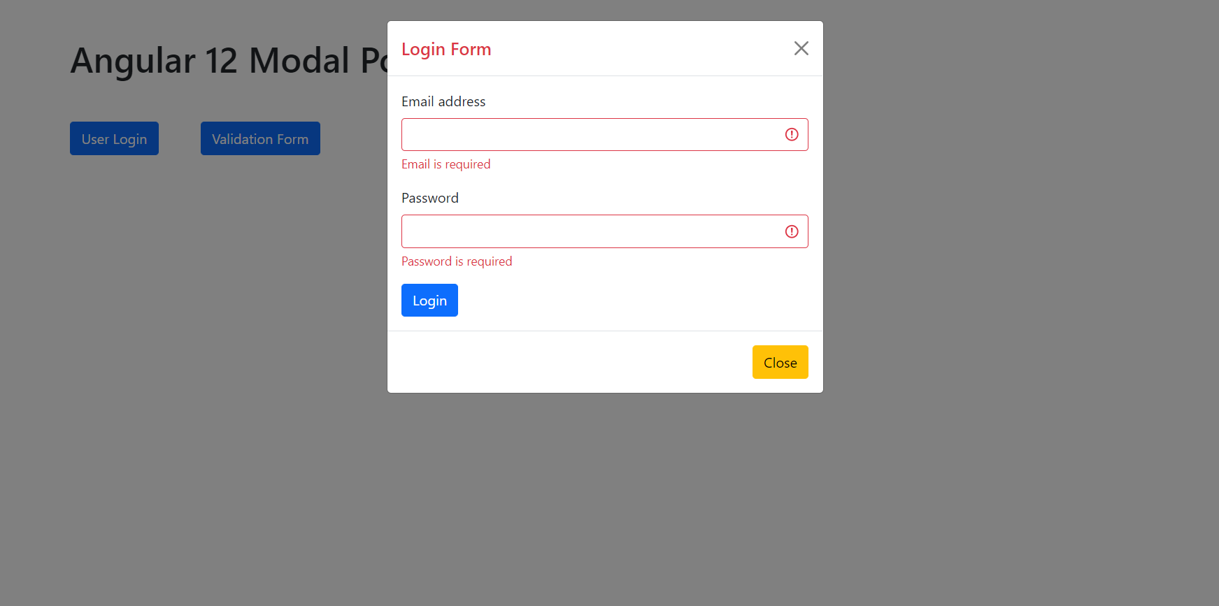
    Hello friends, welcome back to my blog. Today this blog post will tell you, Angular 12 Modal Popup Forms Tutorial.


    Angular 12 Bootstrap Modal Popup

    Angular 12 Modal Popup Forms Tutorial
    Angular12 Modal Popup Forms Tutorial
    Angular 12 Simple Modal Form
    Angular Simple Modal Form

    Angular12 came and Bootstrap 5 also. If you are new then you must check below two links:

    1. Angular12 Basic Tutorials
    2. Bootstrap 5

    Friends now I proceed onwards and here is the working code snippet and please use carefully this to avoid the mistakes:

    1. Firstly friends we need fresh angular 12 setup and for this we need to run below commands but if you already have angular 12 setup then you can avoid below commands. Secondly we should also have latest node version installed on our system:

    npm install -g @angular/cli 
    
    ng new angularboot5 //Create new Angular Project
    
    cd angularboot5 // Go inside the Angular Project Folder

    2. Now friends we need to run below commands into our project terminal to install bootstrap 5 modules into our angular application:

    npm install bootstrap
    
    npm i @popperjs/core

    3. Now friends we just need to add below code into angularboot5/src/app/app.component.html file to get final out on the web browser:

    <button type="button" class="btn btn-primary me-5" data-bs-toggle="modal" data-bs-target="#exampleModal">
      User Login
    </button>
    
    <button type="button" class="btn btn-primary" data-bs-toggle="modal" data-bs-target="#exampleModal2">
      Validation Form
    </button>
    
    <!-- Modal -->
    <div class="modal fade" id="exampleModal" tabindex="-1" aria-labelledby="exampleModalLabel" aria-hidden="true">
      <div class="modal-dialog">
        <div class="modal-content">
          <div class="modal-header">
            <h5 class="modal-title text-danger" id="exampleModalLabel">Login Form</h5>
            <button type="button" class="btn-close" data-bs-dismiss="modal" aria-label="Close"></button>
          </div>
          <div class="modal-body">
            <form>
              <div class="mb-3">
                <label for="exampleInputEmail1" class="form-label">Email address</label>
                <input type="email" class="form-control" id="exampleInputEmail1" aria-describedby="emailHelp">
                <div id="emailHelp" class="form-text">We'll never share your email with anyone else.</div>
              </div>
              <div class="mb-3">
                <label for="exampleInputPassword1" class="form-label">Password</label>
                <input type="password" class="form-control" id="exampleInputPassword1">
              </div>
              <button type="button" class="btn btn-primary">Login</button>
            </form>
          </div>
          <div class="modal-footer">
            <button type="button" class="btn btn-warning" data-bs-dismiss="modal">Close</button>
          </div>
        </div>
      </div>
    </div>
    
    
    <!-- Modal 2 with validation-->
    <div class="modal fade" id="exampleModal2" tabindex="-1" aria-labelledby="exampleModal2Label" aria-hidden="true">
      <div class="modal-dialog">
        <div class="modal-content">
          <div class="modal-header">
            <h5 class="modal-title text-danger" id="exampleModal2Label">Login Form</h5>
            <button type="button" class="btn-close" data-bs-dismiss="modal" aria-label="Close"></button>
          </div>
          <div class="modal-body">
            <form [formGroup]="registerForm" (ngSubmit)="onSubmit()">
              <div class="mb-3">
                <label for="exampleInputEmail1" class="form-label">Email address</label>
                <input type="email" formControlName="email" class="form-control" [ngClass]="{ 'is-invalid': submitted && f.email.errors }"  id="inputEmail4">
                <div *ngIf="submitted && f.email.errors" class="invalid-feedback">
                  <div *ngIf="f.email.errors.required">Email is required</div>
                  <div *ngIf="f.email.errors.email">Email must be a valid email address</div>
               </div>
              </div>
              <div class="mb-3">
                <label for="exampleInputPassword1" class="form-label">Password</label>
                <input type="password" formControlName="password" class="form-control" [ngClass]="{ 'is-invalid': submitted && f.password.errors }" id="inputPassword4">
                <div *ngIf="submitted && f.password.errors" class="invalid-feedback">
                  <div *ngIf="f.password.errors.required">Password is required</div>
               </div>
              </div>
              <button type="submit" class="btn btn-primary">Login</button>
            </form>
          </div>
          <div class="modal-footer">
            <button type="button" class="btn btn-warning" data-bs-dismiss="modal">Close</button>
          </div>
        </div>
      </div>
    </div>

    4. Now friends we just need to add below code into angularboot5/angular.json file:

    "styles": [
                  ...
                  "node_modules/bootstrap/dist/css/bootstrap.min.css"
              ],
    "scripts": [
                  ...
                   "node_modules/bootstrap/dist/js/bootstrap.min.js"
               ]

    5. Now friends we just need to add below code into angularboot5/src/app/app.module.ts file for reactive forms:

    ...
    import { ReactiveFormsModule } from '@angular/forms';
    @NgModule({
     ...
      imports: [
      ...
        ReactiveFormsModule,
      
      ],

    6. Now friends we just need to add below code into angularboot5/src/app/app.component.ts file to validation and other reactive form functions:

    ...
    import { FormBuilder, FormGroup, Validators } from '@angular/forms';
    
    export class AppComponent {
    //Form Validables 
    registerForm: FormGroup;
    submitted = false;
    constructor( private formBuilder: FormBuilder){}
    //Add user form actions
    get f() { return this.registerForm.controls; }
    onSubmit() {
      
      this.submitted = true;
      // stop here if form is invalid
      if (this.registerForm.invalid) {
          return;
      }
      //True if all the fields are filled
      if(this.submitted)
      {
        alert("Great!!");
      }
     
    }
      ngOnInit() {
        //Add User form validations
        this.registerForm = this.formBuilder.group({
        email: ['', [Validators.required, Validators.email]],
        password: ['', [Validators.required]],
        });
      }
    }

    Friends in the end must run ng serve command into your terminal to run the angular 12 project(localhost:4200).

    Now we are done friends. If you have any kind of query, suggestion and new requirement then feel free to comment below.

    Note: Friends, In this post, I just tell the basic setup and things, you can change the code according to your requirements.

    I will appreciate that if you will tell your views for this post. Nothing matters if your views will be good or bad because with your views, I will make my next posts more good and helpful.

    Jassa

    Thanks

  • Angular 12 PrimeNG Chartjs Working Demo

    Angular 12 PrimeNG Chartjs Working Demo

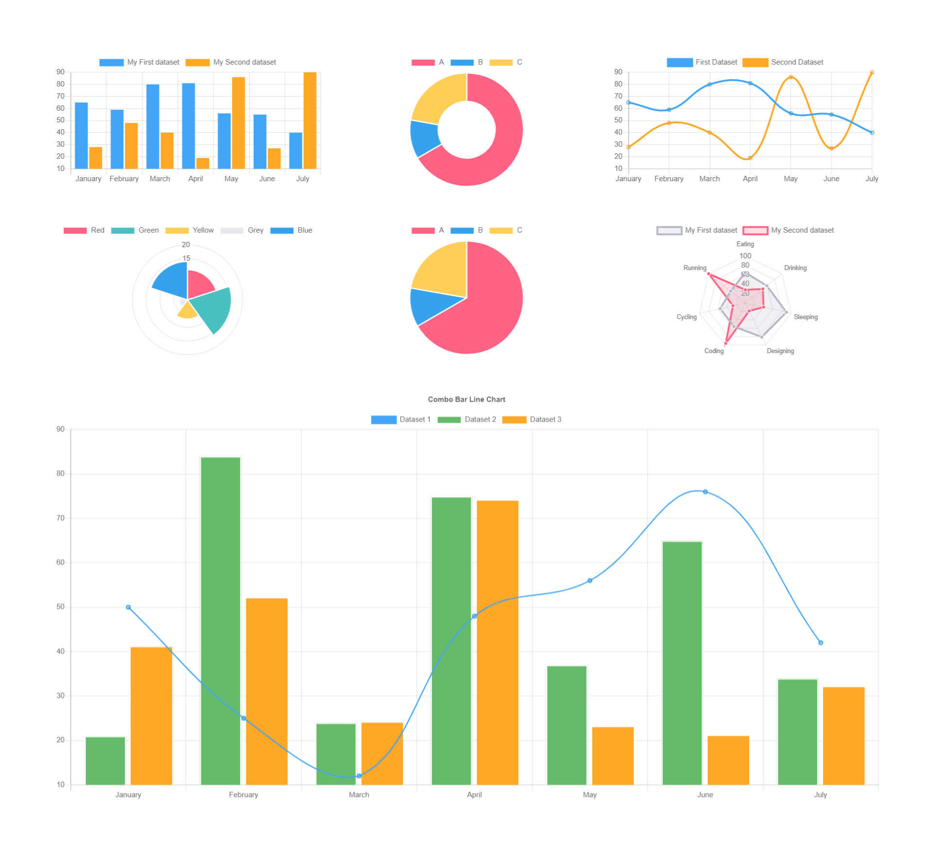
    Hello friends, welcome back to my blog. Today this blog post will tell you, Angular 12 PrimeNG Chartjs Working Demo

    Guys in this post, we will cover below things:

    1. Angular 12 PrimeNG with Chart.js.
    2. Bar Chart, Doughnut Chart, Line Chart, Pie Chart. Polar Chart, Radar Chart and Combo Chart in Angular12.

    PrimeNG Chartjs

    Angular 12 PrimeNG Chartjs Working Demo
    Angular 12 PrimeNG Chartjs Working Demo

    Angular 12 came and Bootstrap 5 also and if you are new then you must check below two links:

    1. Angular12 Basic Tutorials
    2. PrimeNG
    3. Bootstrap 5

    Friends now I proceed onwards and here is the working code snippet and please use carefully this to avoid the mistakes:

    1. Firstly friends we need fresh angular 12 setup and for this we need to run below commands but if you already have angular 12 setup then you can avoid below commands. Secondly we should also have latest node version installed on our system:

    npm install -g @angular/cli 
    
    ng new angularprimeng //Create new Angular Project
    
    cd angularprimeng // Go inside the Angular Project Folder

    2. Now friends we need to run below commands into our project terminal to install primeng  and chartjs modules into our angular application:

    npm install primeng --save
    
    npm install primeicons --save 
    
    npm install @angular/cdk --save
    
    npm install primeflex --save //for flex layout
    
    npm i chart.js@2.9.4

    3. Now friends we just need to add below code into angularprimeng/src/app/app.component.html file to get final out on the web browser:

    <div class="p-grid p-p-4">
    
      <div class="p-col-4">
        <!-- Bar Chart -->
        <p-chart type="bar" [data]="databar"></p-chart>
    </div>
    <div class="p-col-4">
     <!-- Doughnut Chart -->
      <p-chart type="doughnut" [data]="datadoughnut"></p-chart>
    </div>
    <div class="p-col-4">
    <!-- Line Chart -->
      <p-chart type="line" [data]="dataline"></p-chart>
    </div>
    
    </div>
    
    <div class="p-grid p-p-4">
      
      <div class="p-col-4">
    <!-- Polar Chart -->
        <p-chart type="polarArea" [data]="datapolar"></p-chart>
    </div>
      <div class="p-col-4">
    <!-- Pie Chart -->
        <p-chart type="pie" [data]="datapie"></p-chart>
      </div>
      <div class="p-col-4">
    <!-- Radar Chart -->
        <p-chart type="radar" [data]="dataradar"></p-chart>
      </div>
    
    </div>
    <div class="p-grid p-p-4">
      <div class="p-col-12">
    <!-- Combo Line & Bar Chart -->
        <p-chart type="bar" [data]="datacombo" [options]="chartOptions"></p-chart>
    
        </div>
    </div>
    

    4. Now friends we just need to add below code into angularprimeng/angular.json file:

    "styles": [
                  "src/styles.css",
                  "node_modules/primeng/resources/themes/saga-blue/theme.css",
                  "node_modules/primeng/resources/primeng.min.css",
                  "node_modules/primeflex/primeflex.css",
                  "node_modules/primeicons/primeicons.css",
                ],
                "scripts": [
                ...
                 "node_modules/chart.js/dist/Chart.js"
                ],
    ...

    5. Now friends we just need to add below code into angularprimeng/src/app/app.component.ts file:

    export class AppComponent {
    ...
    
    databar: any;
    datadoughnut: any;
    dataline: any;
    datapolar: any;
    datapie:any;
    dataradar:any;
    datacombo: any;
    chartOptions: any;
    constructor() {}
    
    ngOnInit() {
    
      //Bar Chart
      this.databar = {
              labels: ['January', 'February', 'March', 'April', 'May', 'June', 'July'],
              datasets: [
                  {
                      label: 'My First dataset',
                      backgroundColor: '#42A5F5',
                      data: [65, 59, 80, 81, 56, 55, 40]
                  },
                  {
                      label: 'My Second dataset',
                      backgroundColor: '#FFA726',
                      data: [28, 48, 40, 19, 86, 27, 90]
                  }
              ]
          };
    
    
         //Doughnut Chart
          this.datadoughnut = {
            labels: ['A','B','C'],
            datasets: [
                {
                    data: [300, 50, 100],
                    backgroundColor: [
                        "#FF6384",
                        "#36A2EB",
                        "#FFCE56"
                    ],
                    hoverBackgroundColor: [
                        "#FF6384",
                        "#36A2EB",
                        "#FFCE56"
                    ]
                }]    
            };
    
    
           //Line Chart
            this.dataline = {
              labels: ['January', 'February', 'March', 'April', 'May', 'June', 'July'],
              datasets: [
                  {
                      label: 'First Dataset',
                      data: [65, 59, 80, 81, 56, 55, 40],
                      fill: false,
                      borderColor: '#42A5F5'
                  },
                  {
                      label: 'Second Dataset',
                      data: [28, 48, 40, 19, 86, 27, 90],
                      fill: false,
                      borderColor: '#FFA726'
                  }
              ]
          };
    
         //Polar Chart
          this.datapolar = {
              datasets: [{
                  data: [
                      11,
                      16,
                      7,
                      3,
                      14
                  ],
                  backgroundColor: [
                      "#FF6384",
                      "#4BC0C0",
                      "#FFCE56",
                      "#E7E9ED",
                      "#36A2EB"
                  ],
                  label: 'My dataset'
              }],
              labels: [
                  "Red",
                  "Green",
                  "Yellow",
                  "Grey",
                  "Blue"
              ]
          };
    
          //Pie Chart
          this.datapie = {
            labels: ['A','B','C'],
            datasets: [
                {
                    data: [300, 50, 100],
                    backgroundColor: [
                        "#FF6384",
                        "#36A2EB",
                        "#FFCE56"
                    ],
                    hoverBackgroundColor: [
                        "#FF6384",
                        "#36A2EB",
                        "#FFCE56"
                    ]
                }]    
            };
    
            //Radar Chart
            this.dataradar = {
              labels: ['Eating', 'Drinking', 'Sleeping', 'Designing', 'Coding', 'Cycling', 'Running'],
              datasets: [
                  {
                      label: 'My First dataset',
                      backgroundColor: 'rgba(179,181,198,0.2)',
                      borderColor: 'rgba(179,181,198,1)',
                      pointBackgroundColor: 'rgba(179,181,198,1)',
                      pointBorderColor: '#fff',
                      pointHoverBackgroundColor: '#fff',
                      pointHoverBorderColor: 'rgba(179,181,198,1)',
                      data: [65, 59, 90, 81, 56, 55, 40]
                  },
                  {
                      label: 'My Second dataset',
                      backgroundColor: 'rgba(255,99,132,0.2)',
                      borderColor: 'rgba(255,99,132,1)',
                      pointBackgroundColor: 'rgba(255,99,132,1)',
                      pointBorderColor: '#fff',
                      pointHoverBackgroundColor: '#fff',
                      pointHoverBorderColor: 'rgba(255,99,132,1)',
                      data: [28, 48, 40, 19, 96, 27, 100]
                  }
              ]
          };
     
          //Combo Chart
          this.datacombo = {
            labels: ['January', 'February', 'March', 'April', 'May', 'June', 'July'],
            datasets: [{
                type: 'line',
                label: 'Dataset 1',
                borderColor: '#42A5F5',
                borderWidth: 2,
                fill: false,
                data: [
                    50,
                    25,
                    12,
                    48,
                    56,
                    76,
                    42
                ]
            }, {
                type: 'bar',
                label: 'Dataset 2',
                backgroundColor: '#66BB6A',
                data: [
                    21,
                    84,
                    24,
                    75,
                    37,
                    65,
                    34
                ],
                borderColor: 'white',
                borderWidth: 2
            }, {
                type: 'bar',
                label: 'Dataset 3',
                backgroundColor: '#FFA726',
                data: [
                    41,
                    52,
                    24,
                    74,
                    23,
                    21,
                    32
                ]
            }]
        };
    
        //Chart Option For Combo
        this.chartOptions = {
          responsive: true,
          title: {
              display: true,
              text: 'Combo Bar Line Chart'
          },
          tooltips: {
              mode: 'index',
              intersect: true
          }
      };
    
        }
    }

    6. Now friends we just need to add below code into angularprimeng/src/app/app.module.ts file:

    ...
    import {ChartModule} from 'primeng/chart';
    ...
      imports: [
       ...
        ChartModule
      ],
      providers: [],
      bootstrap: [AppComponent]
    })
    export class AppModule { }

    Friends in the end must run ng serve command into your terminal to run the angular 12 project on browser(localhost:4200).

    Now we are done friends. If you have any kind of query, suggestion and new requirement then feel free to comment below.

    Note: Friends, In this post, I just tell the basic setup and things, you can change the code according to your requirements.

    I will appreciate that if you will tell your views for this post. Nothing matters if your views will be good or bad because with your views, I will make my next posts more good and helpful.

    Jassa

    Thanks