
Hello my friends, welcome back to my blog. Today in this blog post, I am going to show you, Vue 3 Bootstrap 5 Popup Sidebar Template.
Guy’s with this post, we will learn many things like below:
- Vue 3 button click functionality.
- Vue 3 add conditional class to html elements.
- Responsive template creation in vuejs with bootstrap 5.
Vue 3 came and if you are new then you must check below link:
Vuejs
Friends now I proceed onwards and here is the working code snippet and please use this carefully to avoid the mistakes:
1. Firstly friends we need fresh vuejs(Vue 3) setup and for that we need to run below commands into our terminal and also w should have latest node version installed on our system:
Guys you can skip this first step if you already have vuejs fresh setup:
npm install -g @vue/cli

vue create vuesidebar

cd vuesidebar

npm install bootstrap --save

npm i @popperjs/core

npm run serve //http://localhost:8080/
2. Now friends please create new file “App.css” inside src folder and add below code inside it:
@import "https://fonts.googleapis.com/css?family=Poppins:300,400,500,600,700";
body {
  font-family: 'Poppins', sans-serif;
  background: #fafafa;
}

p {
  font-family: 'Poppins', sans-serif;
  font-size: 1.1em;
  font-weight: 300;
  line-height: 1.7em;
  color: #999;
}

a,
a:hover,
a:focus {
  color: inherit;
  text-decoration: none;
  transition: all 0.3s;
}

.navbar {
  padding: 15px 10px;
  background: #fff;
  border: none;
  border-radius: 0;
  margin-bottom: 40px;
  box-shadow: 1px 1px 3px rgba(0, 0, 0, 0.1);
}

.navbar-btn {
  box-shadow: none;
  outline: none !important;
  border: none;
}

.line {
  width: 100%;
  height: 1px;
  border-bottom: 1px dashed #ddd;
  margin: 40px 0;
}

/* ---------------------------------------------------
  SIDEBAR STYLE
----------------------------------------------------- */

#sidebar {
  width: 250px;
  position: fixed;
  top: 0;
  left: -250px;
  height: 100vh;
  z-index: 999;
  background: #7386D5;
  color: #fff;
  transition: all 0.3s;

  box-shadow: 3px 3px 3px rgba(0, 0, 0, 0.2);
}

#sidebar.active {
  left: 0;
}

#dismiss {
  width: 35px;
  height: 35px;
  line-height: 35px;
  text-align: center;
  background: #7386D5;
  position: absolute;
  top: 10px;
  right: 10px;
  cursor: pointer;
  -webkit-transition: all 0.3s;
  -o-transition: all 0.3s;
  transition: all 0.3s;
}

#dismiss:hover {
  background: #fff;
  color: #7386D5;
}

.overlay {
  display: none;
  position: fixed;
  width: 100vw;
  height: 100vh;
  background: rgba(0, 0, 0, 0.7);
  z-index: 998;
  opacity: 0;
  transition: all 0.5s ease-in-out;
}
.overlay.active {
  display: block;
  opacity: 1;
}

#sidebar .sidebar-header {
  padding: 20px;
  background: #6d7fcc;
}

#sidebar ul.components {
  padding: 20px 0;
  border-bottom: 1px solid #47748b;
}

#sidebar ul p {
  color: #fff;
  padding: 10px;
}

#sidebar ul li a {
  padding: 10px;
    font-size: 1.1em;
    display: block;
    color: #ffffff;
    text-decoration: none;
}

#sidebar ul li a:hover {
  color: #7386D5;
  background: #fff;
}

#sidebar ul li.active>a,
a[aria-expanded="true"] {
  color: #fff;
  background: #6d7fcc;
}

a[data-toggle="collapse"] {
  position: relative;
}

.dropdown-toggle::after {
  display: block;
  position: absolute;
  top: 50%;
  right: 20px;
  transform: translateY(-50%);
}

ul ul a {
  font-size: 0.9em !important;
  padding-left: 30px !important;
  background: #6d7fcc;
}

ul.CTAs {
  padding: 20px;
}

ul.CTAs a {
  text-align: center;
  font-size: 0.9em !important;
  display: block;
  border-radius: 5px;
  margin-bottom: 5px;
}

a.download {
  background: #fff;
  color: #7386D5;
}

a.article,
a.article:hover {
  background: #6d7fcc !important;
  color: #fff !important;
}

/* ---------------------------------------------------
  CONTENT STYLE
----------------------------------------------------- */

#content {
  width: 100%;
  padding: 20px;
  min-height: 100vh;
  transition: all 0.3s;
  position: absolute;
  top: 0;
  right: 0;
}
.overlay.active {
    display: block;
    opacity: 1;
}
.overlay {
    display: none;
    position: fixed;
    width: 100vw;
    height: 100vh;
    background: rgba(0, 0, 0, 0.7);
    z-index: 998;
    opacity: 0;
    transition: all 0.5s ease-in-out;
}

@media (min-width: 768px) {
    #sidebar {
      margin-left: 0;
    }

    #content {
      min-width: 0;
      width: 100%;
    }
    .show
    {
      margin-left: 0!important;
    }
    .hide
    {
      margin-left: 250px!important;
    }
  }
  @media (max-width: 767px) {
    .show
    {
      margin-left: 0!important;
    }
    .hide
    {
      margin-left: 250px!important;
    }
  }
3. Finally friends we need to add below code into our src/App.vue file to get final output on web browser:
<template>
<div class="wrapper">
<!-- Sidebar -->
<nav id="sidebar" v-bind:class = "(toggle)?'show':'hide'">
<div id="dismiss" @click='toggle = !toggle'>
<i class="fas fa-arrow-left"></i>
</div>
<div class="sidebar-header">
<h3>Bootstrap Sidebar</h3>
</div>
<ul class="list-unstyled components">
<p>Dummy Heading</p>
<li class="active">
<a href="#homeSubmenu" data-toggle="collapse" aria-expanded="false">Home</a>
<ul class="collapse list-unstyled" id="homeSubmenu">
<li>
<a href="#">Home 1</a>
</li>
<li>
<a href="#">Home 2</a>
</li>
<li>
<a href="#">Home 3</a>
</li>
</ul>
</li>
<li>
<a href="#">About</a>
<a href="#pageSubmenu" data-toggle="collapse" aria-expanded="false">Pages</a>
<ul class="collapse list-unstyled" id="pageSubmenu">
<li>
<a href="#">Page 1</a>
</li>
<li>
<a href="#">Page 2</a>
</li>
<li>
<a href="#">Page 3</a>
</li>
</ul>
</li>
<li>
<a href="#">Portfolio</a>
</li>
<li>
<a href="#">Contact</a>
</li>
</ul>
</nav>
<!-- Page Content -->
<div id="content">
<nav class="navbar navbar-expand-lg navbar-light bg-light">
<div class="container-fluid">
<button type="button" id="sidebarCollapse" class="btn btn-info" @click='toggle = !toggle'>
<i class="fas fa-align-left"></i>
<span>Toggle Sidebar</span>
</button>
<button class="navbar-toggler" type="button" data-bs-toggle="collapse" data-bs-target="#navbarSupportedContent" aria-controls="navbarSupportedContent" aria-expanded="false" aria-label="Toggle navigation">
<span class="navbar-toggler-icon"></span>
</button>
<div class="collapse navbar-collapse" id="navbarSupportedContent">
<ul class="nav navbar-nav ml-auto">
<li class="nav-item active">
<a class="nav-link" href="#">Page</a>
</li>
<li class="nav-item">
<a class="nav-link" href="#">Page</a>
</li>
<li class="nav-item">
<a class="nav-link" href="#">Page</a>
</li>
<li class="nav-item">
<a class="nav-link" href="#">Page</a>
</li>
</ul>
</div>
</div>
</nav>
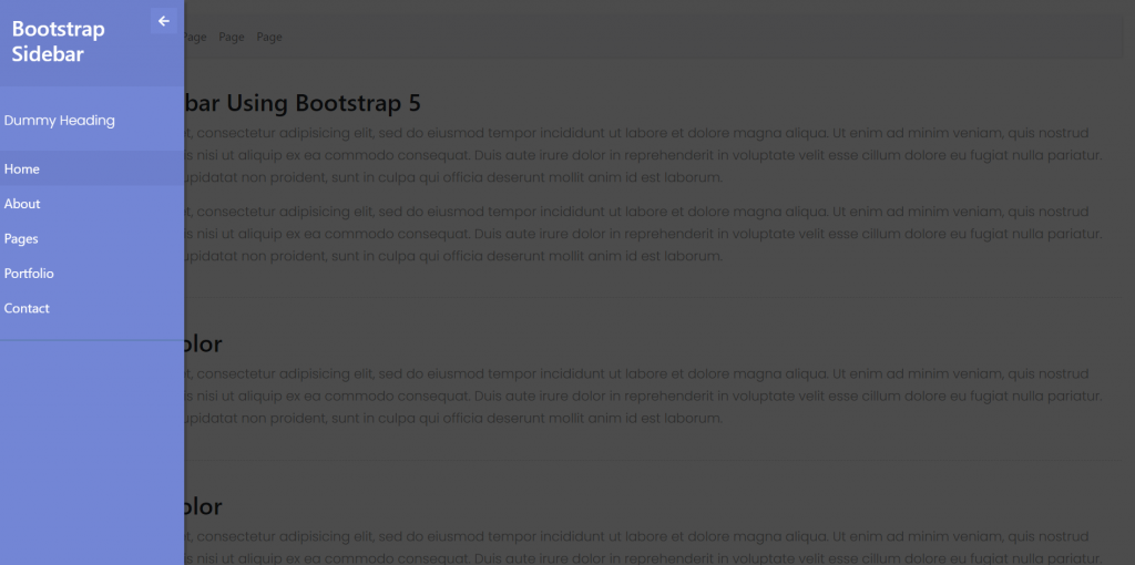
<h2>Collapsible Sidebar Using Bootstrap 5</h2>
<p>Lorem ipsum dolor sit amet, consectetur adipisicing elit, sed do eiusmod tempor incididunt ut labore et dolore magna aliqua. Ut enim ad minim veniam, quis nostrud exercitation ullamco laboris nisi ut aliquip ex ea commodo consequat. Duis aute irure dolor in reprehenderit in voluptate velit esse cillum dolore eu fugiat nulla pariatur. Excepteur sint occaecat cupidatat non proident, sunt in culpa qui officia deserunt mollit anim id est laborum.</p>
<p>Lorem ipsum dolor sit amet, consectetur adipisicing elit, sed do eiusmod tempor incididunt ut labore et dolore magna aliqua. Ut enim ad minim veniam, quis nostrud exercitation ullamco laboris nisi ut aliquip ex ea commodo consequat. Duis aute irure dolor in reprehenderit in voluptate velit esse cillum dolore eu fugiat nulla pariatur. Excepteur sint occaecat cupidatat non proident, sunt in culpa qui officia deserunt mollit anim id est laborum.</p>
<div class="line"></div>
<h2>Lorem Ipsum Dolor</h2>
<p>Lorem ipsum dolor sit amet, consectetur adipisicing elit, sed do eiusmod tempor incididunt ut labore et dolore magna aliqua. Ut enim ad minim veniam, quis nostrud exercitation ullamco laboris nisi ut aliquip ex ea commodo consequat. Duis aute irure dolor in reprehenderit in voluptate velit esse cillum dolore eu fugiat nulla pariatur. Excepteur sint occaecat cupidatat non proident, sunt in culpa qui officia deserunt mollit anim id est laborum.</p>
<div class="line"></div>
<h3>Lorem Ipsum Dolor</h3>
<p>Lorem ipsum dolor sit amet, consectetur adipisicing elit, sed do eiusmod tempor incididunt ut labore et dolore magna aliqua. Ut enim ad minim veniam, quis nostrud exercitation ullamco laboris nisi ut aliquip ex ea commodo consequat. Duis aute irure dolor in reprehenderit in voluptate velit esse cillum dolore eu fugiat nulla pariatur. Excepteur sint occaecat cupidatat non proident, sunt in culpa qui officia deserunt mollit anim id est laborum.</p>
</div>
</div>
<div class="overlay" v-bind:class = "(toggle)?'':'active'"></div>
</template>
<script>
//importing bootstrap 5 Modules
import "bootstrap/dist/css/bootstrap.min.css";
import "bootstrap/dist/js/bootstrap.min.js";
import "./App.css";
export default {
data(){
return {
toggle: true //toggle variable
}
}
}
</script>
4. Guy’s now we need to add below code inside public/index.html file to get the icons:
...
 <head>
   ...
    <script defer src="https://use.fontawesome.com/releases/v5.0.13/js/solid.js" ></script>
    <script defer src="https://use.fontawesome.com/releases/v5.0.13/js/fontawesome.js"></script>
  </head>
...
Now we are done friends also and If you have any kind of query or suggestion or any requirement then feel free to comment below.
Note: Friends, I just tell the basic setup and things, you can change the code according to your requirements. For better understanding must watch video above.
I will appreciate that if you will tell your views for this post. Nothing matters if your views will be good or bad.
Jassa
Thanks
Leave a Reply