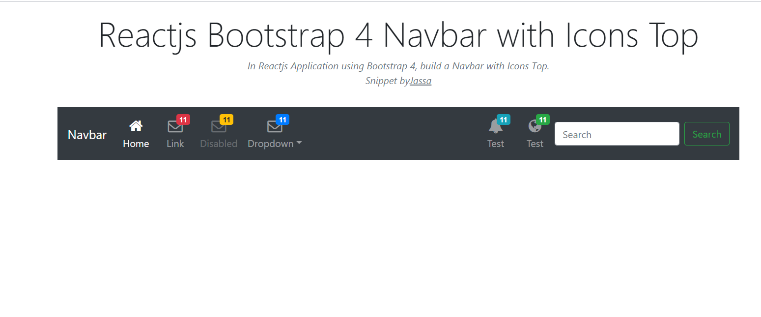
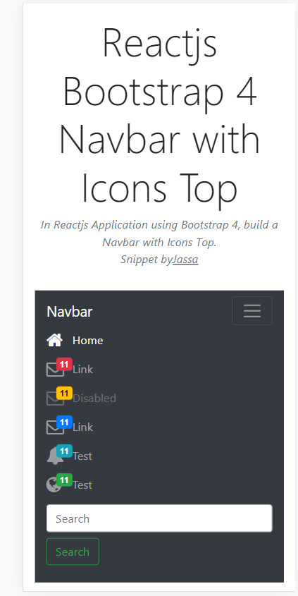
Hello friends, welcome back to my blog. Today in this blog post, I am going to show you, Reactjs Bootstrap 4 Navbar with Icons Top.
For reactjs new comers, please check the below link:
Friends now I proceed onwards and here is the working code snippet for Reactjs Bootstrap 4 Navbar with Icons Top and please use this carefully to avoid the mistakes:
1. Firstly, we need fresh reactjs setup and for that, we need to run below commands into out terminal and also we should have latest node version installed on our system:
npx create-react-app reacttepmate

cd reacttepmate

npm start
2. Now we need to run below commands into our project terminal to get bootstrap and related modules into our reactjs application:
npm install bootstrap --save

npm install jquery --save

npm start //For start project again
3. Finally for the main output, we need to add below code into our reacttemplate/src/App.js file or if you have fresh setup then you can replace reacttemplate/src/App.js file code with below code:
import React from 'react';

import './App.css';
import 'bootstrap/dist/css/bootstrap.min.css';
import 'bootstrap/dist/js/bootstrap.min.js'; import 'jquery/dist/jquery.min.js';
class Home extends React.Component {


  render() {

    return (

        <div className="maincontainer">


          <div class="container">
          <nav class="navbar navbar-icon-top navbar-expand-lg navbar-dark bg-dark">
                    <a class="navbar-brand" href="#">Therichpost</a>
                    <button class="navbar-toggler" type="button" data-toggle="collapse" data-target="#navbarSupportedContent" aria-controls="navbarSupportedContent" aria-expanded="false" aria-label="Toggle navigation">
                        <span class="navbar-toggler-icon"></span>
                    </button>

                    <div class="collapse navbar-collapse" id="navbarSupportedContent">
                        <ul class="navbar-nav mr-auto">
                        <li class="nav-item active">
                            <a class="nav-link" href="#">
                            <i class="fa fa-home"></i>
                            Home
                            <span class="sr-only">(current)</span>
                            </a>
                        </li>
                        <li class="nav-item">
                            <a class="nav-link" href="#">
                            <i class="fa fa-envelope-o">
                                <span class="badge badge-danger">11</span>
                            </i>
                            Link
                            </a>
                        </li>
                        <li class="nav-item">
                            <a class="nav-link disabled" href="#">
                            <i class="fa fa-envelope-o">
                                <span class="badge badge-warning">11</span>
                            </i>
                            Disabled
                            </a>
                        </li>
                        <li class="nav-item">
                            <a class="nav-link" href="#">
                            <i class="fa fa-envelope-o">
                                <span class="badge badge-primary">11</span>
                            </i>
                            Link
                            </a>

                        </li>
                        </ul>
                        <ul class="navbar-nav ">
                        <li class="nav-item">
                            <a class="nav-link" href="#">
                            <i class="fa fa-bell">
                                <span class="badge badge-info">11</span>
                            </i>
                            Test
                            </a>
                        </li>
                        <li class="nav-item">
                            <a class="nav-link" href="#">
                            <i class="fa fa-globe">
                                <span class="badge badge-success">11</span>
                            </i>
                            Test
                            </a>
                        </li>
                        </ul>
                        <form class="form-inline my-2 my-lg-0">
                        <input class="form-control mr-sm-2" type="text" placeholder="Search" aria-label="Search" />
                        <button class="btn btn-outline-success my-2 my-sm-0" type="submit">Search</button>
                        </form>
                    </div>
                    </nav>

                </div>

        </div>


)
};
}

export default Home;
4. Now Friends we need to add below code into our reacttemplate/src/App.css file :
@import url("//maxcdn.bootstrapcdn.com/font-awesome/4.7.0/css/font-awesome.min.css");

.navbar-icon-top .navbar-nav .nav-link > .fa {
  position: relative;
  width: 36px;
  font-size: 24px;
}

.navbar-icon-top .navbar-nav .nav-link > .fa > .badge {
  font-size: 0.75rem;
  position: absolute;
  right: 0;
  font-family: sans-serif;
}

.navbar-icon-top .navbar-nav .nav-link > .fa {
  top: 3px;
  line-height: 12px;
}

.navbar-icon-top .navbar-nav .nav-link > .fa > .badge {
  top: -10px;
}

@media (min-width: 576px) {
  .navbar-icon-top.navbar-expand-sm .navbar-nav .nav-link {
    text-align: center;
    display: table-cell;
    height: 70px;
    vertical-align: middle;
    padding-top: 0;
    padding-bottom: 0;
  }

  .navbar-icon-top.navbar-expand-sm .navbar-nav .nav-link > .fa {
    display: block;
    width: 48px;
    margin: 2px auto 4px auto;
    top: 0;
    line-height: 24px;
  }

  .navbar-icon-top.navbar-expand-sm .navbar-nav .nav-link > .fa > .badge {
    top: -7px;
  }
}

@media (min-width: 768px) {
  .navbar-icon-top.navbar-expand-md .navbar-nav .nav-link {
    text-align: center;
    display: table-cell;
    height: 70px;
    vertical-align: middle;
    padding-top: 0;
    padding-bottom: 0;
  }

  .navbar-icon-top.navbar-expand-md .navbar-nav .nav-link > .fa {
    display: block;
    width: 48px;
    margin: 2px auto 4px auto;
    top: 0;
    line-height: 24px;
  }

  .navbar-icon-top.navbar-expand-md .navbar-nav .nav-link > .fa > .badge {
    top: -7px;
  }
}

@media (min-width: 992px) {
  .navbar-icon-top.navbar-expand-lg .navbar-nav .nav-link {
    text-align: center;
    display: table-cell;
    height: 70px;
    vertical-align: middle;
    padding-top: 0;
    padding-bottom: 0;
  }

  .navbar-icon-top.navbar-expand-lg .navbar-nav .nav-link > .fa {
    display: block;
    width: 48px;
    margin: 2px auto 4px auto;
    top: 0;
    line-height: 24px;
  }

  .navbar-icon-top.navbar-expand-lg .navbar-nav .nav-link > .fa > .badge {
    top: -7px;
  }
}

@media (min-width: 1200px) {
  .navbar-icon-top.navbar-expand-xl .navbar-nav .nav-link {
    text-align: center;
    display: table-cell;
    height: 70px;
    vertical-align: middle;
    padding-top: 0;
    padding-bottom: 0;
  }

  .navbar-icon-top.navbar-expand-xl .navbar-nav .nav-link > .fa {
    display: block;
    width: 48px;
    margin: 2px auto 4px auto;
    top: 0;
    line-height: 24px;
  }

  .navbar-icon-top.navbar-expand-xl .navbar-nav .nav-link > .fa > .badge {
    top: -7px;
  }
}
Now we are done friends. If you have any kind of query or suggestion or any requirement then feel free to comment below.
Note: Friends, I just tell the basic setup and things, you can change the code according to your requirements.
I will appreciate that if you will tell your views for this post. Nothing matters if your views will be good or bad.
Jassa
Thanks
Leave a Reply
You must be logged in to post a comment.