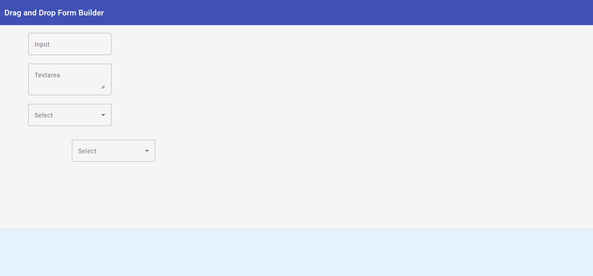
Hello to all, welcome to therichpost.com. In this post, I will tell you, How to create a drag-and-drop form builder in Angular 18?
Guy’s Angular 18 came and if you are new in Angular 18 then please check below links:
Here is the working code snippet and please follow carefully:
To create a drag-and-drop form builder in Angular 18 using standalone components, follow these steps:
Step 1: Set up Angular Project
First, make sure you have Angular CLI installed. Then create a new Angular project.
ng new drag-drop-form-builder
cd drag-drop-form-builder
Step 2: Install Angular Material and CDK
Angular Material and CDK provide useful components and utilities for building UI elements, including drag-and-drop functionality.
ng add @angular/material
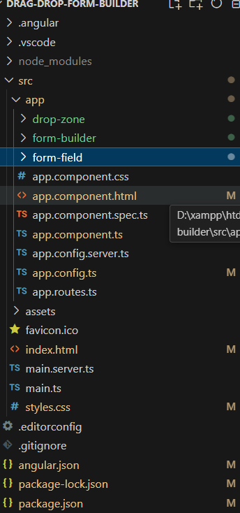
Step 3: Create Standalone Components
Create standalone components for the form builder and form elements.
ng generate component form-builder
ng generate component form-field
ng generate component drop-zone
Step 4: Import Drag and Drop Module
Import the DragDropModule from Angular CDK in your standalone components.
// form-builder.component.ts
import { Component } from '@angular/core';
import { CdkDragDrop, moveItemInArray, transferArrayItem, DragDropModule  } from '@angular/cdk/drag-drop';
import { CommonModule } from '@angular/common';
import { MatToolbarModule } from '@angular/material/toolbar';
import { FormFieldComponent } from '../form-field/form-field.component';
import { DropZoneComponent } from '../drop-zone/drop-zone.component';

@Component({
  standalone: true,
  selector: 'app-form-builder',
  templateUrl: './form-builder.component.html',
  styleUrls: ['./form-builder.component.css'],
  imports: [CommonModule, MatToolbarModule, FormFieldComponent, DropZoneComponent, DragDropModule]
})
export class FormBuilderComponent {
  fields = [
    { type: 'input', label: 'Input' },
    { type: 'select', label: 'Select' },
    { type: 'textarea', label: 'Textarea' }
  ];

  drop(event: CdkDragDrop<any[]>) {
    if (event.previousContainer === event.container) {
      moveItemInArray(this.fields, event.previousIndex, event.currentIndex);
    } else {
      transferArrayItem(event.previousContainer.data,
                        event.container.data,
                        event.previousIndex,
                        event.currentIndex);
    }
  }
}
Step 5: Create Drag-and-Drop Area
Define the drag-and-drop area in your form-builder.component.html.
<!-- form-builder.component.html -->
<mat-toolbar color="primary">
  Drag and Drop Form Builder
</mat-toolbar>
<div class="form-builder" cdkDropList id="formBuilder" [cdkDropListData]="fields" [cdkDropListConnectedTo]="['dropZone']" (cdkDropListDropped)="drop($event)">
  <div *ngFor="let field of fields" cdkDrag [cdkDragData]="field" class="draggable-field">
    <app-form-field [field]="field"></app-form-field>
  </div>
</div>
<app-drop-zone></app-drop-zone>
Step 6: Handle Drag and Drop Events
Implement the logic to handle drag-and-drop events in your form-builder.component.ts.
// drop-zone.component.ts
import { Component } from '@angular/core';
import { CdkDragDrop, transferArrayItem } from '@angular/cdk/drag-drop';
import { CommonModule } from '@angular/common';
import { FormFieldComponent } from '../form-field/form-field.component';
import { DragDropModule } from '@angular/cdk/drag-drop';

@Component({
  standalone: true,
  selector: 'app-drop-zone',
  templateUrl: './drop-zone.component.html',
  styleUrls: ['./drop-zone.component.css'],
  imports: [CommonModule, DragDropModule, FormFieldComponent]
})
export class DropZoneComponent {
  droppedFields: any[] = [];

  drop(event: CdkDragDrop<any[]>) {
    if (event.previousContainer !== event.container) {
      transferArrayItem(event.previousContainer.data,
                        event.container.data,
                        event.previousIndex,
                        event.currentIndex);
    }
  }
}
<!-- drop-zone.component.html -->
<div class="drop-zone" cdkDropList id="dropZone" [cdkDropListData]="droppedFields" [cdkDropListConnectedTo]="['formBuilder']" (cdkDropListDropped)="drop($event)">
    <div *ngFor="let field of droppedFields" class="dropped-item">
      <app-form-field [field]="field"></app-form-field>
    </div>
  </div>
Step 7: Define Form Fields
Define the form fields in form-field.component.ts and form-field.component.html.
// form-field.component.ts
import { Component, Input } from '@angular/core';
import { CommonModule } from '@angular/common';
import { MatInputModule } from '@angular/material/input';
import { MatSelectModule } from '@angular/material/select';
import { MatFormFieldModule } from '@angular/material/form-field';

@Component({
  standalone: true,
  selector: 'app-form-field',
  templateUrl: './form-field.component.html',
  styleUrls: ['./form-field.component.css'],
  imports: [CommonModule, MatInputModule, MatSelectModule, MatFormFieldModule]
})
export class FormFieldComponent {
  @Input() field: any;
}
<!-- form-field.component.html -->
<div [ngSwitch]="field.type">
  <mat-form-field *ngSwitchCase="'input'" appearance="outline" class="full-width">
    <mat-label>{{ field.label }}</mat-label>
    <input matInput placeholder="{{ field.label }}">
  </mat-form-field>
  <mat-form-field *ngSwitchCase="'select'" appearance="outline" class="full-width">
    <mat-label>{{ field.label }}</mat-label>
    <mat-select>
      <mat-option>{{ field.label }}</mat-option>
    </mat-select>
  </mat-form-field>
  <mat-form-field *ngSwitchCase="'textarea'" appearance="outline" class="full-width">
    <mat-label>{{ field.label }}</mat-label>
    <textarea matInput placeholder="{{ field.label }}"></textarea>
  </mat-form-field>
</div>
Step 8: Style Your Components
Add styling to your components in form-builder.component.css and form-field.component.css.
/* form-builder.component.css */
.form-builder {
  width: 100%;
  height: 500px;
  border: 1px solid #ccc;
  display: flex;
  flex-direction: column;
}
/* form-field.component.css */
.form-builder {
    width: 100%;
    min-height: 500px;
    border: 1px dashed #ccc;
    padding: 20px;
    background-color: #f9f9f9;
    display: flex;
    flex-direction: column;
    gap: 10px;
  }

  .draggable-field {
    padding: 10px;
    border: 1px solid #ccc;
    background-color: #fff;
    border-radius: 4px;
    cursor: grab;
  }

  .draggable-field:active {
    cursor: grabbing;
  }
Step 9: Combine & call all inside app component:
//app.component.ts
import { Component } from '@angular/core';
import { FormBuilderComponent } from './form-builder/form-builder.component';
import { MatToolbarModule } from '@angular/material/toolbar';
import { CommonModule } from '@angular/common';

@Component({
  standalone: true,
  selector: 'app-root',
  template: '<app-form-builder></app-form-builder>',
  styleUrls: ['./app.component.css'],
  imports: [FormBuilderComponent, MatToolbarModule, CommonModule]
})
export class AppComponent {}
Step 10: Run Your Project
Finally, run your Angular project to see the drag-and-drop form builder in action.
ng serve
This should give you a basic drag-and-drop form builder using standalone components in Angular 18. You can expand on this by adding more features, such as saving the form structure, adding different types of form fields, or customizing the appearance.
Note: Friends, I just tell the basic setup and things, you can change the code according to your requirements. For better understanding please watch the above video.
I will appreciate that if you will share your views for this post. Nothing matters if your views will be good or bad.
Jassa
Thank you.
Leave a Reply
You must be logged in to post a comment.