
Hello friends, welcome again on my blog therichpost.com. Today in this post, I will tell you, Create Your First ReactJS Application Responsive Page with Bootstrap 5.
Guys with this post we will do below things:
- Add Bootstrap 5 in Reactjs Application.
- Create responsive page in reactjs application.
- Here is the first part of this post : Part 1
Here friends, for live working example please check the below video:
For Reactjs new comers, please check below link:
Here is the code snippet and please follow carefully:
1. Firstly friends we need fresh react set up and for this, we need to run below commands into our terminal or if you already have then no need for this step. Importantly we should have latest node version installed on our system:
npx create-react-app therichpost

cd therichpost

npm start //this will make project run on browser http://localhost:3000/
2. Now friends we need to run below commands into our project terminal to get bootstrap and its dependencies:
npm install bootstrap --save

npm i @popperjs/core

npm start
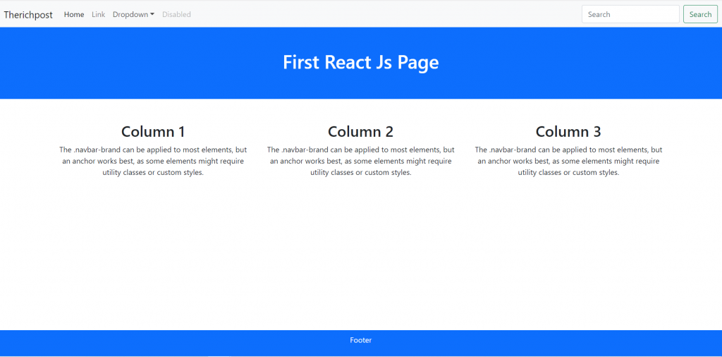
3. Now friends we are done with commands, now please open project/src/App.js file and add below code inside it:
import logo from './logo.svg';
import './App.css';
import 'bootstrap/dist/css/bootstrap.min.css'
import 'bootstrap/dist/js/bootstrap.min.js'
function App() {
  return (
    <div className="App">
     <nav className="navbar navbar-expand-lg navbar-light bg-light">
  <div className="container-fluid">
    <a className="navbar-brand" href="https://therichpost.com/">Therichpost</a>
    <button className="navbar-toggler" type="button" data-bs-toggle="collapse" data-bs-target="#navbarSupportedContent" aria-controls="navbarSupportedContent" aria-expanded="false" aria-label="Toggle navigation">
      <span className="navbar-toggler-icon"></span>
    </button>
    <div className="collapse navbar-collapse" id="navbarSupportedContent">
      <ul className="navbar-nav me-auto mb-2 mb-lg-0">
        <li className="nav-item">
          <a className="nav-link active" aria-current="page" href="#">Home</a>
        </li>
        <li className="nav-item">
          <a className="nav-link" href="#">Link</a>
        </li>
        <li className="nav-item dropdown">
          <a className="nav-link dropdown-toggle" href="#" id="navbarDropdown" role="button" data-bs-toggle="dropdown" aria-expanded="false">
            Dropdown
          </a>
          <ul className="dropdown-menu" aria-labelledby="navbarDropdown">
            <li><a className="dropdown-item" href="#">Action</a></li>
            <li><a className="dropdown-item" href="#">Another action</a></li>
            <li><hr className="dropdown-divider" /></li>
            <li><a className="dropdown-item" href="#">Something else here</a></li>
          </ul>
        </li>
        <li class="nav-item">
          <a className="nav-link disabled" href="#" tabindex="-1" aria-disabled="true">Disabled</a>
        </li>
      </ul>
      <form className="d-flex">
        <input className="form-control me-2" type="search" placeholder="Search" aria-label="Search" />
        <button className="btn btn-outline-success" type="submit">Search</button>
      </form>
    </div>
  </div>
</nav>
<div className="container-fluid bg-primary p-5 text-white text-center">
  <h1>First React Js Page</h1>
</div>

<div className="container mt-5">
  <div className="row">
    <div className="col-sm-4">
      <h2>Column 1</h2>
      <p>
      The .navbar-brand can be applied to most
      elements, but an anchor works best, as some elements might require utility classes or custom styles.
      </p>
    </div>
    <div className="col-sm-4">
    <h2>Column 2</h2>
    <p>
      The .navbar-brand can be applied to most
      elements, but an anchor works best, as some elements might require utility classes or custom styles.
      </p>
    </div>
    <div className="col-sm-4">
    <h2>Column 3</h2>
    <p>
      The .navbar-brand can be applied to most
      elements, but an anchor works best, as some elements might require utility classes or custom styles.
      </p>
    </div>
  </div>
</div>
<div className="container-fluid bg-primary p-2 text-white text-center fixed-bottom">
  <p>Footer</p>
</div>
    </div>
  );
}

export default App;
Now we are done friends. If you have any kind of query or suggestion or any requirement then feel free to comment below.
Note: Friends, I just tell the basic setup and things, you can change the code according to your requirements.
I will appreciate that if you will tell your views for this post.Nothing matters if your views will good or bad.
Jassa
Thanks
Leave a Reply